Hawley school LED illuminated letters
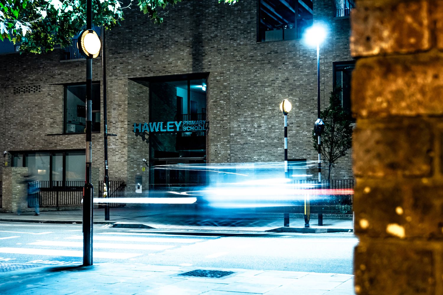
We were thrilled to provide LED illuminated letters to Camden’s Hawley School. This recently completed architectural project was given the Outstanding Design Award at the Camden Business Awards in 2017 for its transformation. Just 300 metres away from its previous residence where it existed for a hundred years, the establishment has now been revolutionised, allowing it to become an ‘all-through’ primary for the kids to stay on till age 11. Thanks to its historical links, the decision to move it and make it part of larger area-wide regeneration project was made by public consultation and popular demand.
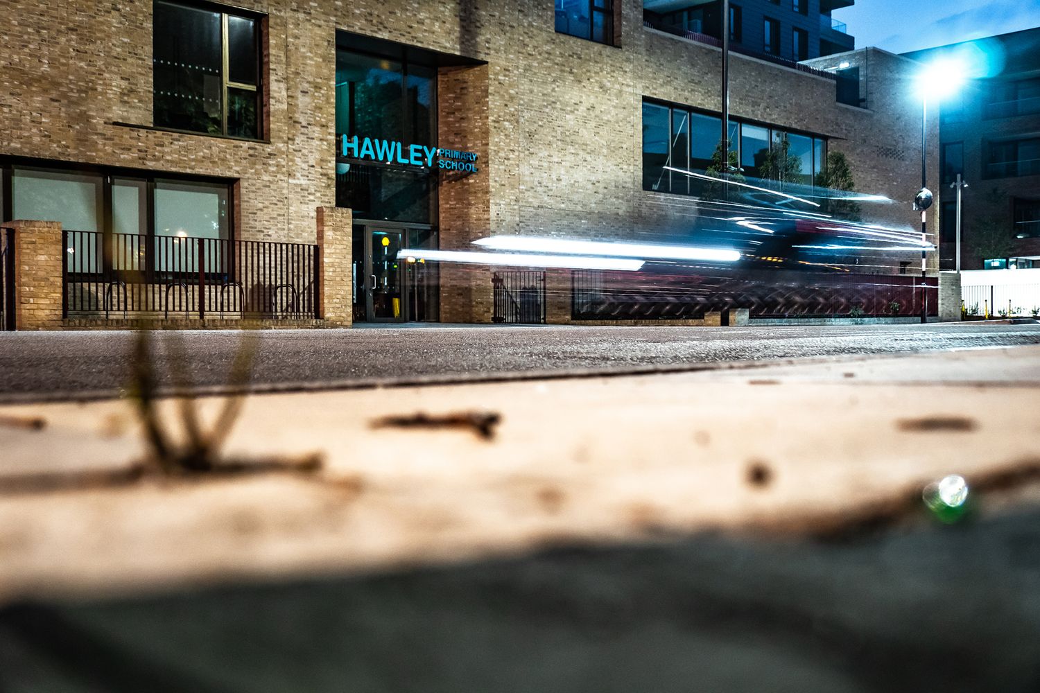
The new site honours these communal roots via a courtyard layout complete with wide double-height hallways that branch out into terraces - visually connecting the space to its urban setting. Fabricated from diverse materials, this building upgrade upgrades its surroundings, and we felt privileged to take even a small part in its intelligent design. Aware of how the brand new facade is the face of the future for the community, we set out to do it justice with the school’s sole external sign.
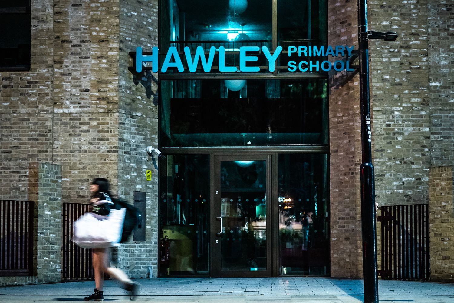
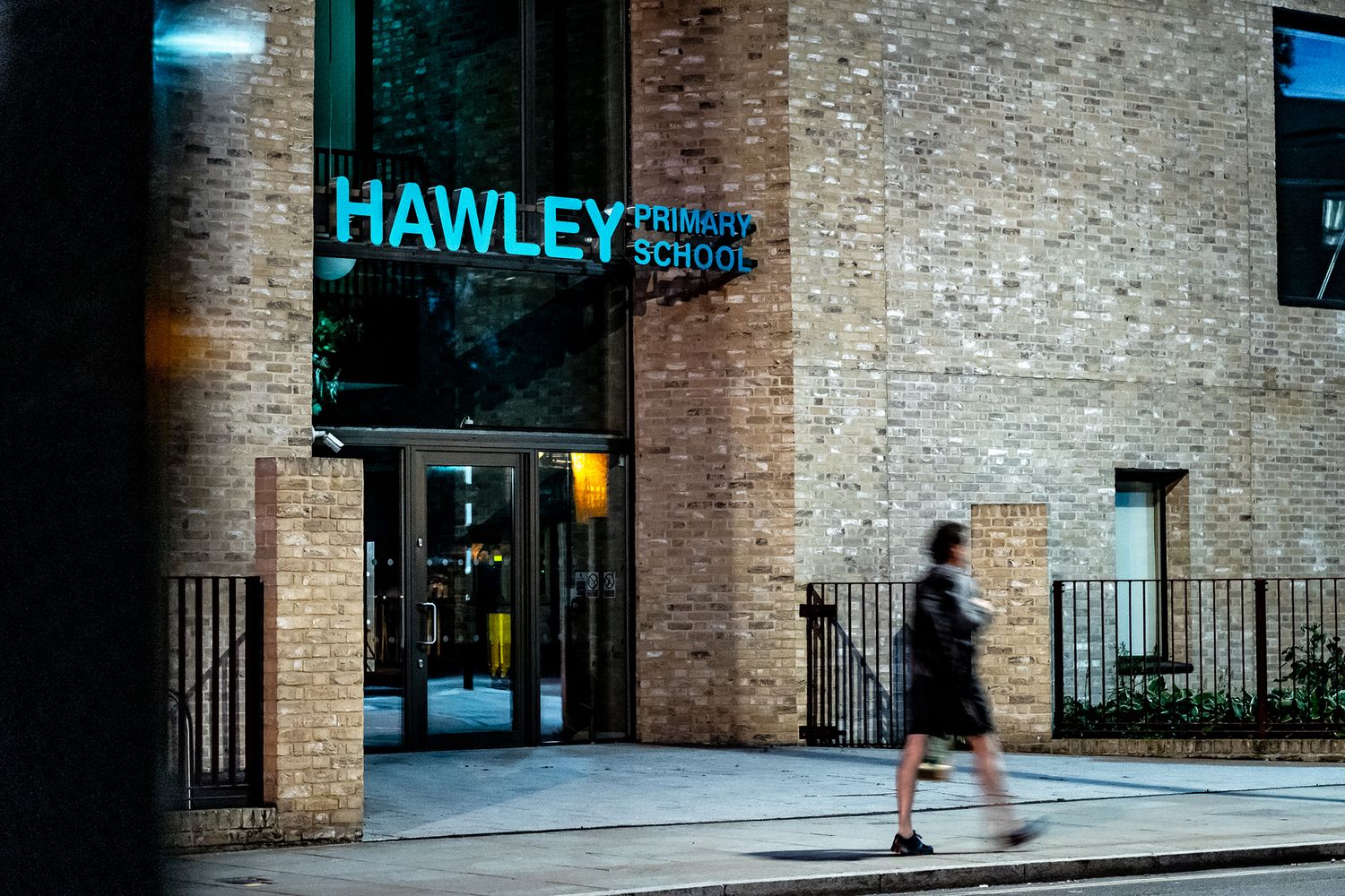
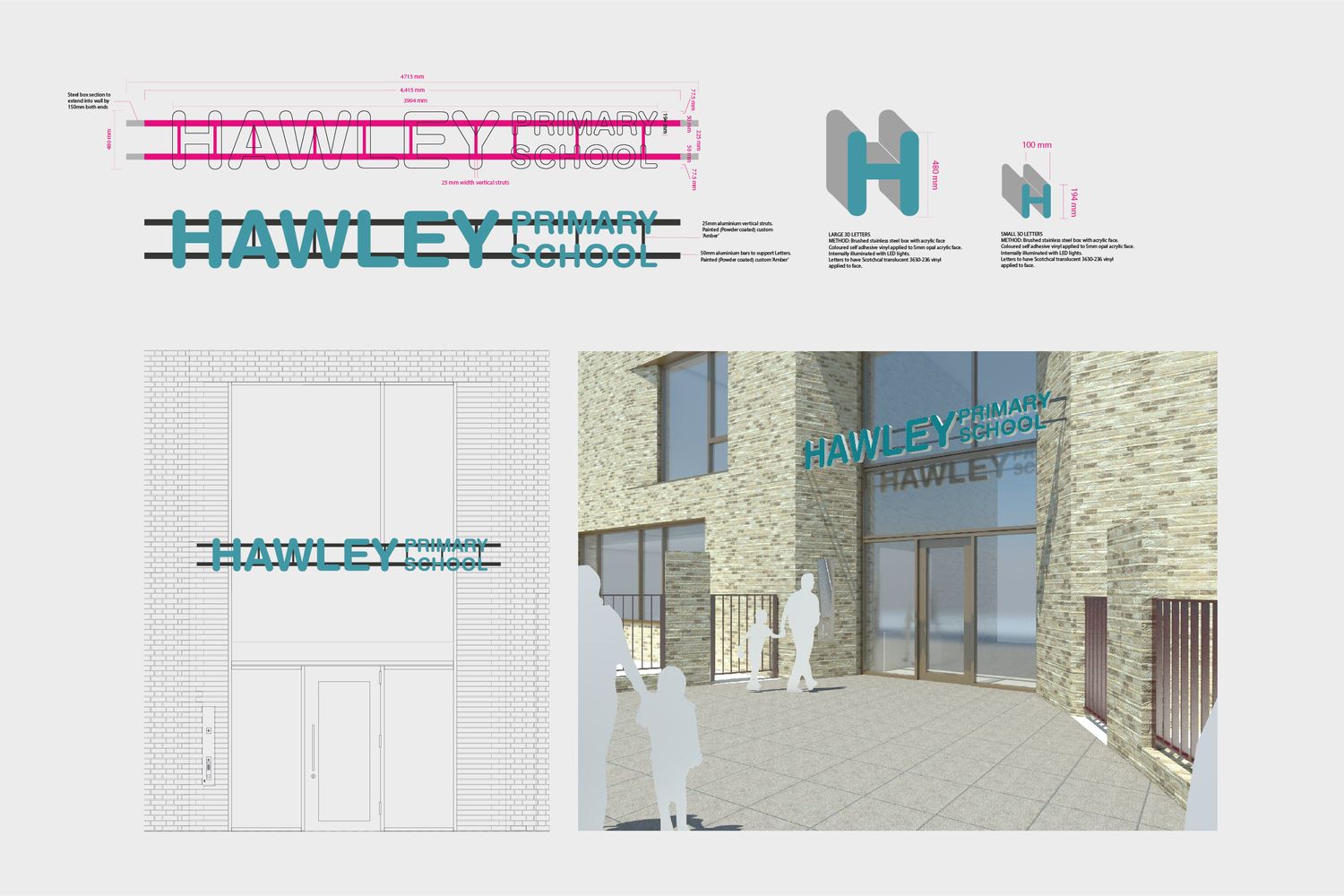
We knew we wanted this school sign to fit in with the sense of modernisation projected by the new building and with the ongoing investment being pooled into the architecture in this part of Camden in general. Our answer was signage made up of strong shapes – 100mm thick lettering constructed from robust materials.
Suspending the sign across the school entryway would pose a challenge - we'd need to mount it onto brackets that would be attached to walls that slanted diagonally, opening up the possibility of issues at implementation stage.To circumvent that eventuality, we got drawings produced and built brackets that fit those angles exactly, and ensured the shell provided enough rigidity to support the entire construction.
We went with 50mm box section aluminium for the bracket material, powder coating them in an amber colour, and made certain they weren’t so thick as to detract from the lettering. We then built the rimless 3D boxes for the letters from brushed stainless steel and utilising weather-wearing translucent vinyl, installed opal faces onto the front aspect. We painstakingly set LED modules inside each letter, achieving optimum illumination to diffuse a soft glow across the street in front.
The sign's sleek appearance aligns with the contemporary building design, and proves a satisfying match for the external fabric. It’s fitting that the school's name shines so brightly – providing necessary light in a darker inner city area and reflecting the place it holds in the hearts of locals.
FAQs - Hawley School
One of the main advantages of 3D signs is their ability to stand out, which is especially useful in high traffic areas - and of course they can be highly legible thanks to their depth. If built to be hollow, the internal space can also the easy installation of LED lights.
Illuminated signage refers to any signs that incorporate an element of light within them, and we offer a variety of options. Logos, lettering, box and tray signs that are powered by neon or LEDs are a big drawcard for businesses - fulfilling the need to create curiosity while spicing up a space.
Our illuminated 3D signage is mostly fabricated out of acrylic or a metal such as aluminium or stainless steel. The material depends on what you would like to achieve or what you want your sign to say about you, as well as the sign's environment, so we'll work closely with you to identify the design and build that suits your brief best.
It was a key factor in our approach - we selected materials known for their longevity (stainless steel and acrylic) and utilised energy-efficient lighting options (LEDs), minimising the sign’s environmental footprint while maximising its aesthetic impact.
Typically, we create things like wayfinding signs, informational boards, safety signs, wall graphics and more - these can all be customised to meet your specific needs and create bespoke solutions for diverse academic settings.
We have undertaken various projects for schools, ranging from creating custom wrapped canvases for a reception area to crafting hand painted motivational wall graphics. Each project is tailored to enhance the school’s learning environment and communicate its values.
We ensure our designs add value by specialising in custom signage - reflecting the unique identity of our clients, complementing the architectural character of their space, and enhancing the presence of their brand. For a bespoke sign, start by contacting us for a consultation where we’ll discuss your specific needs and the impact you hope to achieve.