BP: Advanced Mobility Unit Corporate rebrand with glass manifestations and vinyl graphics
THE LOWDOWN
BP’s brand is just as crucial internally as it is externally. Born in the early 1900s, the company is constantly reviewing how to stay relevant and the best way to communicate that – ensuring all comms support their current goals and aspirations for the future. From that perspective, part of their current business plan involved conveying their identity and corporate messages on the walls of their Advance Mobility Unit – located in a private office at a coworking hub called The Space, in East London.
They had been tipped off about our work by building management, so BP’s Communications and Engagement Manager, got in touch and invited us to personalise the office, implementing a very particular design…
THE SPECS
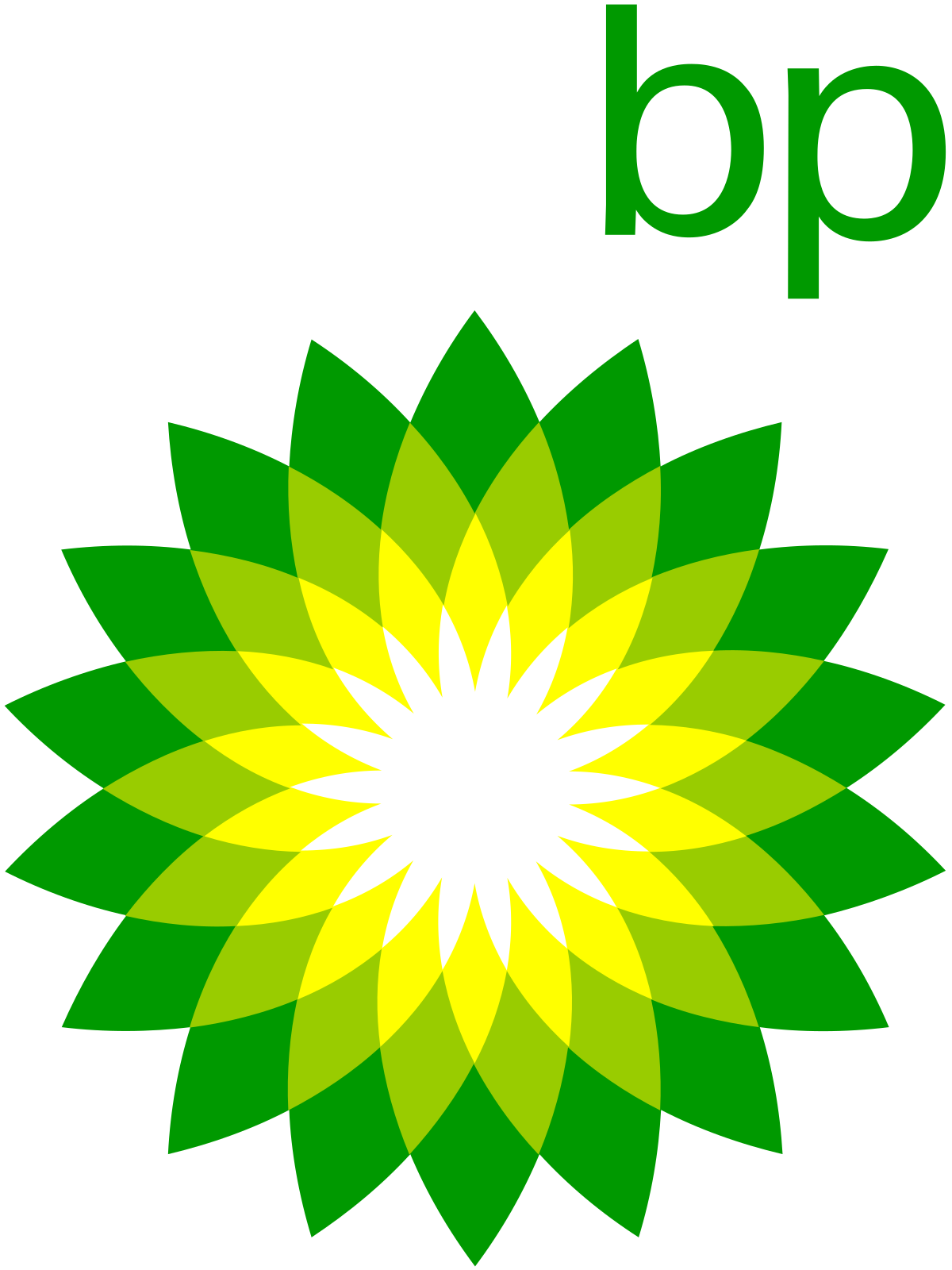
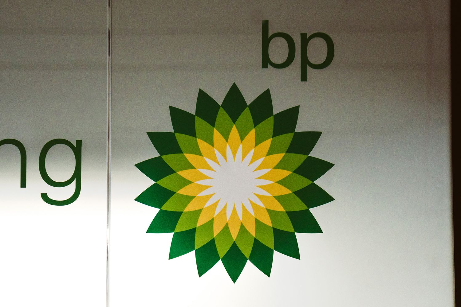
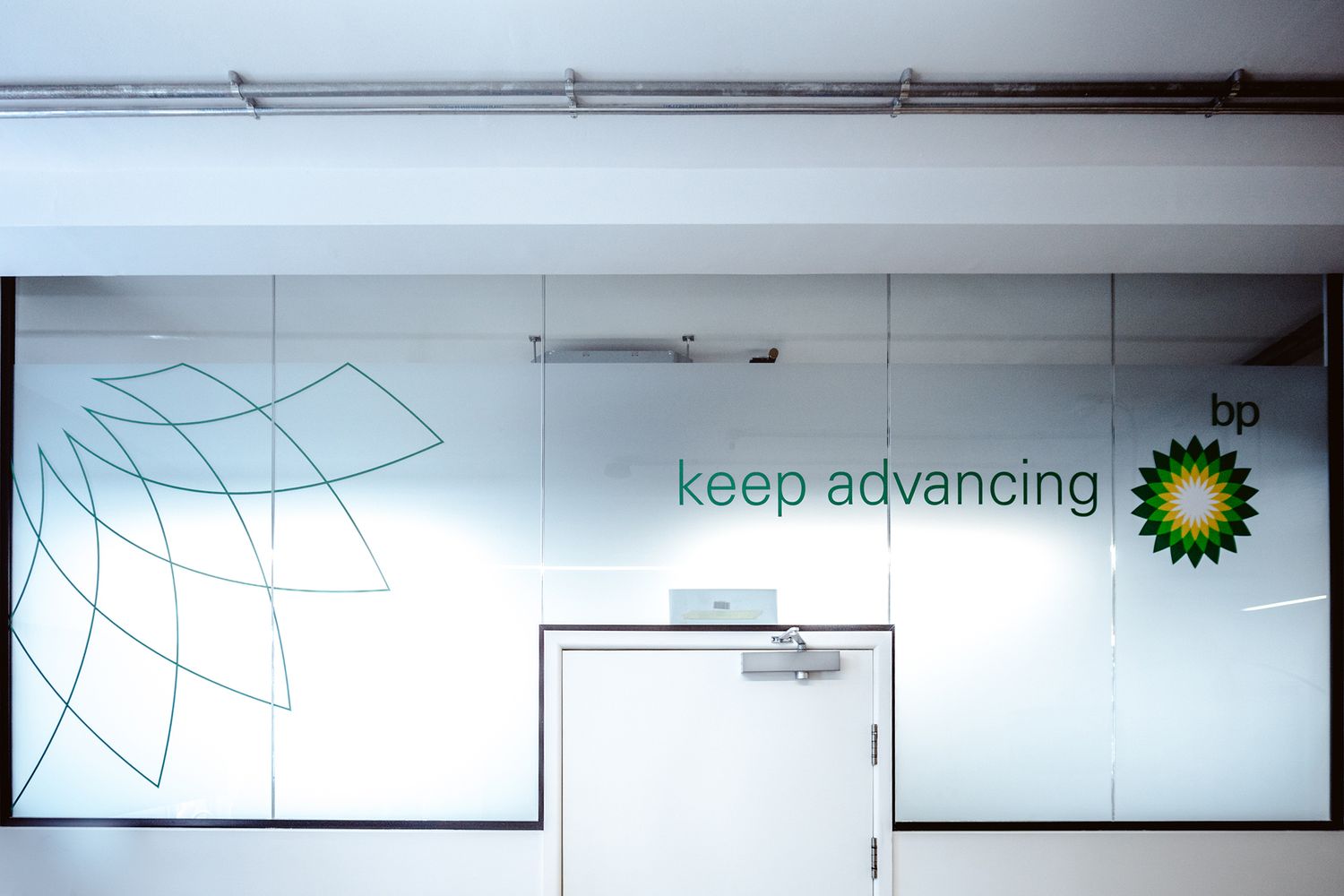
The company’s principles are encapsulated best by their beaming emblem, the Helios. Its sunburst like structure is a single entity made up of many different parts working as one, much like BP, and it suggests heat, light and nature. As might be expected, our first job was to adapt the logo to glass panelling in the entrance hall, establishing the welcome area with a frosted window manifestation.
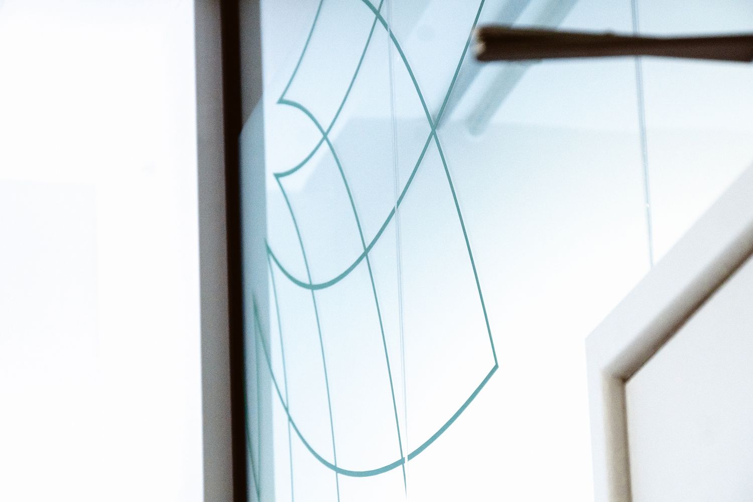
Following a quick visit and measure up, we used the simplified green outline version of the logo and arranged its overlapping rays over the doorway entry. The translucent vinyl lets light diffuse through, allowing the design to sing while keeping the look and feel clean and corporate. Our swift delivery and ability to successfully navigate the brand guidelines then led to BP getting back in touch for further office signage, requesting us to rebrand a small space that was at the time enclosed by the blank canvases of white washed walls.
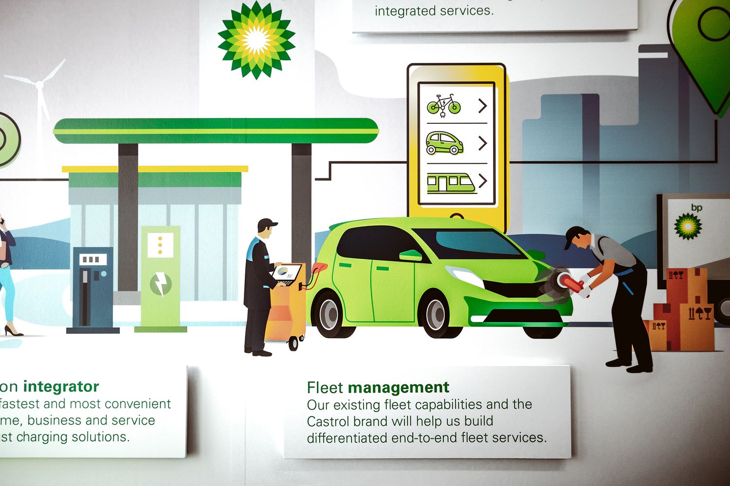
BP’s Commercial Development department, wanted to create a sense of community inside the office and asked us to make it happen. In line with BP’s Energy Illustrated campaign, which puts artwork at the heart of their corporate messages, they asked us to work on a brief full of fun graphic design elements that would depict the department’s values, effectively communicating their dedication to develop sustainable transportation and invest in new technologies.
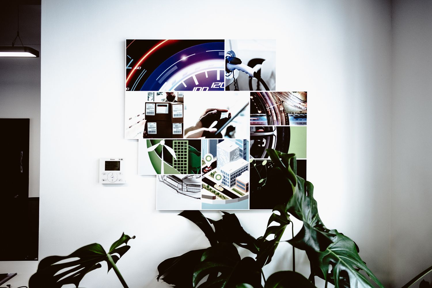
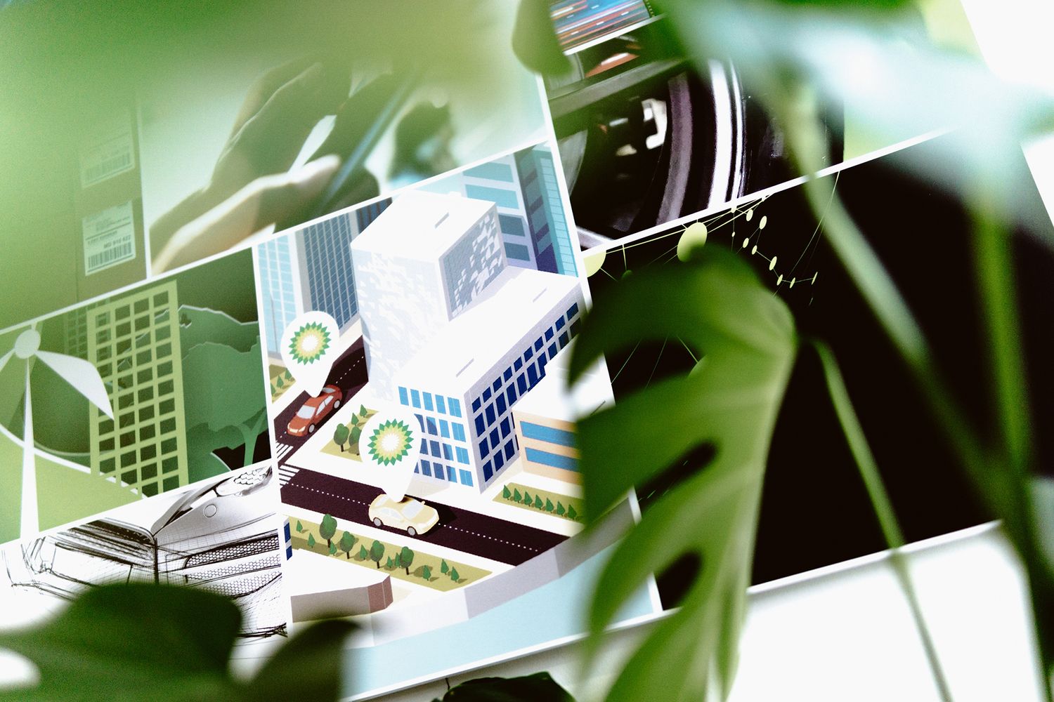
The brand has replaced complex ideas with colourful visuals across its entire digital real estate, so we used that as a starting point. From digital artwork showing electricity fuelled cityscapes, to futuristic images of mobility design, we took that bold and vibrant presence from the screen and put it onto their walls, bringing that fresh approach into the real world.
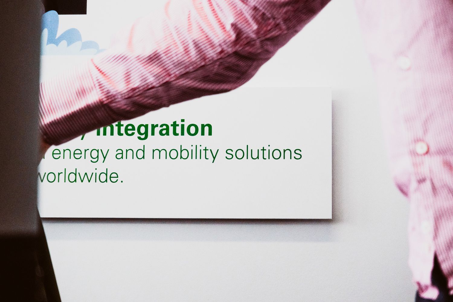
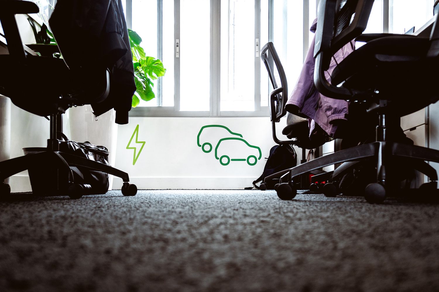
In practical terms, that saw us install photography in the form of foamex signs and infographics as wall vinyls with raised 3D elements. We picked out key terms that held meaning for the team and made sure they stood out in the design, and placed symbolic logograms (like the bolt of lightning) strategically around the office, where they’d catch the light. The result is a space with a strong visual and verbal identity that holds the attention of the team, and a subliminal injection of good energy that drives them onwards.


