China Works Hand painted wall and glass signs
THE LOWDOWN
The Workspace Group acquires industrial establishments and sets them up to make great co-working offices for start-ups and established businesses. With building up a functional portfolio comes a knack for picking out properties with real prospects – often proven by a traceable history of productivity.
China Works is one such space; being the only surviving part of the Lambeth factory complex of Doulton Pottery, famous still for churning out earthenware and porcelain. The Grade II listed building actually dates to before the existence of that reputation, as far back as the early 1800s when less refined Victorian pottery was all the rage. Its façade even tells the transformation story of bland stoneware to bone china through gothic friezes, visible over the entranceway, etched in ornate terracotta.
Fast forward to 2004, when Workspace acquired the site and carried out extensive work to revamp the décor – and things have come full circle in a beautiful way. They too looked to recount the past in their own manner, creating a modern business hub while giving delicate nods to the Doulton design philosophy, including decorative touches reminiscent of tilework, hand painted office walls, and lace like laser cut signs – enlisting our artisan skills to instil that sense of nostalgia.
THE SPECS
Having attended a web design course in this building some 20 years ago and witnessed how rough around the edges it was ourselves, we were feeling optimistic about the changes taking place, and quite nostalgic anyway!
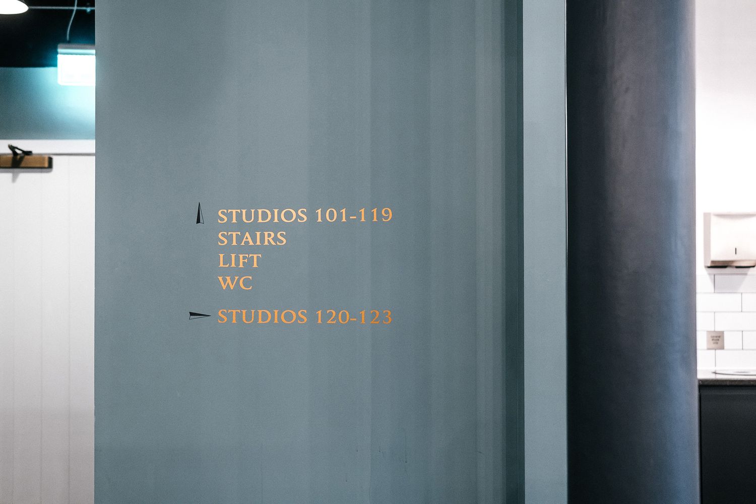
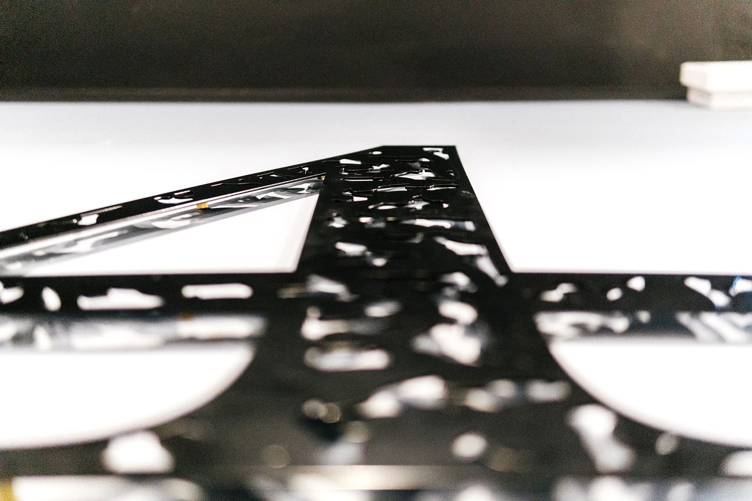
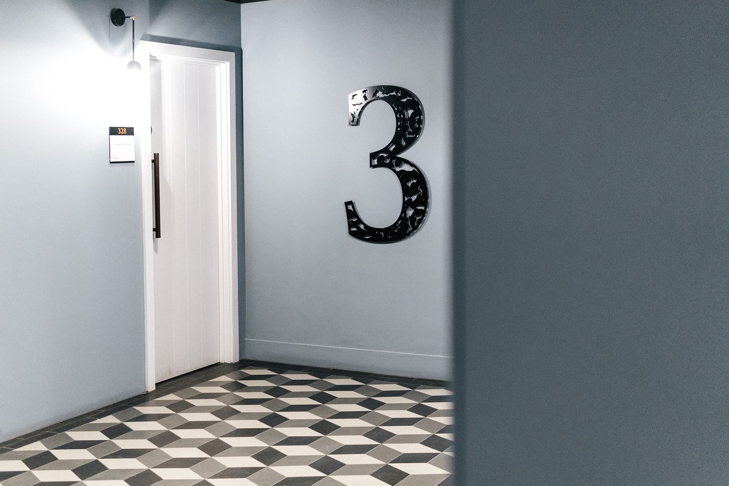
Workspace had refurbished the interior completely and repainted the corridors, asking us to complete their fit out with the finer detailing such as copper cut vinyl wayfinding signage, ornate spray coated aluminium floor level numbers that matched China Works’ logo branding, and sliding name plates for the units being let to tenants.
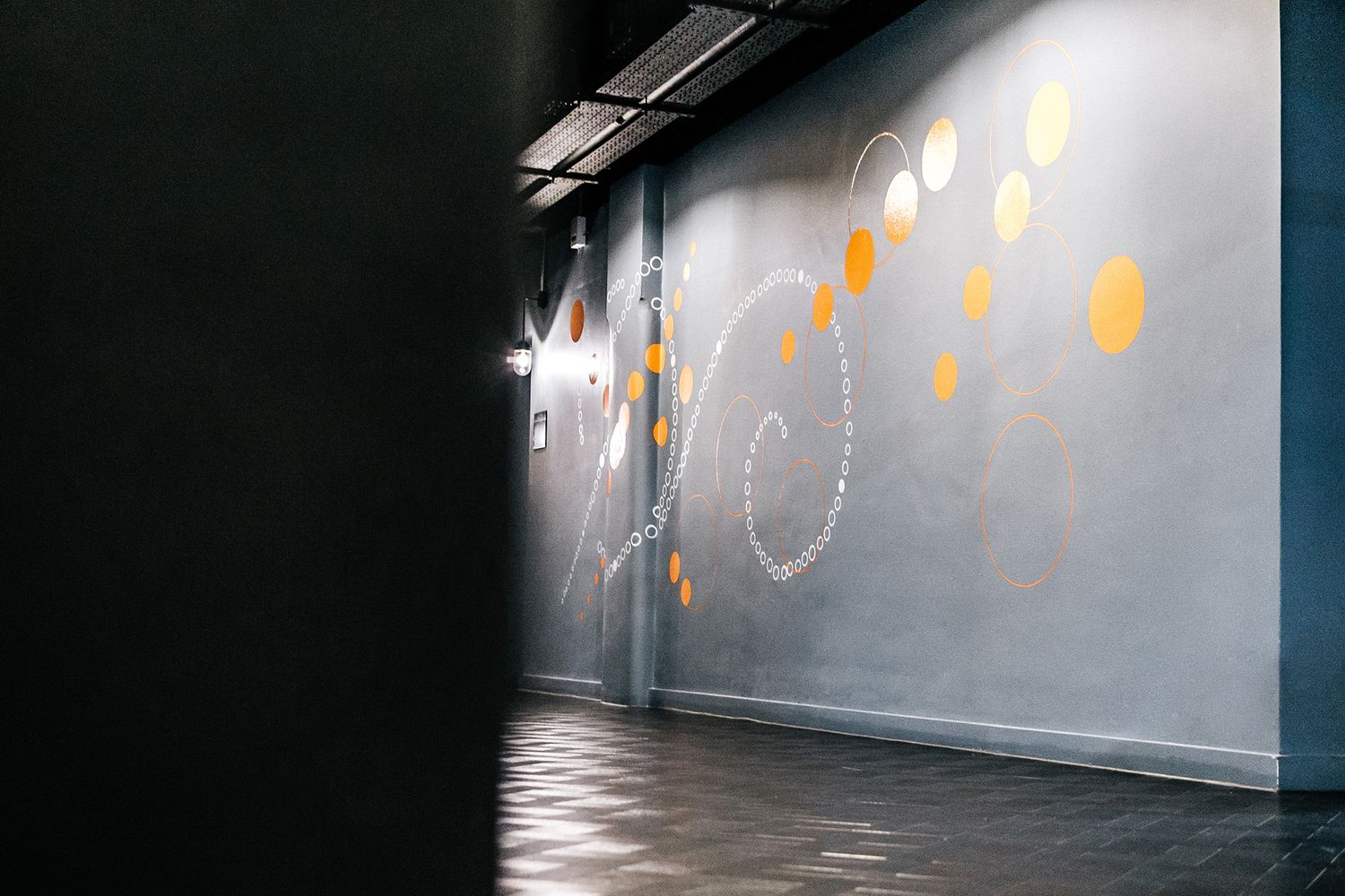
Keeping the period features of the shell meant that parts of the building were under lit, so in addition, Workspace asked us to brighten up the walls and ground floor level meeting rooms with hand painted office wall signage.
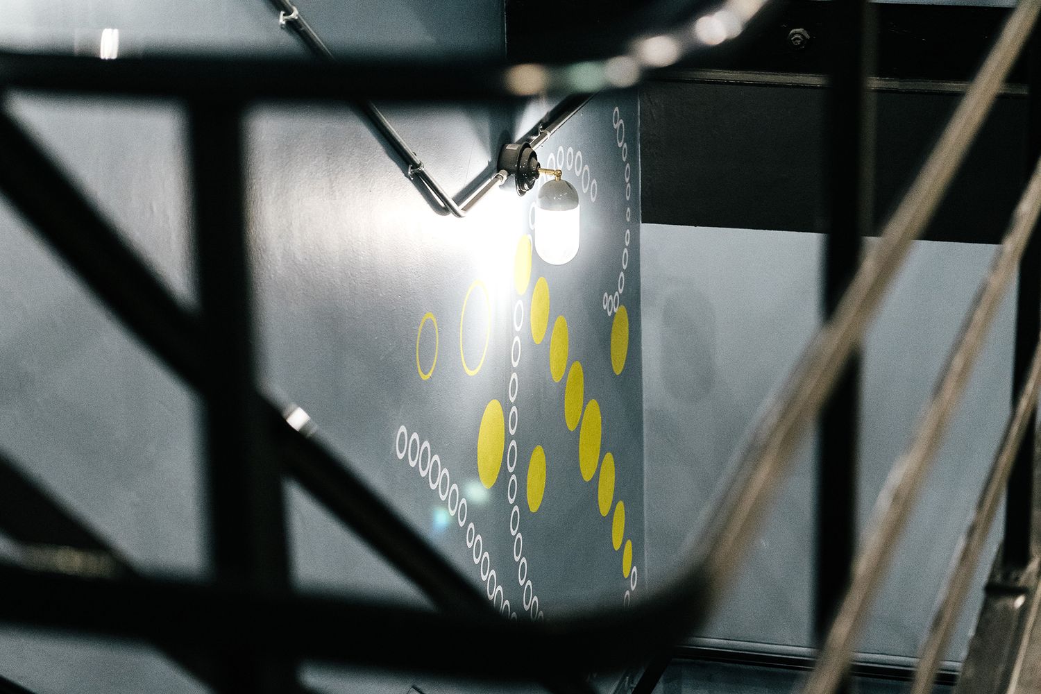
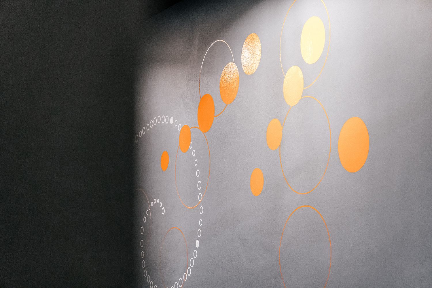
Retaining some of the old charm saw to it that we faced walls that had been coated over multiple times, and we were left with an uneven finish to work with. We sent in a team of three artists to overcome that challenge and follow patiently behind the decorators over the course of around three weeks, creating a splash in the corridors with colourful, swirling graphics made up of exact circles. Every brush stroke was based on the patterns that appeared on Doulton’s glazed plates, designed by architects, Blue Bottle, and painted by us for the perfect resemblance.
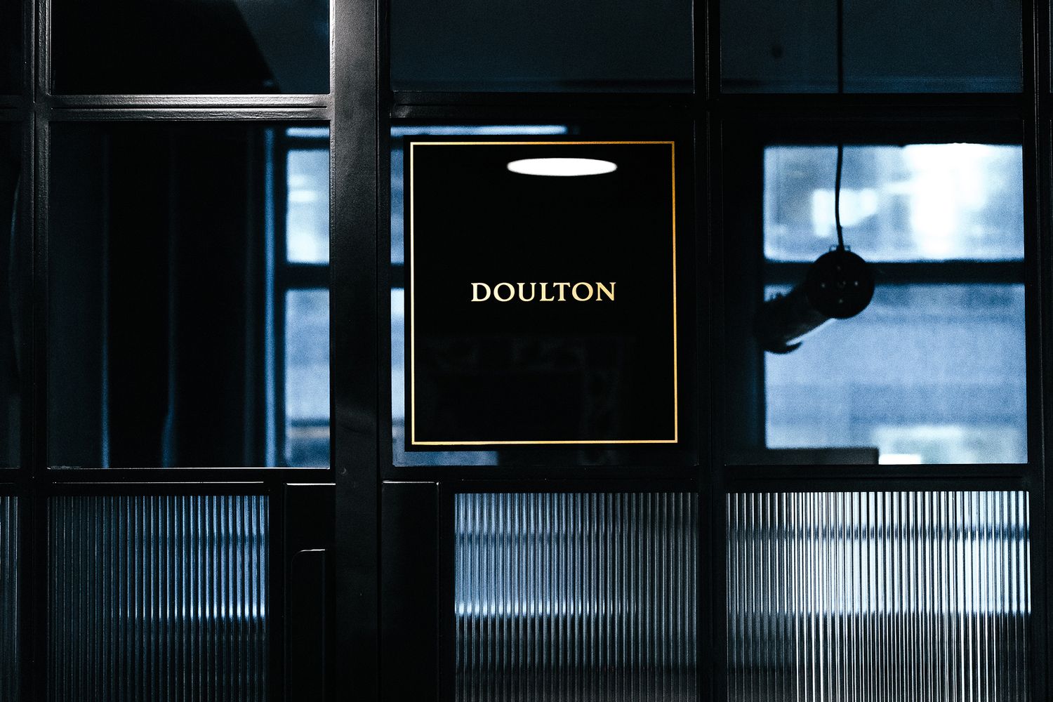
They say it’s beneath the cloak of darkness where all the fun happens, and they were right! One of those under lit spaces we mentioned before was in fact a ground floor area filled with glass meeting rooms, which we accessorised with bespoke chamber names, based on relevant pottery terms, like ‘Doulton’, ‘Glaze’ and ‘Clay’. Cute!
We were really happy with the way these signs came out – they were a fantastic example of hand painted typography on glass, with each letter made of a beautiful deep liquid copper (to match the wayfinding cut vinyl found around the rest of the building), and backed with ink black paint to help the metallic type scintillate. We think it’s easy to mistake these signs as simple print outs because of their precision, and the client did too – since this project, we have gone on to do two further Workspace locations, with more in the pipeline, and fifteen already under our painter’s belt.


