The Croc Vinyl graphics and 3D logo / lettering
Customer experience agency, The Croc, provides award winning marketing solutions for B2B. Its name is a nod to the fact this business is home to a team of killer creatives, and though they’re used to building digital campaigns for their clientele, this time round they were looking at a real life refurb for themselves, led by their Creative Director Nick Watmough and Design Director Pete Rossi, and brought to reality by us at Glyphics.
With the assertive brand catchline ‘where fierce thinking lives’ it only made sense that savage style came to stay too, right? From blazing hot pink manifestations to a foyer sign that greets you in glistening, galvanised form – this is how we made it happen.
With an office divided only by glass, the brief outlined a need to draw some stronger lines to delineate the rooms and spaces. The client asked us to wrap their largest meeting rooms with privacy film for a sense of seclusion, and to mark out and make apparent the smaller glass rooms with some manifestations, for safety’s sake.
We considered the spec and came up with a solution that provided the aforementioned practicalities, as well as instilling the brand’s design ethos and making the most of the natural light flooding the space.
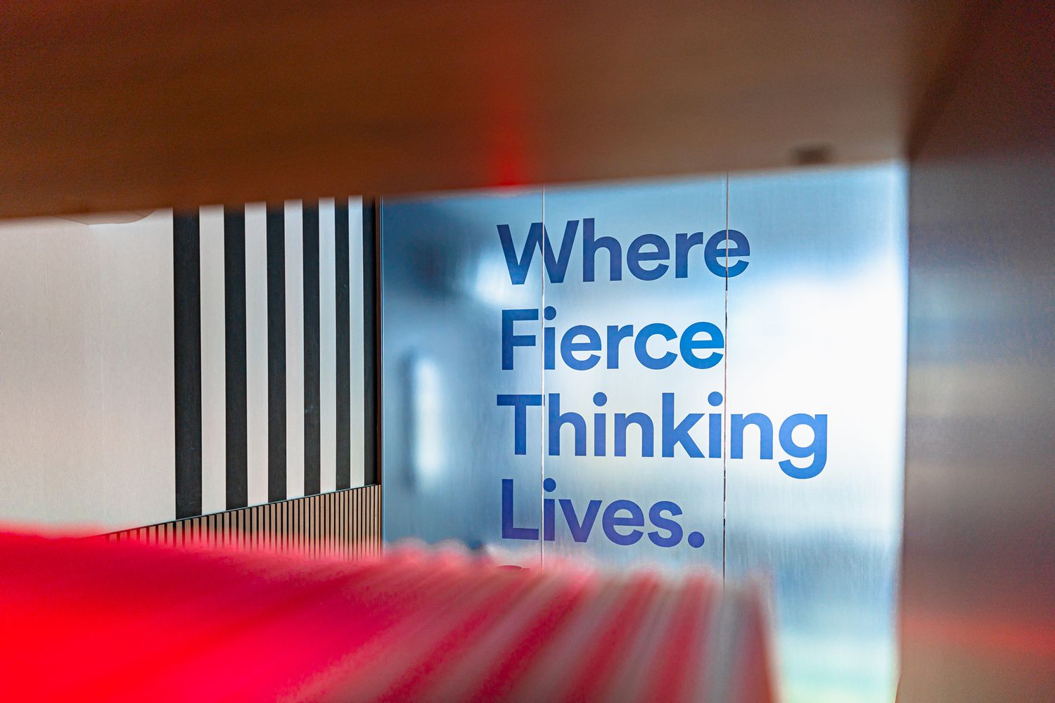
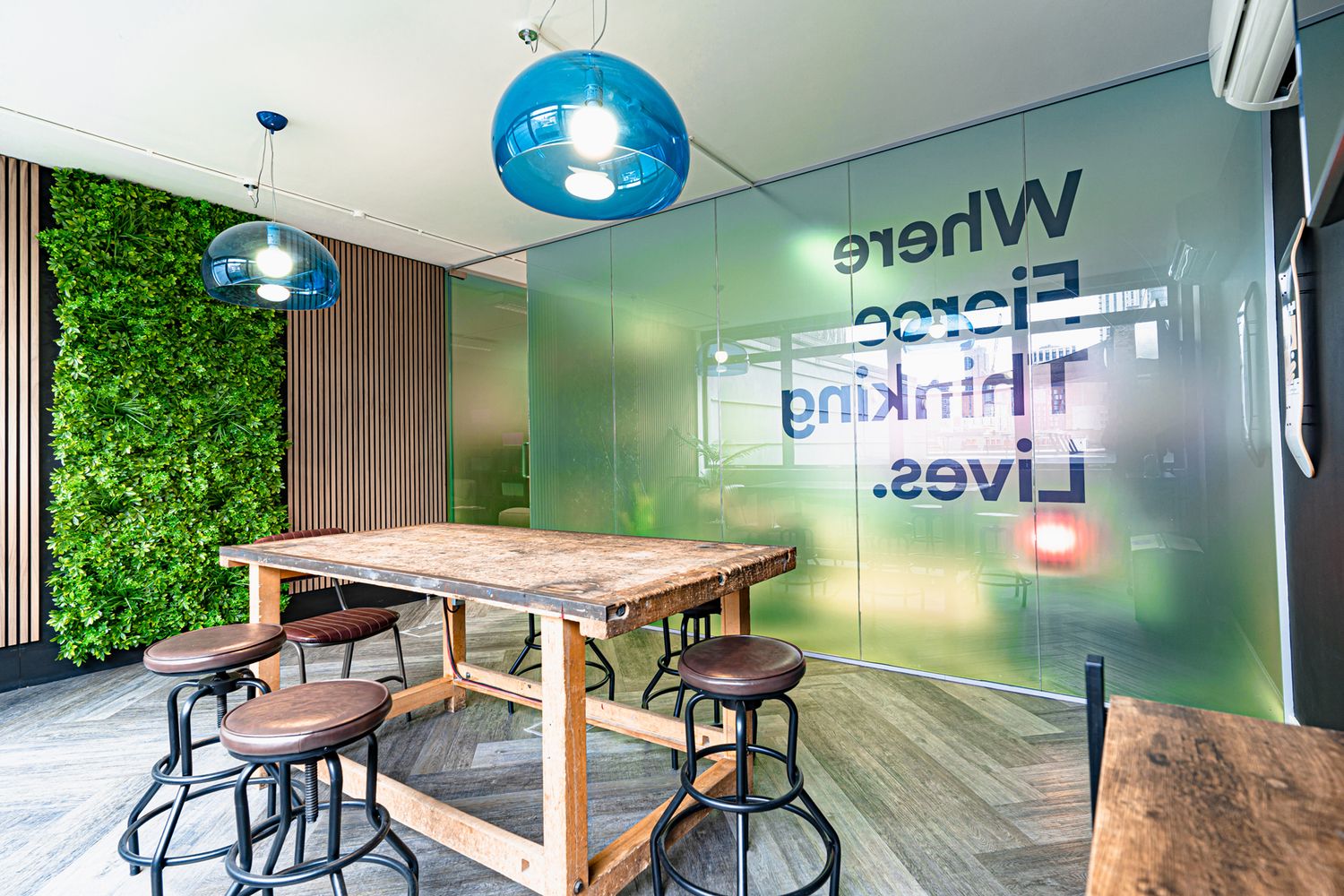
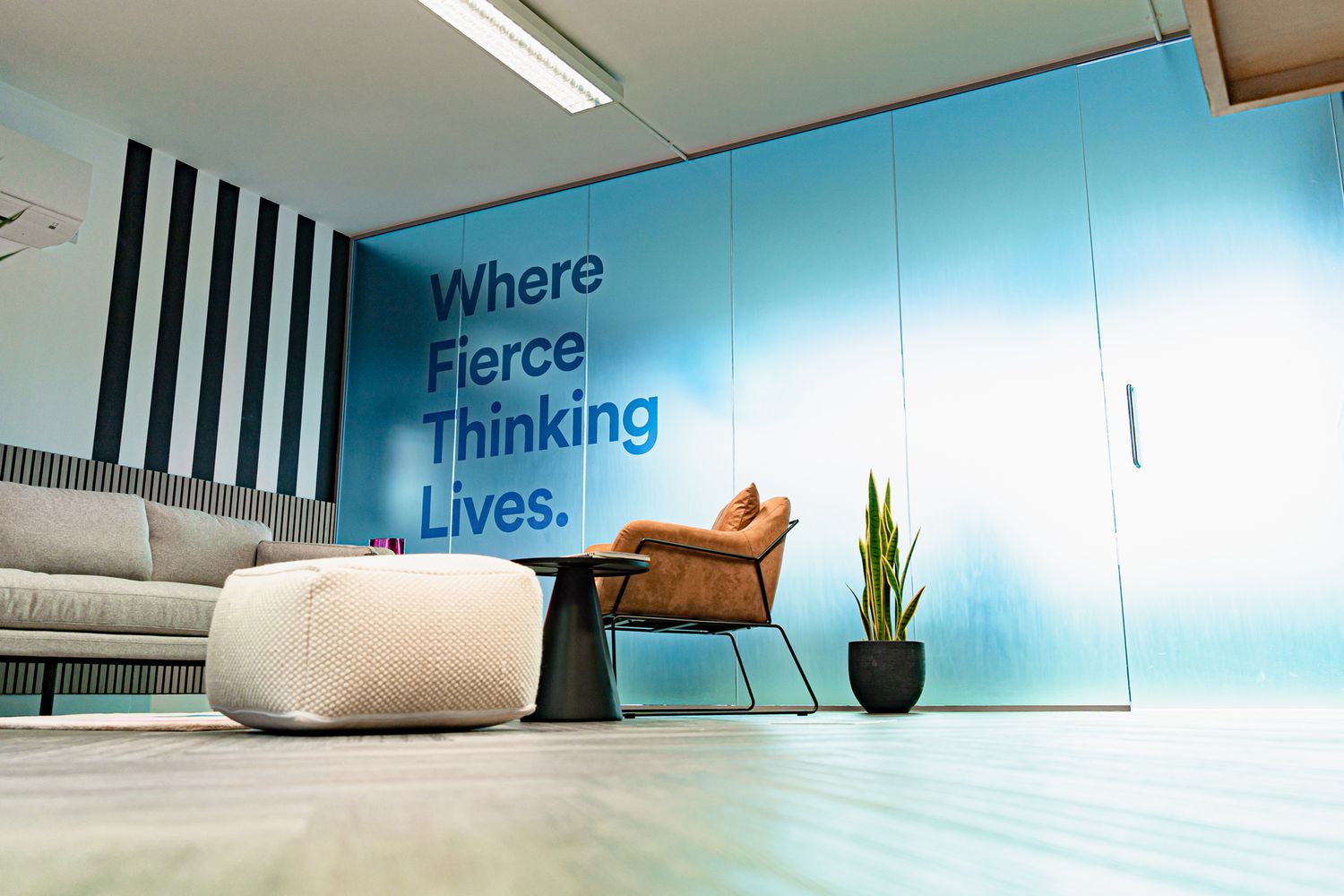
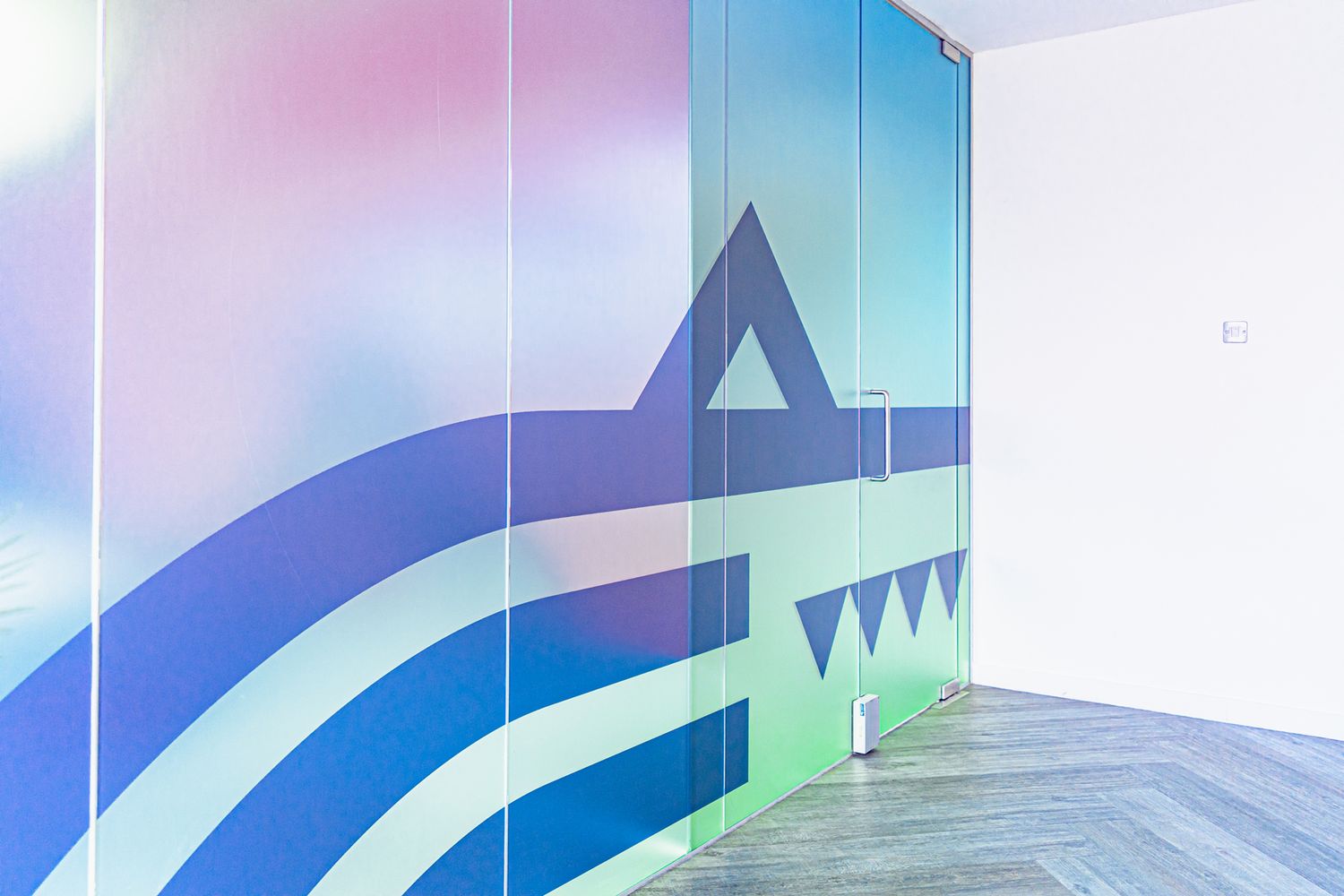
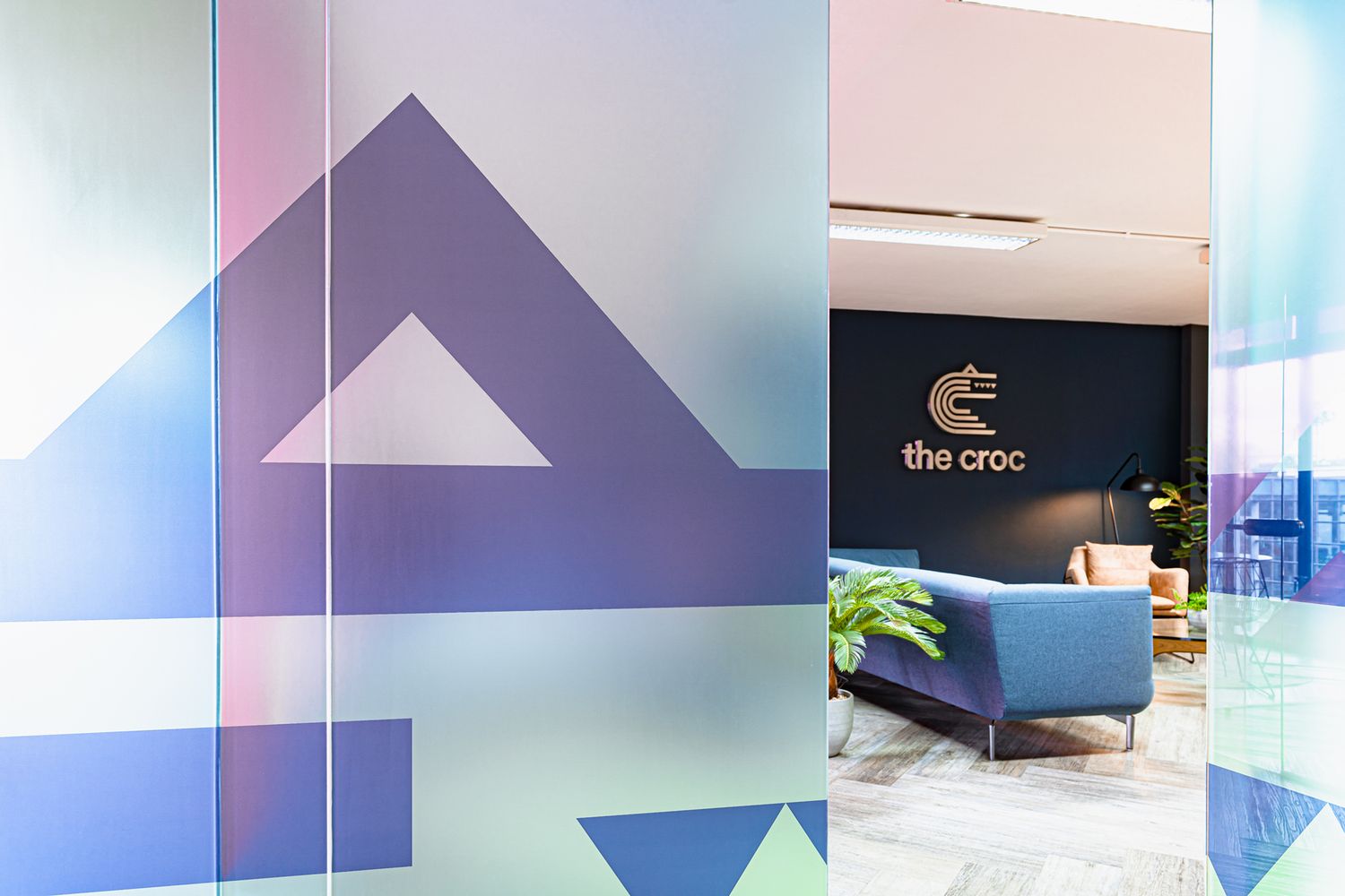
Utilising Croc’s signature blue-green gradient as a backdrop, we screened off the meeting rooms from top to bottom for complete separation. For the room towards the back, we positioned the company’s bold motto in bold blue lettering on top of the vinyl graphic, while overlaying it with their reptilian logo instead for the room to the side – we wanted it to be consistent yet still distinctive.
The fade from one hue to the next is an aesthetic unique to the agency, which we achieved by printing onto optically clear vinyl, and finished with matt lamination for a touch of textural flair. In choosing the materials we did, we were able to restrict visibility, blocking out the bulk of the action with an ombre wash, and still retain enough translucency for the lights within to cast a subtle glow outside.
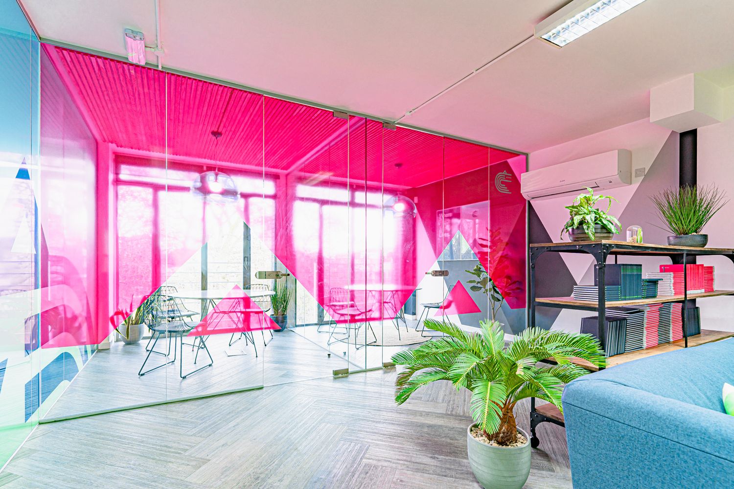
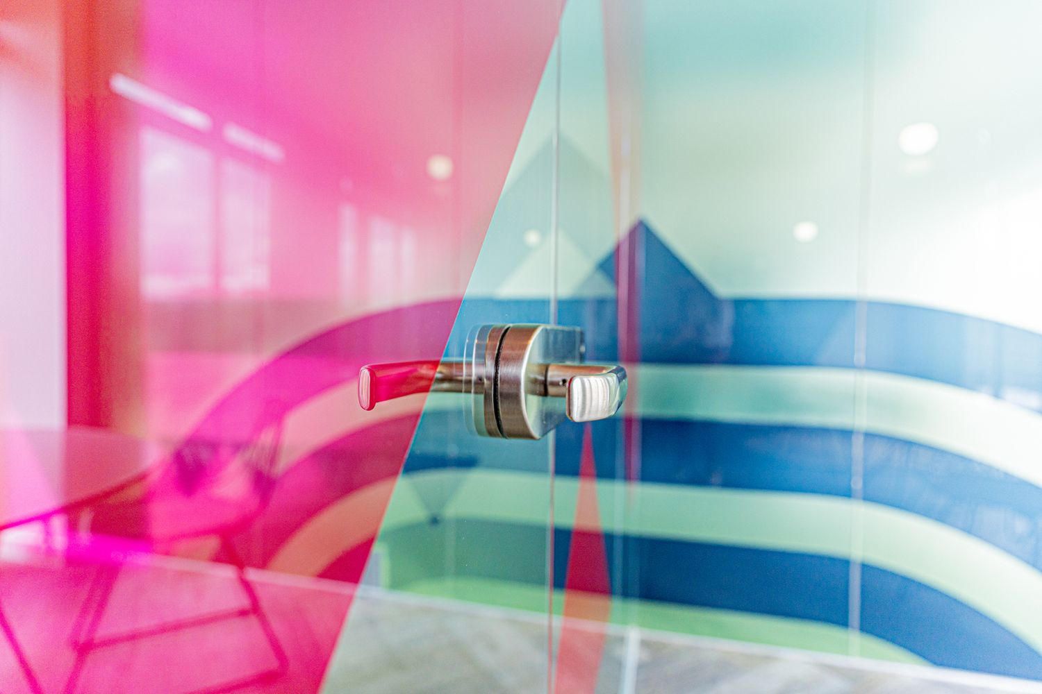

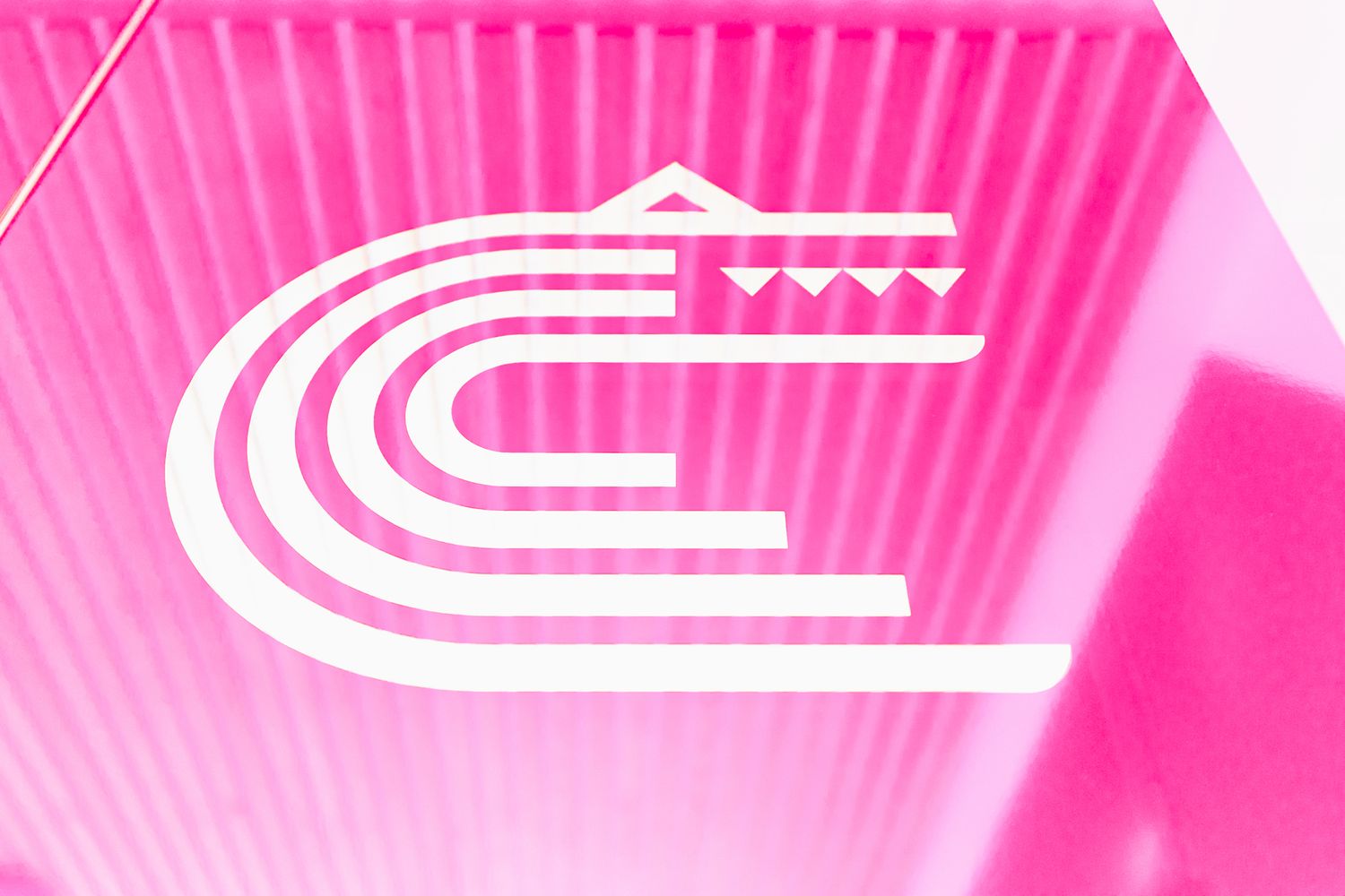
Next up was the protective glazing for the smaller rooms at the front. Overlooking Hoxton Square, on a summers’ day, these are drenched in sunshine; making the glass partitions particularly difficult to see. This called for a solution that adequately signposted the internal window panels and doors, while allowing the feng shui to flow through into the floorspace of the foyer beyond. For this, we decided to take another element of the client’s digital identity (a luminescent shade of watermelon) and colour match it with a see-through pink vinyl from the library of rolls up on our studio walls.
We sized up the vinyl, cut it to shape and applied it across the glazing, by design leaving negative space at the bottom to create a triangular pattern that echoes the geometric scales of The Croc logo. The symphony of a glossy film in a gorgeous fluoro colour, a smart office interior, and a well thought-out composition equals the flashiest manifestation we’ve had the pleasure of making to date.
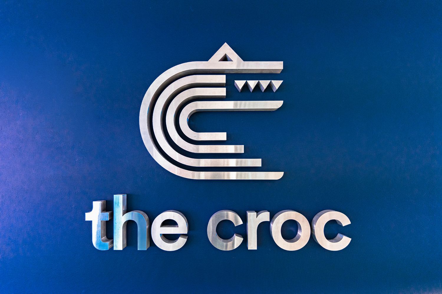
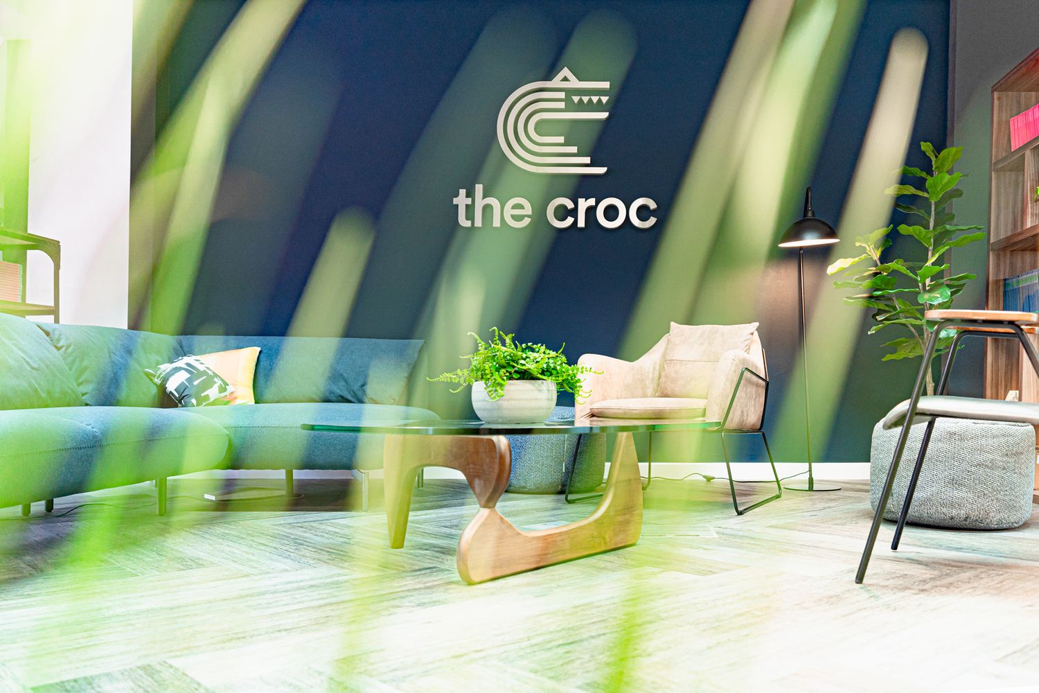
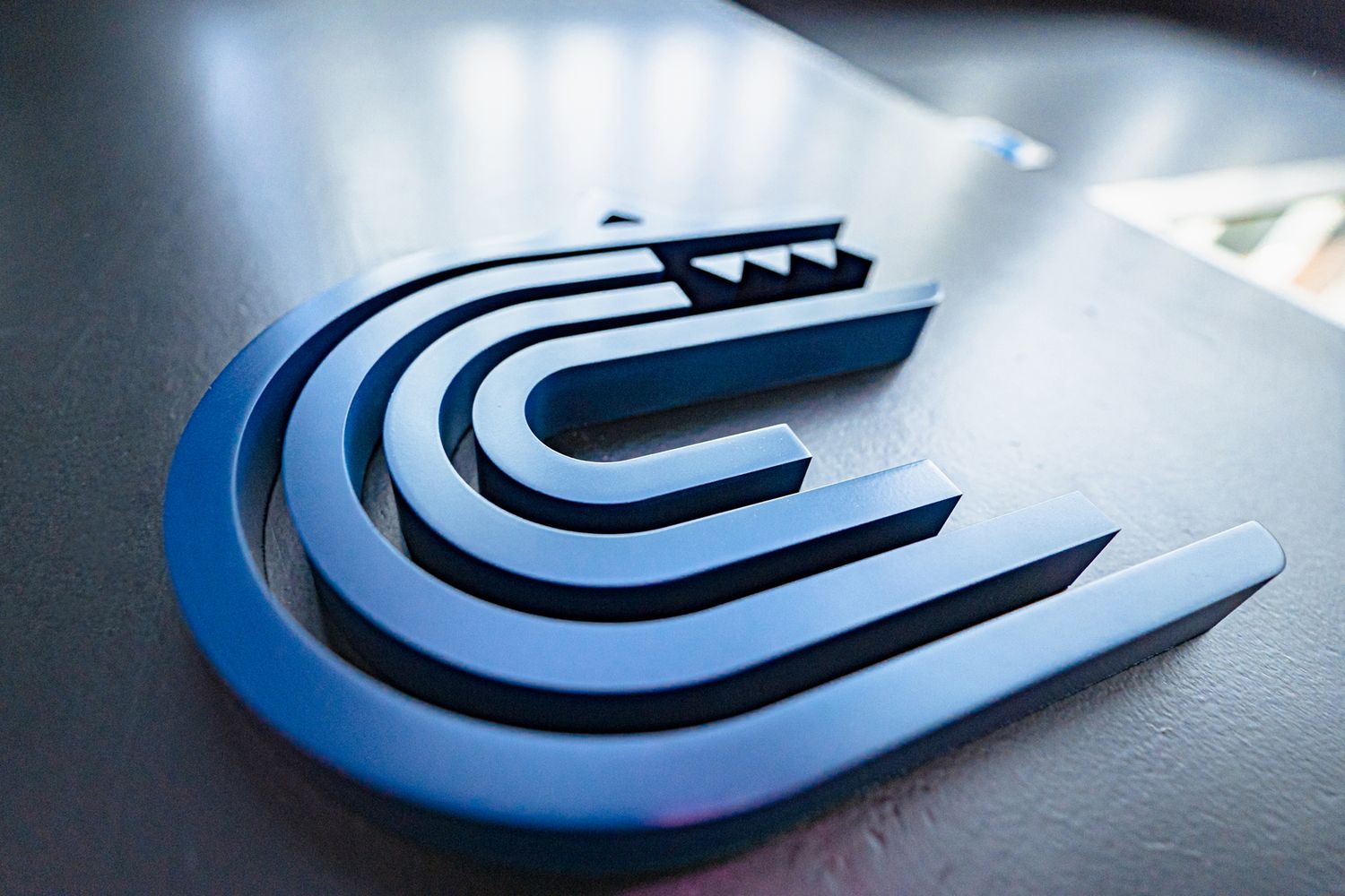
Sometimes the simplest ideas are the most striking, but we continued with the flourishes by bringing the client’s silvery, grey website logo offline and into the material world. We put together a small acrylic logo to go outside the main office door to let people know they’re in the right place, and at approximately 90cm by 110cm in size, built up a large 3D logo as the focal point for the foyer. We decided to produce it out of brushed stainless steel, as opposed to polished metal, to ensure it wouldn’t get lost in the deep blue of the navy entrance wall, and set it 4cms off the back.
The result is a weighty, razor sharp piece of artwork that reflects the surrounding pinks and greens, and provides a suitably snappy finish for The Croc.
