
AccuRx - Worship St Campus Cut vinyl glass manifestation, raised acrylic wayfinding, and custom metal room plates
AccuRx approached Glyphics with a brief for building a new visual identity for their new offices. Without a designer of their own on board at the time, and with a complete blank canvas to kit out, the company looked to us to first conceptualise branding elements using their established business guidelines before building any signage.
We relish the incubation period of a project - researching, visualising, drafting, and positioning artwork is an opportunity for structured playfulness. In this instance, the scope included exploring the manifestation design for internal glazing, developing basic wayfinding principles throughout, and supplying graphic details and typographic layouts for meeting room door signage, with a possibility of eventually adding room numbers too.
Concepts included organic form signage and signs themed around people who’ve made a positive impact upon modern medicine, to symbolise AccuRx’s ties with the public healthcare industry - though we didn’t move forward with all of our initial ideas, they were well received, and we got the go ahead to expand our proposal.
We’d be rebranding an open plan office with an already rich colour palette and exposed bricks, and saw an opportunity to use our signage to pare back the busy interior design with low key yet contemporary elements. Our approach was to keep sign compositions sophisticated, soften the overall aesthetic with neutral tones, and freshen things up by incorporating signature shapes from the AccuRx brand language into our signage.


After our earlier meetings and having seen the floor plans, we dug into what is our daily bread first - crafting glass manifestation and wayfinding signage that blends seamlessly into the space while moving people effectively through it.
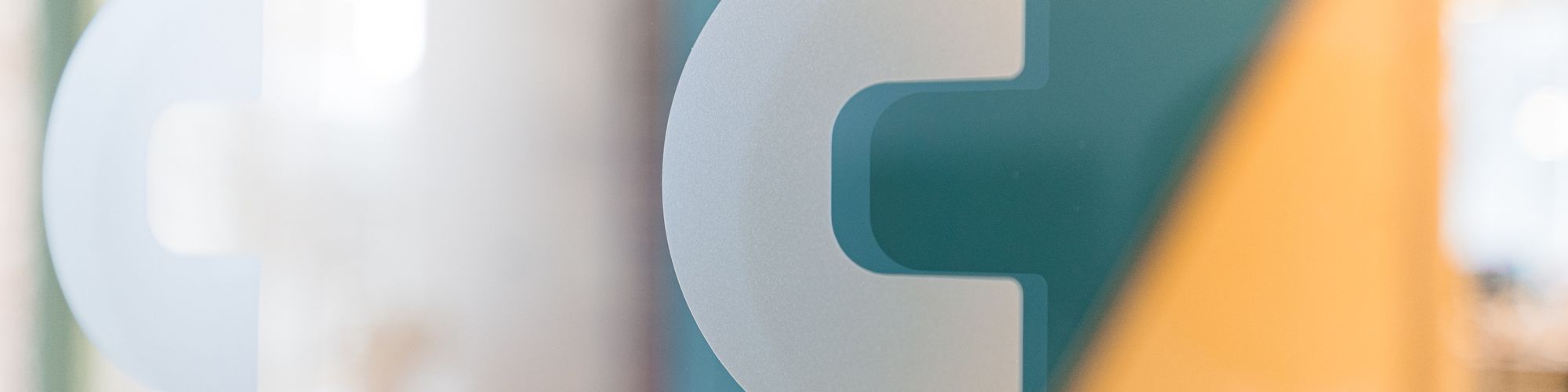
For the intramural window manifestations, we repurposed the AccuRx logomark into a subtle repeat pattern, cutting the letter C out from semi-opaque white vinyl before arranging it symmetrically - highlighting any glass surfaces with an identifiable yet understated icon.
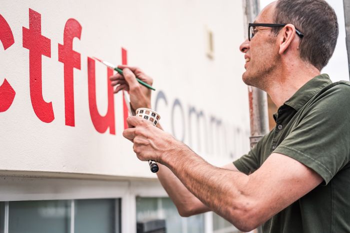
Moving on, the cut vinyl lettering and raised acrylic lettering for wayfinding signage were designed with legibility in mind - utilising a sans serif type with medium density tracking in a white colourway, creating high contrast words against warm brick facades and painted doors. Our attentive installers managed to successfully recreate our digital blueprints with their real world implementation, achieving extremely uniform line spacing to produce neat spatial forms that stand out just the right amount.
The meeting room identifiers were central to the rebrand. Our original proposal was a square shaped metal panel for each suite, overlaid with a unique vinyl print of a notable person who has contributed to the science or practice of medicine. They would be represented either by a photograph of their face or a pictorial line drawing, along with their name. As the process went on, the client took the lead and evolved the idea themselves, merging both the photo realistic and minimalist options, to land upon a graphic illustration. They expanded the copy to include a larger biographical description of each historical figure, and so naturally the signs shapeshifted into long vertical plates.
It’s a pleasure to work with people that share our design ethos, and together we attained a professional finish. We were quickly able to produce samples to their taste and the final metal signs were custom-made with a matt finish, giving them a solid, smart quality.
What began as an abstract design project, manifested as a holistic rebrand for AccuRx as a business. We created custom safety signs for their glass manifestation, implemented a navigational language to give them their own bespoke wayfinding system, and brought their brand to life with a theme of impactful motifs that were made-to-order. We’re currently fleshing out what form any external signage will take, and for the future, AccuRx plan to standardise our scheme across their various buildings.


The AccuRx office rebrand aimed to craft a visual identity that mirrors the company’s ethos as a healthcare software provider, undertaking digital transformations for the NHS at a system level. By designing and integrating custom safety signage and wayfinding solutions, our goal was to not only allow people to navigate the office effectively but also embody AccuRx’s commitment to innovation within the physical workspace.
Our work for AccuRx featured three main elements: cut vinyl glass manifestations for privacy and branding, raised acrylic wayfinding to guide staff and visitors effortlessly, and custom metal room plates for identifying spaces.
Glass manifestations are designs applied to glass surfaces to both enhance safety by making the glass visible and contribute to the interior's aesthetic. For the AccuRx office, we used cut vinyl, though with our high quality printing facilities and range of raw materials, there are a vast array of effects that can be achieved. Explore more here.
It’s a very versatile material that has many uses that you can explore here. In this instance, acrylic was chosen for the wayfinding as it can be easily cut into any shape or size, allowing us to produce the small yet deep set lettering you see that pops off the walls, and it’s resistant to scratches, making these white signs, which can notoriously be difficult to keep looking new, appear spick and span for longer.
We use many different types of metals for our signs, but generally speaking, as a group they offer durability.
Uncoated signs last up to a few years, and in an era when industrial design is at its peak, allow the natural aesthetic appeal of the material to shine through, while protective coating on a sign can extend its life by around a decade and gives a pleasingly uniform appearance.
That makes either form suitable for any medium to long term signage, and especially perfect as part of a wayfinding scheme as illustrated in this project.
This project uses powder coated aluminium, which is one of the most commonly chosen metals at Glyphics, as it resists oxidation. We've implemented laser cutting technology to create the shape of the metal panelling and finish it with simple edges of super smooth quality - a technique that’s proving extremely popular for wall plaques and directory boards.
We started with a deep dive into AccuRx's design guidelines, researching the elements we could use to ensure our signs resonated with their corporate identity. Once we’d developed our concepts, we trialled them with various signage types to thoroughly explore how best to enhance the aesthetics of the office, and meet the functionality sought after in the brief - enhance wayfinding, reinforce the organisational image, and inspire employees by integrating the company's mission into their daily environment.
From repurposing the business’ logomark into a subtle pattern for glass manifestations, to fabricating meeting room identifiers that emphasise AccuRx's connection to public healthcare by celebrating medical pioneers - every aspect was thoughtfully built to the brand. By manifesting signage in AccruRx’s unique visual language, we were able to create a cohesive workspace with both navigational flow and motivational flair.
Starting a project with Glyphics is straightforward. Reach out to us with your vision and brand requirements. Our team will collaborate closely with you to understand your objectives and develop signage solutions that enhance your office space, ensuring your brand’s identity is seamlessly integrated into the design.