

Porky's & Play Restaurant rebrand with hand painted lettering & vinyl fit out
Porky’s restaurant was synonymous with patrons pigging out on hearty finger lickin’ grub and knocking back a good old pint of draught, however the Bankside branch had a whole other side to it that most weren’t privy to - beer pong.
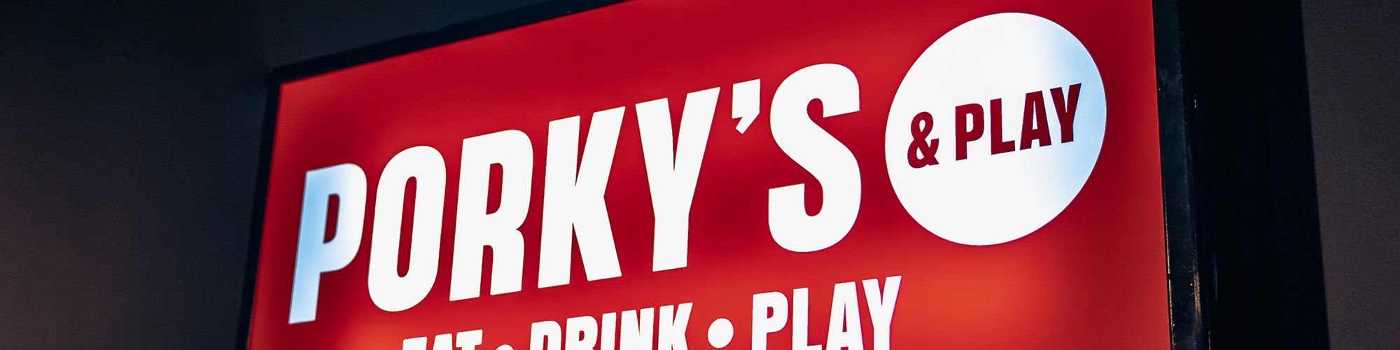
Providing laughs at lunch and downtime at dinnertime, the drinking game proves to be the perfect after-work pursuit for city folk. As a result, the business' owners decided a tweak to the title would bring the entertainment side of the establishment back into play – triggering a rebrand that called for Glyphics’ sign making skills.
The subtle addition of '& Play' to the restaurant's name markedly broadened its appeal, signalling a shift from BBQ offerings to a vibrant American eathouse experience, a transition that was reflected profoundly in the establishment's design ethos.
In charge of capturing Porky’s transformative journey, R Design, their creative agency, reached out to us to discuss a rebranding strategy. The restaurant's aesthetic transitioned from the understated monochrome tones and simple typography of a traditional smokehouse to a striking, vivacious identity resonant with a retro diner's lively atmosphere.
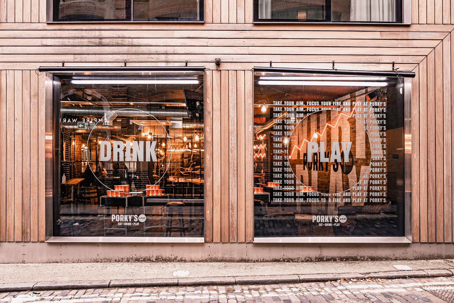
This evolution was characterised by the use of a bolder typeface and a striking new colour scheme, dominated by red hues. The client wanted the spirit of their interiors to match the high energy of their customers, and requested custom vinyl wallpaper signage and a giant hand painted wall mural illuminated by the radiant glow of faux neon.
Tasked with completing the kit out within a tight time period, our estimators set up a site visit to scope out the scale of the brief and despite its artisan element, felt confident about fast tracking the project. Knowing where to look for potential pitfalls and surmising an accurate quote quickly helped us propel past the ideas phase into production.
After meeting with the client, we agreed on a final proof of design and got the printers rolling at our shop in Shoreditch, churning out the bespoke vinyl wallpaper that would section off socialising areas, and bring all the venue’s little nooks and crannies in line with the new aesthetic.
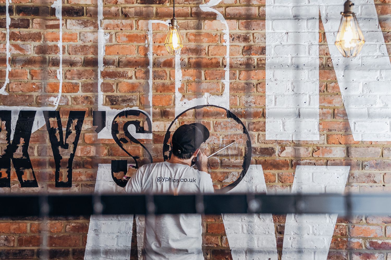
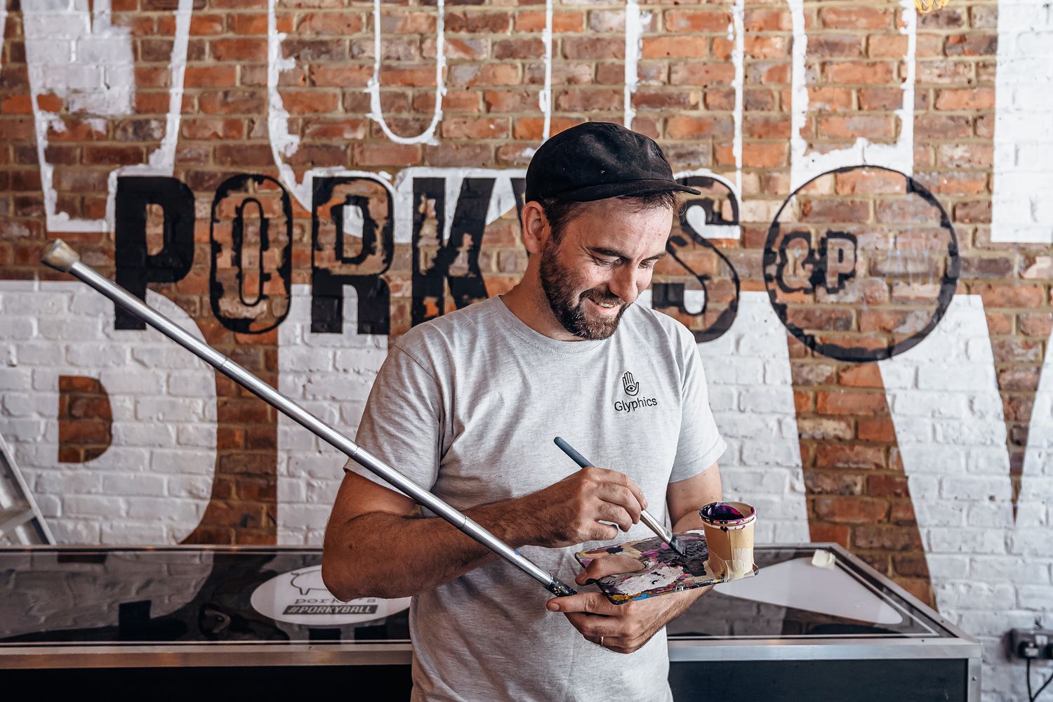
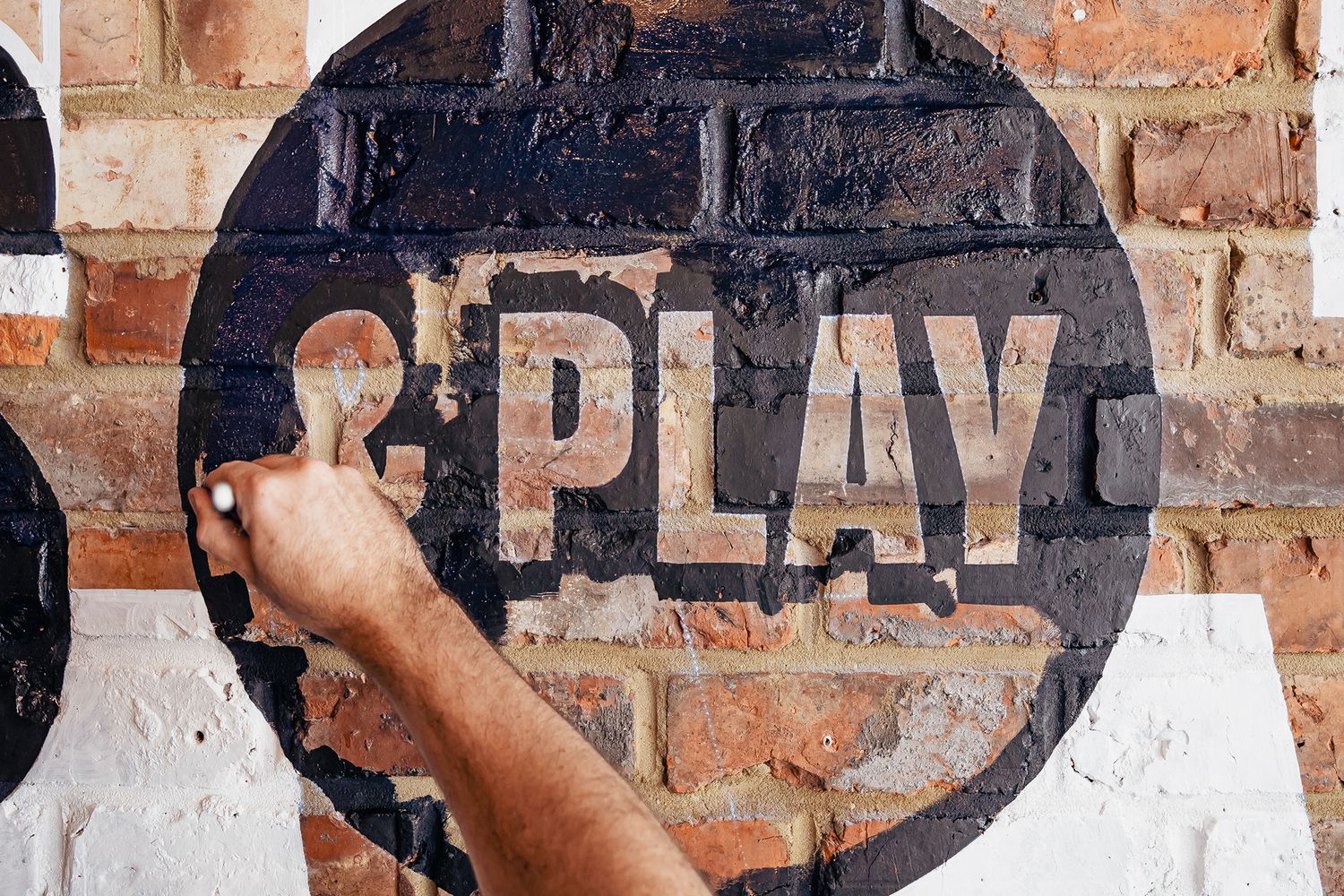
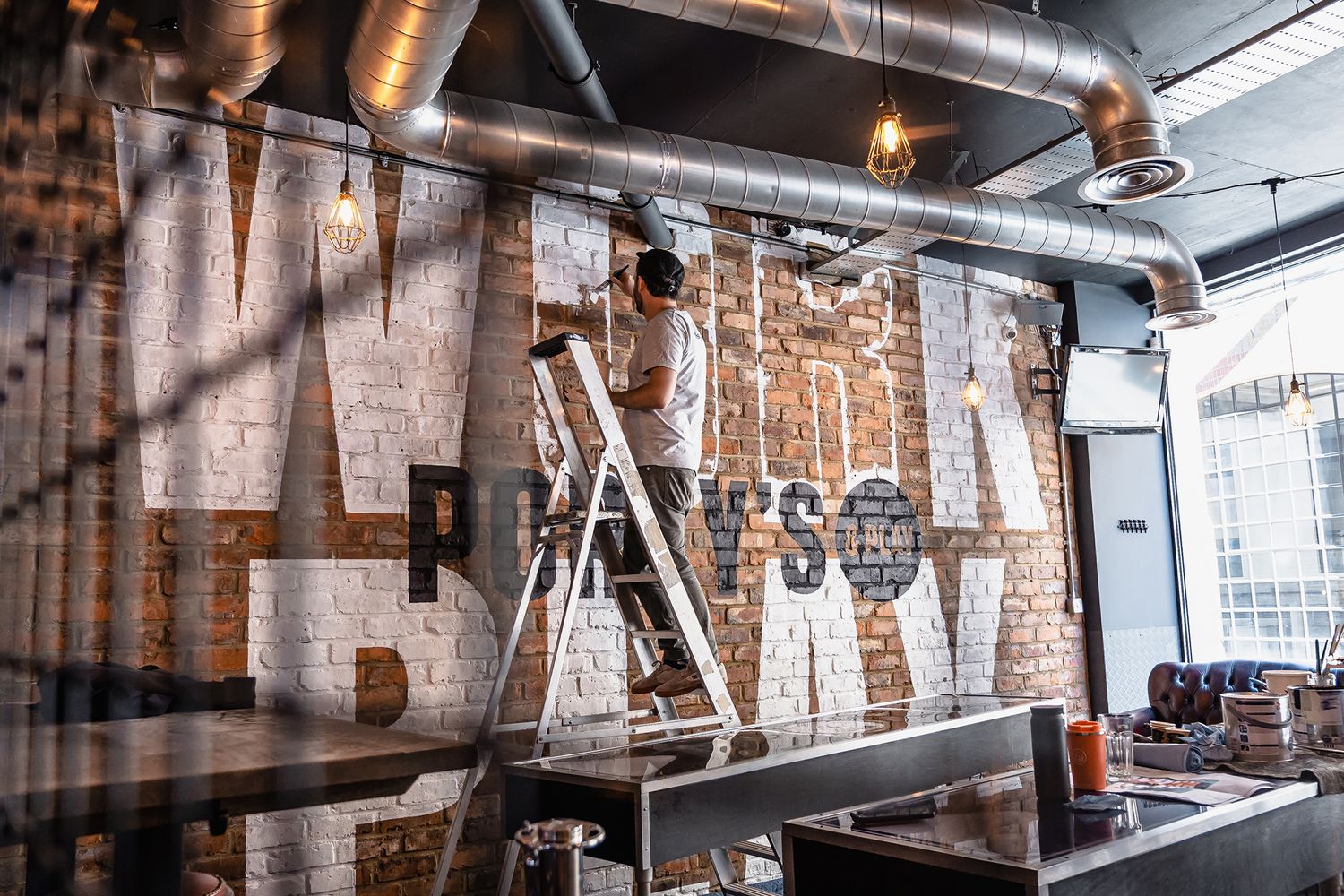
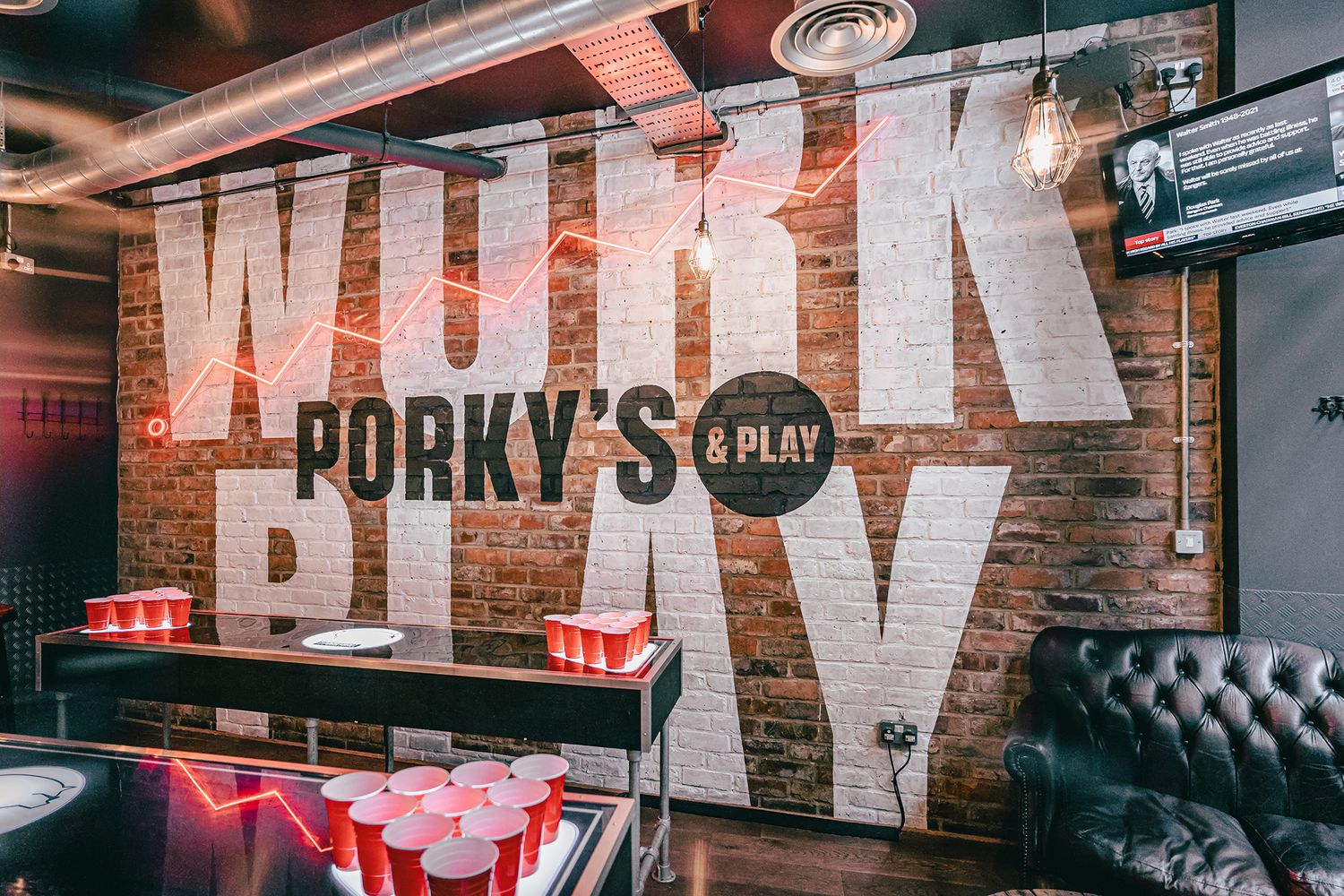
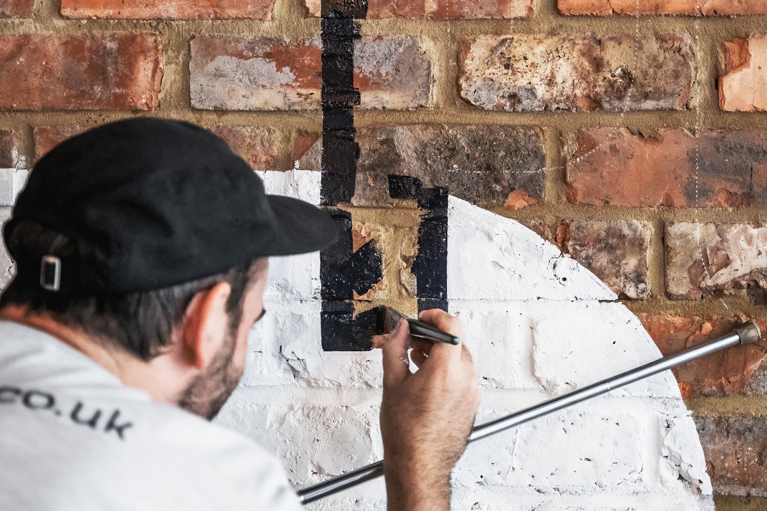
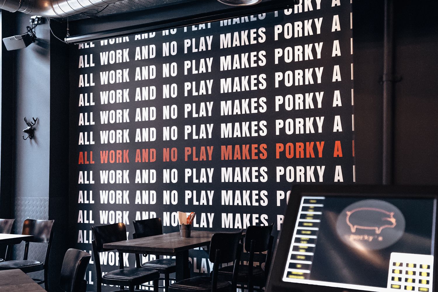
With installation spanning two days, our signwriter took to the exposed brick wall at the heart of the restaurant with a cool wash of paint, moving between ground level and ladder height to scale three metres of raw surface area with his lettering skills, layering words with logo.
With WORK and PLAY in bone white at the base and an emblem made up of chalky black and negative space on top, this was an intricate job. Extra hands were brought in to fulfil our promise of speedy delivery, as well as any gaps in the brushwork.
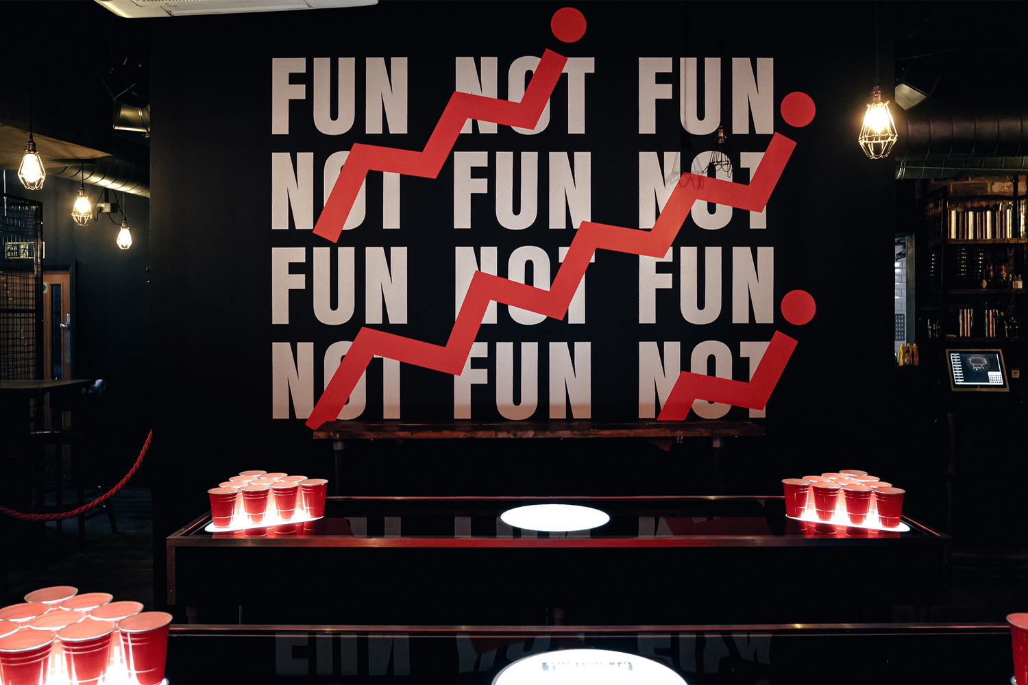
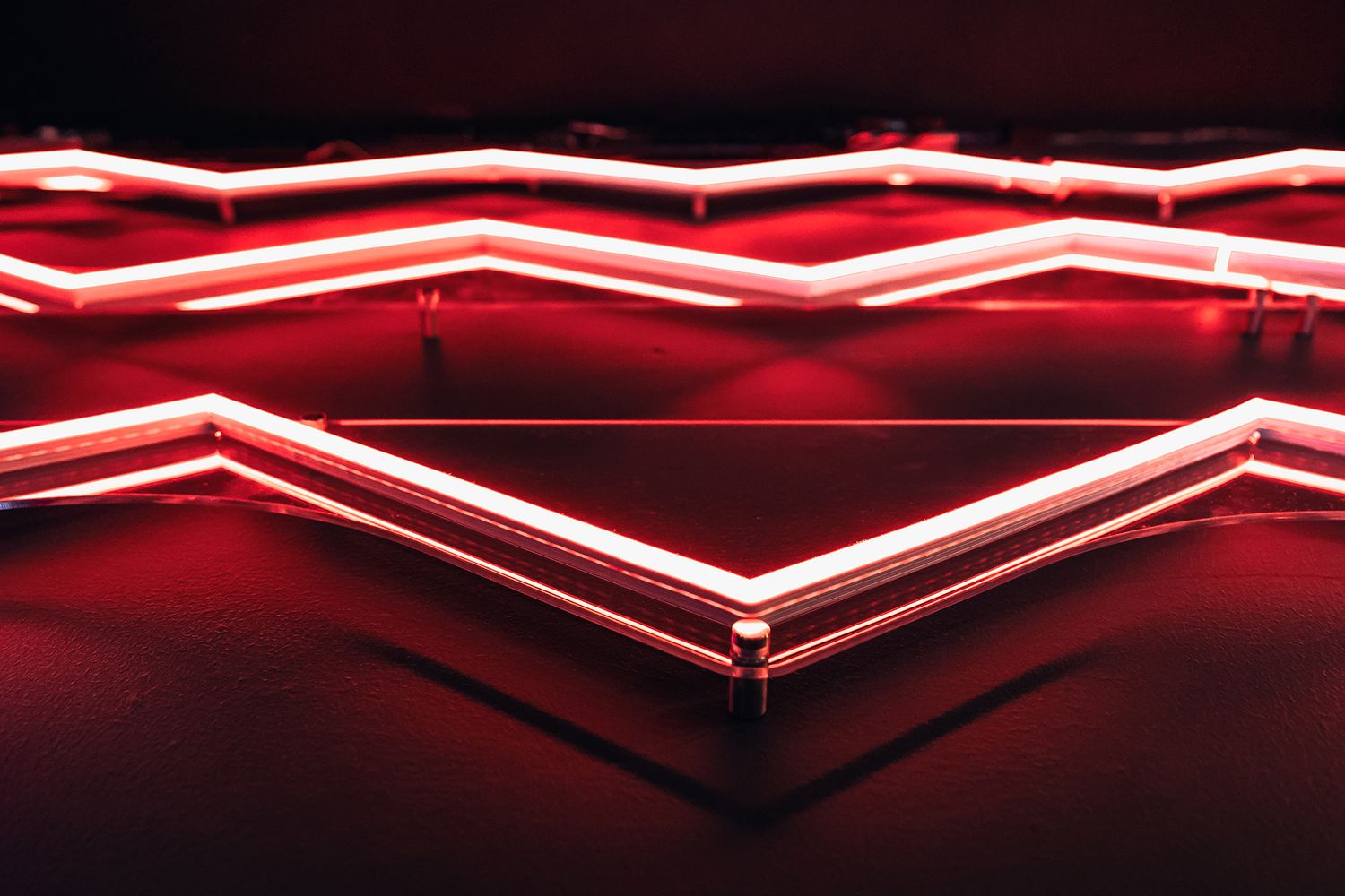
Bringing such a large creation to life on a rough canvas in a short space of time was no mean feat, but we think we managed to sink the shot. To definitively elevate the space from quiet parlour to destination fun, we overlaid the wall mural with a zigzag of hot LEDs, representing the trajectory of a ping pong ball.
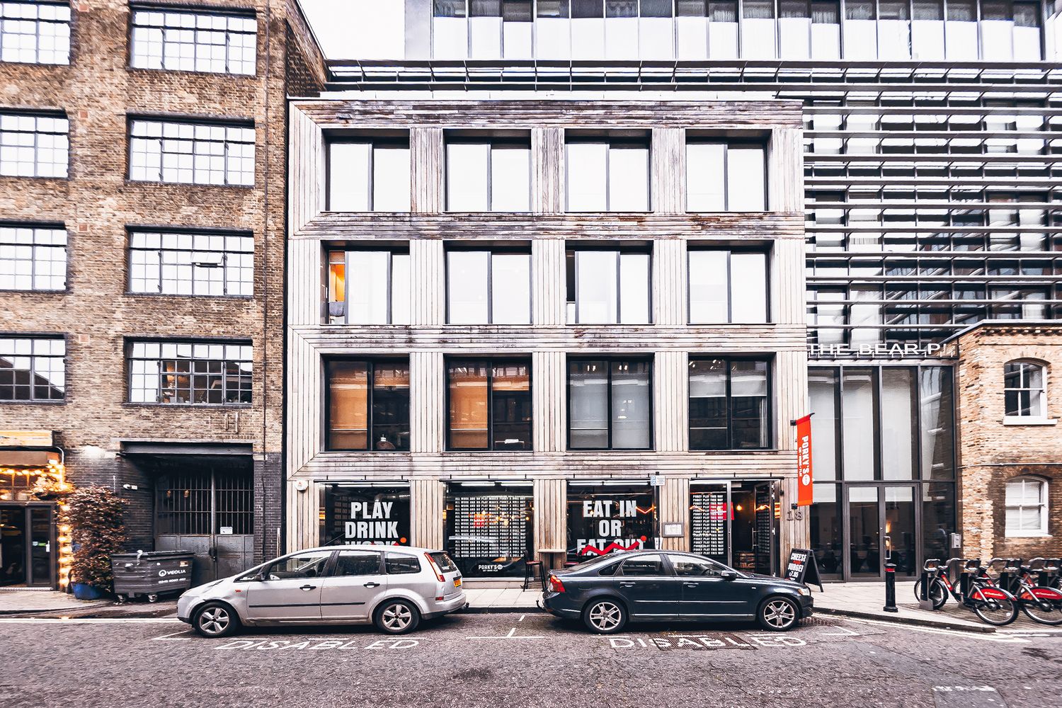
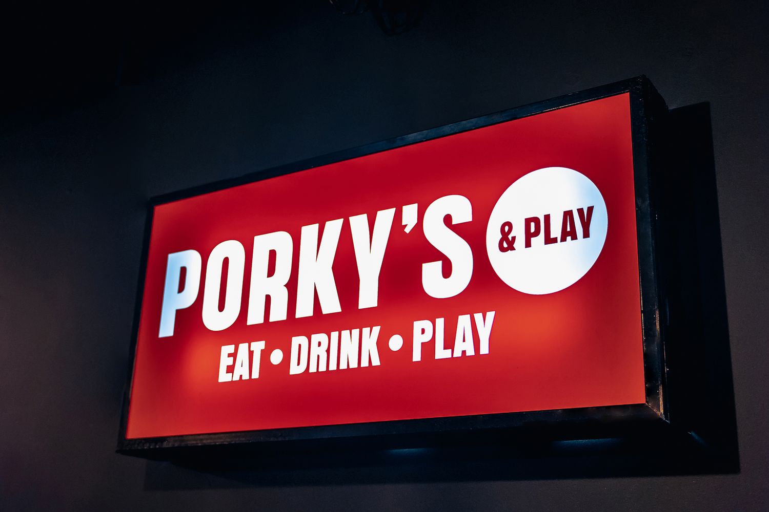
Satisfied that Glyphics had put the bounce back into Porky’s & Play, we were then asked for some additional finishing touches at the very end, including a light box and window vinyl, which were only too happy to provide.
This project focused on their rebranding effort, which aimed to emphasise the beer pong experience on offer. The challenge was to transform the Bankside branch's ambiance to reflect this lively, social game without losing the venue’s core identity as a food and drink establishment.
Sure, we created an expansive hand painted sign that became the focal point of the restaurant's new look, and of this case study - pop over here for more content on this subject. A mural that stretches across three metres of exposed brick, it features the restaurant's refreshed branding and faux neon accents on a wall that faces the street, entrancing passers-by with the revitalised spirit and vibrancy of Porky's & Play.
Hand painted signage offers a host of advantages, notably its bespoke and artisanal quality which provides authentic character that can't be replicated by digital prints. Signwriting exudes a classic feel, striking a more profound chord with observers and giving a nod to skilled craftsmanship. These signs are enduring additions to indoor or outdoor environments when crafted with premium materials, and offer unparalleled customisation opportunities, allowing for one-of-a-kind designs that align perfectly with individual branding strategies.
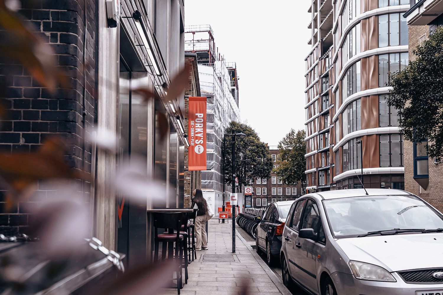
Our flexible way of working often allows us to accommodate last minute requests, in this instance, we were able to produce extra signage and install it quickly to ensure the completion of Porky’s & Play's transformation before its relaunch. Generally speaking, our team is well versed in responding to the evolving demands of a project while maintaining a high standard of client satisfaction.
The brief grew as we worked on the project but by completion we had provided a suite of products, including a hand painted wall mural with dynamic faux neon detailing, various customised vinyl wallpapers for different areas within the venue, eye-catching promotional window displays, an illuminated lightbox, and an exterior vinyl banner.
Yes, our solutions are versatile and have been suitable for multifunctional spaces. Examples amongst our clientele include clubhouse venue, Swingers, which combines an indoor crazy golf course with food shacks and lounge bars, and concept gym, BLOK, which integrates a retail space, a coffee shop and gallery art amongst its offerings.
Our expertise extends to a wide array of signage solutions tailored for the hospitality & leisure sector, including but not limited to brand signage such as external logos and interior wall graphics, wayfinding signs including information boards such as menus, promotional or events signage for the likes of windows and A boards, as well as decorative or safety manifestations for internal and street facing glass partitions.
The process begins with a chat where we learn about your requirements and objectives. We may conduct a site visit for an in-depth assessment, followed by the design, production, and installation of your signs, ensuring they fulfil their intended function with finesse. To commence your project, simply get in touch with us.


