Design Led Art Director, Tara Blackmore, On Centtrip’s Branding
Just across the road from us, based at shared working space WeWork, is our sleek client, Centtrip. The fintech company offers a global multi-currency account, app and card to multi-national business, small enterprises and private clients. It’s ‘currency freed’ as their motto says, and the folks there are absolute beauties, as is their branding design.
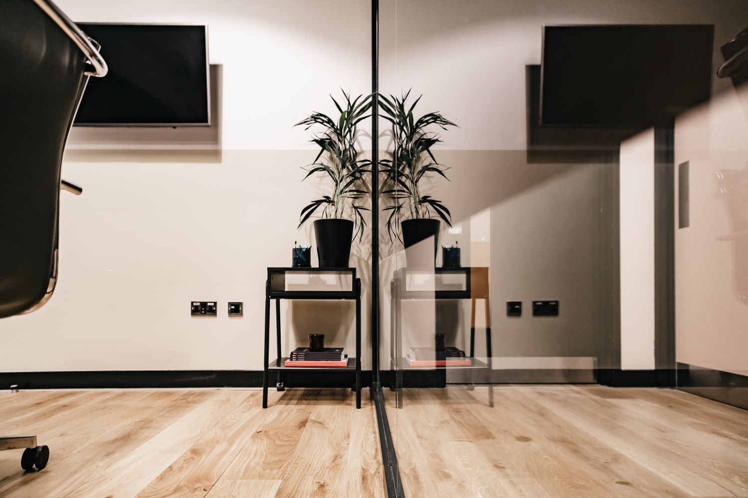
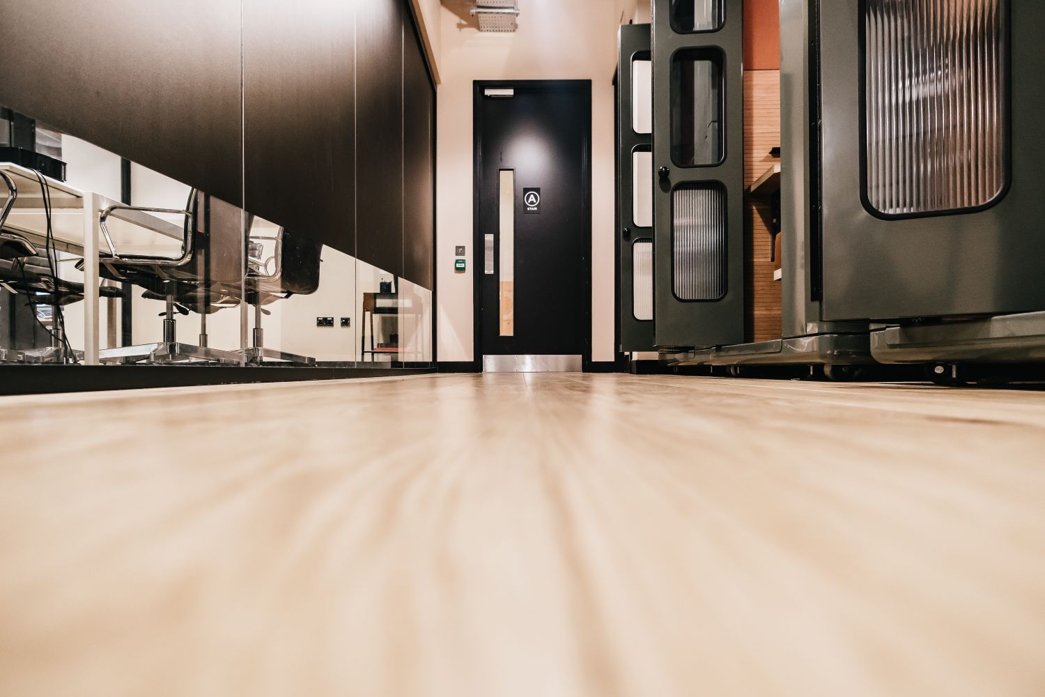
Centtrip is an upmarket organisation that’s a modern day success story, and its office identity reflects just that, whilst also maintaining a cohesion with the clean, contemporary look of its host location. The vibe is so skillfully formulated that we felt compelled to share photos of the space, and have a chat with the creative brains behind Centtrip’s branding: Art Director, Tara Blackmore.
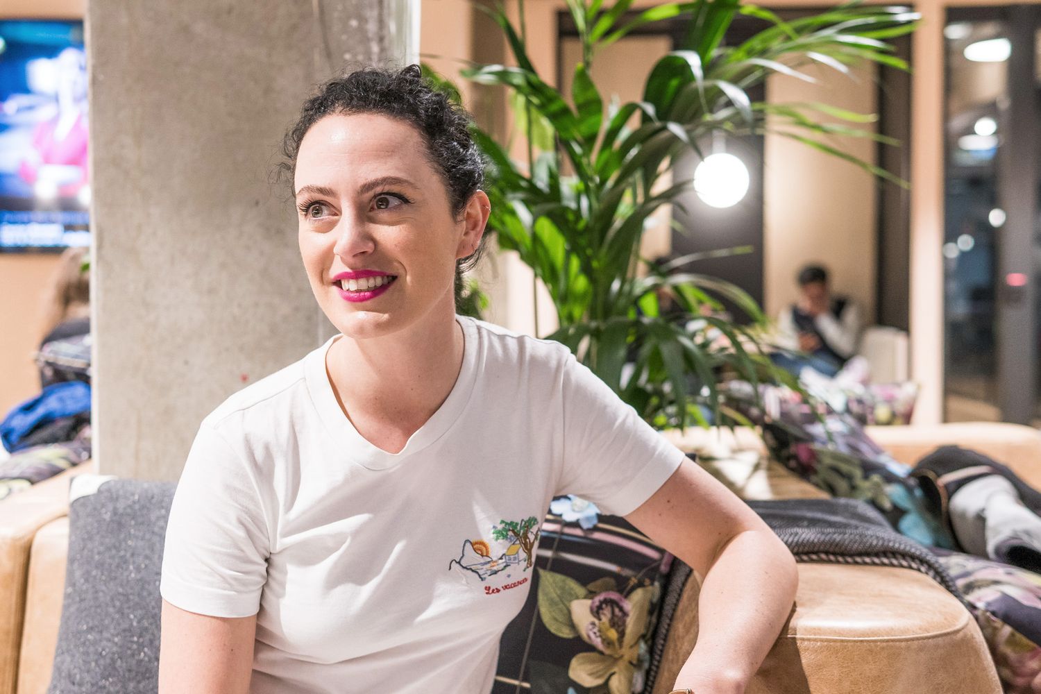
Alongside websites, apps, social content, print, and packaging, she believes interior design is pivotal to how a company articulates its ethos. Sure, lighting, comfort levels and character help create strong first impressions, but they have the power to be an essential source of internal communications too.
If done right, these details can speak volumes to the workforce about what their employer represents, thereby increasing productivity and collaboration. Tara explains why she didn’t want to miss that opportunity, and walks us through her perspective:
What’s Centtrip?
We’re a financial tech company making global payments, treasury and foreign-exchange services more efficient and transparent, empowering our clients.
Who is your audience?
More than 13,000 companies and private clients, including nearly 400 superyachts and more than 250 of the world’s biggest music artists, use a Centtrip account. We aim to build long-lasting relationships with them rather than make short-sighted sales, and believe our focus on transparency and trust have earned us a strong reputation and network.
Tell us your story…
Well Centtrip was founded by Tony North and Brian Jamieson who were co-founders of a company called Schneider Foreign Exchange. After selling, they joined forces to launch Centtrip, looking to shake up the industry by offering ‘spread free’ exchange rates, much lower charges and complete transparency.
I used to work with Amelia, who is Centtrip’s Marketing Director, and she brought me on board to solidify the brand and strengthen our brand message, based on all the new products and services we’ve introduced over the last 18 months.
Why WeWork?
We were always going to out grow our first office as we’d been there for over 4 years. It was like a little house over three floors, and because of that, each department was split, we didn’t have cohesion.
I’d heard of WeWork and I really liked that you get all these external facilities as well as having your own office. The community team here are amazing as well and viewed as an extension of our own – they’ve made us feel welcome from day one and support us in so many ways day-to-day. We’ve never looked back, it’s been the best thing ever, because we’ve been in here probably four months, and in that short time, I’ve spoken to every person at Centtrip now – I actively work with them, I know about them, I make jokes with them, I ask about their weekend, we socialise together – it’s just been an amazing turn around in culture.


What have been the benefits of moving here?
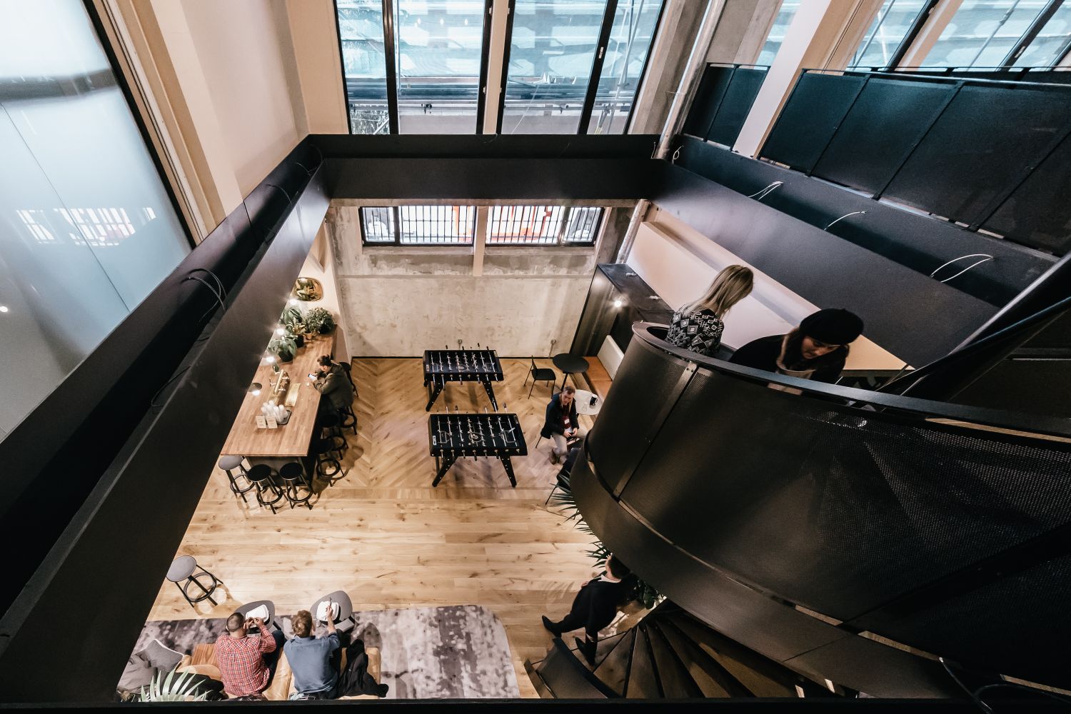
I see people interact more. In terms of work, it’s incredible. Before, we had no designated areas, it’d be like ‘Where should we have a meeting?’ The move has also enabled transparency, for people to see what other people are working on. Especially from the marketing team – we have our wall of workflow, so everyone in the company is visibly seeing plans and progression and finding out more – they actually ask questions. And another thing, people would go out for lunch and come back and eat it at their desk. I thought that was really sad, that they couldn’t go out somewhere fresh and sit together as a group. People do that now and the teams mix, we’re more synchronised.
Has Centtrip taken its cue from WeWork?
In the future, each of our verticals will have its own colour way, while the art direction will be consistent throughout the company, but our core colours are black and white. So yes, we stay true to our core colours especially because it feels more in tune with WeWork. Down to our furniture and even the cushions – we don’t want to conflict with the surrounding space because people have to come into WeWork before they come into our office, and if we worked against it, it would just be jarring, I want it to feel fluent, but feel us. As an art director, it’s just not within me to create a clash.
What are the key design elements?
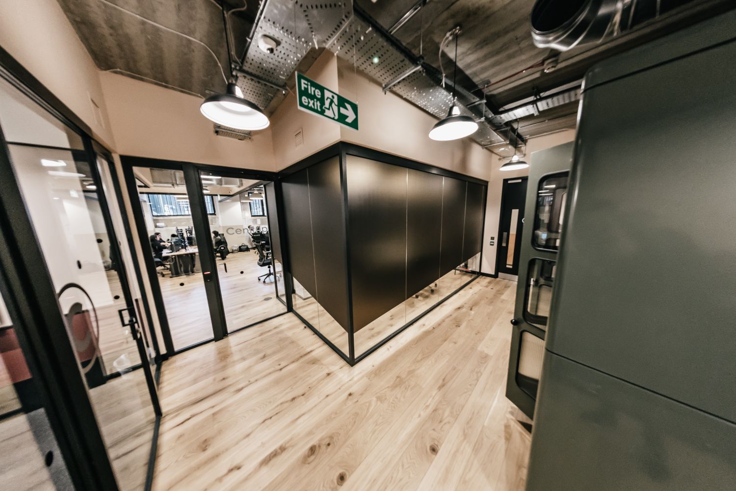
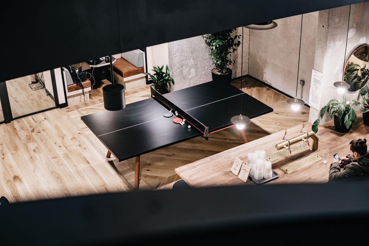
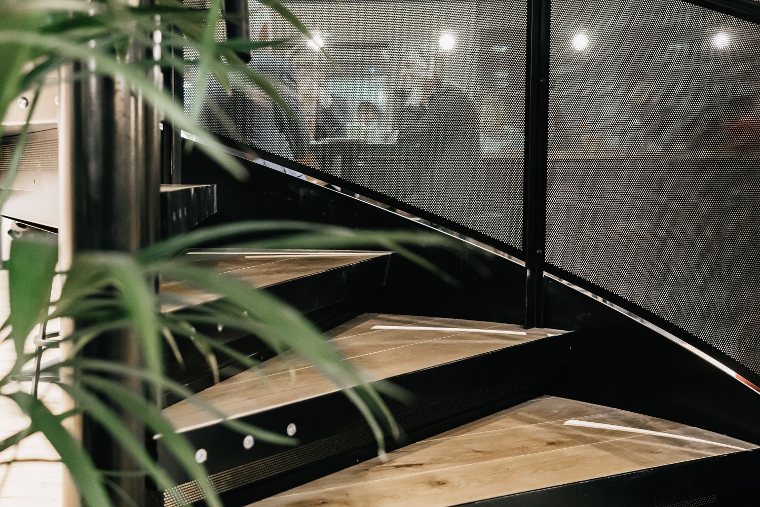
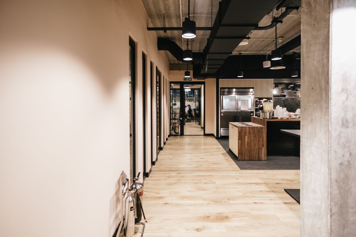
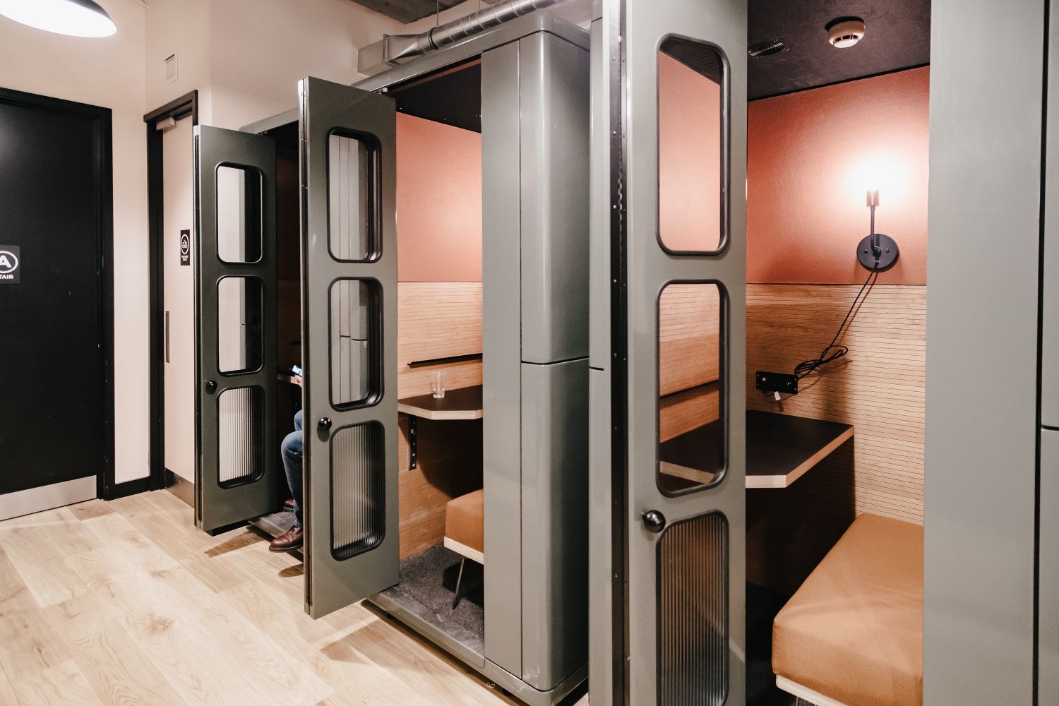
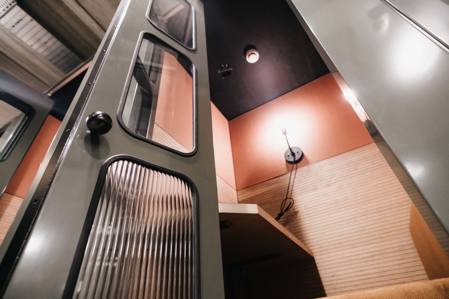
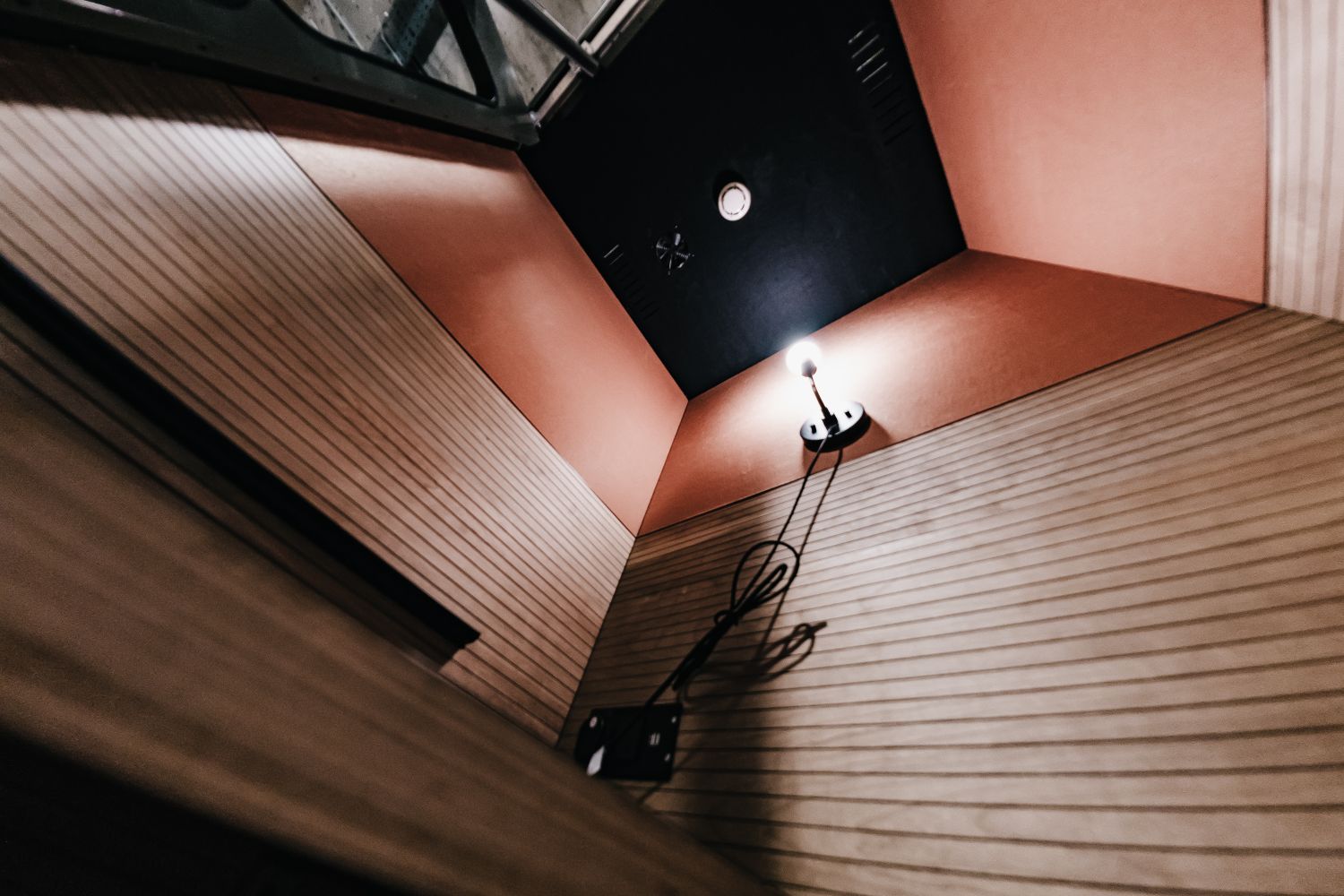
Picking this part of WeWork was quite strategic – the spiral staircase down to the kitchen comes straight to our office front door, the glass meeting rooms are great and the phone booths are a lovely little bit of design, and give us an extension of space and culture. If people want to step out for a second, they can. So we felt like this was the perfect spot and lent itself to our style.
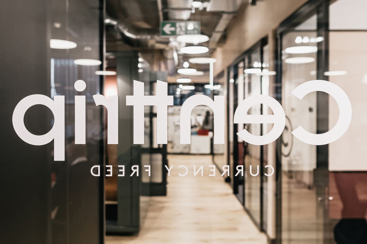
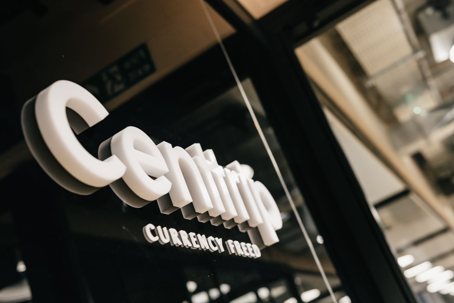
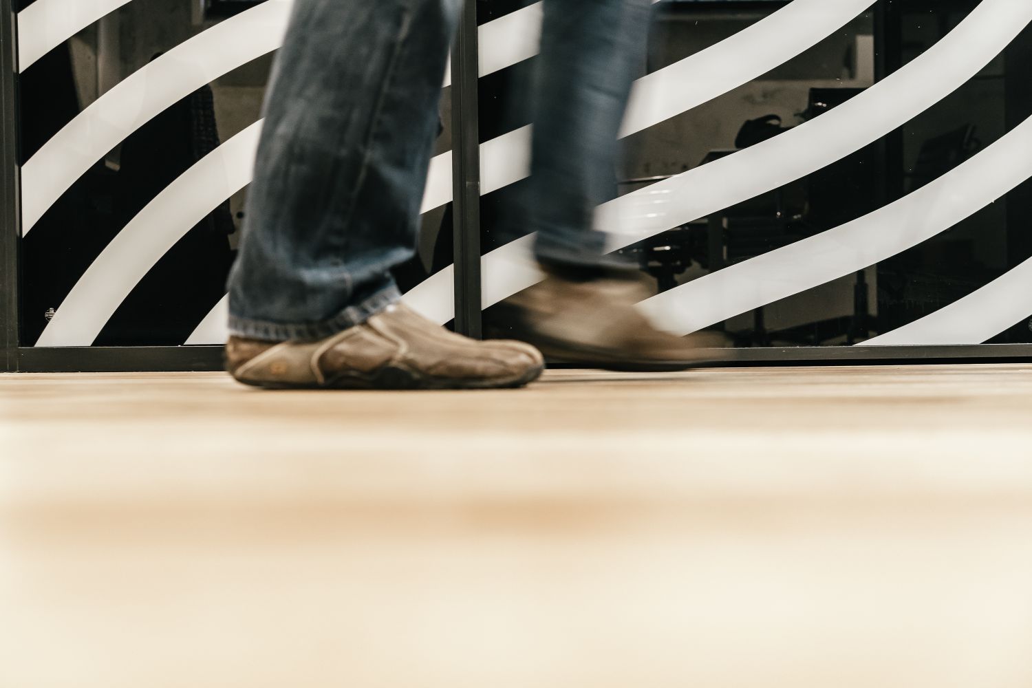
My objective was to create a seamless journey, everything is quite fluid from inside our office to outside, but we also had to distinguish ourselves – so we installed a full black glass screen with a white 3D logo at our front door – it may sound a bit boring, but if you walk around this building, no one else has got that.
I’m aware that with us being on the same floor as where everyone else comes to eat, it’s very important that we sort of shout, without shouting. I feel like we’ve successfully done that, and we haven’t finished – we’re still adding things. We want to coin names for the different areas we have and crown them with plaques, just adding attention to detail that speaks about our values, in subtle ways. It was about getting everyone on the same page, and for me that gets done visually.
We have a great mix of people who have been here since day one as well as continually investing in more reinforcement as we grow so the move has given us all a fresh start.
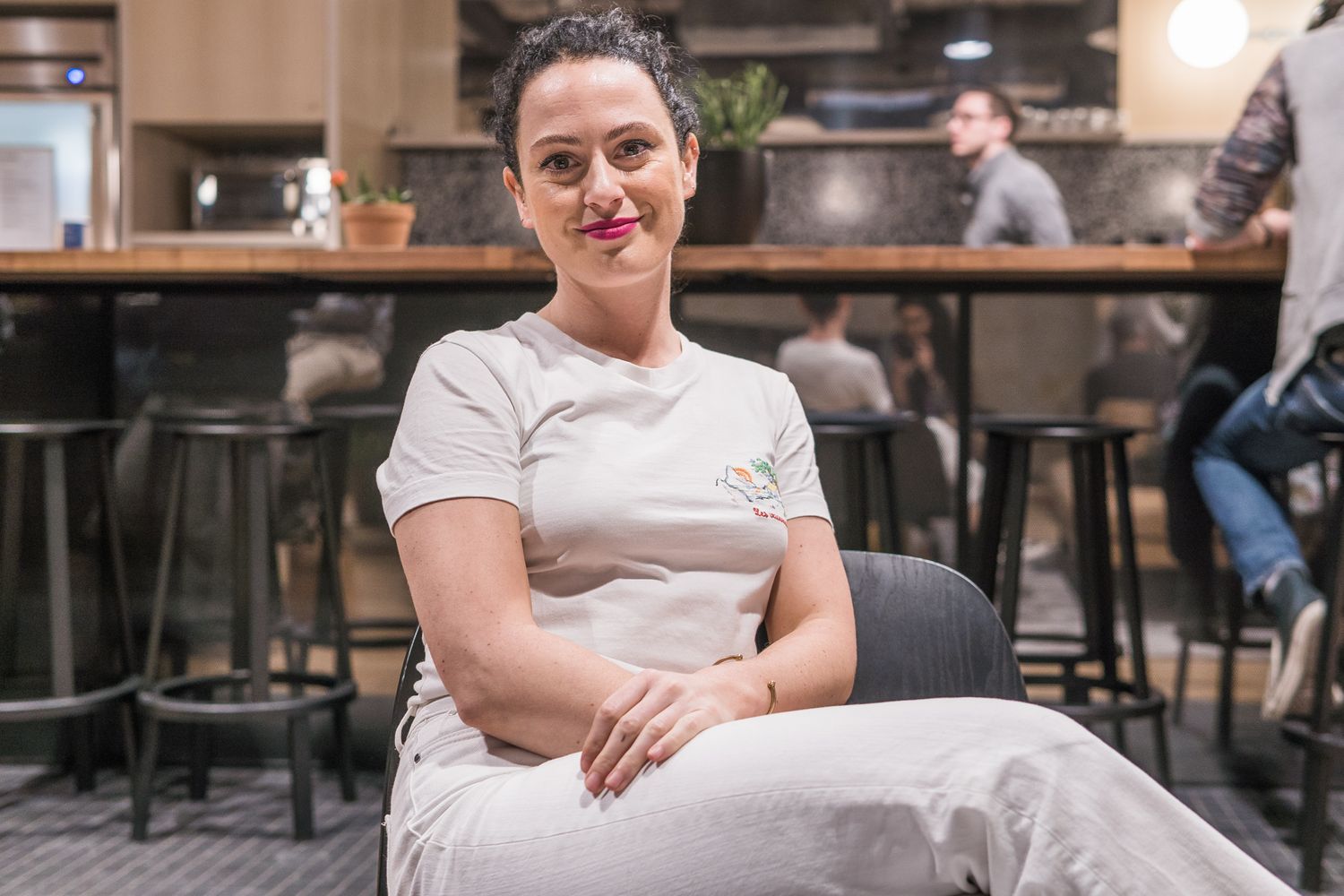
Has being at the heart given you an advantage?
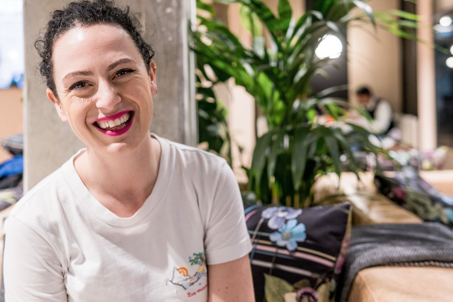
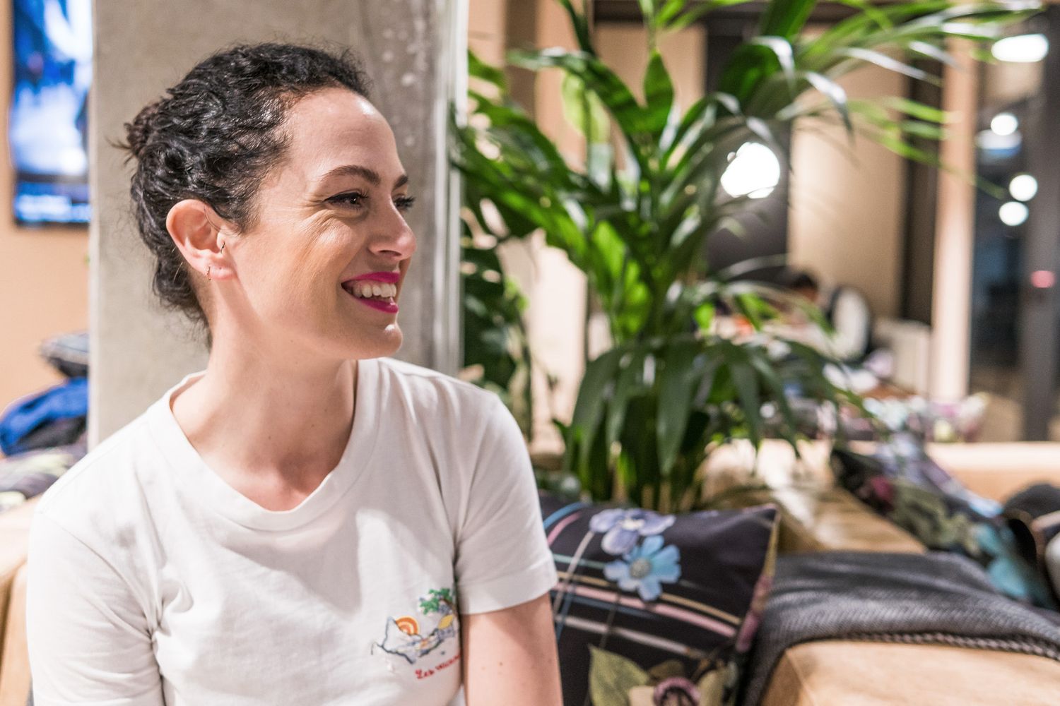
Definitely. Myself, I’ve been approached by another company to help them out with design. People have even come and asked us about our vinyls, so we’ve told them about Glyphics. They’re noticing the space, or the people within it, and we’ve only been here for four months.
What’s the concept for your meeting room?
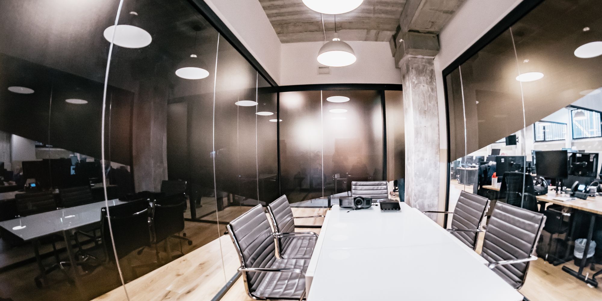
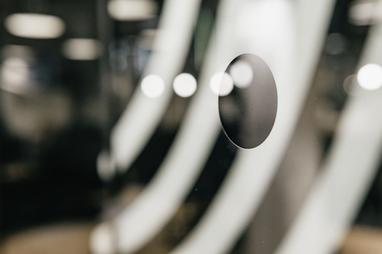
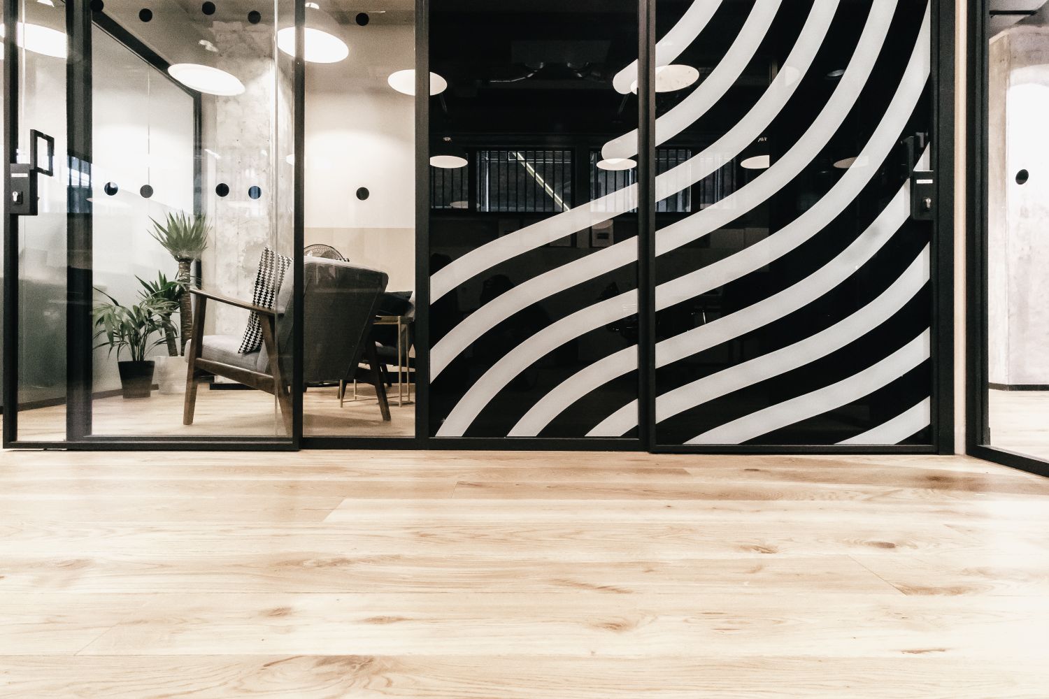
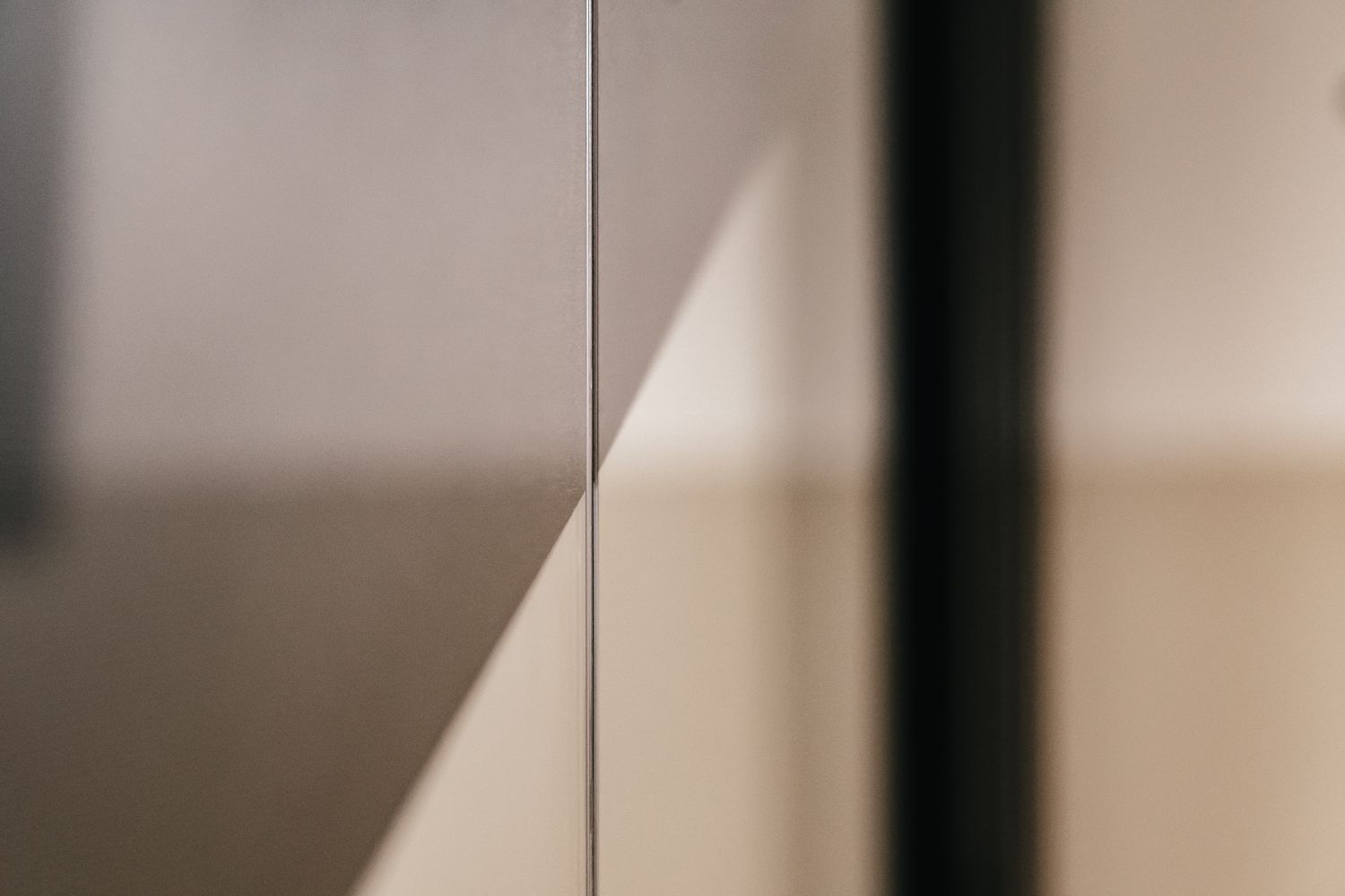
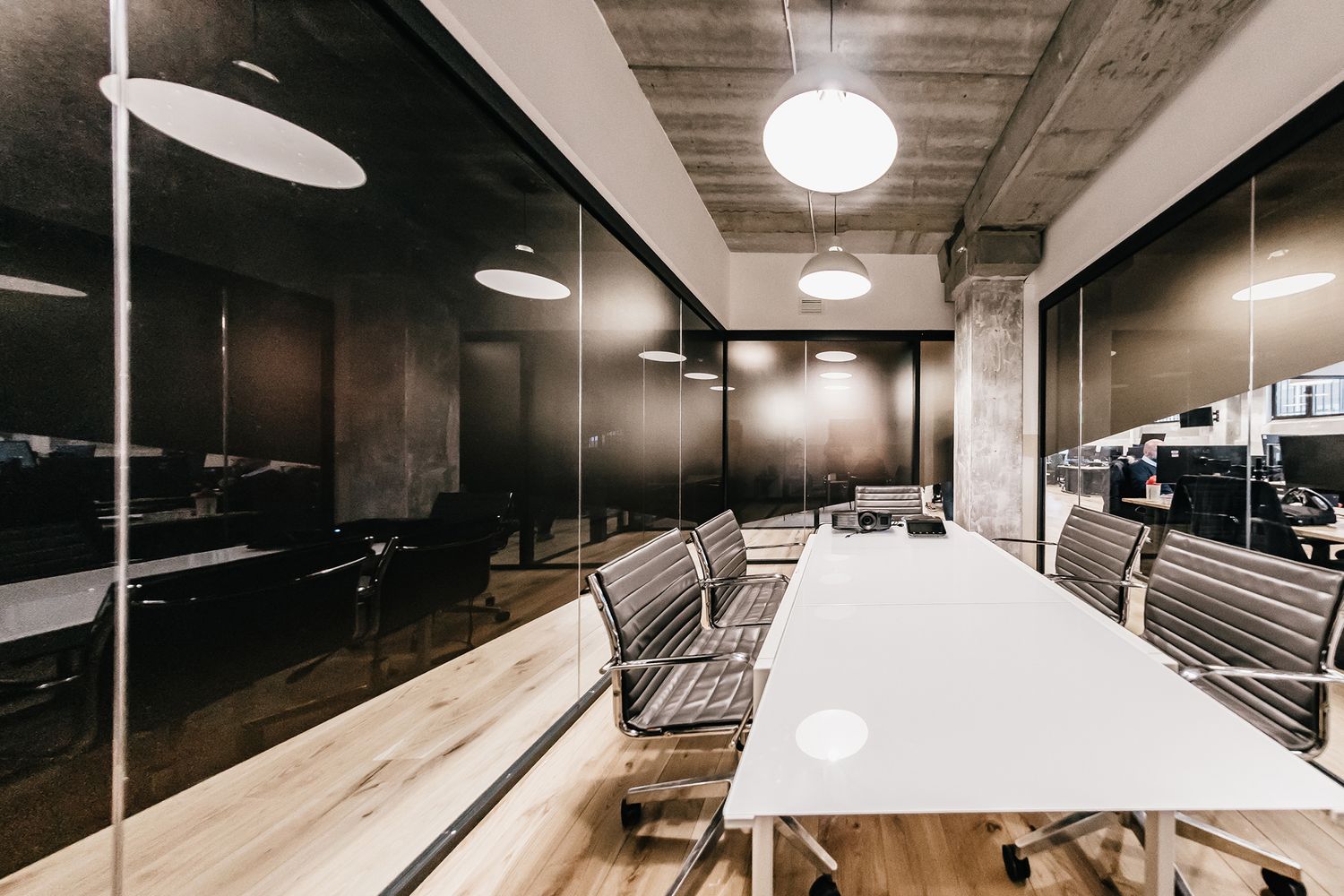
I didn’t want it to feel like a box. The meeting room is made of four walls – three of them glass. We have sensitive information being shared in there, and it’s overlooked by street facing windows. So I needed something that didn’t allow the public to look in the room, but facilitated those inside the office to be able to. Within Centtrip, we want to be very transparent and I didn’t want to create some weird, blocked out area that felt secretive, I wanted it to be fluent with the open feeling the office – so that’s where the triangles on the glass came about. I could have the vinyl lower on one side, blacking out for privacy, but bring it higher on the other to let light in, fulfilling both functions.
Are you concerned about outgrowing the space?
When I started, our marketing team was just me, we didn’t have a copywriter, we didn’t have half the team. Now we do, and we’re developing a fresh website, brochures, our photography – we’re building a more robust, future-proof brand strategy – and everything that’s still to come is all digital, so the great thing is that our branding will move with us as we grow.
We will inevitably out grow the space as we have huge ambitions as a business. However, for now, we’re settled. One of the attractions to WeWork is the flexible working space offering us opportunities to expand our space or move within their office network. There’s room to wiggle, but ultimately the question won’t be ‘Have we outgrown ourselves?’ but ‘H
