Attest 3D logo and vinyl signs for glass
We were contacted by Emily at Attest to replace the main entrance signage for their offices on Holywell Road. She had heard of us from the previous company based there for whom we had done work - Forever Beta we are forever grateful! Not only did we gain a referral thanks to their word of mouth recommendation, but further work with Attest when the brief grew to include vinyl manifestations for the glass panes surrounding their courtyard.
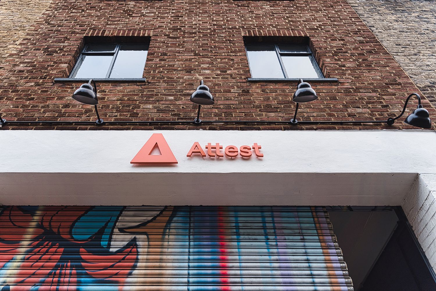
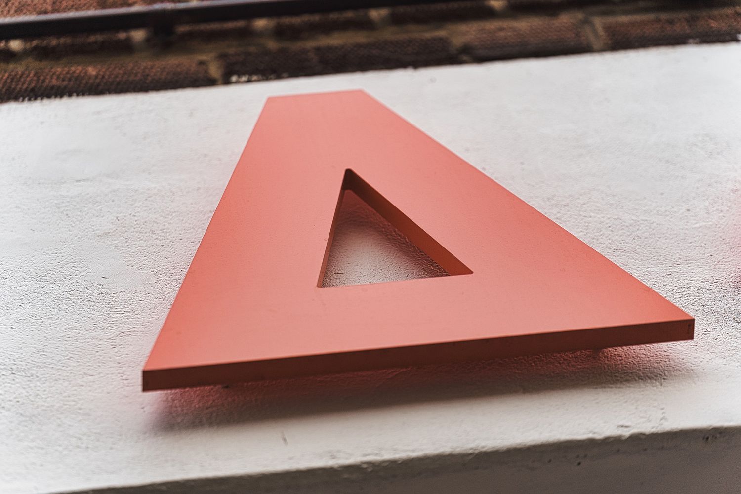
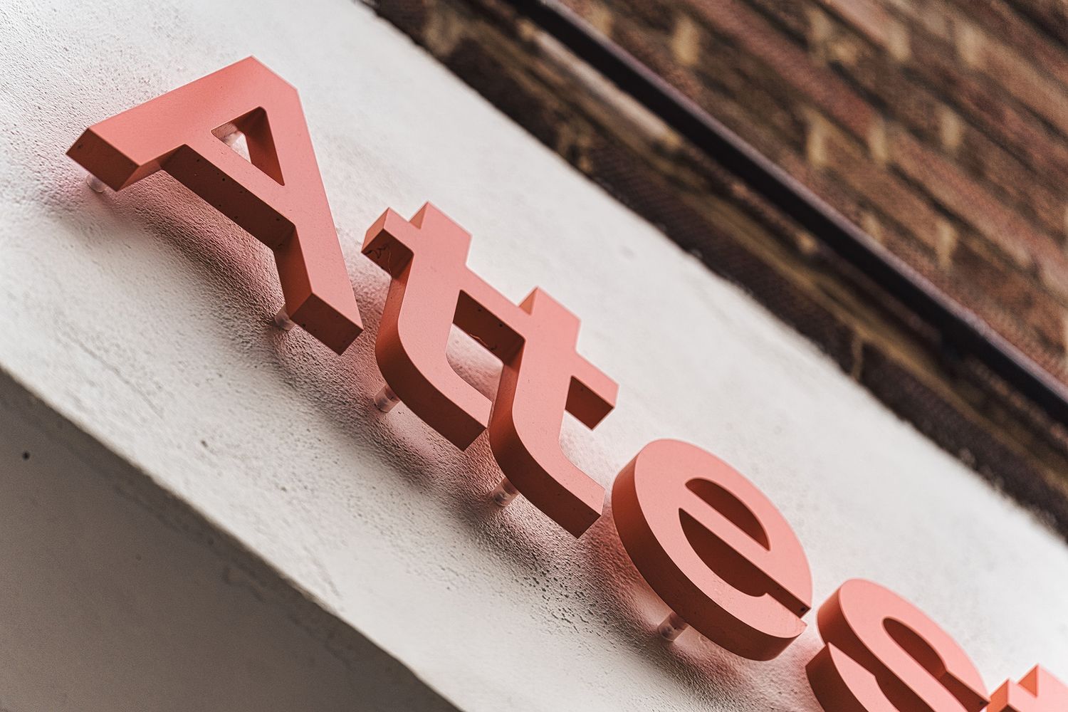
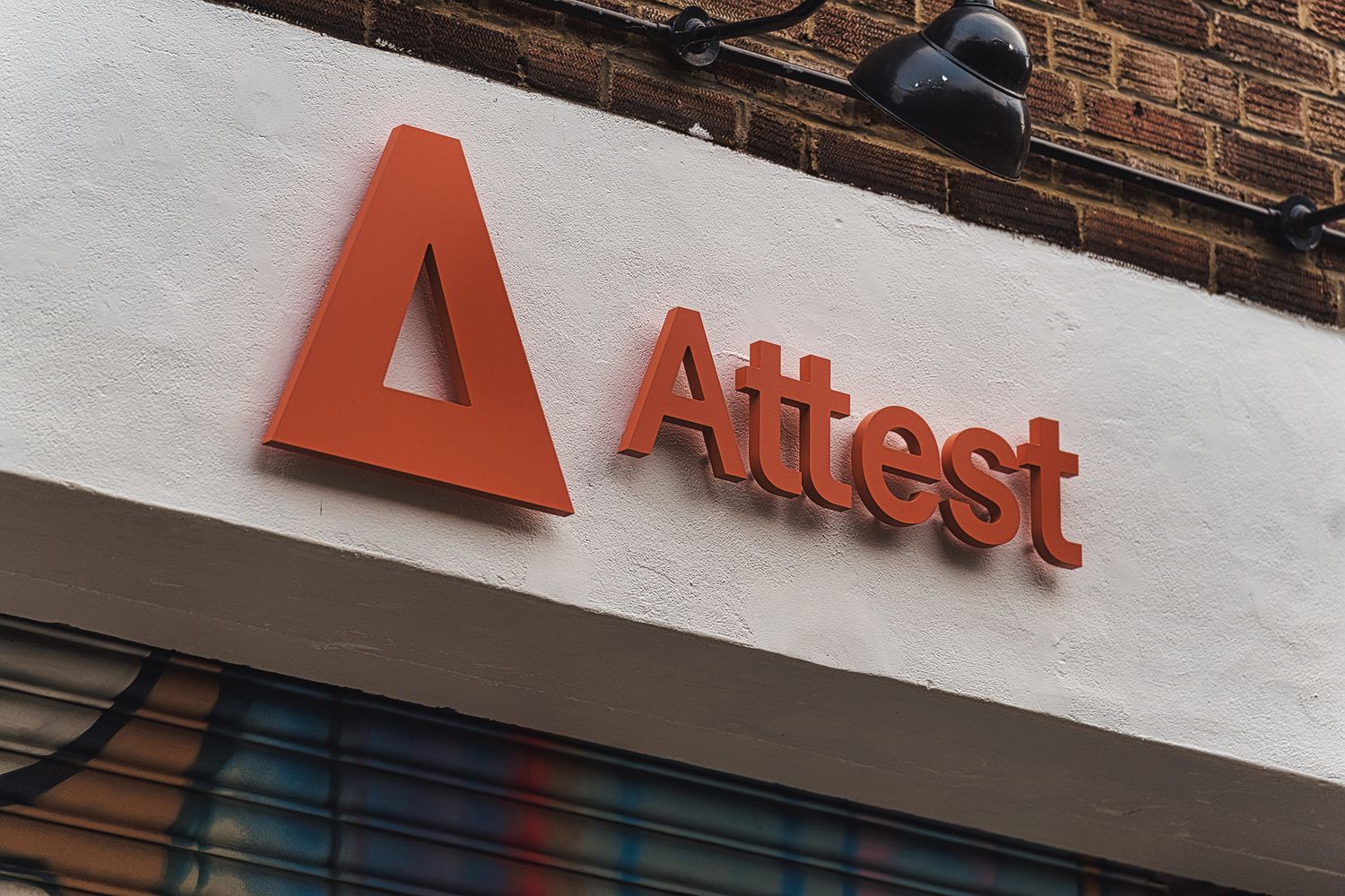
Attest were in need of a 3D sign to take pride of place on the arch over their entranceway, and were looking for it to match their minimalist branding. With the company moving in its workforce within the space of a week, we got ready to take on a pretty tight timeframe and delivered a sign in satin finish acrylic that honours their brand’s visual language.
Based on the size and layout of the host space, we replicated their logomark and wordmark in their exact Pantone® colourway - a popping orangey coral - and placed it horizontally over the arch. For maximum oomph, we installed the sign on pop locator standoffs so that it would slightly jut out over the street below, which has the happy consequence of drop shadows forming when the sun shines on it while purposefully creating more presence.
With an end to end process that was as smooth as the final result, Emily then felt confident to ask us for our ideas on how they could spice up the rest of the space, so we took a walkabout their Shoreditch office with their brand toolkit in hand and began to brainstorm. Attest’s design system includes a set of free flow 3D shapes that provides a sense of playfulness to their brand language while intelligently enriching visual compositions.

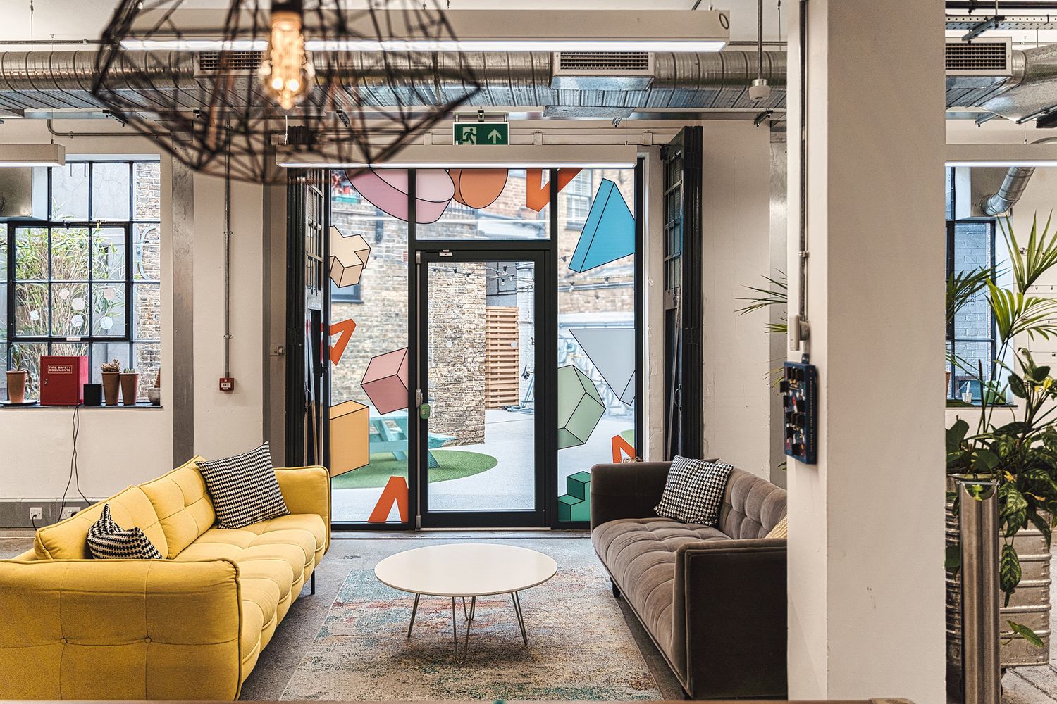
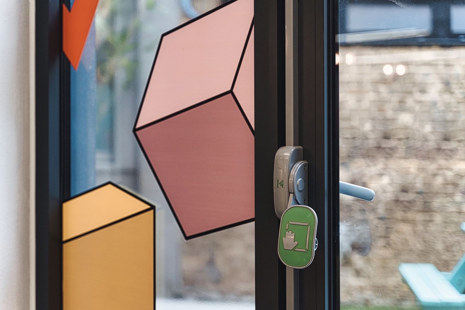
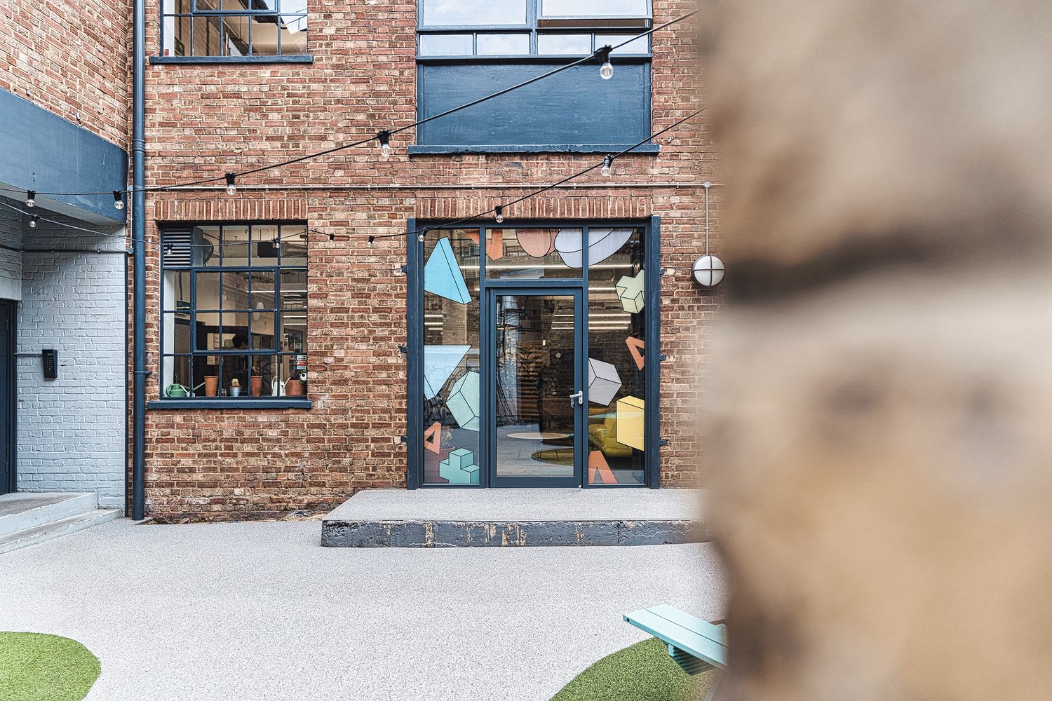
The cylinder, hexagon prism, cross, triangle and cuboid come in pale pastel tones outlined in black, and make the perfect elements for window graphics. We decided to repurpose them for all the courtyard facing doors and windows - making an impact in the lived in spaces outside as well as inside.
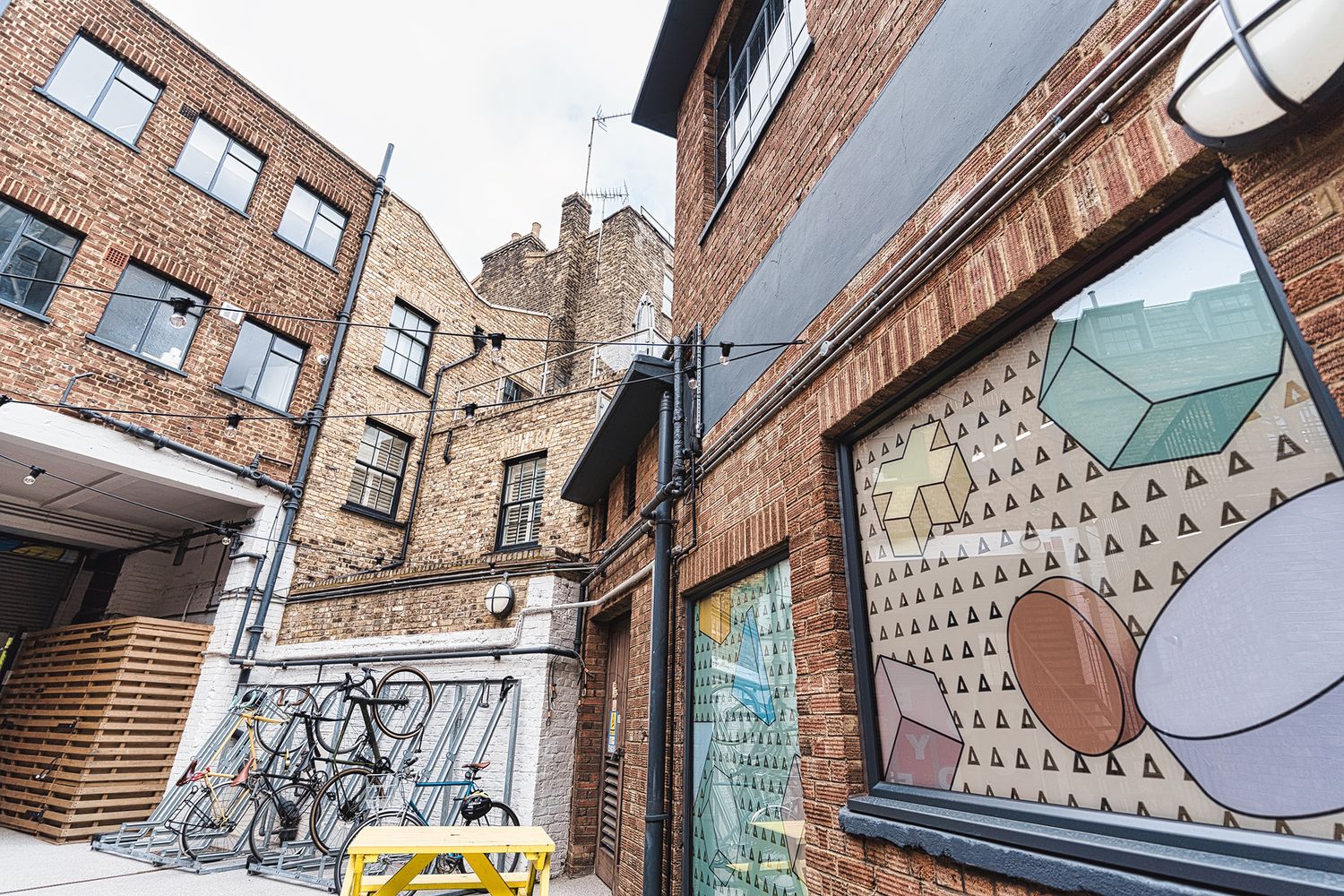
First up were simple opaque vinyl graphics for the panels of the entrance door, and a transparent vinyl for the courtyard door which was offset with graphics in reverse print, making them equally striking on both sides of the glass. We then developed a more complex composition for three large windows that housed a yoga room within, calling for privacy while still letting daylight in to set a meditative mood.
Our solution was a soft hued glazing overlayed with contour cut graphics, resulting in a translucent layer that we then cut small logo-shaped icons into. Making for an impressive manifestation, we were able to diffuse the glare of the sun while blocking out the glares of curious people, as well as influence the aesthetics of the yoga room and the courtyard outside.
The overall effect of this graphic led sign installation brings a brightness to the red brick and ironwork of an industrial setting, adding depth and dimension in the same way Attest does to data, while in essence, expressing the friendliness of the brand upon welcome.
FAQs - Attest
We were tasked with refreshing the main entrance signage for Attest, following a strong recommendation from Forever Beta. Our role expanded to include crafting vinyl manifestations for the glass areas around their courtyard, complementing the company's minimalist branding.
For Attest, we designed a 3D logo sign to take centre stage above their entrance, using pop locator standoffs to create drop shadows and demand the attention of passers-by. When creating welcome signage, we consider visibility and impact, so we put up a sign that not only marks the location but also immediately makes a mark by communicating the brand.
We also applied vinyl manifestations to Attest's ground floor windows, projecting the brand's aesthetic outside onto the courtyard and providing privacy inside the surrounding rooms while letting natural light in - a double sided win.
Vinyl manifestations offer several benefits, including increased privacy, the illusion of boundaries in open plan spaces, signposting glass walls for safety purposes, brand reinforcement, and the integration of design elements that can transform the look and feel of an office space.
This is our bread and butter - we have a vast array of examples to view of glass manifestation for privacy, division of spaces, safety and aesthetics. We work to fulfil all the requirements of your space and whatever the functionality, we ensure our designs are in line with your brand's identity - as a result our glass manifestations are often key components in creating cohesive environmental experiences.
If you don't have established brand guidelines, we have a comprehensive design service that will be happy to figure out those elements for you. If you do, we'll adhere to them meticulously, ensuring every aspect of your signage reflects your visual identity in the best way possible.
The Attest project is a prime example of our commitment to intelligently incorporating a client's branding, with the company's unique Pantone colours and design language proving central to the signage output - translating into vinyl graphics that are playfully geometric in glorious pastel tones, consistently applied to create an engaging narrative across the space.
Our approach involves selecting materials and employing techniques that are proven to withstand the outdoor environment. For Attest, we used vehicle-grade vinyl, ensuring the signage remains pristine over time.
Starting a project with us is straightforward. Reach out with your vision and requirements, and we'll conduct a full assessment to deliver signage that fulfils your needs and exceeds your expectations.


