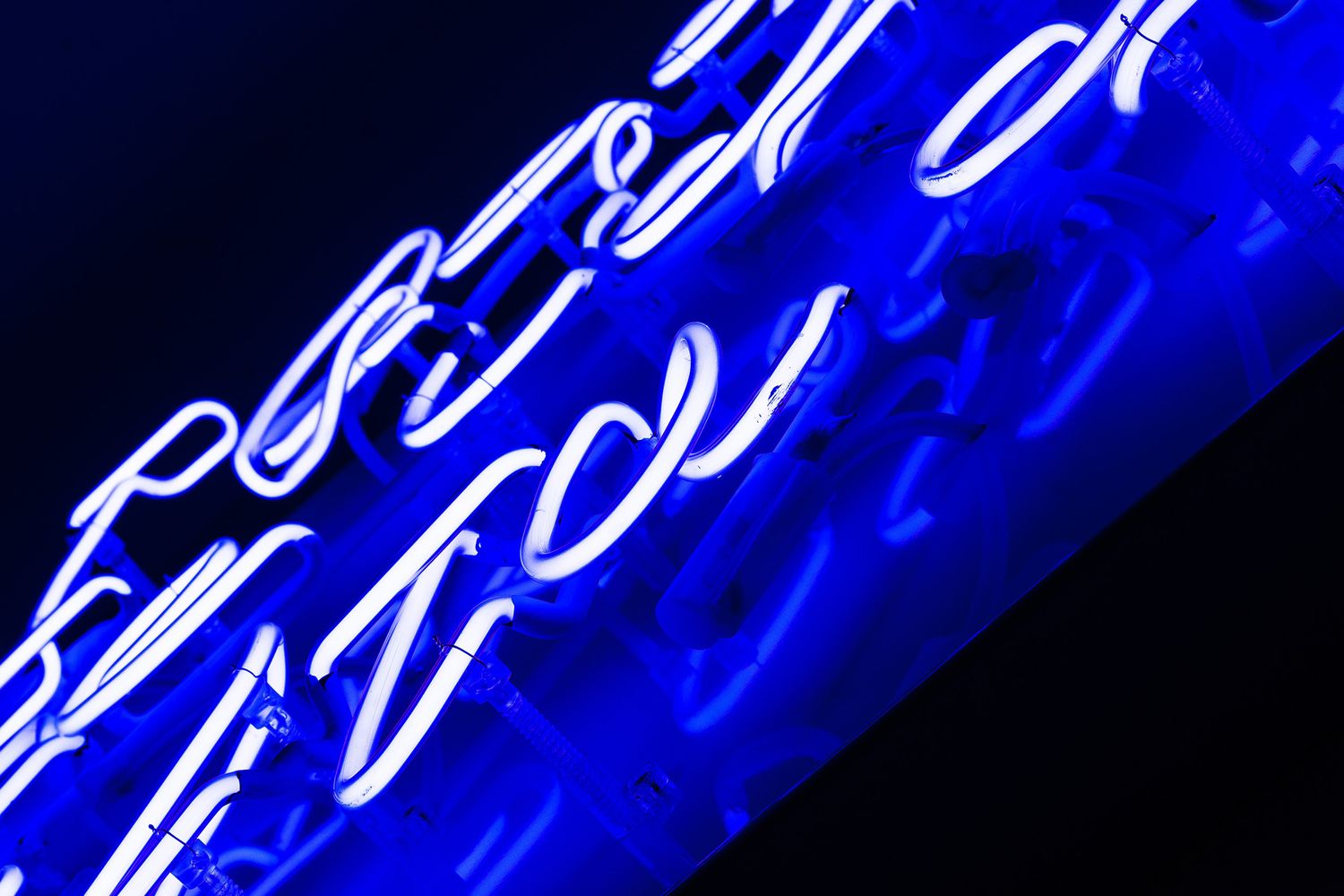
Blue Raincoat Music Neon lettering
THE LOWDOWN
With a catalogue of era-defining hits behind them, this leading indie label commissioned Glyphics to custom-make a neon sign that is equally as timeless.
Established in 1968, Chrysalis Records forms part of the company conglomerate, who wanted us to create a dreamy piece of neon lettering artwork centred around a song from its historical tracklist – the 1981 hit, ‘Dancing With Myself’ by Billy Idol.
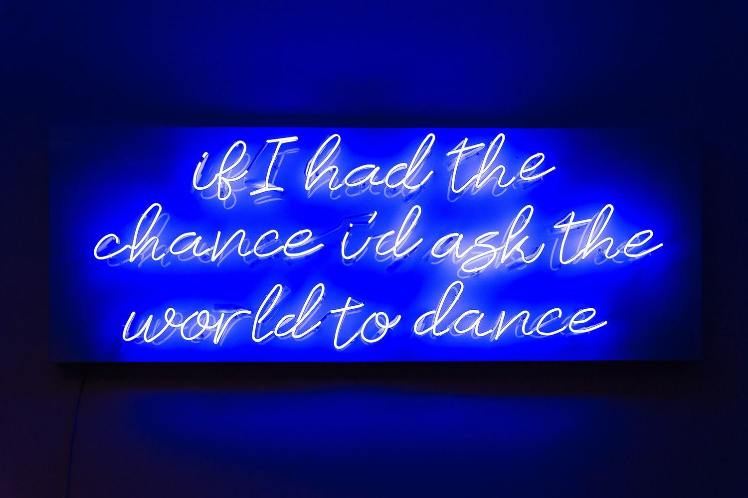
The brief was left wide open for interpretation – take our handpicked quote ‘if I had the chance I’d ask the world to dance’ and use its whimsy to bring a little bit of nightclub bling or jazz bar coolness to our breakout area. Music to our ears!
With the business located just around the corner from our office in Shoreditch – where neon signs light up little windows of urban life and the craft still endures in the commercial world – we headed in to meet our neighbours for a face to face consultation, and to wax lyrical on their walls.
THE SPECS
Whilst there, we tallied up and took in the character of the space, and discussed the fabric of the destination wall, walking through what we’d need for a successful installation.
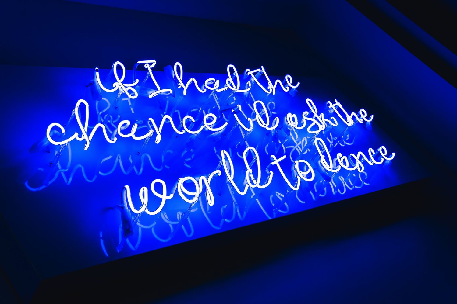
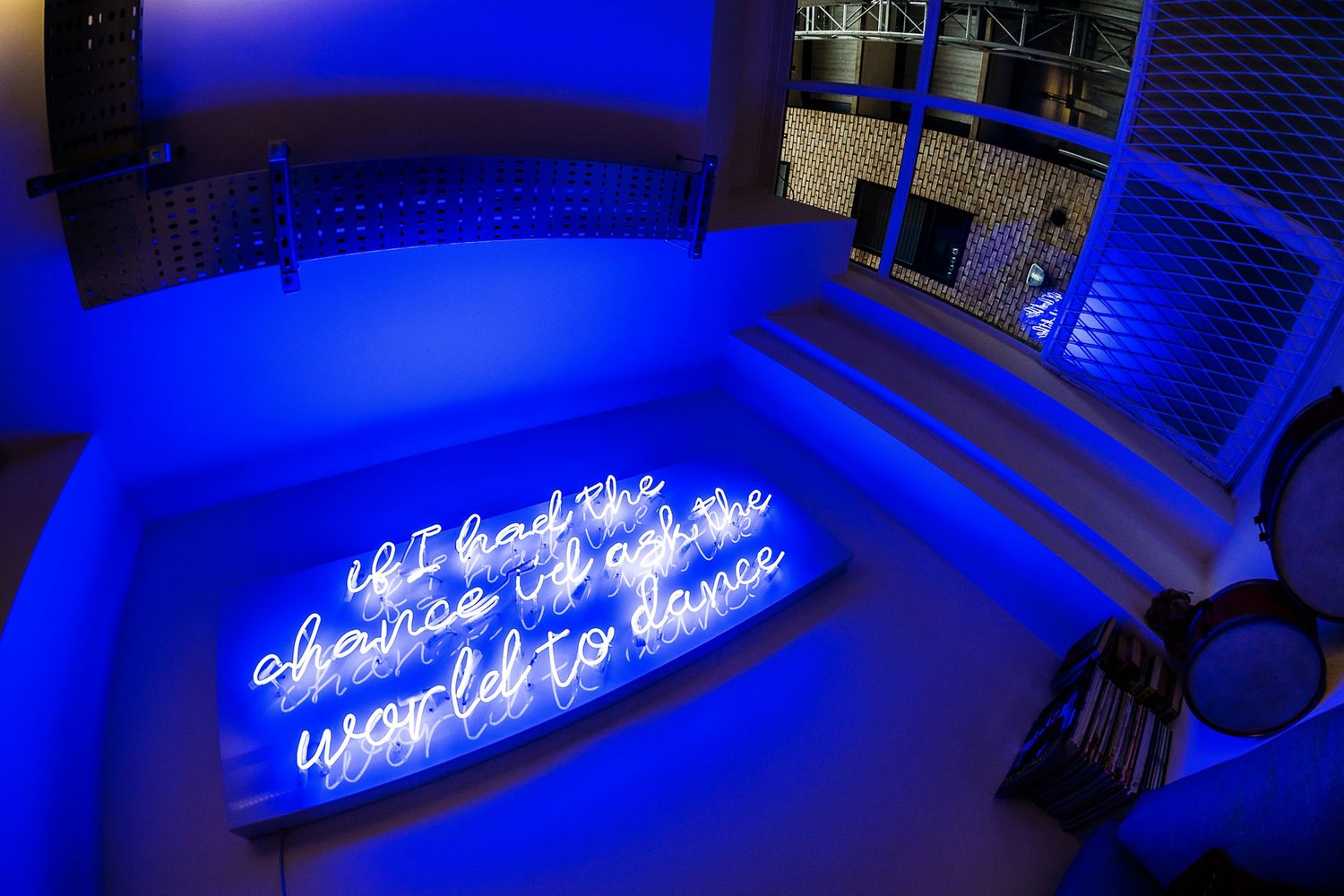
Popping in beforehand meant we picked up on some wiring limitations early on, so we decided to place the neon lettering sign on an aluminium tray to effectively hide the feeds without taking away from the feel, leaving just one cable leading off to the power switch.
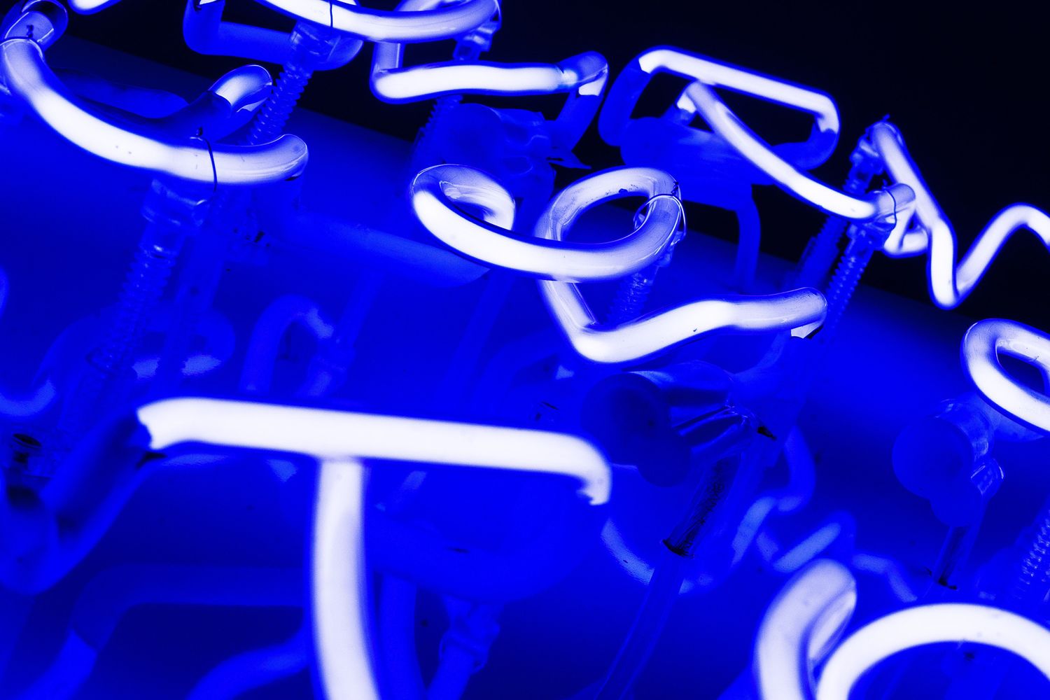
Without that raw look to fall back, we then took to designing the project; powder coating the tray in high gloss white for a clean, contemporary aesthetic that would beautifully reflect the lettering on top when lit. To maximise impact, we chose to build the piece in classic ‘super blue’ – a neon colour that achieves hypnotising levels of saturation when pulsing with electricity, and powers up even more in the dark.
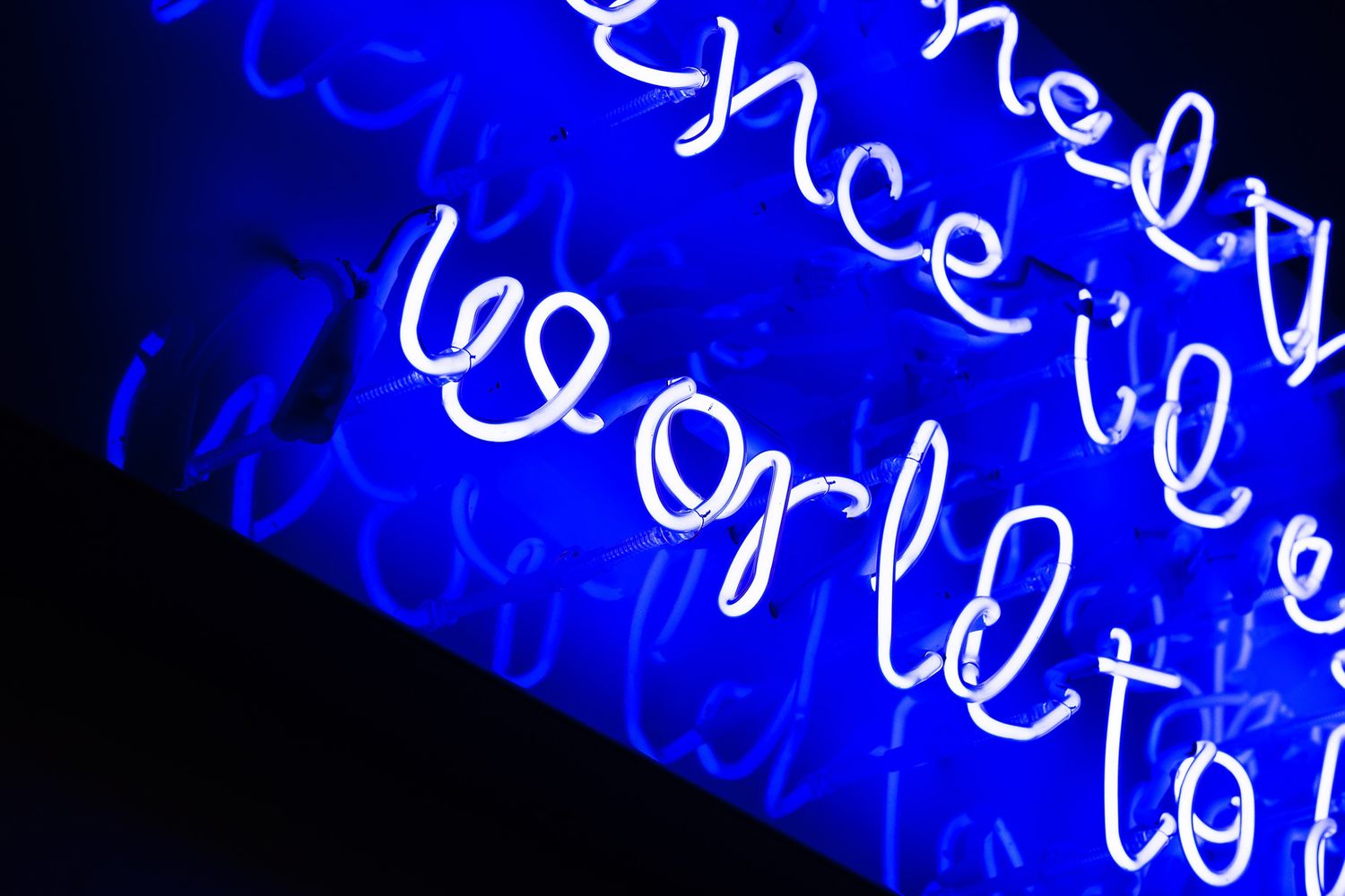
We wanted the client to get a sense of the possibilities, so we mocked up the quote in three different styles of writing, all in cursive, to really bring sexy back. The degree of concentration and skill needed to bend handwritten typefaces out of neon tubing (as opposed to blocked out fonts) takes a different level of patience and expertise – you literally have to heat up every millimetre of the glass to create those continuous curves and form the flowing shapes that make up script.
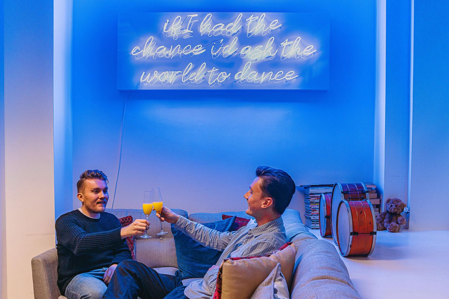
You can imagine how pumped we were for the challenge when the client picked our most italic option! Giving a high voltage, ritzy twist to the flicks and loops of calligraphy allowed us to elevate the sign from a decorative scribble to a true focal point. Approximately 150cm wide across the wall and endlessly deep with its throwback to the business’ heyday in the industry, the finished product draws the eye, tells a story and inspires meaning.


