Boardwalk Place Apartments Graphic Wallpaper Design, Printing and Application
THE LOWDOWN
The estate management at this prime Canary Wharf complex called us in to bring the lobby walls of their residential buildings to life – updating their previous wallpaper for brand new custom graphic wallpaper.
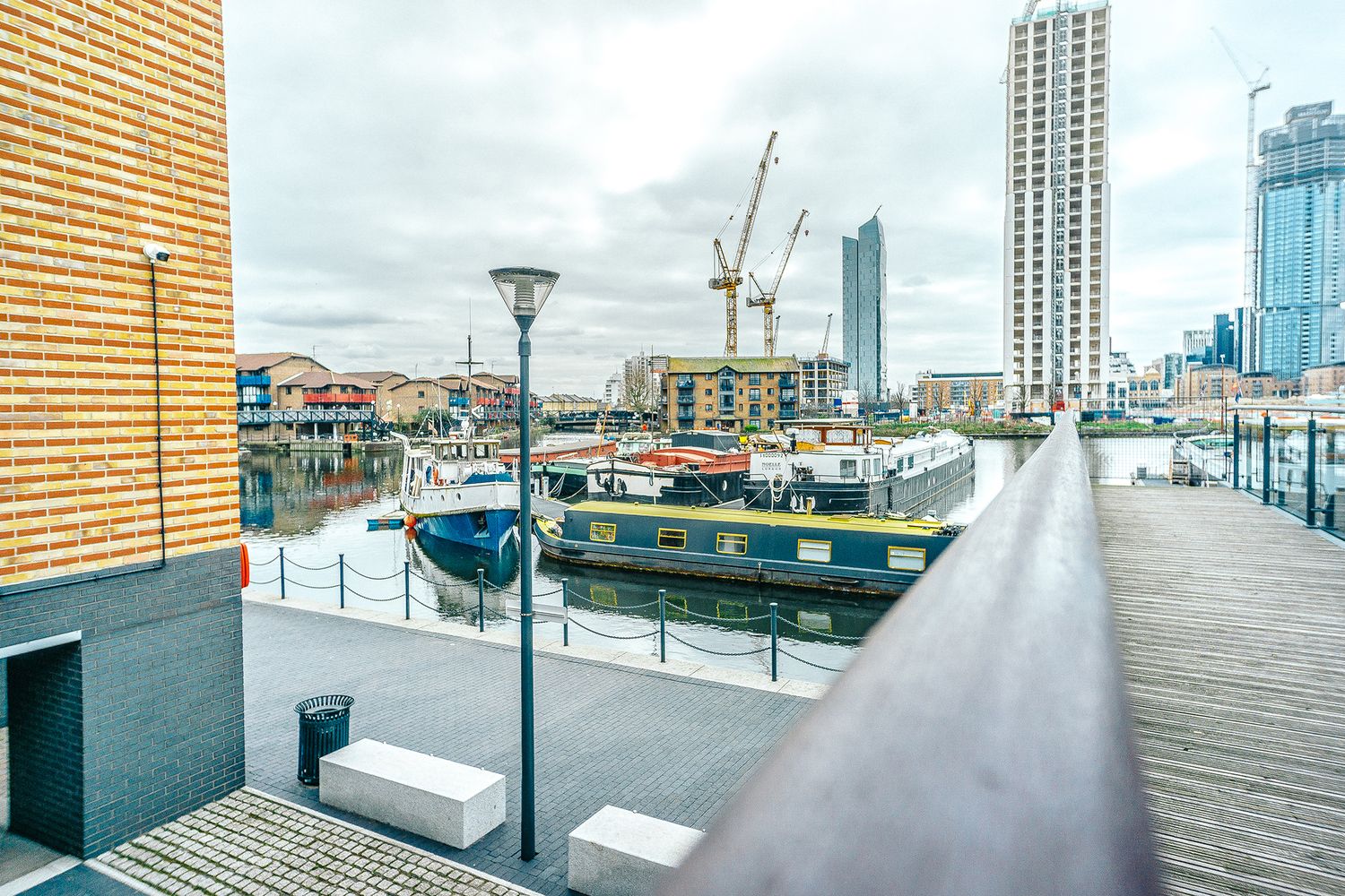
Both the old and fresh designs were photographed, drafted and produced by us, drawing inspiration from the riverside location of this world-class development. The iconic boardwalk is dotted with about 300 cafes, hip bars, restaurants and shops, with its signature neon lights leading out over the Blackwall Basin, made evermore picturesque thanks to the local flotilla of houseboats.
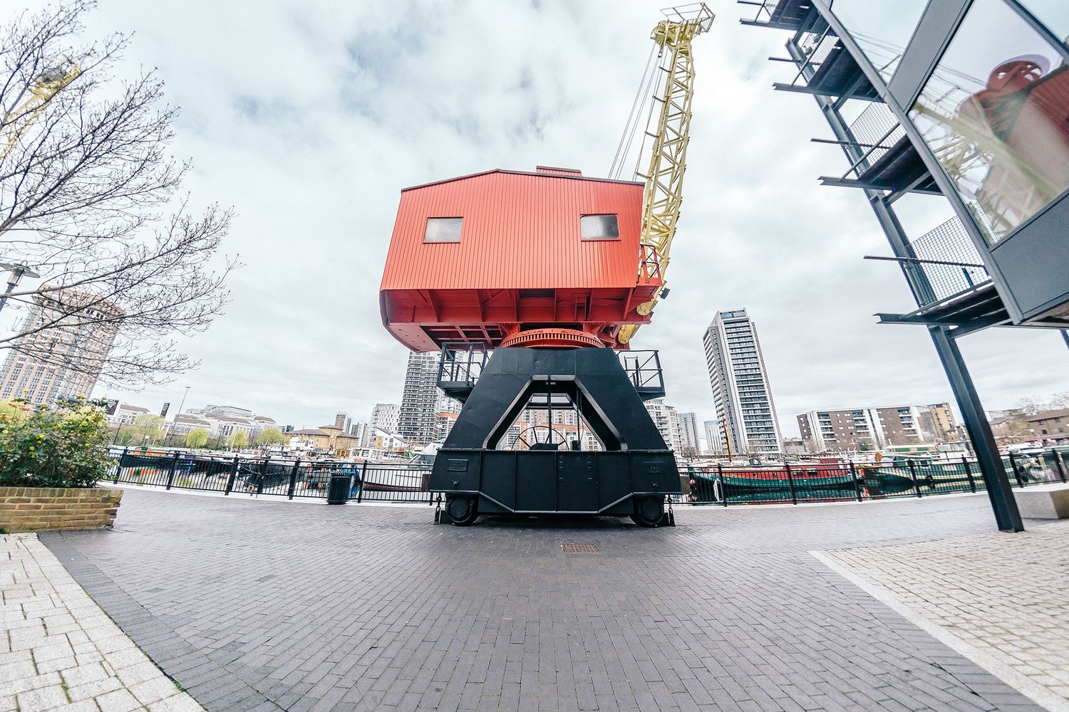
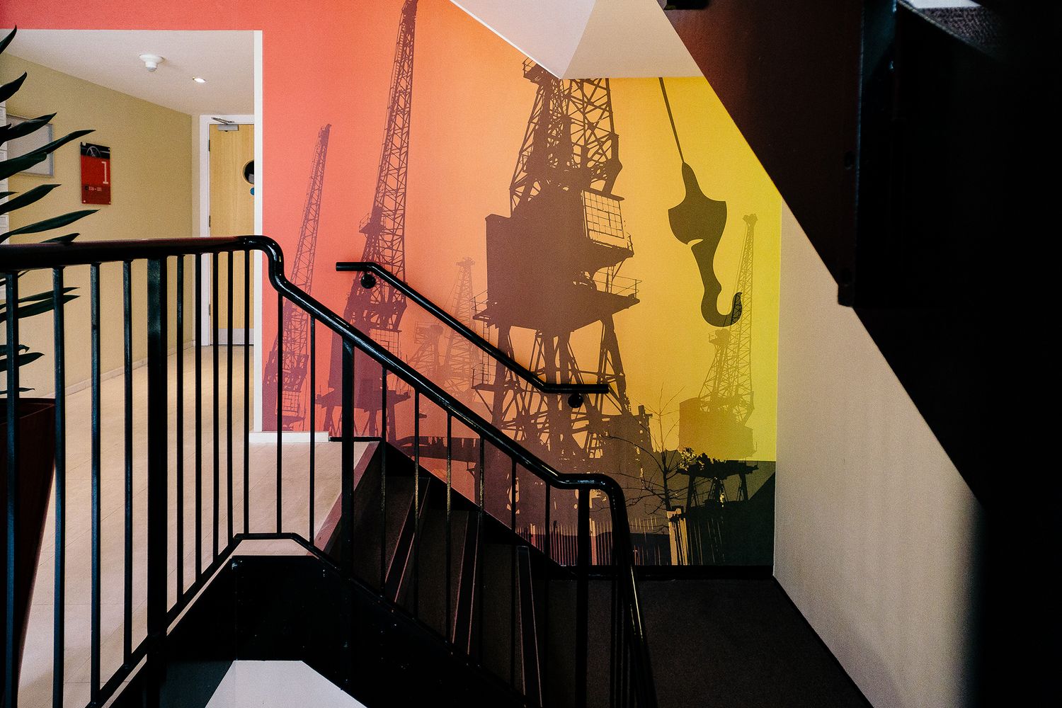
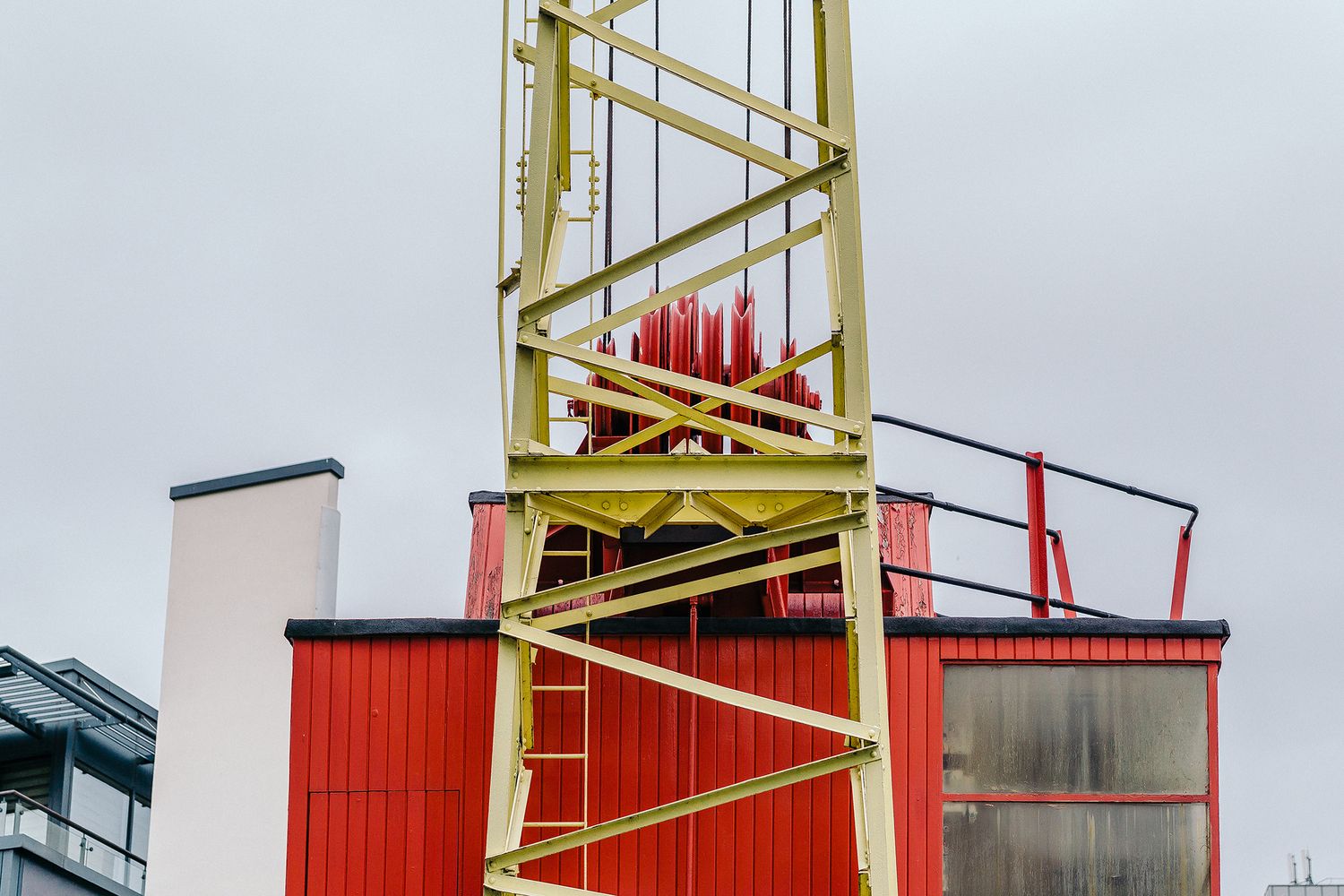
However, from all of the area’s heritage, we picked a much loved permanent feature – the historic cranes on Poplar Dock – as the muse for our visuals and to celebrate all things urbanesque, roll by roll.
Our challenge now was to create a fresh take and deliver something that was essentially the same, but different. So this time round we decided to upgrade our original idea and work on a brighter, bolder iteration – rendered on Textura Digifort Grain wallpaper in full colour inkjet print, and better suited to the interiors surrounding luxury serviced apartments.

THE SPECS
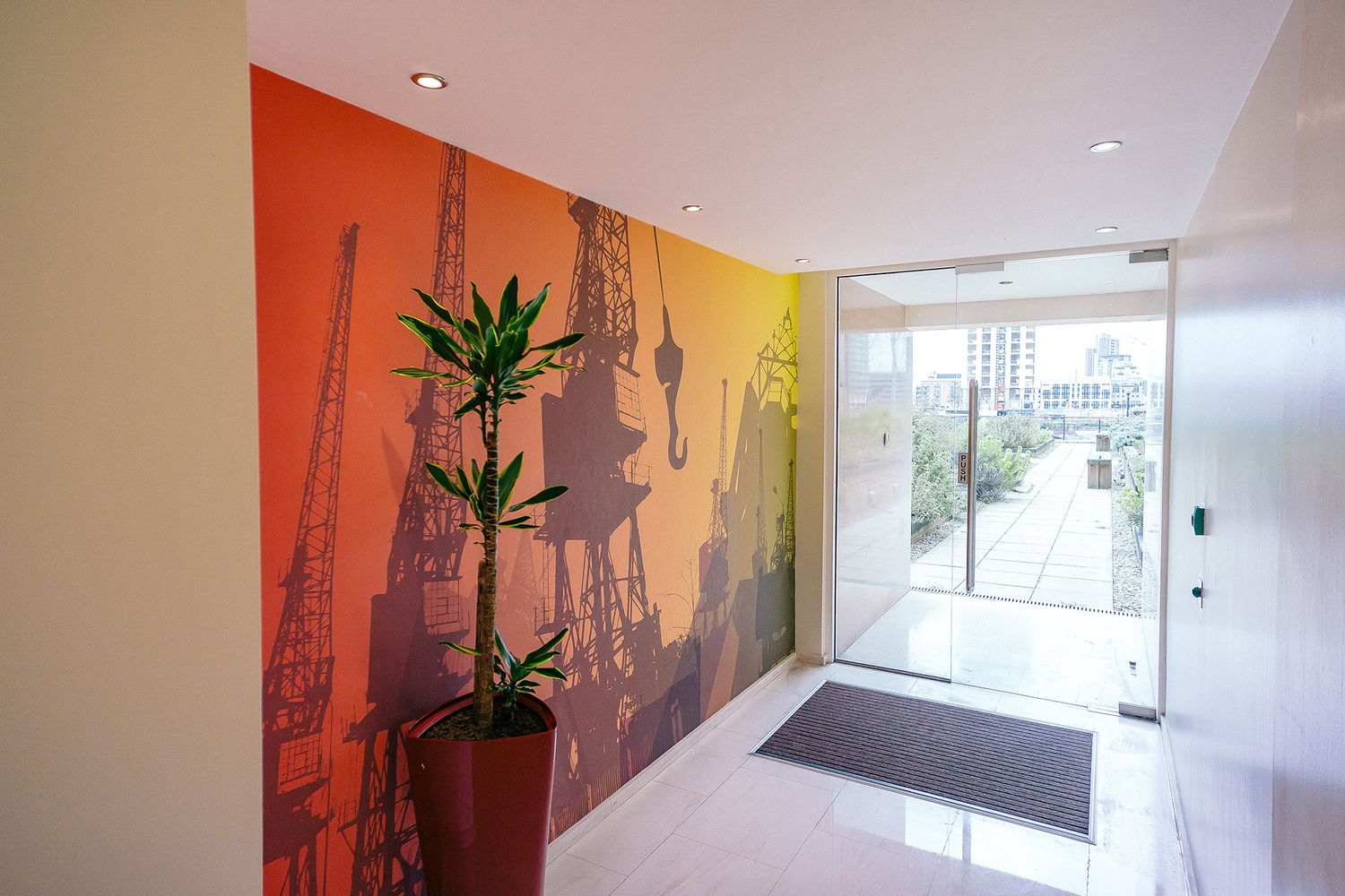
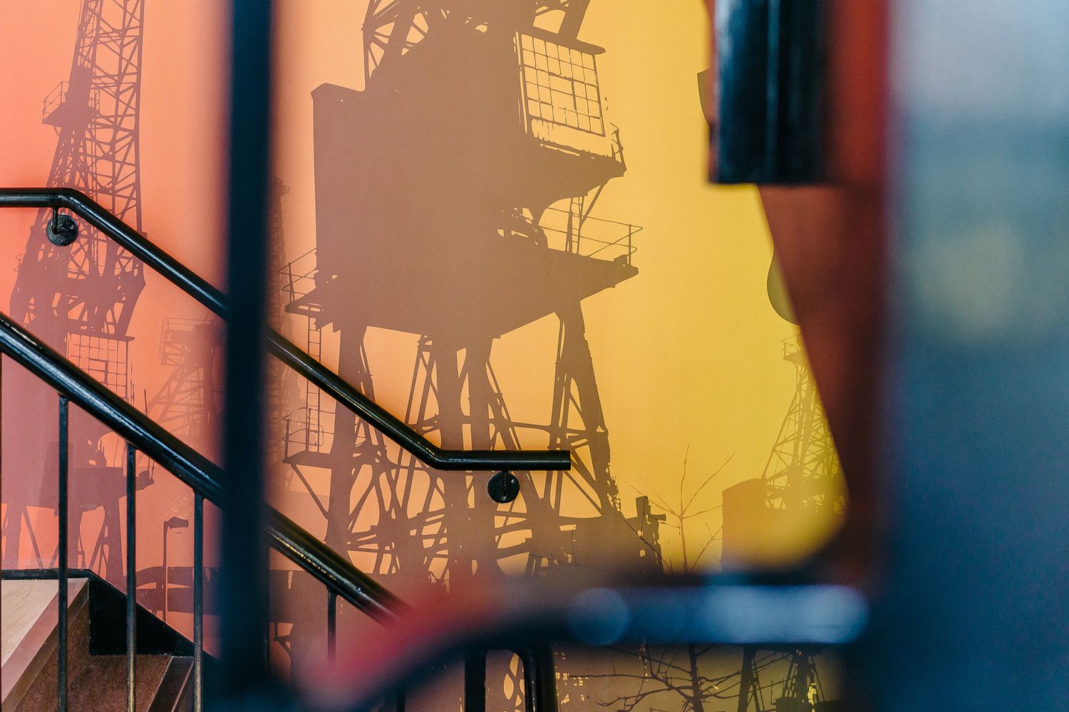
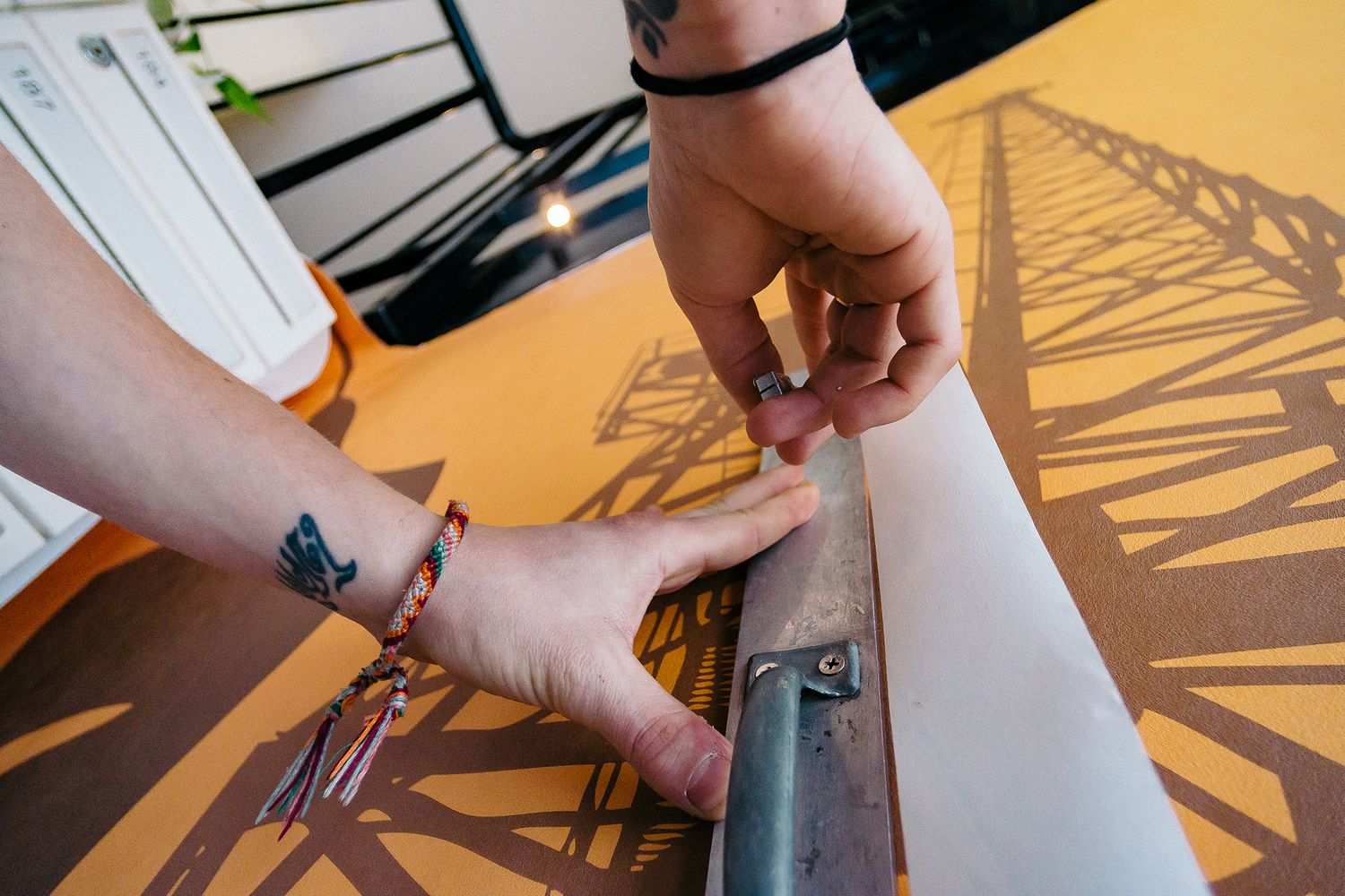
Canary Wharf is a bustling financial district that witnesses a breathtaking sunset over waterfront views every evening, so we selected a hot palette of yellows, oranges and scarlets for the wallpaper backdrop to fit in situ.
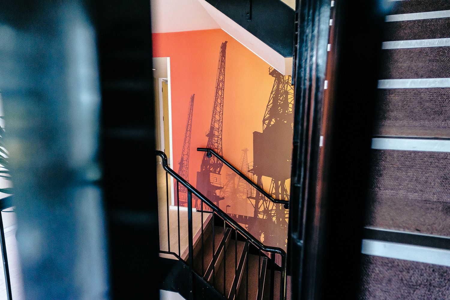
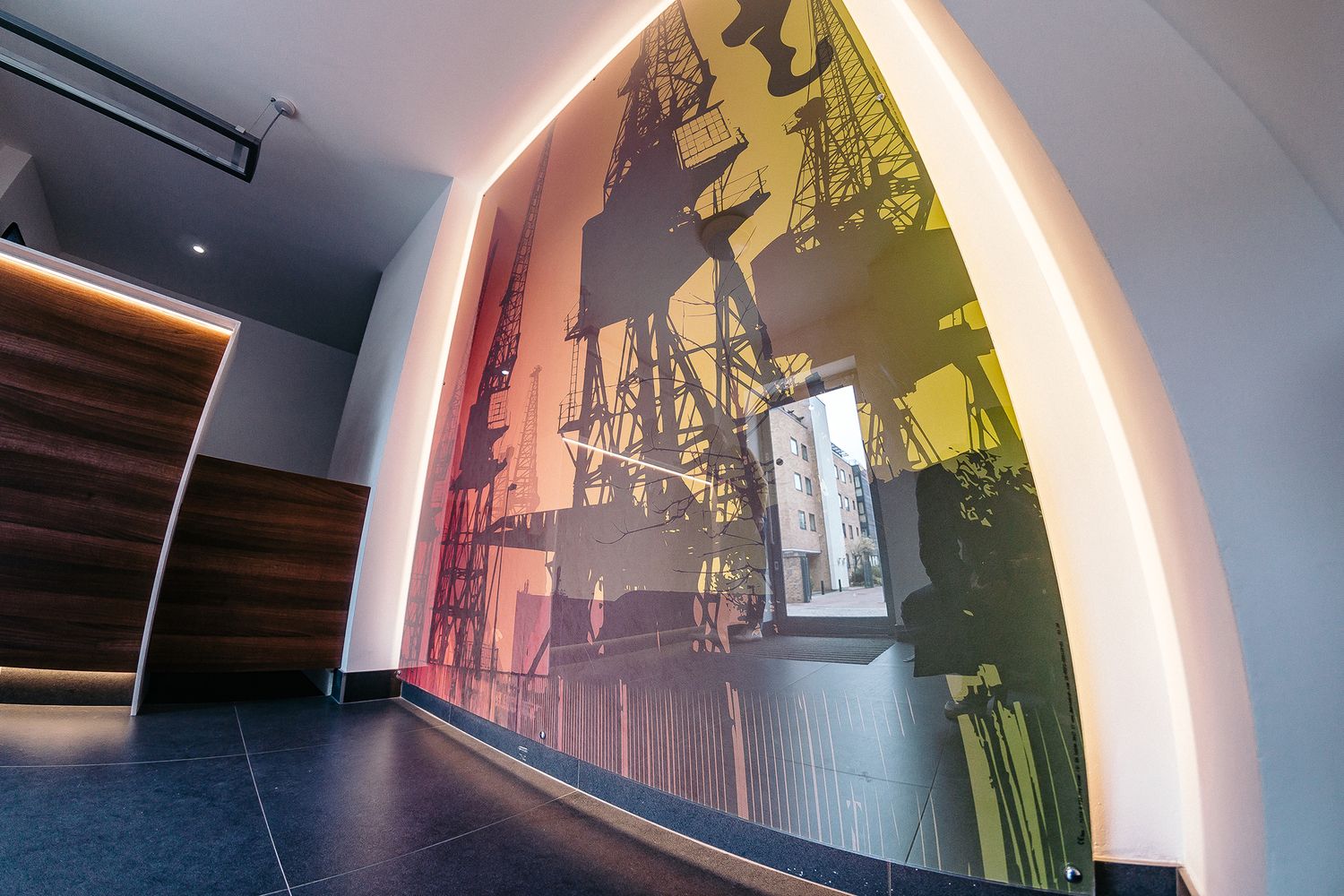
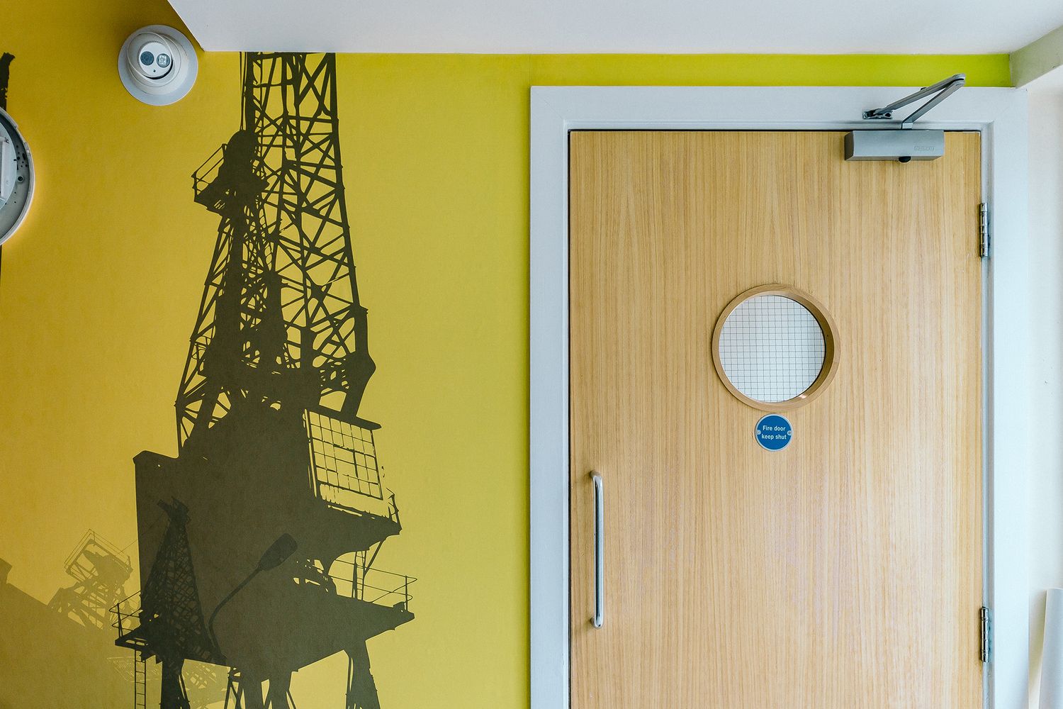
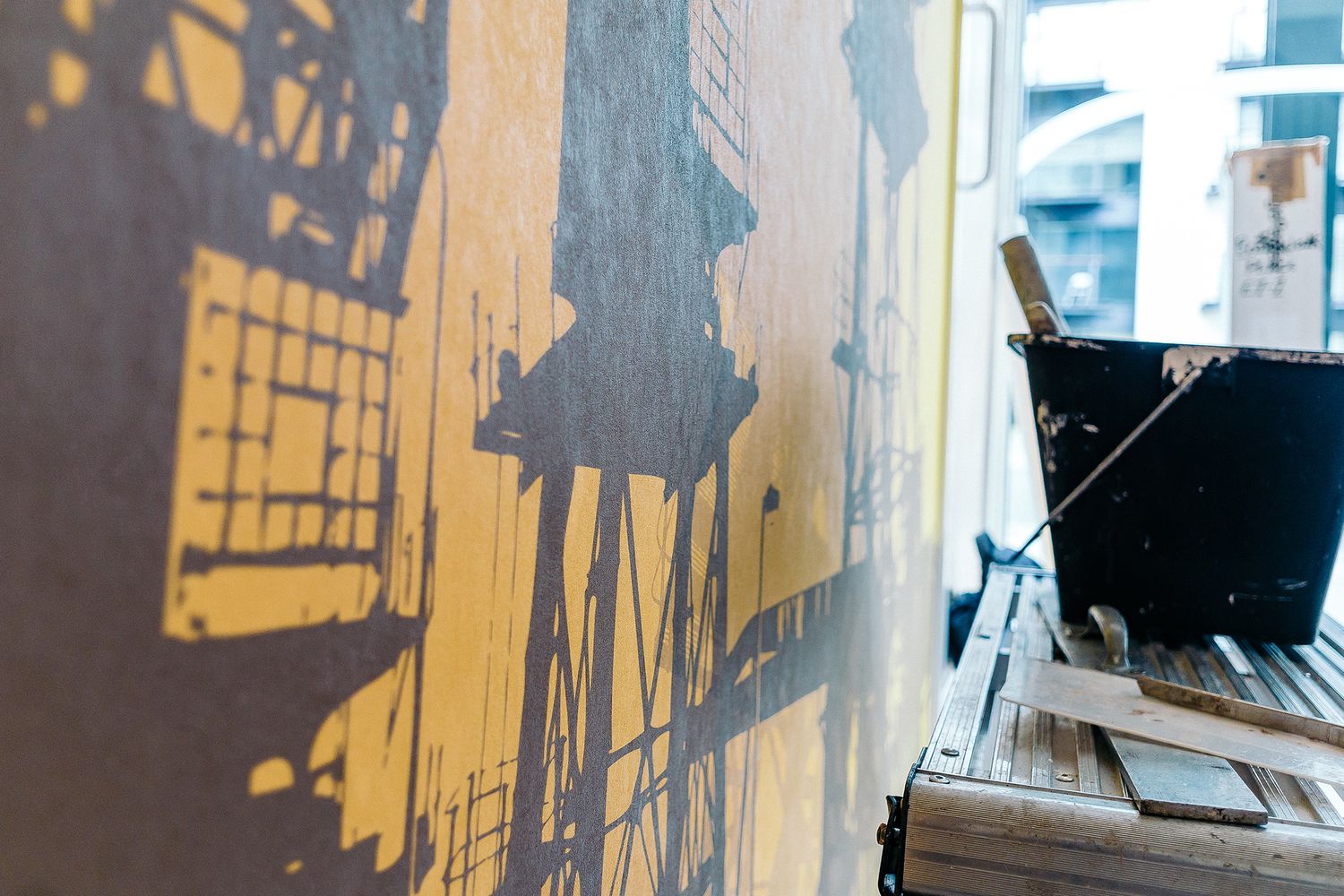
We then overlaid those acid tones with vectors we’d drawn using our own photography – in fact we mocked up five versions of the vectors and the client chose grey scale reproductions of the neighbourhood’s landmark rigs to go on top, adding a sense of serenity to the warm gradients of each scene.
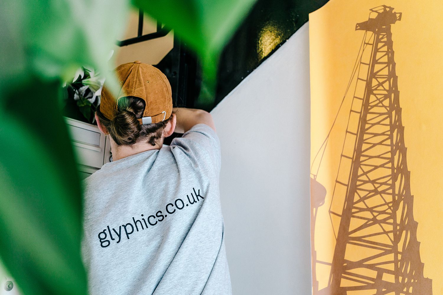
We went high resolution and low saturation to create a slightly faded look. All of the paper panoramas were then printed, cut and rolled here in house, and configured or scaled to their host walls – adapted to changing aspects like size and texture.
We strategically applied the artworks over the course of several Saturdays, and synchronised our schedules with the decorators as they stripped and prepared each surface area. Many of the edges were made up of angles coming in at varying degrees, but by working in phases, we successfully kitted out 21 large walls, providing that pop in a labyrinth of corridors across a variety of buildings, as requested.
Placing the iconic criss-crosses of lattice arms at the top of the hierarchy in our designs made for some really eye catching common areas, creating a chic and familiar feel for the residents and injecting a sense of vibrancy for visitors here on business or leisure.
