Co-Space Wayfinding & Branding Signage
Co-Space found Glyphics online, coming to us as a newcomer to the shared working market outside of the m25. The client loved our work on the central London office space of Fora but needed a visual language that represented the aspirations of their brand while keeping to a reasonable budget, as they were just establishing themselves in relatively uncharted waters.
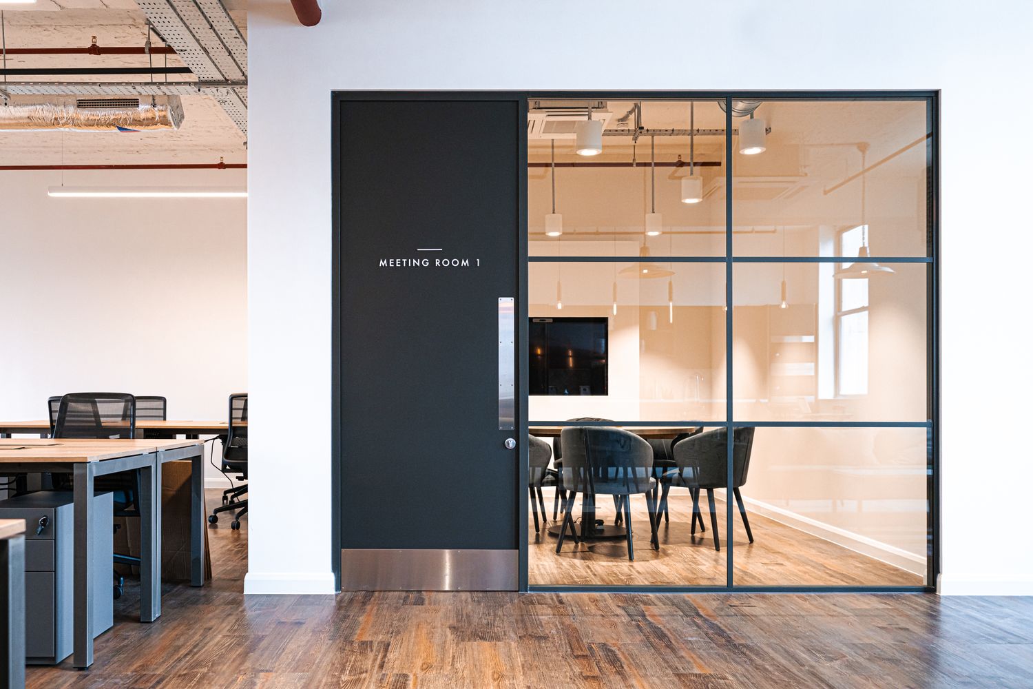
Weaving together everything from the drop-in meeting rooms and larger office suites to the roof terrace and on-site coffee shop, they asked us to conceptualise a clean, minimalist wayfinding system from scratch and implement it within their three storey site in Reading, not forgetting logo signs for the exterior. We were happy to help, and ensured our signage worked for their specific needs – cost savviness, effectiveness, and statement aesthetics that matched the elegance of their interior design.

Our solution?
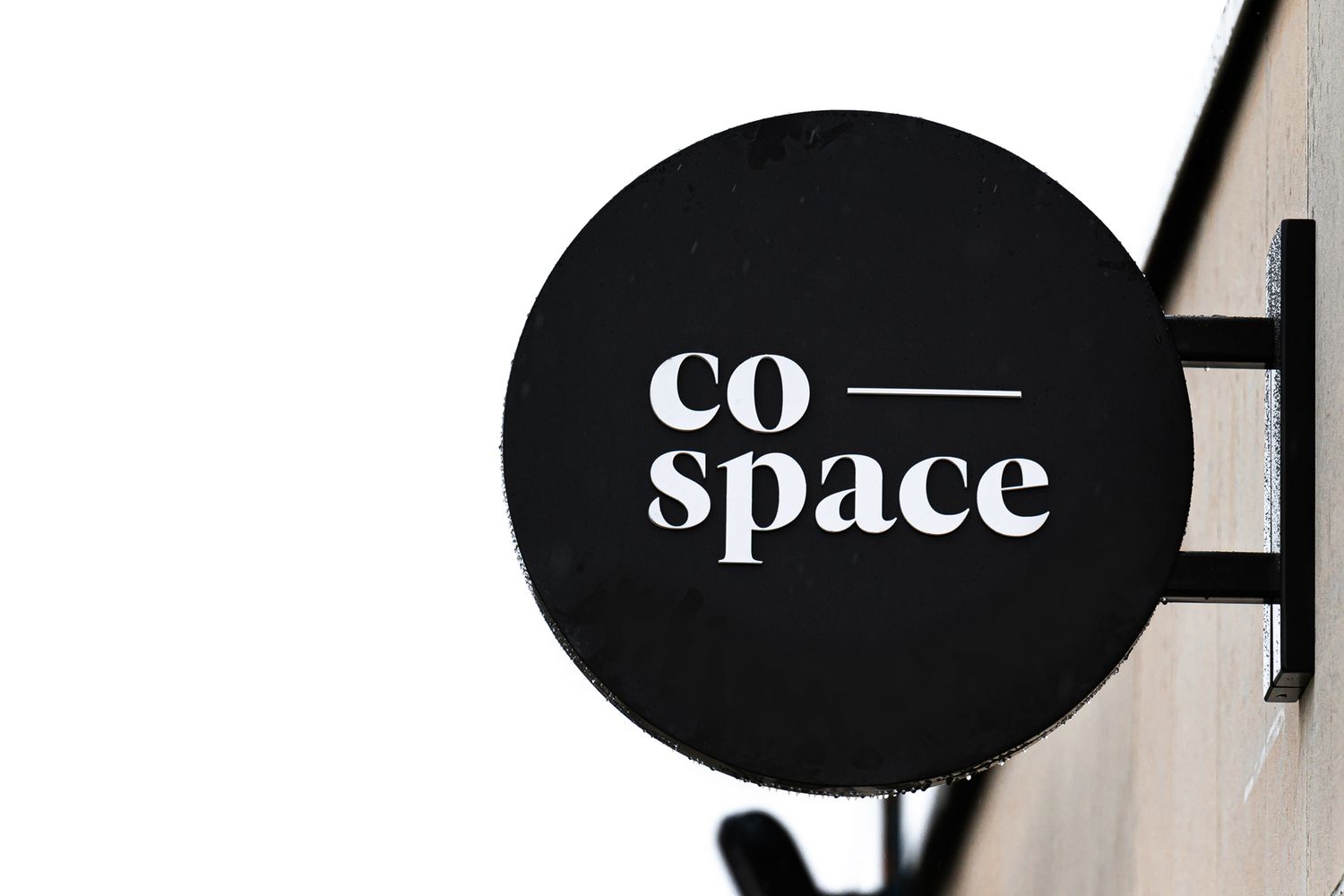
On the exterior, we kept things simple with a double sided aluminium projecting sign to bring attention to the building, but we elevated it with a hard wearing powder coated satin finish, and the laser cut the logo onto each side. Moving from the outside in, panels built from the same materials but with vinyl lettering on the fascia were dispersed across the landings. With the basics done, we then turned our attention to the design-led interiors.
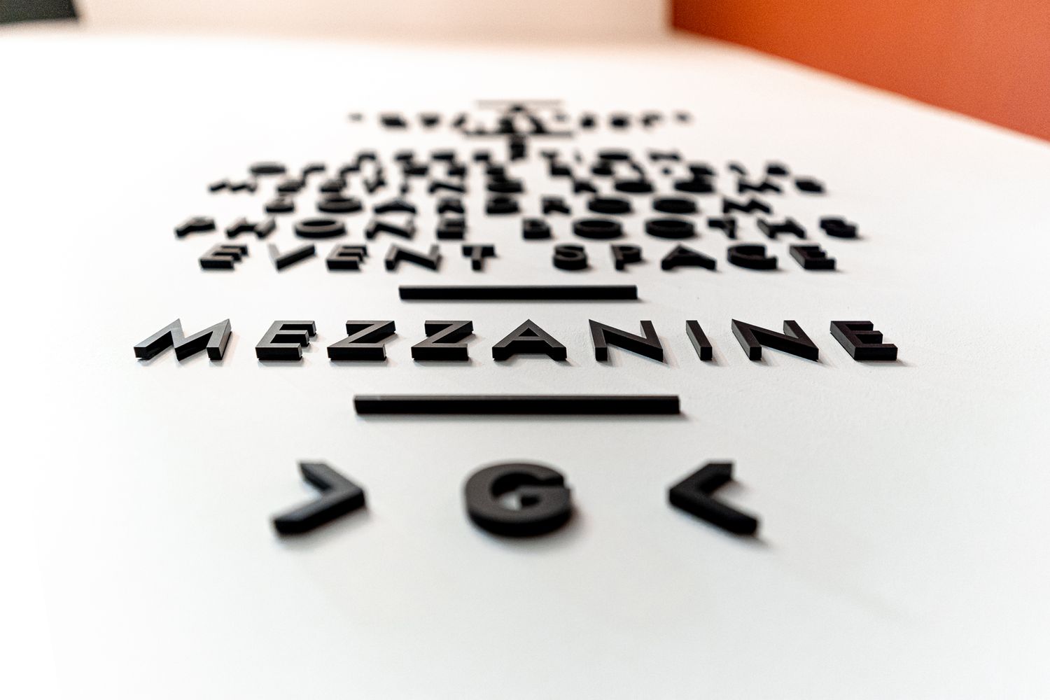
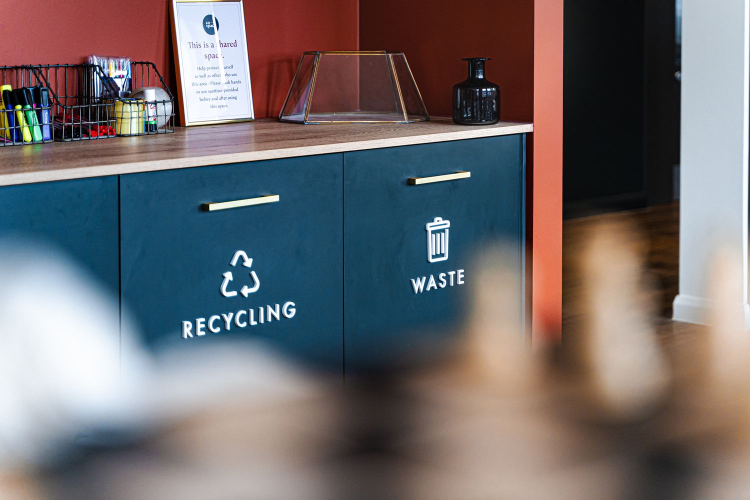
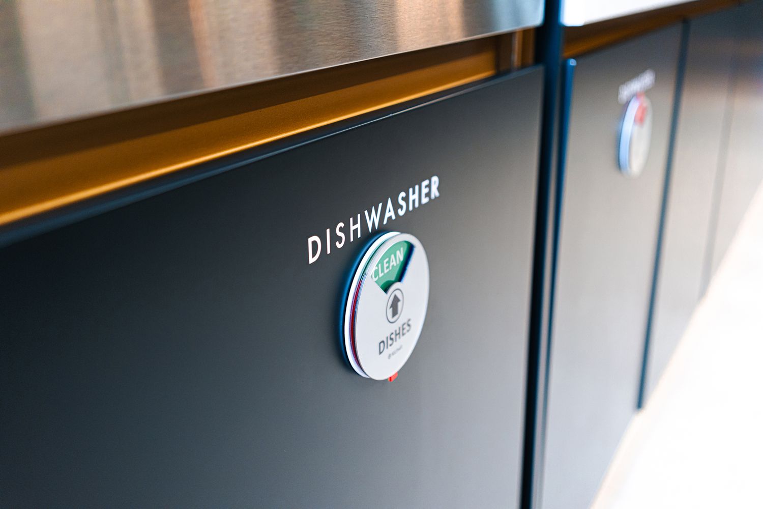
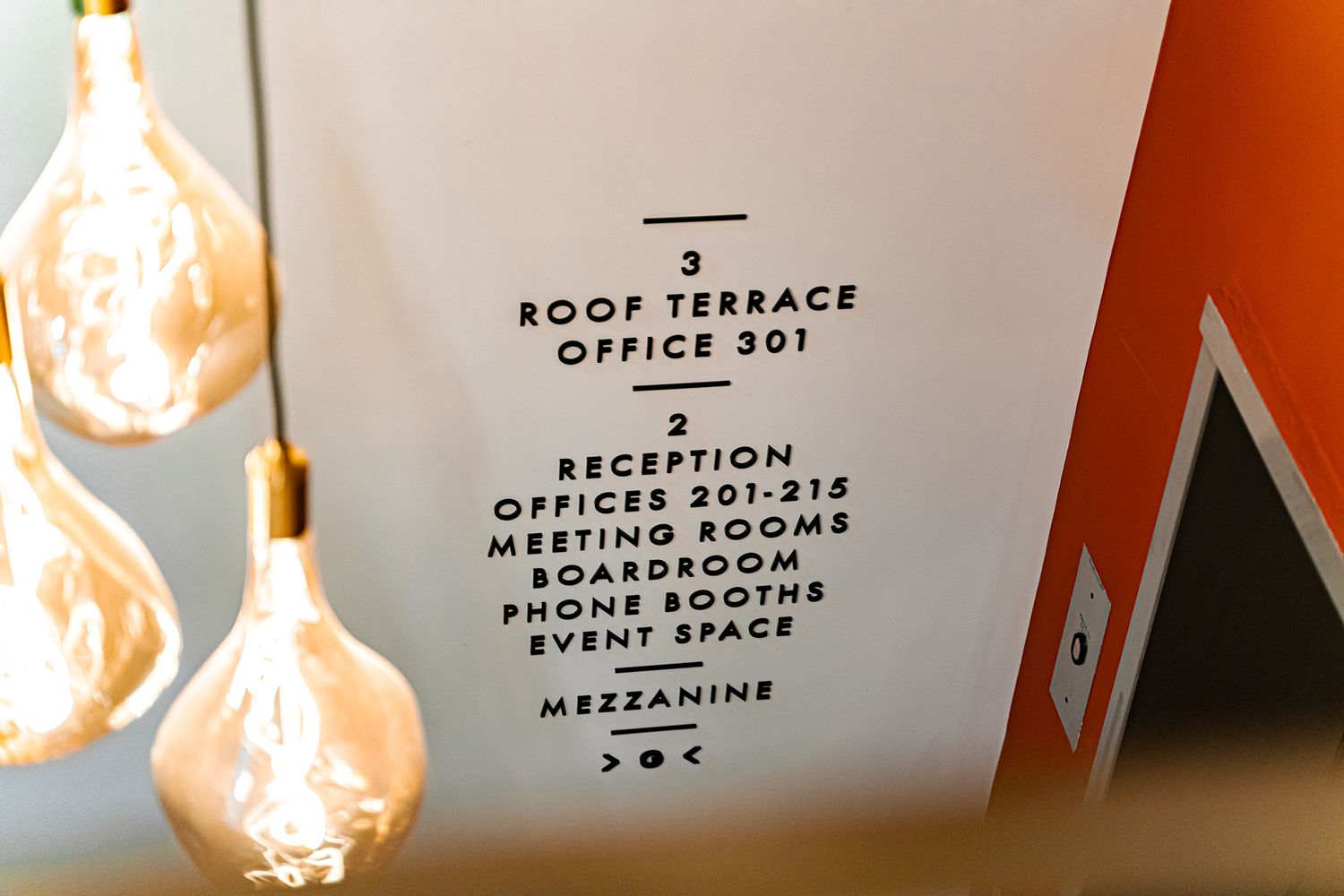
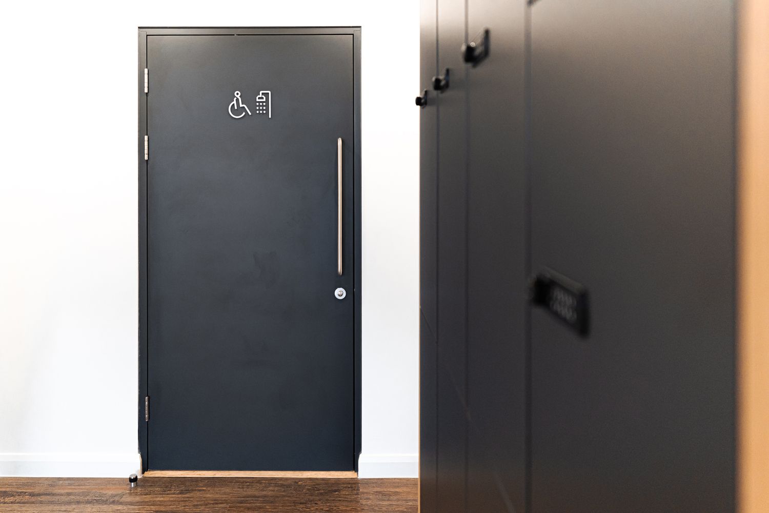
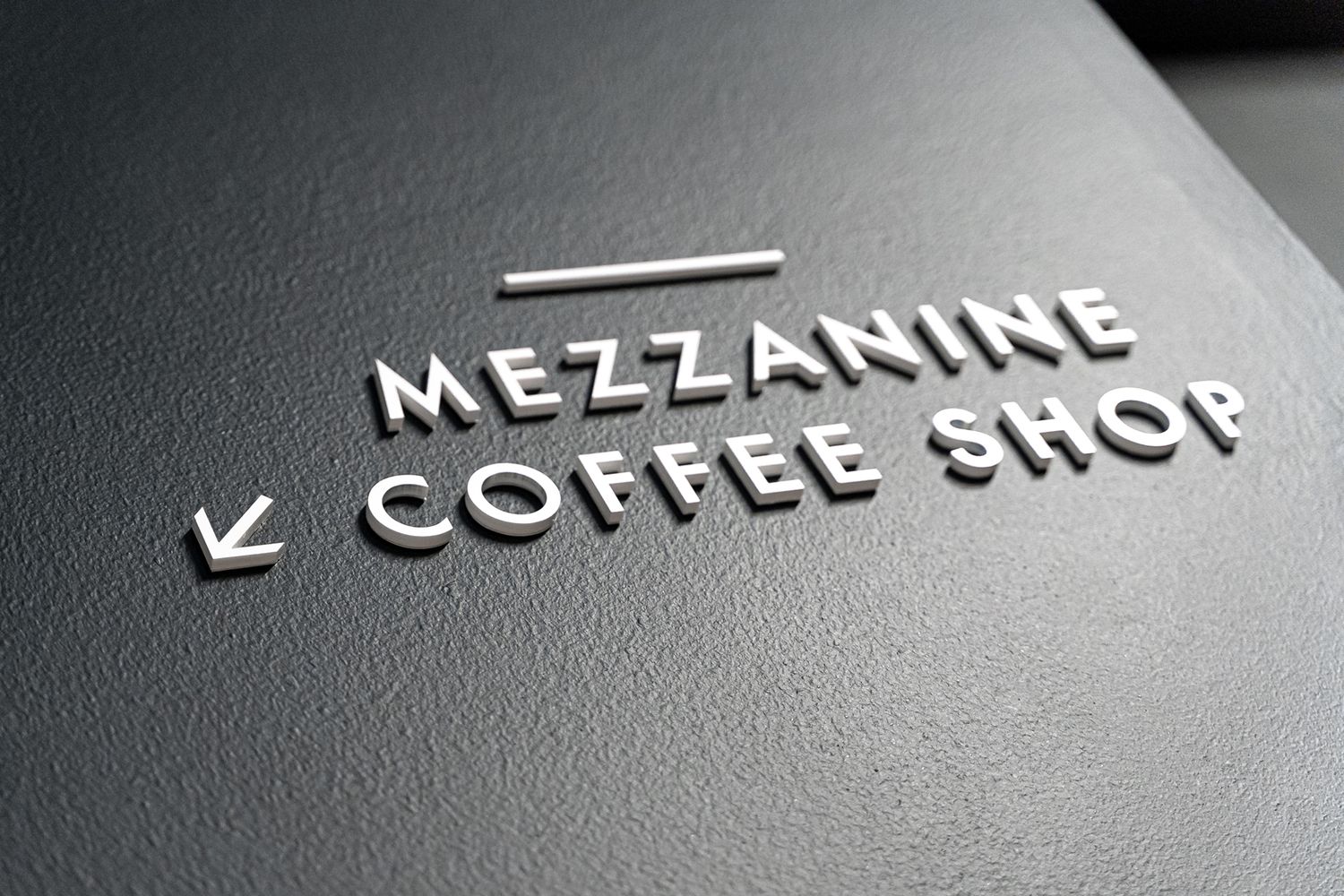
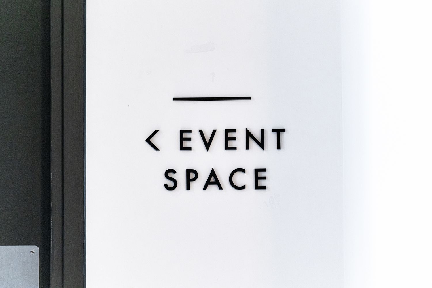
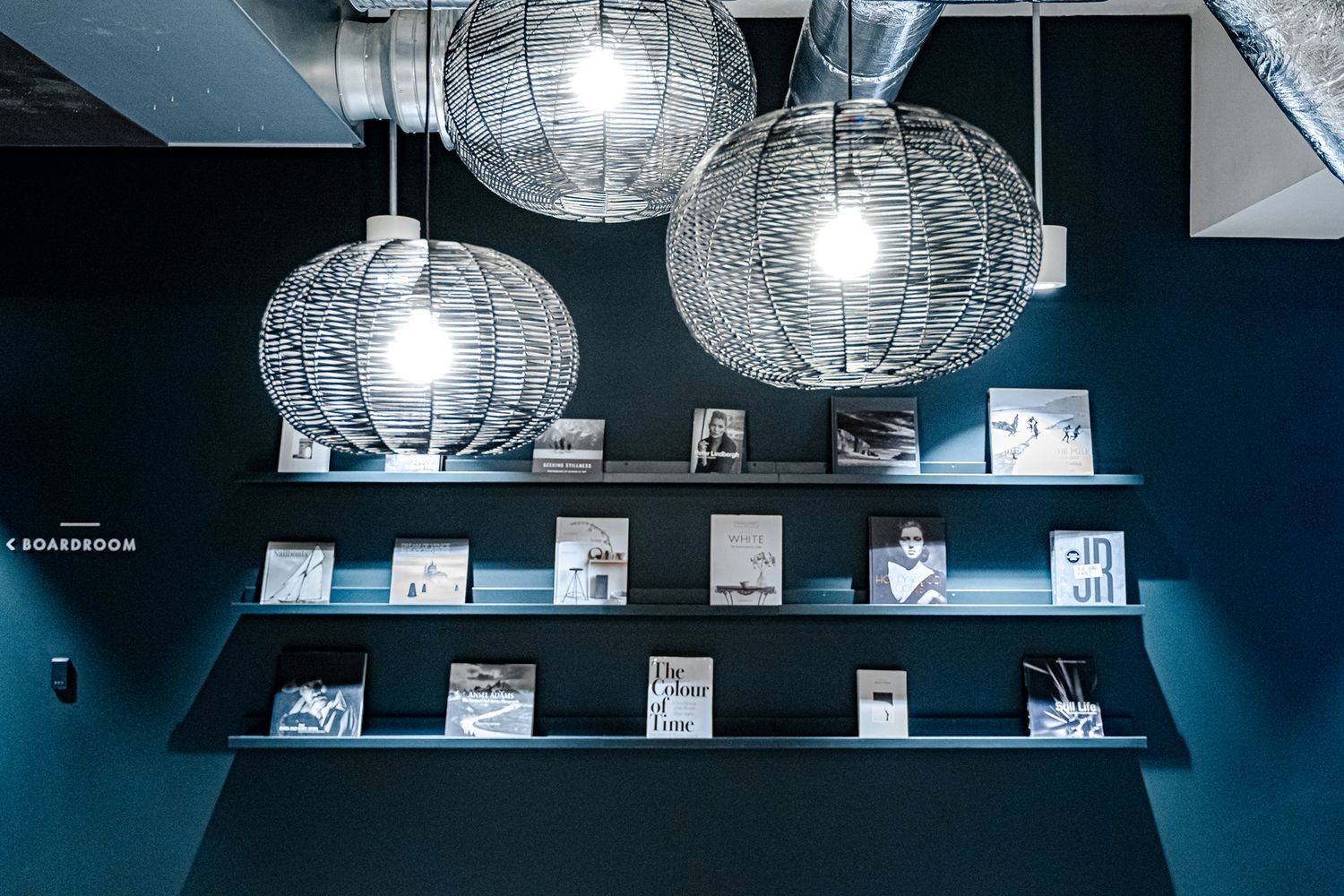
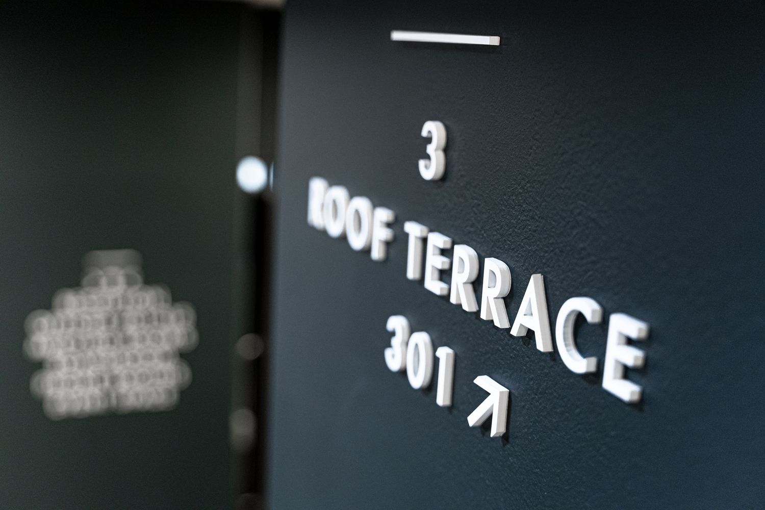
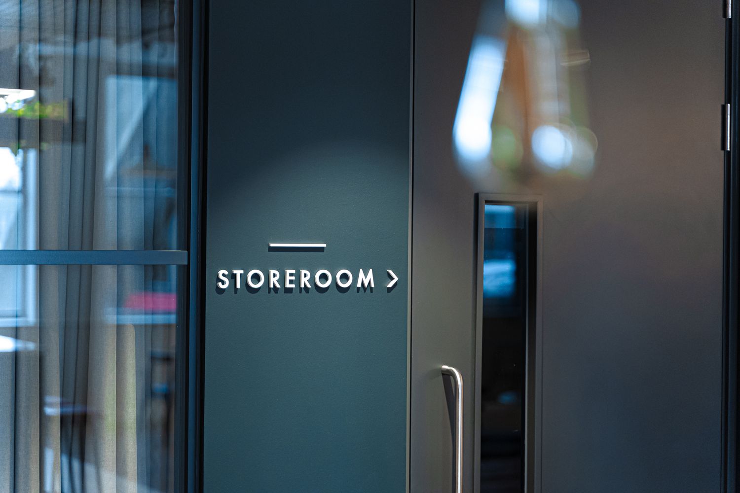
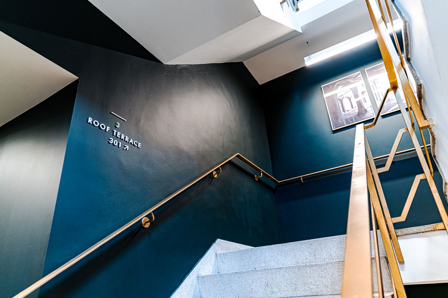
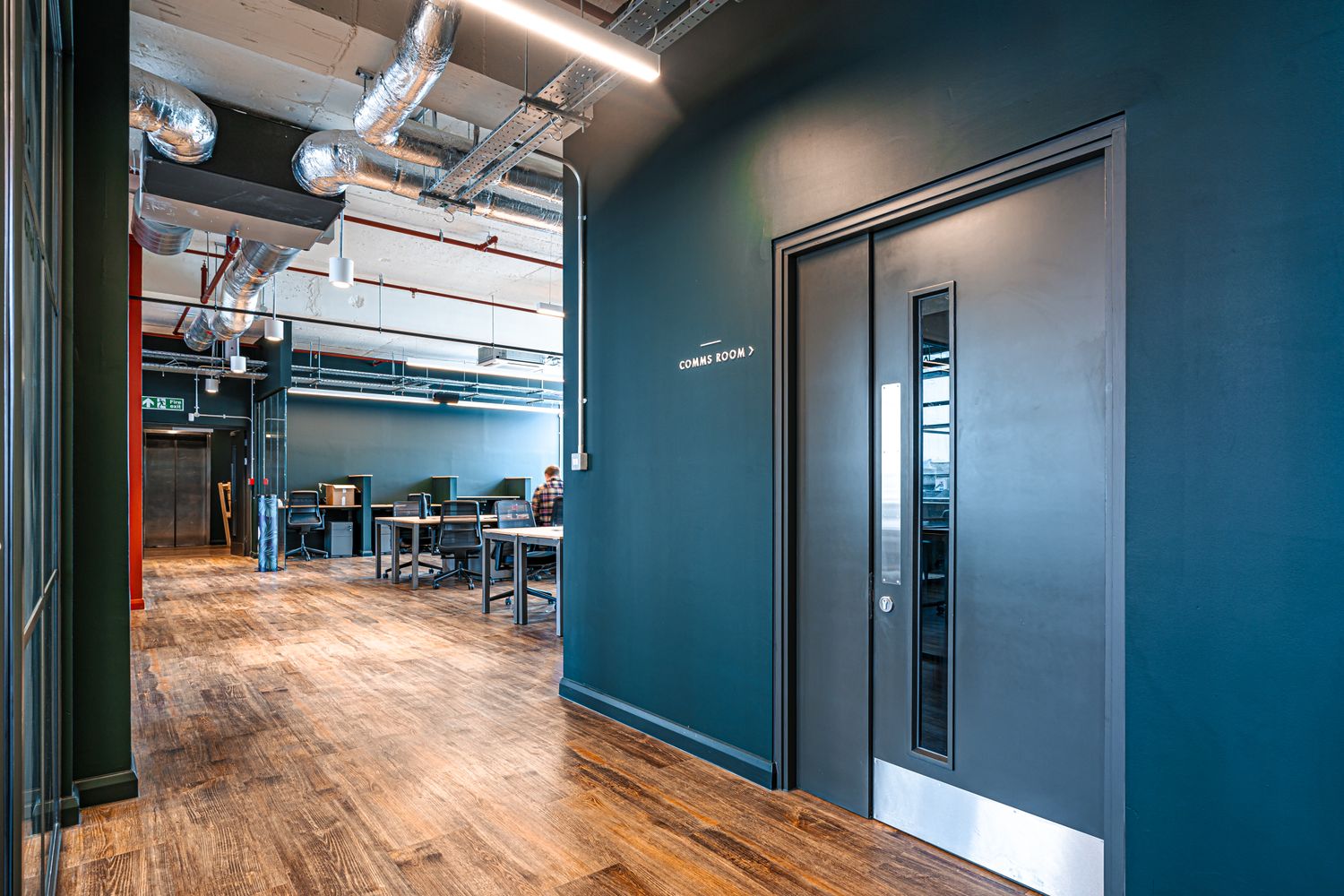
First off, we did a once over of the layout to sense-check how foot traffic should flow and agreed on a blueprint of signage placement with Co-Space. For the look and feel, we went for 5mm thick lettering or pictograms that would be applied straight onto the native surface of the space to achieve an expensive looking decorative 3D finish. Generous line spacing and uppercase formatting kept things un-busy and uniform.
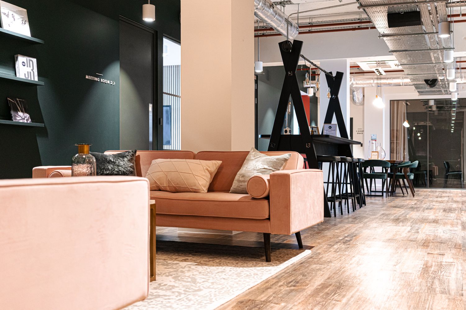
To keep things classy whilst still having budget in mind, we decided on using readymade materials to lessen the processes and reduce lead times, cutting out the words for our wayfinding system from matt black or white acrylic to embellish the walls for the lobby, mezzanine and general floor signage.

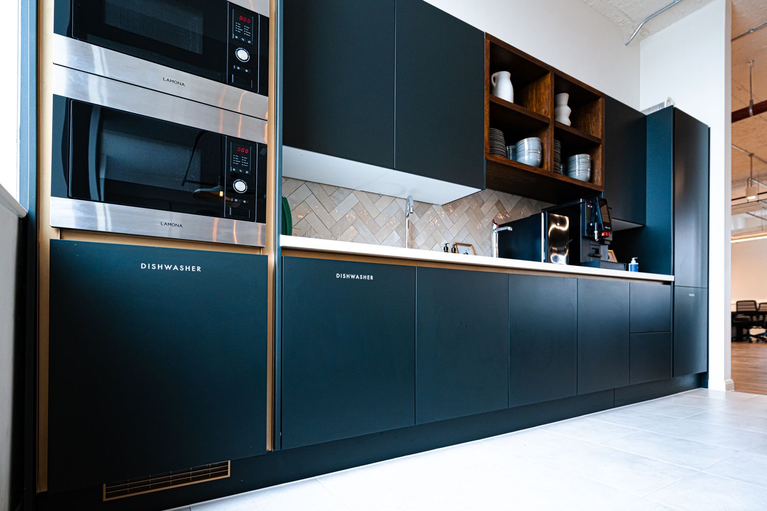
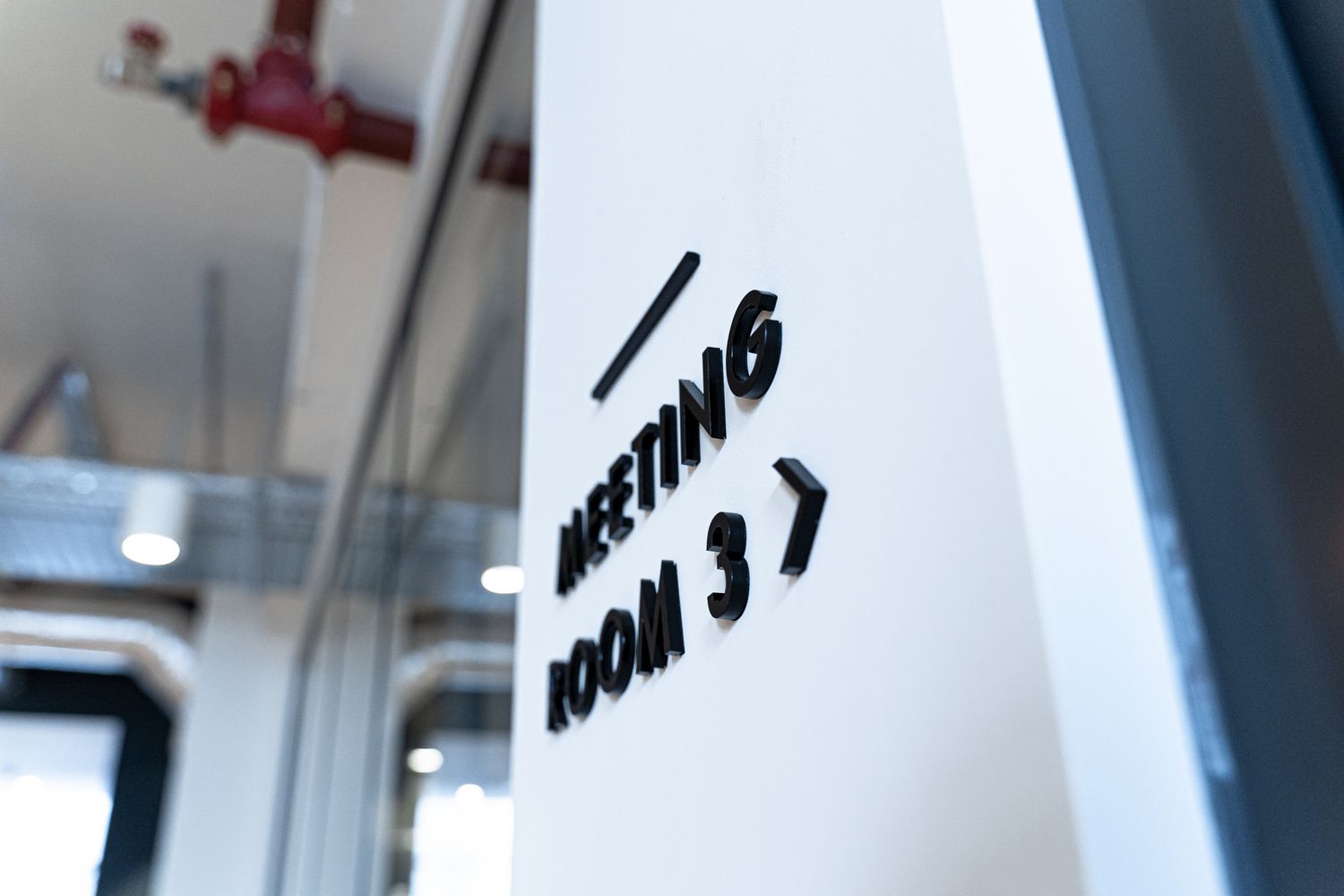
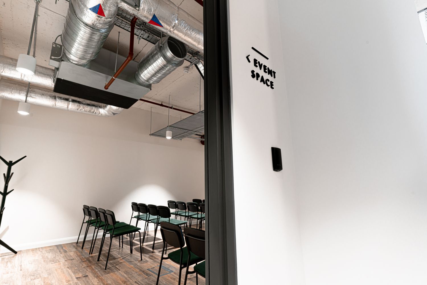
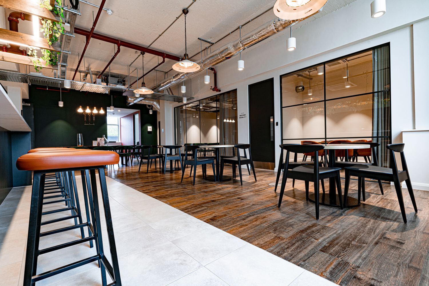
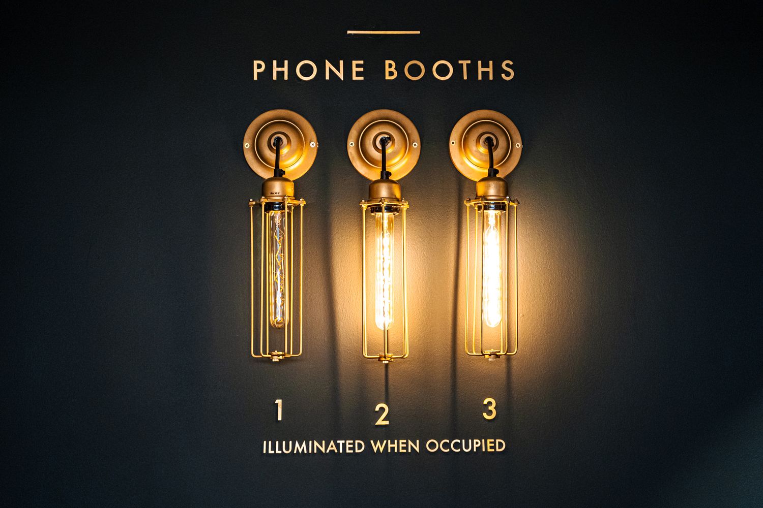
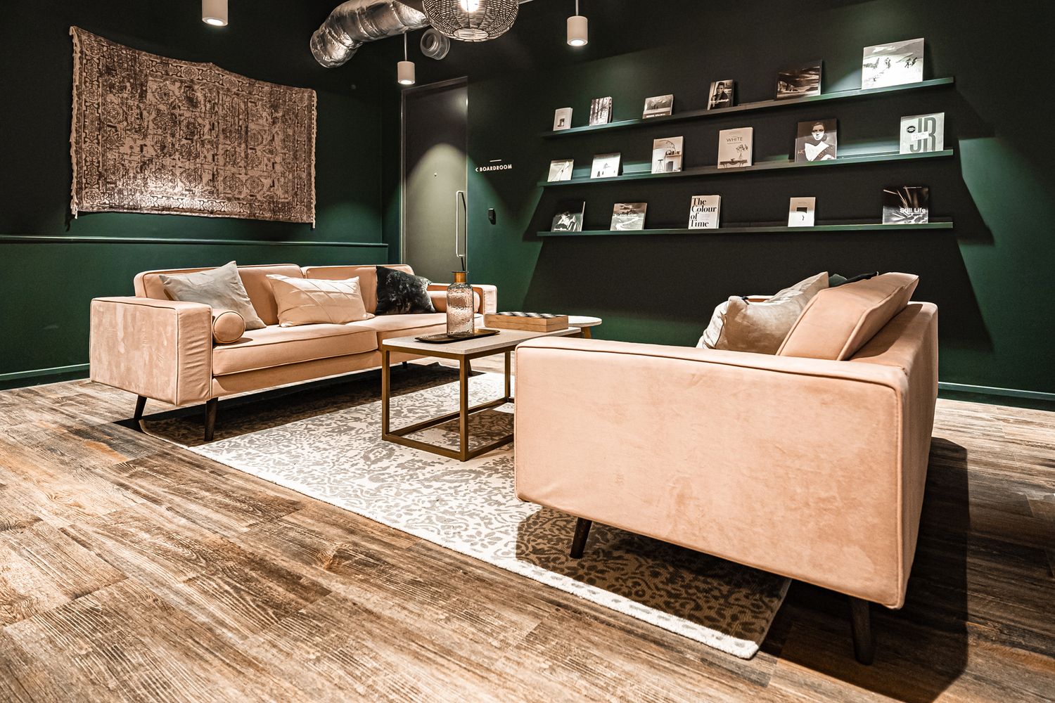
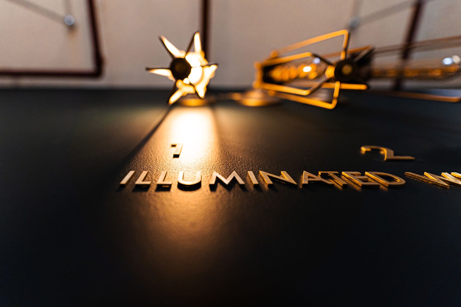
Of course, we feel as invested as our clients in the outcome of a space, and aspired to provide flashes of luxury despite the limitations of the brief. Being set in a room with high spec and soft furnishings, the phone booth signage definitely called for some levelling up, so we delivered with a satin brass finish that glimmers beautifully under the entrancing glow of edison lights – undoubtedly a favourite spot of ours, you would have found us here, repeatedly opening and closing the booths just to see the hot bulbs pop on and the letters pop off!
In retrospect, unveiling a coworking space during the coronavirus pandemic was never going to be a mean feat. It presented our client with stops and starts galore throughout the setting up process – would the materials arrive today, would the tradespeople be in? When could they open, when would it be safe to open? Of course these issues dominoed and moved goal posts for us too, as we worked to accommodate knock on effects like sudden changes in deadlines.
Executing the application perfectly for the sake of the client’s constraints made all the difference in creating the desired impression – from confirming that every single letter was put on straight, to double checking that the adhesive wasn’t visible, or that the paint job on the walls behind stayed fresh. For this collaboration, being painfully attentive to the little details paid off in the end – acquiring two more spaces in 2021, Co-Space has since been a returning client for Glyphics and the end result is a relationship that keeps on growing.
