Ellisse by SpacemadeArt Deco Signage: metal logo, illuminated reception wall, glass manifestation, 3D directories and wayfinding
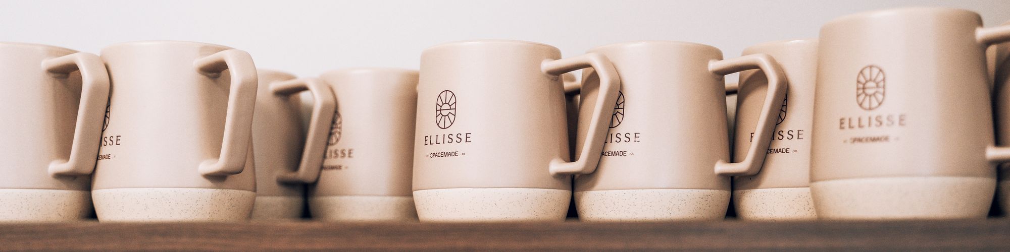
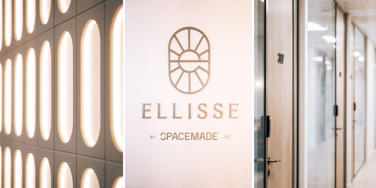
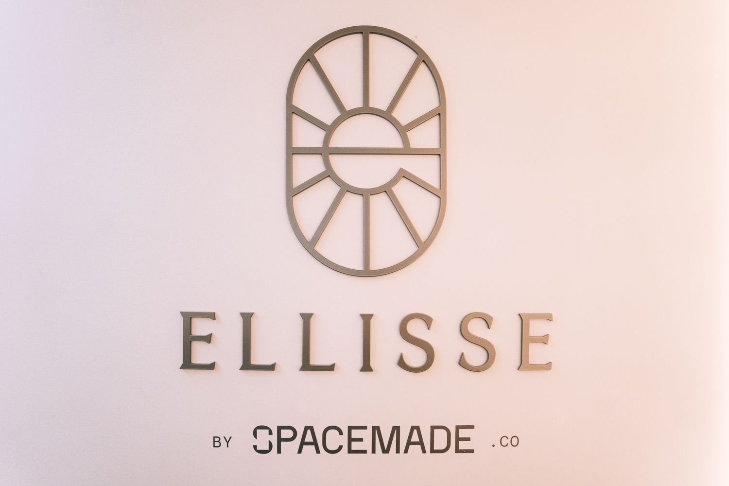
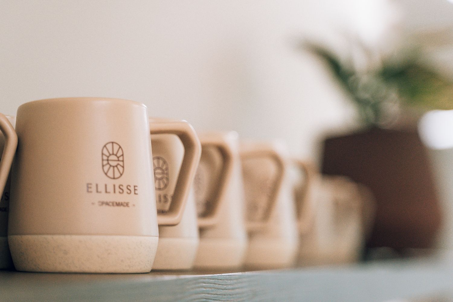
Every Spacemade location has its own identity, a nod to the history, character or architecture of the space it occupies. At Ellisse, the central brand icon is born from the literal fabric of 10 St Bride Street, with a distinctive ellipse shape inspired by the building’s arched windows. Combined with rays of light and the initial ‘e’, it creates a radiant symbol that commands attention. Our role was to give the logo the respect it calls for and carry the brand’s visual language beyond the guidelines and into the physical realm, working it into our bespoke reception installation and throughout the wayfinding and glass manifestation.
The BrandThe BriefCreative DevelopmentObstacles & OutcomeFAQs
Operating a growing number of locations across England, including, at current count, a dozen in London, Spacemade is a fast-growing flexible workspace company. It stands out for its commitment to fostering meaningful connections between landlords, businesses and the communities that use its spaces. But what does that actually look like?
Unlike many flexible workspace operators, Spacemade doesn’t simply rent a building, apply its brand and move in. Instead, it works in partnership with landlords to create a workspace tailored to the building, its location and the community it serves.
That means every Spacemade site has two identities to balance: the personality of the individual location and Spacemade itself as the brand behind it. Each space needs enough character to stand on its own, while still feeling unmistakably part of the wider family. That duality makes things considerably more interesting for designers and, for us as signmakers, it shapes our solutions too.
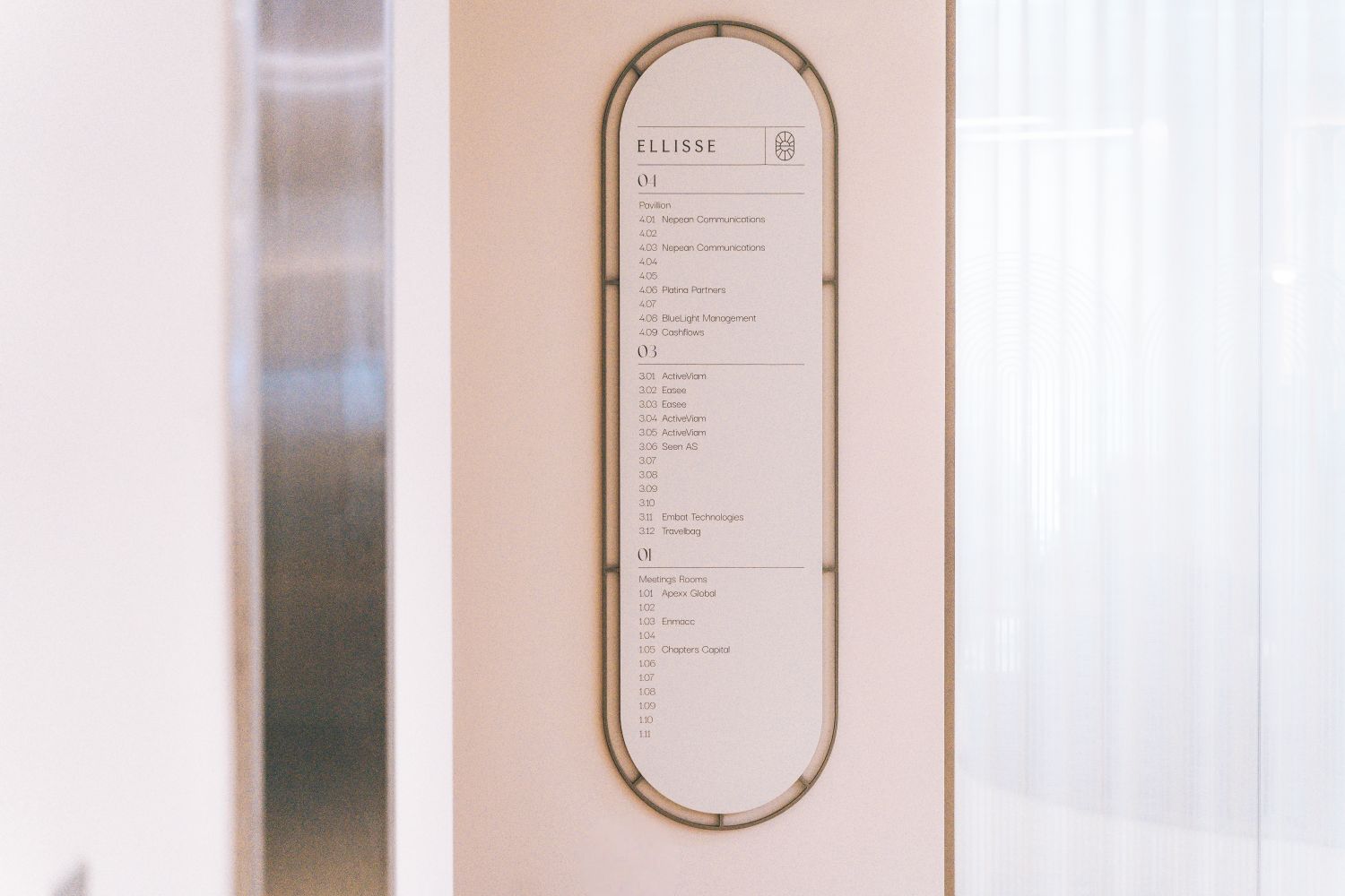
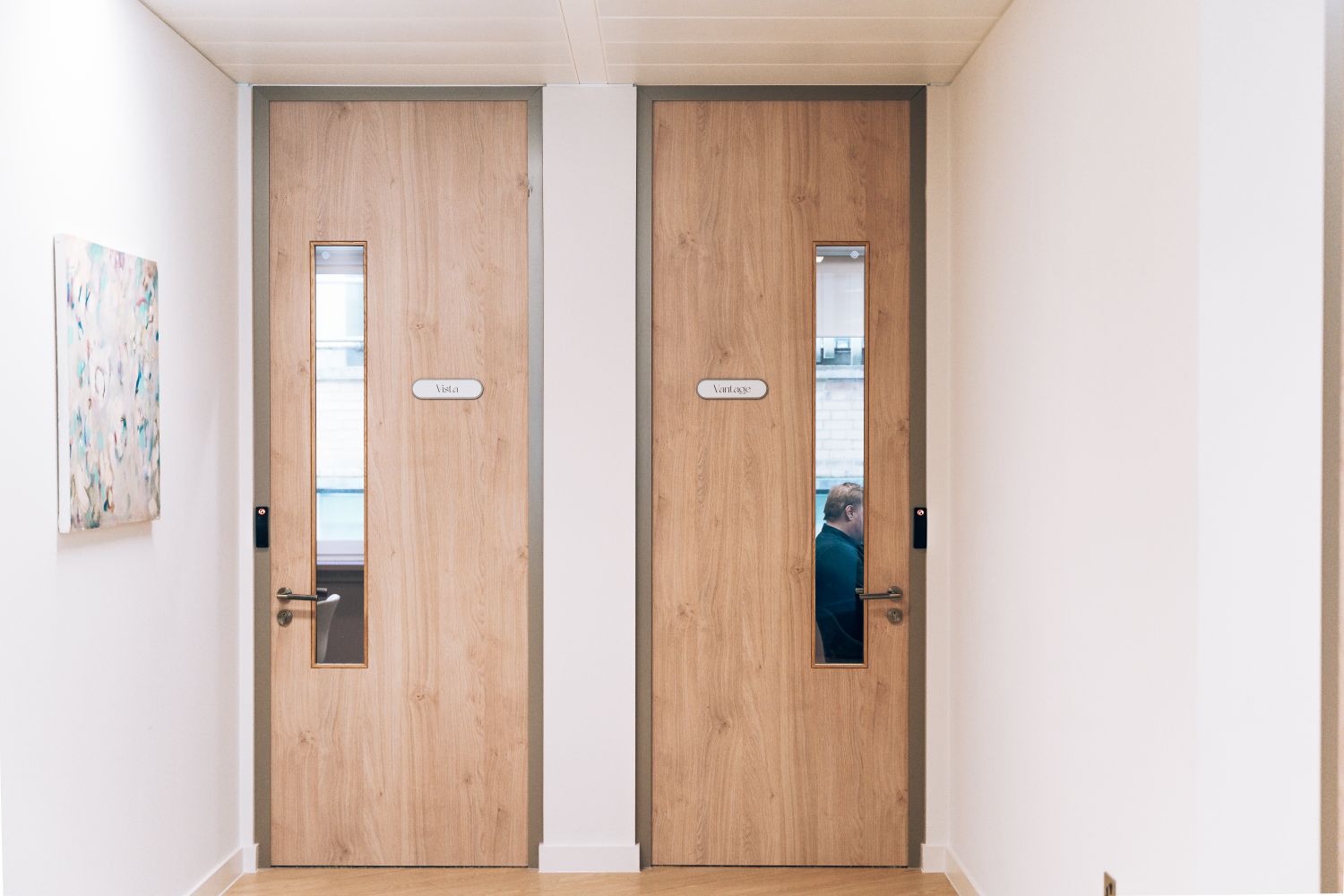
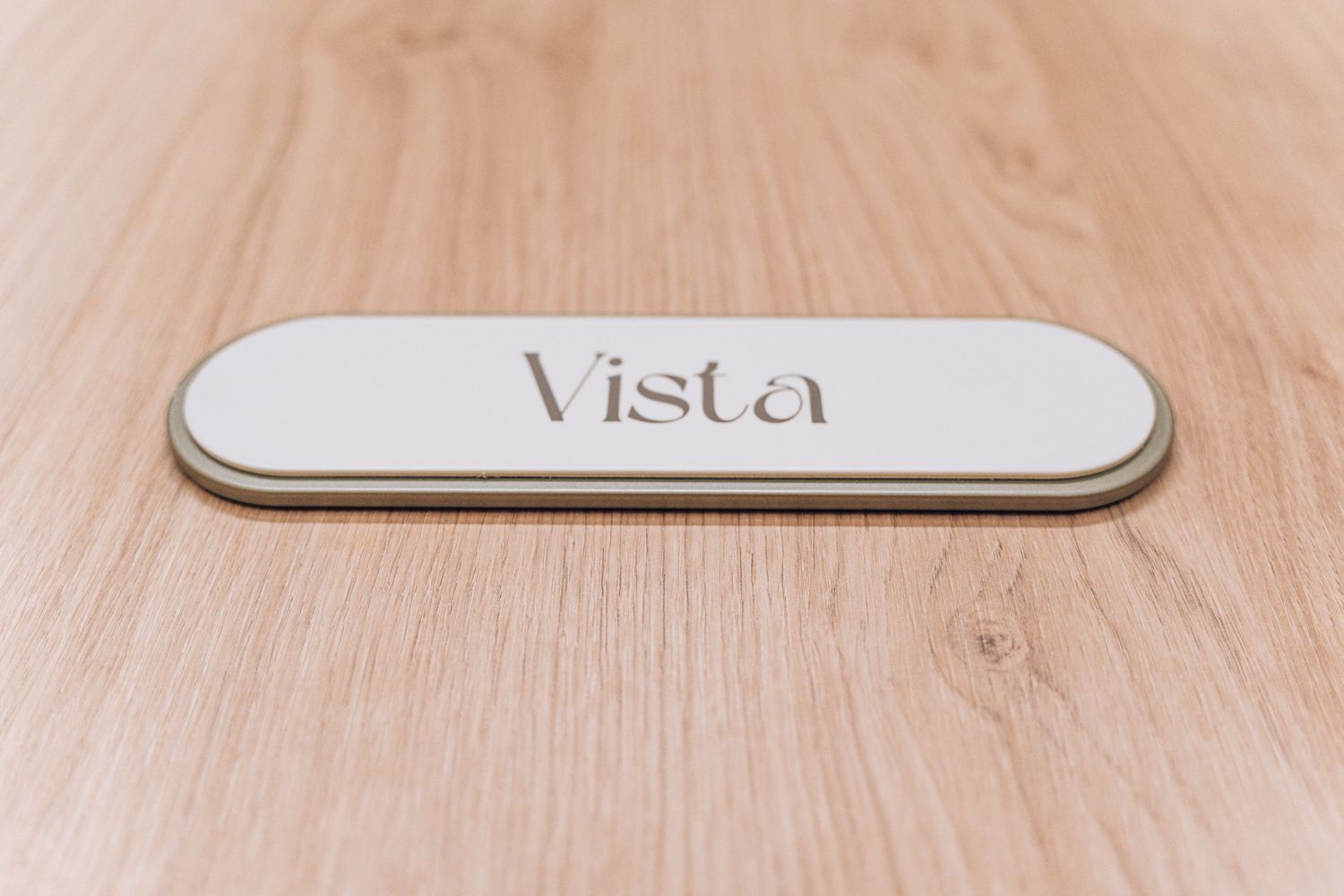
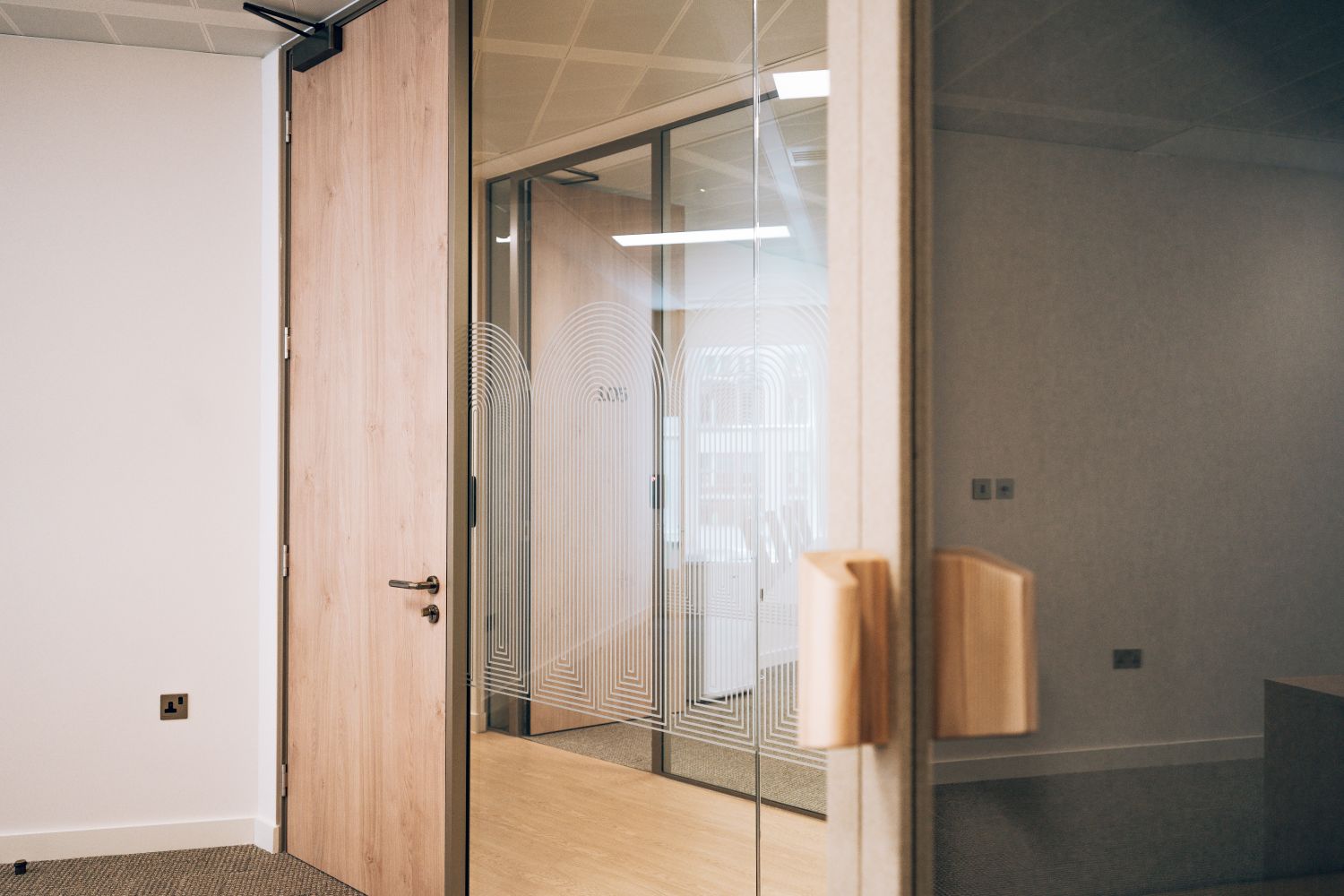
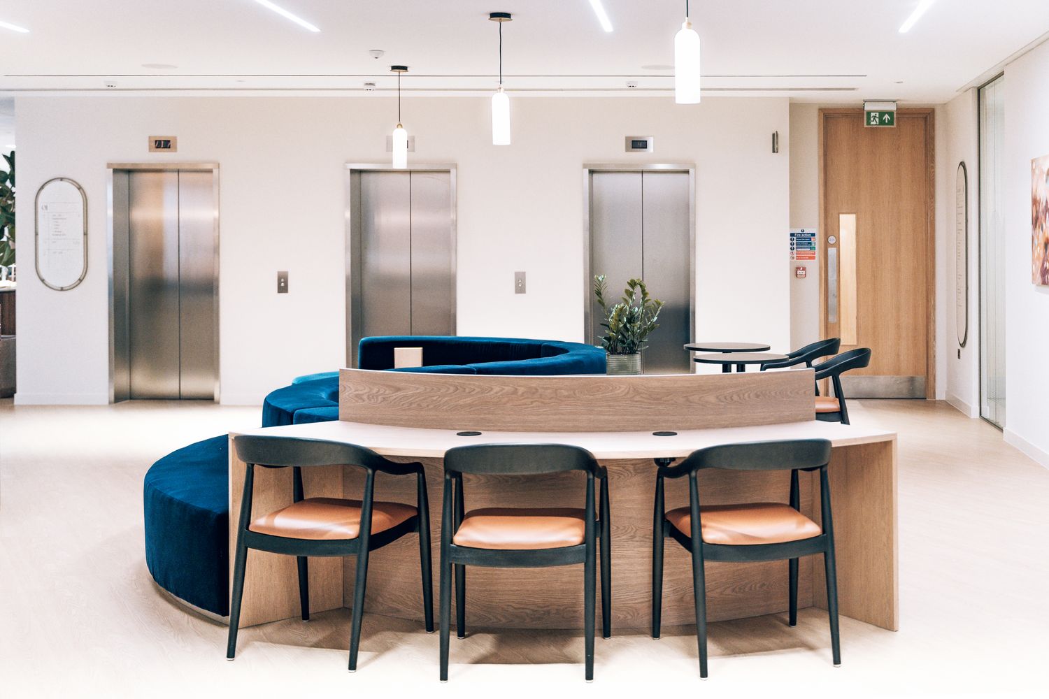
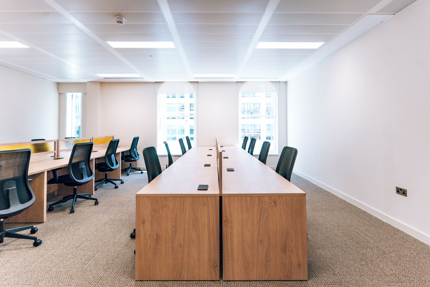
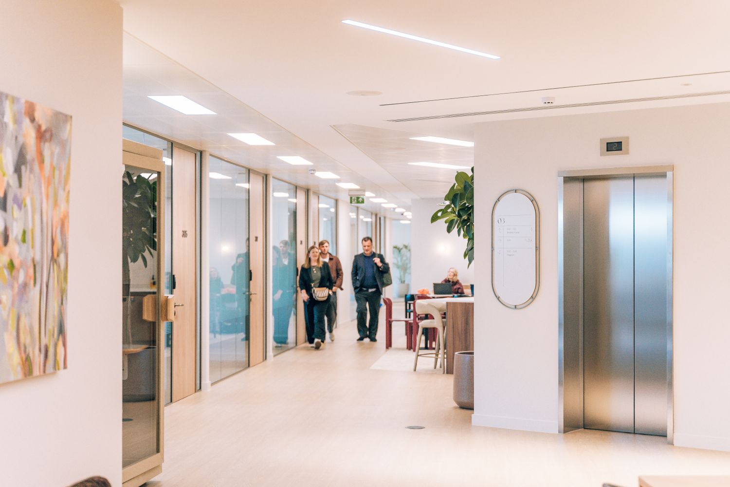
Spacemade’s overarching identity is deliberately clean and restrained, giving each of its locations room to develop a character of its own. At Ellisse, we carried that clarity into this venue through the use of carefully controlled typography, generous spacing and simple information hierarchy in the signage.
These quieter elements allowed the system to feel consistent with the wider Spacemade brand: contemporary, considered and easy to navigate, without competing with Ellisse’s own, more expressive visual identity.
Within that framework, the elongated ellipse, or lozenge, became the defining device for the location itself. Derived from the Ellisse logo, its curved geometry and symmetry introduced a subtle Art Deco influence that complemented the interiors, and the brief for 'something more premium'.
We developed it into a flexible design element that could frame information, form decorative patterns and become a three-dimensional architectural feature in its own right.
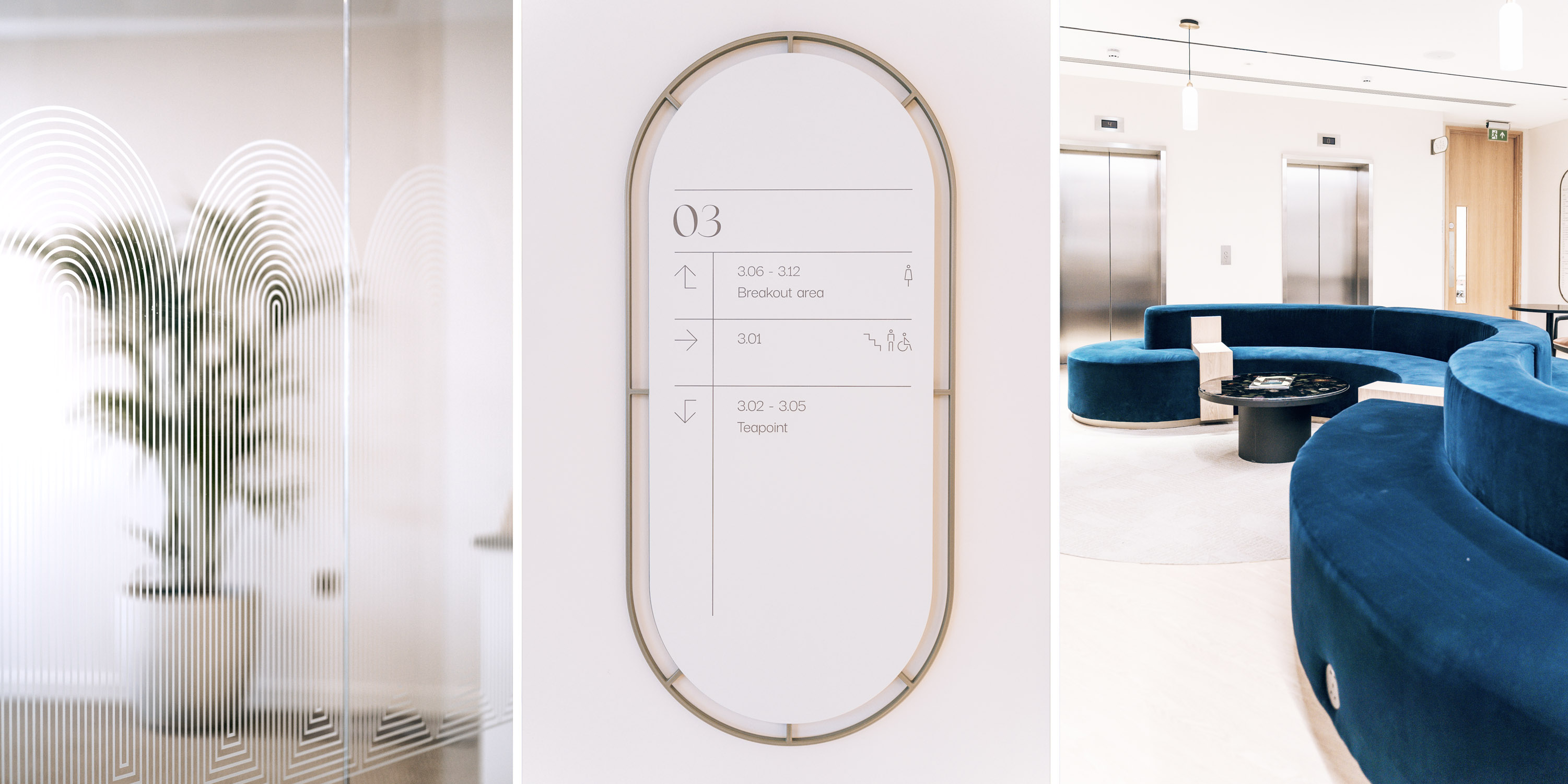
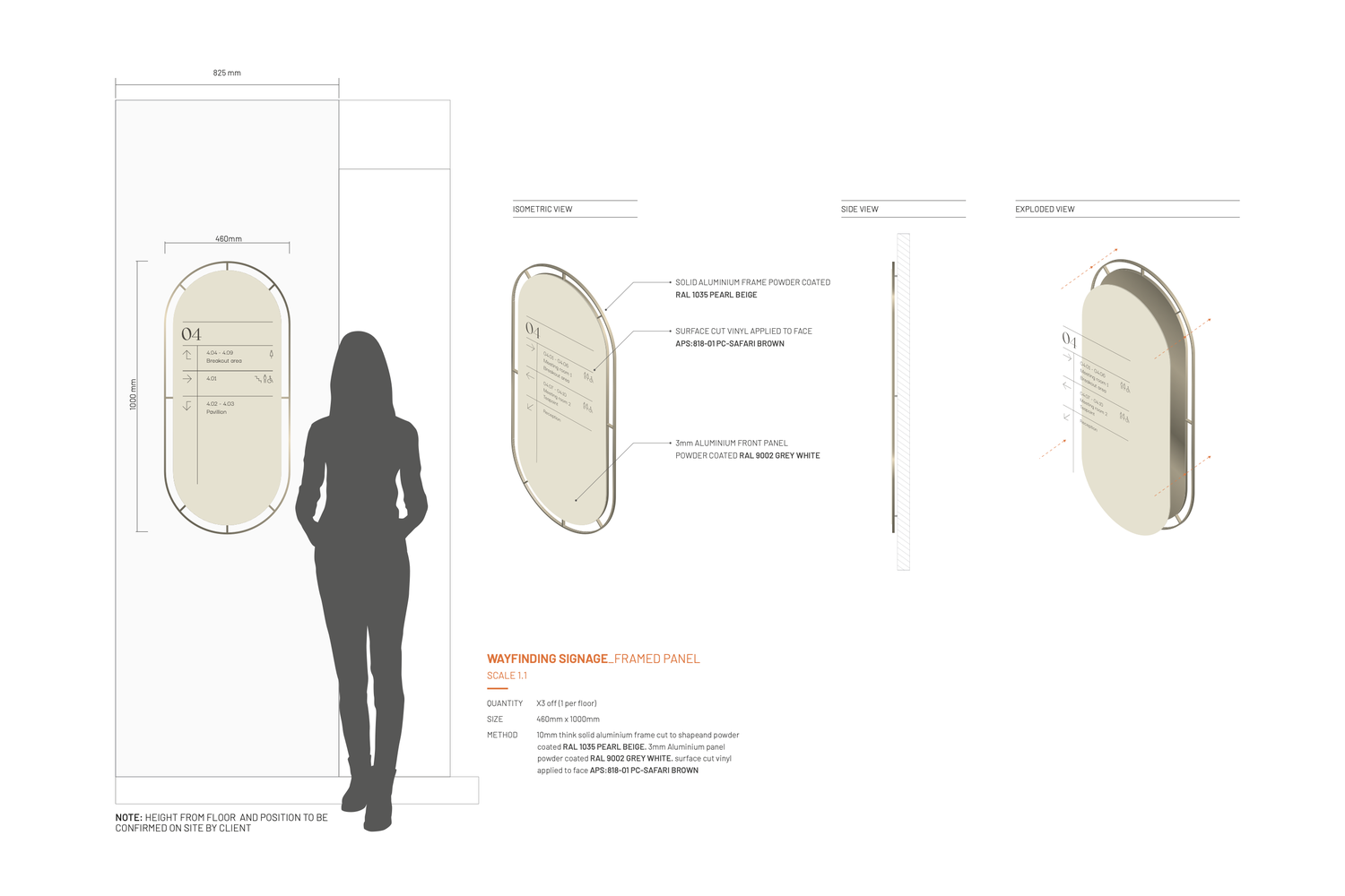
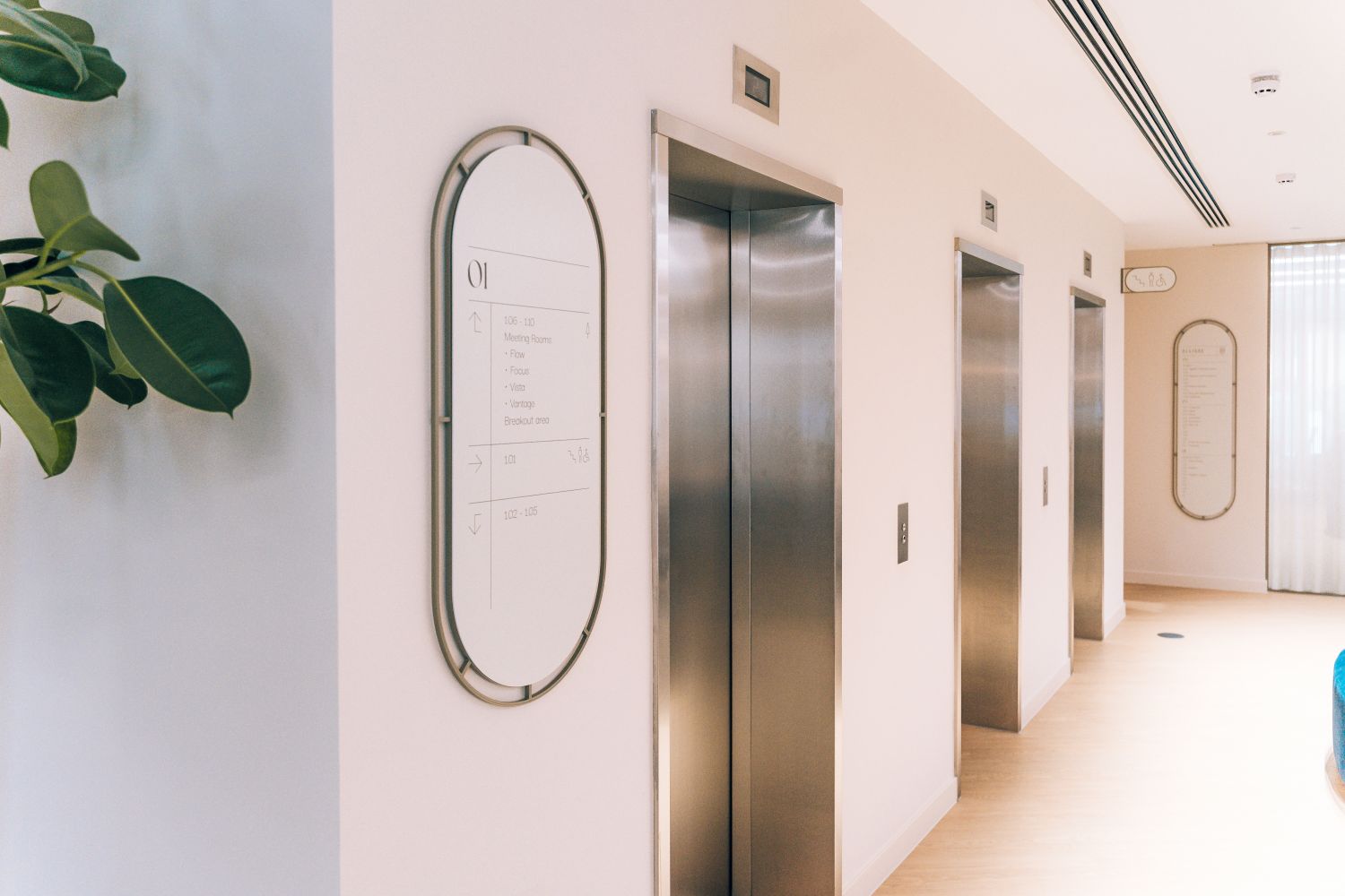
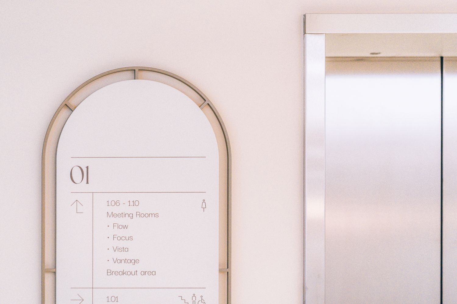
We explored a series of custom panel shapes, materials and framing systems before developing the curved, metal framed signs used throughout the finished space. The same outline was adapted vertically for directories and floor level wayfinding, then rotated horizontally for projecting signs and room identification. This created consistency without making every sign identical.
The finalised system paired solid aluminium frames in a soft pearl-beige finish with grey-white faces and warm brown graphics. The palette was luxurious but neutral, allowing the signs to feel substantial and premium while remaining integrated with the surrounding interior.
The system was applied across the building through:
Branding signage: reception logo and illuminated wall
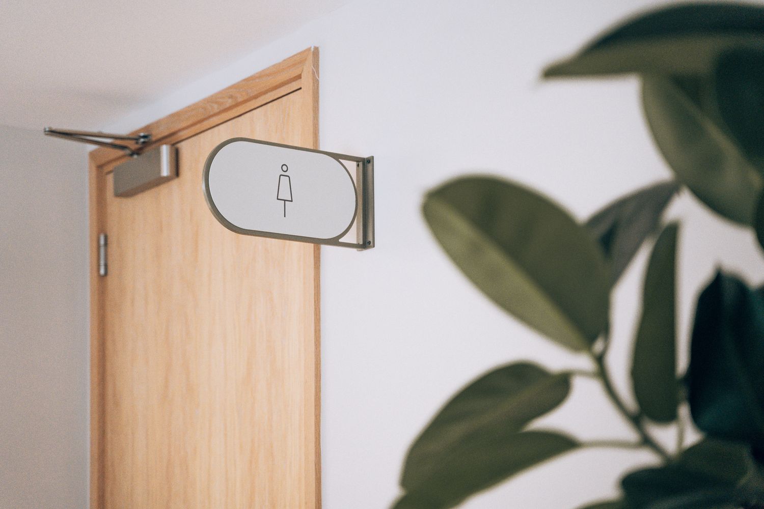
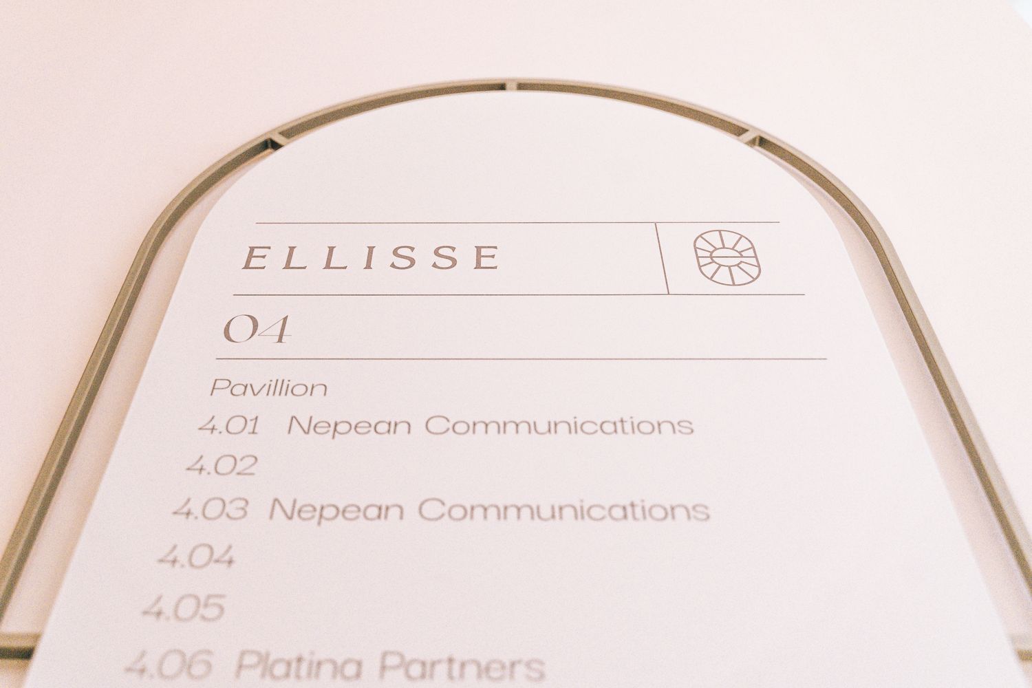
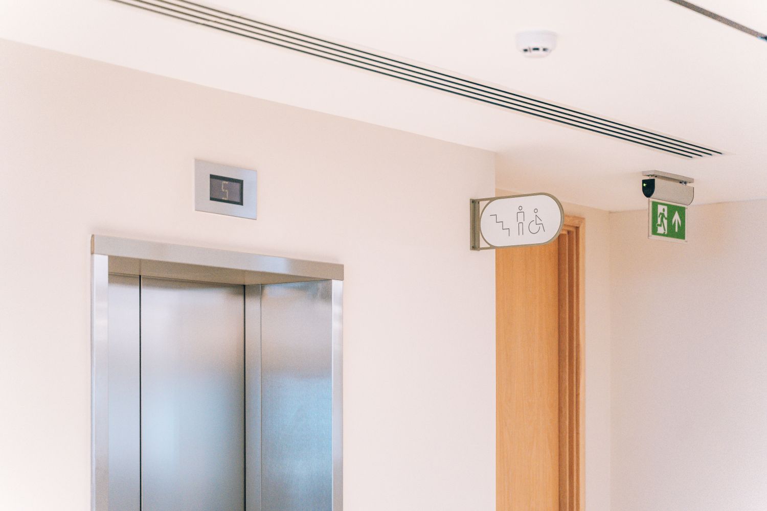
Navigational signage: building directories and double-sided projecting signs
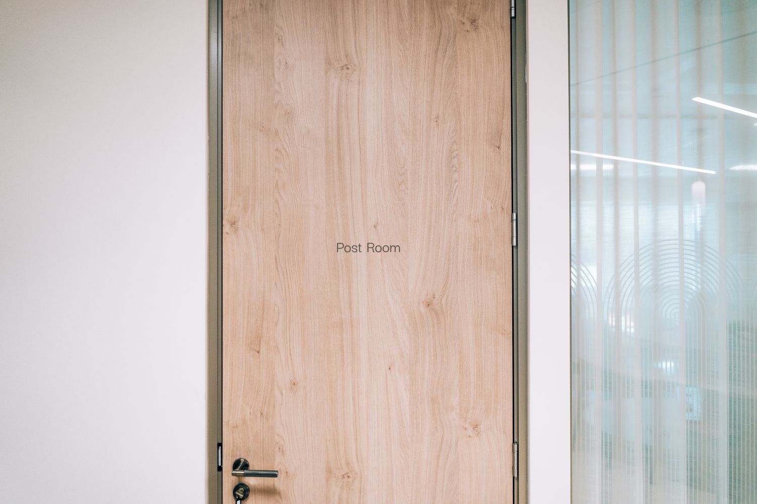
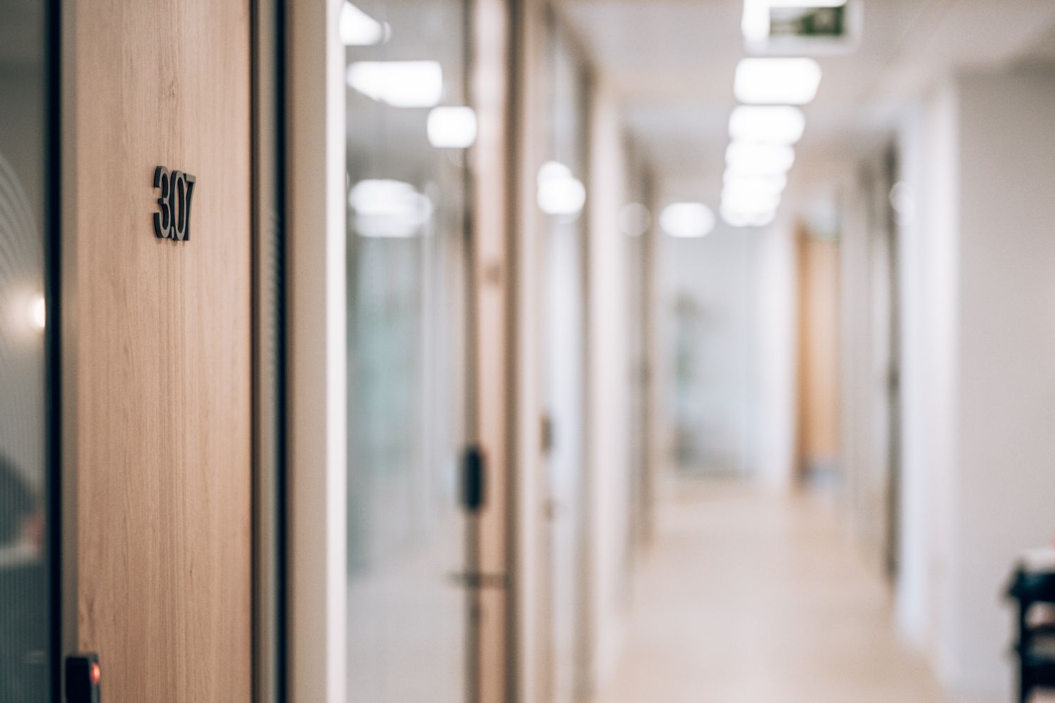
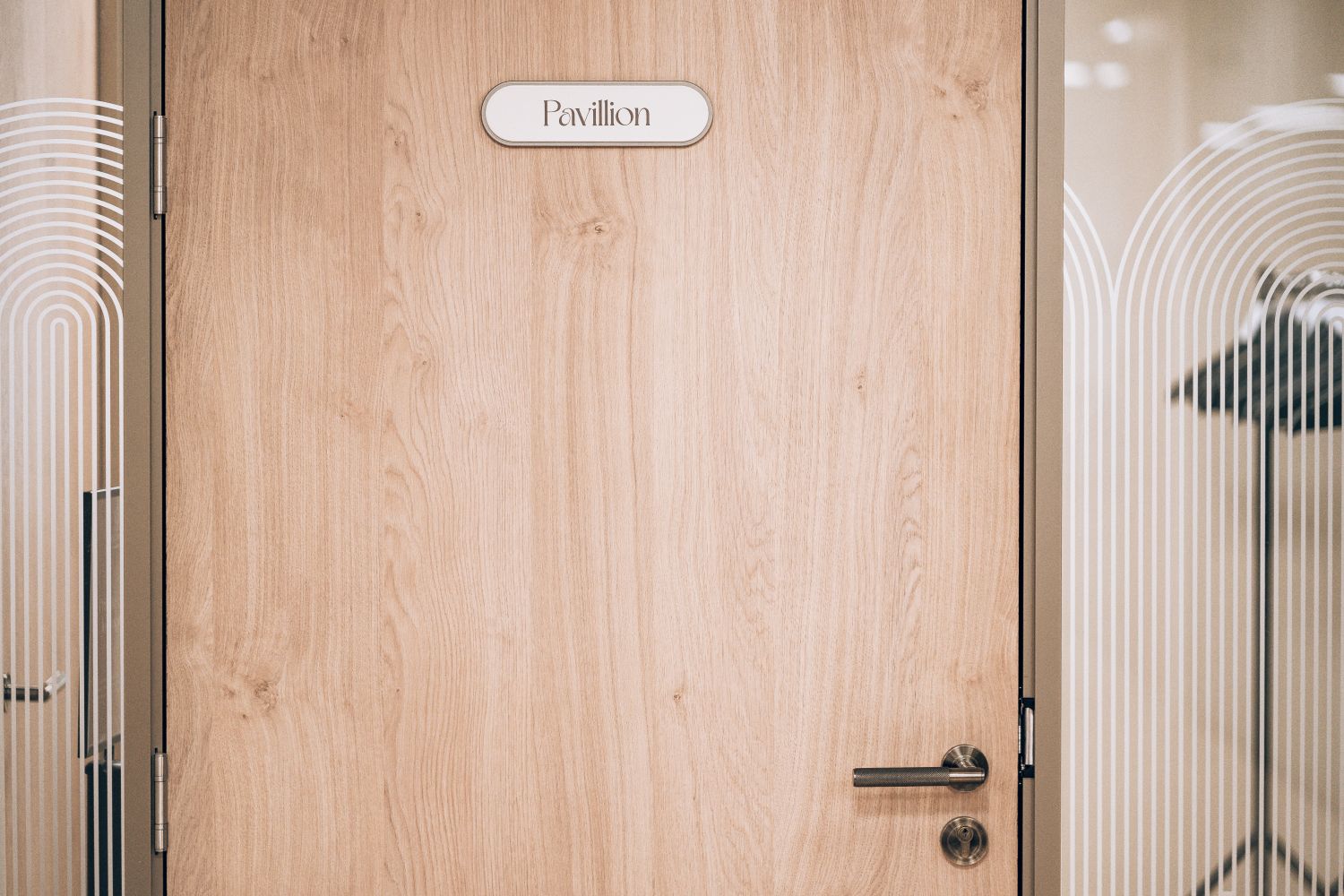
Identification signage: meeting room name plaques, office numbers, kitchen and amenity icons
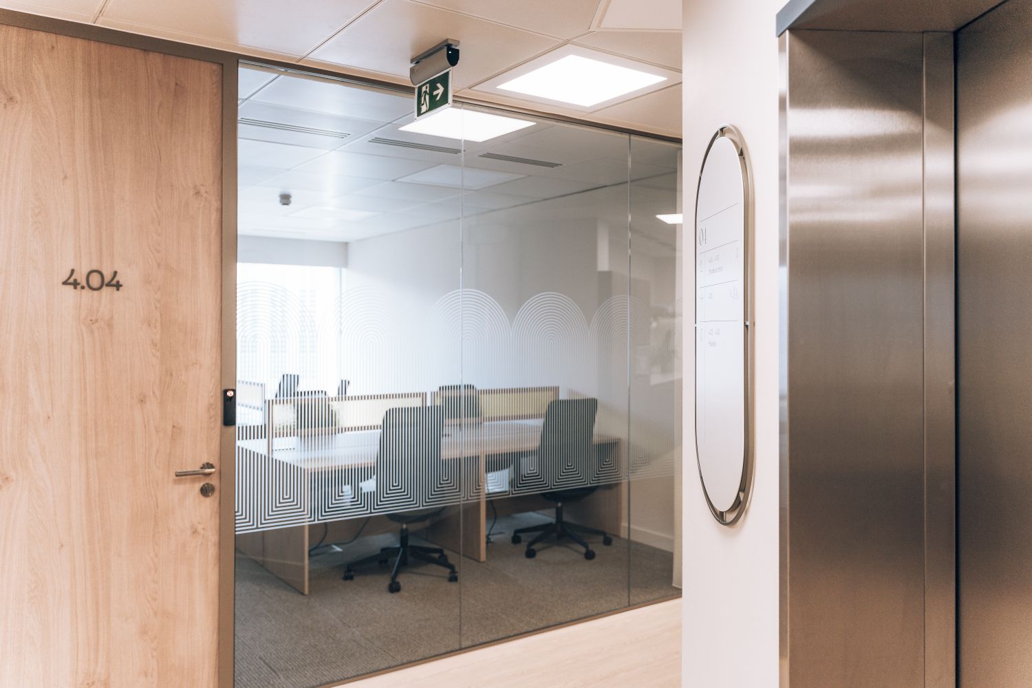
Glass manifestation: branded privacy and visibility graphics across glazed partitions
Each element was designed as part of the same family, using common proportions, curves and material finishes rather than relying on standard workplace signage formats.
Branding Signage
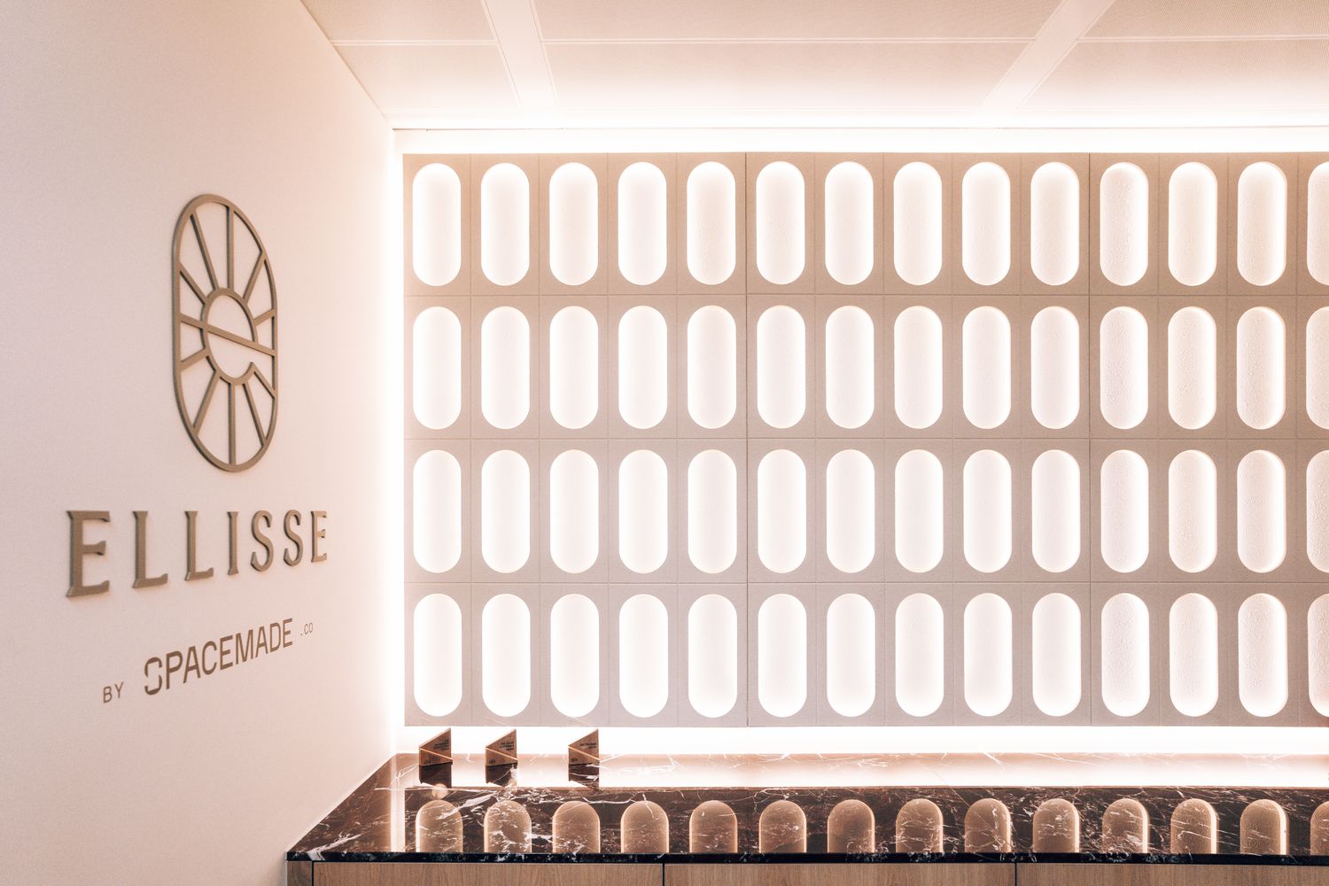
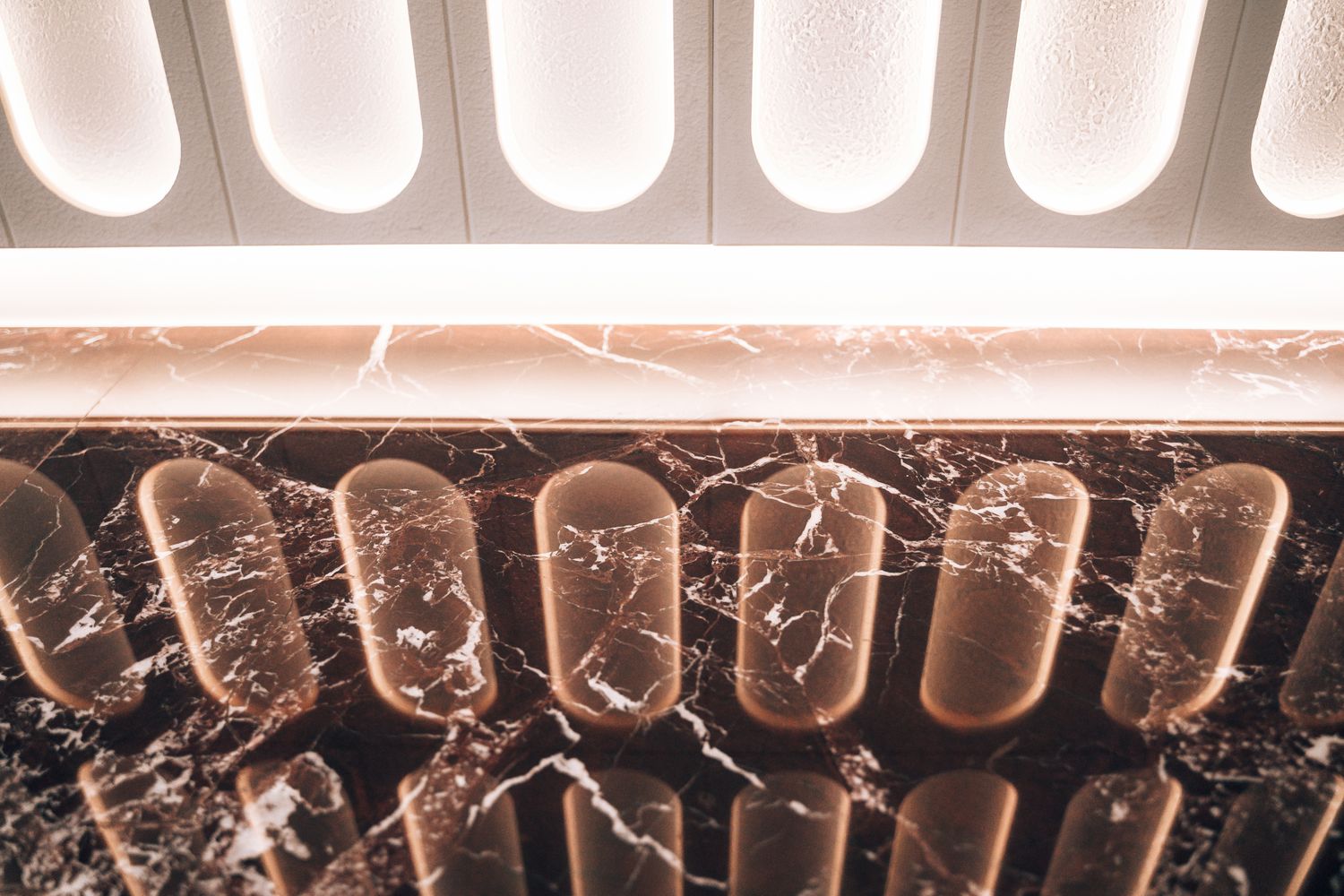
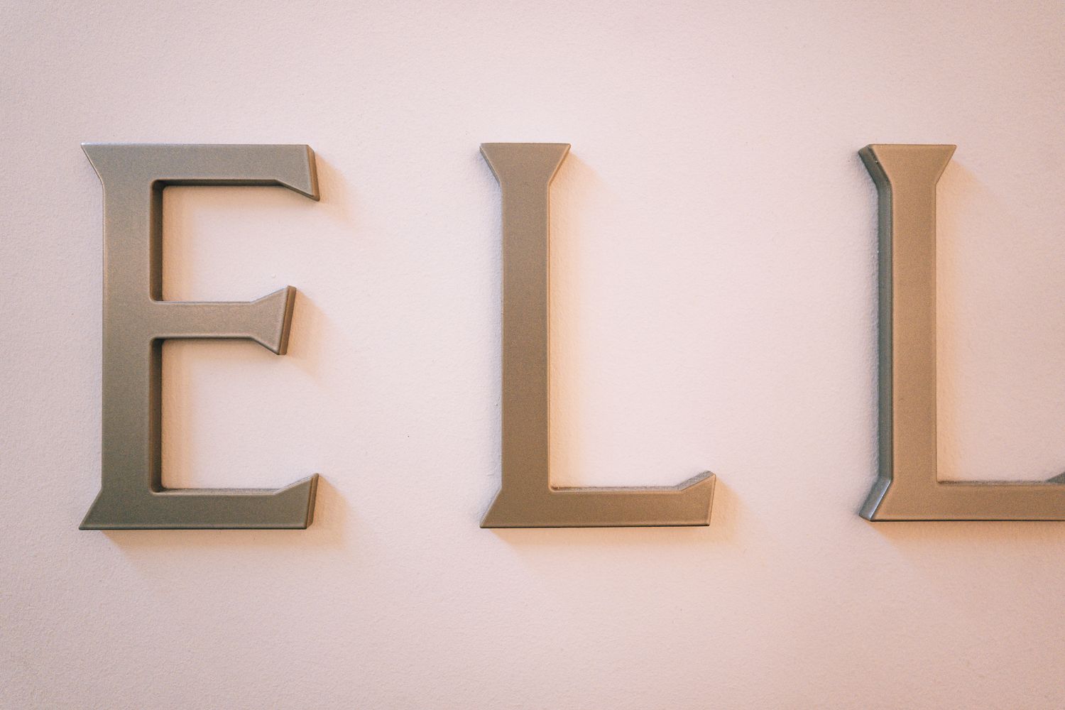
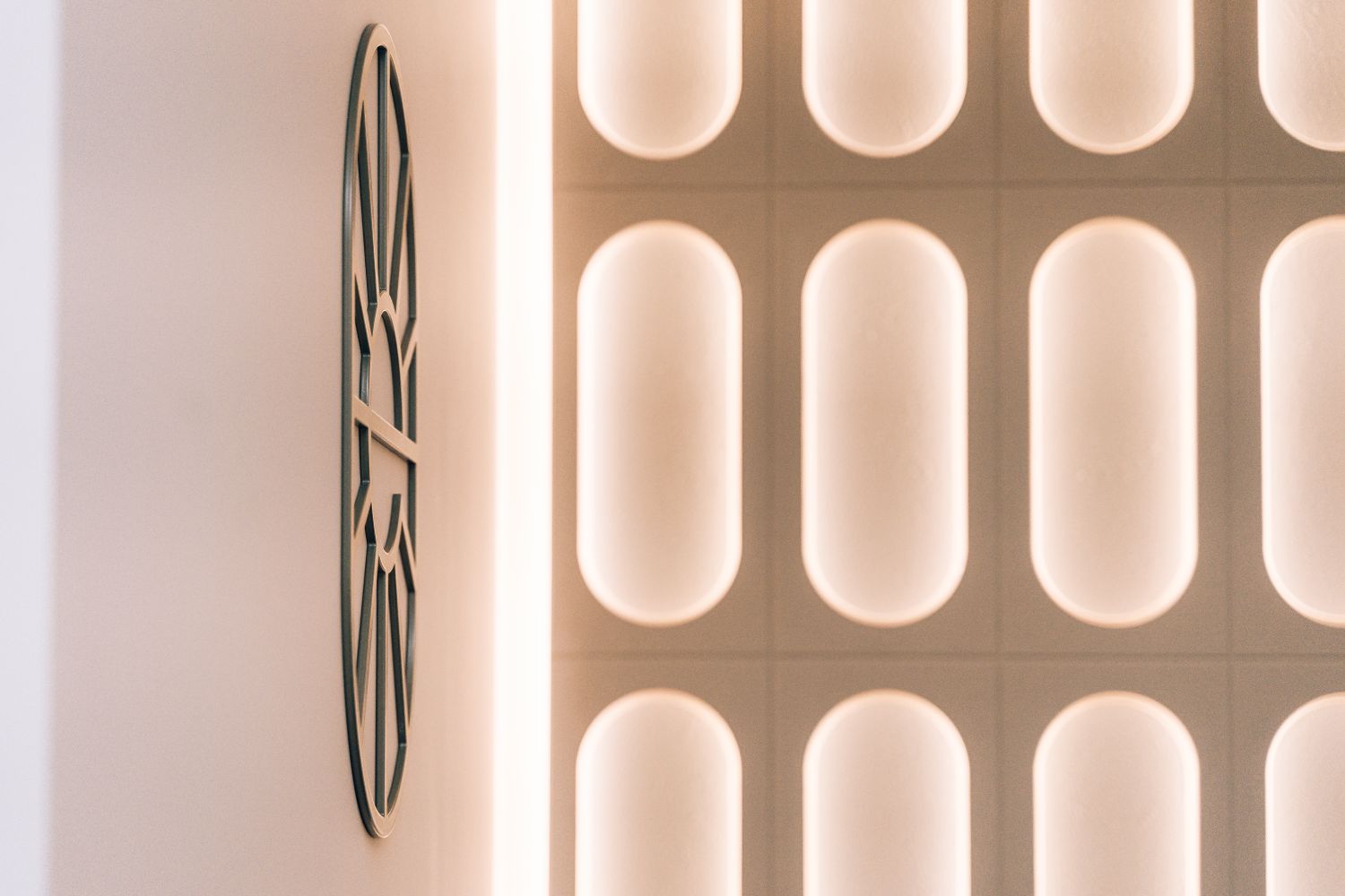
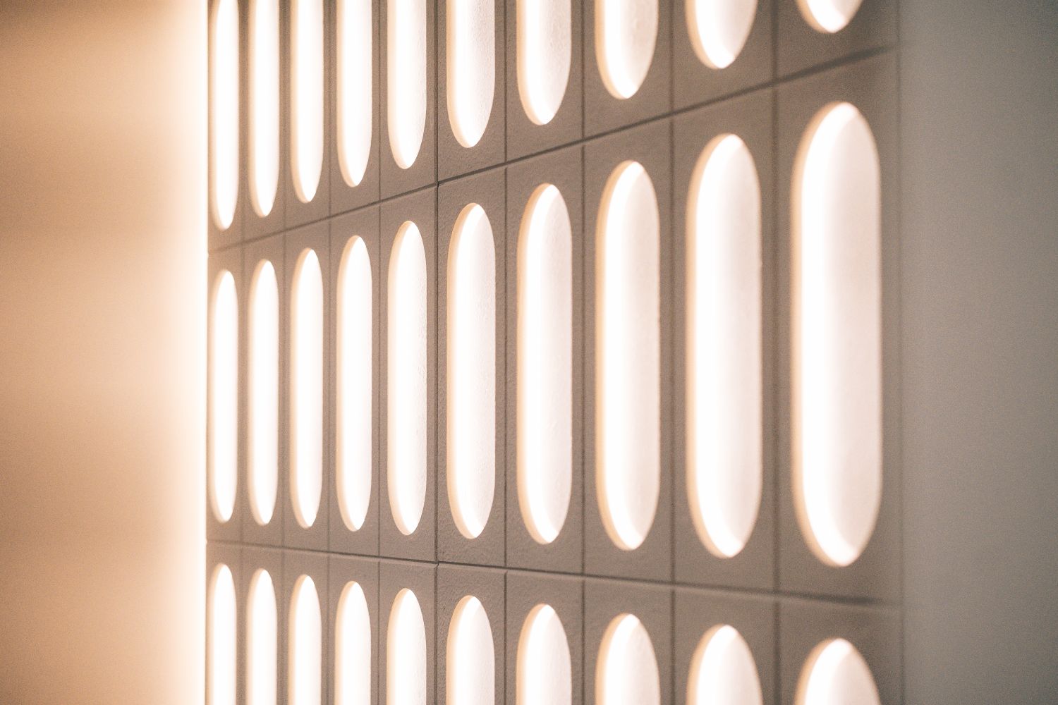
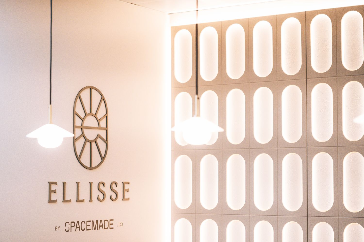
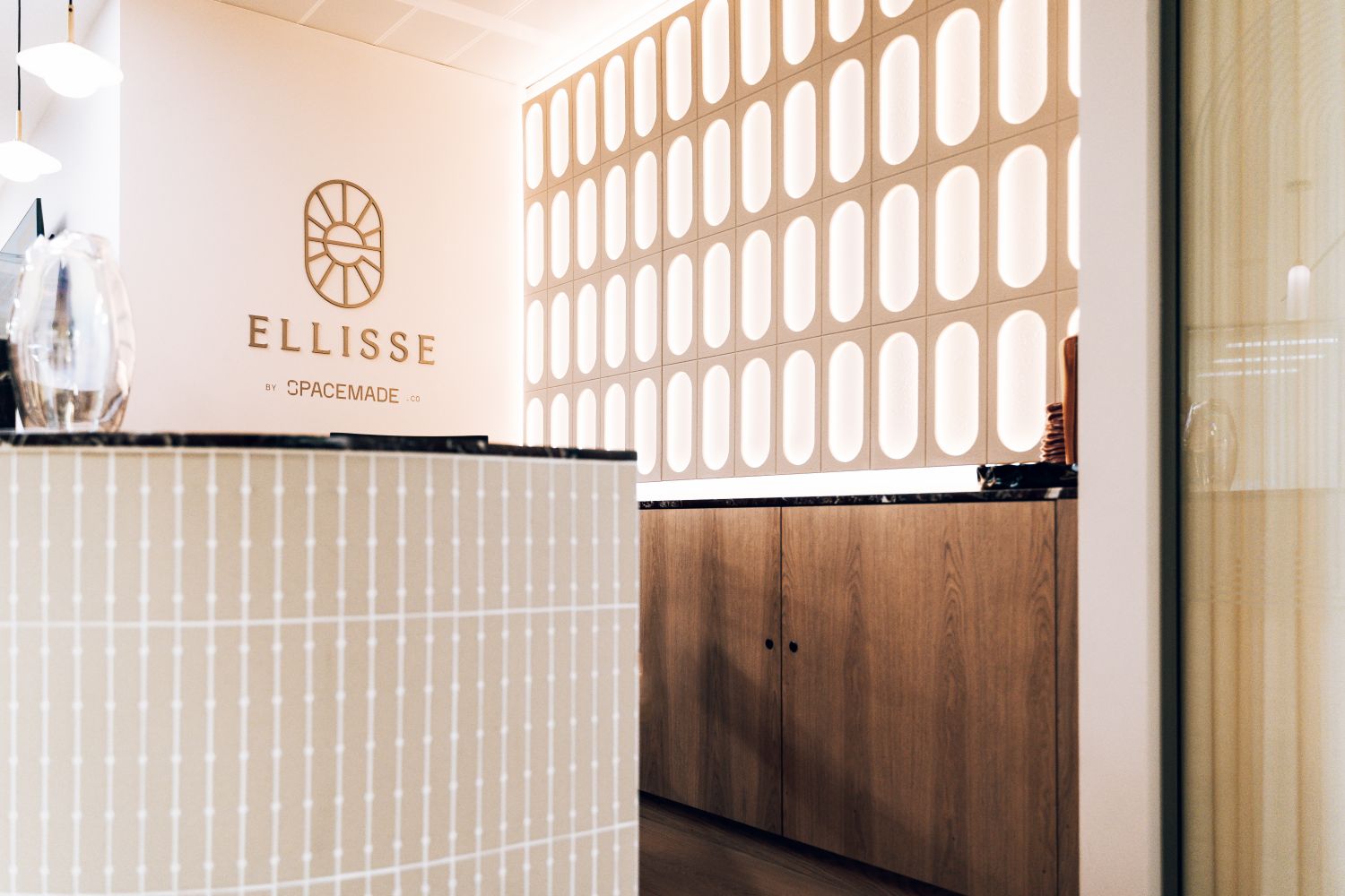
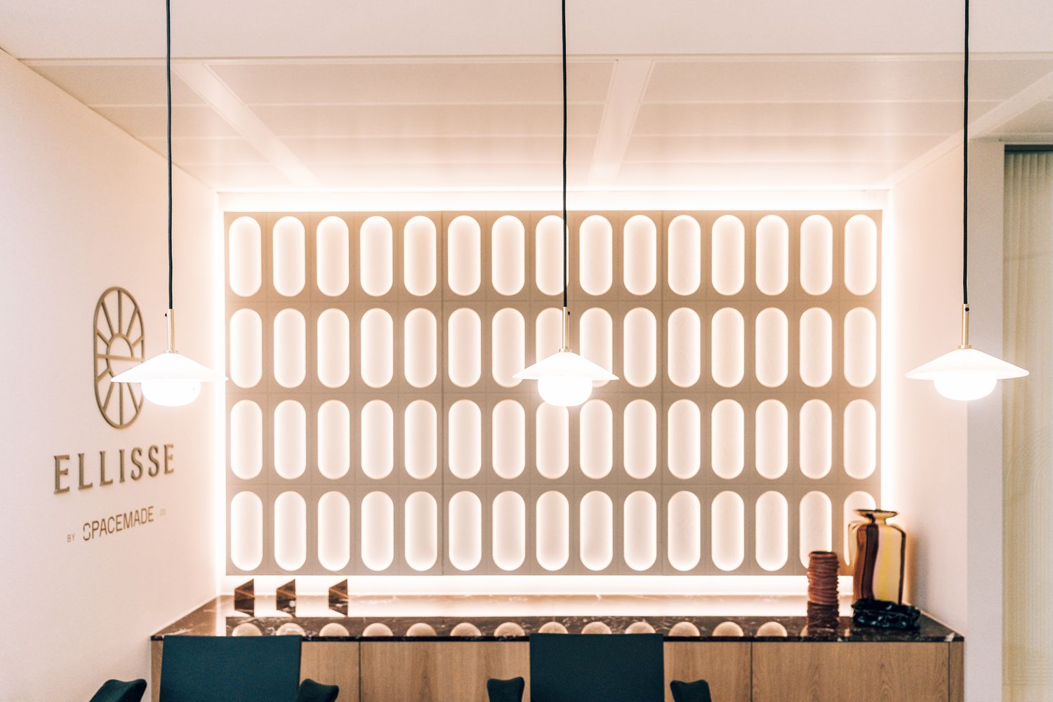
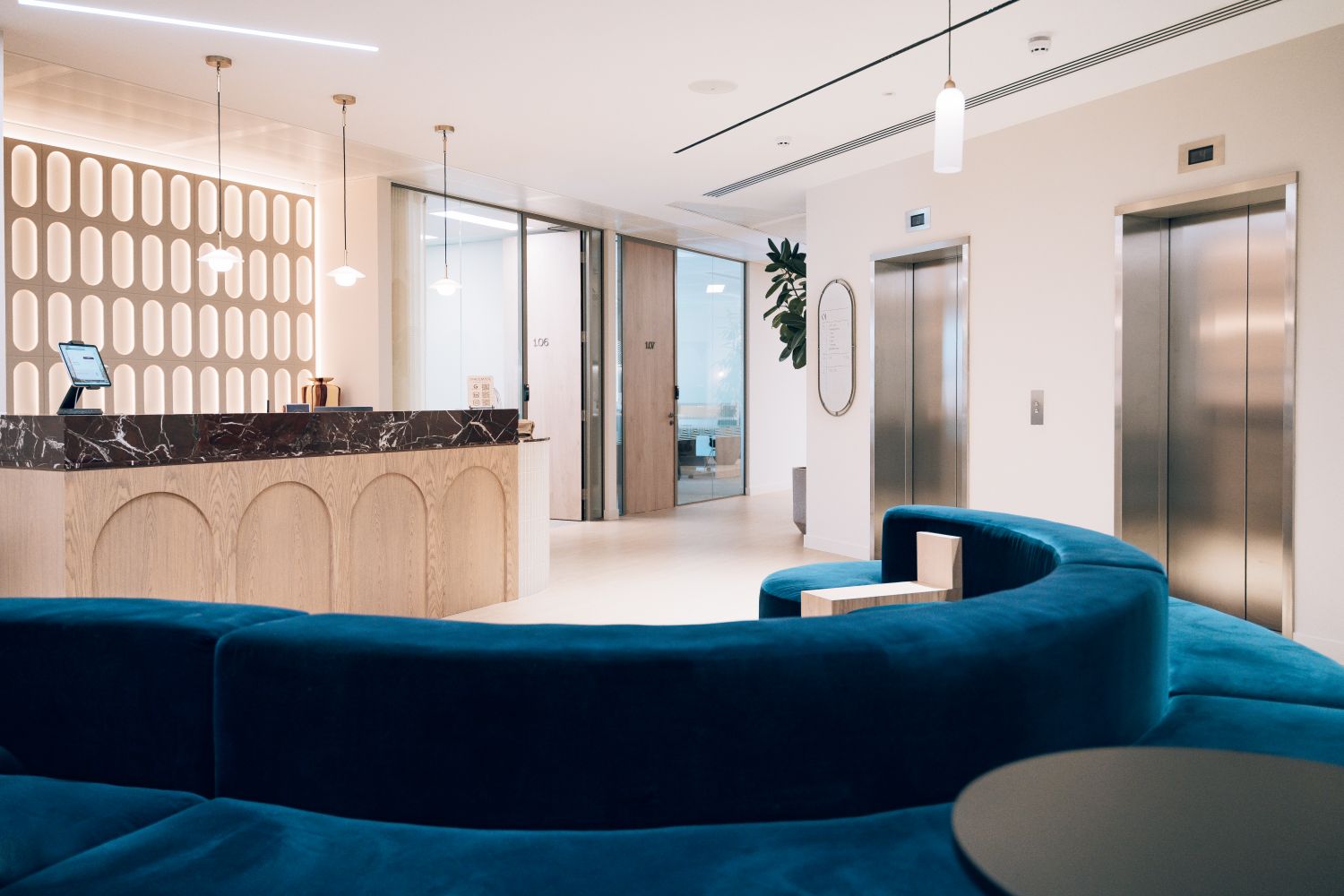
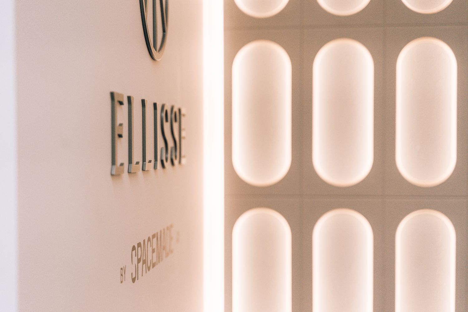
The reception brings the Ellisse identity into the space at its most architectural. Dimensional logo and lettering establishes the brand on arrival, while the illuminated feature wall takes the same curved form and expands it into a large scale composition of repeating pattern, depth and light.
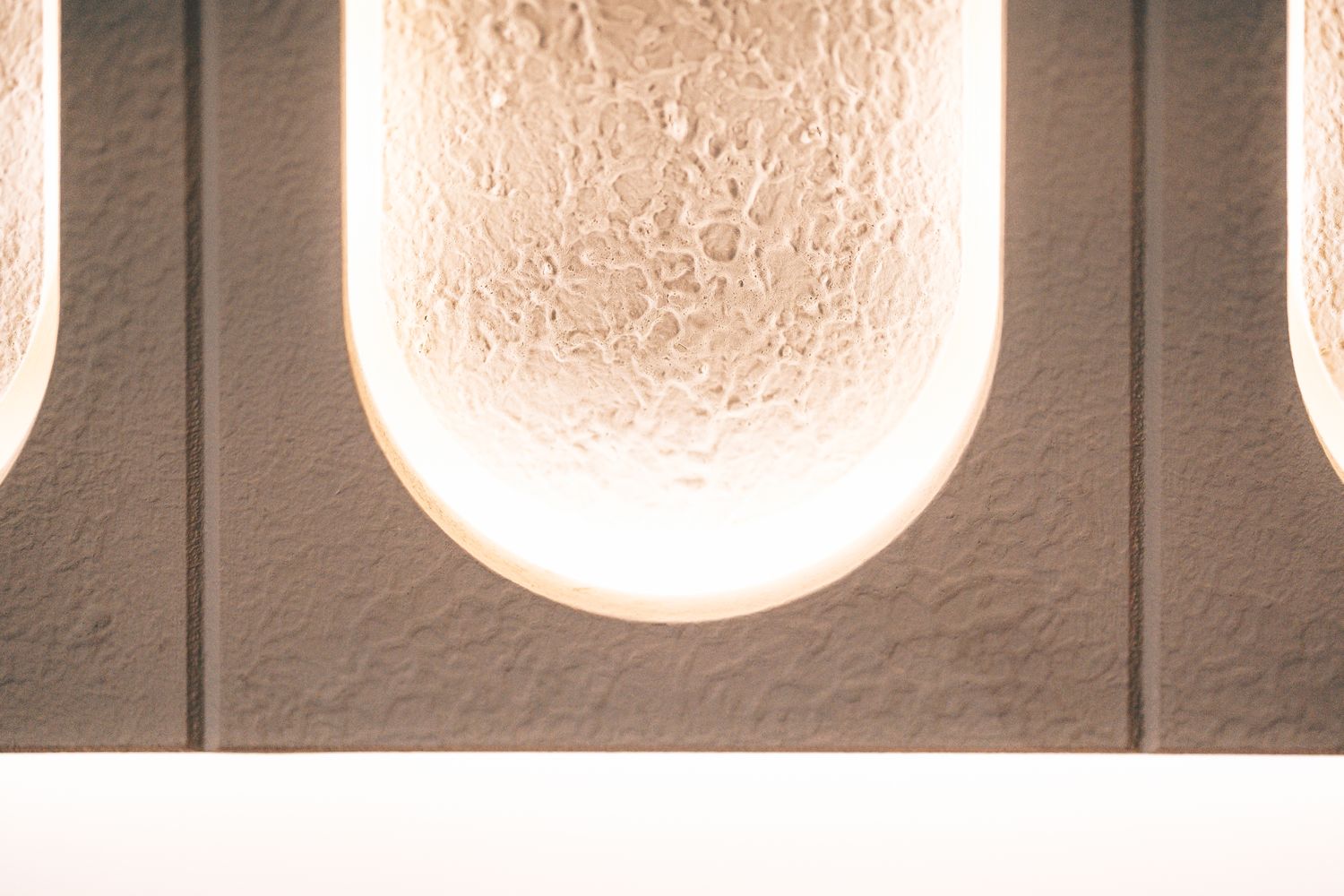
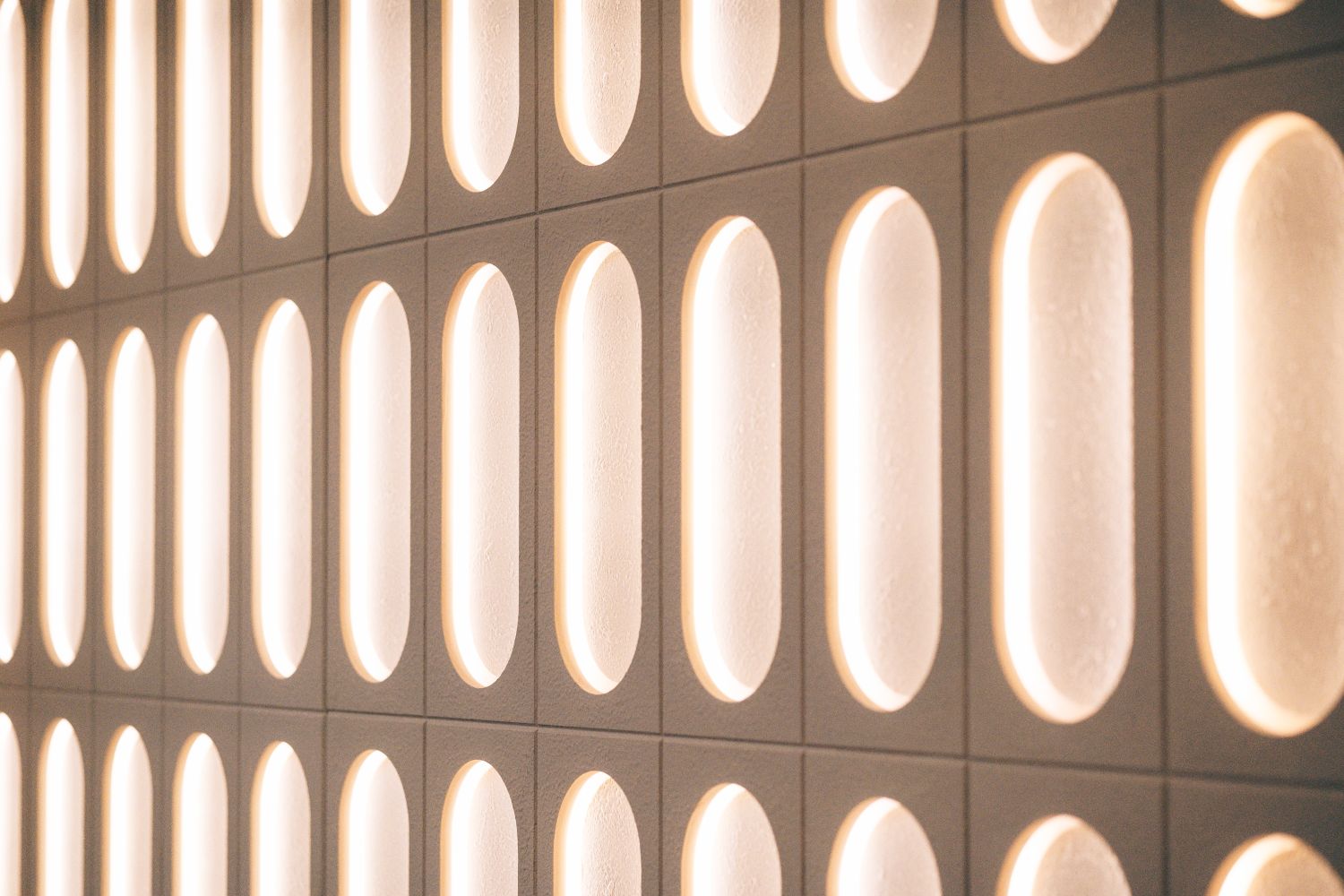
The logo and lettering are made from 5mm aluminium, powder coated in a warm finish. The feature wall is built from 12mm interlocking MDF panels, CNC-cut and V-engraved, with 60 individual recessed forms finished in a specially formulated textured paint. White LEDs are mounted behind on spacers to create the halo effect and varying sense of depth.
Navigational Signage
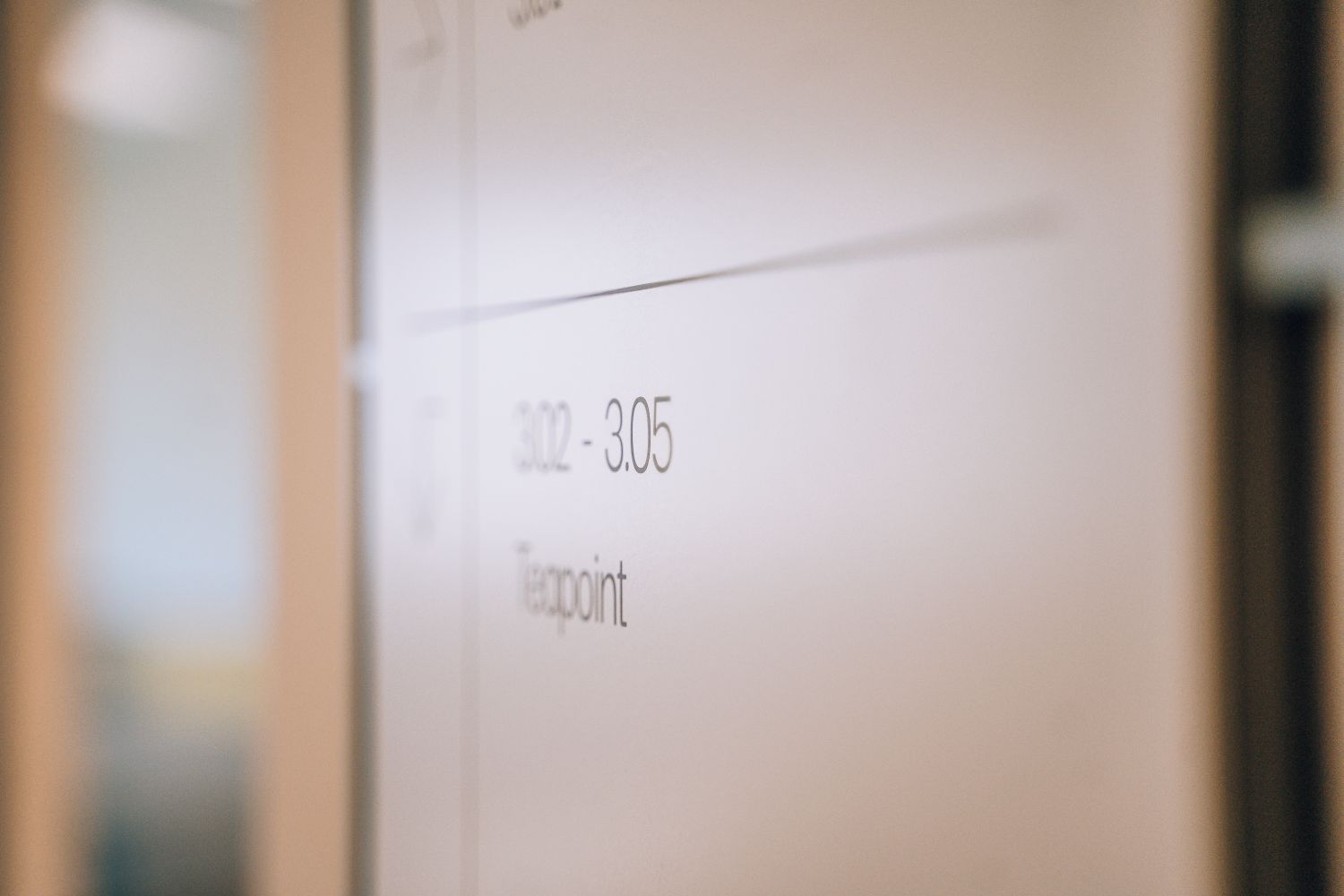
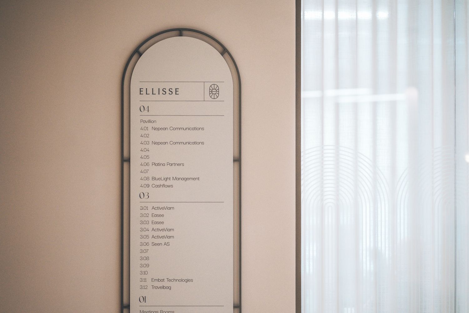
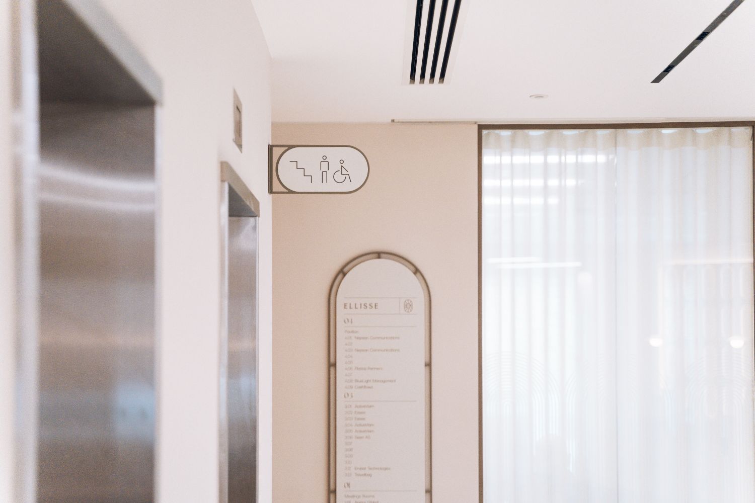
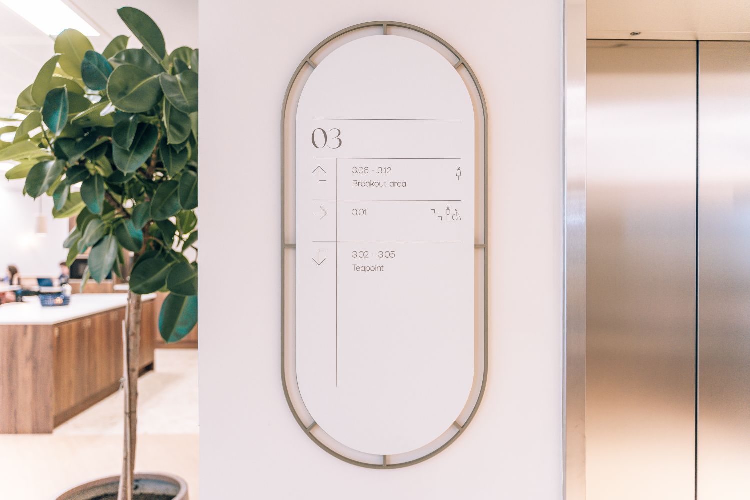
The main wayfinding points use the Ellisse lozenge as a consistent framing device across directories and double-sided projecting signs. Clear information hierarchies, restrained finishes and the repeated curved form give each sign presence without competing with the interior.
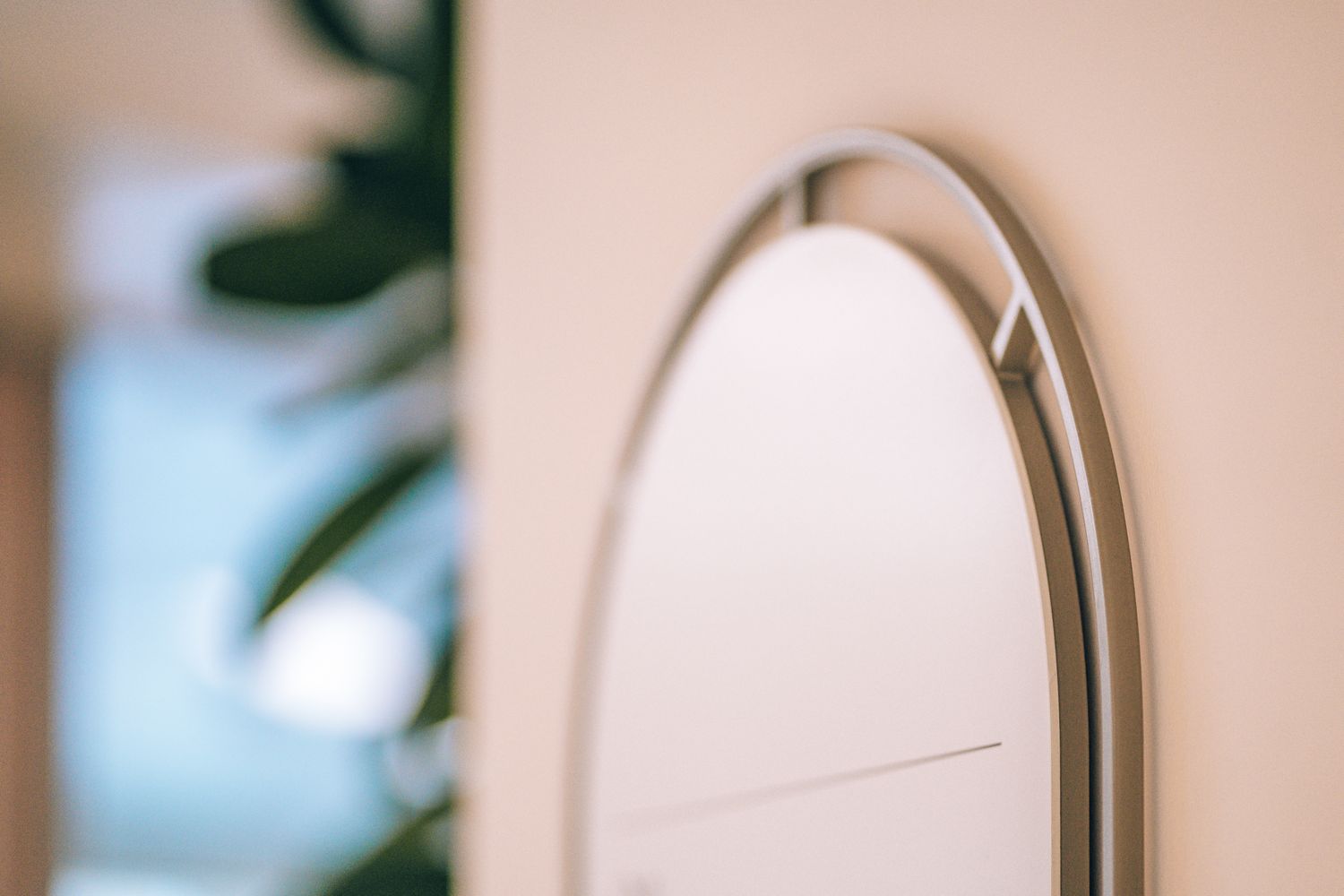
The directories use 10mm solid aluminium frames, cut to shape and powder coated in a pearl-beige, with 3mm aluminium faces in a grey-white and warm brown applied vinyl graphics. The projecting signs continue the same language with shaped aluminium frames and 1mm stainless steel face panels.
Identification Signage
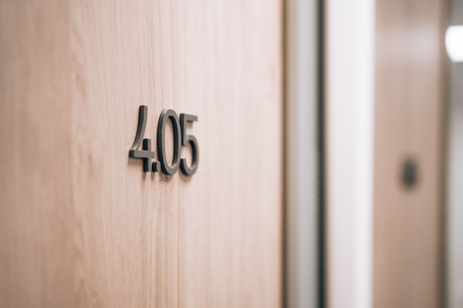
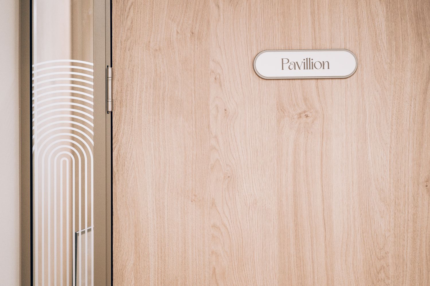
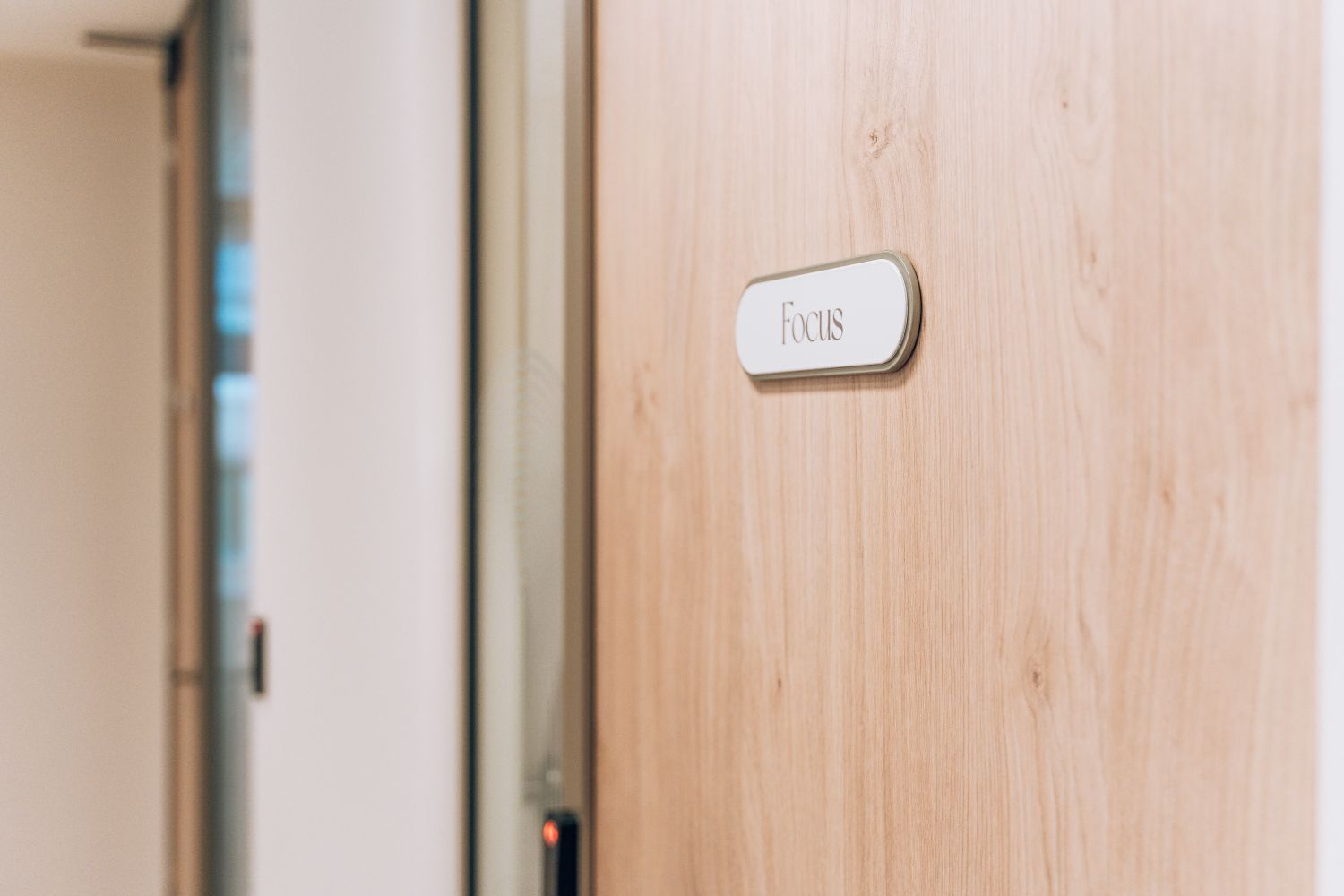
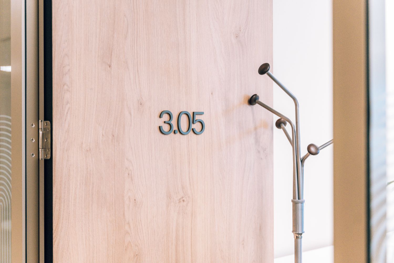
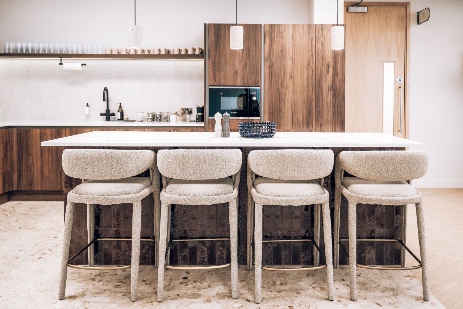
At the smaller scale, the system becomes quieter and more functional. Meeting room plaques, office numbers, kitchen graphics and amenity icons carry the same typography, proportions and material language through to the everyday details of the workspace. We loved that the meeting rooms themselves use a softer naming system, such as Focus, Flow, Vista and Vantage, creating a vocabulary around concentration and retreat rather than relying on purely numerical room names.
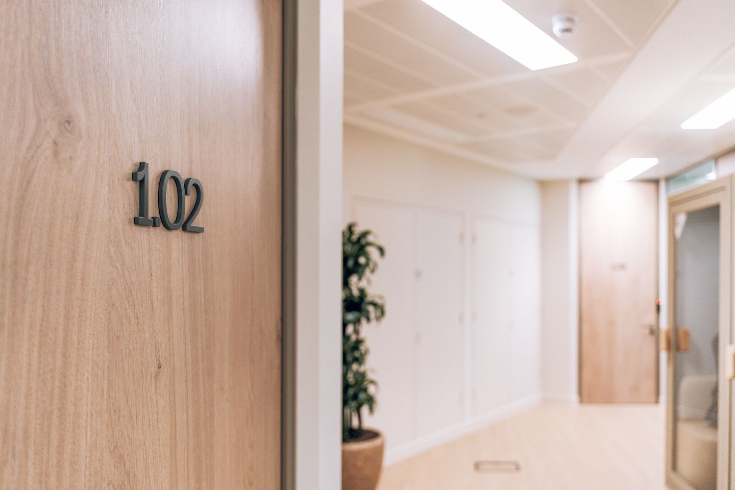
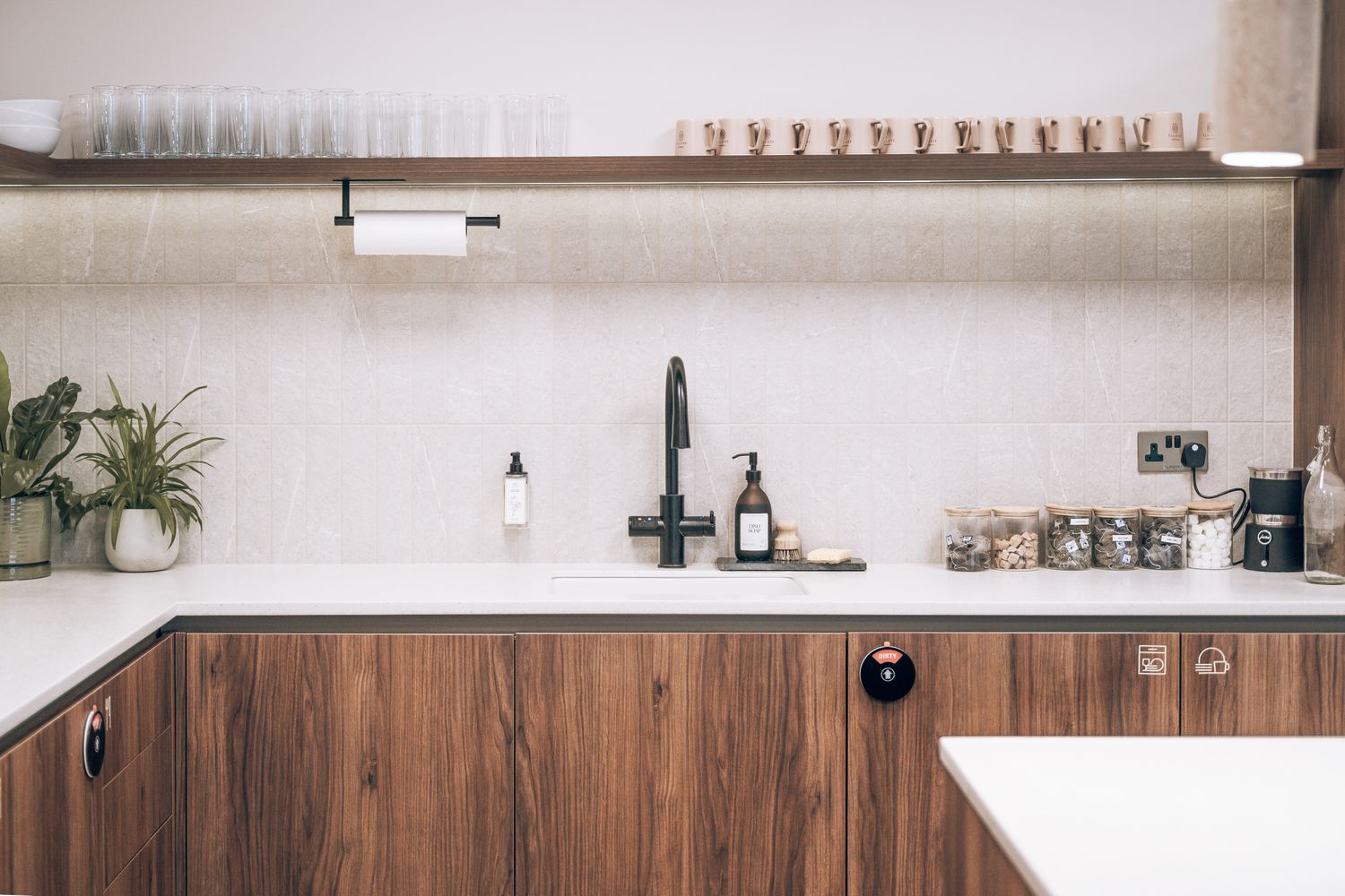
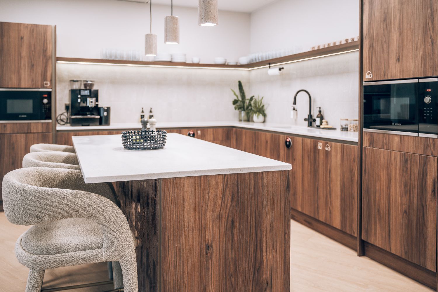
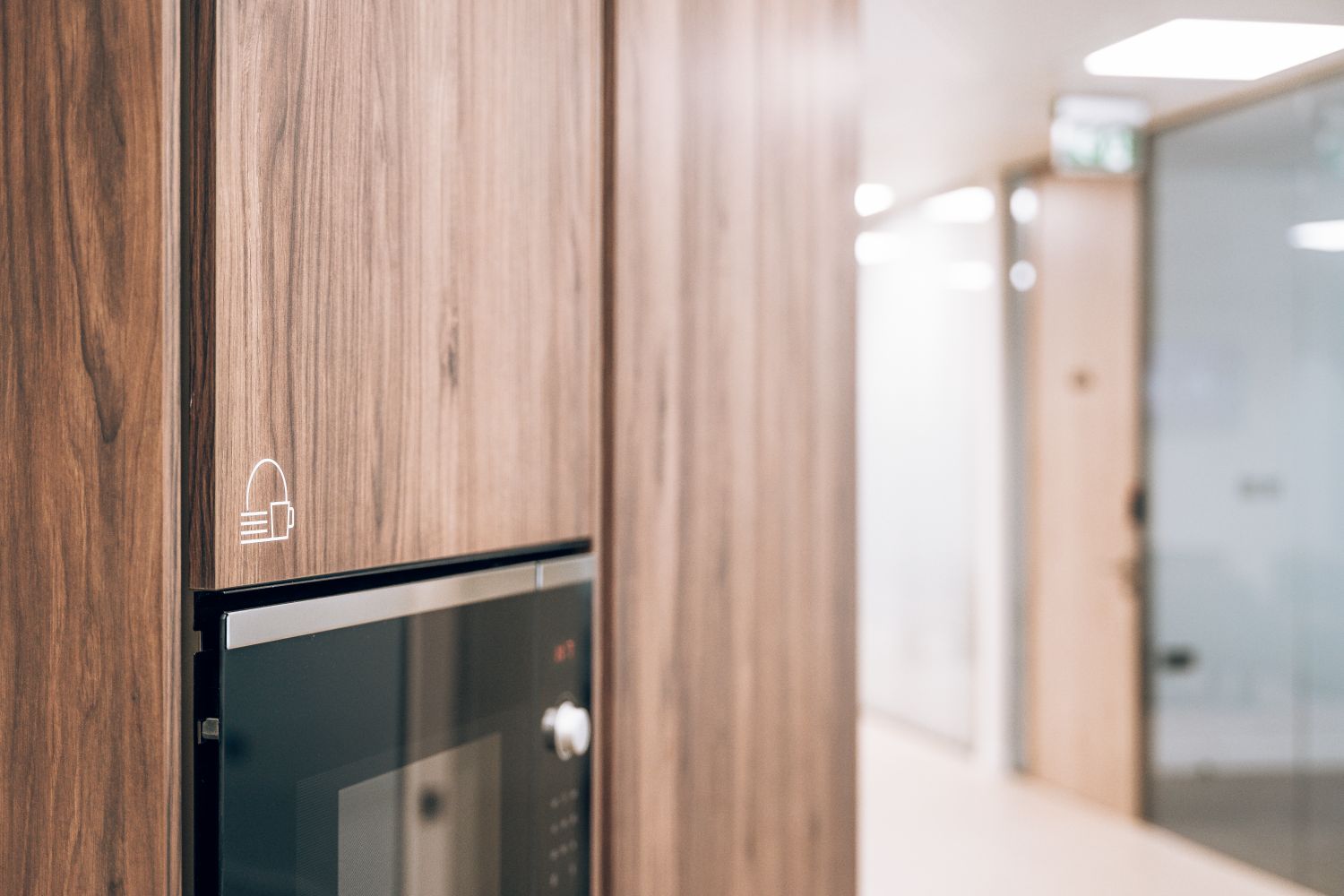
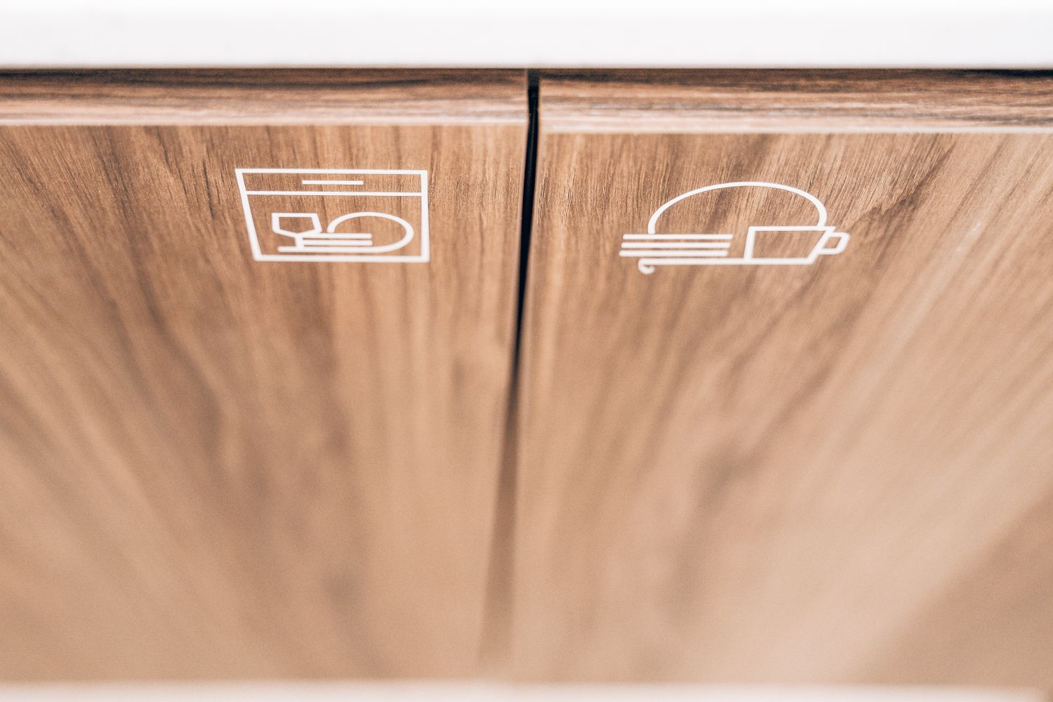
The meeting room plaques use 5mm solid aluminium frames with 1mm stainless steel face panels, in keeping with the elliptical directories and projecting signs, while the office numbers are 5mm laser-cut acrylic, painted to match the wider graphics and fixed directly to the doors. Kitchen and amenity icons are produced in surface-cut matt vinyl, keeping these more functional elements visually light.
Glass Manifestation
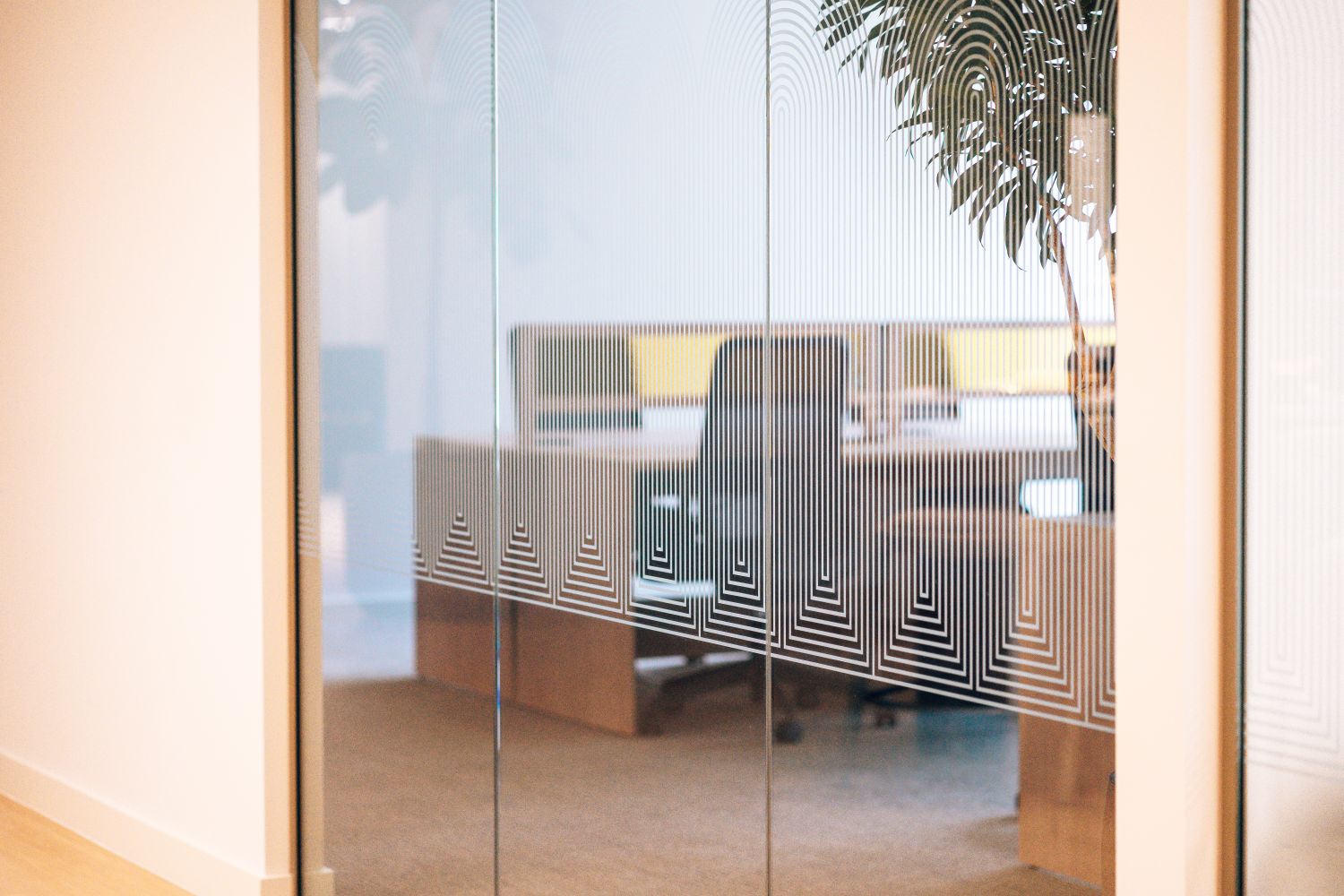
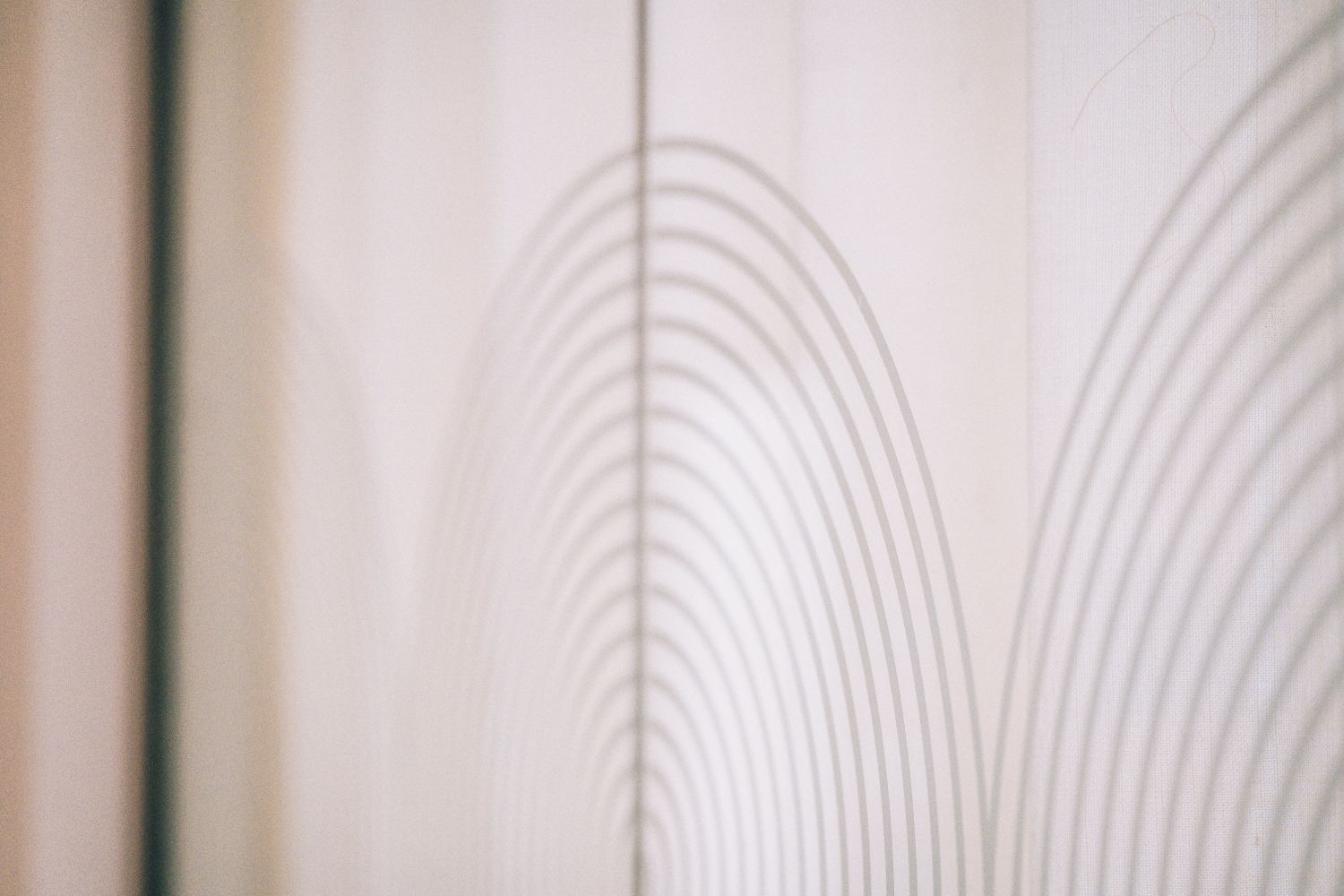
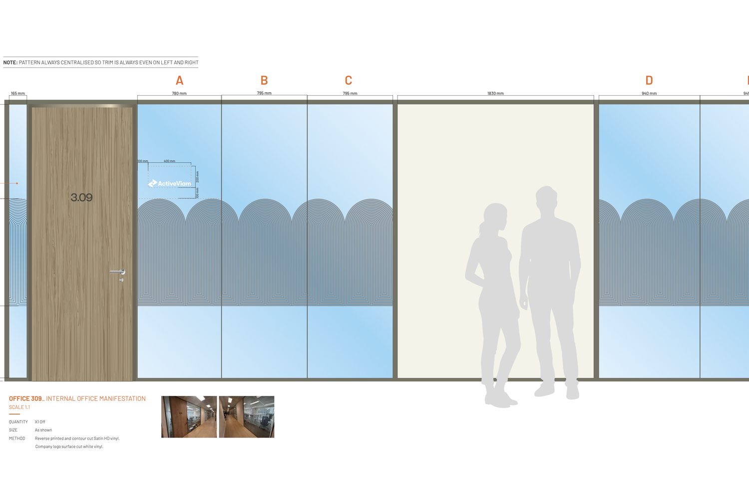
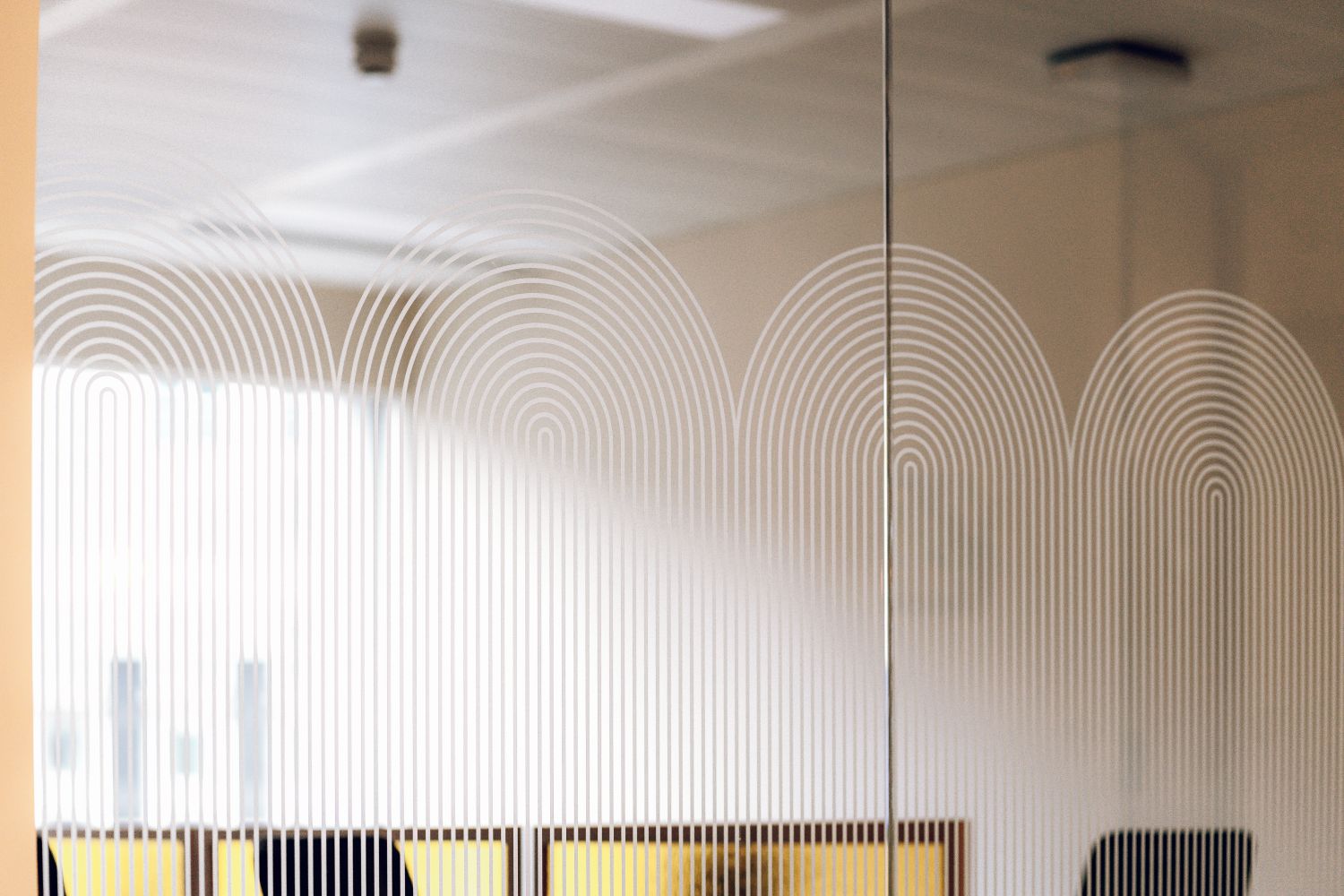
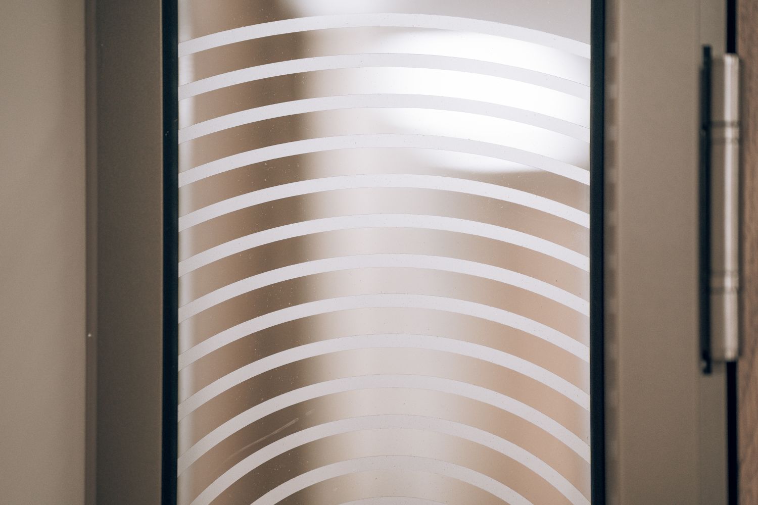
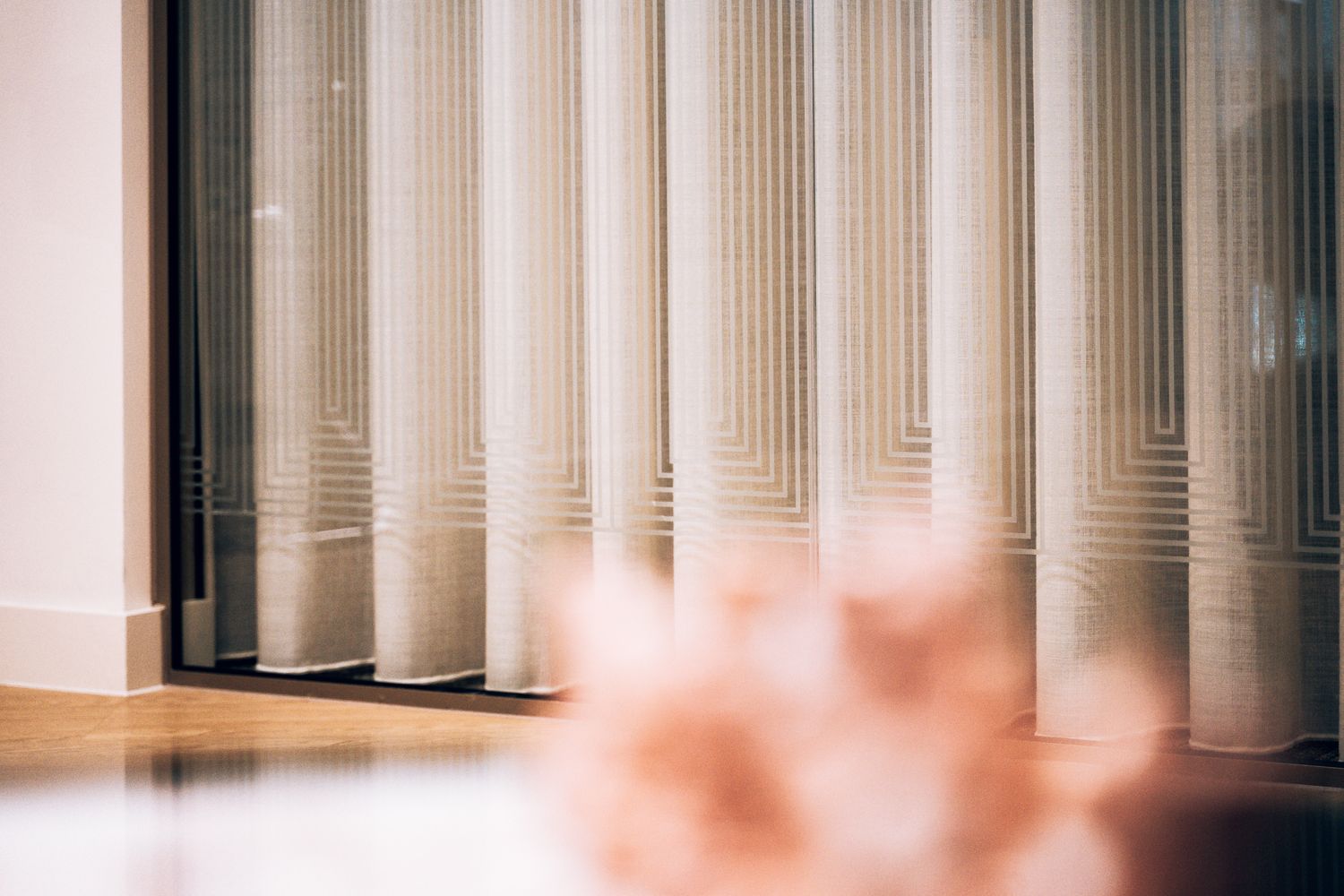
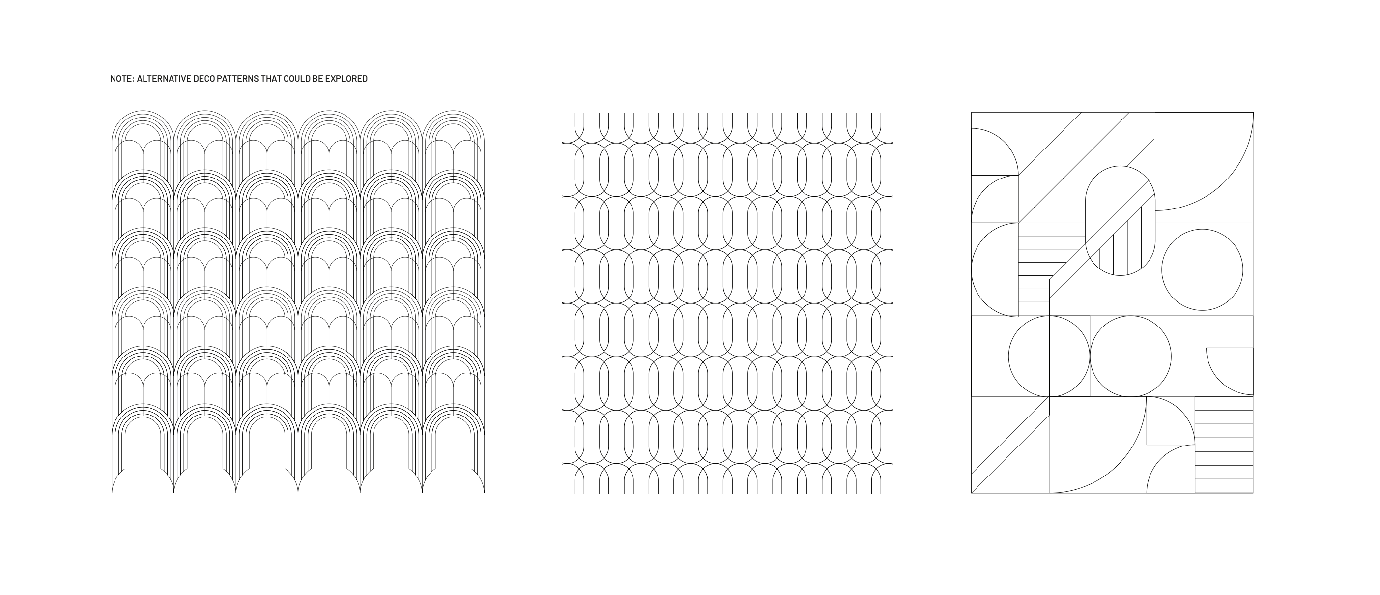
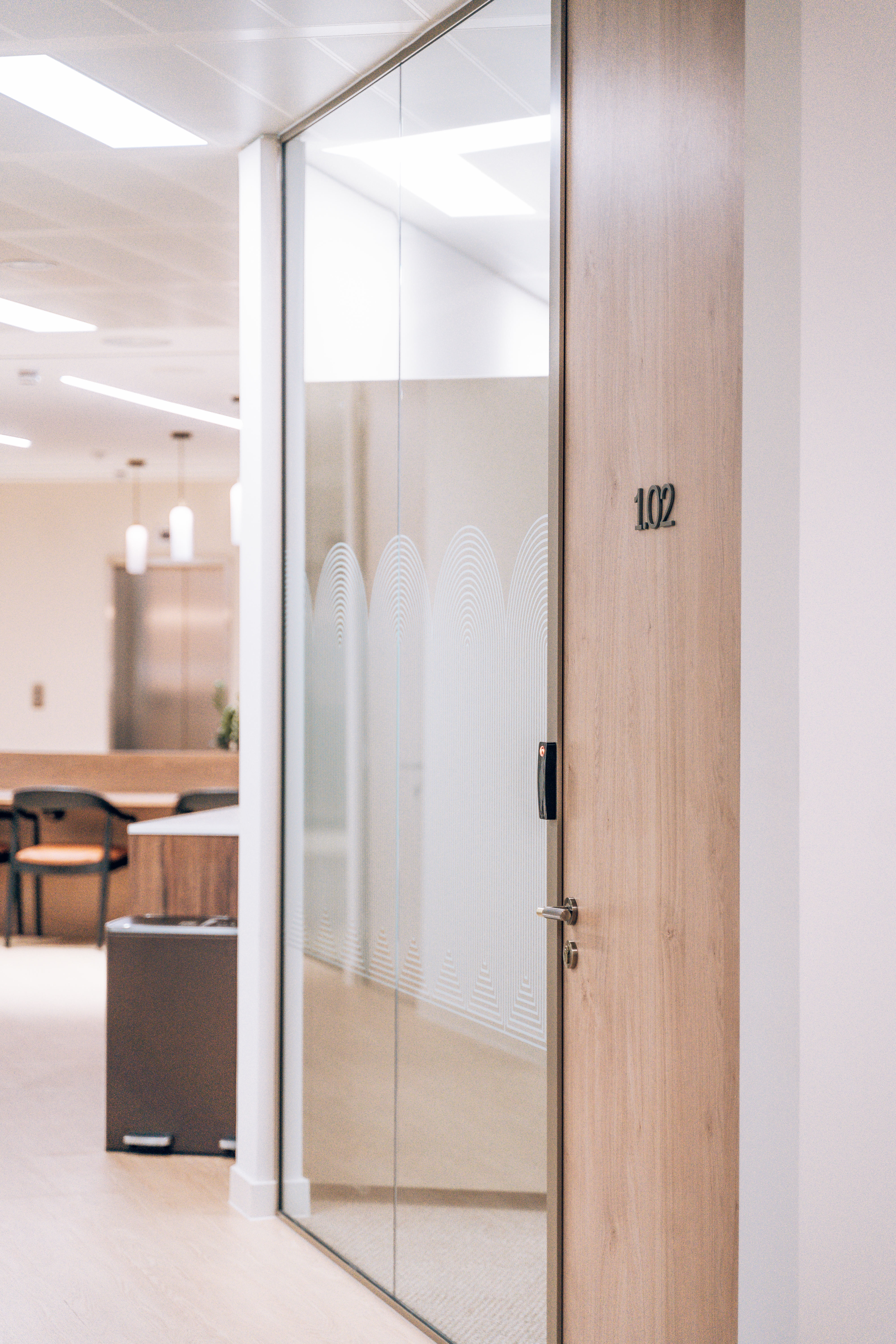
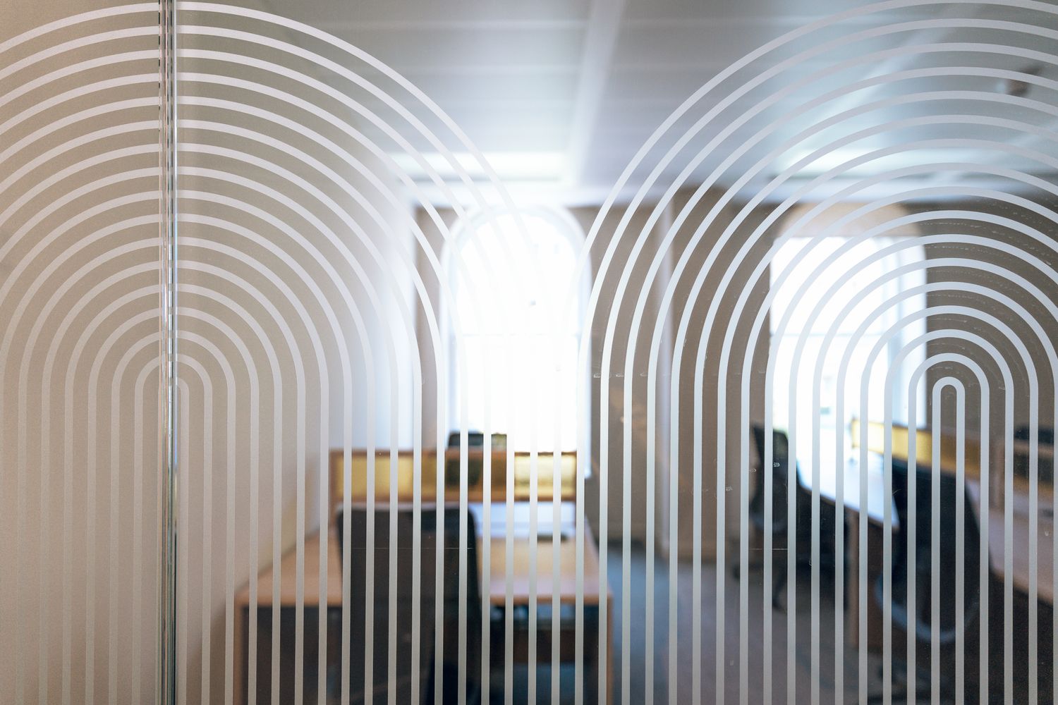
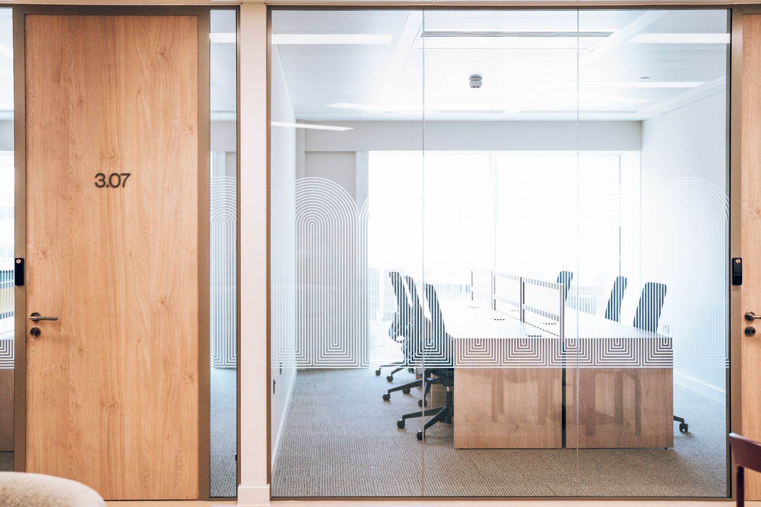
Across the glazed partitions, the Ellisse shape is repeated as an Art Deco inspired manifestation pattern. It adds privacy and visibility while still allowing light to move through the space, turning a practical requirement into another subtle expression of the brand.
The pattern is produced in cut frosted manifestation vinyl, using the same lozenge geometry developed elsewhere in the scheme and repeating it across the glazing at scale. The result gives the glass a decorative rhythm without making the partitions feel heavy or overly branded.
From reception directories to the smallest room marker, we can design, manufacture and install a complete wayfinding system that works with your brand and interior.
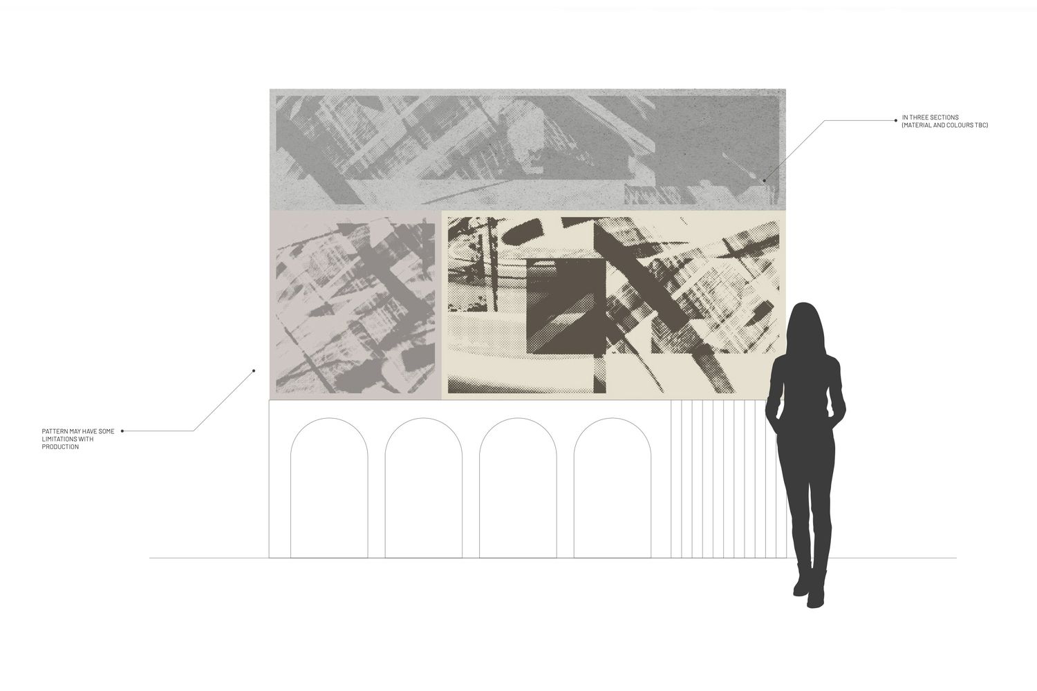
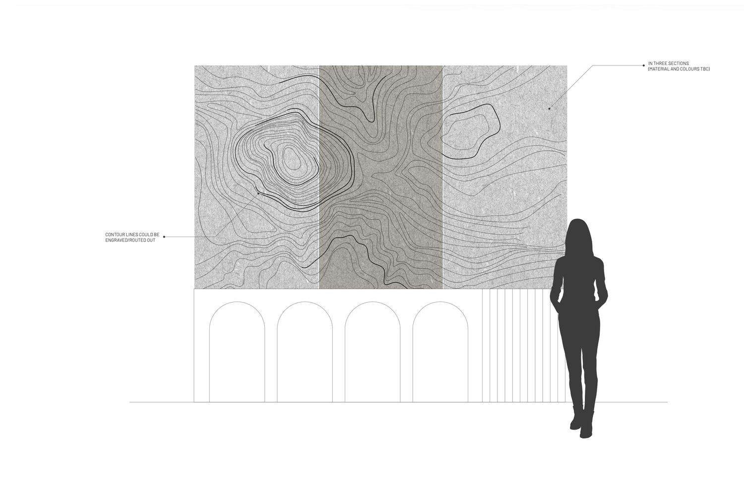
The original brief was for a built-up artwork or installation above the reception counter. Given the building’s location near Fleet Street and its connection with the history of printing and publishing, our early concepts explored paper, books, newspaper printing and the movement of material through printing machinery.
Some ideas used folded paper forms or abstract open books. Others transformed photographs of the building into halftone patterns that recalled newspaper printing. Another route used flowing engraved lines inspired by paper passing through a press.
The development process involved several different routes and scales. The client knew the wall needed to become a focal point, but the right balance between literal artwork, pattern and architecture took time to resolve.
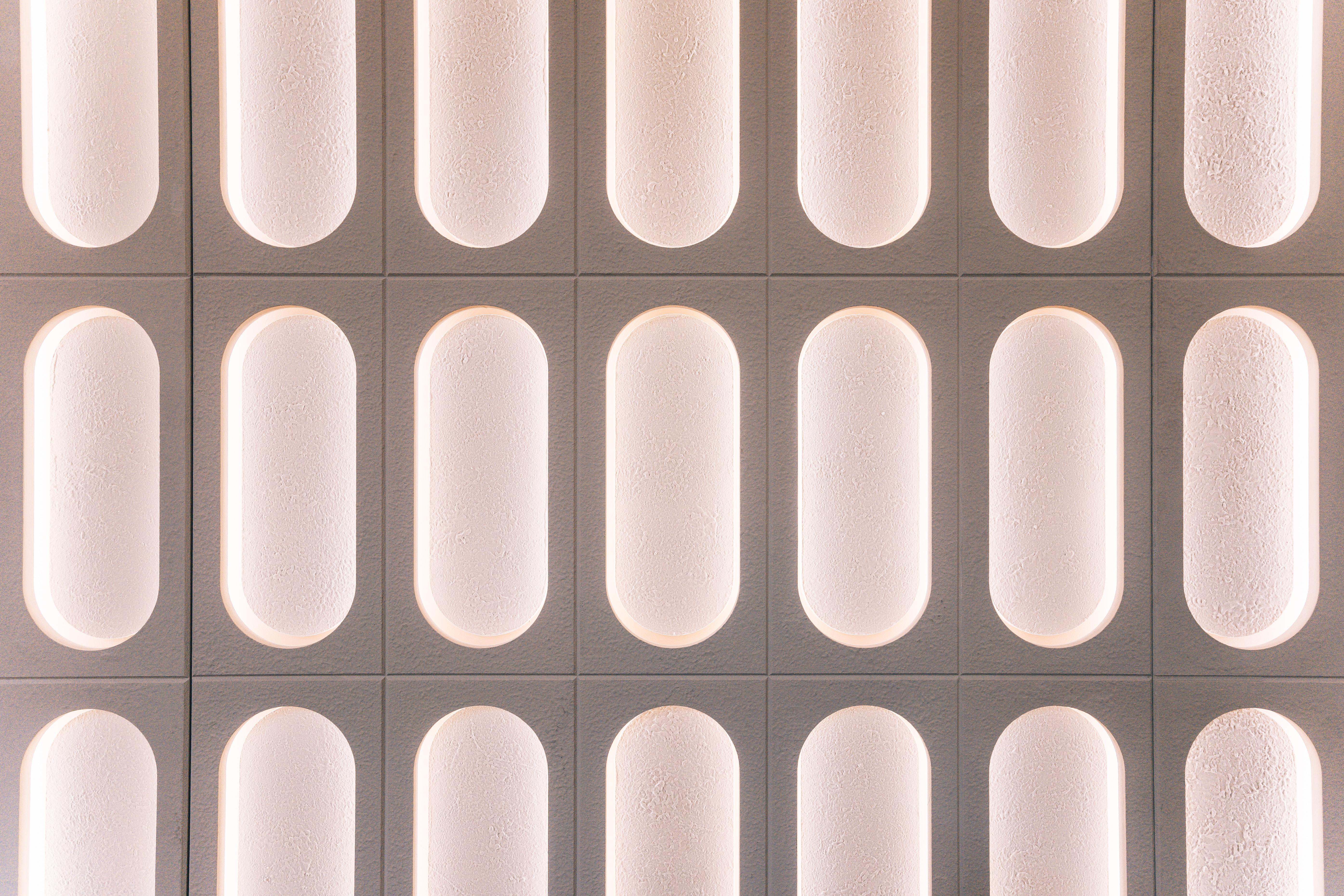
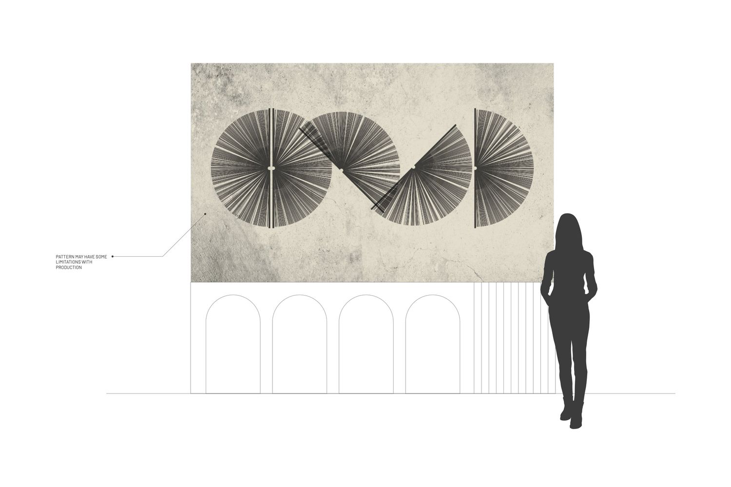
Eventually, we moved away from a direct reference to books or printing and returned to the strongest element already established in the signage: the Ellisse shape.
Repeating the lozenge across a structured grid created something simpler, stronger and more connected to the wider environment. The pattern also echoed the rhythm of the curved reception counter below, allowing the wall and joinery to feel like parts of the same composition.
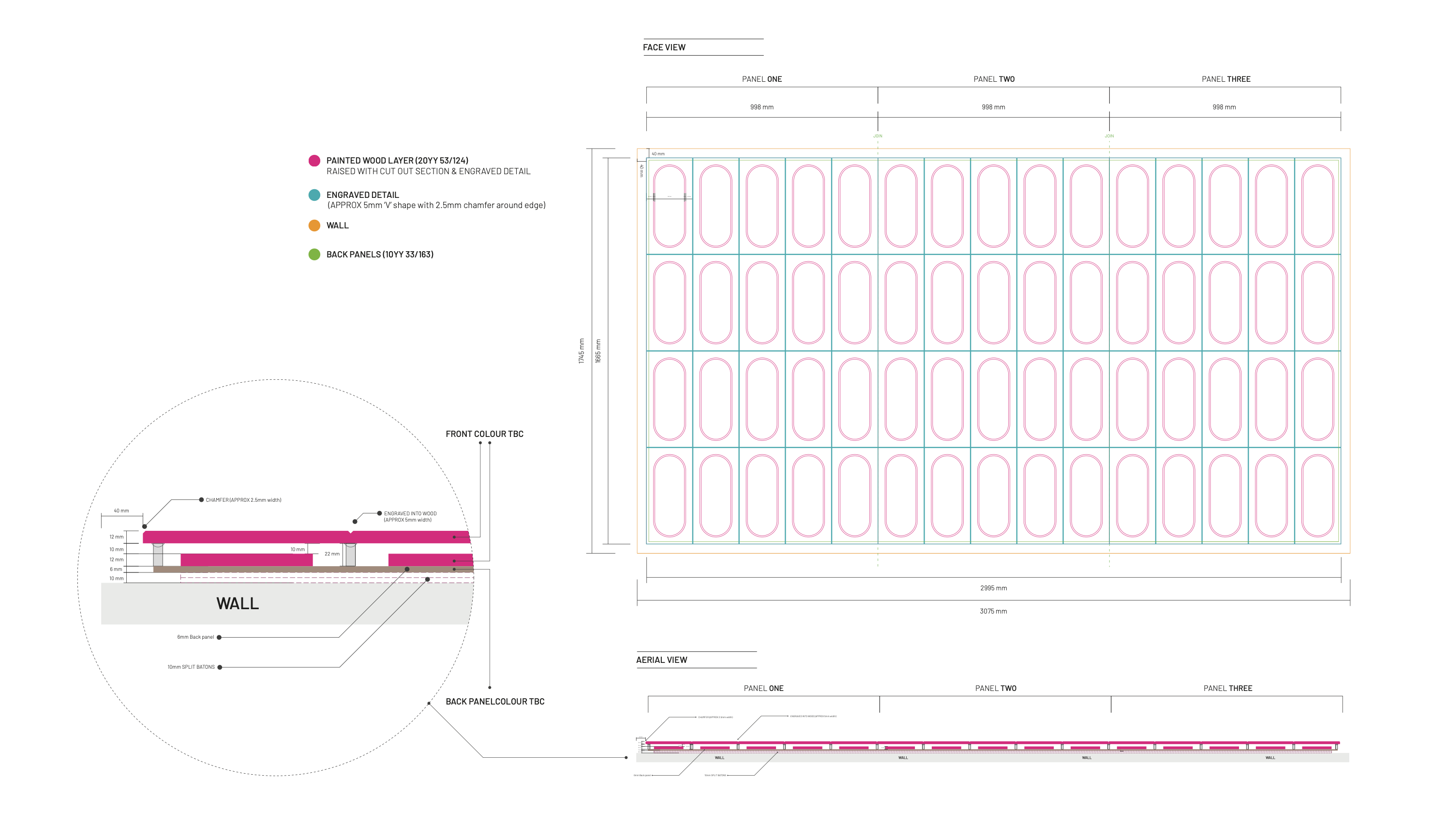 Rather than a flat graphic, the feature wall was designed as an installation that plays with depth and light. Once illumination was introduced to the brief, the construction developed further. Each repeated form could be recessed to a different degree, allowing shadow play to become part of the pattern.
The finished installation was built from three large interlocking MDF panels, with 60 individual forms positioned inside CNC-cut apertures. V-engraved linework and chamfered edges introduced fine detailing across the surface, while white LEDs mounted behind the elements created a soft halo of light.
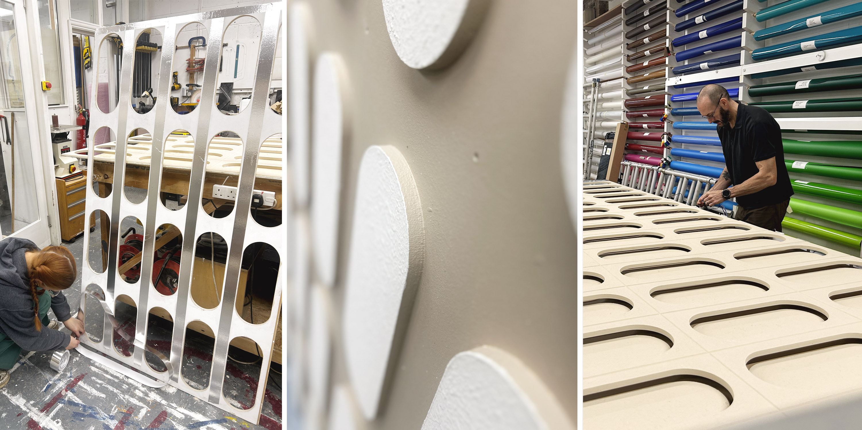
The spacing of the grid had to be calculated precisely to fit the dimensions of the wall. Alternative pattern sizes were tested visually before the final scale was selected, balancing the number of repeated elements with the impact needed across the reception.
Because of its overall size, the installation also had to be manufactured in three separate sections before being brought together on site.
A bespoke textured finish was developed through sampling so the surface would feel tactile and hand-finished rather than overly smooth or artificial. The result changes subtly throughout the day. In daylight, the tiers, textures and engraved details are most apparent. Once illuminated, the negative spaces and repeated forms become more atmospheric.
Related services:
The same shape also informed the manifestation across the glazed partitions.
Here, the ellipse was expanded into a repeating, Art Deco inspired pattern that provided privacy and visibility while maintaining the open character of the workspace.
Rather than treating the glass as a separate graphic opportunity, we used it as another layer within the same environmental system. The manifestation therefore feels connected to the reception artwork and signage, but lighter and more understated.
Related service:
We create bespoke illuminated signs and built installations shaped around your brand, architecture and interior. Bring us a developed idea or involve us from the earliest design stage.
Ellisse demonstrates the value of developing signage alongside the interior rather than adding it at the end.
The project involved reviewing the brand identity, understanding the interior design direction, surveying the building, planning the wayfinding from floor plans and then testing those decisions by walking the routes in person.
Every relevant area of glass also had to be measured and recorded, while the illuminated reception feature required coordination between the design team, fabricator, installers and electrical contractors. The electrical supply had to be positioned correctly before the installation arrived, while the three-part construction needed to fit precisely within the available wall space.
The creative process brought its own challenges. The reception wall went through several false starts as we tested more illustrative ideas and worked towards a direction that felt right for both the brand and the space.
The simplicity of the finished pattern was not the obvious first answer, but the result of refining the concept until the artwork, signage and manifestation all felt connected.
The finished project gives Ellisse a physical identity that feels embedded within the building.
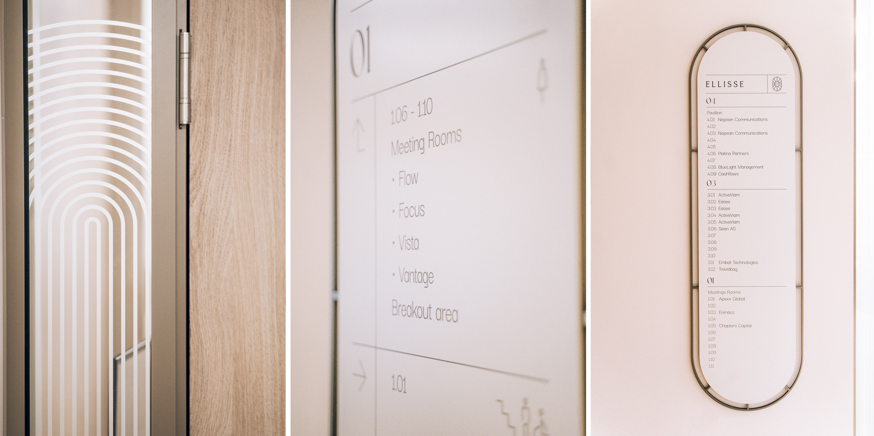
One recognisable shape moves through the space in different forms: illuminated and repeated across the reception wall, framed in metal around directories, rotated across smaller signs and layered into patterns on glass.
The result is coherent without becoming repetitive, and premium without feeling overstated.
Spacemade felt Ellisse had set a new bar for the work we created together and asked us to bring the same design-led approach to the next project. Involving us earlier and giving us greater creative responsibility became the new way of working together.

FAQs - Ellisse by Spacemade
It can cover everything from the first branded moment at reception through to the signs people rely on every day. For Ellisse, that included reception branding, building and floor directories, double-sided projecting signs, meeting room plaques, office numbers, amenity icons and glass manifestation.
Designing these elements as one system allows the typography, proportions, materials and visual language to remain consistent throughout the space.
Yes. Often our starting point is an existing brand pack rather than a finished signage specification. We look at the logo, typography, colours and graphic language, alongside the architecture and interior design, to work out which elements can translate successfully into three-dimensional signage and environmental graphics.
At Ellisse, the lozenge shape within the brand became the connecting device across directories, projecting signs, manifestation and the illuminated reception feature.
Glass manifestation is graphics or pattern applied to glazing to make it more visible for safeguarding purposes. In workplaces it can also provide varying degrees of privacy, help define meeting rooms and shared areas, and become part of the wider interior or brand scheme.
For Ellisse, we developed a repeating Art Deco inspired pattern from the brand geometry and produced it in cut manifestation vinyl across glazed partitions.
We normally begin with floor plans and a site survey, then walk the routes people will actually take through the building.
That allows us to identify the key navigational points - where a directory is needed, where a directional sign needs to be visible from more than one approach, and where individual rooms or facilities need identification.
From there, we can develop the hierarchy, sign types, locations and visual system as a whole rather than designing each sign in isolation.
Yes. Glyphics specialises in creating custom large signs and reception feature walls, they can range from dimensional logos, vinyl papers and illuminated lettering to completely bespoke built installations.
At Ellisse, the reception wall developed through a full creative process before becoming a three-dimensional illuminated installation made from CNC-cut and engraved MDF panels, individually recessed forms, a specially developed textured finish and integrated LED lighting.
Ideally, before all of the interior decisions have been finalised. Earlier involvement allows the signage to respond to the architecture, materials, lighting and circulation of the space, while also allowing practical requirements such as power supplies, fixing points and glass manifestation to be coordinated with other contractors.
Ellisse became an important project for us in that respect: the design-led approach worked so well that Spacemade asked us to become involved in the next project in the same way, with greater creative responsibility from an earlier stage.
Yes. We can take a project from early concept and site survey through design development, material specification and technical drawings to manufacture and installation.
Where a project involves specialist fabrication, illumination or electrical requirements, we can also coordinate with trusted fabricators and the wider fit out team to make sure the finished elements work as intended on site. Contact us to discuss your project, we'd love to help.