Moo Black & White Vinyl
THE LOWDOWN
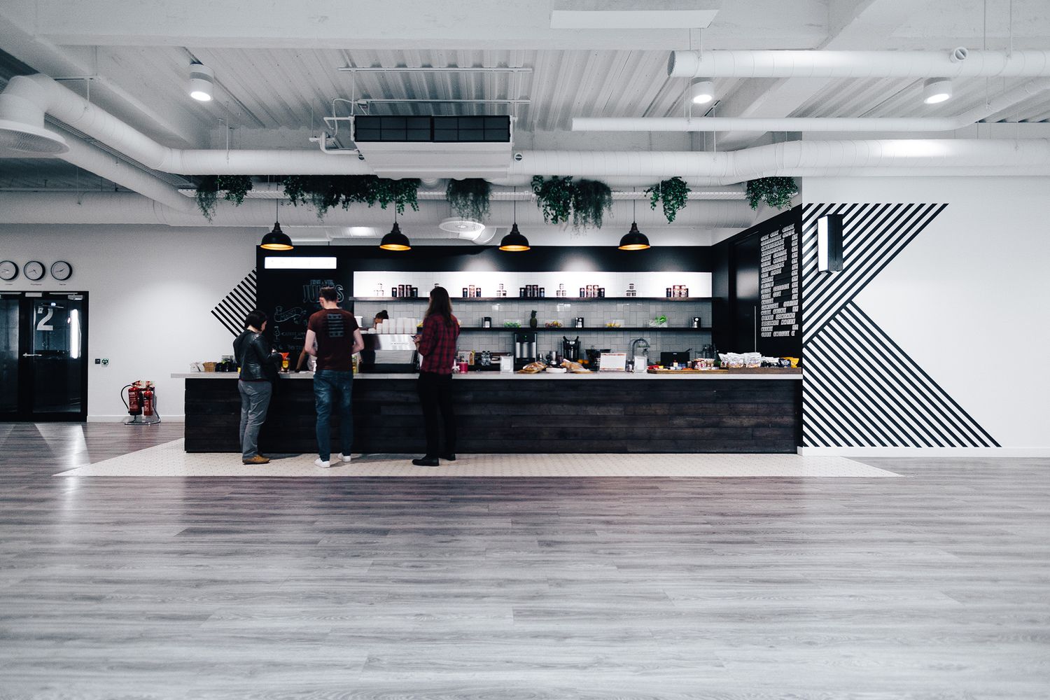
2016 was the year that saw digital print and design company MOO come home to nest in EC1, as they set up shop just some 500m from where their business originally started ten years earlier. This time they had some 33,000 sq ft of space to work with, and in a rare move, they opened the floor up to the wider company for design ideas – resulting in a range of micro environments, each aesthetically unique, that would piece together to make one epic office. One such patch of turf was The 404 – a concept café that MOO put their faith in us to furbish with signs and wall decor, having worked with us on interior design before.
The name is a clever play on the URL error message ‘404 Not Found’, which pops up on websites when a user attempts to access a broken link or a dead page. MOO uses it as hyperbole for the workforce’s demand for a caffeine kick – when hit with a mental block or faced with a slump at work, time to redirect to the onsite café! Graphic designer, Hannah Myatt, contacted us to transform this vision into a reality, so we headed to the office in Farringdon Road to put our heads together for a consultation.
THE SPECS
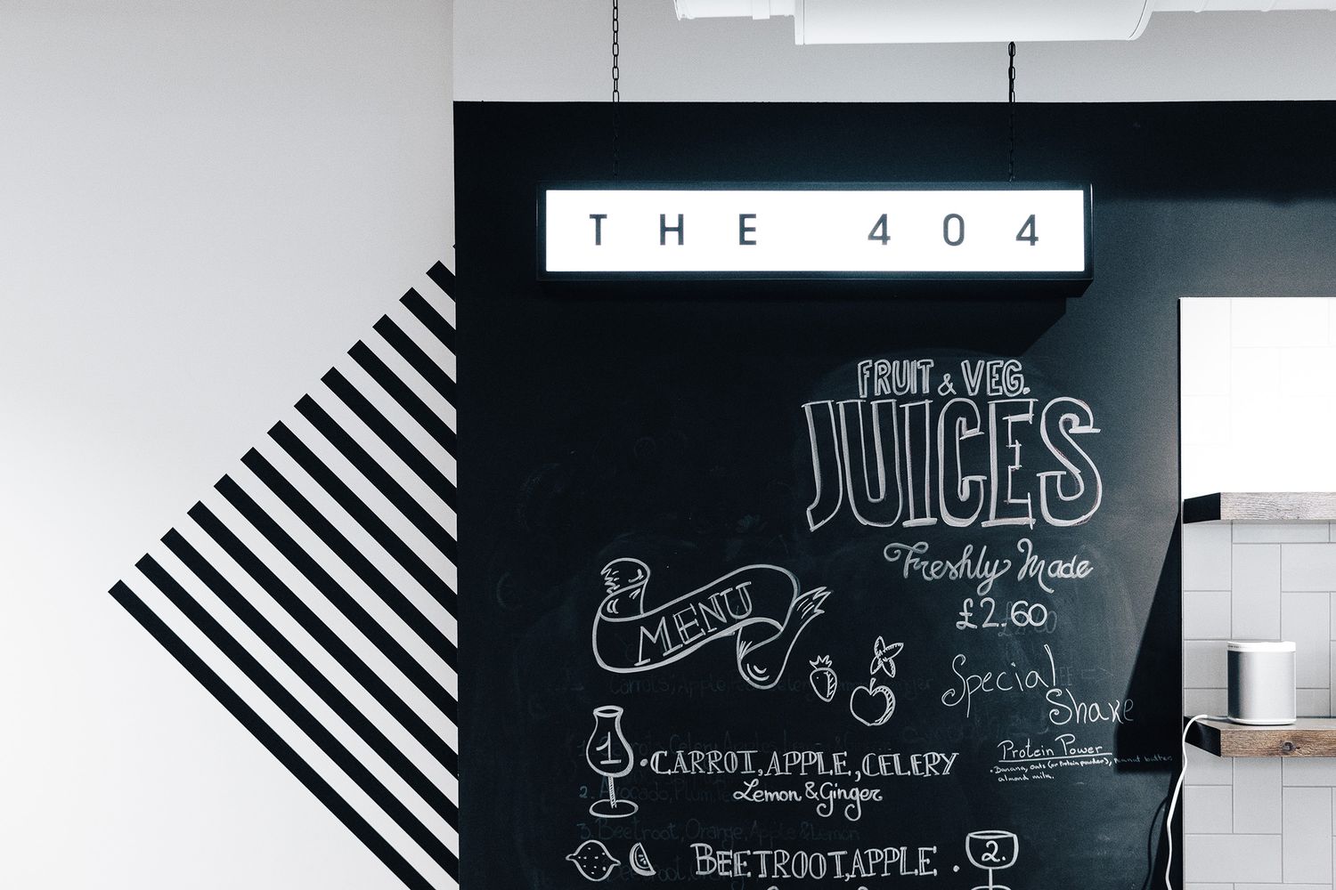
We’ve all seen it…the dreaded ’404’ appearing in black on the expanse of a blank white web page…well, you can also hold this little internet cue responsible for the black and white colour palette of this project. MOO, being a supplier of stationary, had already designed all the paper assets in that vein, from the coffee cups to the loyalty cards, and we used the look and feel of those as our drawing board.
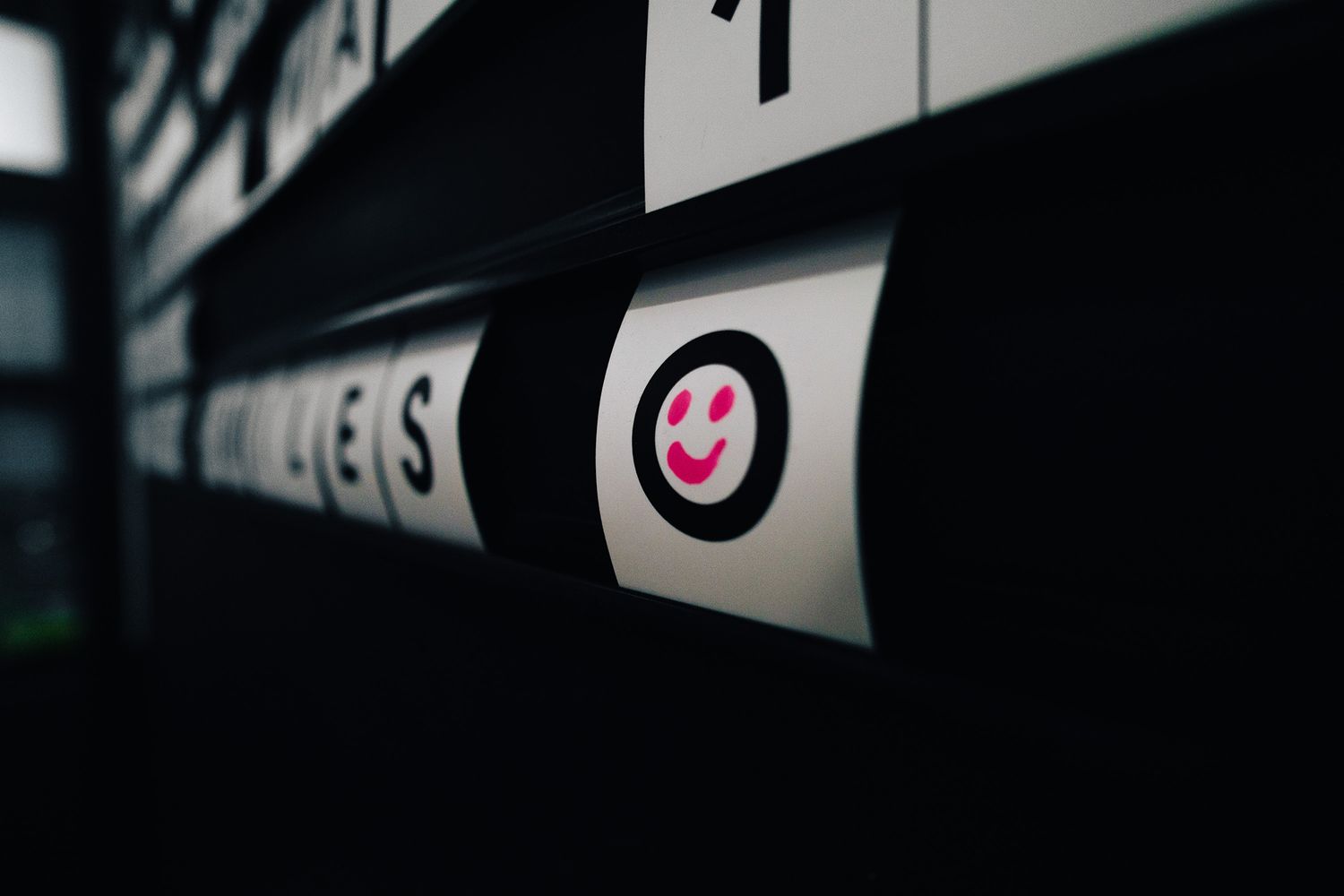
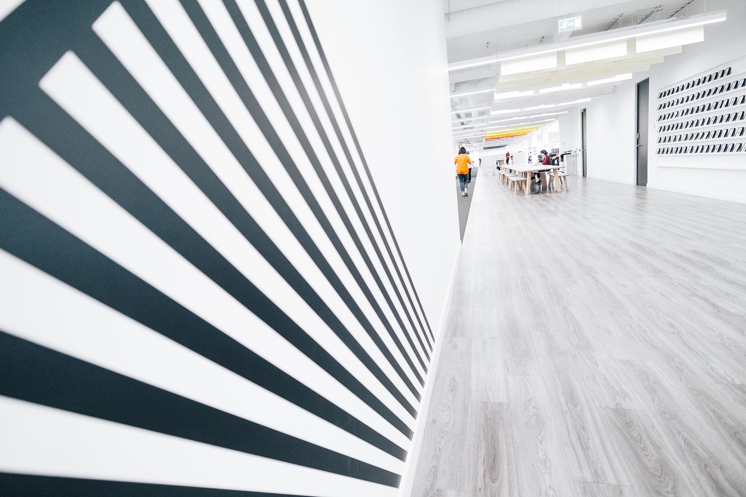
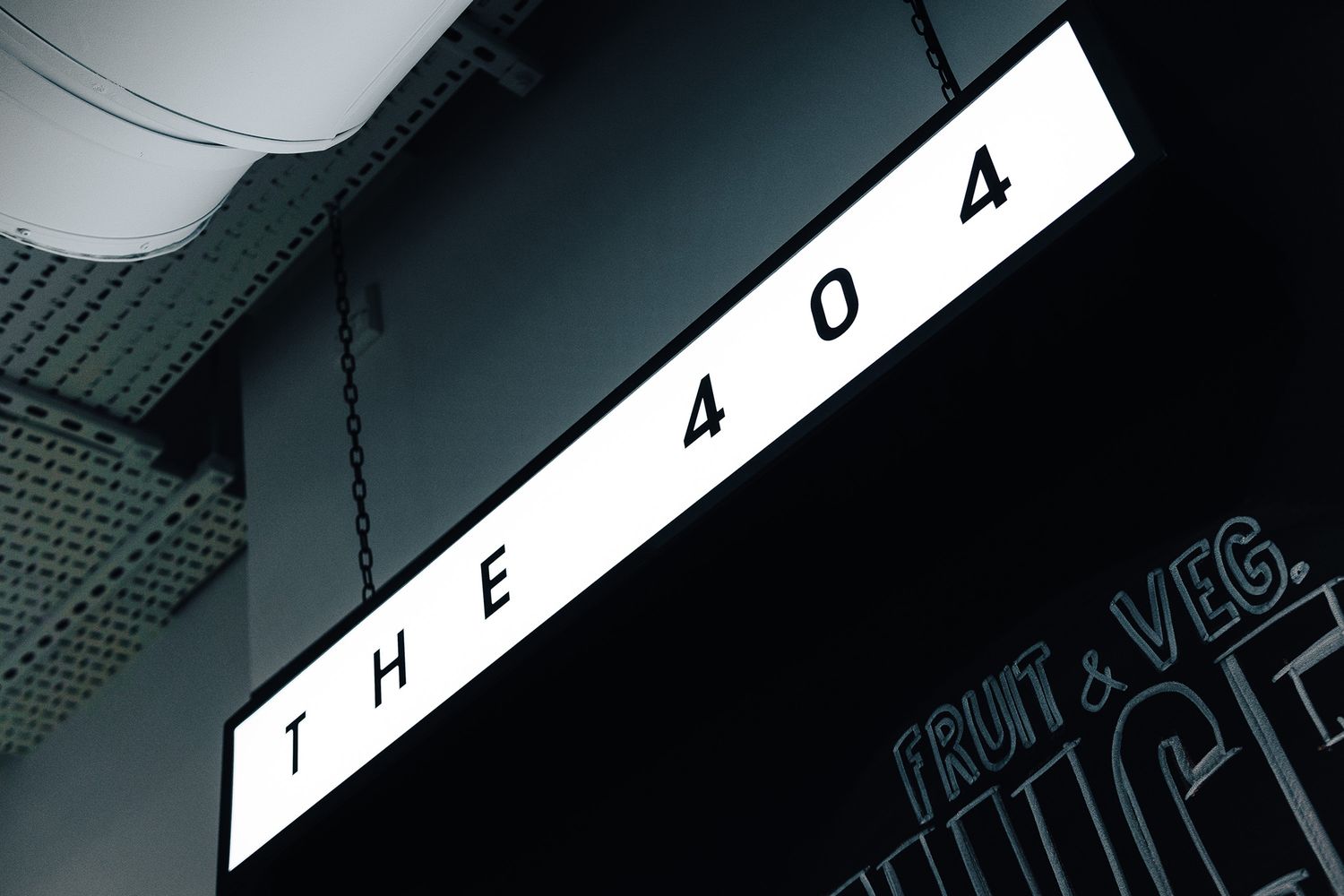
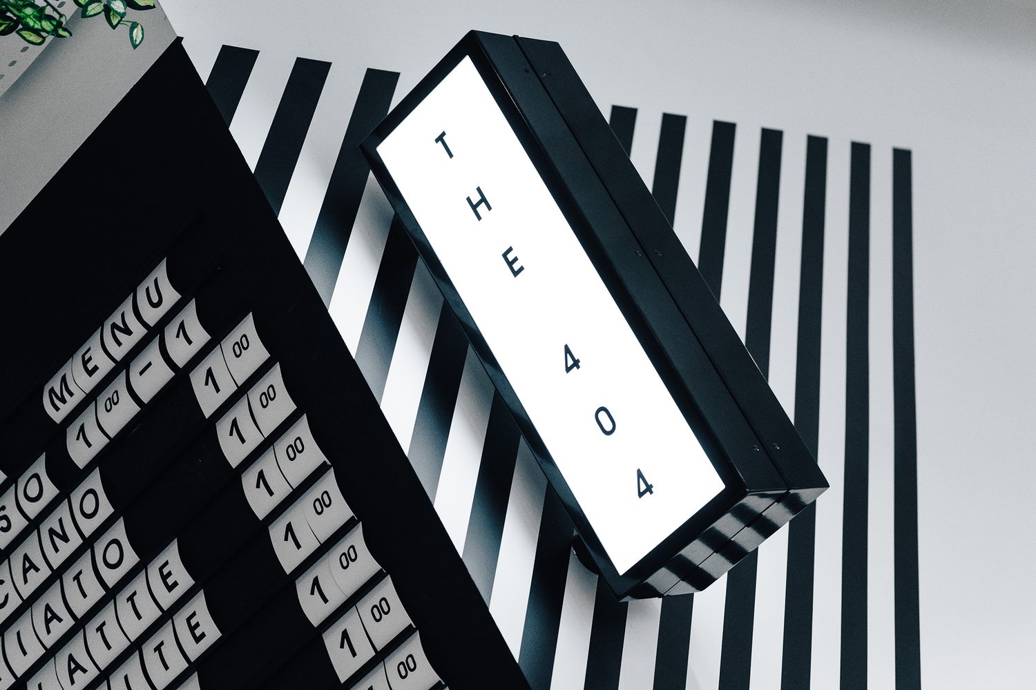
We manifested a clean monochrome theme in a number of ways; custom black slider rails for the menu board that allows staff to change what’s on offer whenever necessary; black wall graphics that cut cleanly across freshly painted white walls in a striped pattern from floor all the way to the ceiling; and two black light boxes in the form of a hanging sign and a projecting sign, for atmospheric illumination.
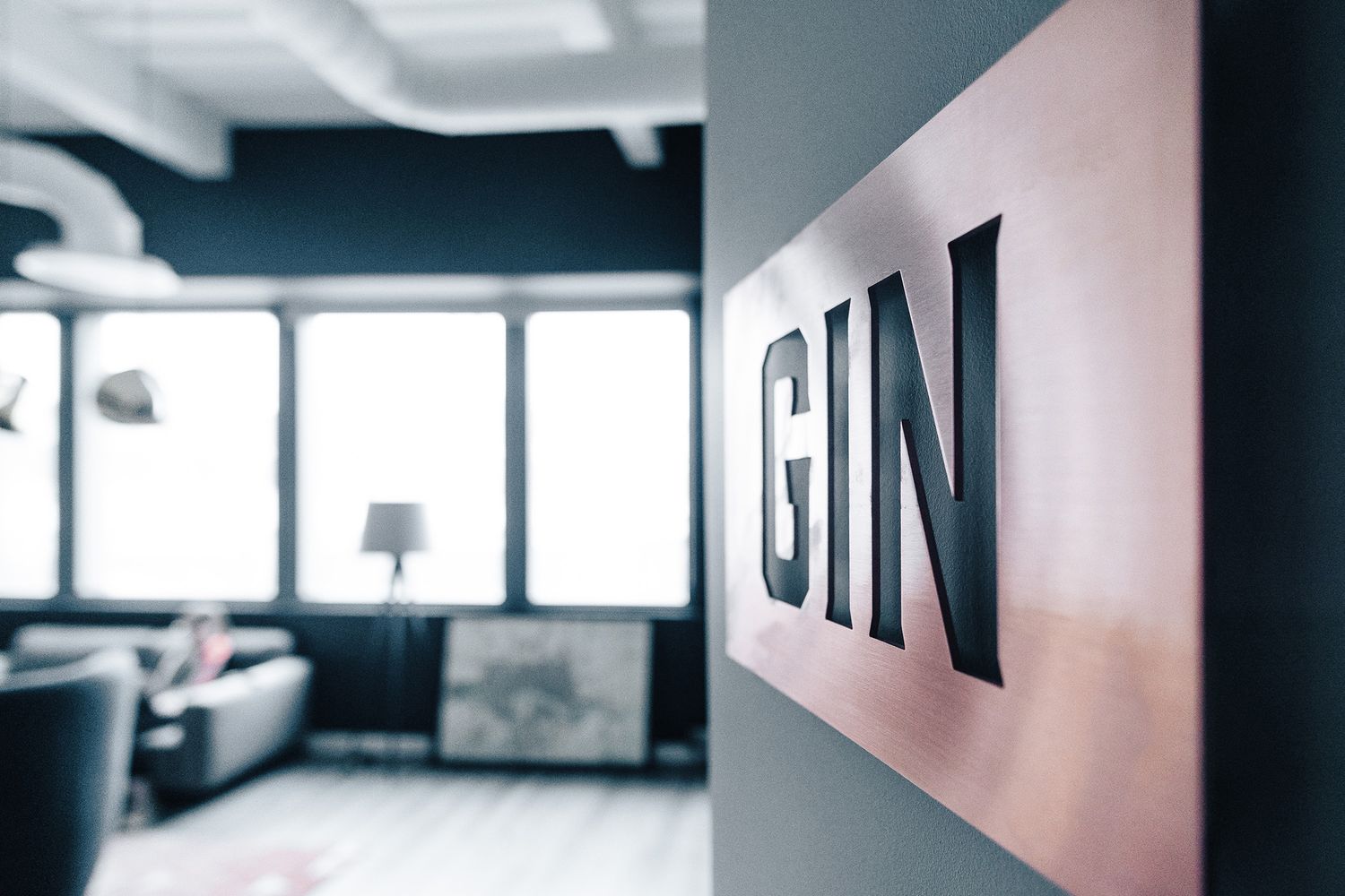
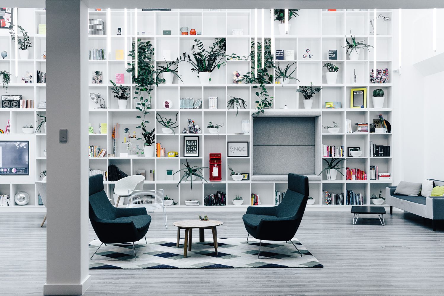
Opposite The 404 is an informal seating reception – a different zone yet very much interconnected. In it, bookshelves climb up the walls into an atrium and comfy seats await those who want to walk across, sit, sip on coffee and deliberate. Like the brief, as a whole, this area inspires collaboration, creativity and innovation, and we’re grateful for this context of a double height room flooded with natural light, where our simple details form a stimulating visual tonic for any tired mind.


