Sleven Crossfit Gloss and matt laminated contour cut vinyl graphics
THE LOWDOWN
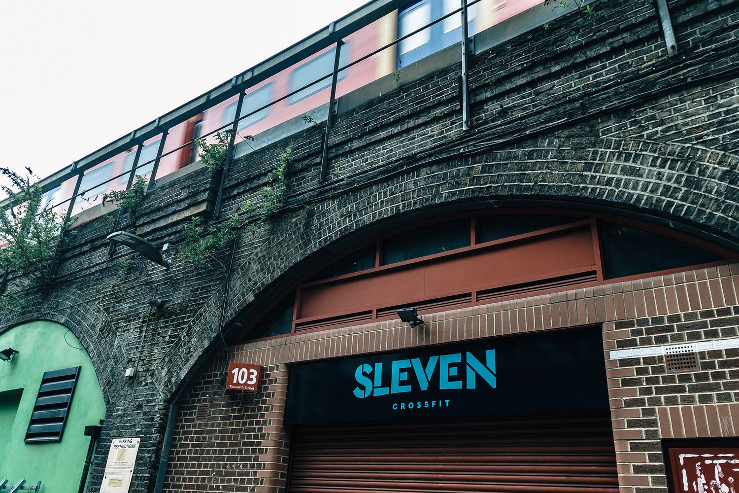
After taking up one of the arches on Tinworth Street at Vauxhall, the co-owners of Sleven CrossFit Gym set about getting the space in tip top shape, and contacted us to discuss custom vinyl signage, having seen the vinyl section of our website.
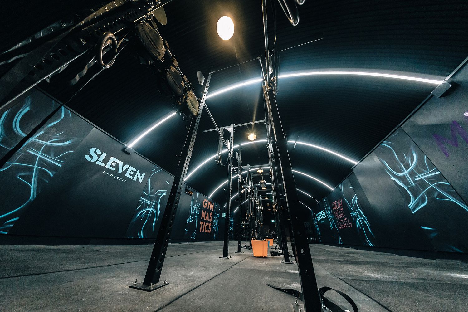
Sleven’s workouts are all about training in groups, building strength in a range of movements from gymnastics, weight lifting and rowing to running, cycling and skipping. All the focus is on pushing each other forward, including the interiors.
Co-owners Nick and Tim double up as coaches, and they opted to gut the red brick core and replace it with an eloquent design that says go hard, don’t go home! In line with their online branding, they decided to go for an audaciously dark look, offset by vibrant graphics.
The first step for them was to cover the ceiling in black corrugated sheets and paint the walls in midnight ink, leaving a powerful canvas for us to make our splash on with some high impact custom vinyl signage.

THE SPECS
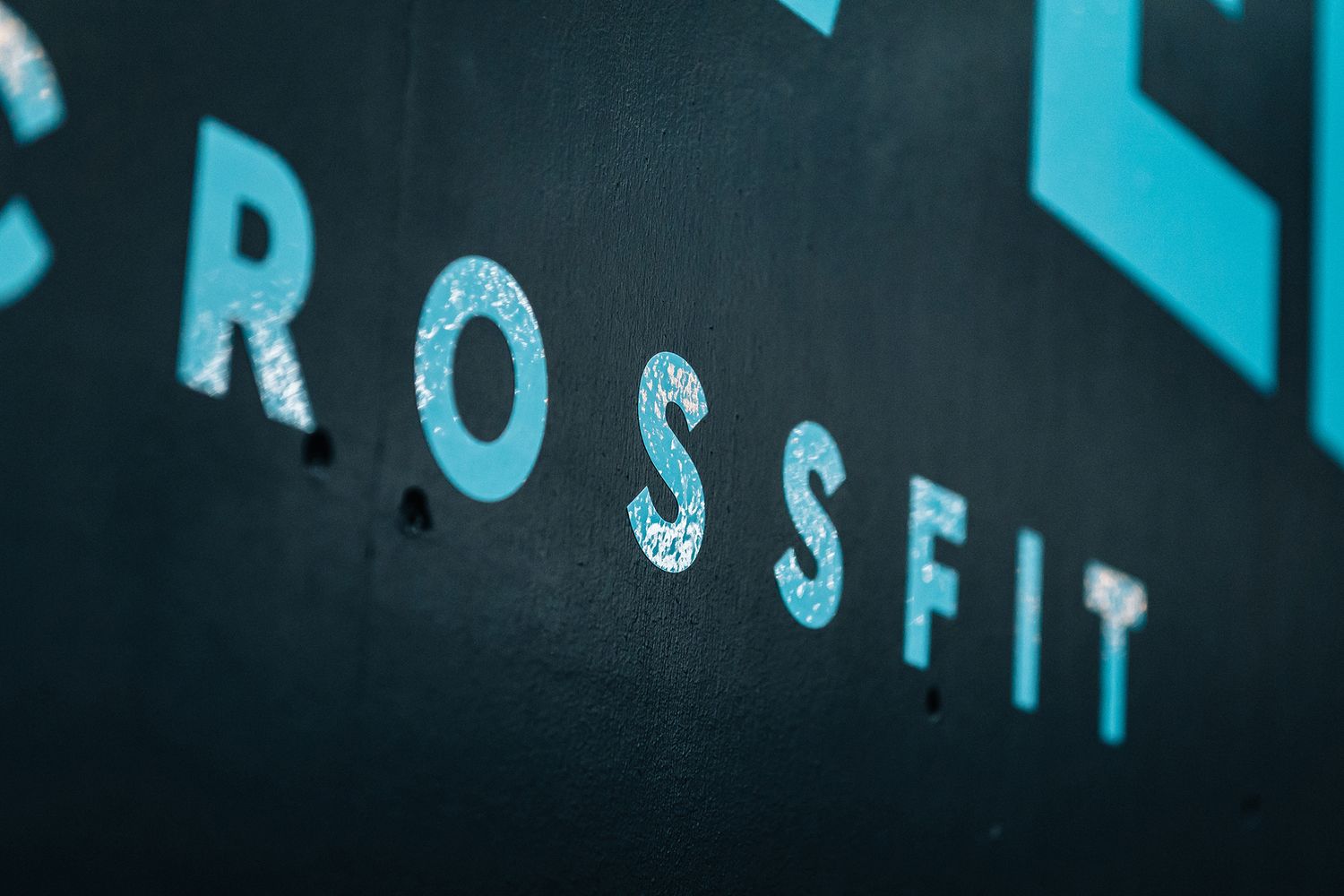
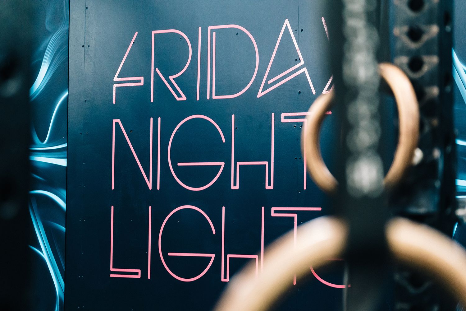
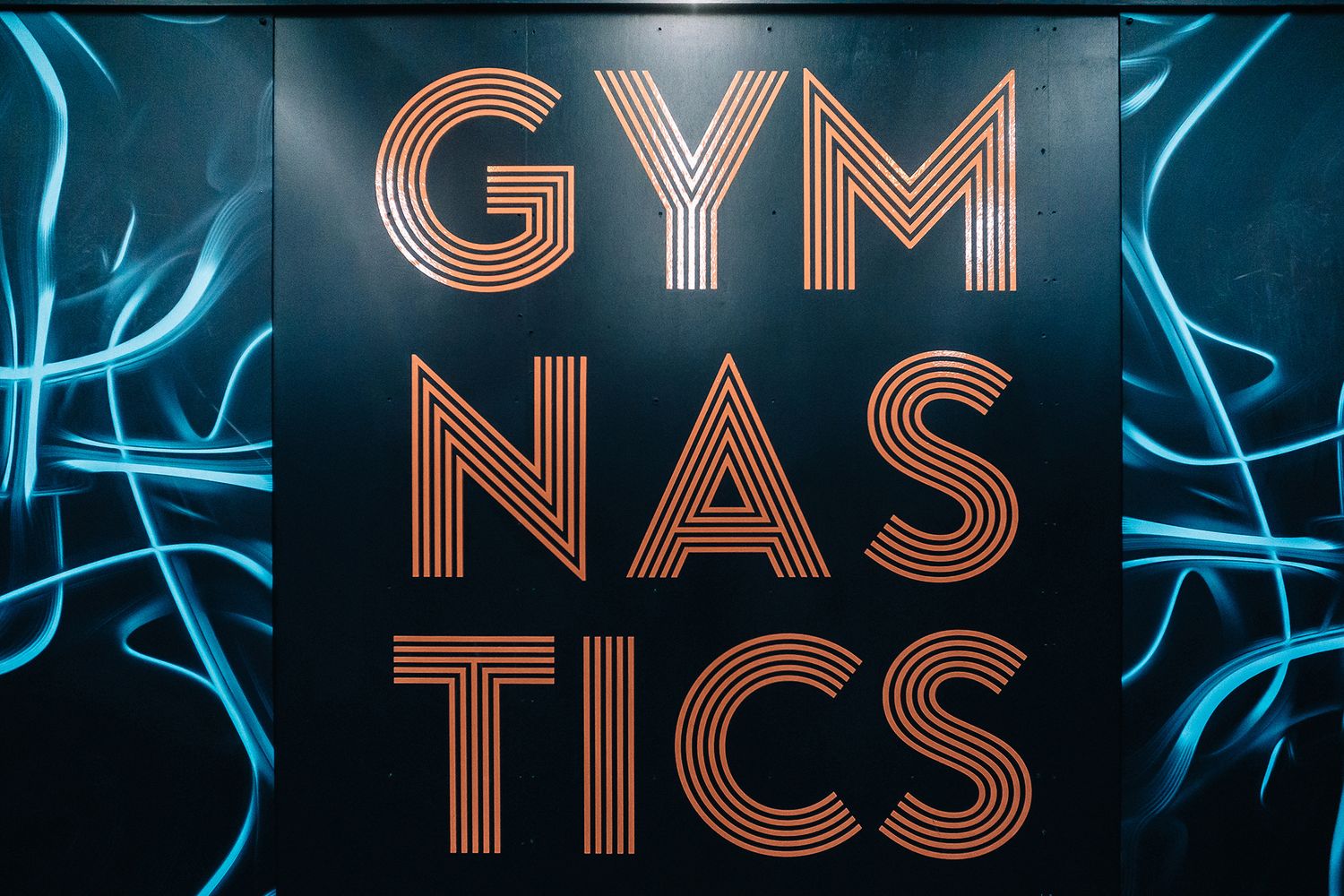
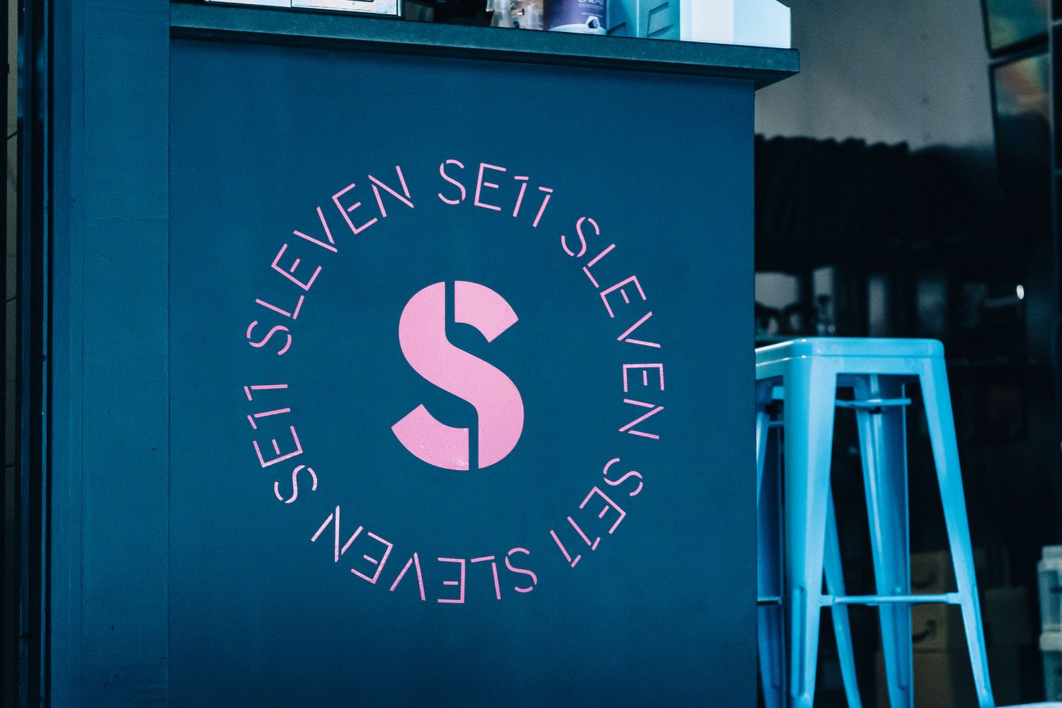
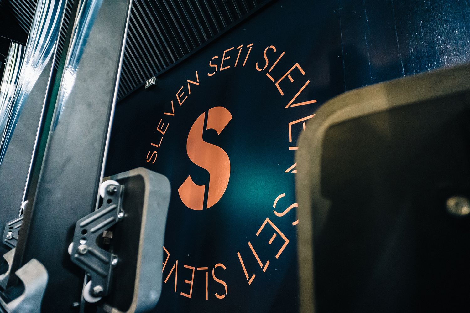
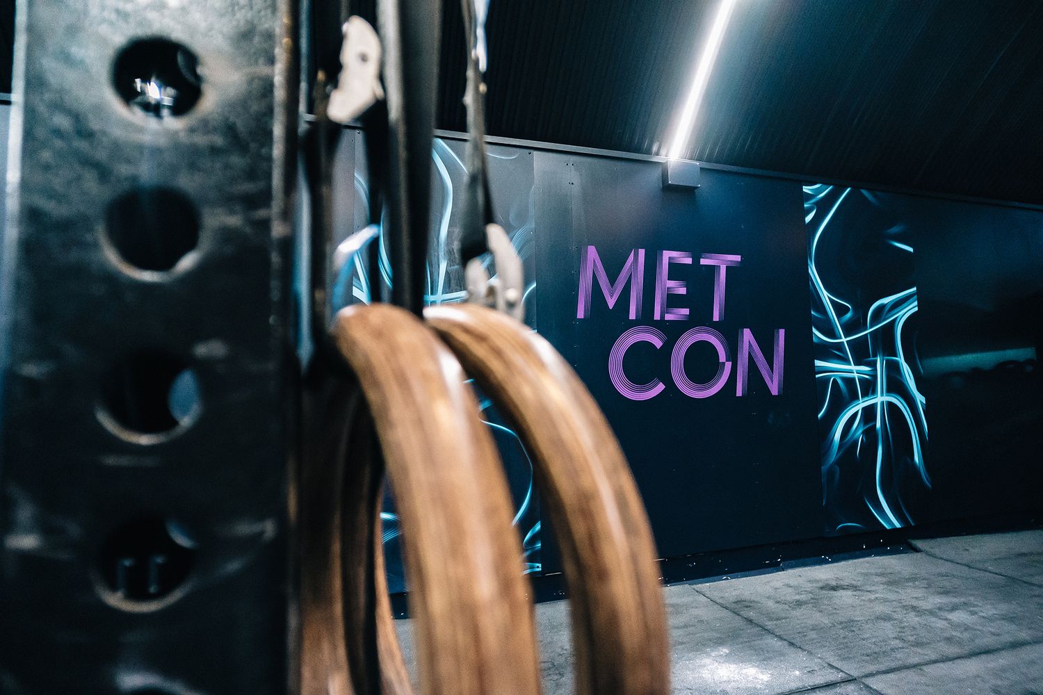
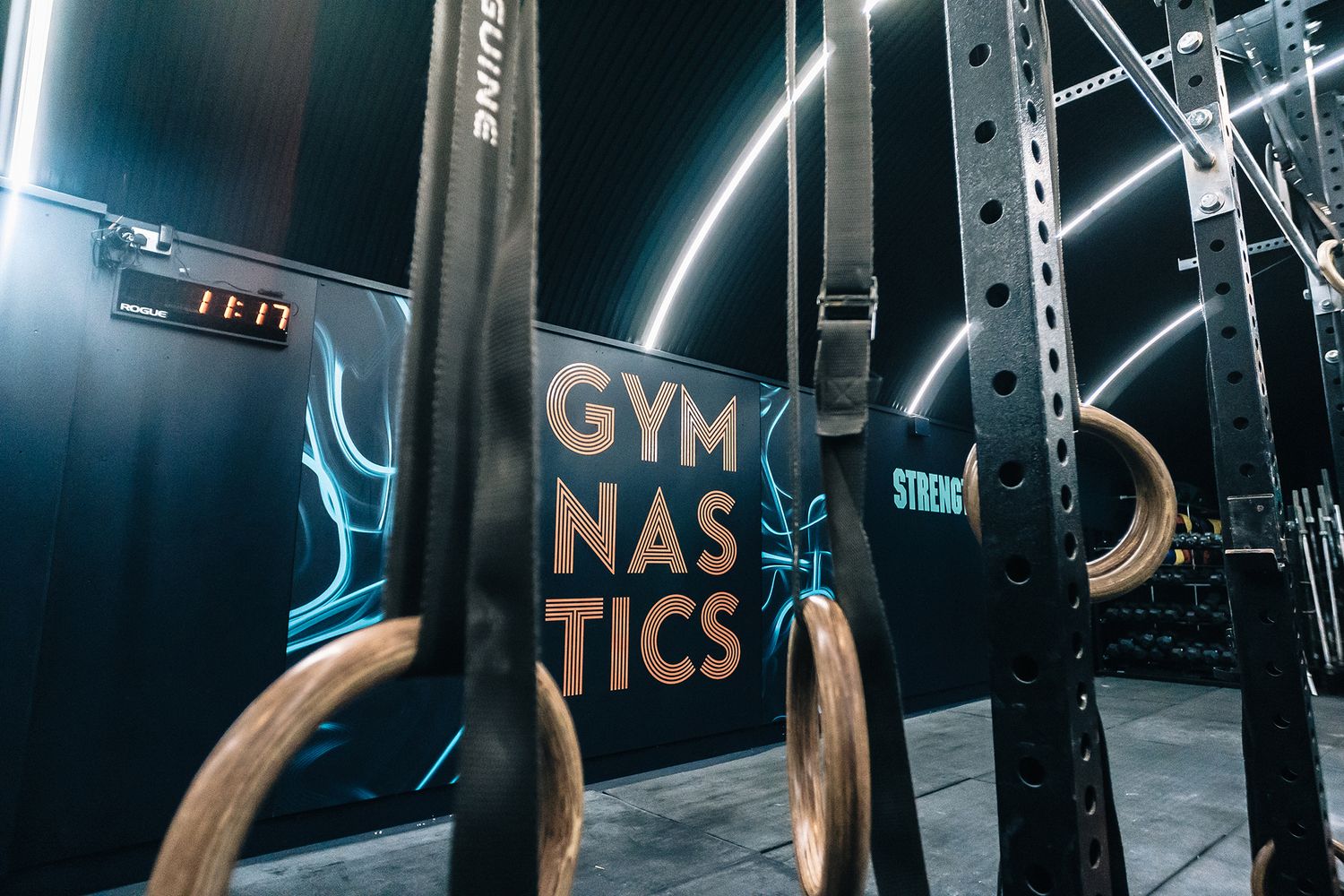
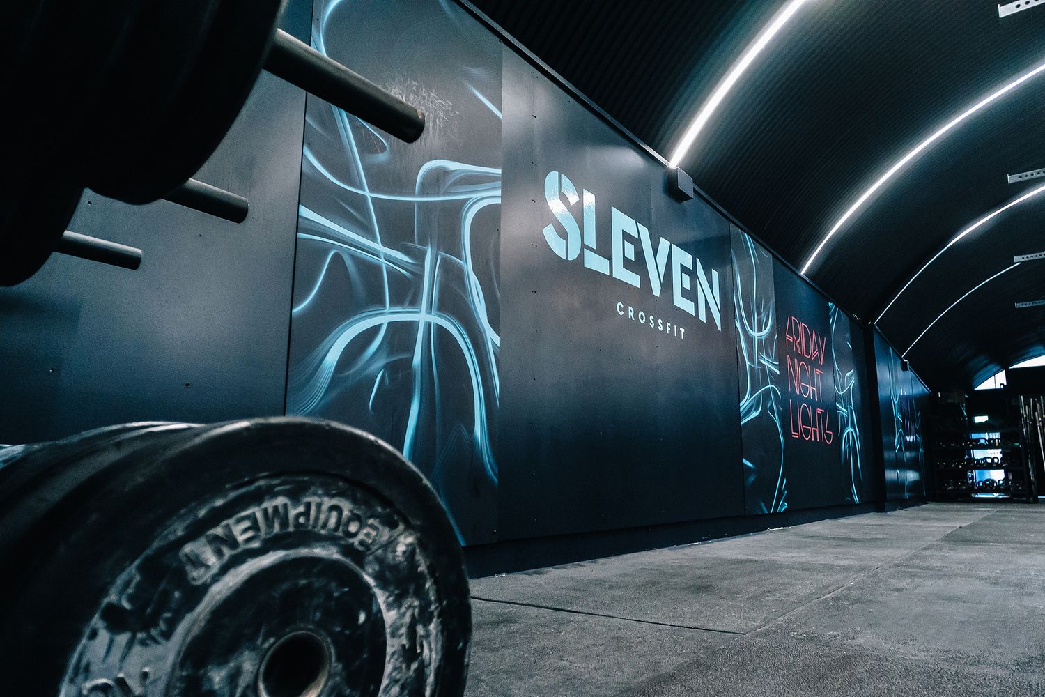
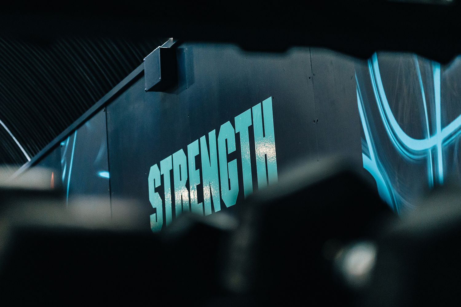
The client chose a design scheme that overlays the walls and workout surfaces with the names of Sleven’s exercise regimens, like ‘MetCon’ and ‘CrossFit’, in large lettering – transforming what was a rustic cubby hole into a sublime bodybuilding batcave with bold, zesty typography at the heart of it.
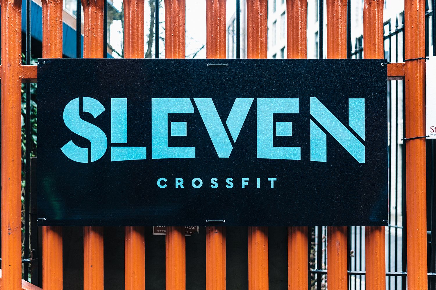
Along with wall graphics to revolutionise the space, Nick and Tim requested custom aluminium composite sign panels that members could practise handstands against, a large aluminium entrance sign and some prints for their existing A-board to complete the good vibes.
It was imperative to create an environment that truly stands out in the lineup of competition, so we created a set of sample graphics to help them visualise their searing colour palette, and show them just how bright we could make it burn.
With a confident client behind us, we got to tweaking the product and overcoming some of the less obvious obstacles that can often blindside you later on in the job.
First things first – with the business being under a railway bridge, we headed down and measured the arches to figure out what curves we’d be working with. We realised there was no flat surface to attach the main entrance sign to, so we shaped it to the front of the arch and added returns to the edges, drilling it into the ceiling and sides to form a floating sign that neatly drops down and faces out.
We then ensured that our boards would be robust enough to bear the weight of upside down gym goers and their super strong cores, and, after some trying and testing, produced equally Herculean vinyls in response to the fact that the walls were coated with repellent paint, which is easy to clean but hard to stick adhesives to.
Finally, we ramped up the energy of the space in an install that took just two days, applying the electric blues, cool mints, hot pinks, neon oranges and deep purples of the wall graphics to the ebony boundaries, manifesting an almost luminous effect. Our verve was matched only by the disco ball hanging between the suspension bars – a lovely addition by the client that’s symbolic of the refurb, where little touches and flashes of fun work the hardest.
