The Advent Colander Fest-sieve window graphic
THE LOWDOWN
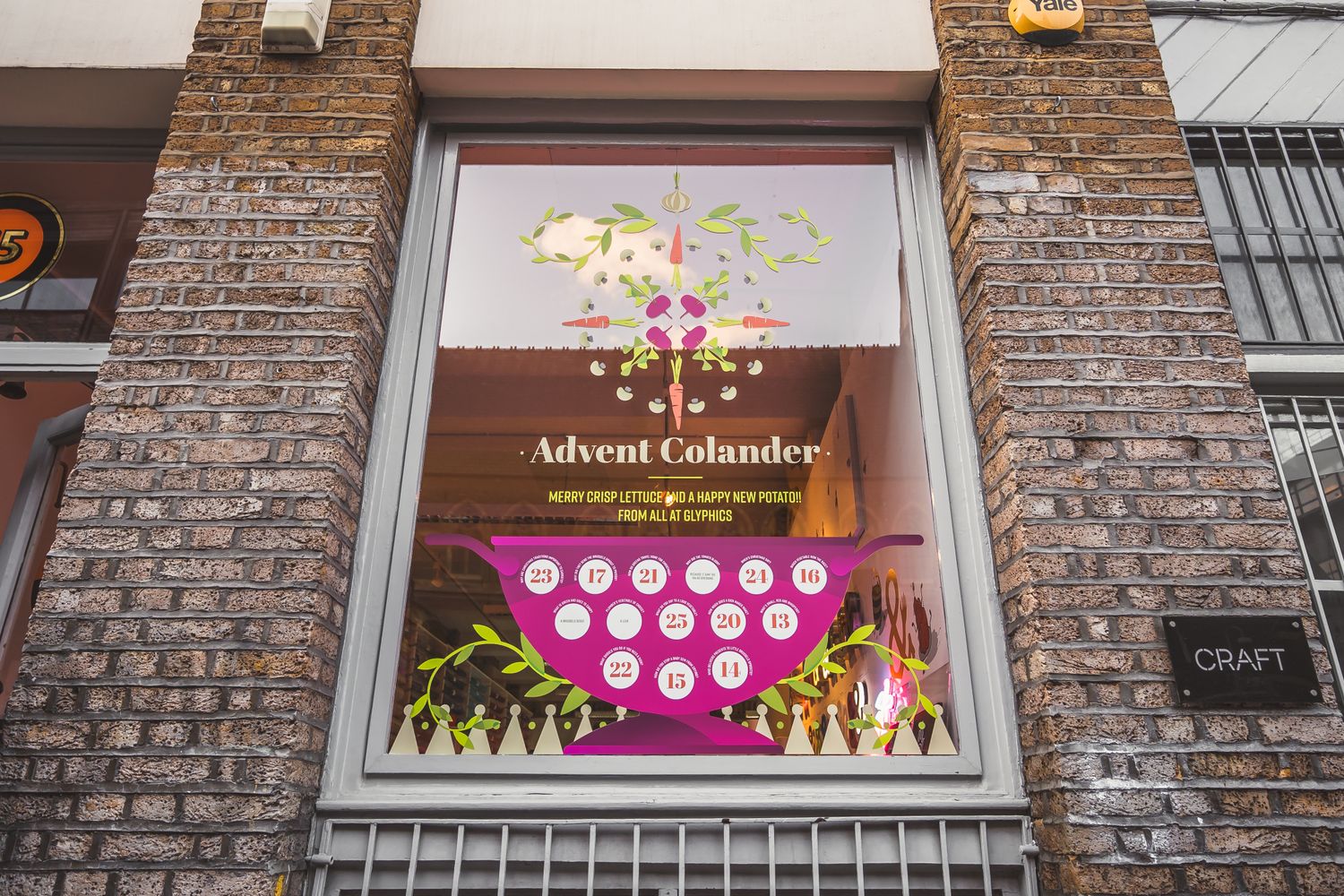
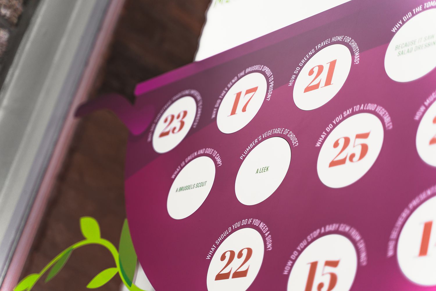
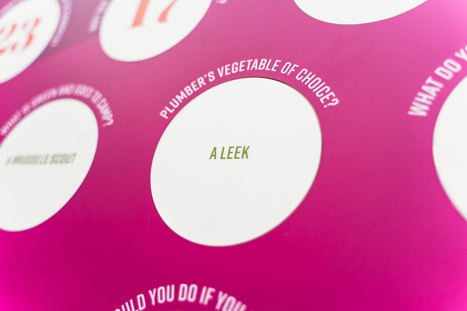
Just in time for Santa, we’ve put up our version of an advent calendar in our shop front – it’s in the shape of a colander filled with jokes that are logically about food – mostly root veg, to keep it seasonal of course.
The idea is to gradually peel back each of the holes and bring a little ray of sunshine to passers-by as they trudge wearily past our window in the lead up to Christmas, allowing them to grin, grimace or groan at a dreadful joke every day.
Twenty-odd years in the making, this visualisation is how our long standing designer, Paul, made sense of a mind filled with terrible jokes about vegetarian food – a strainer, living under the strain of his puns.
Alas, a theme was born, and long forgotten, but after the last few years of particularly difficult holidays that COVID has given us, Glyphics felt compelled to go green and give everyone a little window into Paul’s weird and wonderful world.
So how did this idea go from ancient scribble to stylised nordic production?
THE SPECS
Although a fun piece of concept work that indulges our sense of humour, we took Paul’s idea seriously as a brief and saw it as an opportunity to stretch our design muscles.
Our newest designer, Damian, saw parallels between the idea of the advent colander and the philosophy of Hygge, and decided to start sketching with the seeds of nordic design in mind.
Hygge is all about creating a sense of cosiness with what’s around you and seeing fun in the everyday, so he began improvising a kitchen worktop scene with yuletide vibes – a vector graphic of a colander, draped in an arrangement of decorative elements, sitting under a hanging wreath of greens.
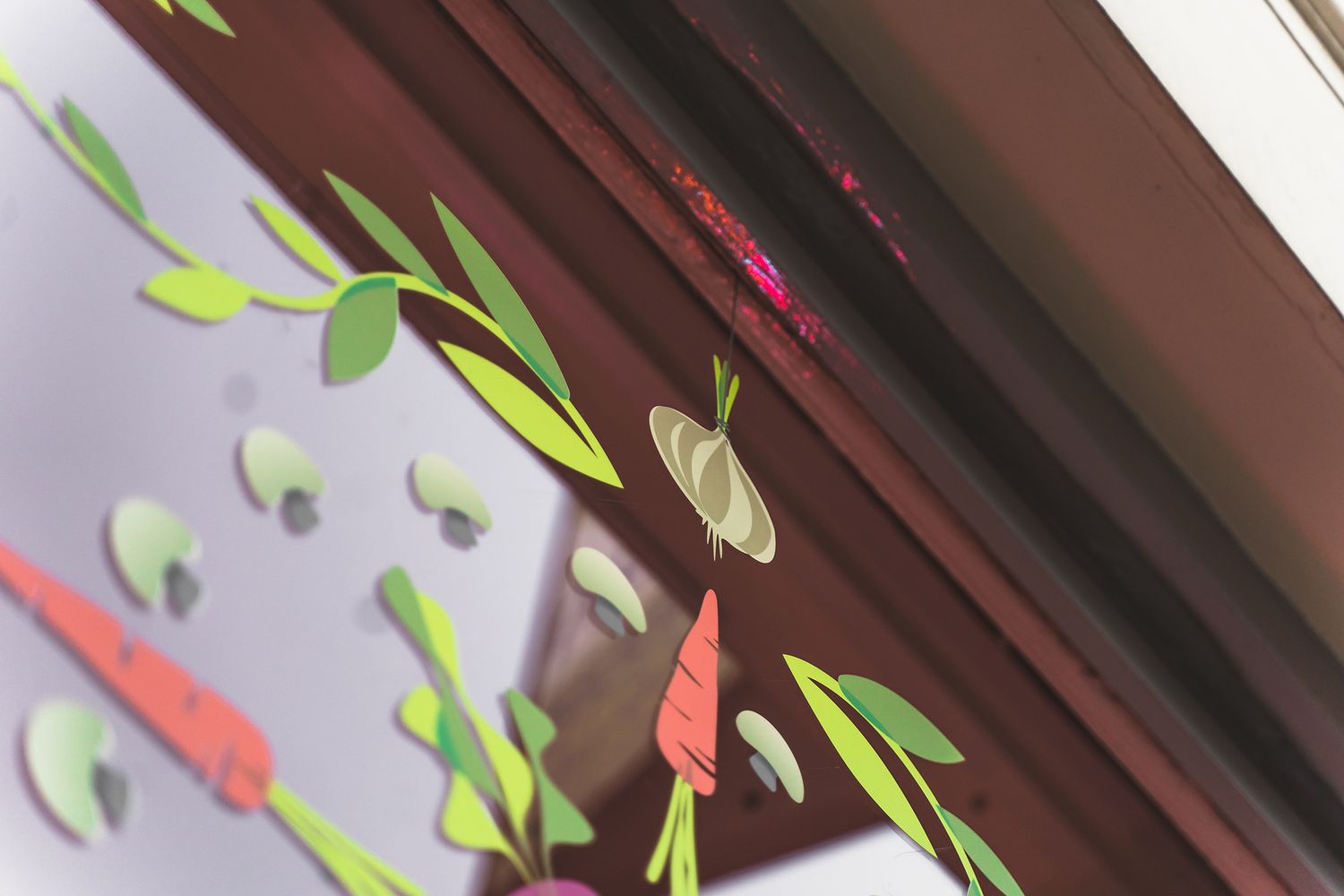
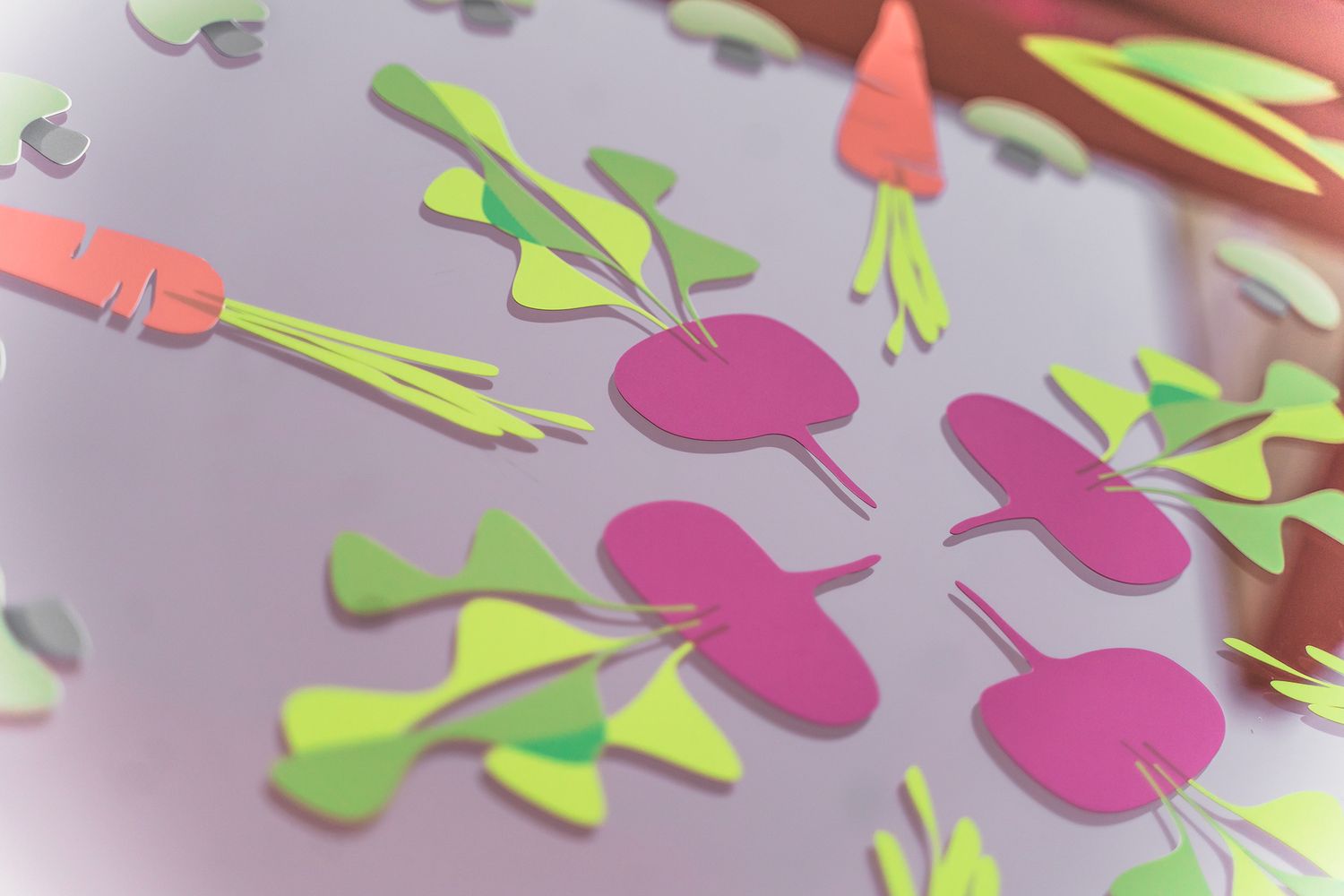
To compose the suspended ornament, Damian developed clean, flat icons of vegetables and played around with their layout till he built up a mandala of sorts – sticking to the norse design principles of geometry and minimalism.
He picked woodland imagery, such as taupe mushrooms and green foliage to fill out the pattern, and contrasted the Scandinavian look and feel with a popping colour palette of bright orange carrots and hot pink beets, now sparkling in our window like juicy gems in a bed of leaves.
Printed in true colour on vinyl, cut and applied neatly to our largest street facing display, we’re currently providing a healthy diet of giggles to our unsuspecting neighbours this season of jolly, and we couldn’t leave you without one of your five a day –
What do peas like to listen to?
A podcast!


