


Elmtree by Spacemade Quiet wayfinding for a co-working space with wow factor
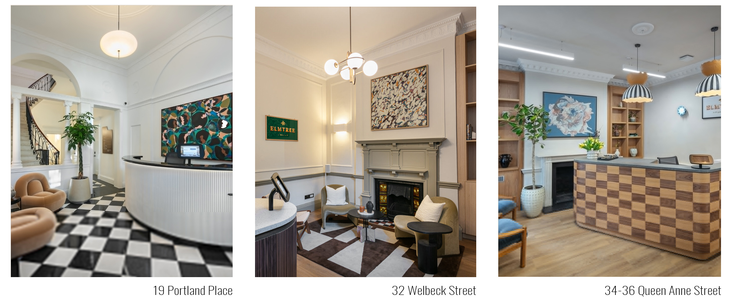
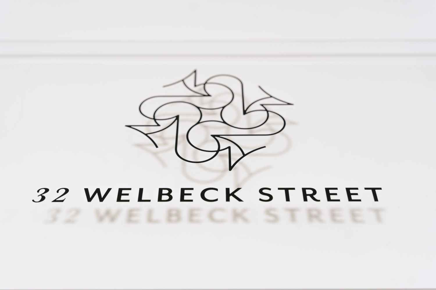
Following a number of successful fit-outs with Spacemade, Glyphics was asked to produce and install signage for Elmtree; a trio of flexible co-working locations spanning Marylebone, including Queen Anne Street, Welbeck Street and Portland Place.
The collection takes its name from a century-old Huntingdon elm on Marylebone High Street - a local landmark that survived both the development of London and wartime bombing. That sense of resilience, heritage and locality informs the wider brand, which combines architectural detail with a contemporary co-working experience.
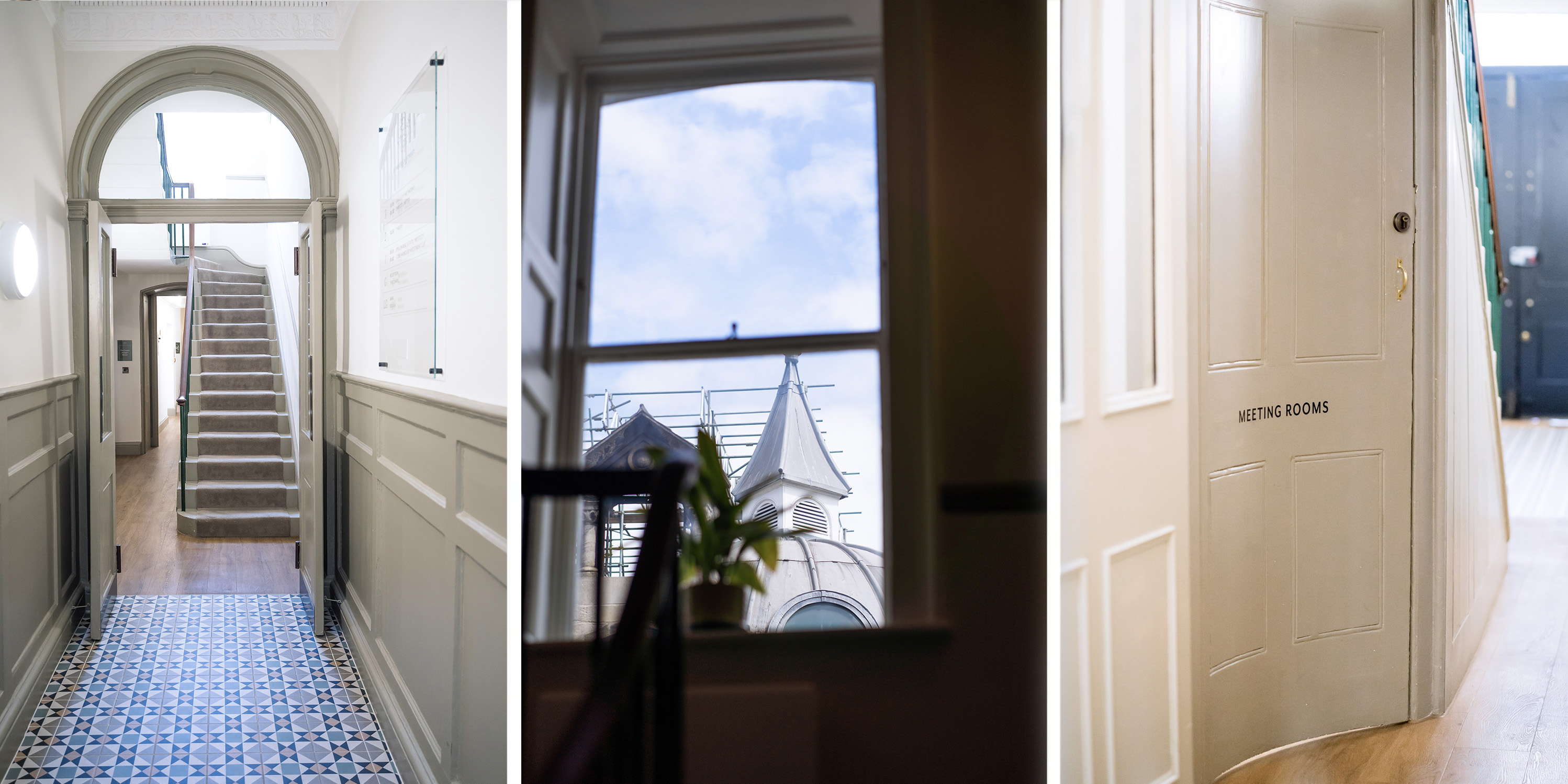
Situated within three beautifully converted heritage properties, Elmtree responds to the growing demand for boutique co-working environments with character, flexibility and a strong sense of identity. Each location has its own townhouse feel, with elegant staircases, restored details and carefully considered interiors shaping the experience of the buildings.
While signage was delivered across the wider Elmtree collection, Welbeck Street offered the most distinctive setting and is the focus of this project.
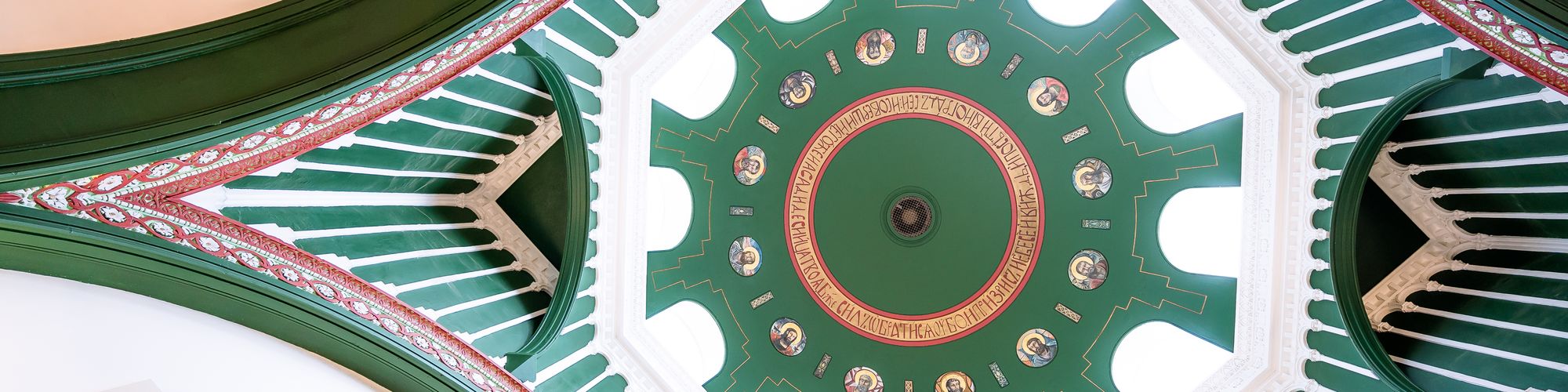
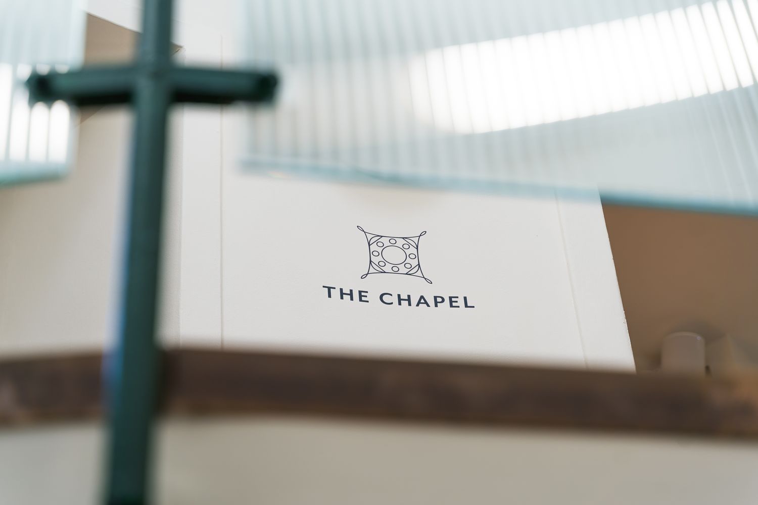
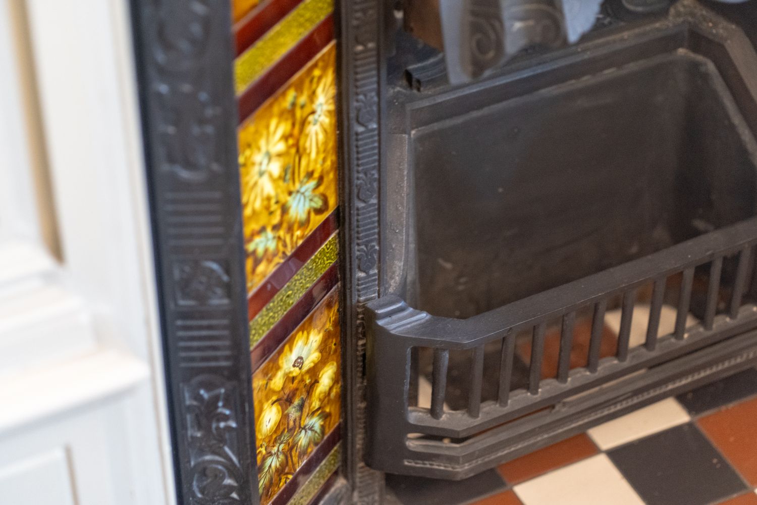
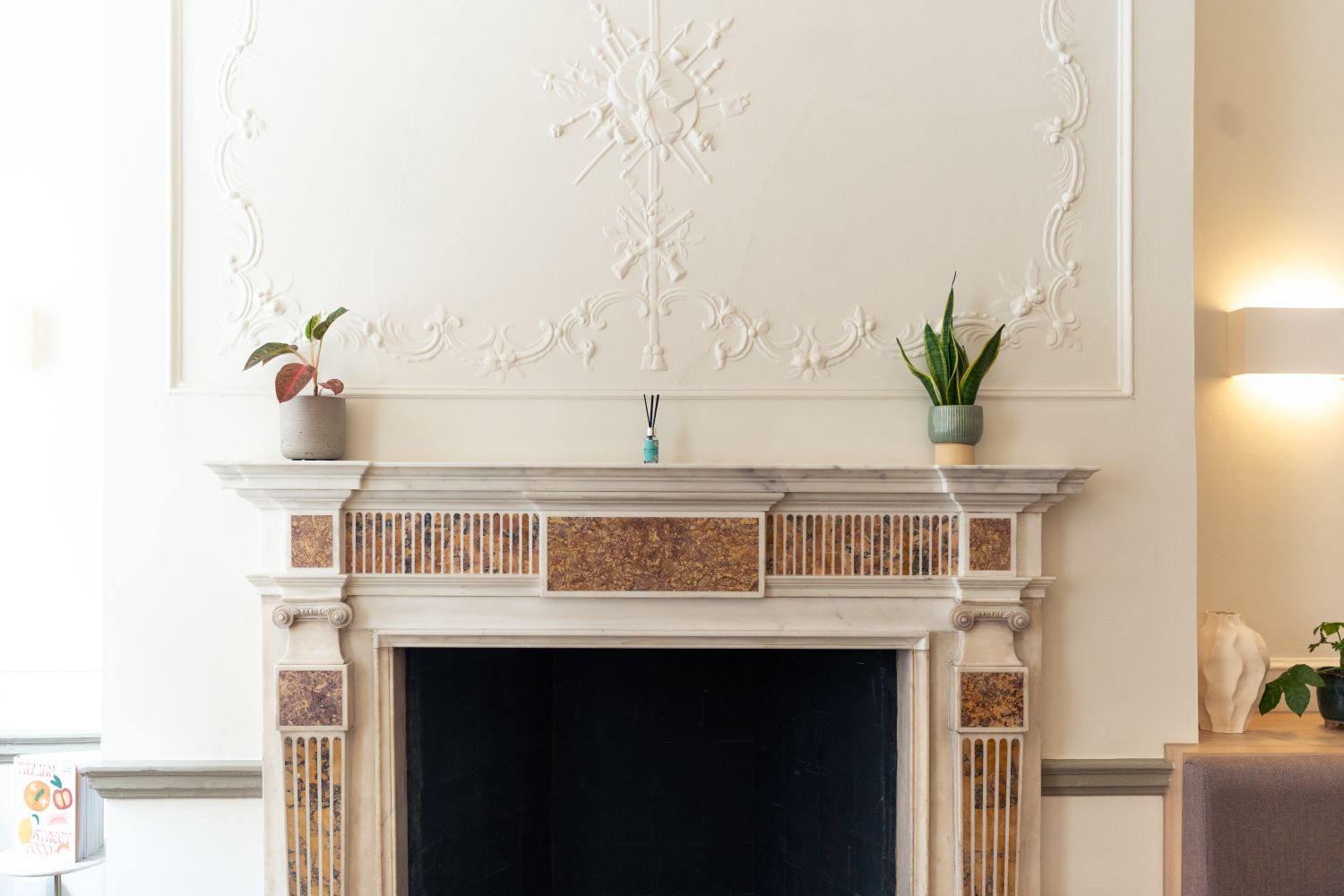
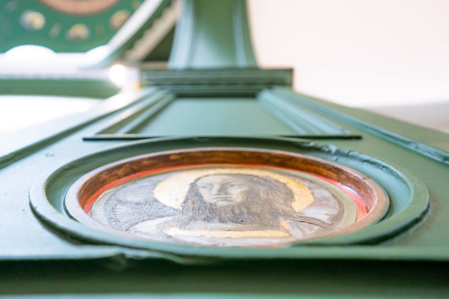
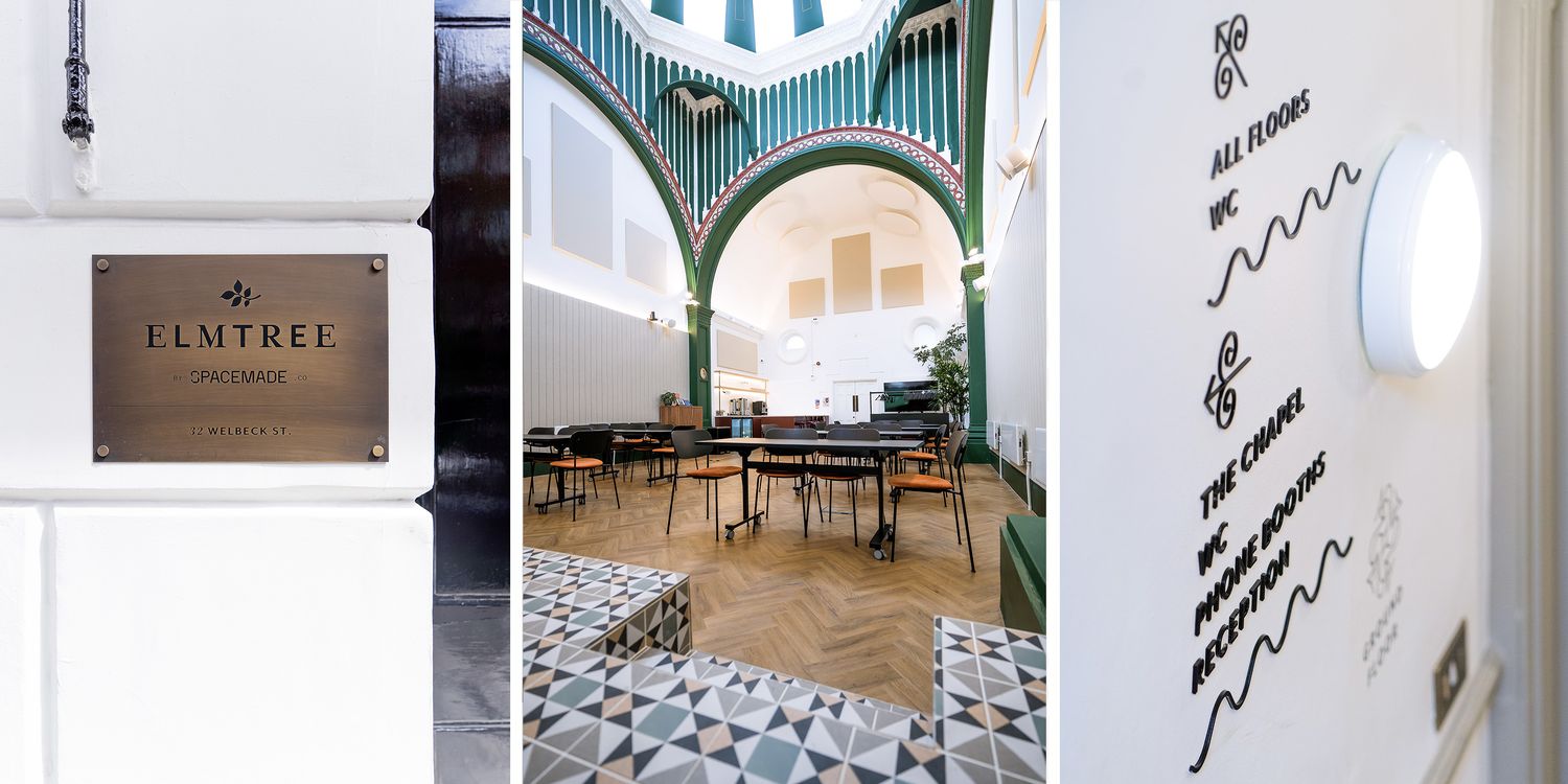
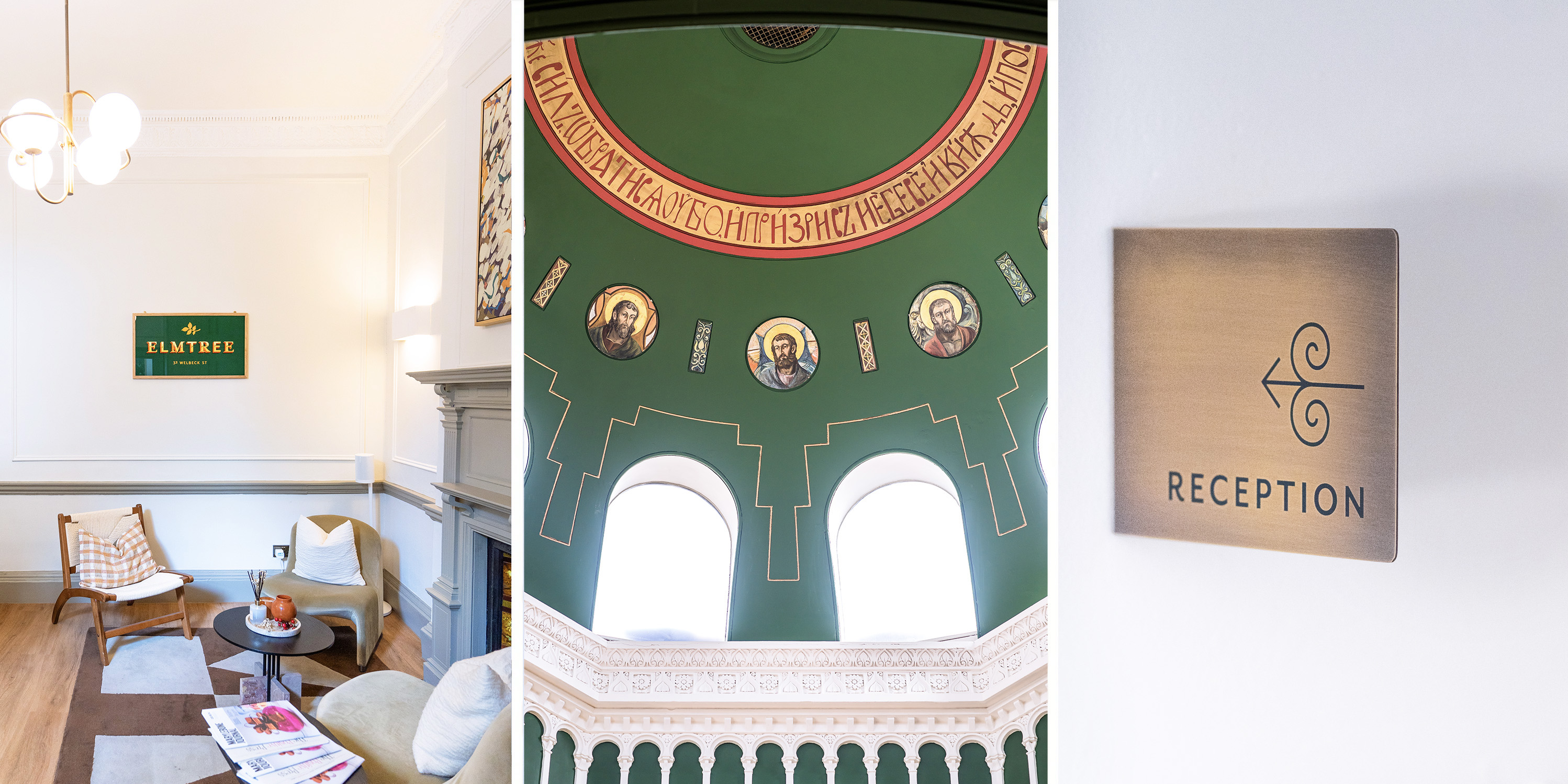
Hidden behind the Georgian terraces at 32 Welbeck Street is a Grade II listed former Russian Orthodox chapel, originally built on the site of a stable in the 1860s/1870s and once known as the Church of the Dormition of the Most Holy Mother of God.
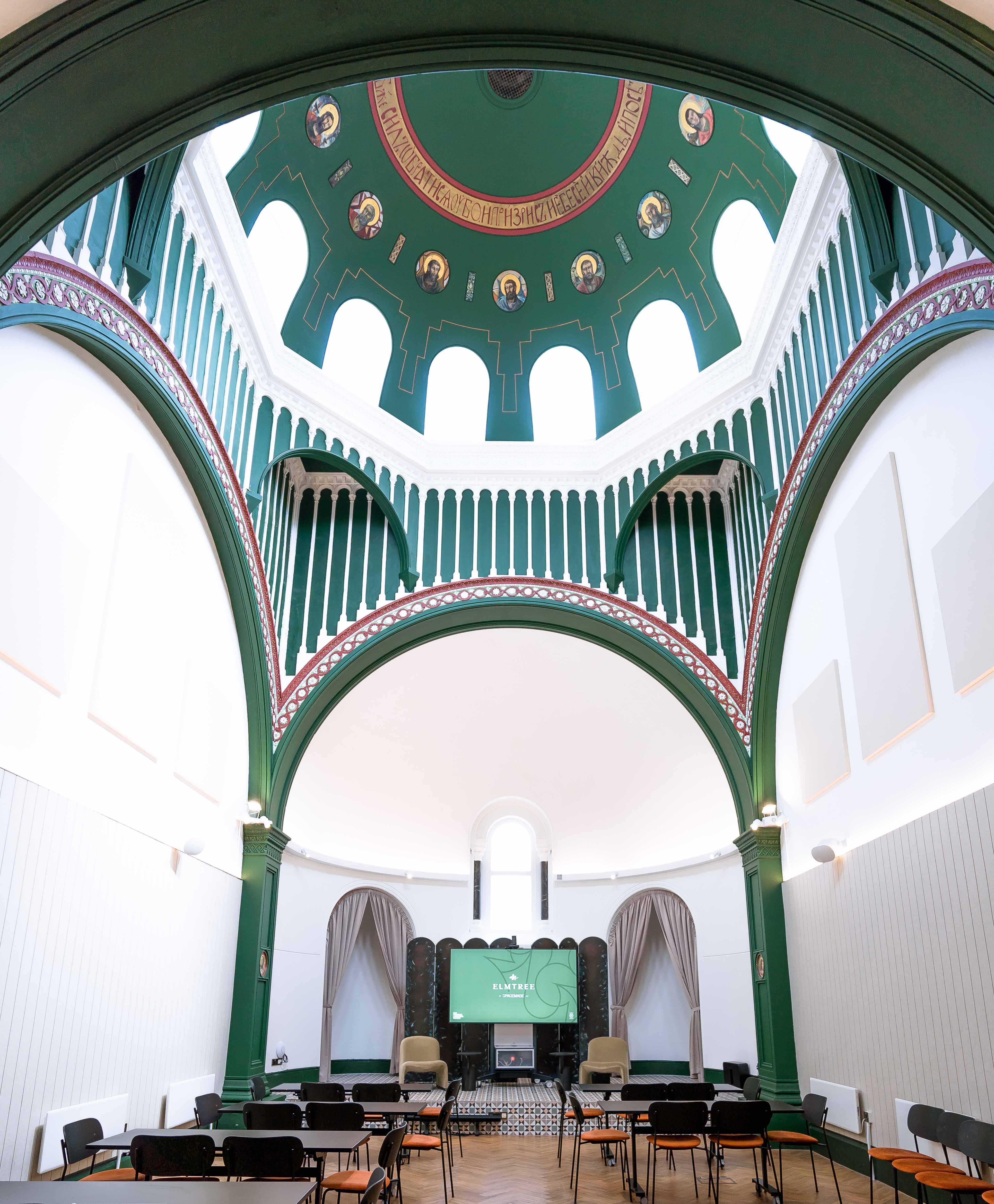
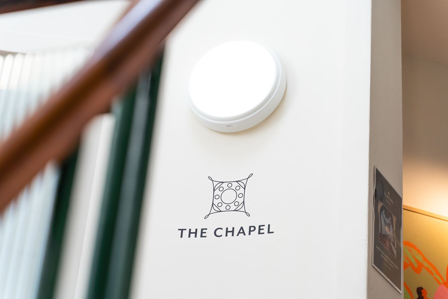
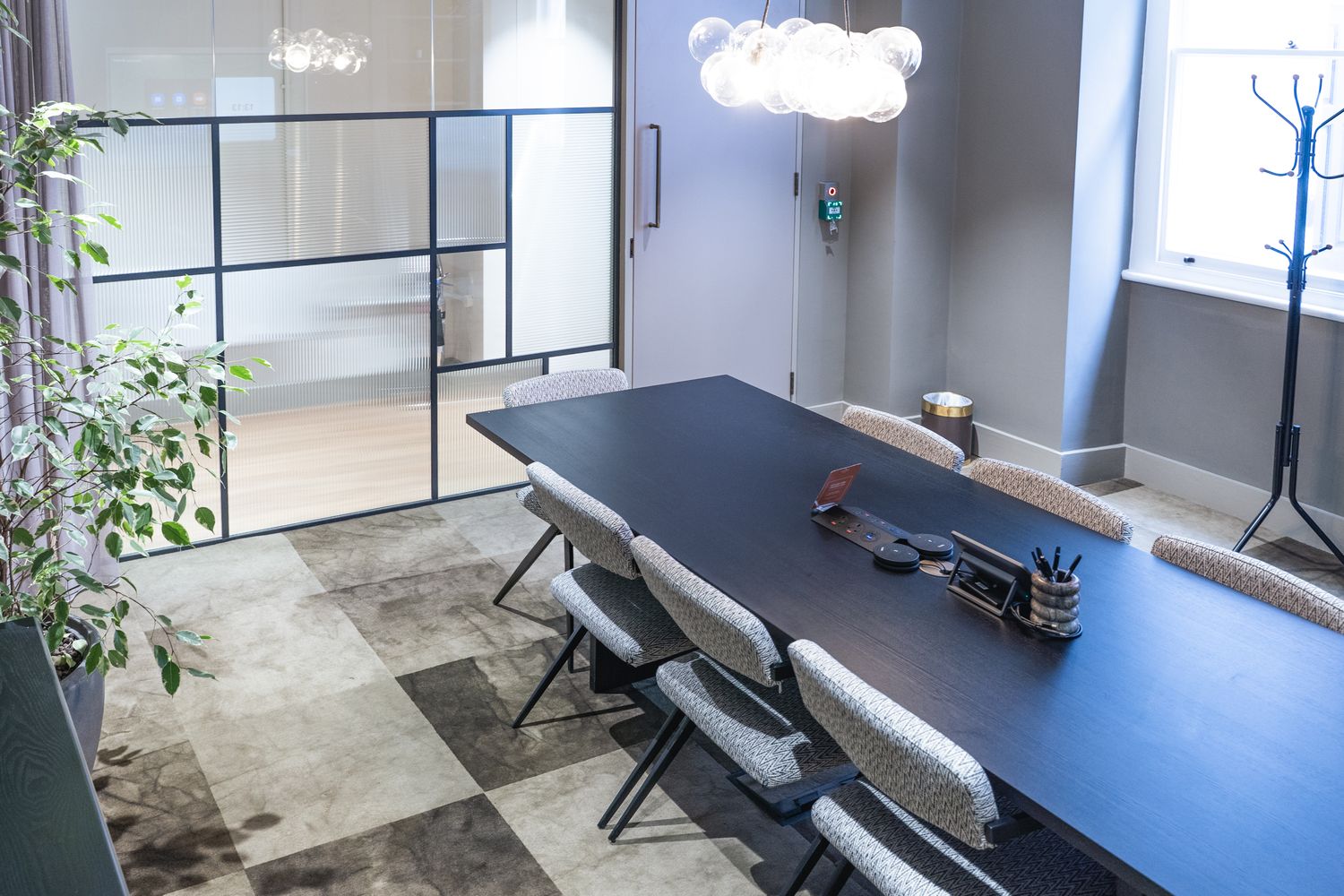
Now restored by Spacemade as The Chapel at Elmtree, the venue features vaulted ceilings, dome structures, generous natural light and remarkable historic detail, creating a striking backdrop for co-working, private events, launches, photoshoots and intimate conferences.
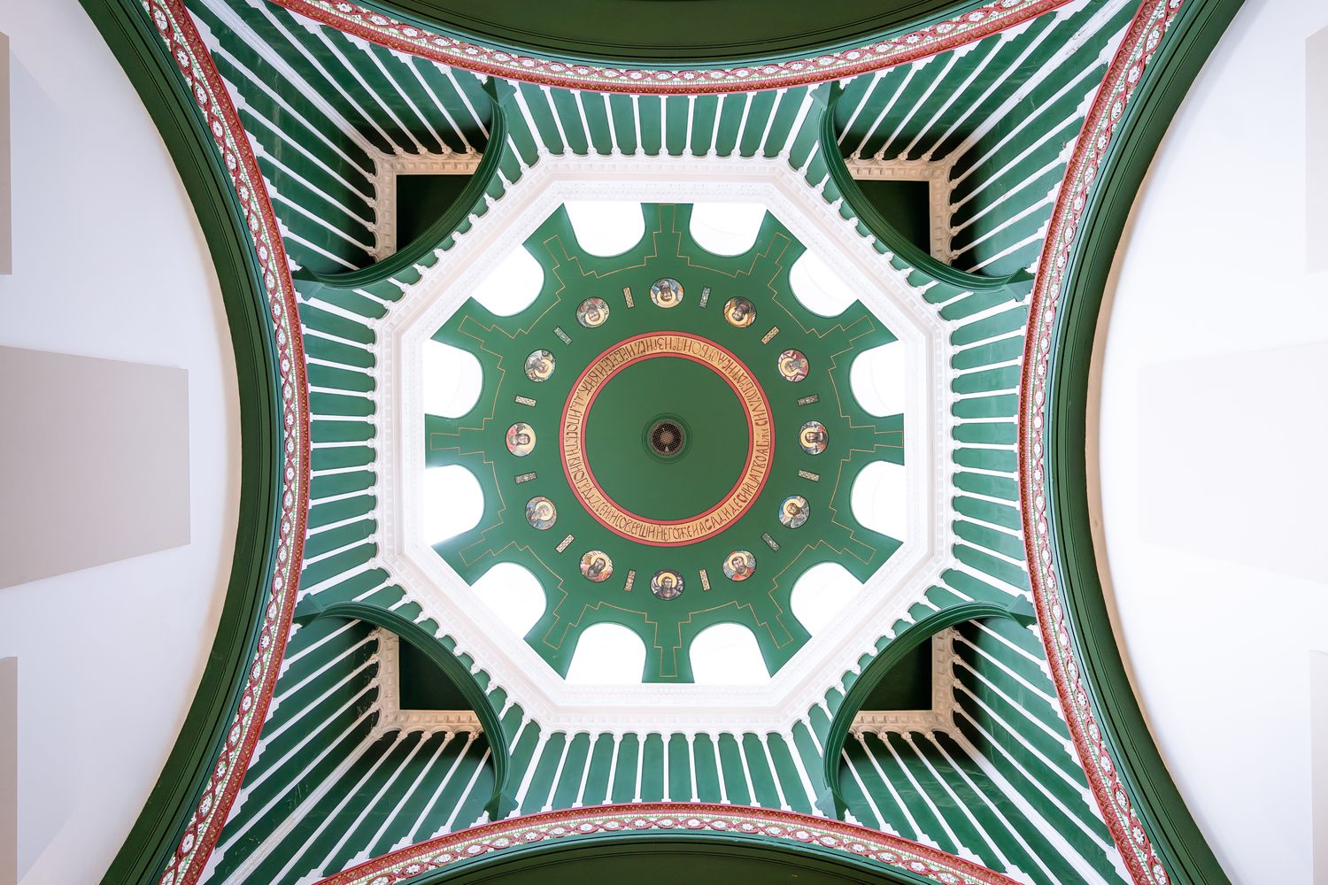
Our task was to create a wayfinding scheme that could support The Chapel’s new role as a shared workplace and event venue, while remaining sensitive to its Grade II listed surroundings. Clear navigation was essential, but the treatment needed to feel restrained, considered and in keeping with the chapel’s architectural detail.
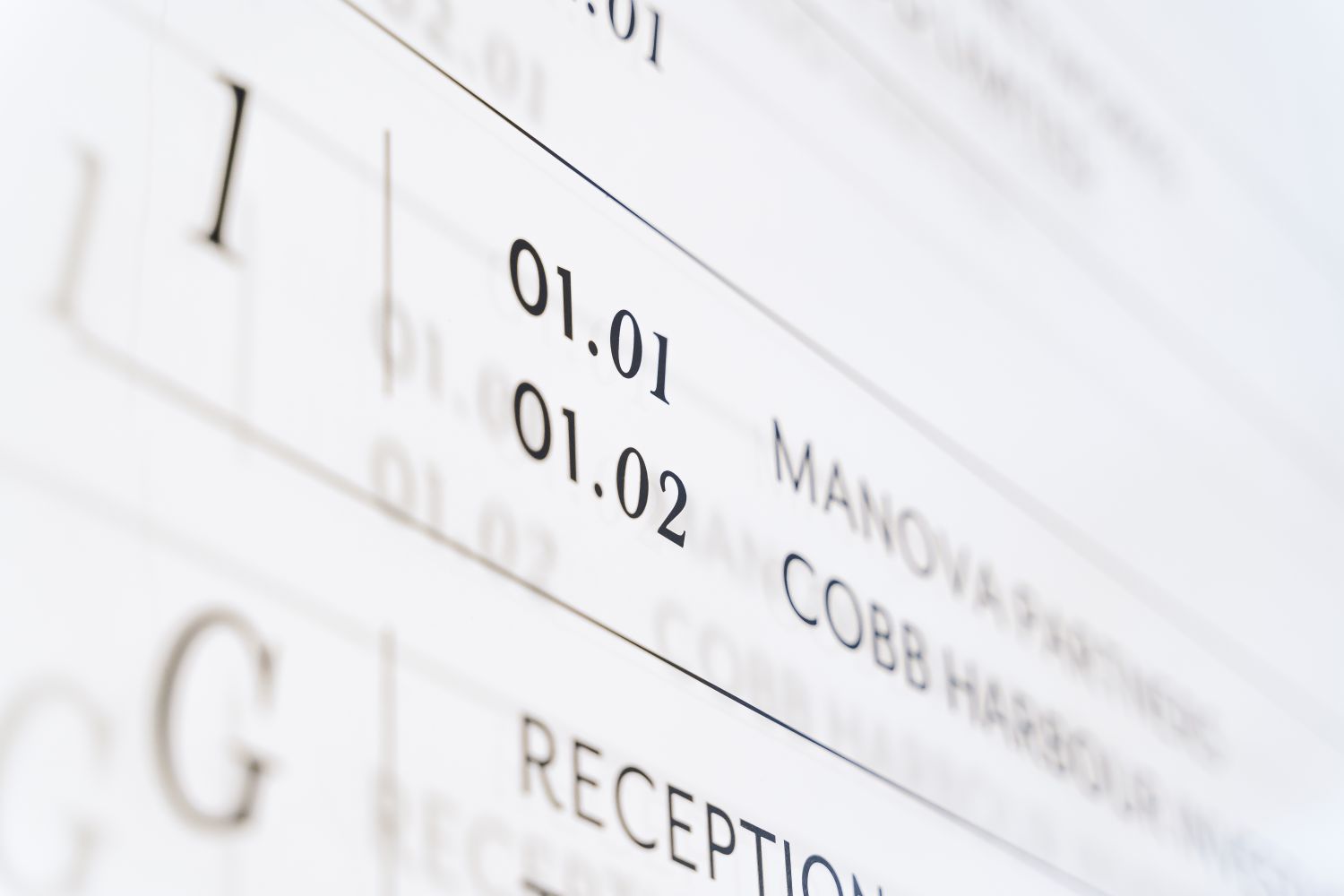
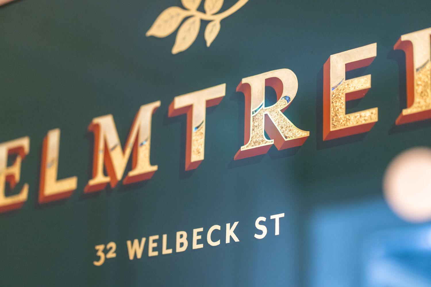
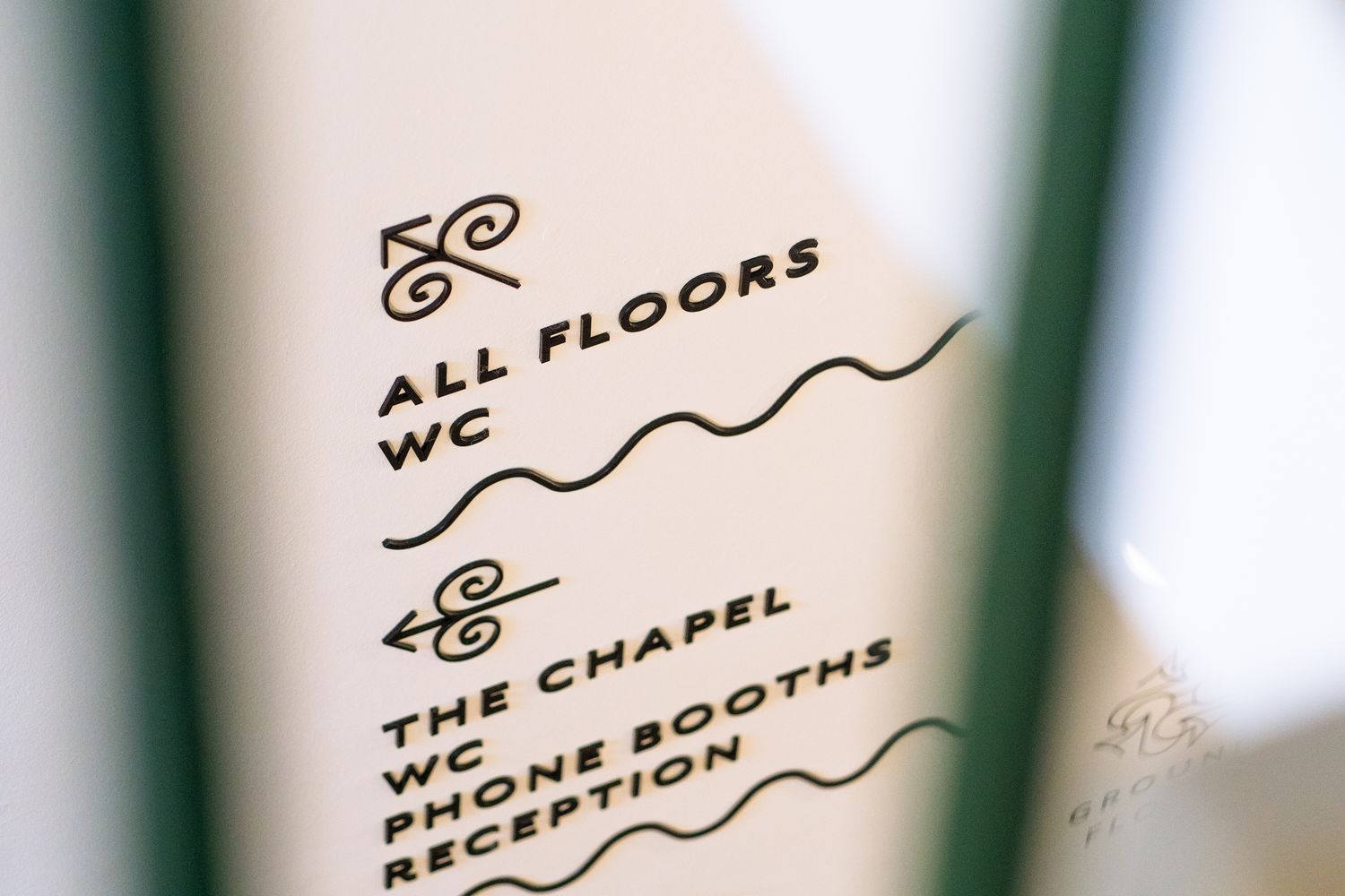
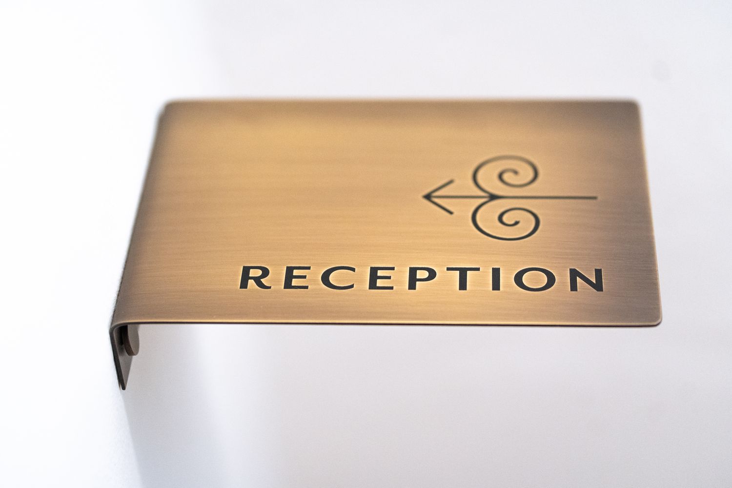
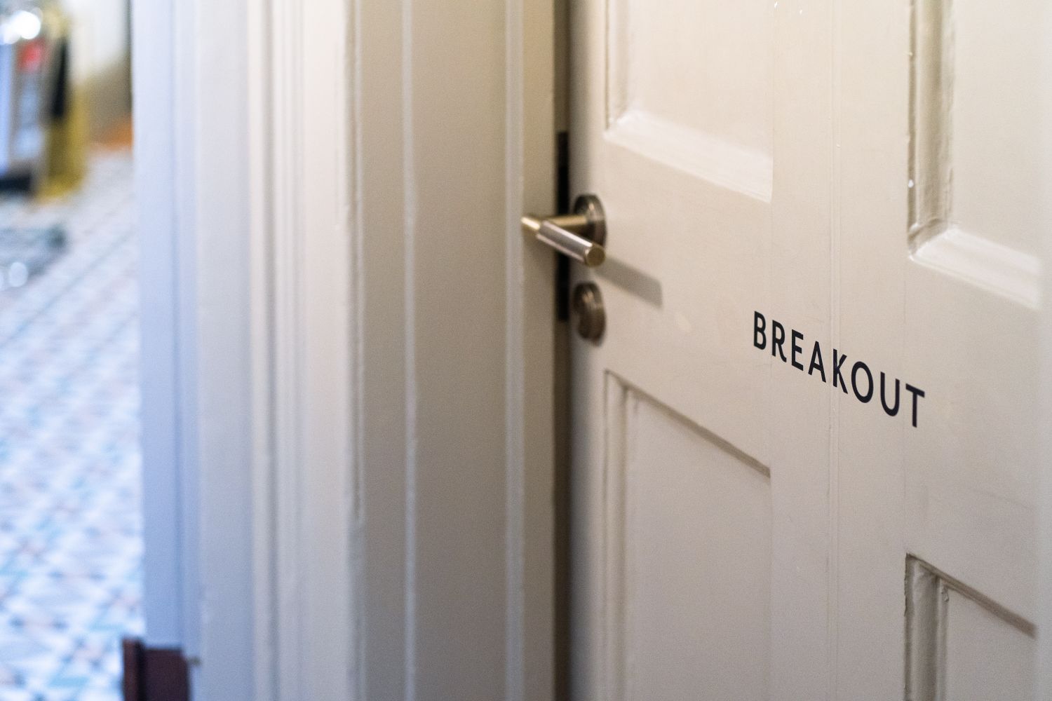
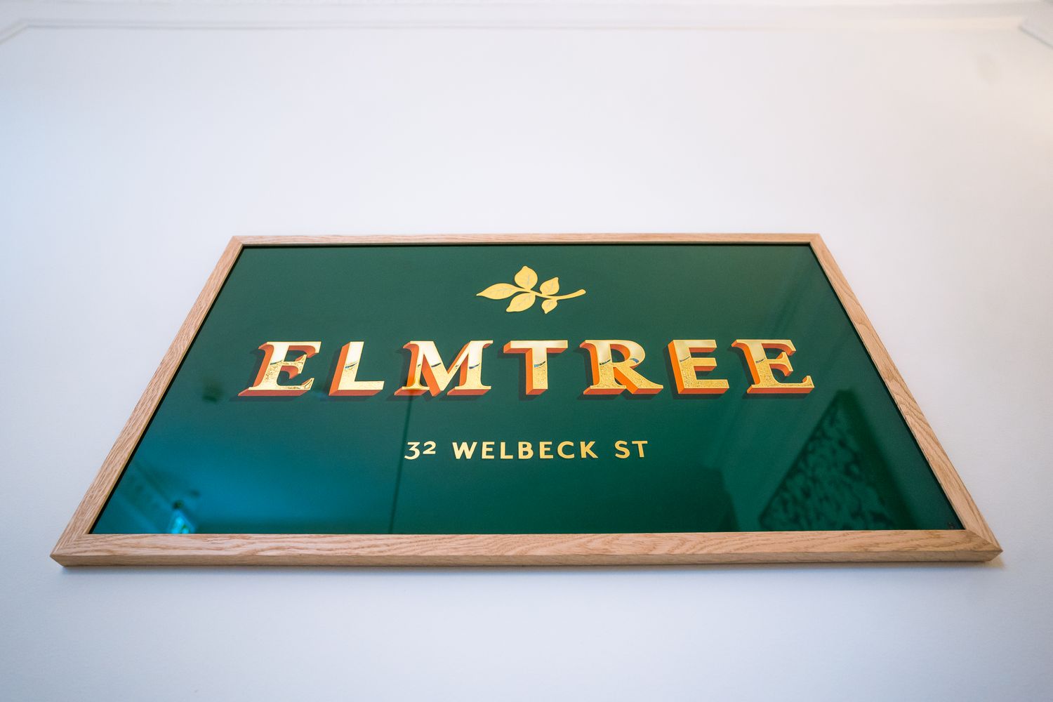
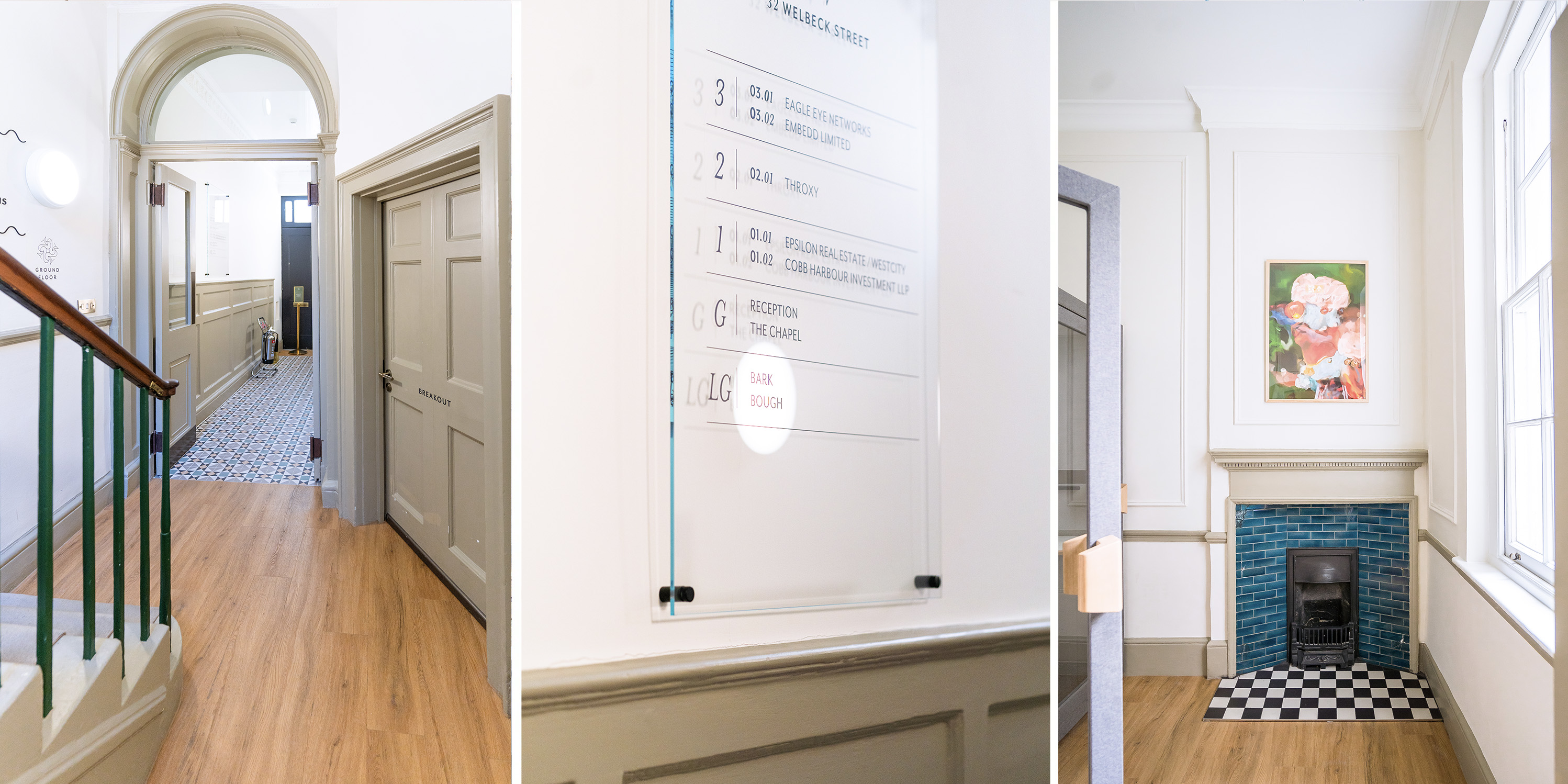
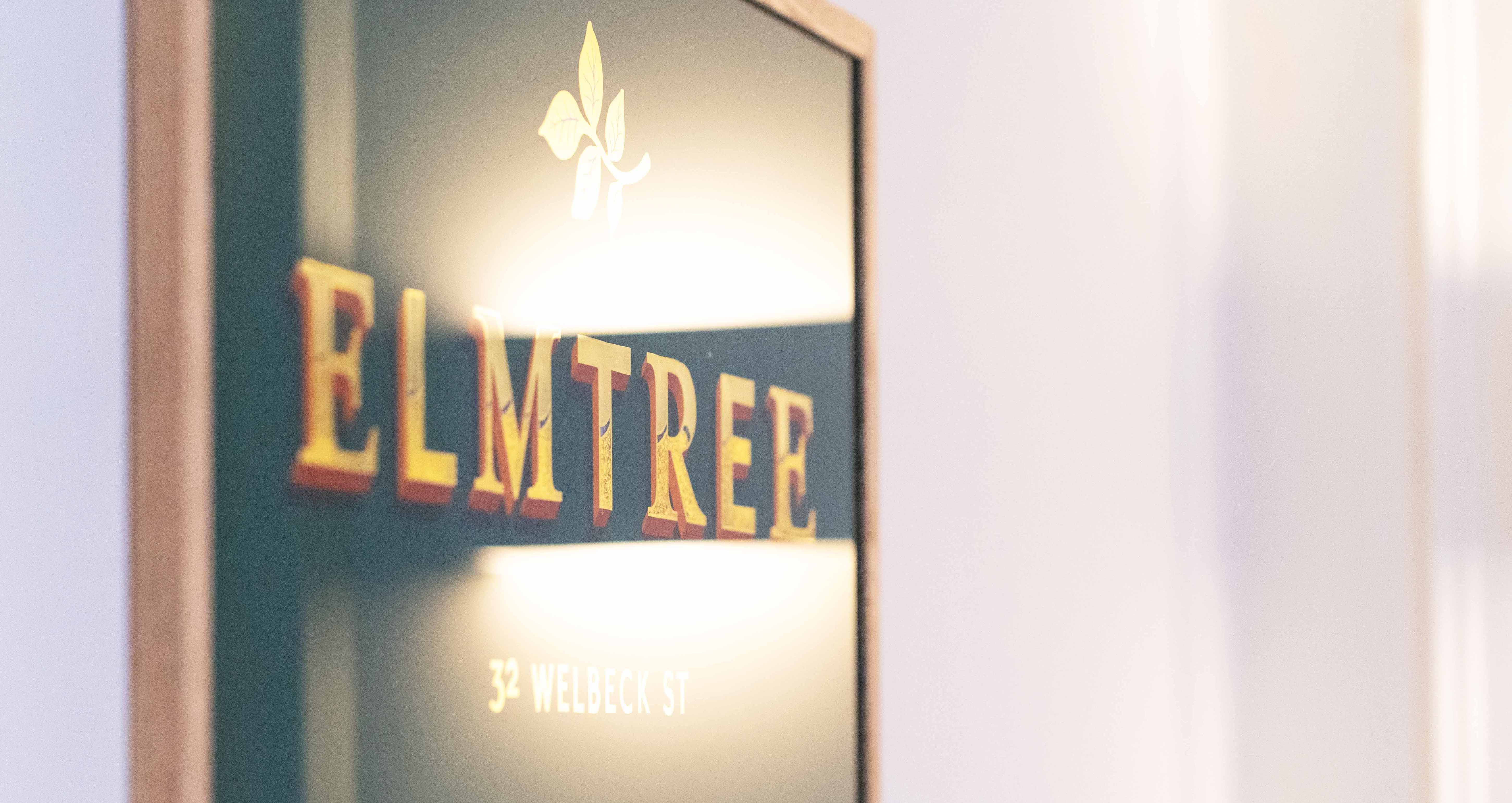
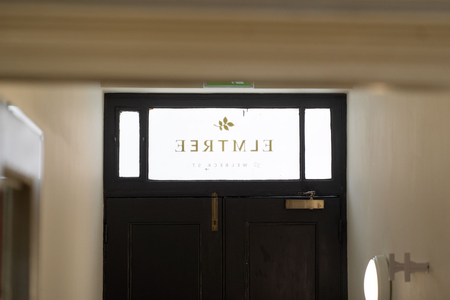
The finished scheme brought together external identification, black vinyl door graphics, reeded-style manifestation, clear glass directory panels, raised black acrylic lettering, a brass reception plaque and a hand-painted framed sign finished with gold leaf.
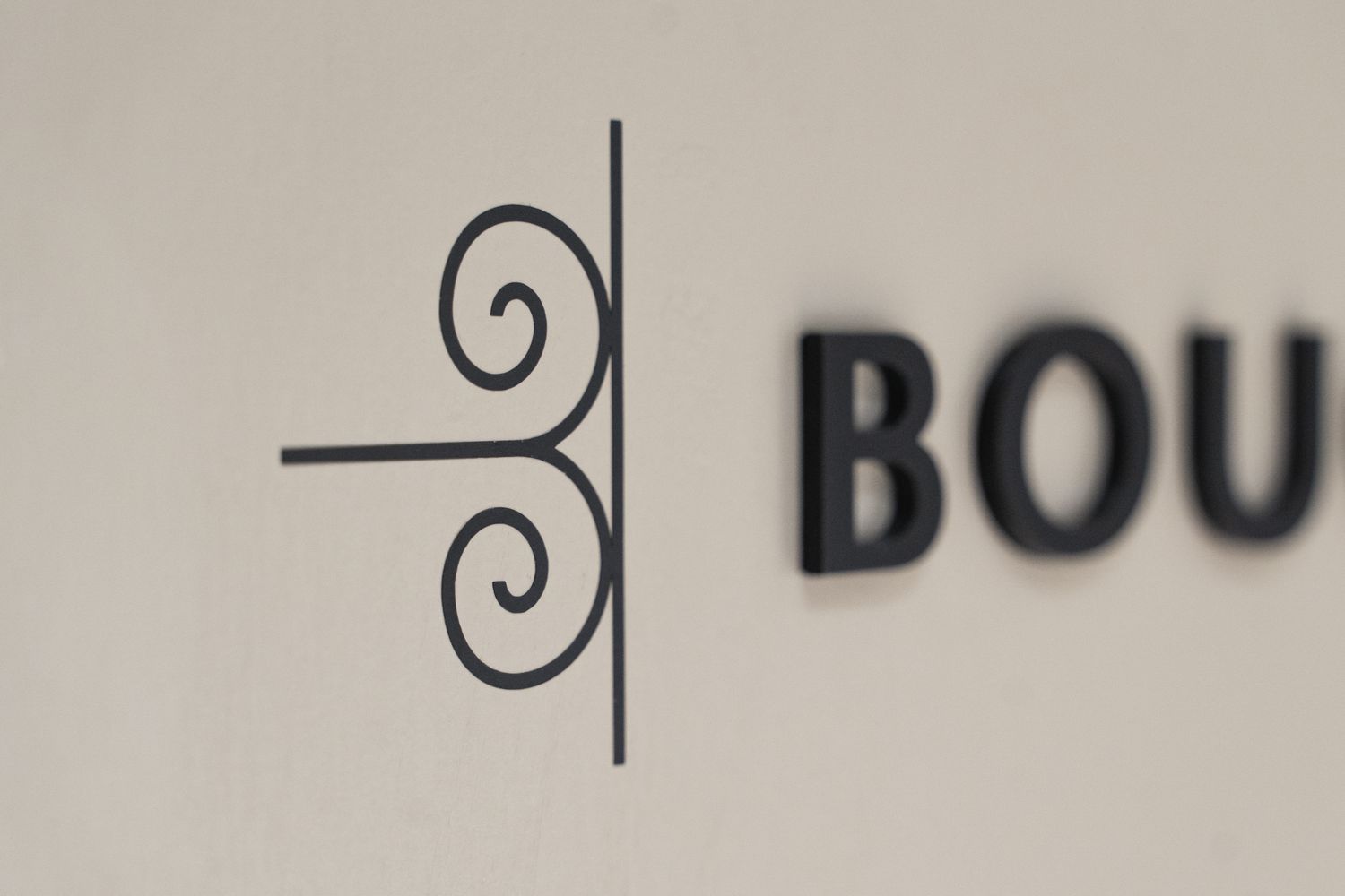

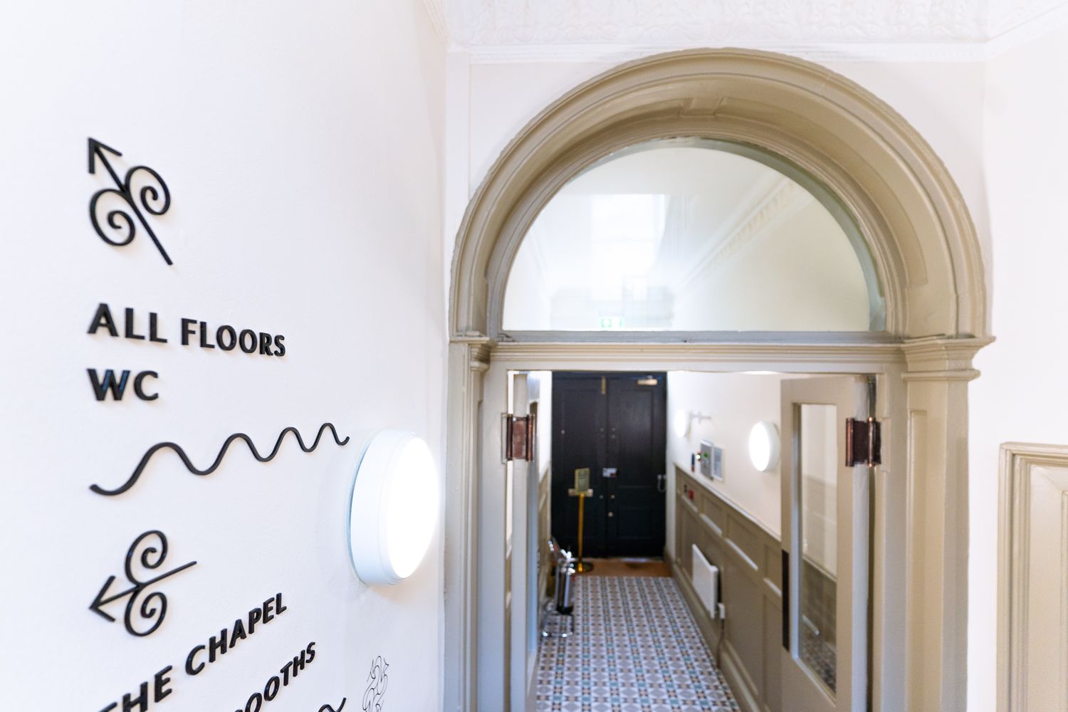

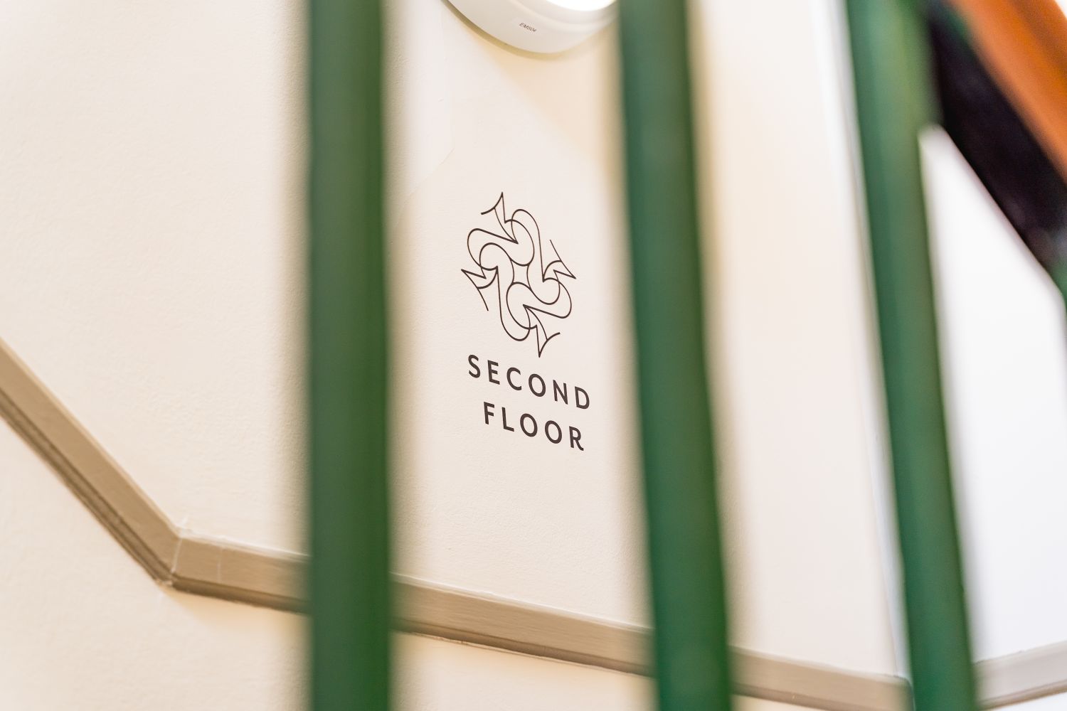

The Elmtree identity already had a rich visual language, with ornately styled arrows, flowing linework and decorative icons inspired by the original features found across the locations. Our role was to translate this into physical elements that felt useful, refined and appropriate, from the first point of arrival through to the building’s staircases, doors and shared spaces.
Rather than introducing a heavy branded layer, the signage was designed to sit comfortably within the building. This meant working carefully with a varied set of surfaces and sightlines, including curved walls, narrow circulation routes, glass panels, painted doors and restored interior details.


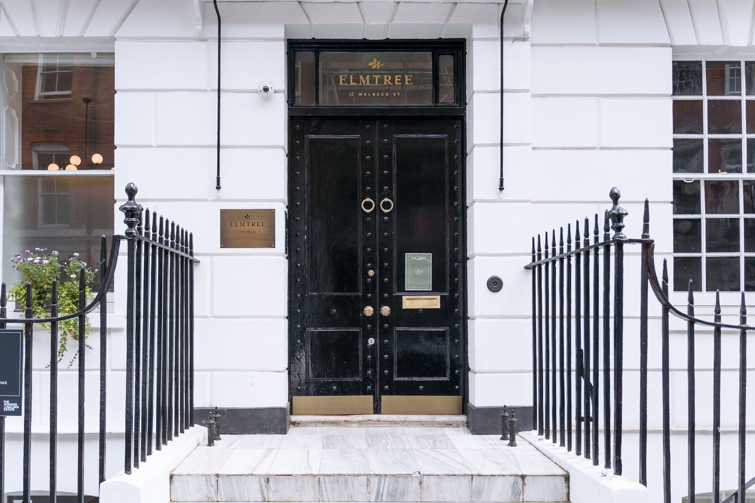
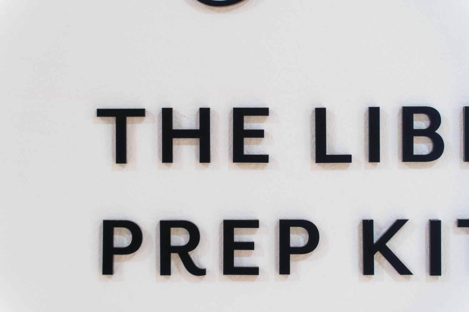
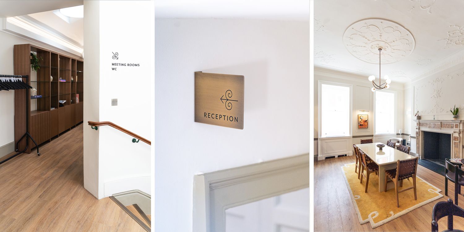
Externally, the brass plaque and gold Elmtree lettering above the entrance give the building a clear but understated presence from the street. Inside, raised black acrylic lettering and wavy divider details add depth and shadow to the main wayfinding moments, while keeping the overall treatment restrained.
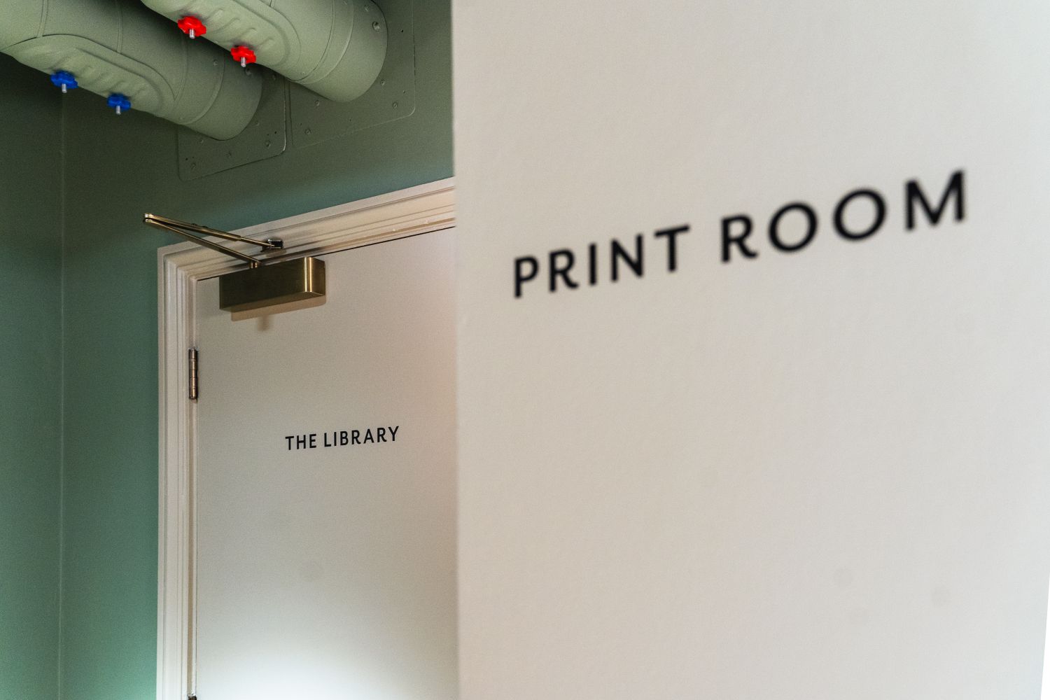
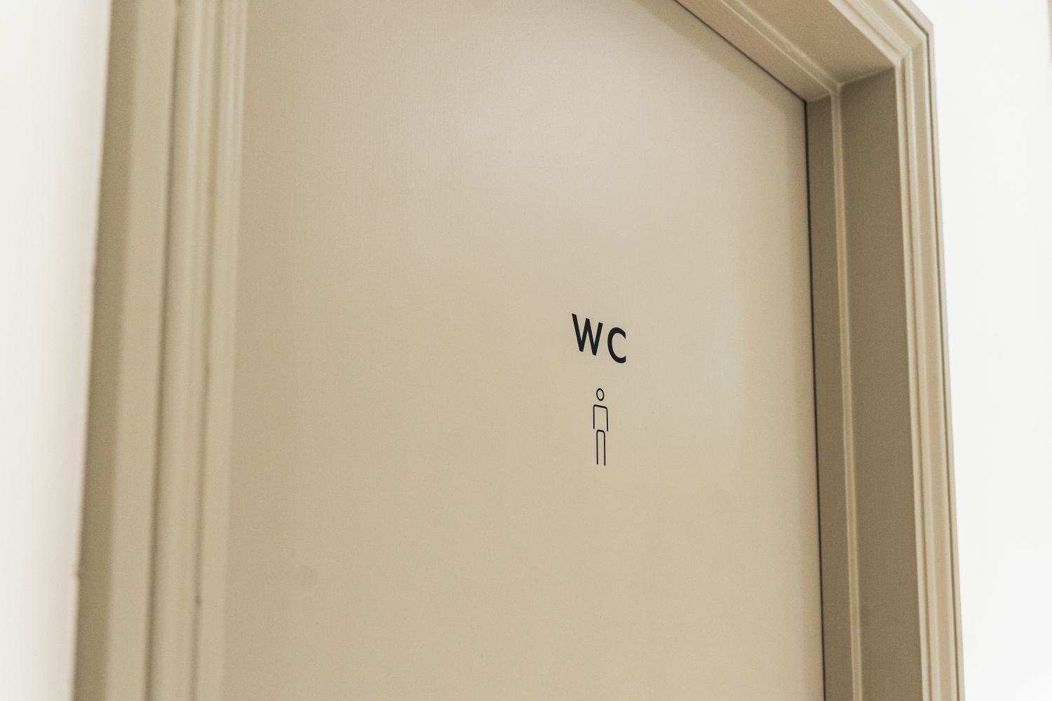
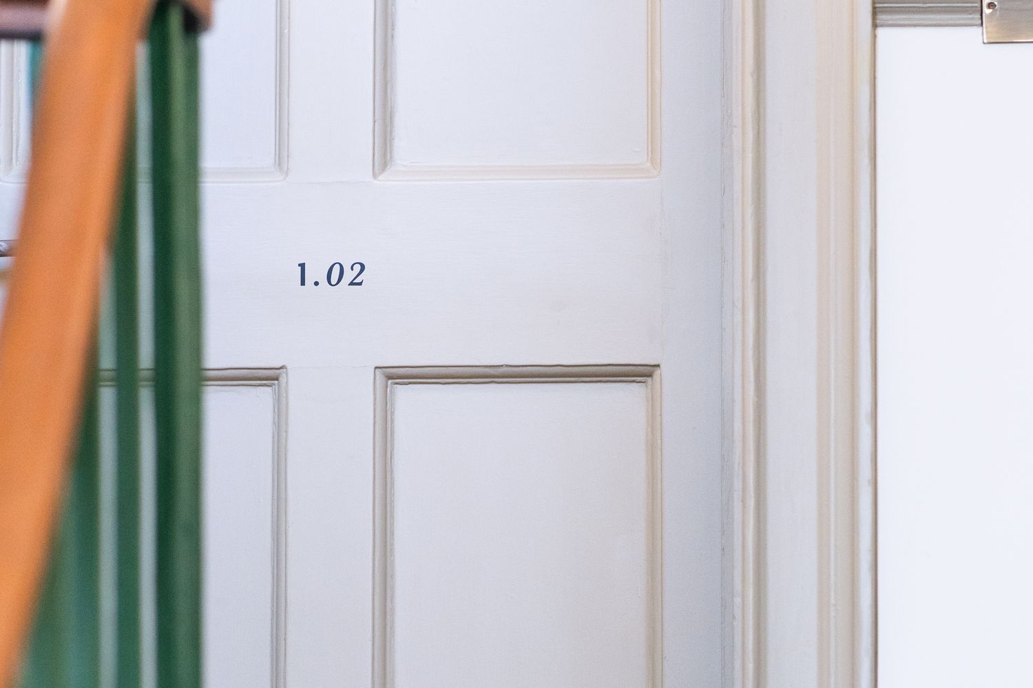
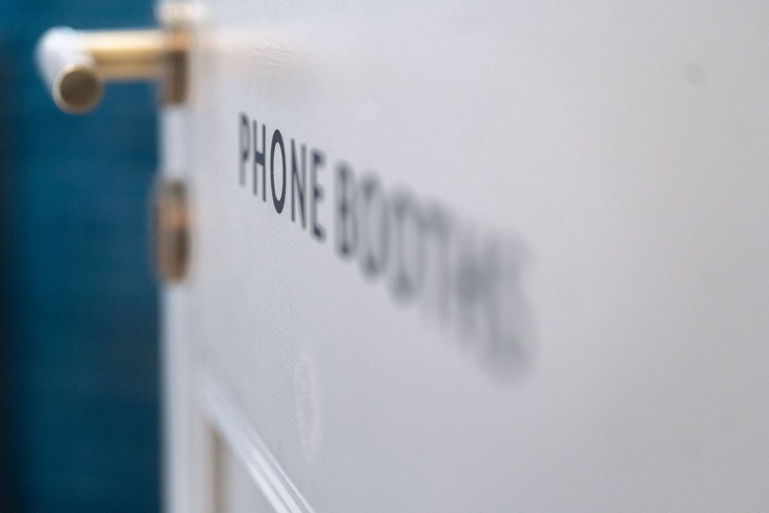
For doors and smaller identifiers, black vinyl provided a discreet touch, allowing practical information to appear clearly without feeling overworked. It also gave us the flexibility to carry the wayfinding across sweeping walls and tighter circulation spaces, where heavier signage would have felt less at home. Minimal icons do much of the work, with supporting text kept clean and simple.
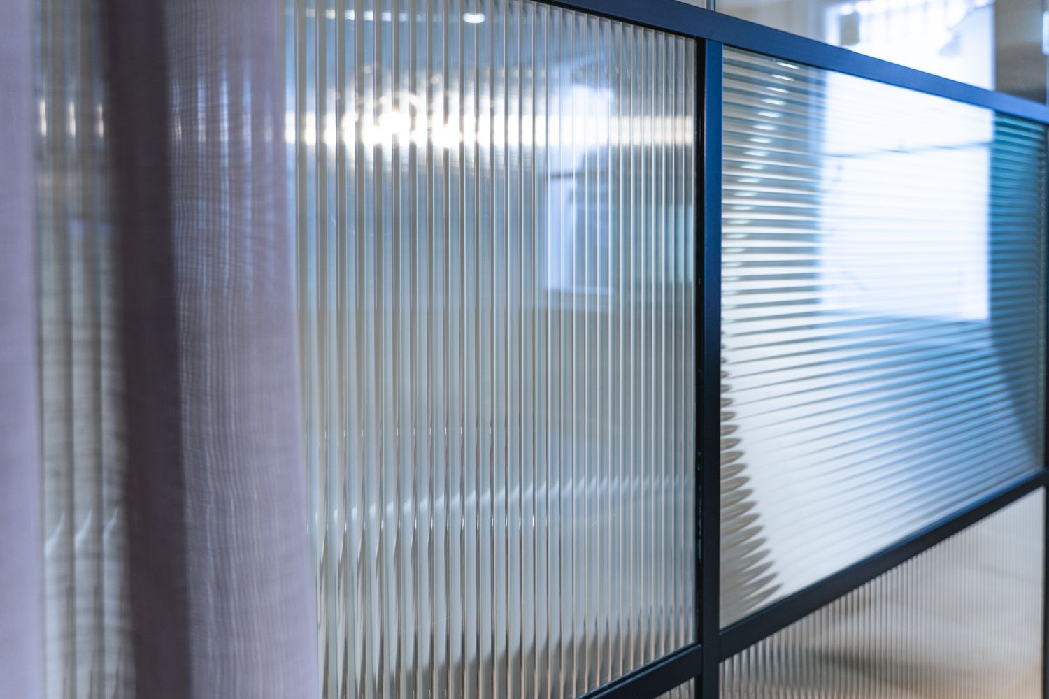
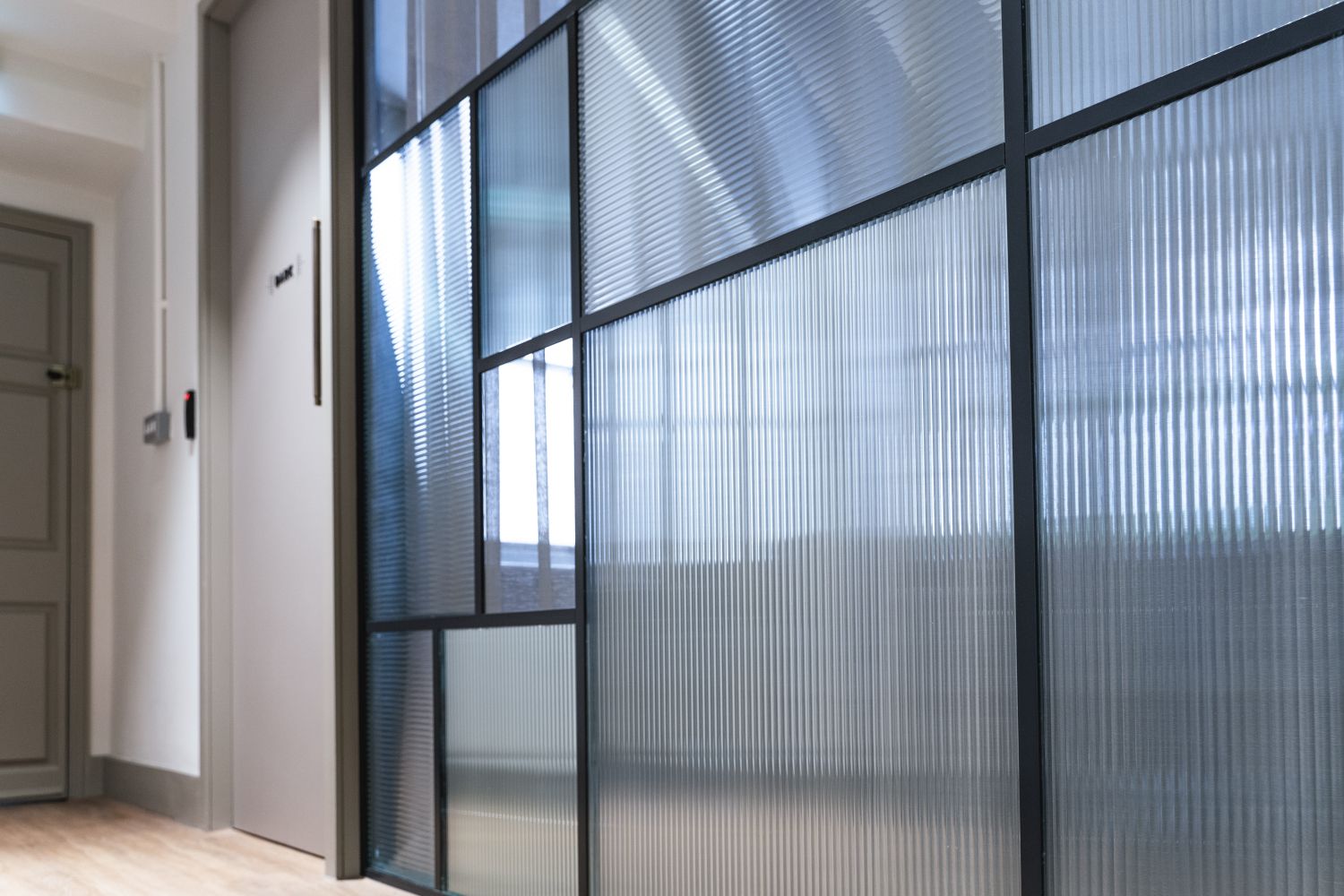
The clear glass directory panels continued this sense of subtlety, giving visitors information on arrival while sitting comfortably within the restored interiors. Downstairs, a reeded-style manifestation was applied to the meeting room glazing, adding privacy without closing the room down or distracting from the refined interior aesthetic.
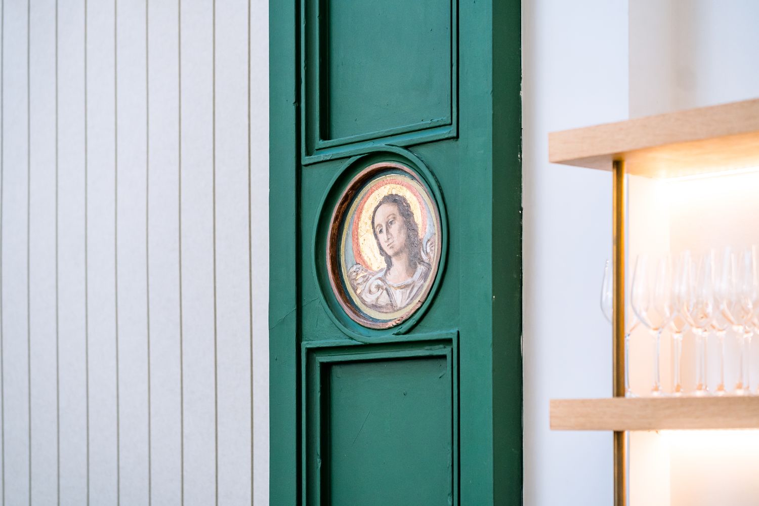
More crafted moments were introduced through a brass projecting reception plaque and a framed Elmtree sign, hand-painted and finished with gold leaf for the cosy reception lounge. These pieces brought warmth and tactility into the scheme, echoing the building’s heritage and adding a traditional signwriting quality that felt well suited to the chapel.
The completed scheme gives The Chapel at Elmtree a calm but characterful physical identity that supports its new use while respecting the restored interior. Practical wayfinding is elevated through material choices and thoughtful application, allowing the building to work as a contemporary co-working destination and events venue while keeping the chapel architecture firmly at the centre.
Elmtree also formed part of a wider working relationship with Spacemade, leading into later projects including Ellisse, where Glyphics’ role developed further on the design side. With the Elmtree collection continuing to expand, it remains a strong example of signage shaped around heritage, clarity and character.
FAQs - The Chapel at Elmtree
In heritage interiors, the signage needs to support the building rather than compete with it. For The Chapel at Elmtree, we used a restrained mix of black vinyl, raised black acrylic, clear glass, brass and gold leaf so the wayfinding remained clear and useful, while still allowing the restored chapel architecture to remain the focus.
Materials with depth, subtlety and craft tend to work best. At The Chapel at Elmtree, clear glass, raised acrylic, brass and hand painted gold leaf helped create a refined scheme that felt appropriate to the Grade II listed setting. Though a commonly used material in signage, cut black vinyl designed with finesse offered a lighter-touch solution where the signage needed to look discreet yet smart on doors and smaller surfaces.
Flexible materials such as vinyl can be useful where walls are curved, sweeping or difficult to fix into. At The Chapel at Elmtree, black vinyl allowed wayfinding to continue across tighter circulation spaces and less straightforward surfaces, where heavier or more rigid signage would have felt intrusive. There are alternatives available - in some areas, we layered vinyl with 3D acrylic lettering to create a raised effect.
A few key factors can make a significant difference:
Surface type: glass, painted walls, concrete and metal all behave differently
Lighting: natural and artificial light can change how graphics are perceived
Viewing distance: designs need to work both up close and from further away
Access: installation may require specialist equipment, especially in taller or more awkward spaces
Longevity: the application may need to be removable, updateable or permanent
We guide clients through these considerations early, so the final signage performs as intended and suits the building.
We plan installation around the building, not just the signage. In sensitive interiors, this can mean choosing lighter-touch applications, avoiding unnecessary fixings, checking access routes and adjusting locations once site conditions are reviewed. The aim is to install cleanly and carefully, so the signage feels integrated rather than forced onto the space.
The key is to keep the information simple, but let the details carry personality. For Elmtree, minimal icons, clean supporting text and subtle decorative elements helped the signage feel clear and easy to use, without giving the co-working space a generic office feel.
Material choice depends on the role each sign needs to play. We consider how each sign will be used, where it will be installed, the distance it needs to be read from, and how it should sit within the interior. For The Chapel at Elmtree, we reviewed the building on site and used raised black acrylic for stronger wayfinding moments, black vinyl for lighter door and wall graphics, clear glass for directory panels and brass for refined reception details. This material hierarchy helped the scheme feel layered without becoming busy.
We began with the Elmtree brand guidelines and developed a location plan for signage across the building. From there, we carried out a site walkaround to review routes, room uses, viewing points and installation conditions in person. This allowed us to refine positioning, layouts and finishes so the scheme worked with the building's architecture rather than simply following a plan on paper. This site-led process is especially useful for heritage interiors, where drawings alone rarely tell the full story.
Absolutely. Many of our projects begin with brand packs, ideas or artwork supplied by clients, architects or design studios. Our role is to turn these into a built signage scheme, making sure they work at scale, across materials and within the realities of the site.
Where needed, we suggest refinements to improve legibility, alignment or installation feasibility while staying true to the original concept.
For Elmtree, the brand’s ornately styled arrows, flowing linework and decorative icons were translated into physical signage elements across vinyl, acrylic, glass, brass and gold leaf.
Have designs ready? Get in touch and we can review your artwork, advise on materials and bring the signage to life.
Yes. For The Chapel at Elmtree, the scheme included external identification as well as internal wayfinding. The brass plaque and gold lettering above the entrance created a clear arrival moment from the street, while the interior signs continued the same visual language through the building.


