Herbert Smith Freehills Laser cutting & Laser Engraved Signs
THE LOWDOWN
Herbert Smith has been a client of Glyphics well before they became incorporated with Freehills. Consequently, we’ve been coming up with solutions for them for the past 15 years or so, developing both ideas and a beautiful partnership along the way.
Stuart Moles, the building facilities manager for Herbert Smith Freehills has been with the company for just as long, and as our main point of contact, we’ve built a strong relationship over the years – collaborating on the fit outs of all HSF offices, going so far as to travel to their European HQs and head up a worldwide brand changeover.
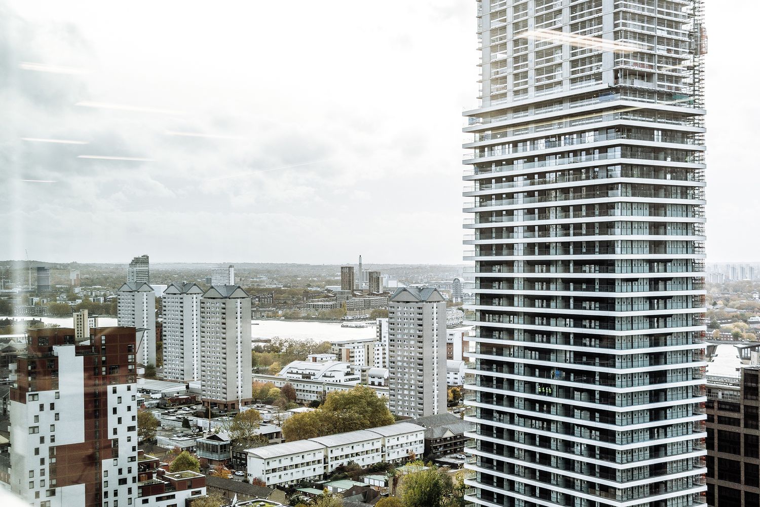
We couldn’t be more head over heels about a client, and so when HSF invited us to meet their interior architect, Amira, to discuss a new office space overlooking the Thames Barrier in Canary Wharf, we were glad to be of service!
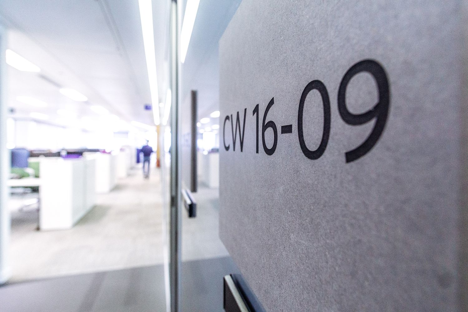
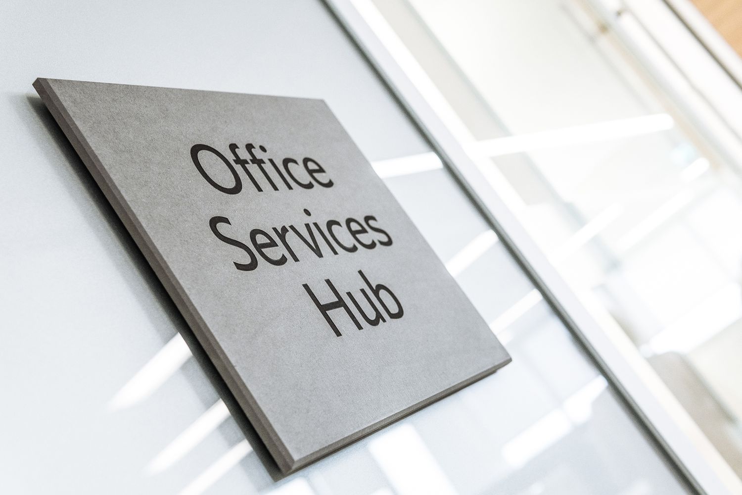
After convening at the Borough hangout of interior design company, Unispace, Amira filled us in on her design strategy. The company planned to build their own office furniture and to continue the theme by using upholstery materials, cladding walls in a grey valcromat – a type of textured and coloured mdf.
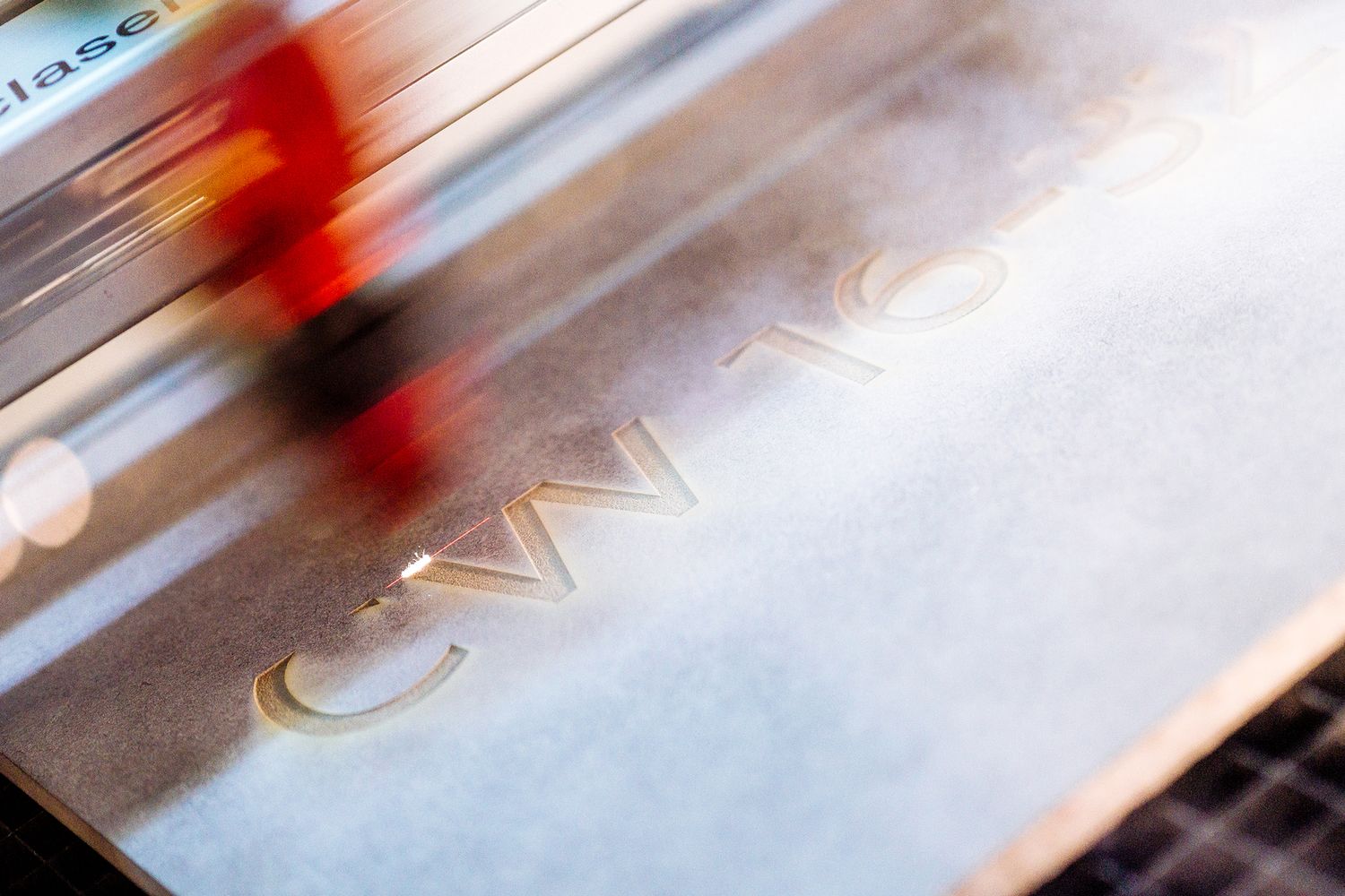
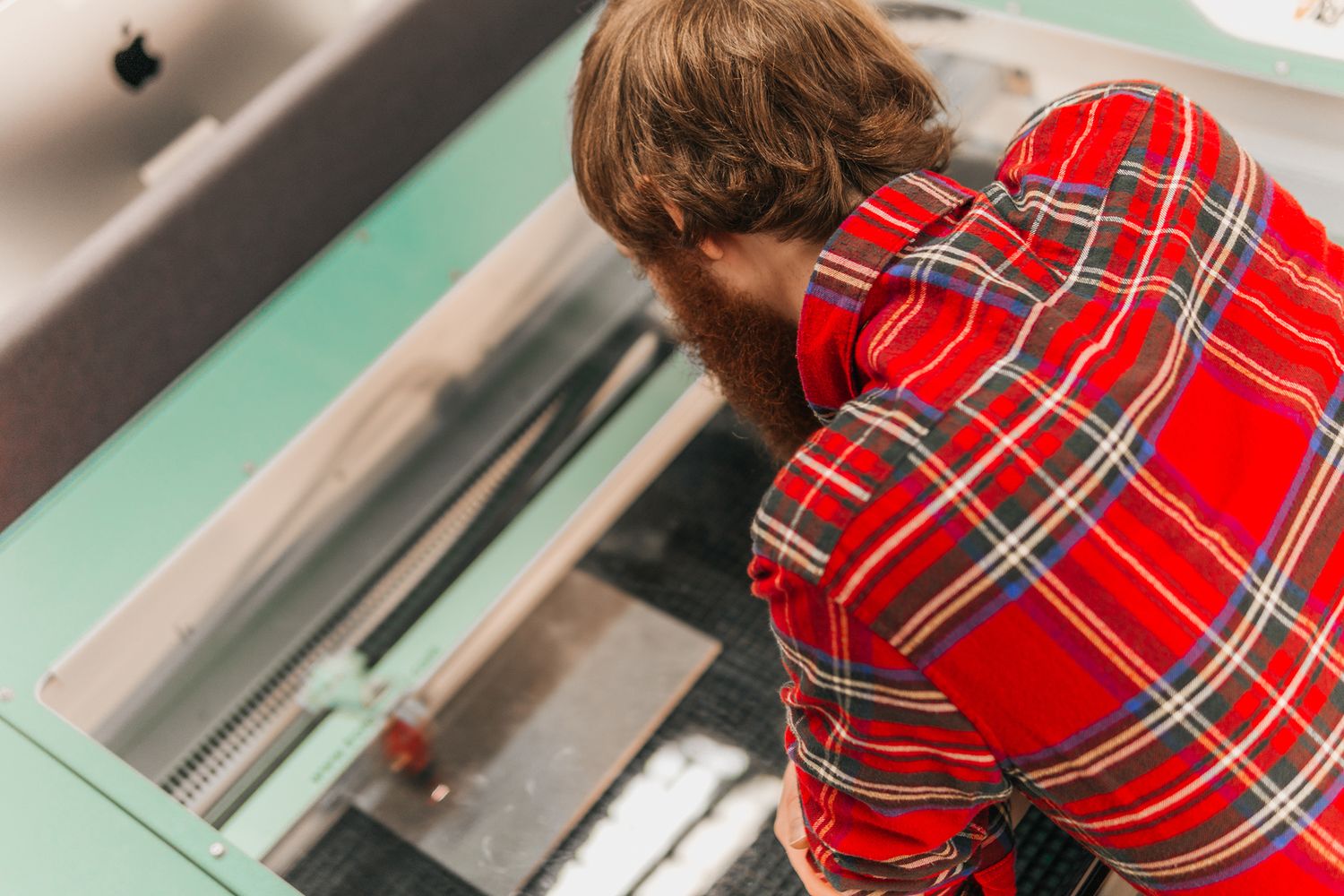
They asked if we could match materials and make signs that fit in flawlessly, so we set about producing a sample of the concept. As the client was adverse to cut vinyl, we decided to head down the laser engraving route…
THE SPECS
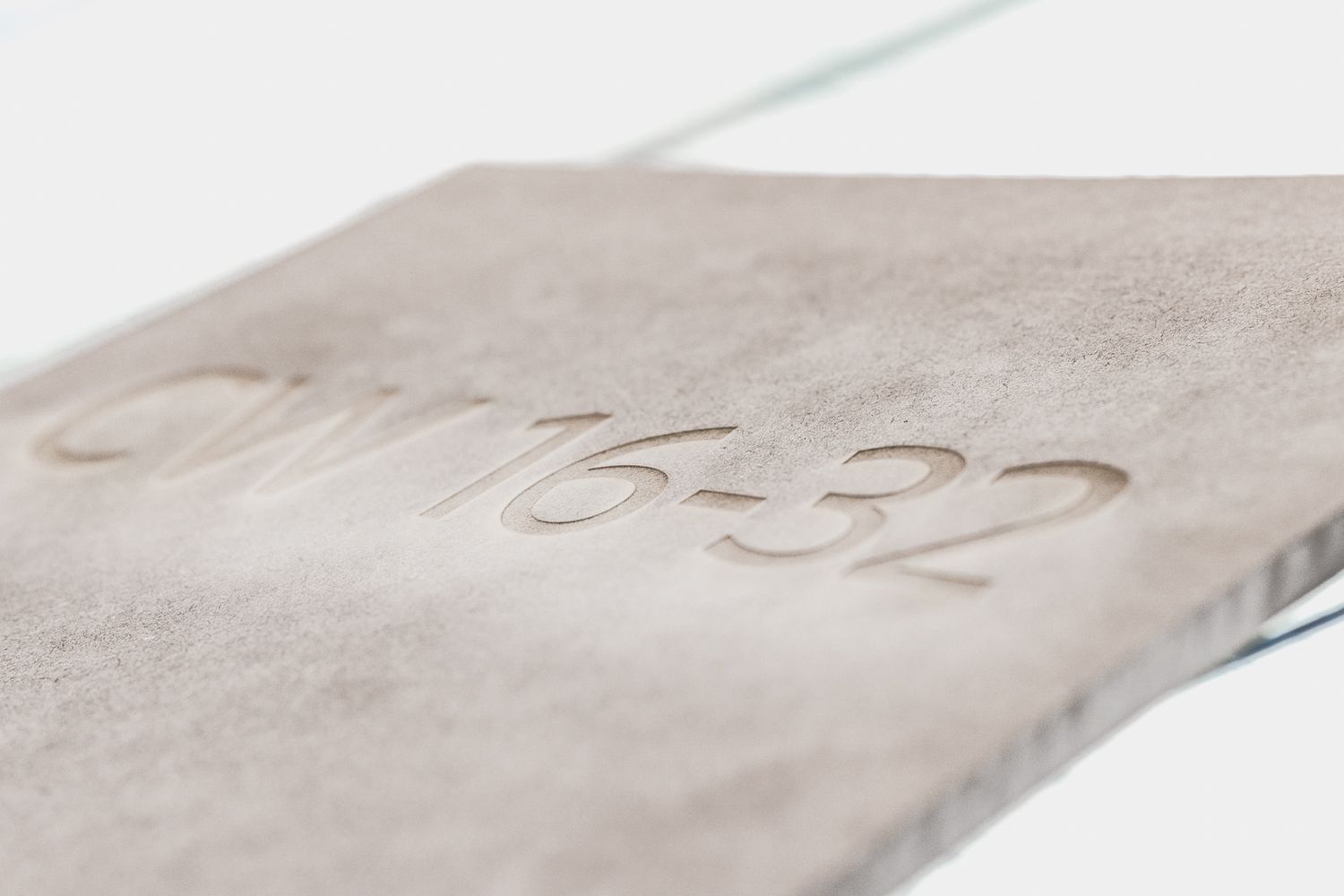
First off, we produced a sample of a room number that we etched into the grey valcromat. To do this, we placed a paper template on top of the material to laser through and spray paint over. Then we simply removed the paper and voilà! There lay a complete sign made from a singular block, rather than superimposed materials, and when we showed it to them, HSF liked what they saw.
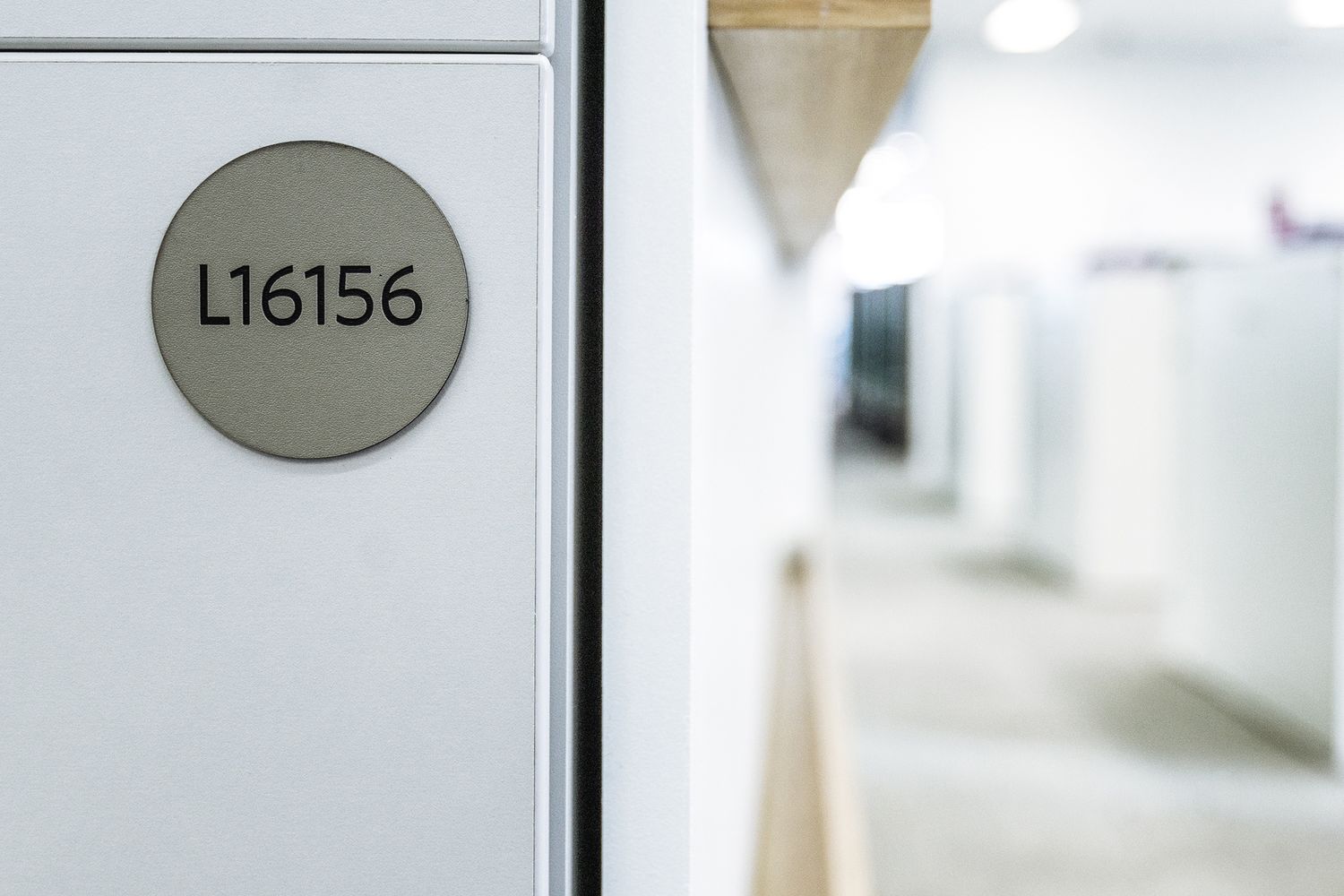
So as well as wayfinding signage such as room numbers and names, they asked us to produce 300 sequential number signs for the staff lockers. To do this we used 50mm diameter discs made of 2mm thick 2 ply material, topped with a grey face to complement the valcromat mdf. We then laser engraved into them with each number, revealing a black underlayer that really allows the typography to pop out and catch the light.
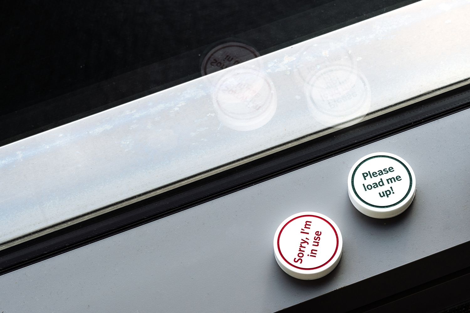
Next up, the client seemed to be having a particularly hard time with their dishwashers…the ultra silent feature had in fact ended up being a bit of a nightmare, with people unknowingly opening the dishwasher while it was running, only to get a face full of water! They asked us to come up with a solution that would signpost when the machine was in use and when it wasn’t, and of course our first thought was: doughnuts. Not the eating kind unfortunately.
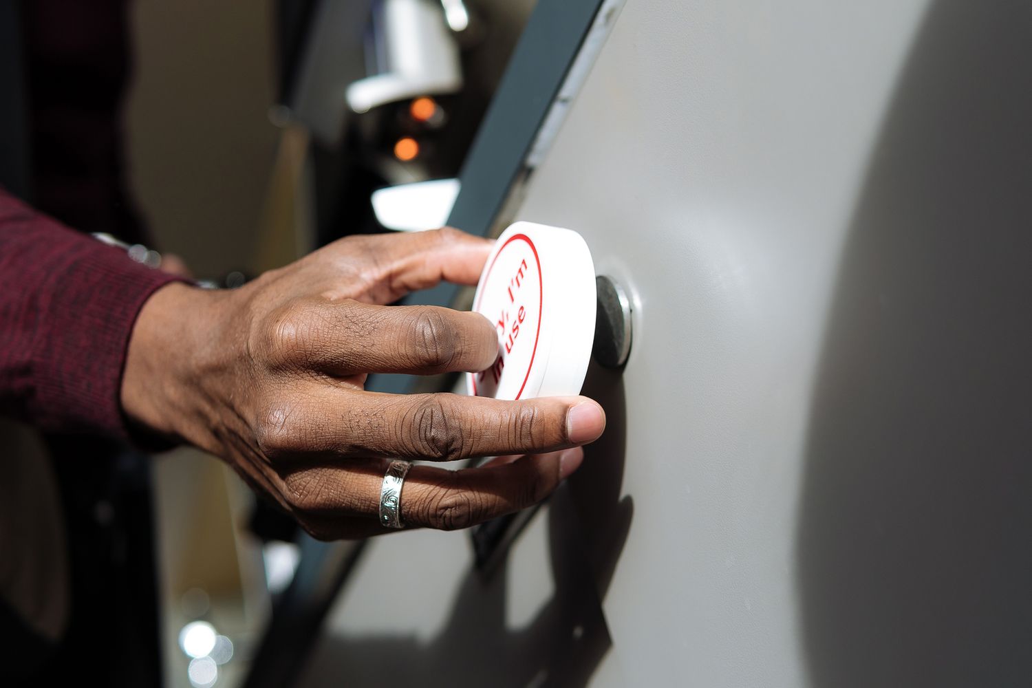
Instead, we put together a 75mm white and 10mm deep white acrylic disc, and laser etched one side with ‘in use’ (infilled in red paint to be extra cautious) and the other side with the playfully invitation of ‘fill me up’, infilled with green paint to give the go ahead. We made the disc magnetic so that it could be easily attached to the dishwasher, and flipped over as and when needed – making a splash with the office team in all the right ways.
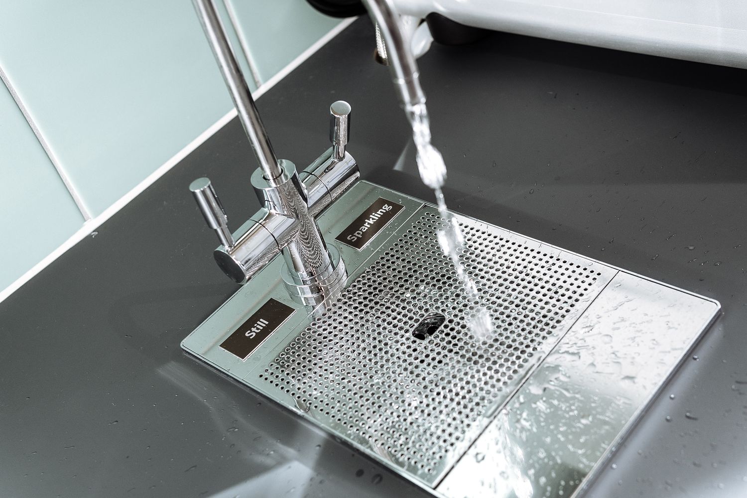
Sticking with the kitchen, we kitted out the drinking water taps with ‘sparkling’ and ‘still’ signs to avoid any mix ups – etching tiny matt white lettering on anodised polished aluminium plates for a highly modern and stylish finish. To top it all off, we removed existing frosting manifestations from 40 rooms and reinstalled them according to the architect designs, smoothly implementing what we think is some seriously impeccable corporate design.


