
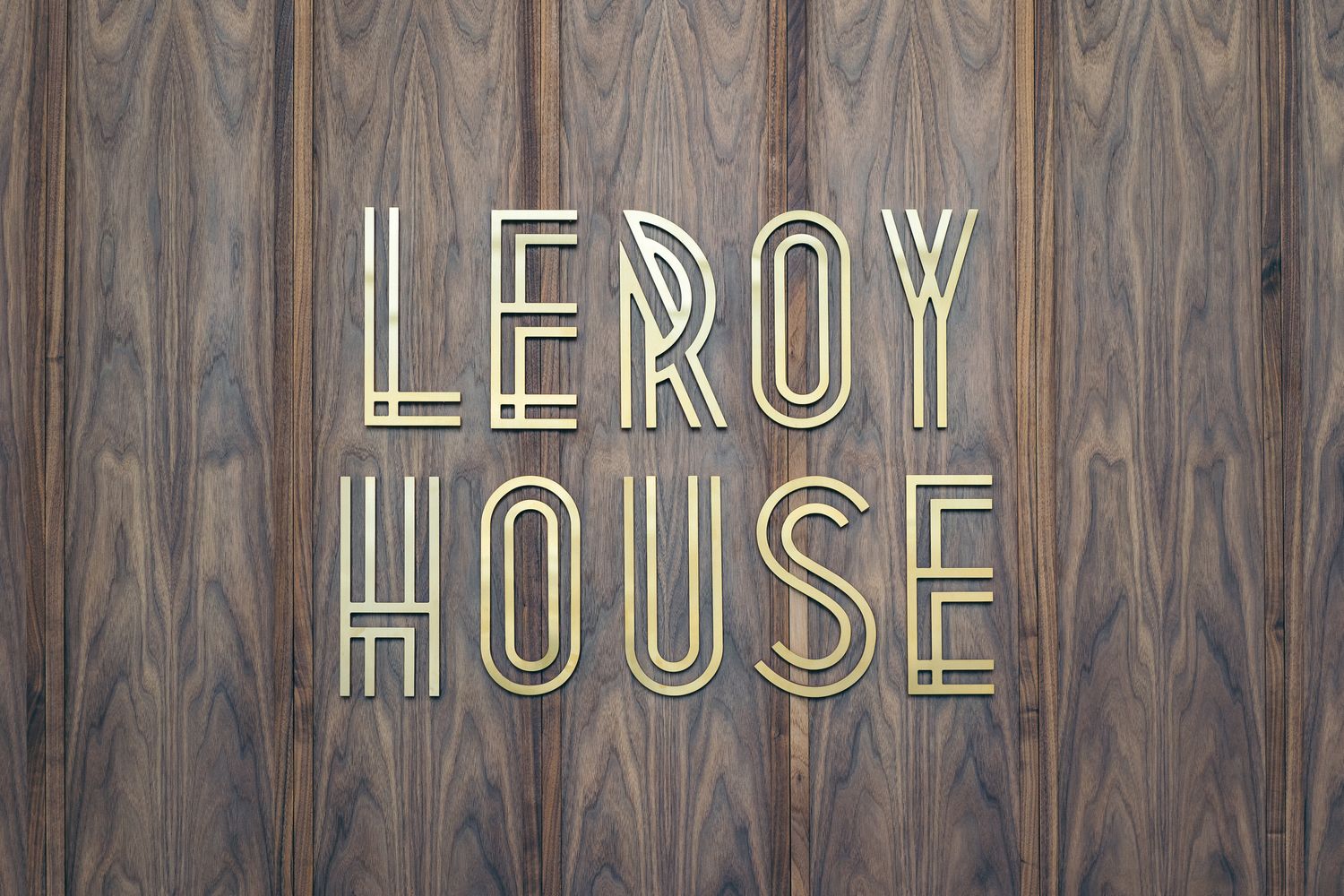
Leroy House by Workspace Signage Design & Sustainable Offices: Wayfinding, Icons & Reception Branding for a Net-Zero Co-Working Space
A bold renovation called for a signage system that could balance functionality with a crafted, premium feel - and live up to the building’s sustainable credentials. Working closely with Workspace and the interior designers, we created wayfinding and identity signage throughout Leroy House, using durable materials, solvent-free coatings and efficient fabrication methods. The result is a cohesive system that feels contemporary, considered and true to the building’s character.
The BrandThe BriefDesign WorkOur SolutionsThe OutcomeGlossaryFAQs
Location, location, location
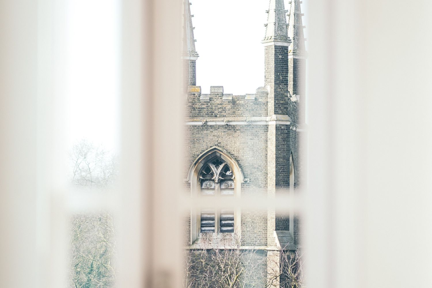
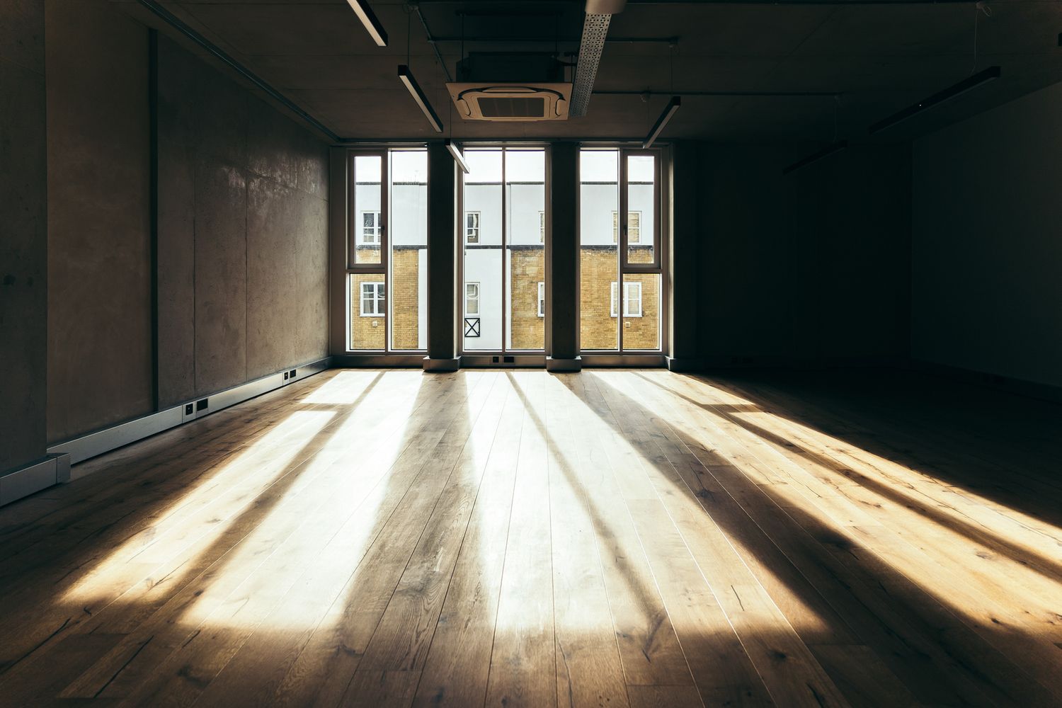
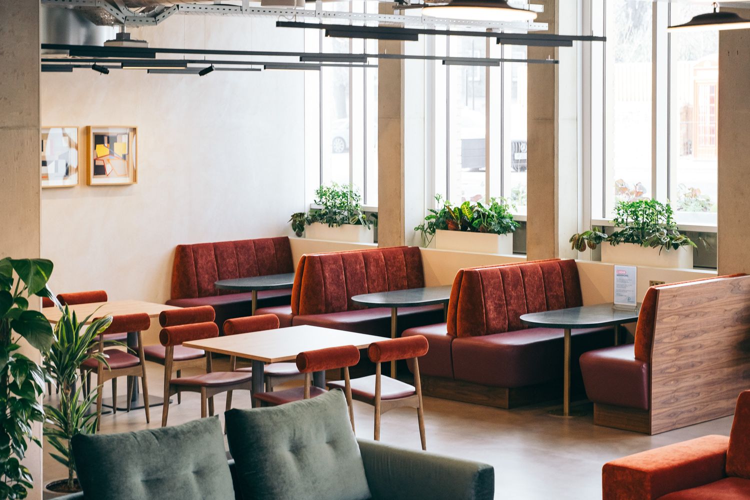
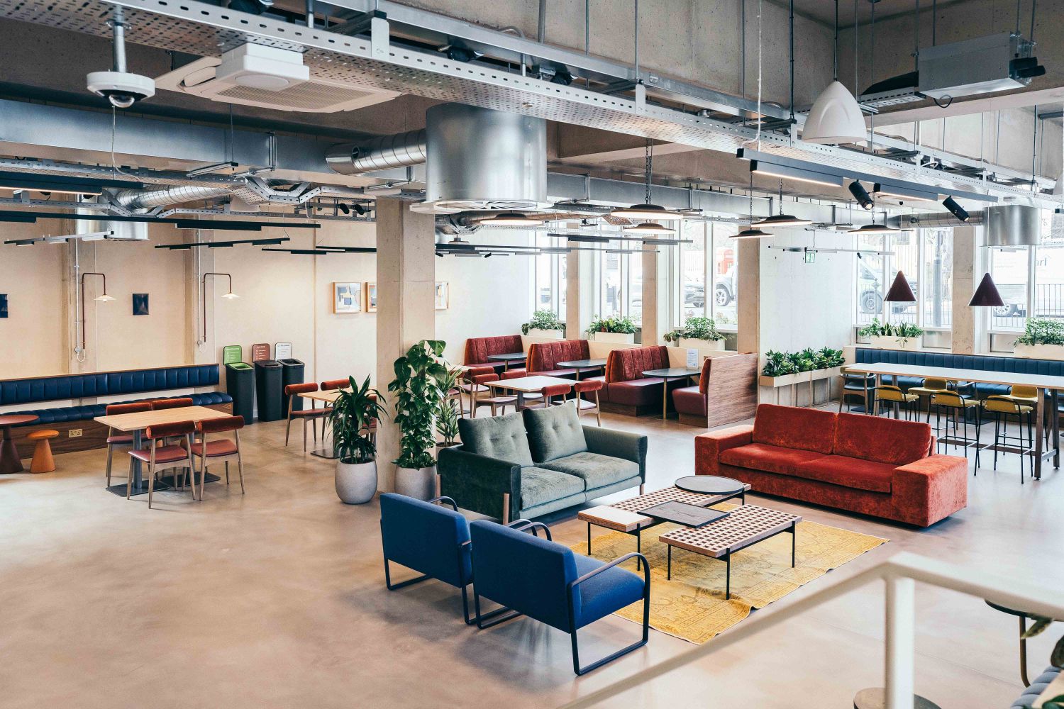
Leroy House, located on Essex Road in Islington, was originally built in the 1930s as a watchmaker's factory and has since undergone a comprehensive redevelopment into a modern office and studio space. Designed by Piercy & Company, the building now offers a net-zero carbon, flexible workspace for creative businesses, featuring an on-site café, communal areas and sustainability-focused features. Retaining and upgrading over 90% of the existing structure embodies a reuse, not rebuild ethos — an approach we mirrored in the longevity and efficiency of our signage design.
Client Profile
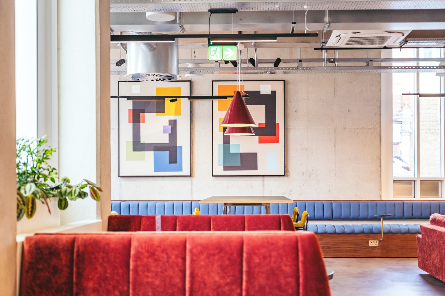
Workspace is a leader in the commercial property sector, transforming historic and industrial buildings across London into vibrant offices and studios. Their spaces are designed for creative businesses that value both practical performance and visual integrity, with each redevelopment balancing respect for heritage with contemporary design and, increasingly, sustainability-led thinking.
A Robust Relationship
As a long-standing signage partner, Glyphics has delivered multiple schemes across Workspace’s portfolio. Our role is to create signage that reflects the brand’s consistent identity while enhancing each building’s character and supporting its sustainability goals - through thoughtful material selection and efficient fabrication. Leroy House continues this collaboration, aligning Workspace’s net-zero vision with a signage solution rooted in its architectural heritage.
We use Glyphics for almost all of our internal office signage and have recently worked with them again on Leroy House and we couldn’t be happier with the results. Their team was professional, attentive, and delivered exactly what we envisioned. The quality of the signs is exceptional, and they were installed flawlessly. - Kahroon Tanvir | Head of Project Management at Workspace
Heritage and Design
Building on that foundation, the redevelopment of Leroy House draws from its origins as a 1930s watchmaker’s factory. Piercy & Company’s design preserves the building’s industrial framework and brick façades, maintaining its distinctive character while significantly reducing embodied carbon - an approach we mirrored by creating signage designed to last.
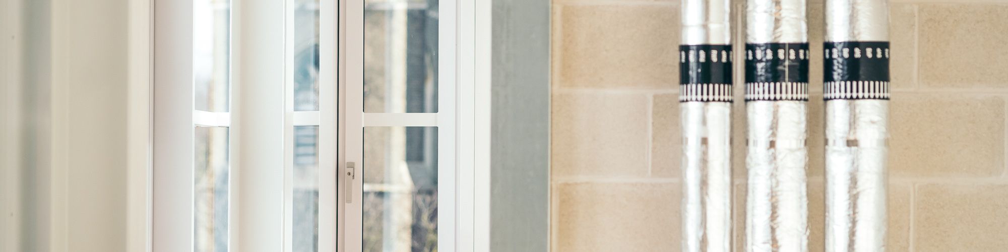
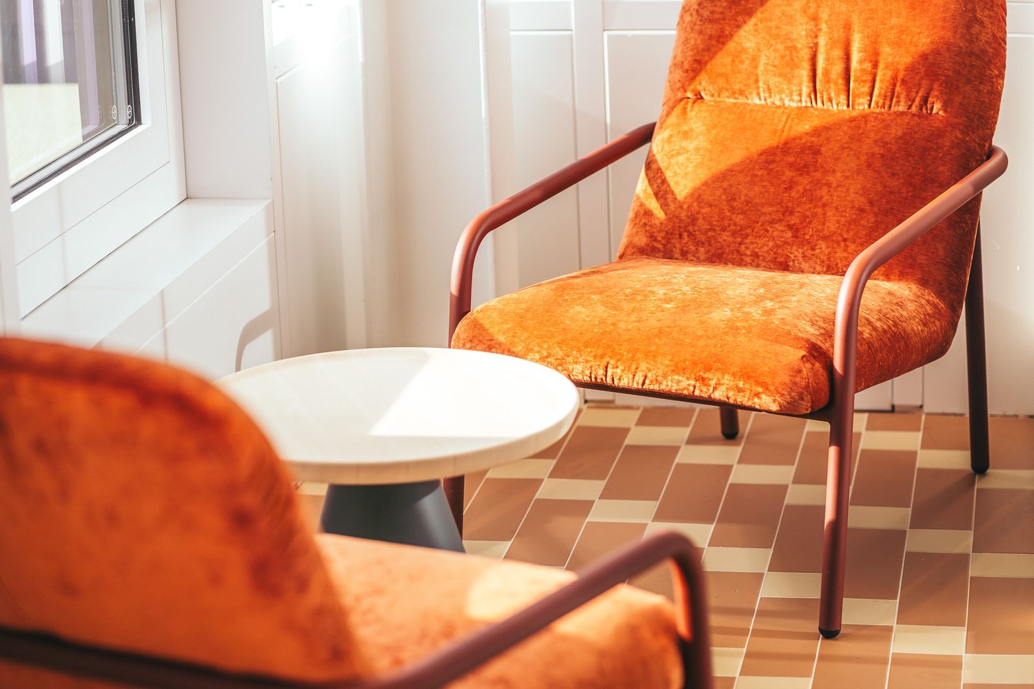
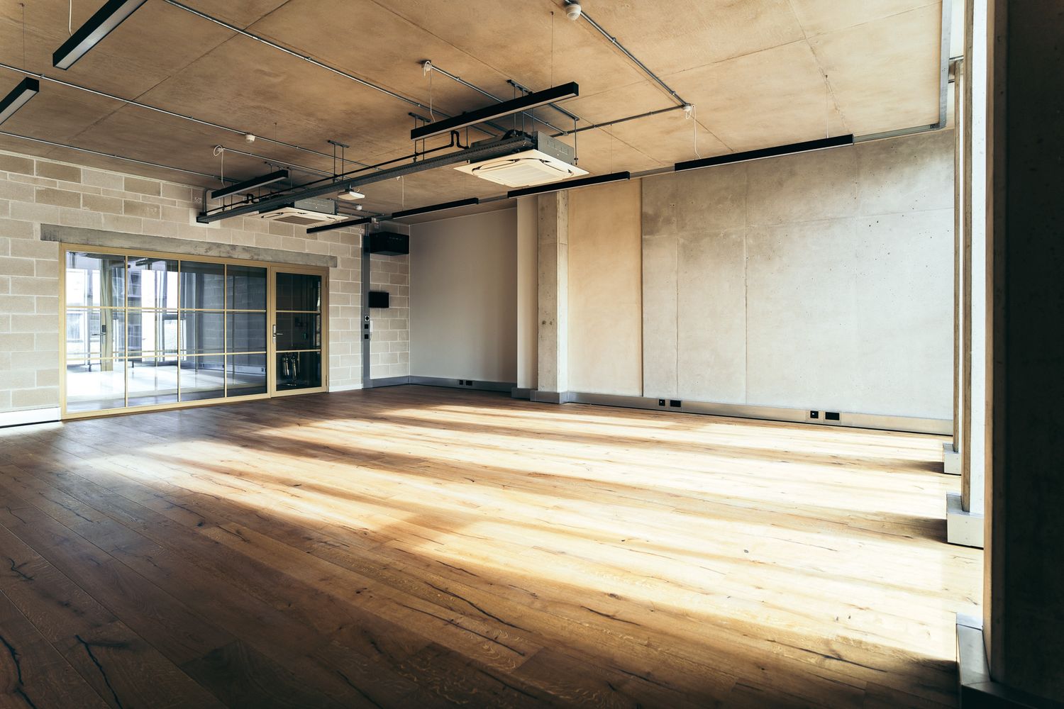
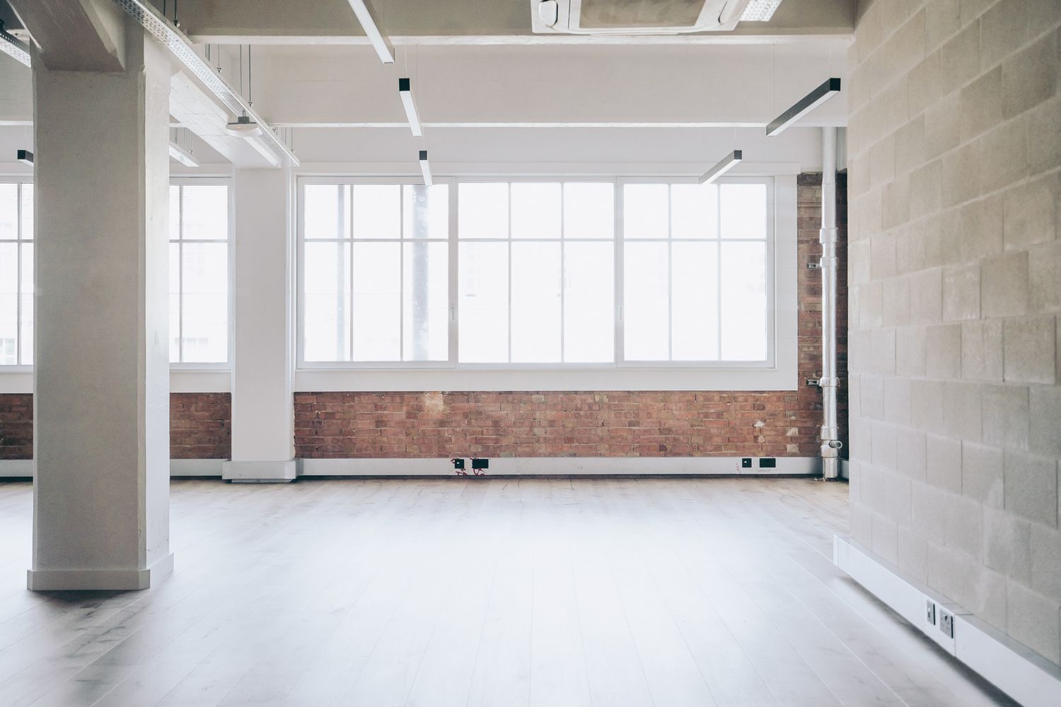
The architectural scheme celebrates precision and craftsmanship, expressed through exposed concrete, steel detailing and a grid of tall windows that recall the ordered geometry of the original factory.
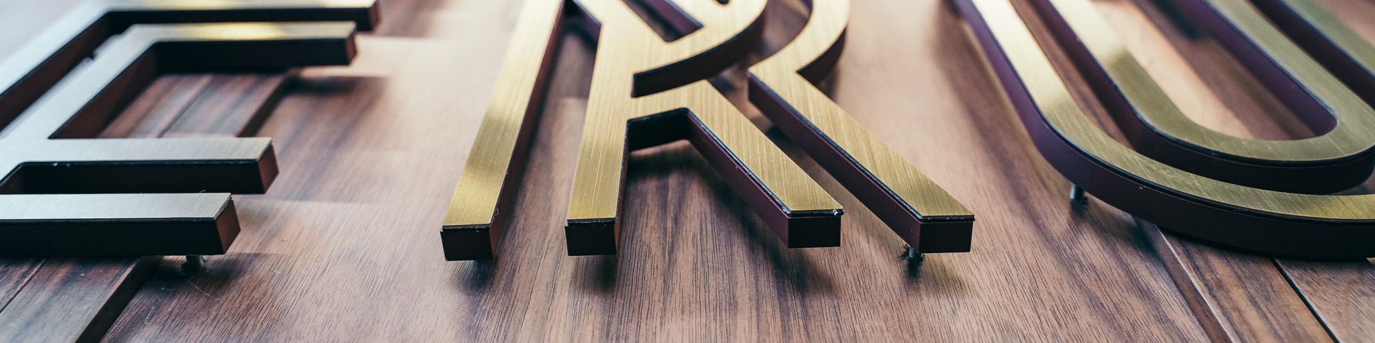
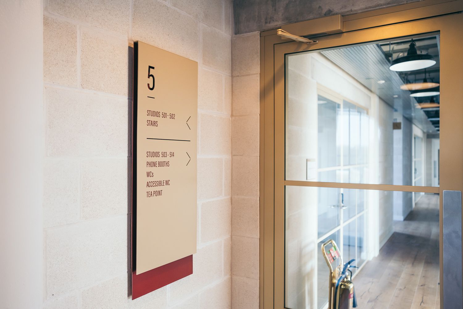
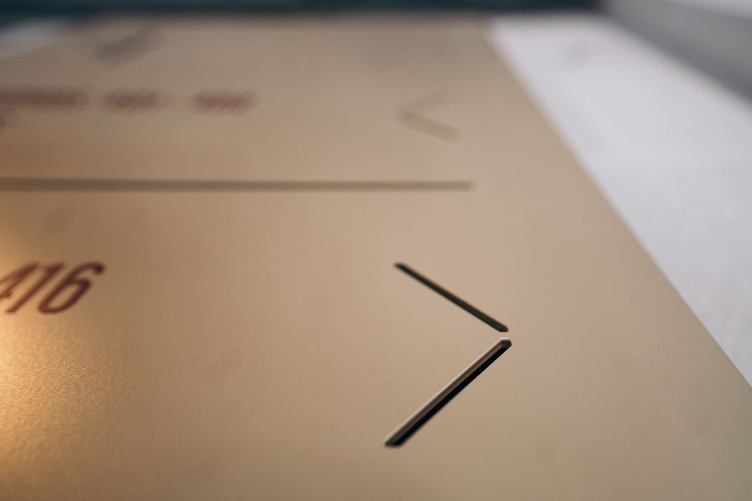
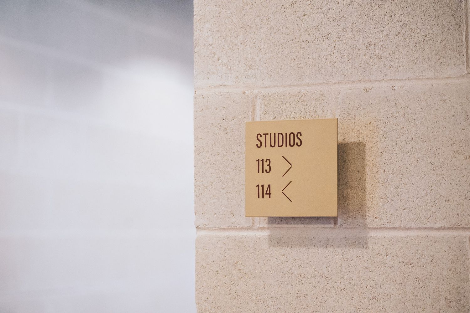
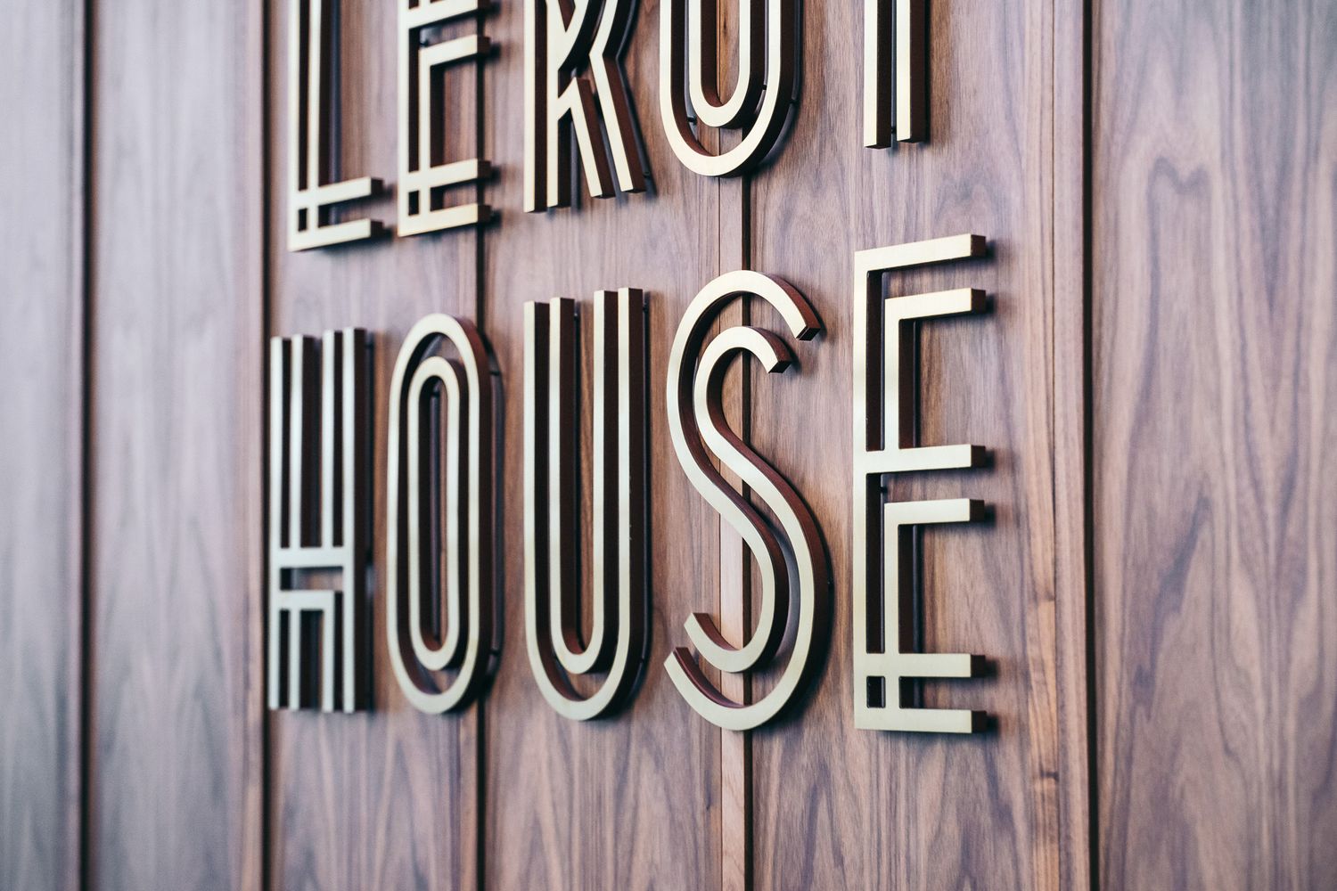
Glyphics’ signage extends this narrative. Folded aluminium wayfinding panels with crisp edges and refined proportions mirror the discipline of watchmaking, while stencil-cut arrows and numerals introduce texture and depth. Together, these elements translate the building’s legacy of meticulous workmanship into a contemporary visual language that guides and grounds the space with clarity and permanence.
Workspace approached us to design and produce a complete internal signage package for Leroy House, a large-scale refurbishment of one of their existing buildings. The brief required a branded signposting system that communicated clarity and cohesion while complementing the building’s sustainable design ethos.
Our scope included:
Reception logo signage
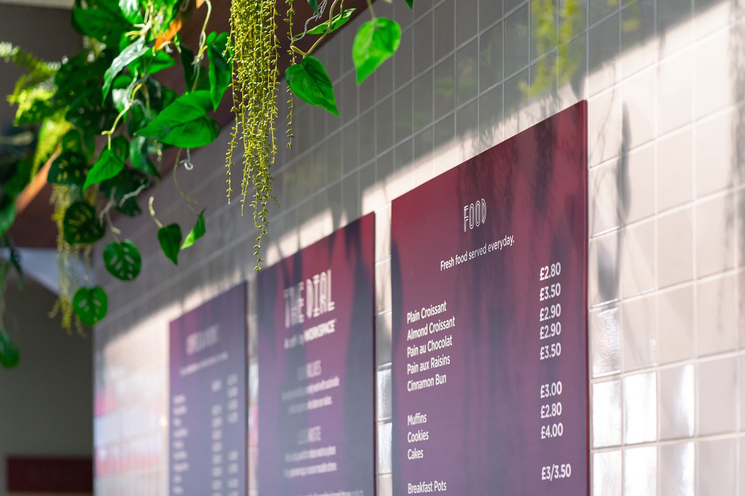
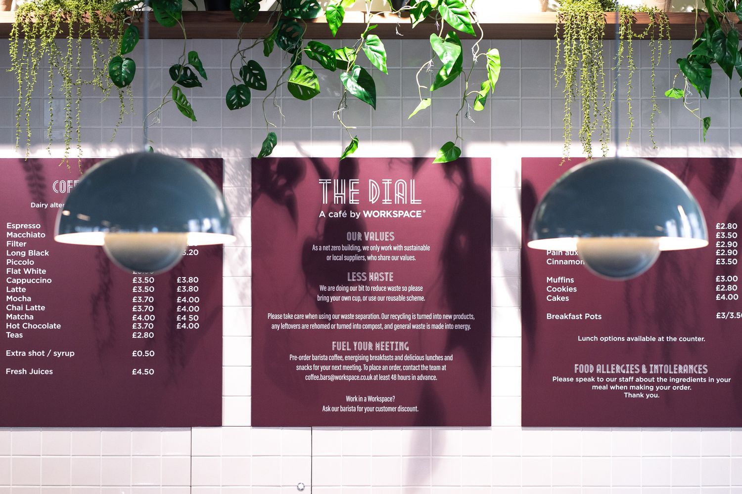
Cafeteria menu boards
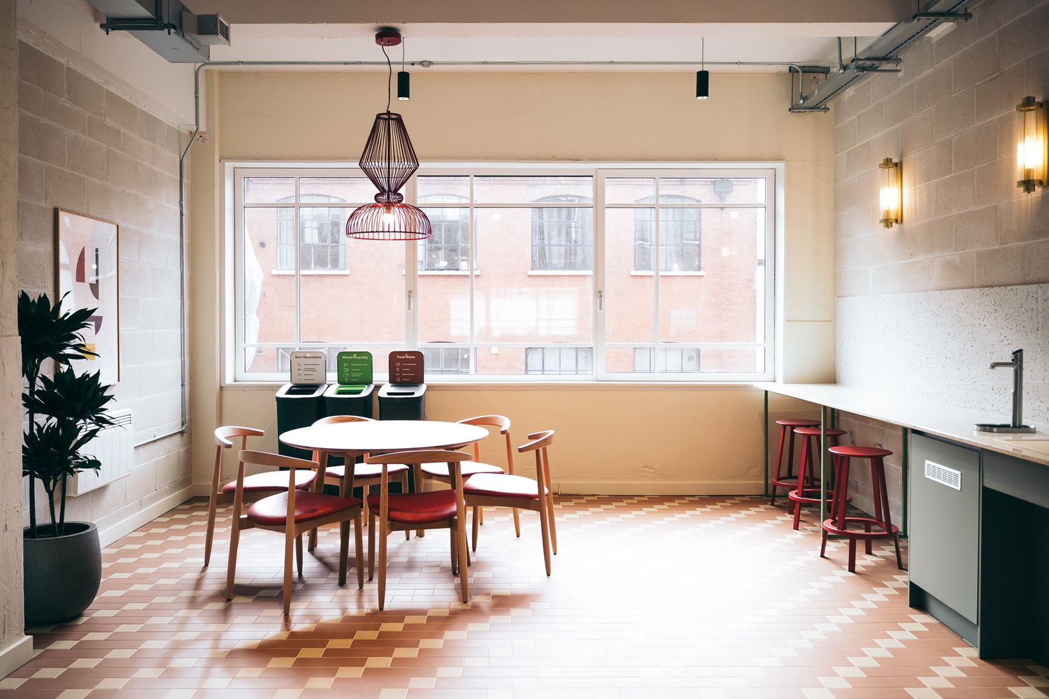
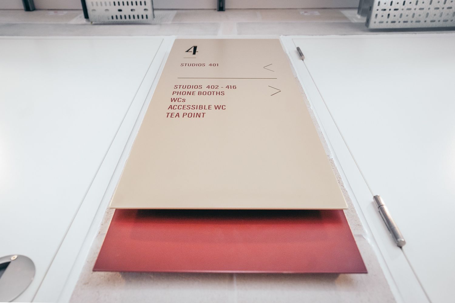
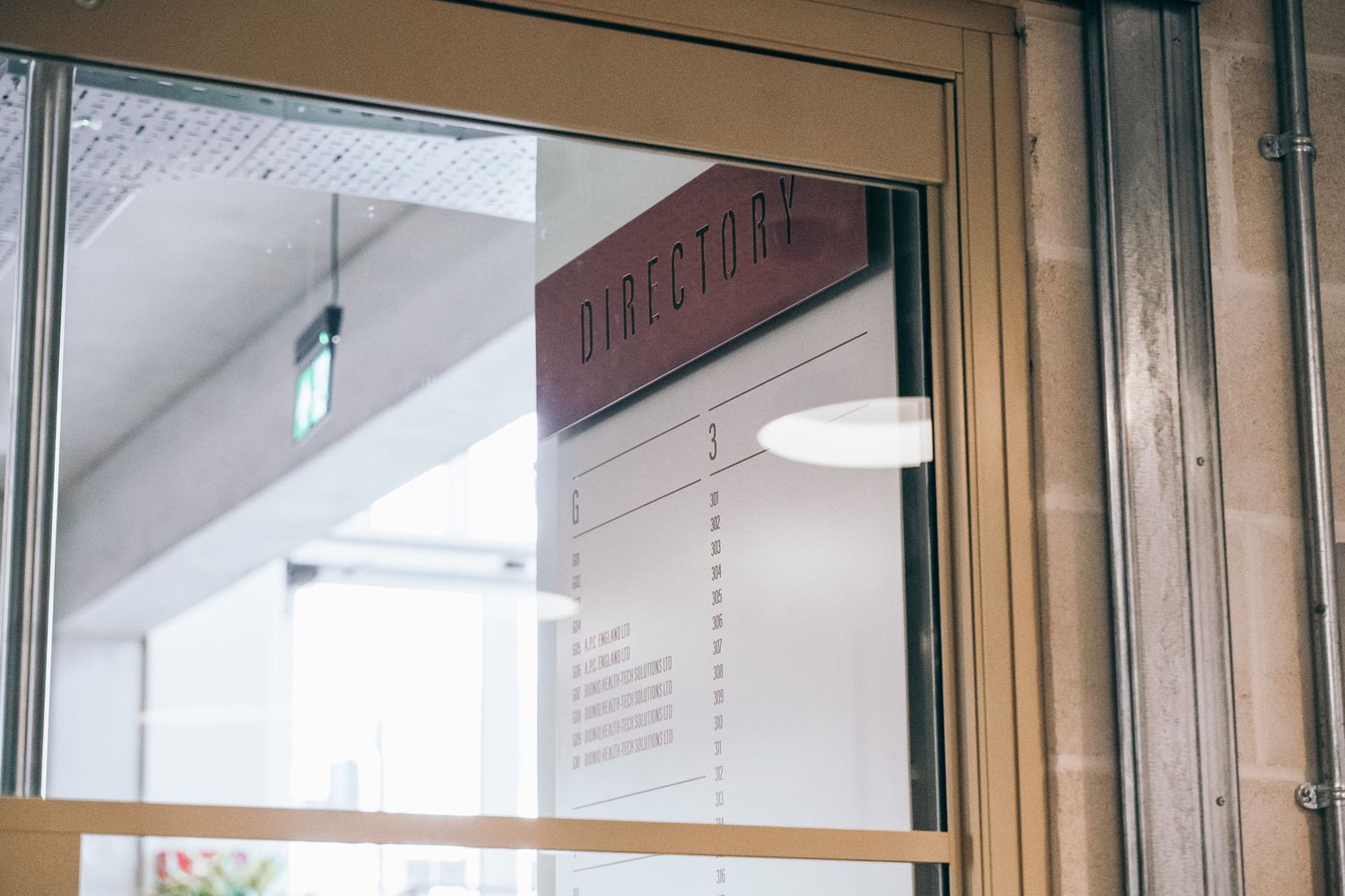
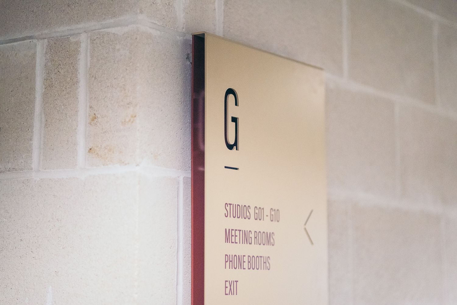
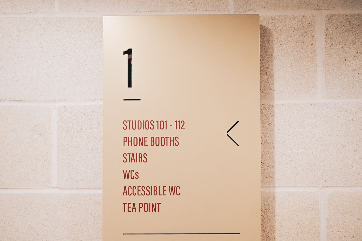
Wayfinding signage across five floors, made up of:
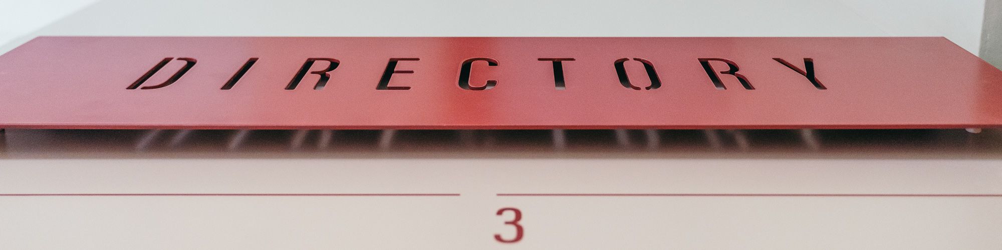
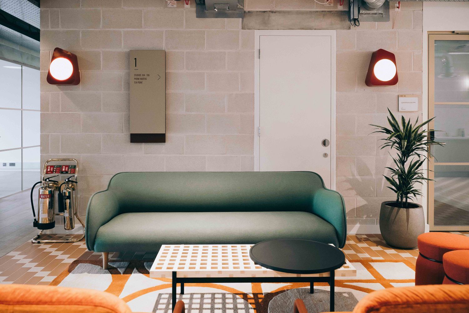
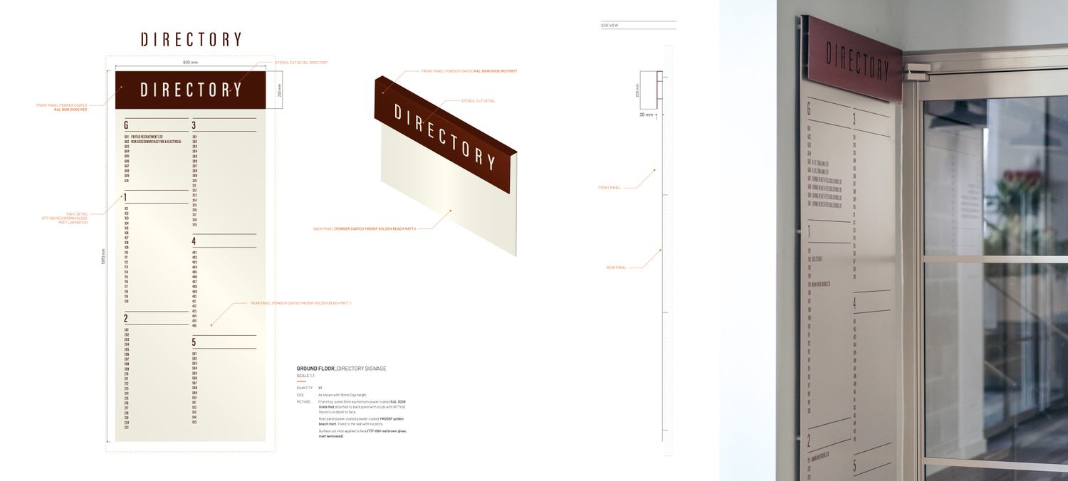
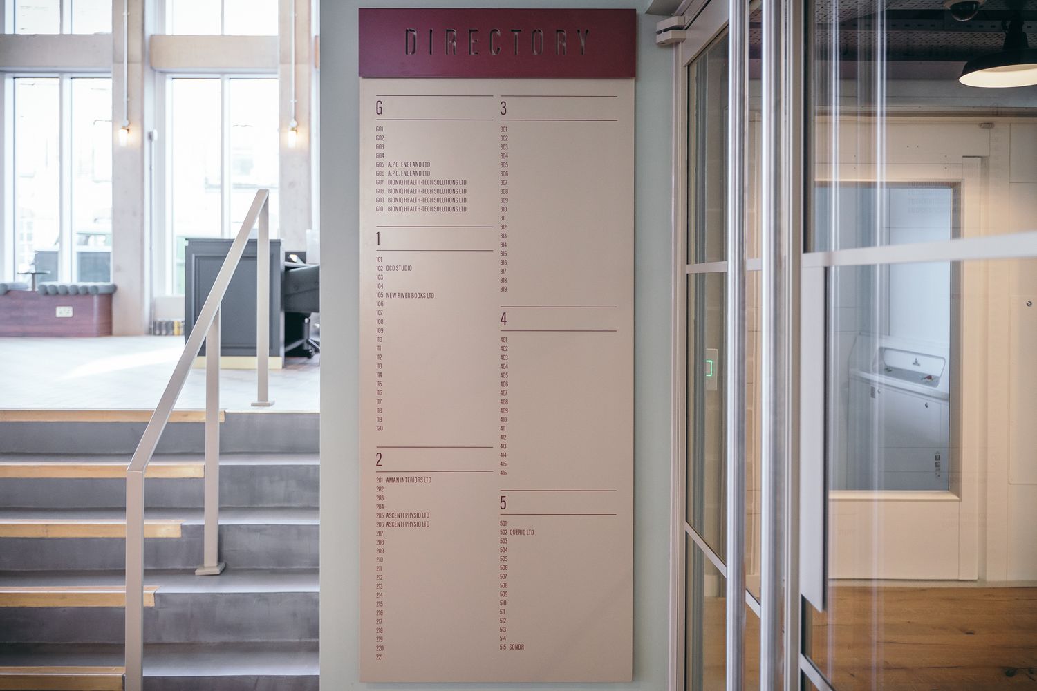
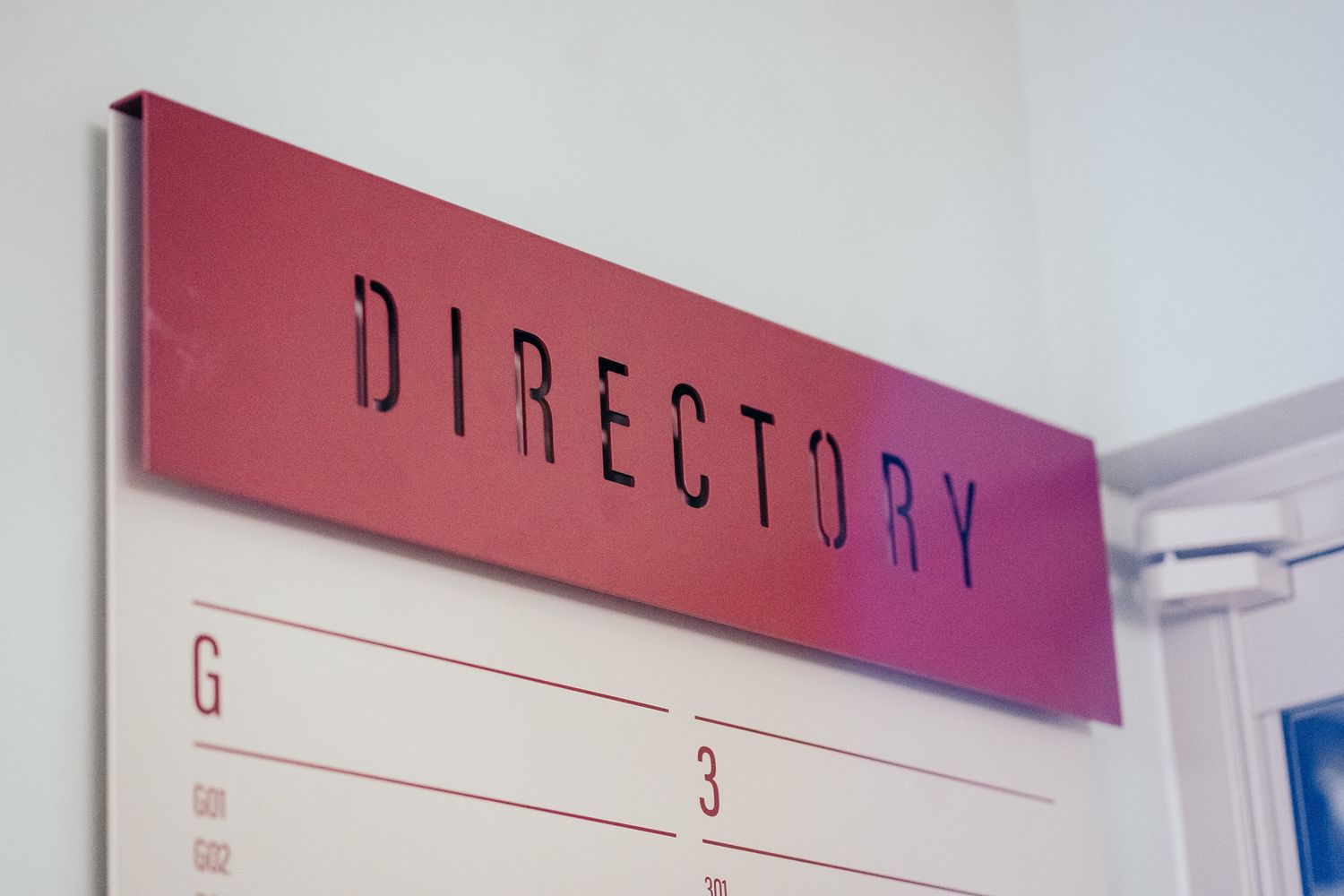
A large wall-mounted directory
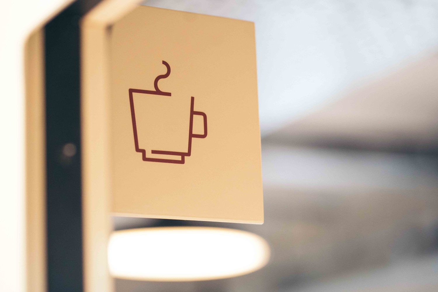
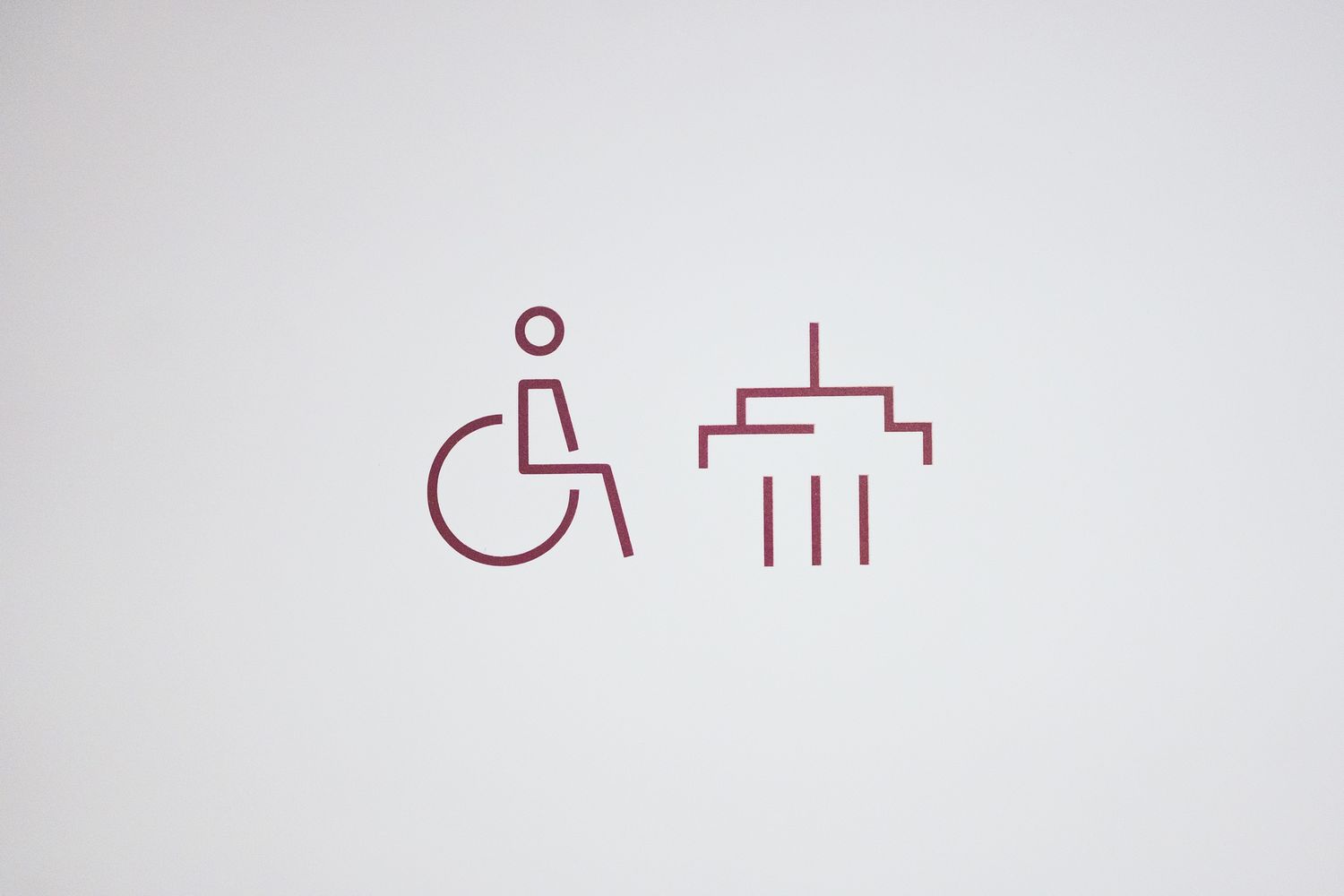
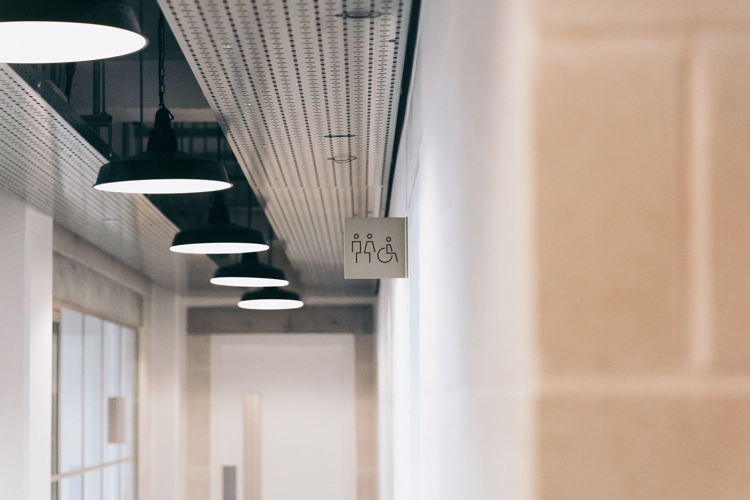
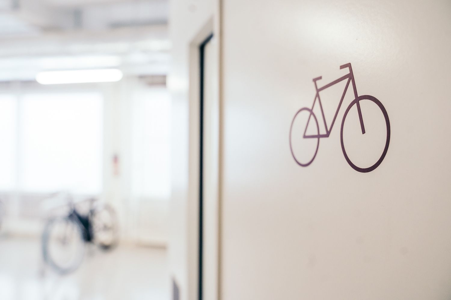
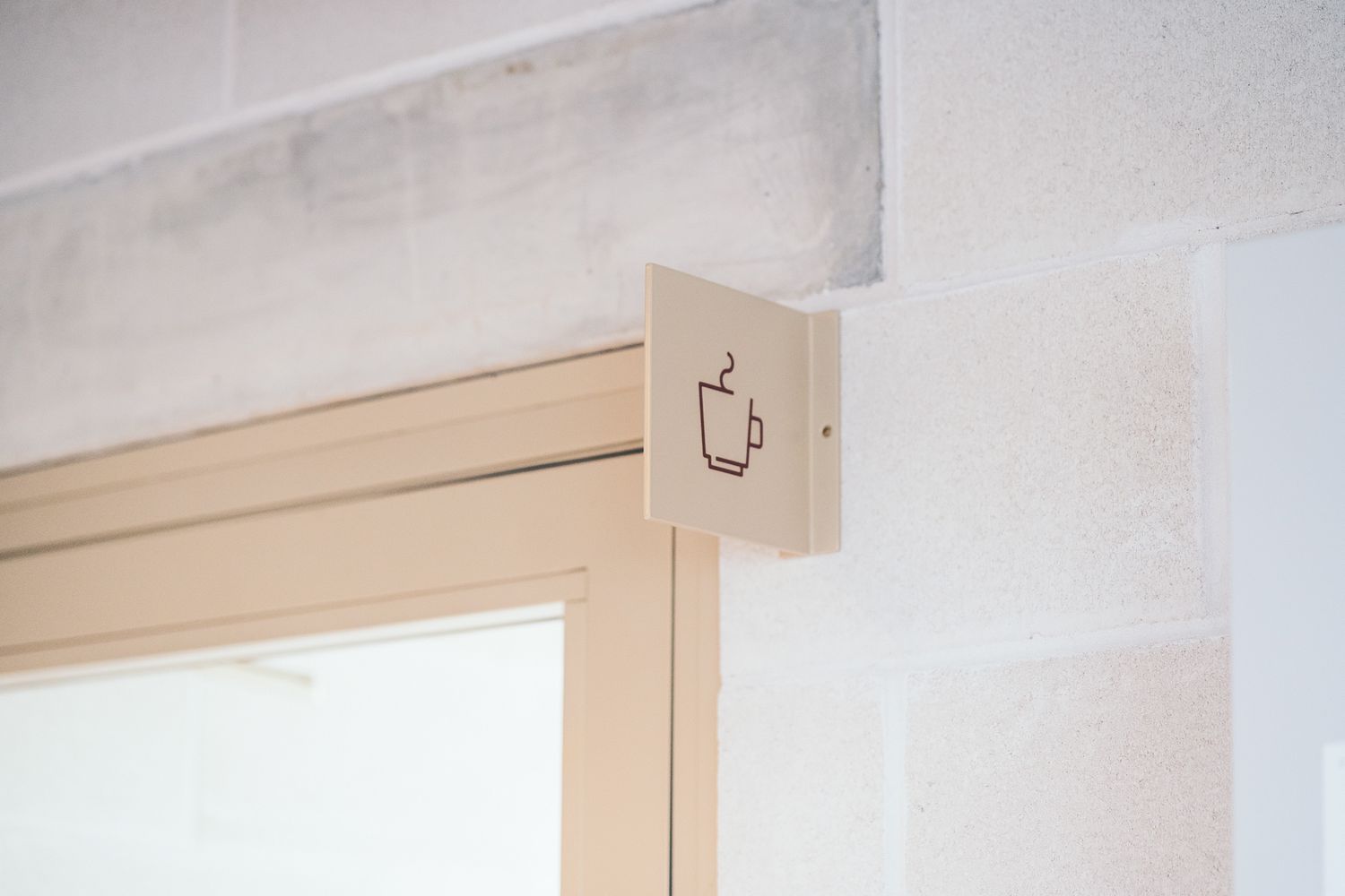
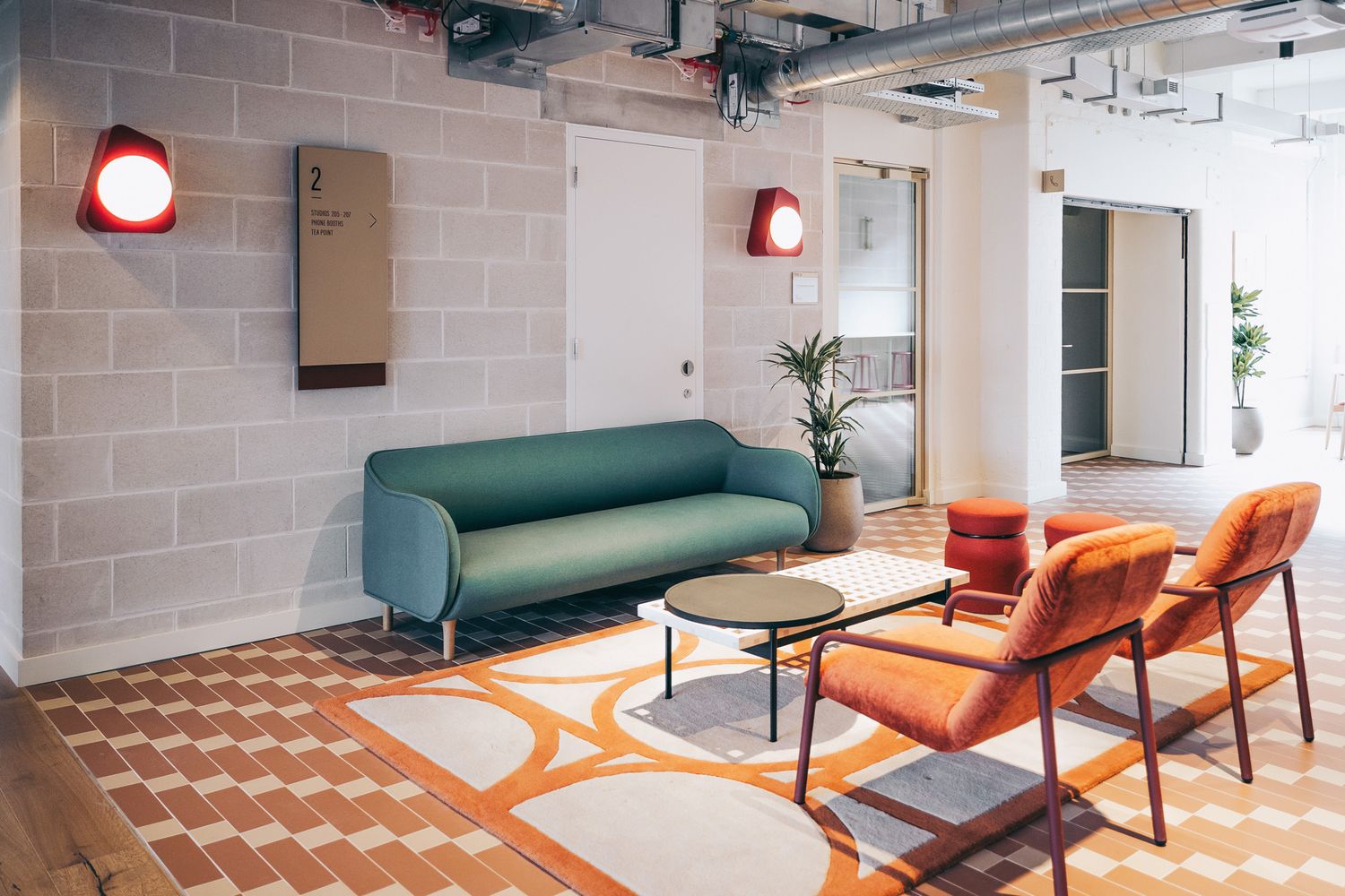
A bespoke set of icons
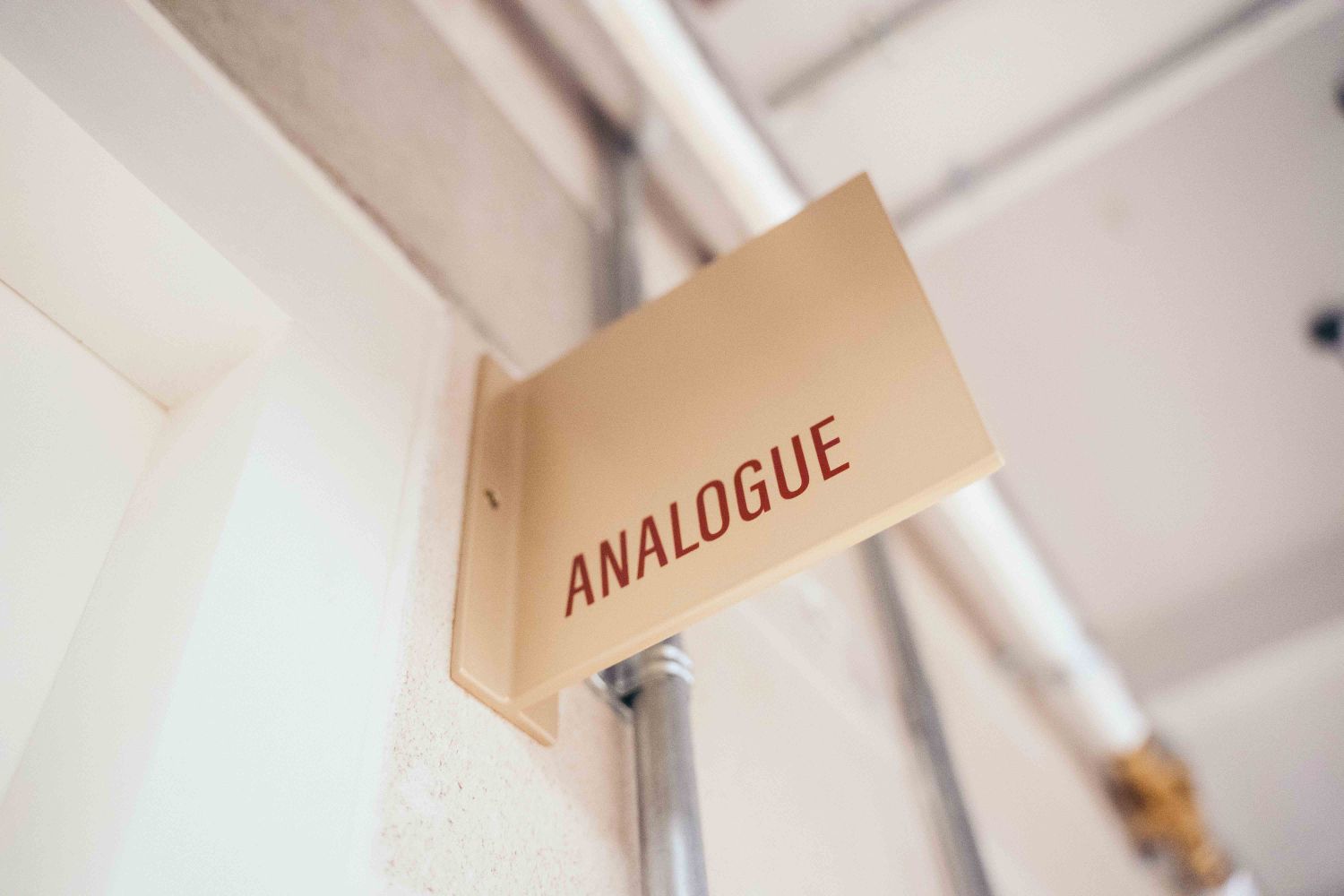
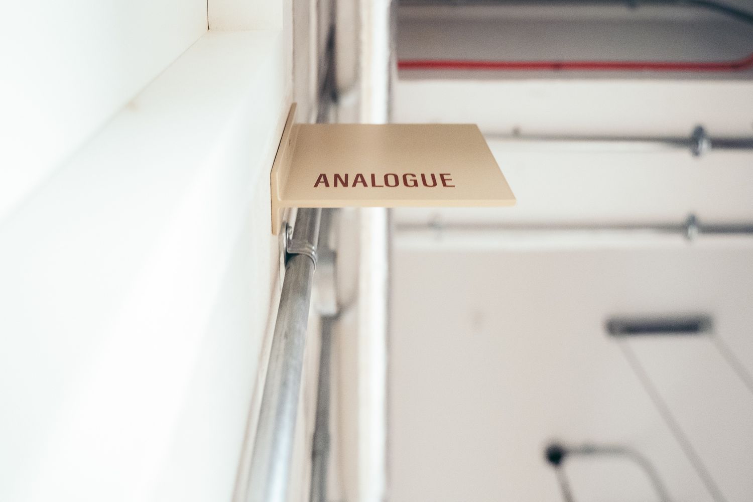
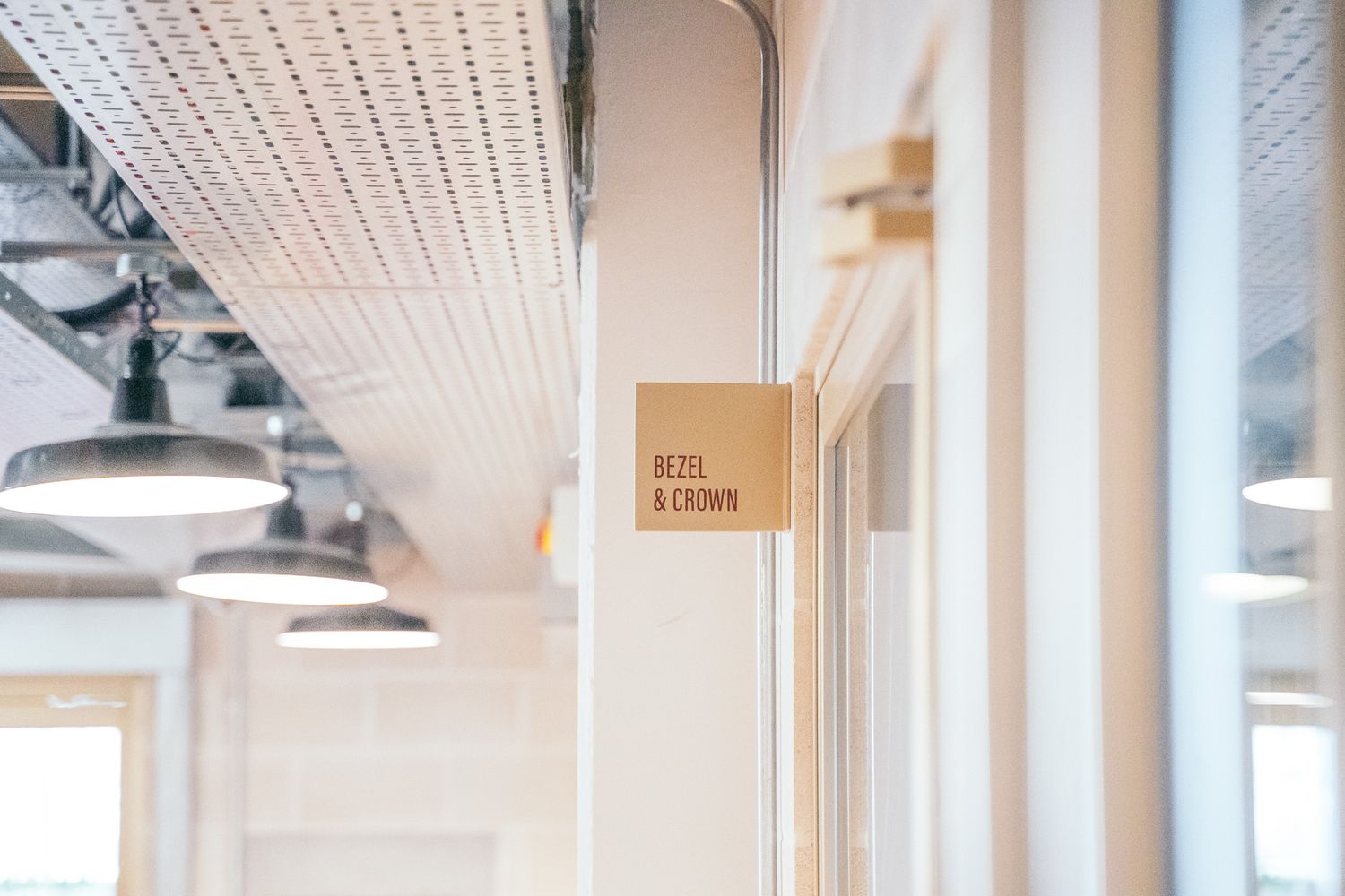
Projection signs and door graphics
Customisable acrylic slider panels for tenants
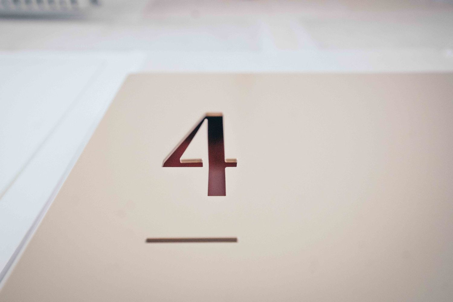
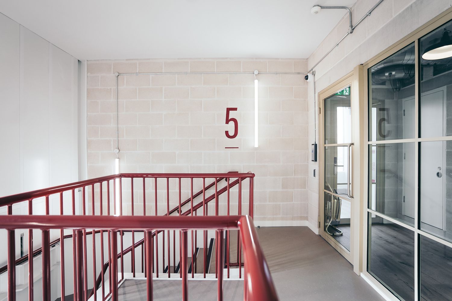
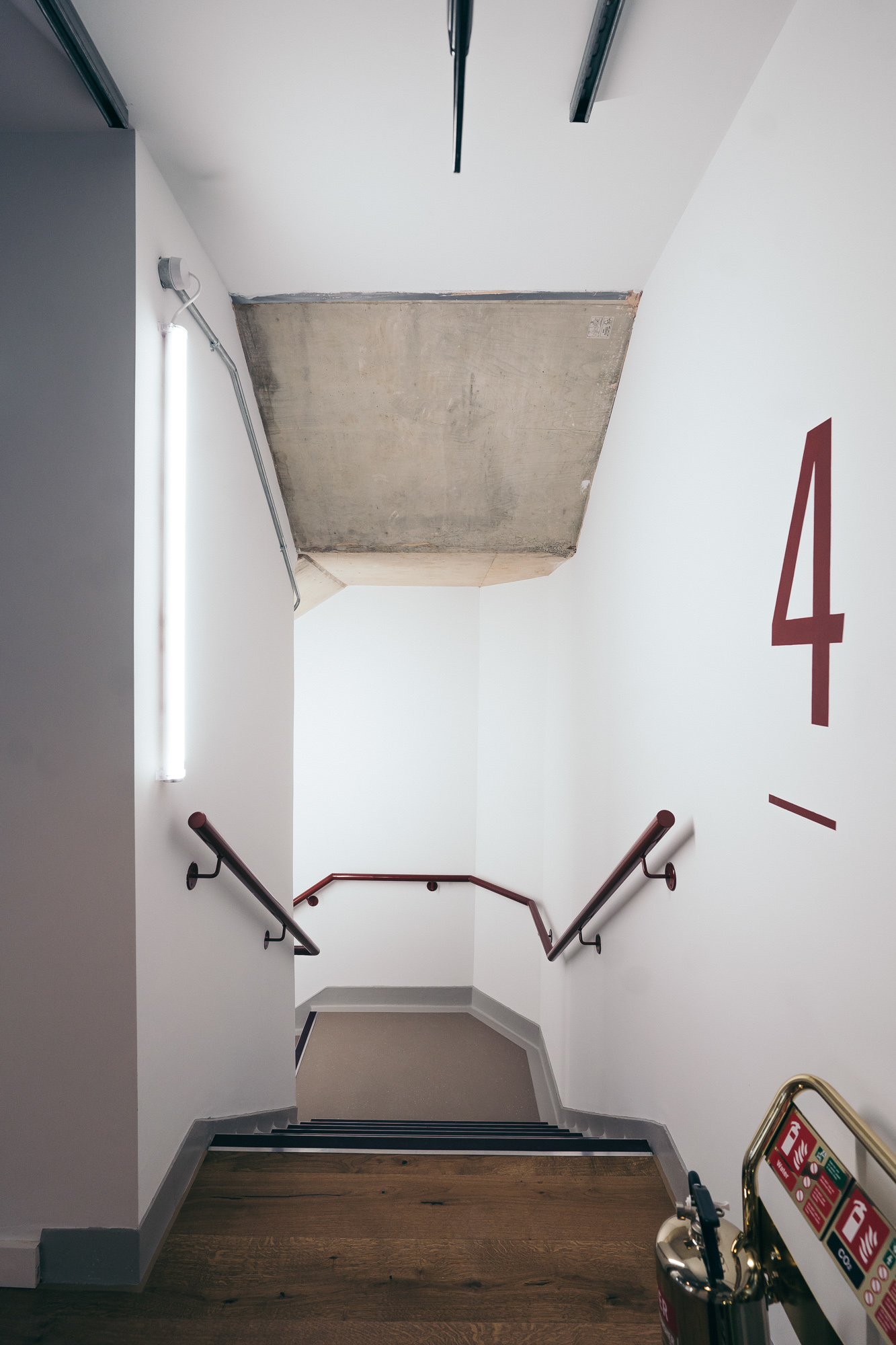
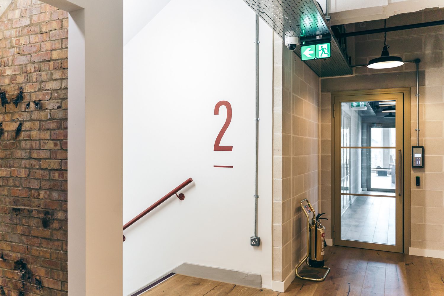
Hand-painted floor level numbers in stairwells
The challenge lay in producing a scheme that felt refined and durable, while also being practical to manufacture and consistent across multiple sign types.
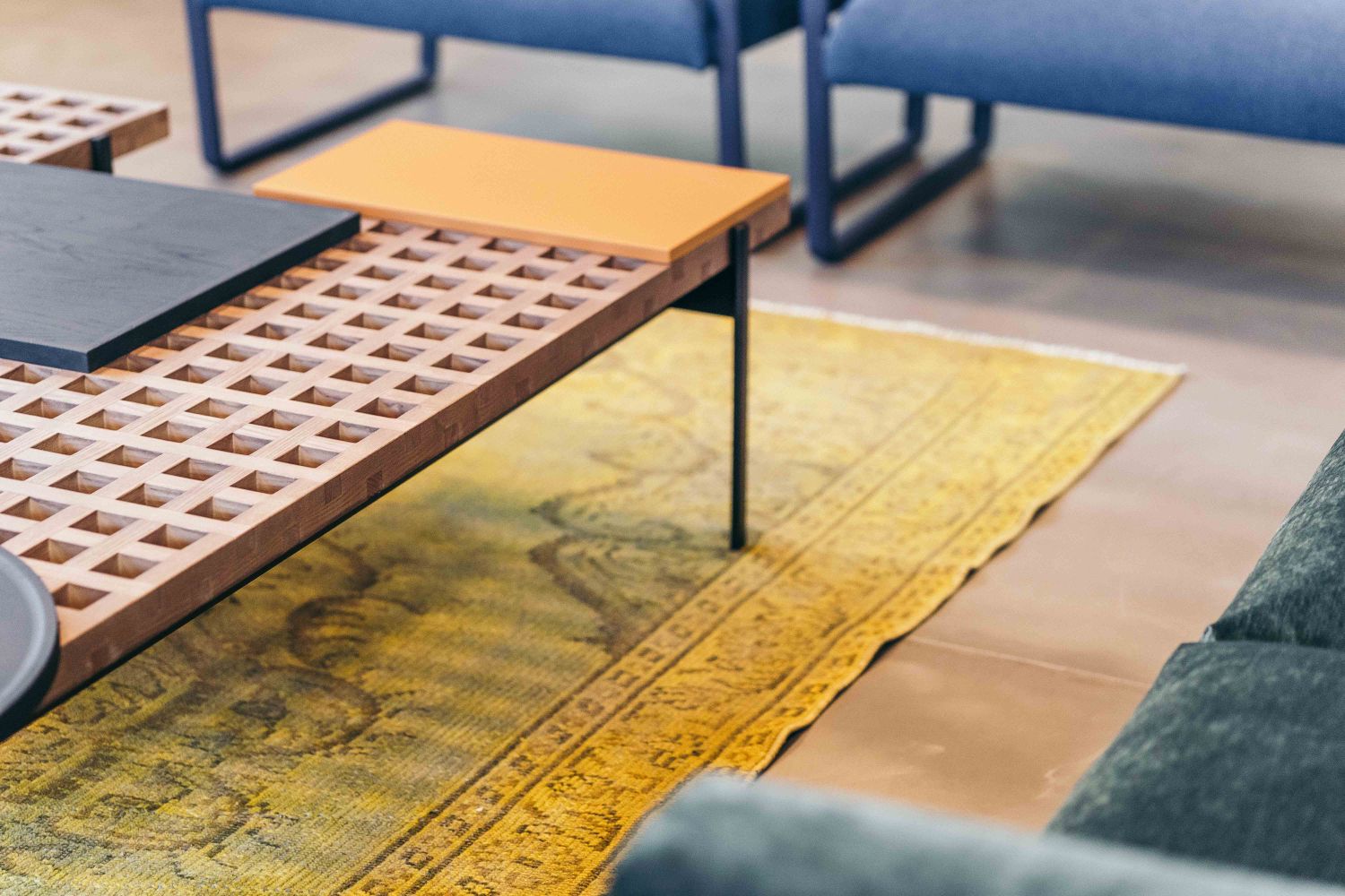
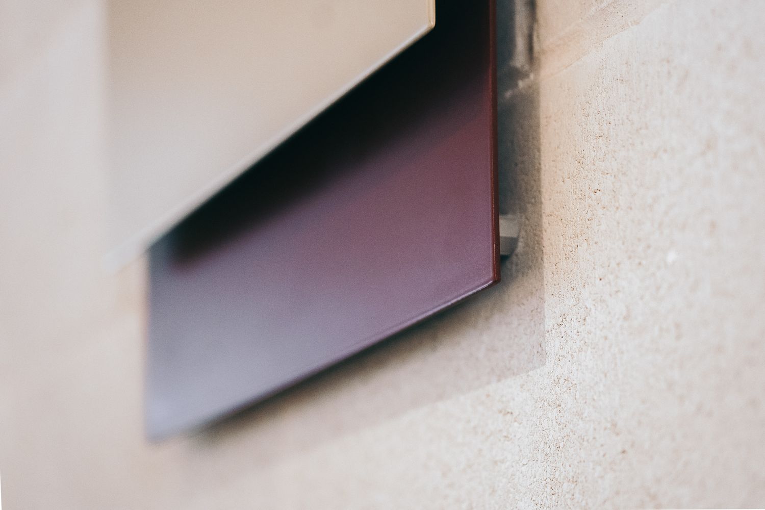
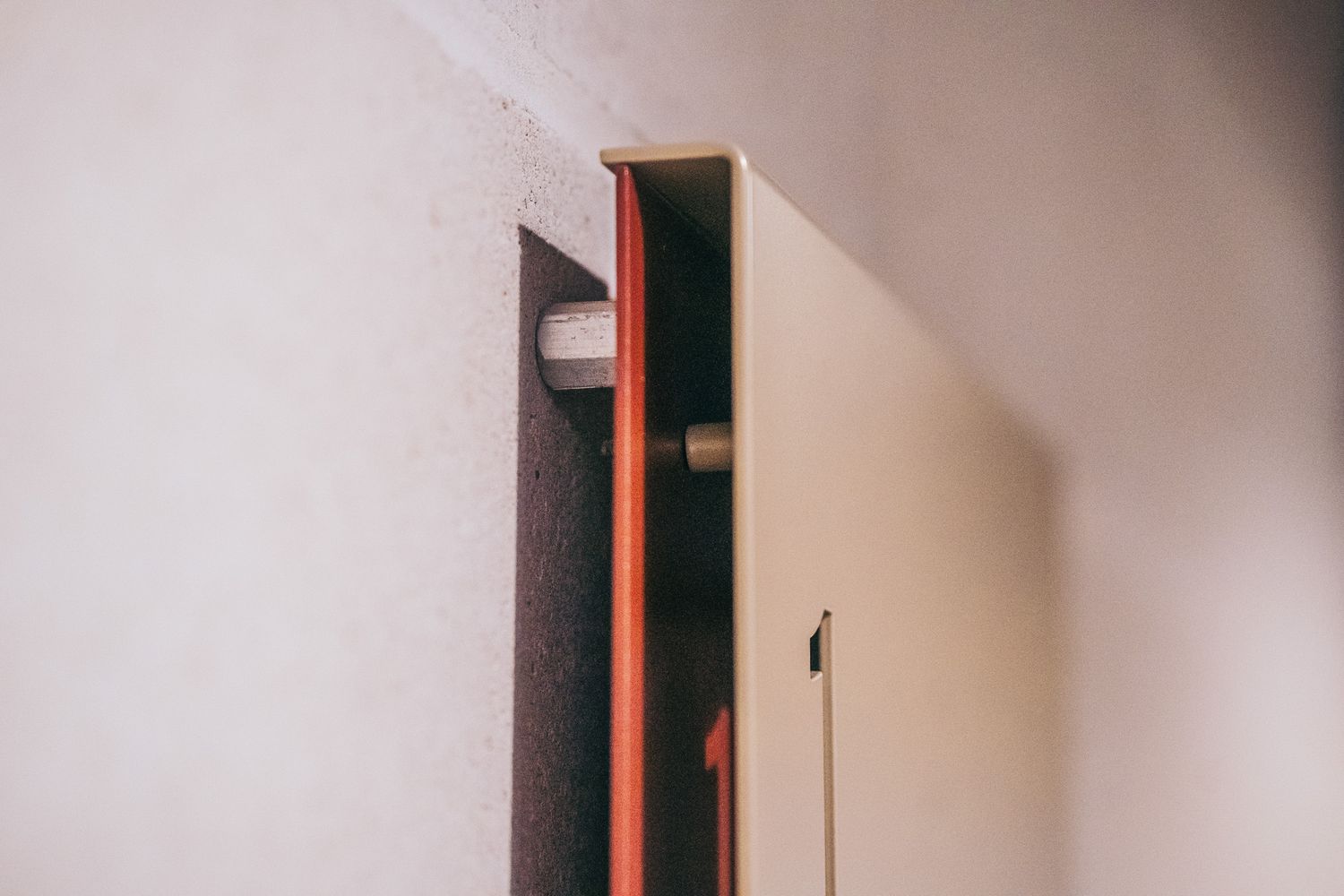
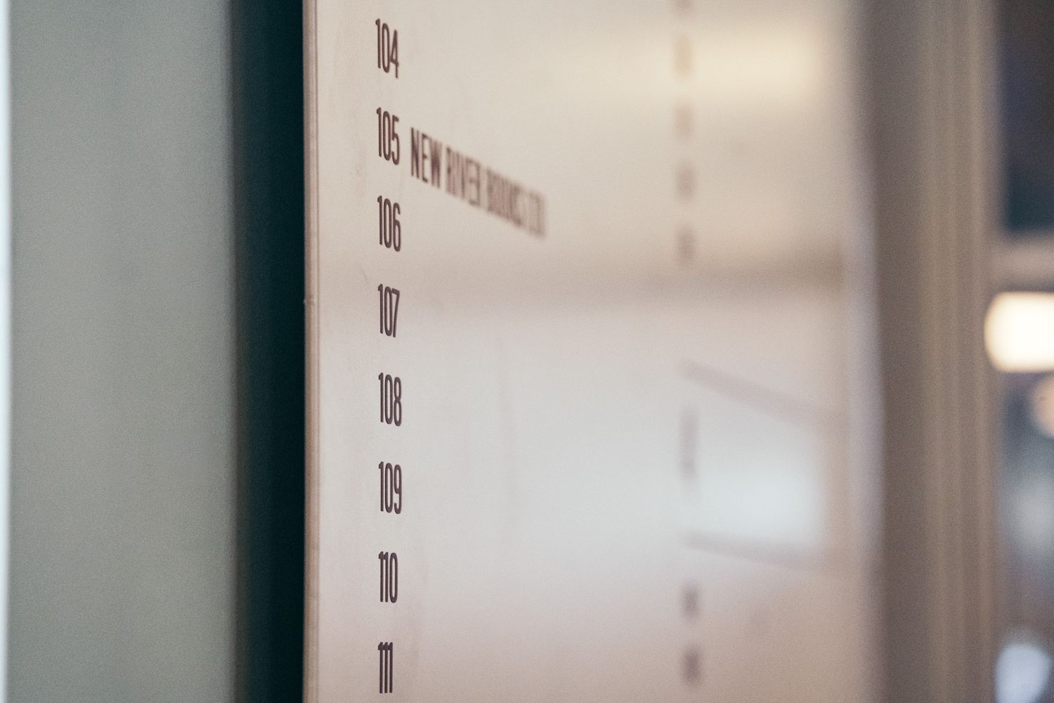
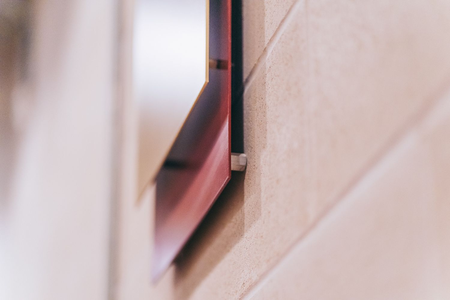
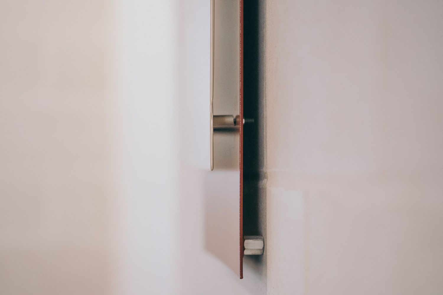
We began by exploring folded metal concepts for the wayfinding panels that would give the signs depth and distinction, setting them apart from standard flat panels.
The first iteration used a rolled-over fold, but this proved tricky to fabricate as a single piece. Instead, we refined the idea into a sharper, cleaner fold made from two separate panels. This approach reduced production waste and allowed each section to be powder coated independently, achieving precise colour separation and a premium finish.
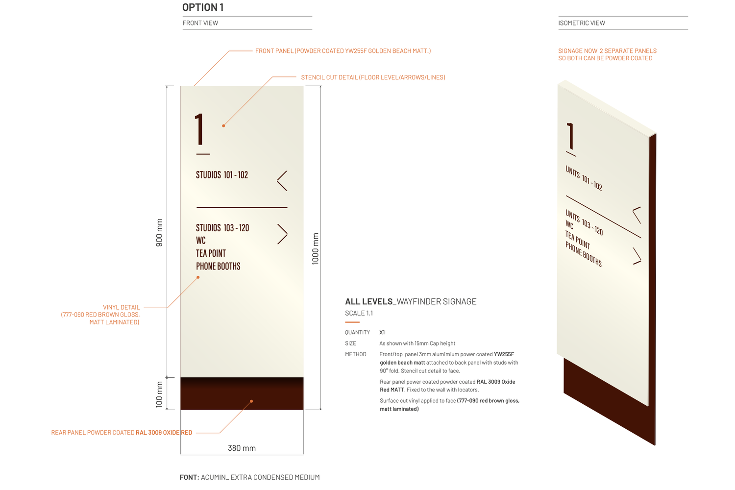
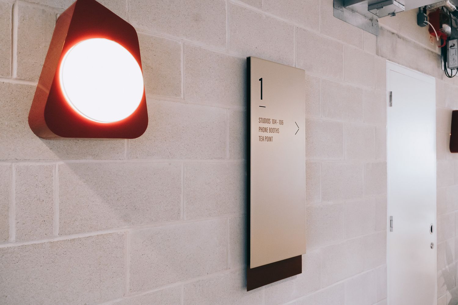
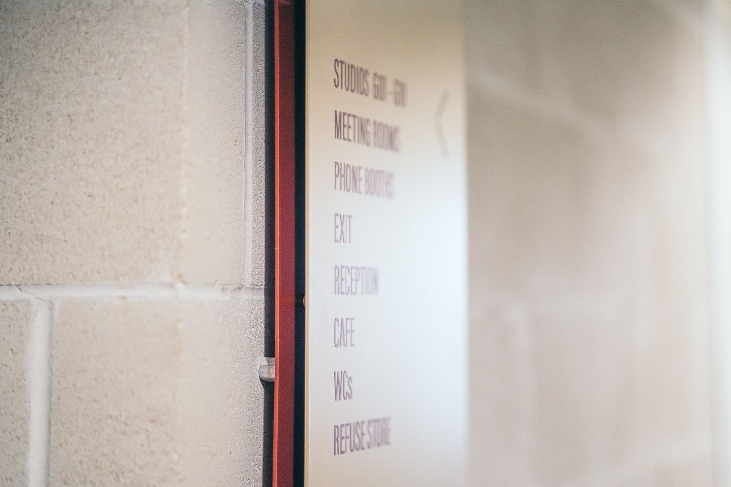
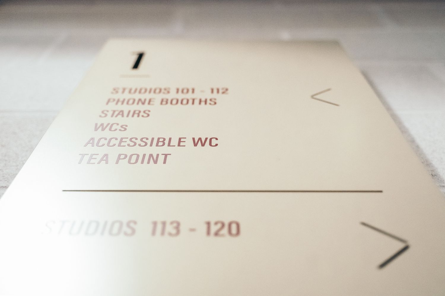
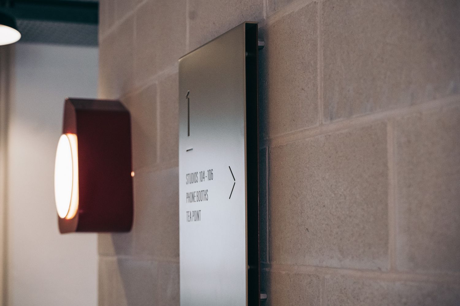
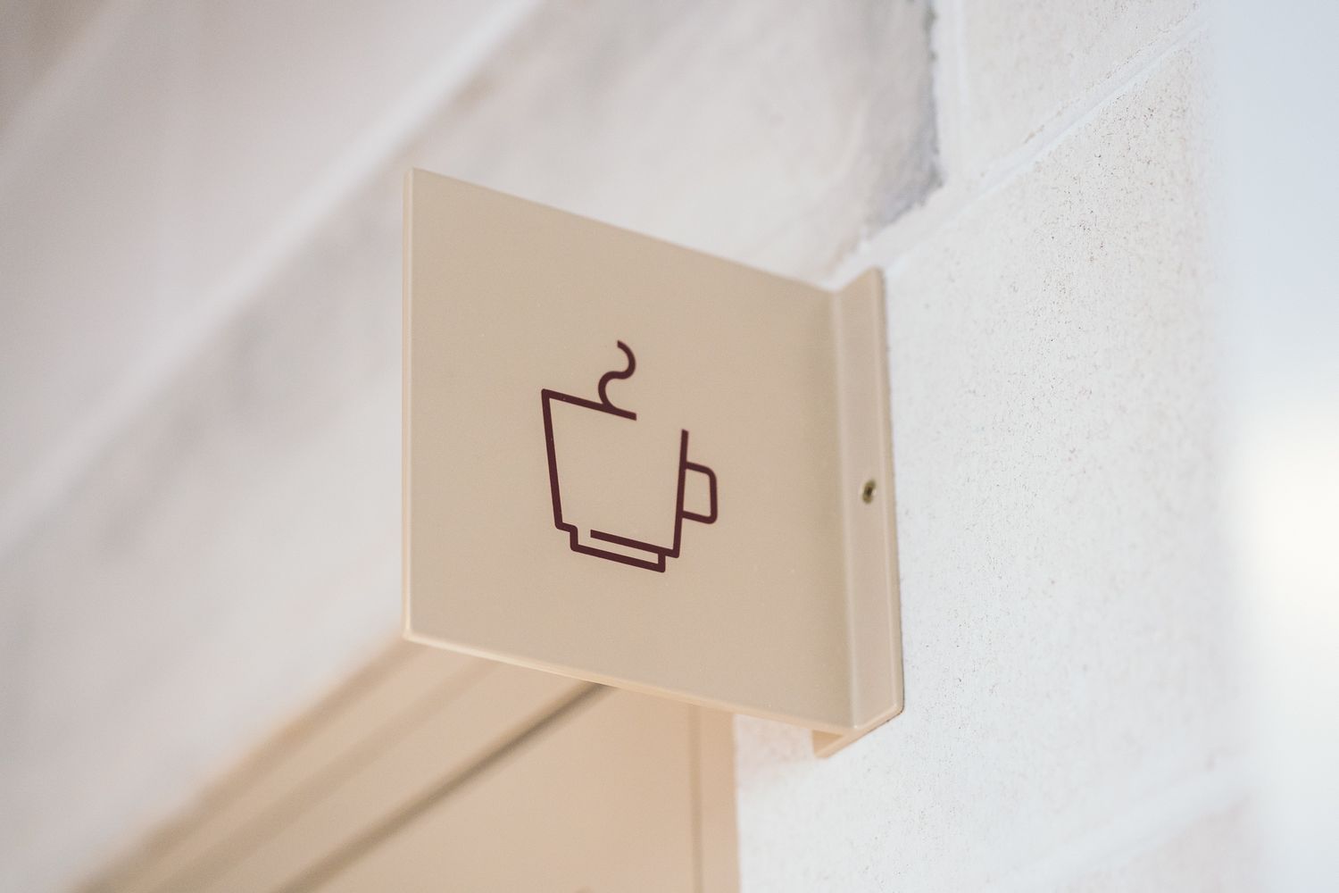
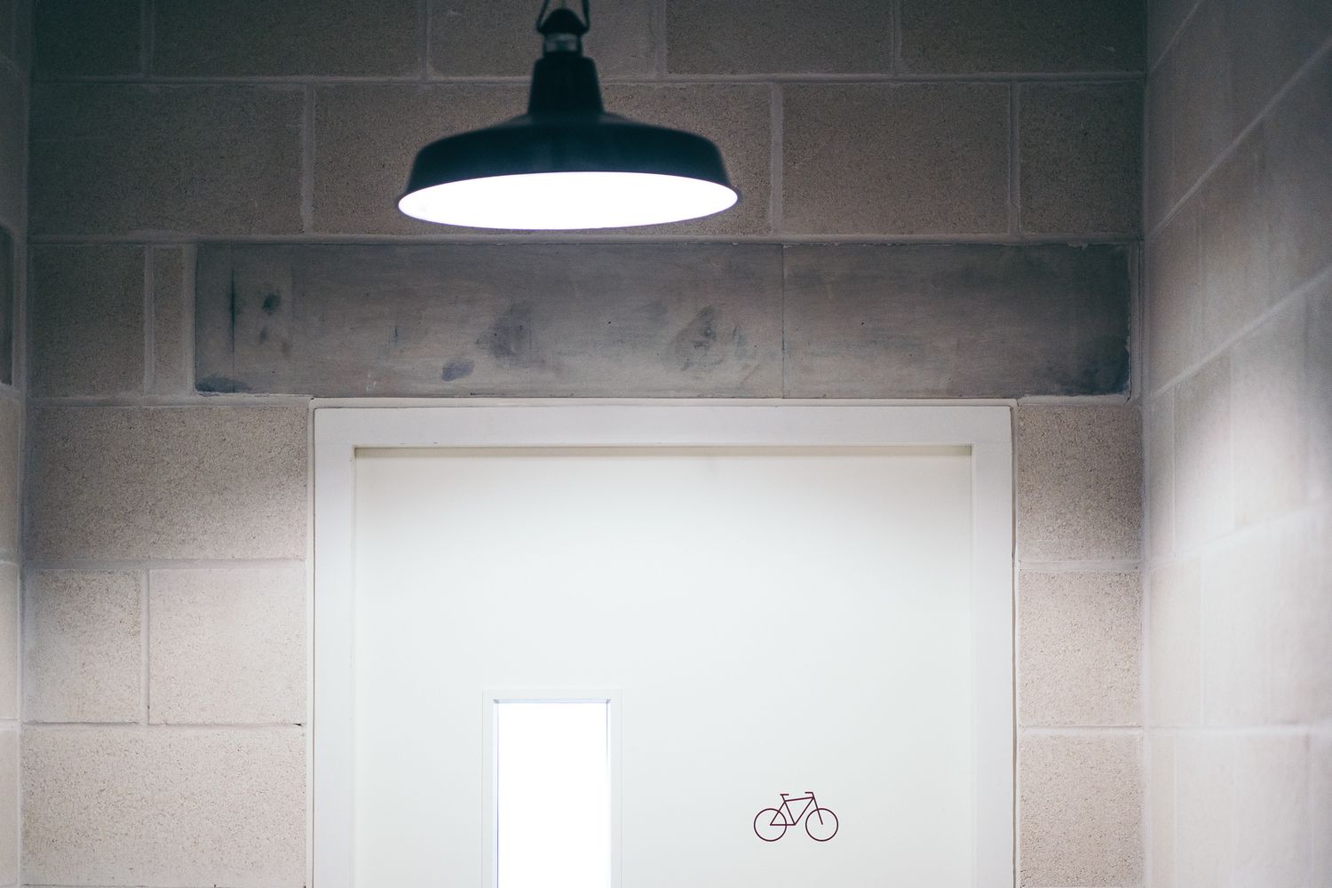
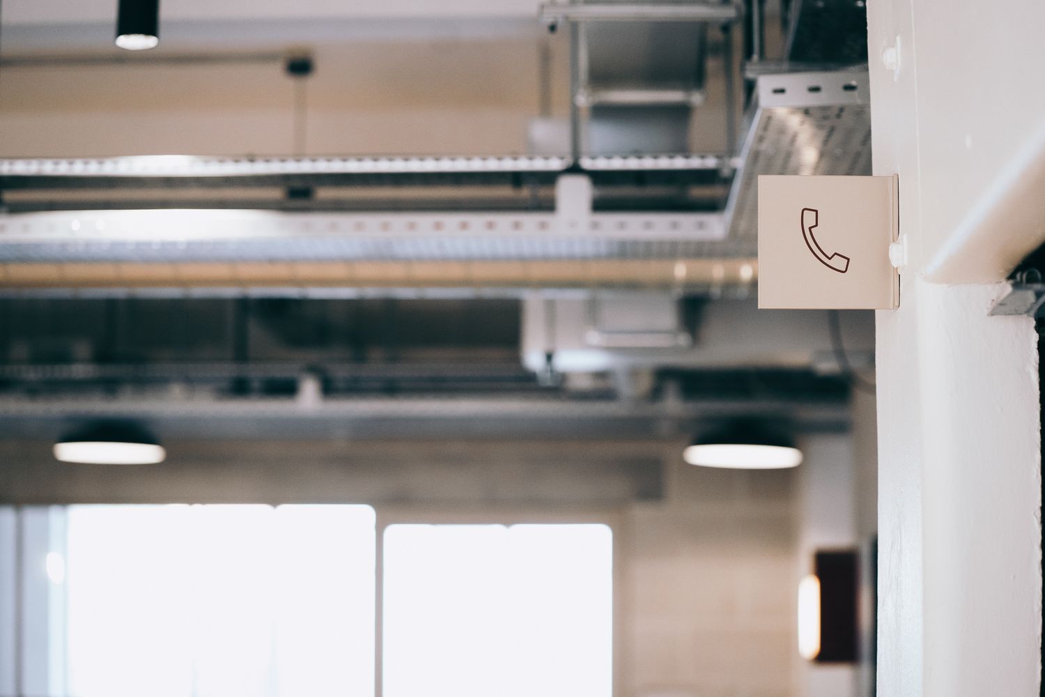
Stencil-cut details were introduced for numbers, arrows and directional lines, adding subtle shadow and texture - a theme later echoed in the reception sign. The same folded-panel technique was applied to the building directory for cohesion, creating a seamless visual rhythm throughout.
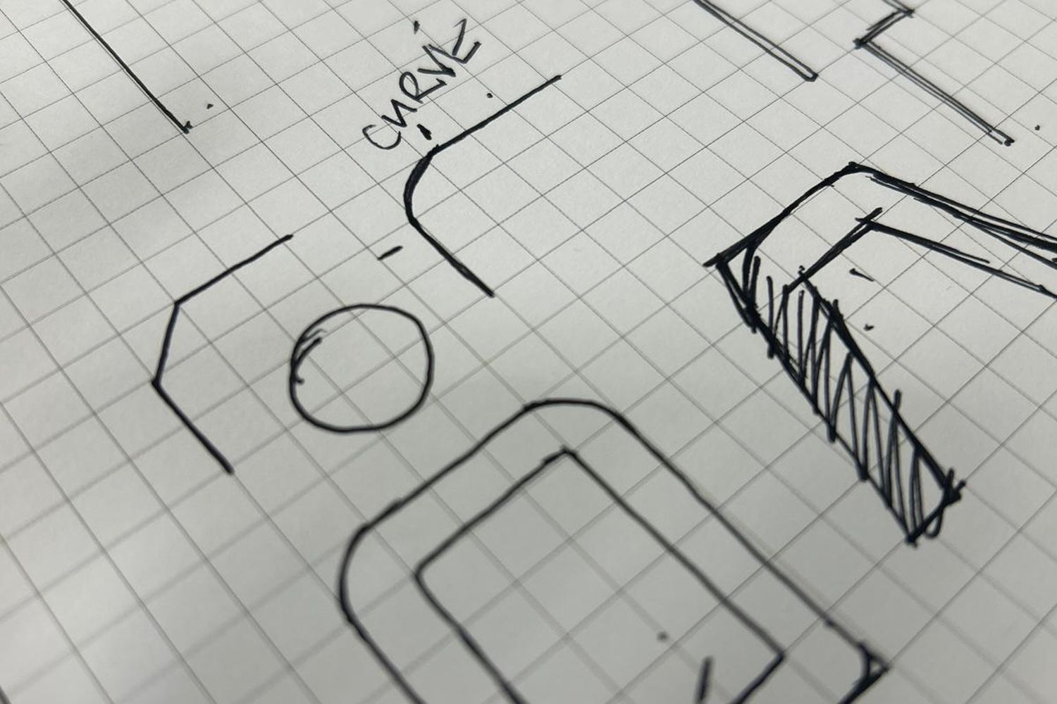
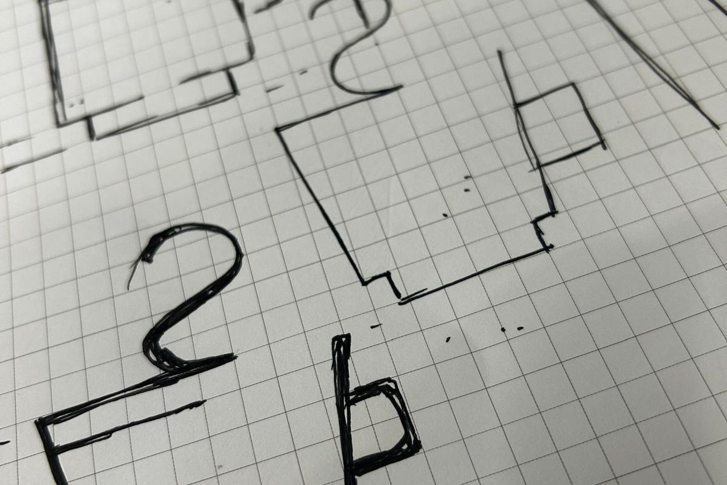
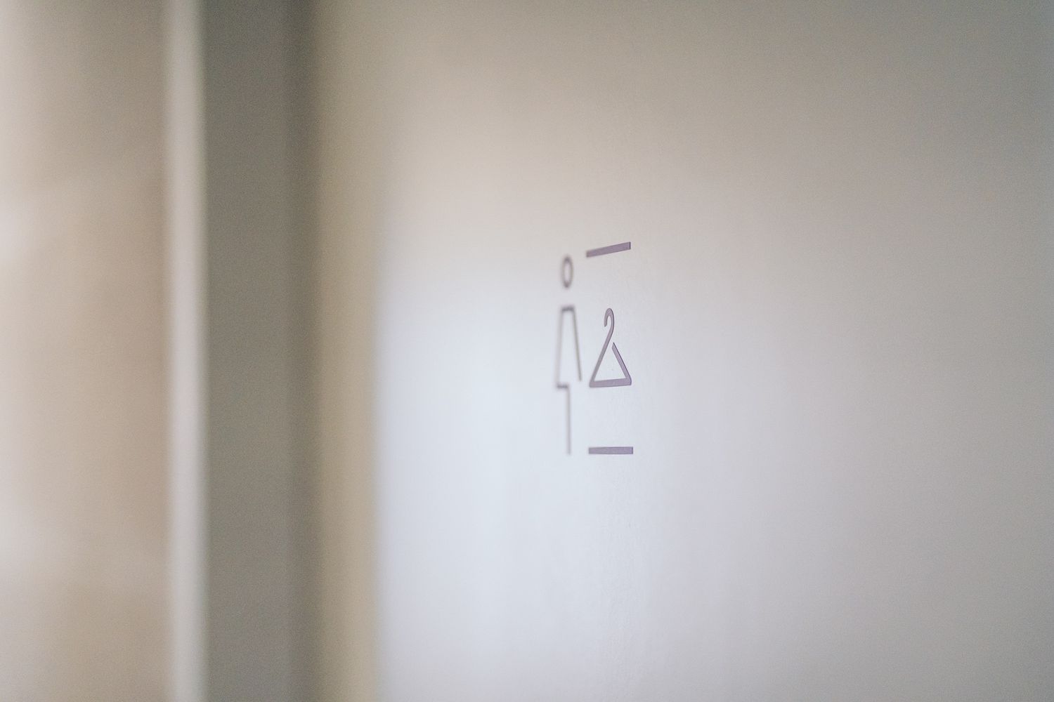
In parallel, we developed a suite of icons, refining early sketches into a modern set of pictograms for amenities such as phone booths, showers and accessible facilities.
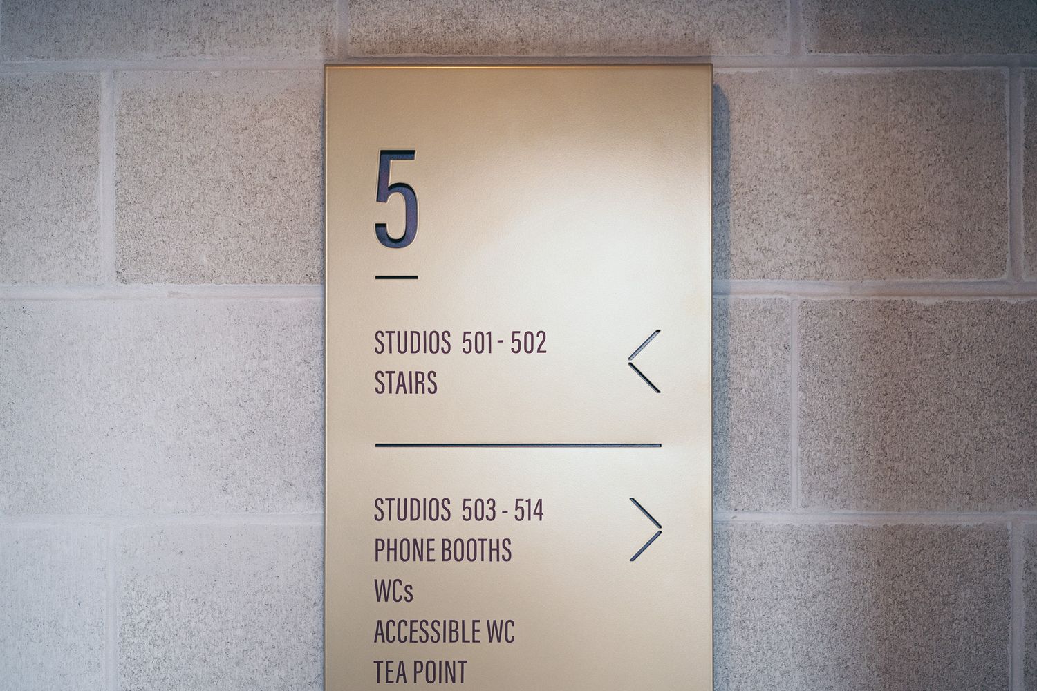
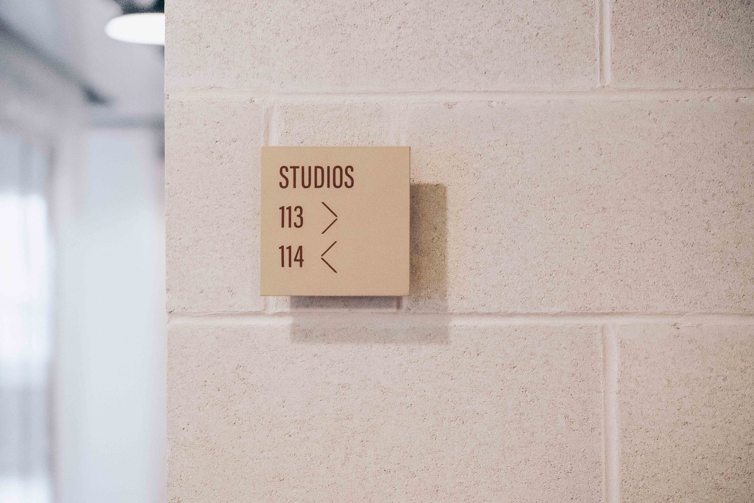
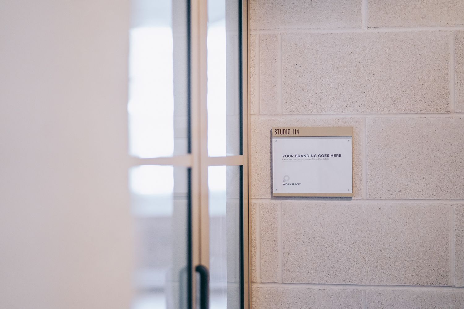
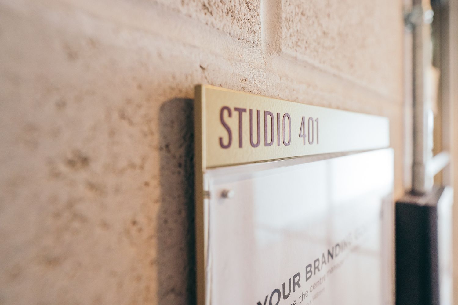
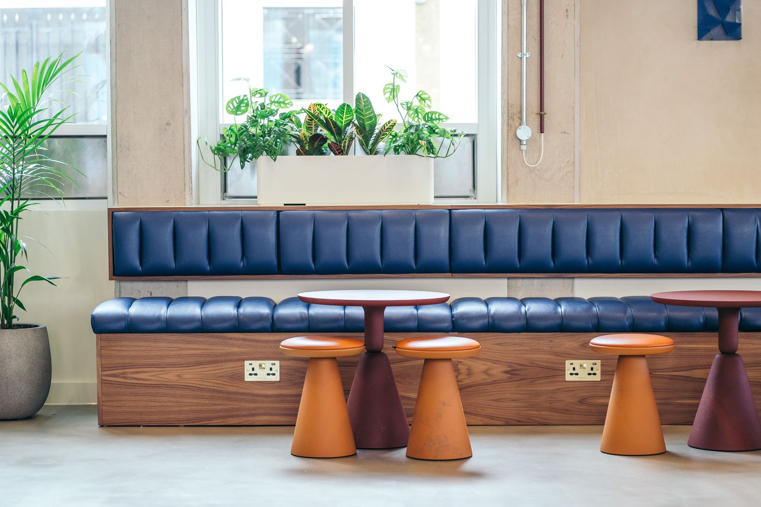
Wayfinding & Directory
Construction: Dual-panel folded aluminium
Finish: Powder coated in YW255F Golden Beach Matt and RAL 3009 Oxide Red Matt
Detailing: Stencil-cut numbers and arrows with applied vinyl accents
The wayfinding scheme was designed to feel confident yet understated, guiding users seamlessly without overwhelming the interiors. Folded panels add depth and presence, while stencil-cut details bring a crafted sharpness. Fabricated from recyclable aluminium and coated using solvent-free finishes, the panels are both durable and low-maintenance - built for longevity with minimal environmental impact.

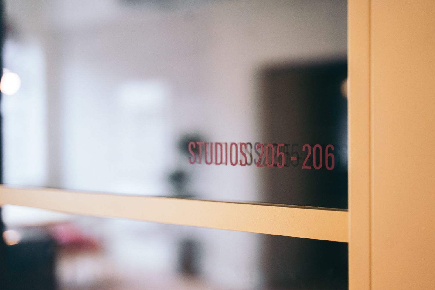
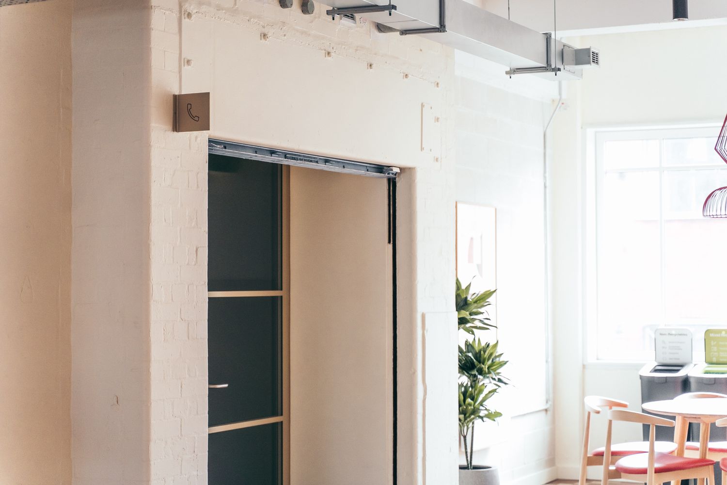
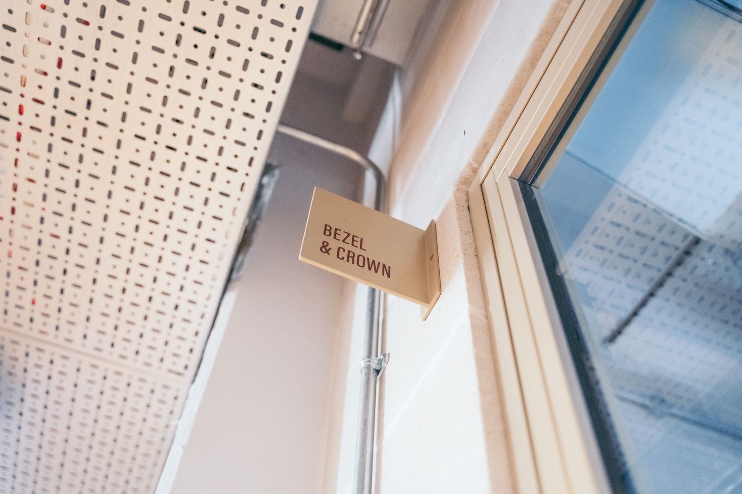
Projection & Door Signs
Surfaces: Glass doors and metal panels
Construction: Panels mounted on stand-offs or projecting arms for clear visibility along corridors
Finish: Cut vinyl graphics applied directly to each surface
These subtle wayfinding elements maintain consistency with the larger folded-panel system, carrying the same typography and iconography through to more compact formats. Their careful placement and restrained detailing ensure clarity at every junction while preserving the clean, cohesive language of the overall scheme.
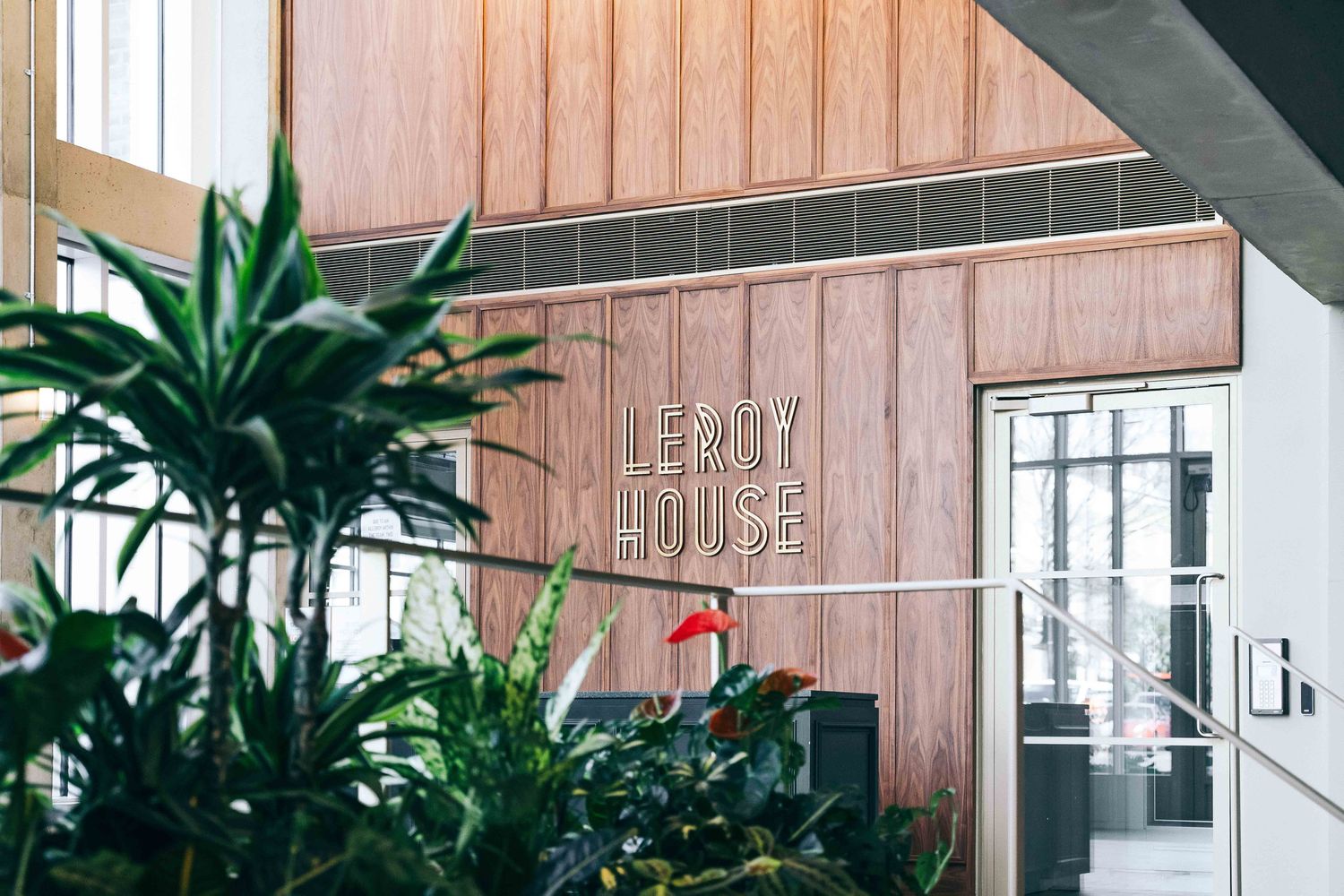
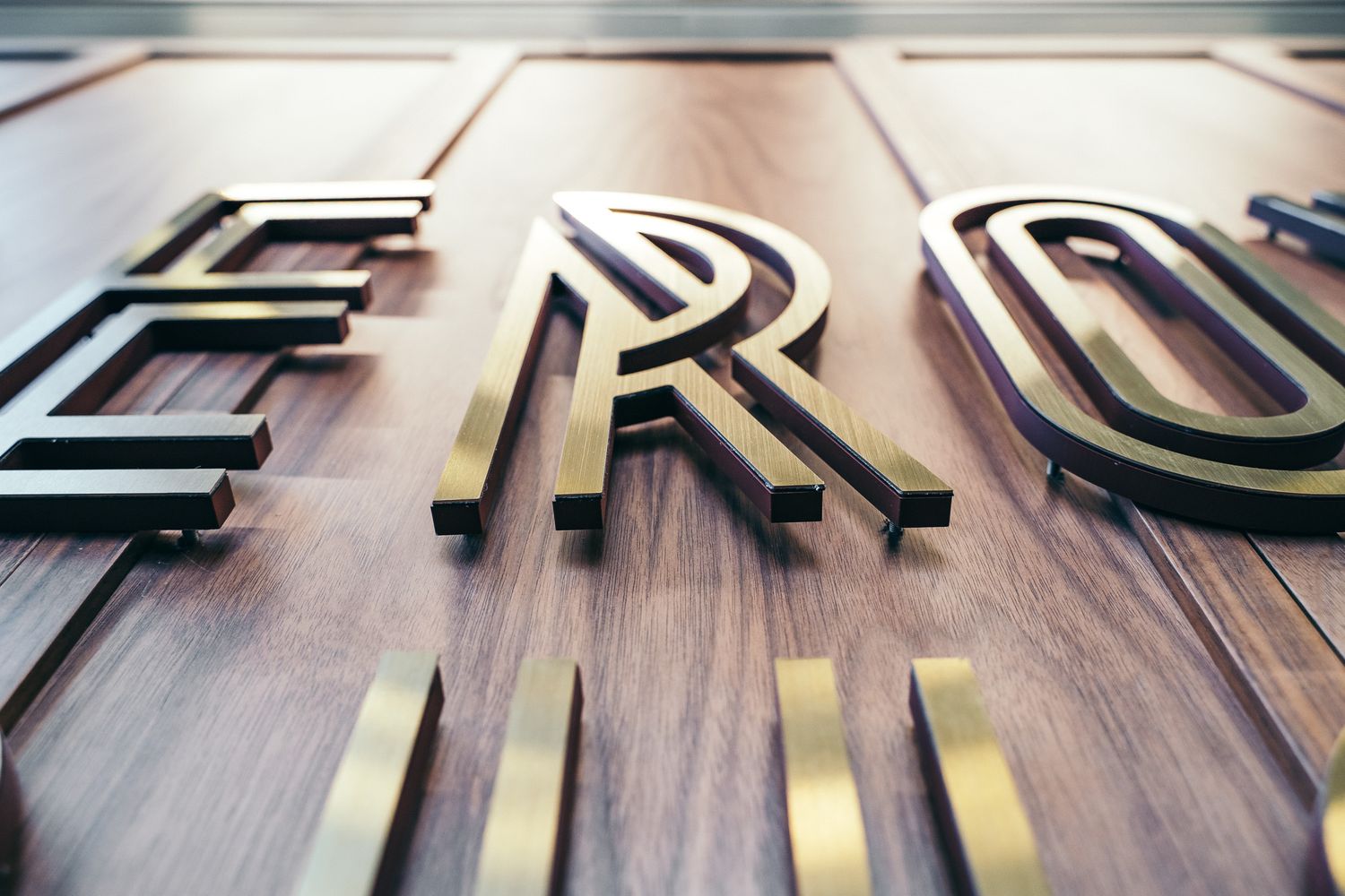
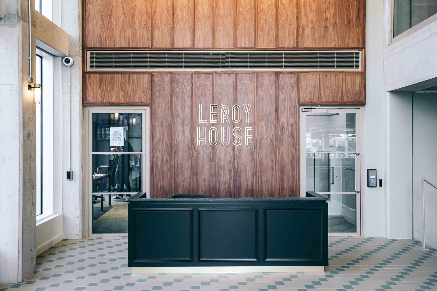
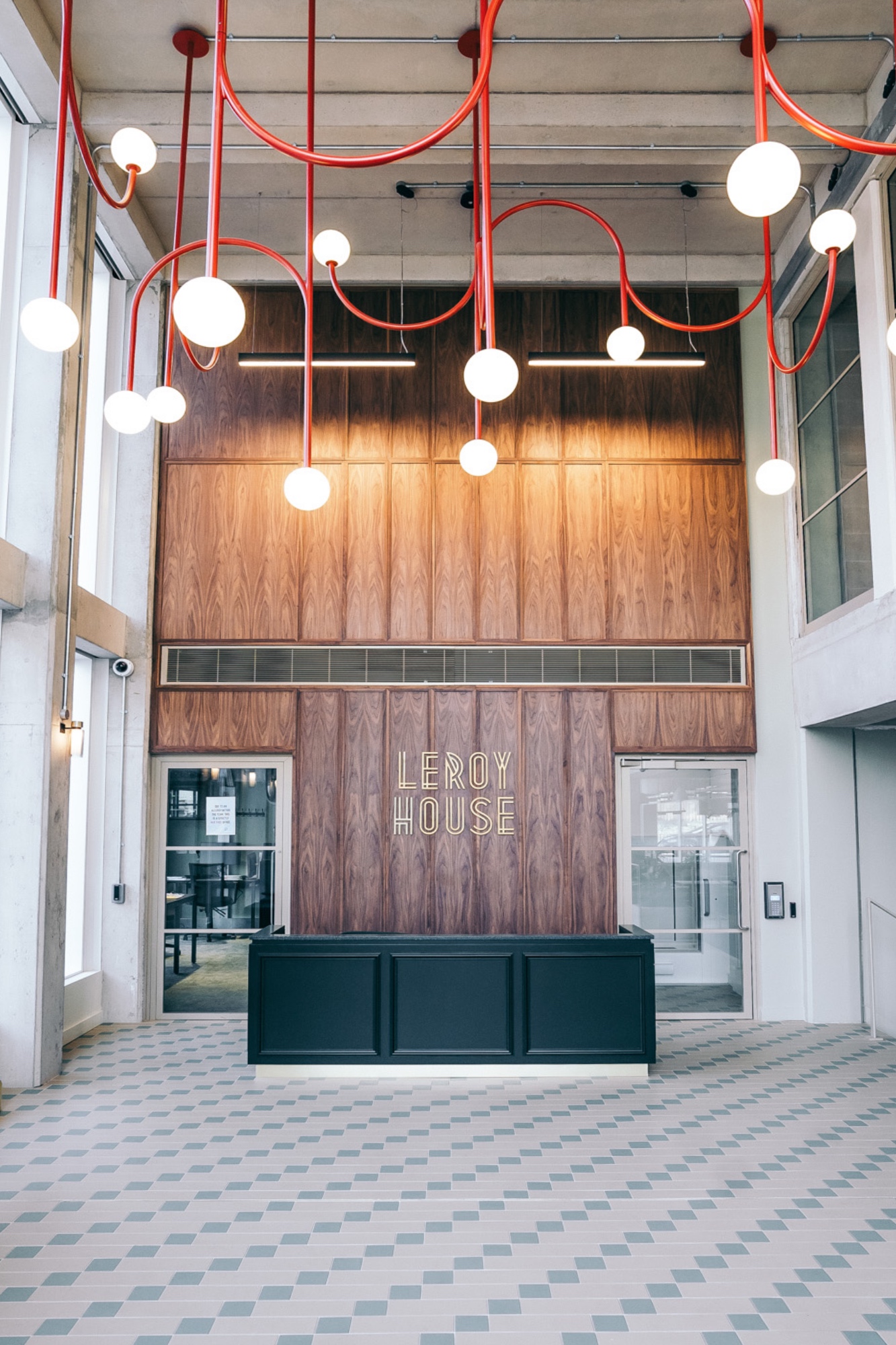
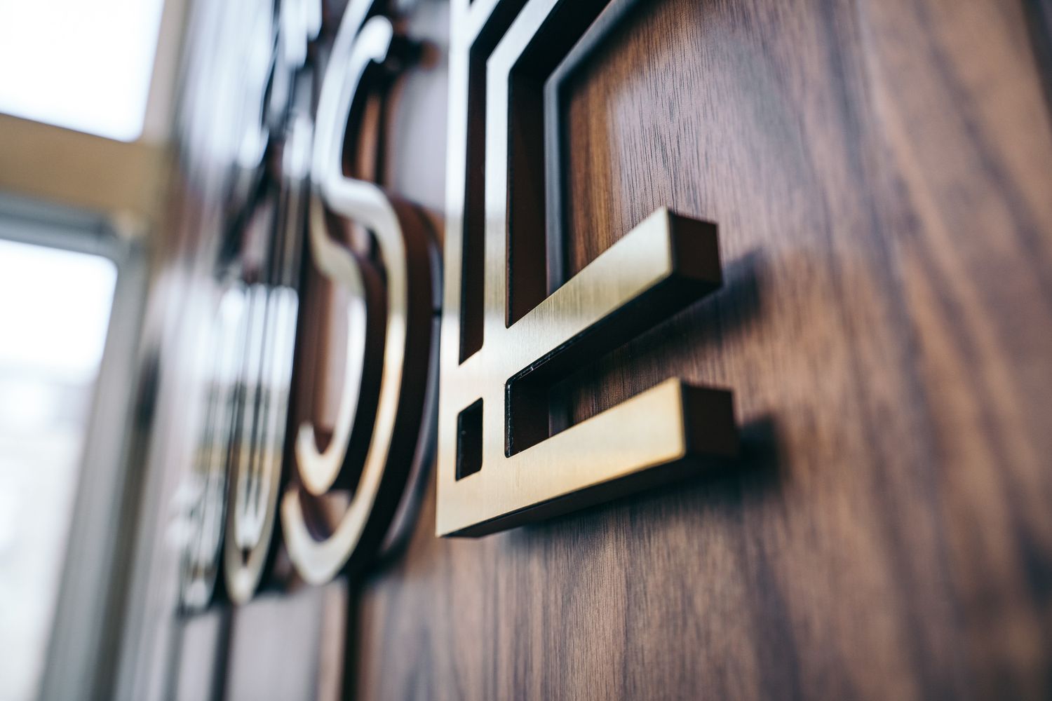
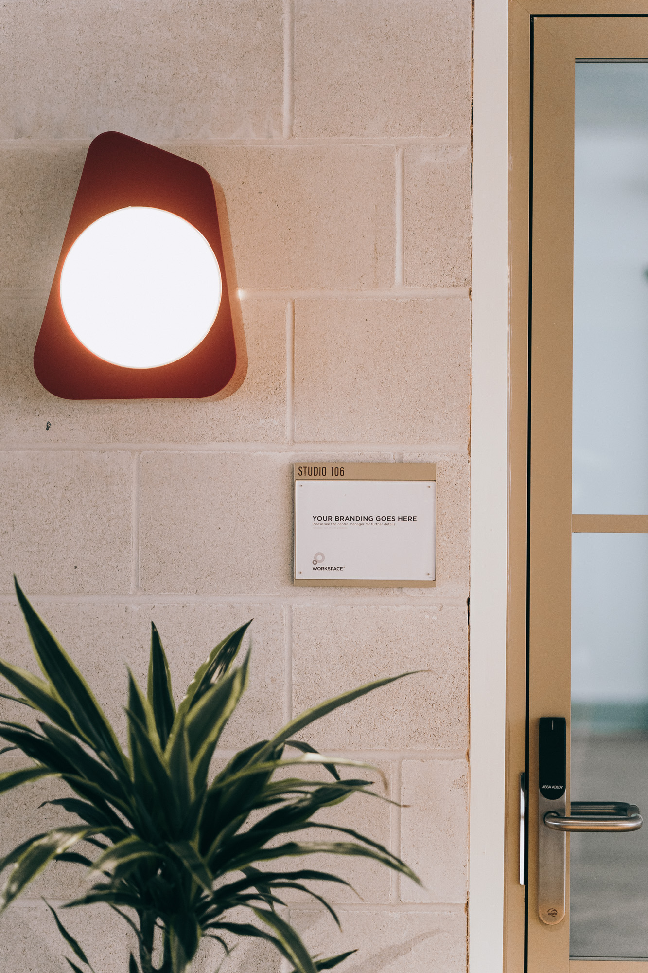
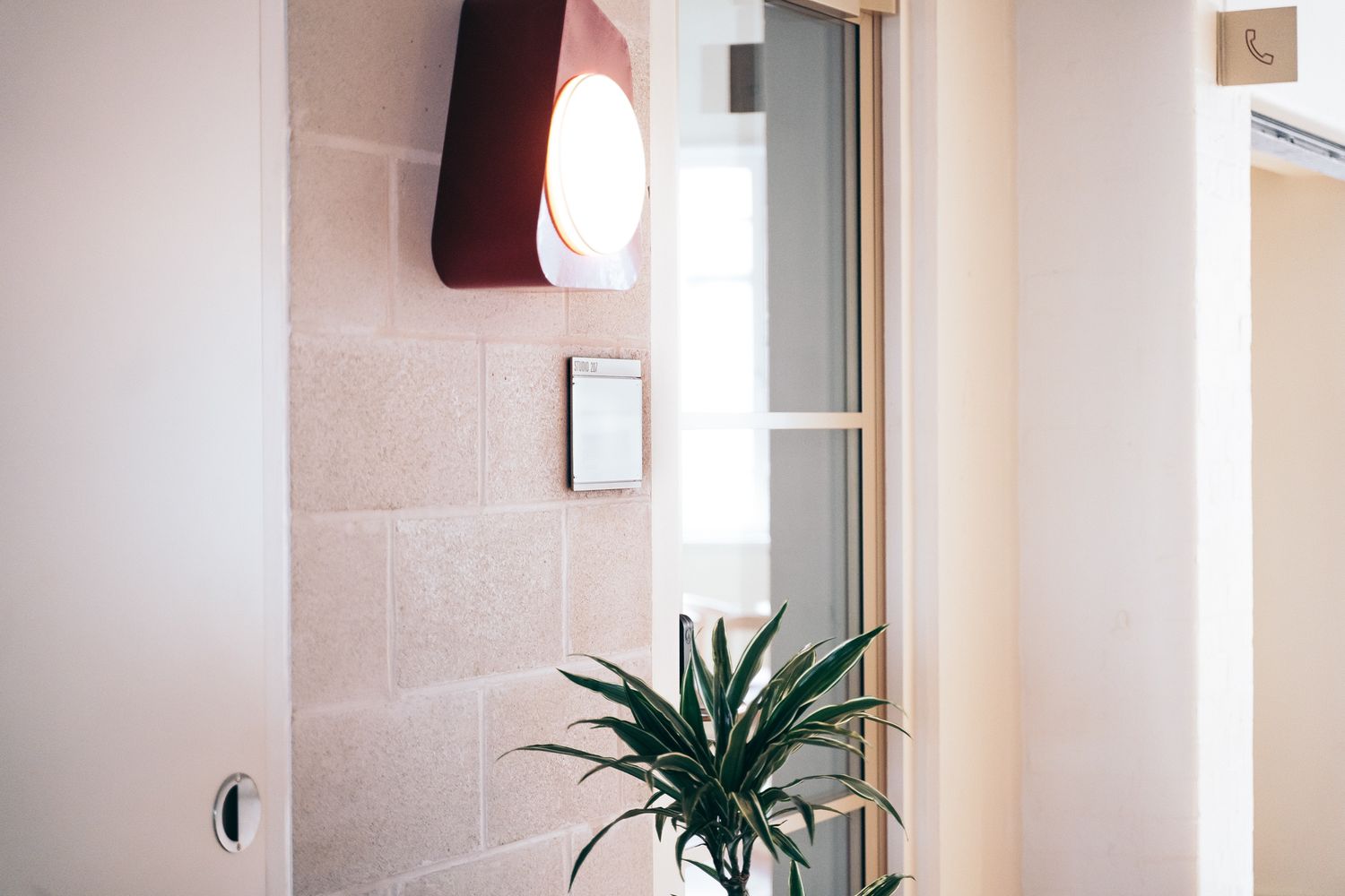
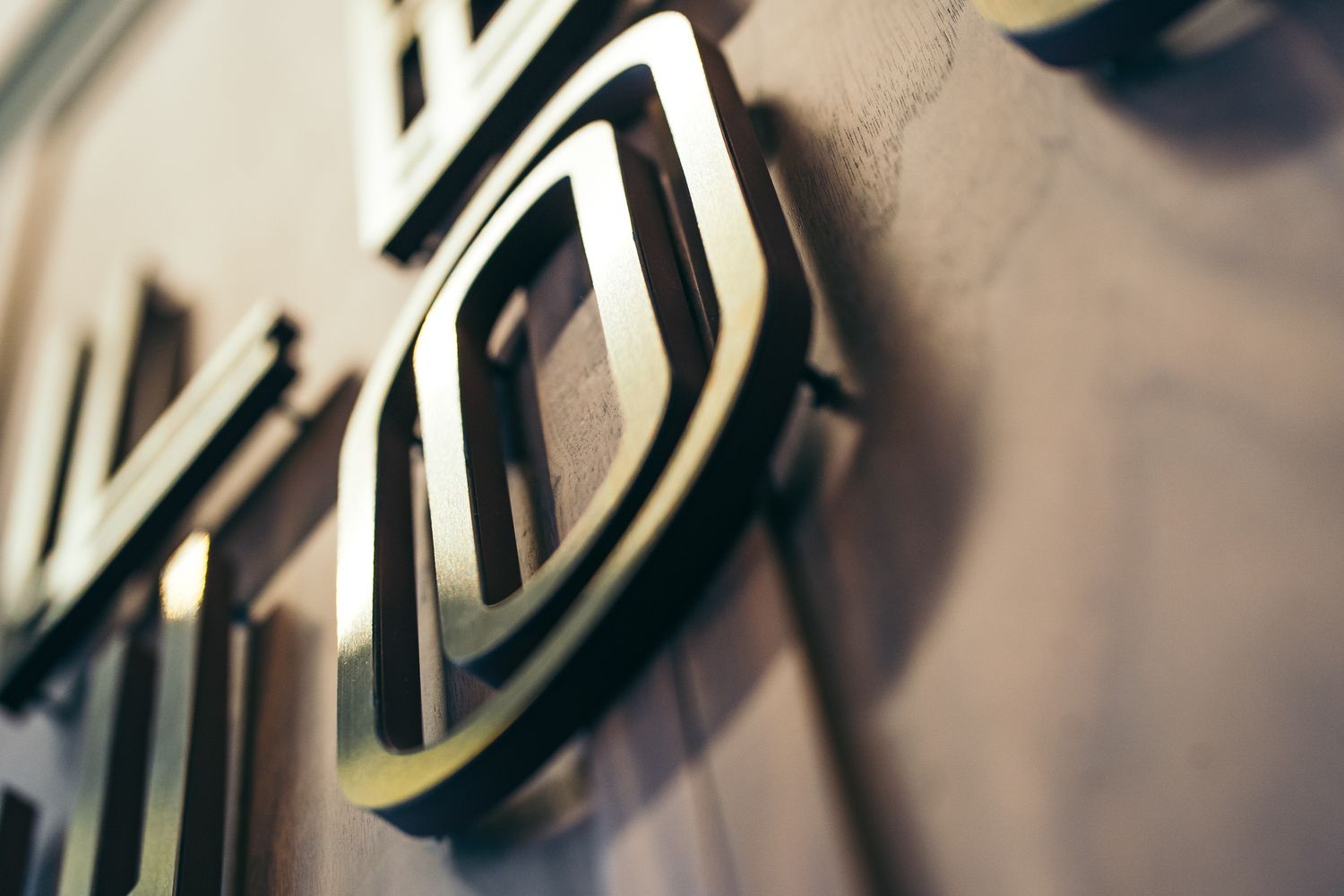
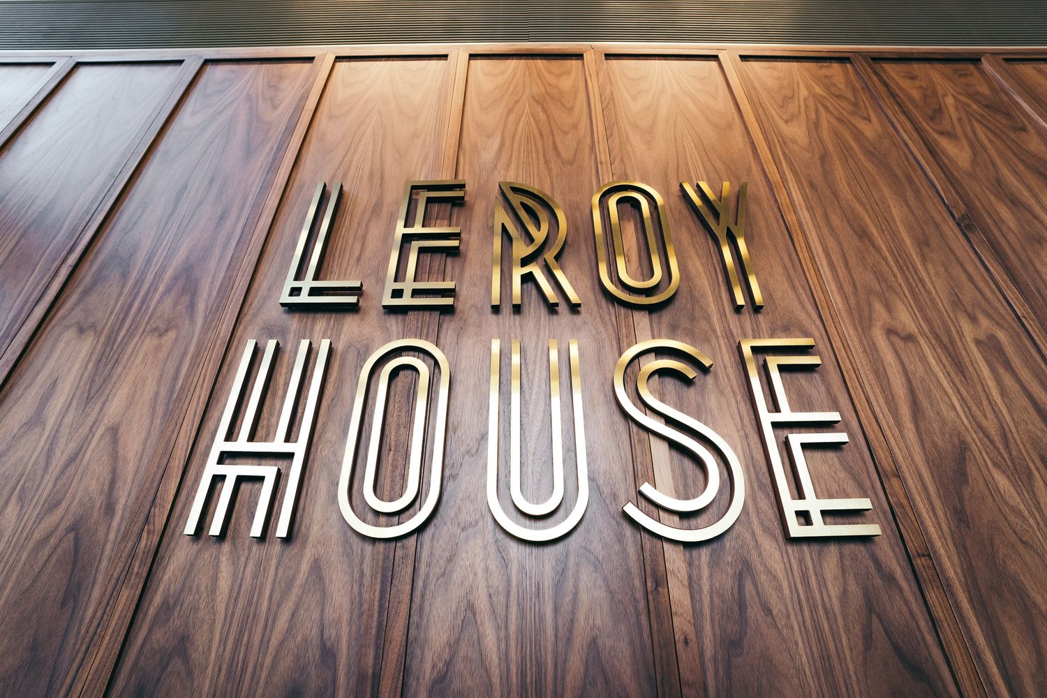
Reception Logo
Materials: Rimex Prestige Gold Hairline stainless-steel face on 10 mm painted acrylic backer
Fixing: Stud-mounted for a clean, floating effect
The reception sign forms the visual anchor of the ground floor. Its warm metallic surface and crisp stencil-inspired detailing echo the precision of the wayfinding, linking the point of arrival to the wider navigation system. Built from durable materials, it’s a long-lasting focal point that balances elegance with permanence.
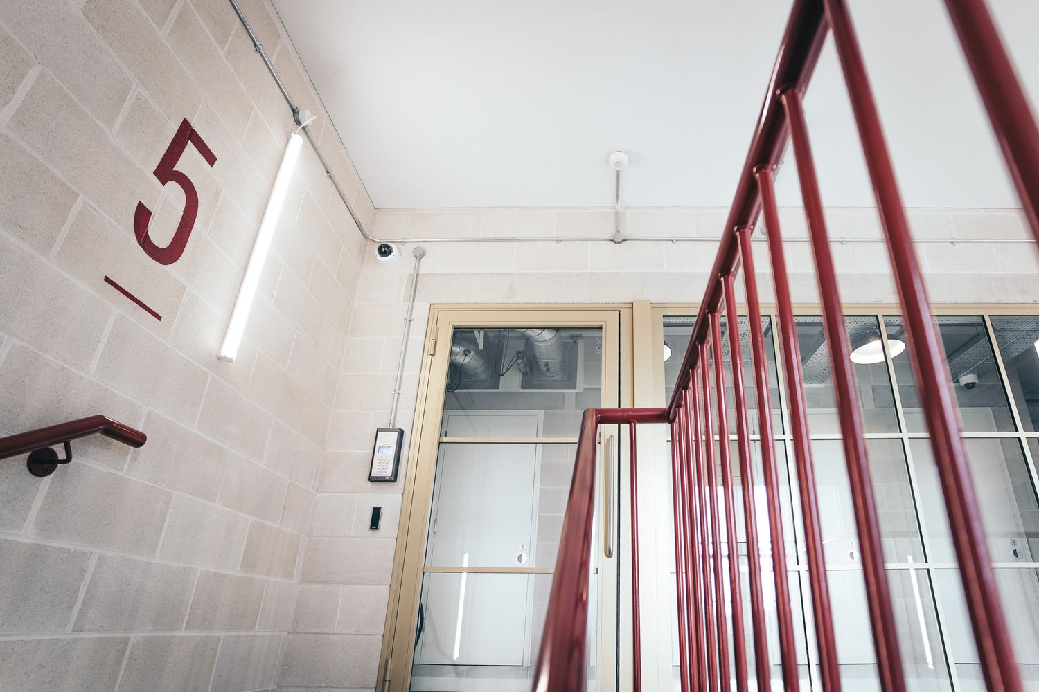
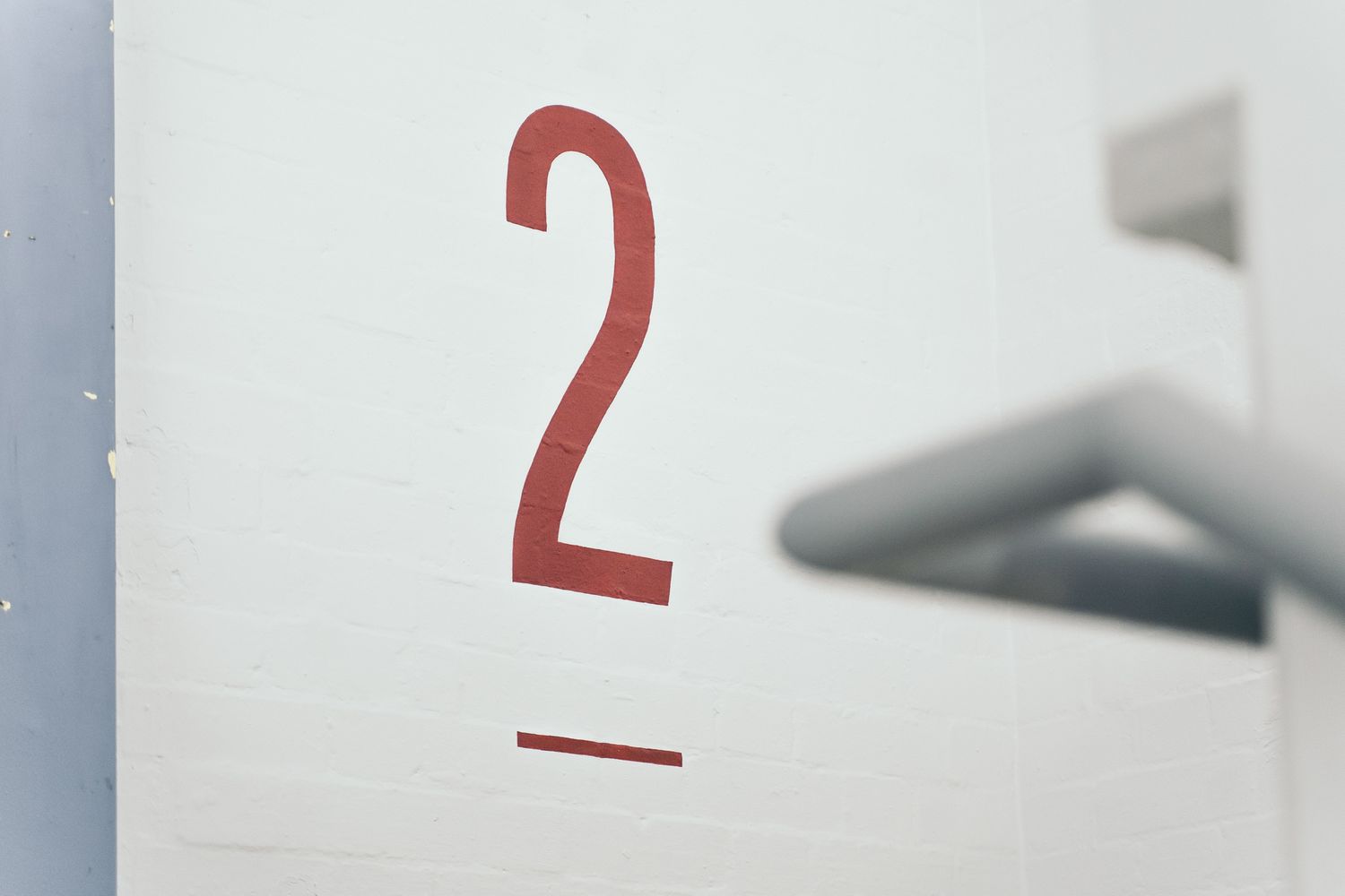
Hand-Painted Floor Numbers
Medium: RAL 3009 Oxide Red paint applied directly to stairwell walls
Scope: Large-scale numerals spanning five levels
The oversized numbers give the stairwells immediate impact, carrying the colour and rhythm of the wayfinding into the vertical circulation spaces. Each was measured, masked and hand-painted for accuracy - extending the building’s sense of order and continuity.
Tenant Panels
Construction: Acrylic slider panels with interchangeable magnetic inserts
Finish: Painted and printed to match wayfinding palette
Designed for flexibility, the tenant panels allow easy updates without creating waste. Their modular structure keeps branding consistent across changing occupiers, mirroring the clean lines and pared-back aesthetic of the main system.
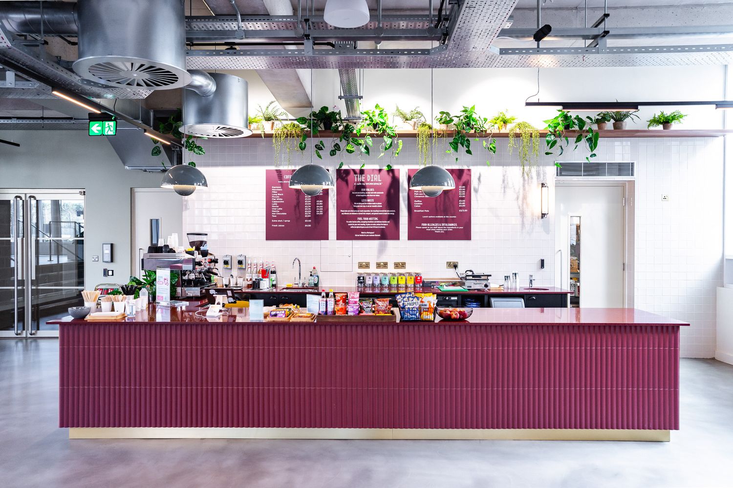
Cafeteria Menu Boards
Materials: Aluminium frames with printed panels
Function: Easy to update as menus evolve
These boards bring the signage language into the communal café, using the same finishes and typography as the wayfinding to maintain cohesion. Simple layouts and robust materials ensure they remain practical and enduring in a busy daily environment.


Together, these elements form more than a collection of signs - they establish a unified visual language. By echoing details such as folds, stencil cuts and colour finishes across wayfinding, reception, tenant and communal signage, the scheme creates a sense of rhythm throughout the building. Each piece reinforces the next, ensuring that visitors and tenants experience Leroy House as a coherent, carefully crafted environment, built to last.
Translating design into reality via the Leroy House signage package required careful planning and coordination with the main refurbishment works / a live workspace.
Mixed Surfaces
The building featured a range of wall finishes — painted plasterboard, exposed concrete, glazed doors and timber panelling — each requiring tailored fixings and preparation for a consistent result.Precision Alignment
Folded aluminium panels and stencil-cut details demanded millimetre-accurate installation. Concealed studs and locators were used to float panels from the wall, creating clean shadow gaps while keeping the system robust.Hand-Painted Stairwell Numbers
The stairwells presented challenges due to uneven surfaces and limited space. The team carefully masked, measured and hand-painted each number directly onto the walls, maintaining sharp alignment across all five floors.Occupied Building Constraints
As the fit-out neared completion, parts of the building were already occupied. Work was phased to minimise disruption, with high-access and noisy fixings completed outside office hours.
By installing directly onto existing surfaces and avoiding unnecessary wall coverings, the process also reduced material use and waste - aligning with the sustainable spirit of the wider refurbishment.
The final installation gives Leroy House a distinct sense of place and identity. Warm metallic finishes contrast with the building’s industrial fabric, while sharp folds, stencil detailing and careful alignment create visual continuity throughout the scheme.
More than a system for navigation, the signage unites the space. From bold stairwell graphics to understated corridor markers and a statement reception logo, every detail speaks the same design language. The result is a synchronised family of signs that reflects Workspace’s character as a co-working brand and embodies the sustainable ethos of Leroy House - proof that clarity, craft and conscience can coexist beautifully.
The following guide outlines the key materials and methods used throughout the project - many of which are staples across our signage for co-working and commercial spaces.
Aluminium
Lightweight, durable and ideal for folded or formed panels. Provides a crisp, architectural finish while keeping signage slim and strong.Powder Coating
A baked-on finish that’s tougher than paint, available in matte, gloss or textured options for consistent colour and protection.Stencil-Cut
Graphics, numbers or icons cut directly through metal panels. This adds shadow and depth while maintaining a clean, crafted look.Vinyl Graphics
Versatile lettering or icons applied to doors, walls or panels, finished with a matte laminate for durability.Acrylic
Smooth and adaptable, used for the reception sign back panels and custom tenant slider panels. Can be painted, layered or engraved for subtle depth.Rimex Stainless Steel
A decorative stainless steel with specialist surface treatments. The “Prestige Gold Hairline” finish used here adds warmth, sophistication and light reflection.Paint Finishes
Used for the hand-painted floor numbers in the stairwells. Durable and easily refreshed, they bring colour consistency to high-traffic areas.Fixings
Hidden studs and locators that float signs away from the wall, introducing refined shadow gaps and a clean architectural presence.Acrylic Slider Panels
Modular signs with interchangeable inserts, letting tenants update information easily while keeping the overall look consistent.Projection Signage
Double-sided wall-mounted panels positioned perpendicular to corridors, for enhanced visibility and information flow in shared spaces.
From concept to completion, every detail balanced practicality, craftsmanship and environmental responsibility. Explore the FAQs below to learn more about how we approach projects like this from design to installation.
FAQS - LEROY HOUSE BY WORKSPACE
Yes. We work extensively with co-working and shared office environments, from full building redevelopments like Workspace’s Leroy House to bespoke one-off projects. Our approach balances clarity and branding - ensuring signage guides visitors seamlessly while reflecting each space’s personality and flow.
A cohesive system typically includes wayfinding, door and projection signs, directories, reception branding and tenant signage. At Leroy House, for example, we combined folded metal panels for navigation with acrylic slider panels that tenants can update themselves - offering both consistency and flexibility.
Every space has its own demands, so we start by understanding where the signage will live and how it needs to perform. We work with a broad palette - metals such as aluminium and stainless steel, acrylics, painted or laser-cut woods, vinyl graphics and illuminated options - then narrow down based on:
Location & exposure - humidity, sunlight, temperature and foot traffic
Durability & maintenance - how the materials will age and be cleaned
Weight & mounting constraints - especially important for historic or mixed-surface buildings
Aesthetic & brand fit - how finishes complement interiors and identity
Cost & fabrication feasibility - ensuring the right balance between look and longevity
From there, we recommend substrates and finishes that meet both the practical and visual goals of the space.
Leroy House showcases a carefully balanced material palette designed to echo both its 1930s heritage and contemporary net-zero credentials:
Folded Aluminium Panels - lightweight yet strong, used for wayfinding and directories.
Powder Coating - applied in Golden Beach Matt and Oxide Red Matt for colour durability and cohesion.
Rimex Prestige Gold Hairline Stainless Steel - refined metallic finish for the reception logo.
Painted Acrylic - smooth backing for the reception sign and tenant panels.
High-Grade Vinyl - clean, legible graphics with matte protection.
Paint Finishes - RAL 3009 Oxide Red for hand-painted level numbers.
Together, these materials strike a balance between industrial honesty and crafted sophistication, reinforcing the architectural rhythm and tone throughout the building.
Our aluminium and stainless-steel panels are built for longevity - typically lasting 10-15 years or more indoors. Acrylic and vinyl elements also stand up well over time when properly cared for, and can be refreshed or replaced with ease, ensuring the scheme stays sharp as tenants change and spaces evolve.
Absolutely. We’re used to working in live environments where coordination and timing are crucial. At Leroy House, we installed throughout an active building, phasing work to avoid disruption and carefully managing access in stairwells, cafés and corridors.
Yes. We can work from your brand guidelines or help you establish a visual language from scratch - including typography, iconography and finishes. Our design team ensures everything from a reception logo to a door plaque feels part of one family.
Reach out with your project brief or a few photos of your space. From there, we’ll assess your needs, propose material options and concept visuals, and provide a detailed quote. You can contact us at hello@glyphics.co.uk, call us on 020 3667 9281 or pop into our studio at 75 Leonard Street, Shoreditch to discuss your project in person.


