Mare Street Studios Aged walls, wayfinders and neon lights
THE LOWDOWN
As they began redevelopment on a shared working office in the heart of East London, Workspace entrusted us with making customised co-working signage for them once more and we were thrilled to collaborate with them again.
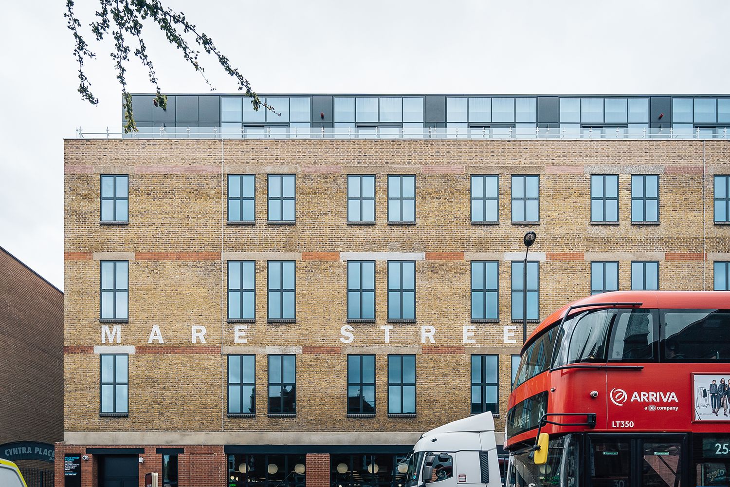
The building at the heart of the project dates back to 1873, tucked between notable landmarks on Mare Street. We set about hand painting giant faux-aged lettering on the front of the property – creating a statement piece on the exterior that pays homage to industrial roots while hiding a deceptively modern interior within.
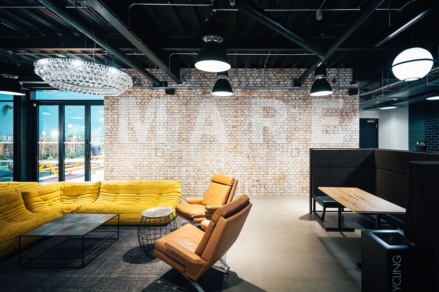
Continuing with the sympathetic additions inside, we added a stylised faux aged feature wall for one of the chill out areas too.
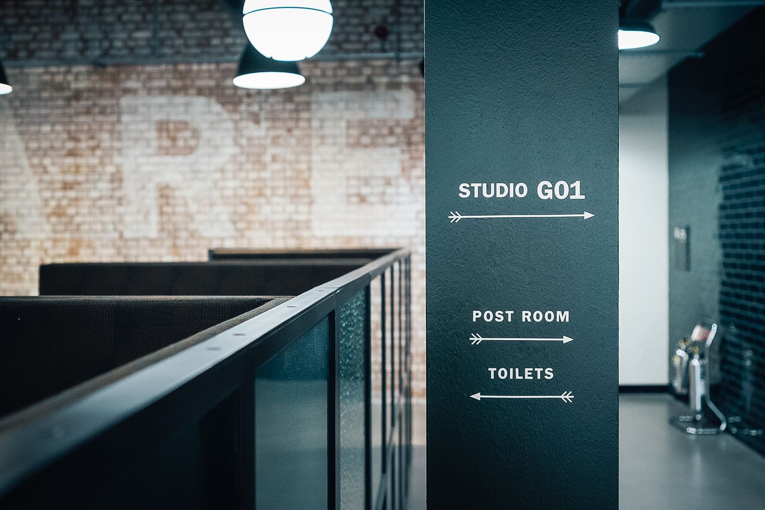
With the company’s goal of facilitating easy working in mind, we also took charge of the navigational signage throughout the communal areas and for over 100 offices and meeting rooms, matching the fresher aesthetic of the rest of the space while getting a tiny bit flashy with a flick of neon.
Challenged with balancing the erstwhile with the new, our mission was to bring Mare Street Studios on-brand.
THE SPECS
With the interior architects’ concepts to hand, we began developing their designs into three dimensional realities. The first port of call was to familiarise ourselves with the layout of the building – we had our initial visit and started work whilst it underwent a full re-fit. The satisfaction of deciphering an efficient wayfinding system is one of the jobs we love best, and we managed to construct floor plans to mark the positioning of all the customised co-working signage while weaving in and out of the way of the tradesman already on site.
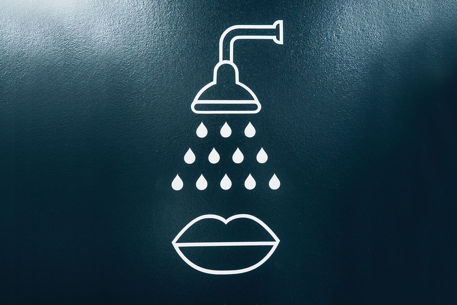
We produced hundreds of signs – from small bits of wall vinyl to bespoke metal directories – to match the contemporary spec of the interior, and blended them into the fabric of the building. Pointing to where the bike stores, showers, roof terrace and on-site café are, our easy-to-follow wayfinding signs helped the business signpost all its facilities while allowing people to map out their own seamless journeys.
Due to the pandemic, wayfinding signage became about more than just identifying where everything was, with a stronger focus on increasing accessibility and safety via floor graphics, asking visitors to mind their step or take care with social distancing.
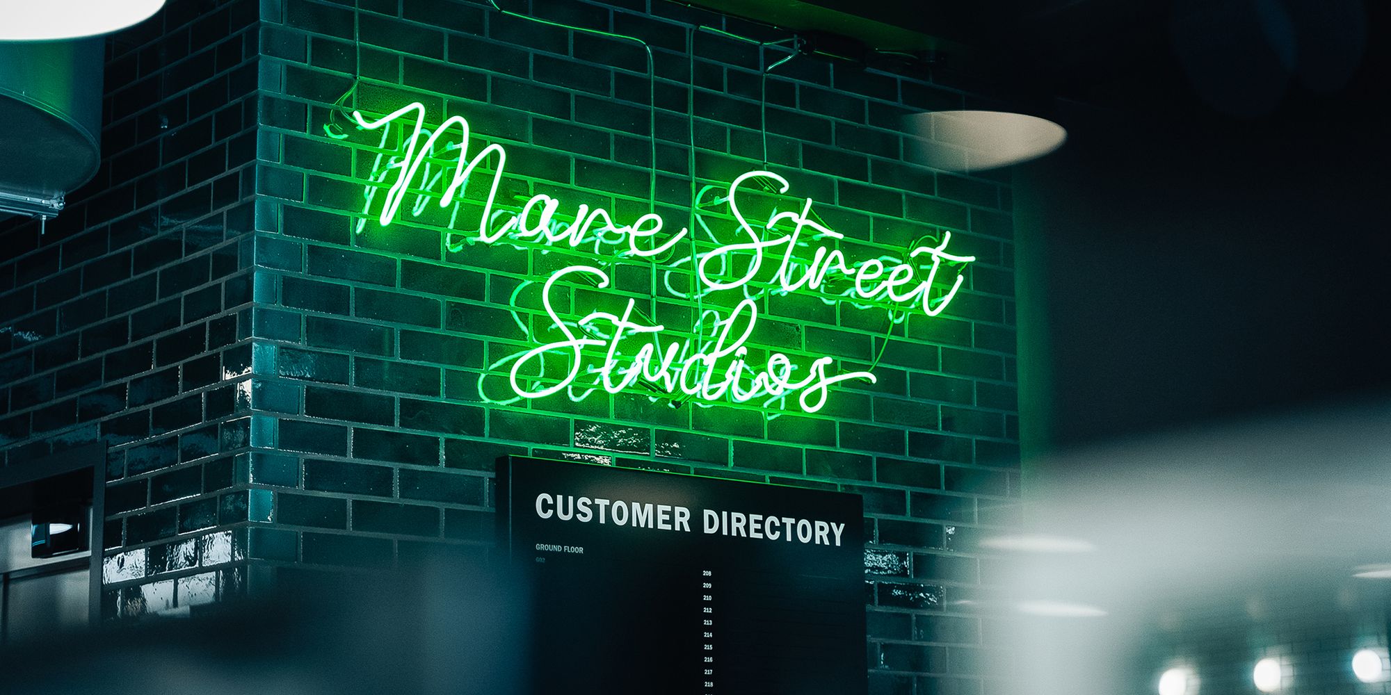
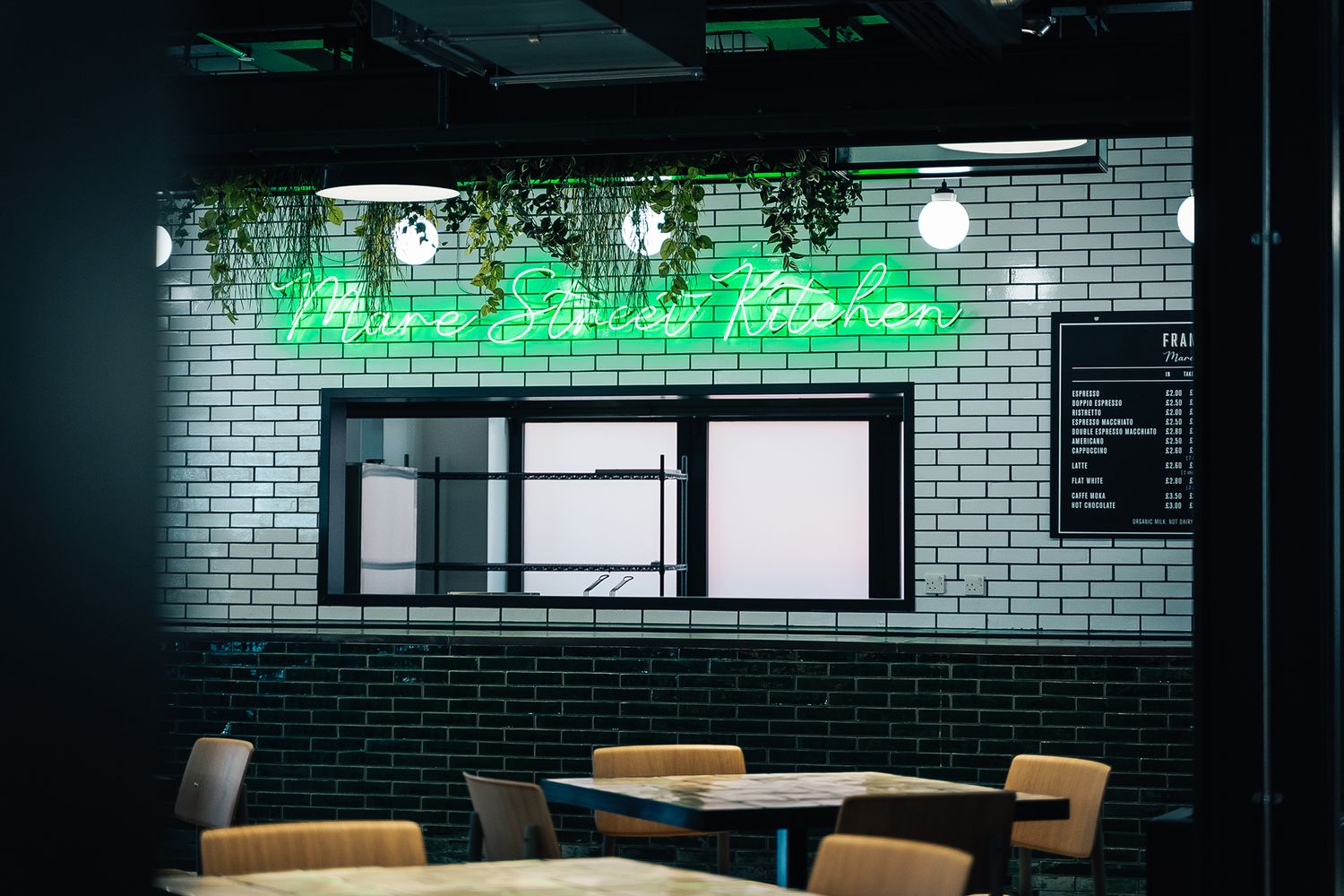
With the necessities well looked after, we went onto the extravagances next; manipulating an elegant, flowing typeface into neon to produce script signs for the reception area and café. We picked a bright pop of parrot green to go on top of the teal backdrop, and it casts the most brilliant reflections on the glazed tiles behind. From the glossy to the grungy, we then began lending an aged look to the interior brickwork wall in the café – whitewashing it, and then rubbing that off to create a worn down background in preparation for some industrial Mare Street branding, which was then hand painted on top in faded white lettering, imitating the ghost signs that grace the skyline of the local area.
One of trickiest elements of the project was the 700mm high and over 30 metre wide lettering of the building branding on the front façade, as we had to coordinate the feat with the council who had planned to relay the pavement outside at the same time. We had just three days to complete the painting aspect; working to deadline, sourcing the pavement licence, overseeing safety and applying finishing touches between bouts of difficult weather.
The entire project took a total of three months from conception to completion, with us dodging builders, decorators and the weather as Workspace’s newest addition came to fruition. What was initially a construction site became a beautiful exposed brick office space, complemented with custom co-working signage true to the client’s style and some signature touches.

