Signage Stylised

When Workspace approached Glyphics to develop a directional signage system for their new Mirror Works building in East London, we recognised an opportunity to elevate functional wayfinding into a striking design statement. To achieve our goal, we worked alongside commercial interiors practice, Trifle, and extended their initial aesthetic concepts for the space into a seamless navigational experience.

Prominent upon entry into Workspace's Mirror Works building is the "hello" sign, crafted from reflective brass 3D lettering, creating a welcoming focal point above the main directory board. This directory, with its sleek design and clear, legible typography, effectively guides visitors through the building, listing essential locations such as Glaze Café and various meeting rooms.
The adjacent lounge area is an example of the sophisticated aesthetic of the space. We sought to complement the interior and create a seamless visual experience by thoughtfully designing our signage - integrating the same materials as the light fixture into our builds as well as colour matching our signs to the walls in the background.
Prominent upon entry into Workspace's Mirror Works building is the "hello" sign, crafted from reflective brass 3D lettering, creating a welcoming focal point above the main directory board. This directory, with its sleek design and clear, legible typography, effectively guides visitors through the building, listing essential locations such as Glaze Café and various meeting rooms.
Overview
At A Glance

Client Profile

Workspace is a force in the commercial property sector, sensitively transforming historical spaces into co-working offices, catering to businesses with a commitment to aesthetic excellence and operational clarity.

Space in Sq Ft
0

A Robust Relationship

As a long-standing signage partner to Workspace, Glyphics consistently delivers solutions that complement the brand's steadfast identity as host to commercial tenants of different shapes and sizes, while keeping pace with a growing building portfolio that is teeming with diverse open-plan environments, each with a distinct identity.

Honouring Heritage

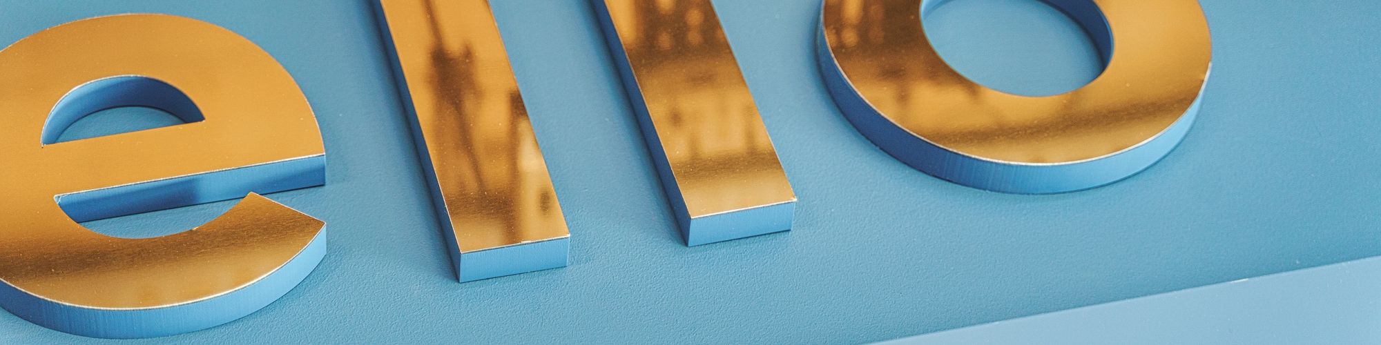
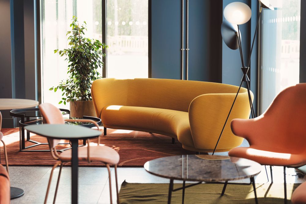
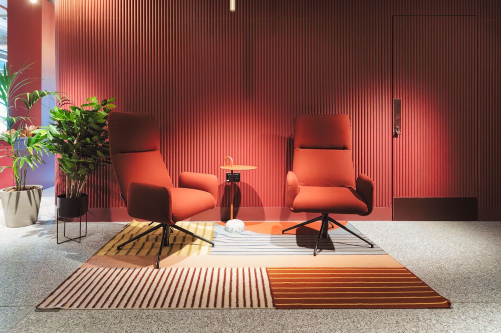
The name Mirror Works is a nod to the origins of this building as a glassworks factory; inspiring the design aesthetic. This influenced material choices throughout, from a polished light fixture in the lounge and hi-gloss reception desk, to the sleek and shiny signage.

Trifle's Vision For The Venue:

"To encourage community and bring teams and different business together so we created a dynamic, flexible space zoned with colour.

...On the ground floor a sunny yellow welcomes you; from the centre manager’s office cool blues ground the area; whilst rich wine tones create comfortable lounge zones.

Colour also helps wayfinding with each level of the building utilising a different colour scheme but still offering the same variety of breakout spaces, phone booths and tea points."

3D Signs
0
Wraparound Plaques
0
Door Signs
0

Design Challenge

The Mirror Works project presented a multifaceted challenge: to flawlessly incorporate the building's existing interior design features, envisioned by Trifle, with custom signage by us, supporting the user experience for staff, tenants and visitors.

Along with being thematically aligned with the environmental identity, our solution would also need to be consistent with the Workspace brand language, without forsaking the clarity that's essential for good wayfinding.

Project Parameters

Our focus was to build upon the interior design vision from Trifle, amplifying existing details from their illustrations by incorporating them into our own artwork. Workspace's brief asked Glyphics to conceptualise all the wayfinding signage for doors, windows and walls, before building and installing the final approved solutions with a view to enhancing the user experience for visitors and tenants alike.  This was the entire scope of the required signage:


Building Identity

  • Logo/Lettering

External Signage

  • Entrance Sign

  • Temporary Signs: Marketing Flags + ‘To Let’ Banner

  • Later Additions: High Level Building Sign + Café Sign

Internal Signage

  • Main Directory Board + Hello Message

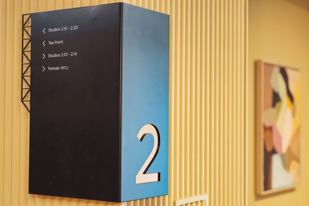
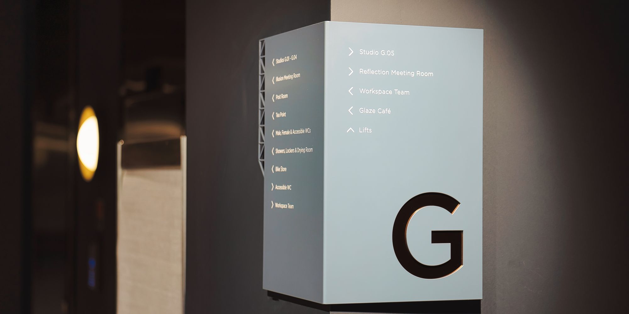
  • Floor Level Indicators

  • Wayfinding Signs

  • Meeting Room Signs + Glass Manifestation

  • Studio Signs + Numbering
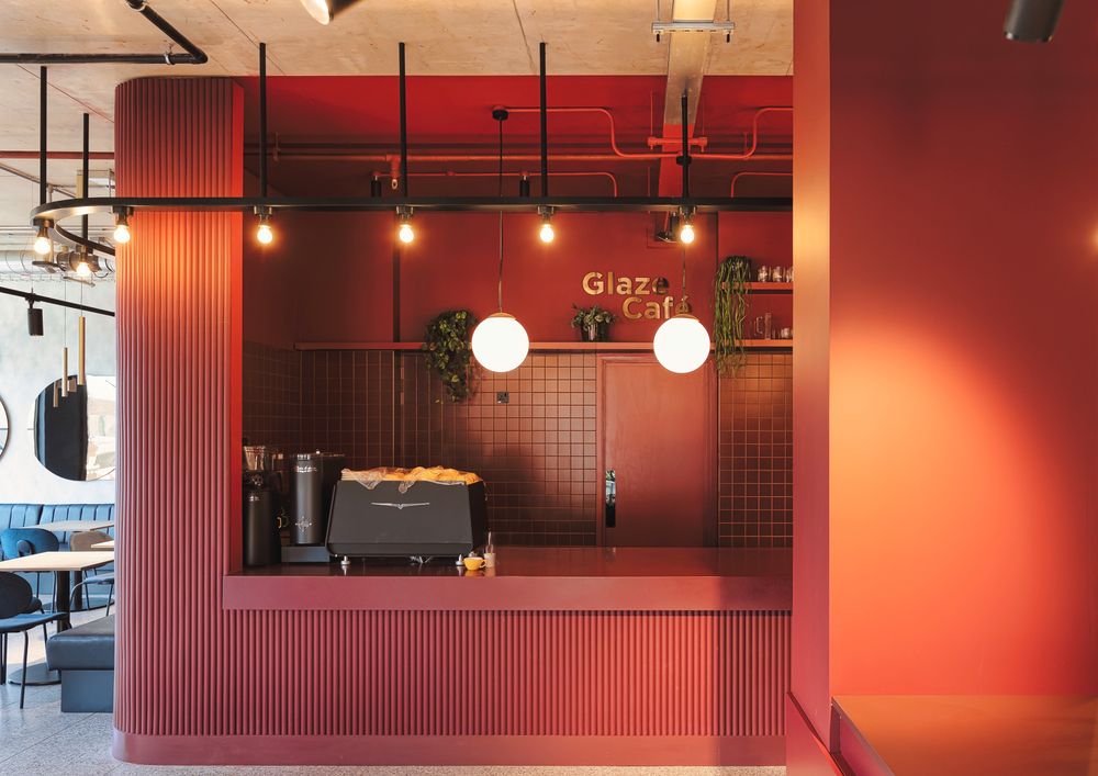
  • Café Sign + Menu

  • Tea Point Signs

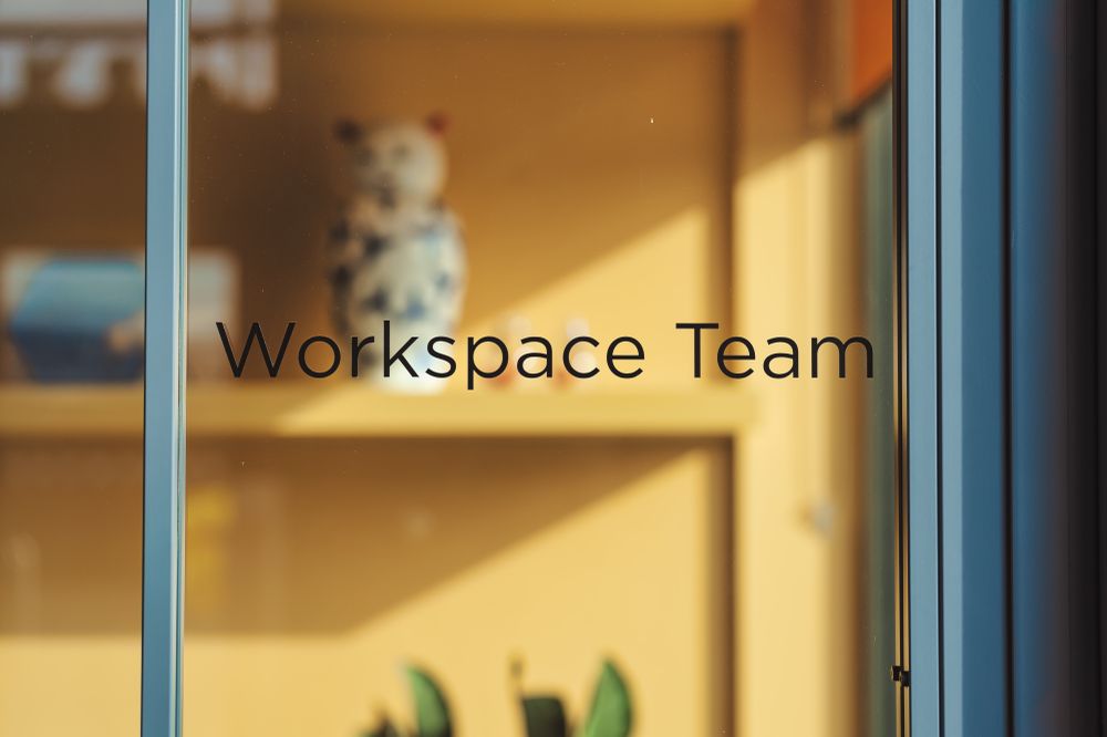
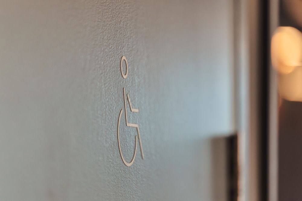
  • WC, Showers + Phone Booth Signs

General Signage

  • Recycling + Warning Signs

High-quality safety signage for AFF Foam fire extinguishers, crafted by Glyphics, prominently displayed at Mirror Works. The signs provide clear instructions and are designed for easy readability, enhancing safety compliance within the building.Minimalist safety decals on glass doors at Mirror Works, installed by Glyphics. The dot patterns ensure visibility and prevent accidental collisions, contributing to the overall safety and accessibility of the office space.Engraved metal signage for food waste disposal, created by Glyphics at Mirror Works. The sign clearly indicates acceptable waste types, promoting proper recycling and sustainability practices within the office environment.

System Design

The first task of any project is finding out or figuring out the plan for how people will move through the space in question. In the case of Mirror Works, Glyphics was responsible for determining routes and defining a set of rules to cohesively present navigational information.

Navigating Navigation

Here are the basics of what we did to build the signage strategy for the Mirror Works brief.


Indoor Mapping:

  • We started by understanding the different needs of those who'll use the co-working office such as staff, contractors, tenants and visitors. This involved looking at floor plans to figure out custom navigation patterns and doing a walk about to gather real time requirements through route following, inference aiming and map reading.

Document Flow:

  • Putting pen to paper, we developed a signage system in principle that is intuitive, easy to understand and uniform throughout the space, sense checking it with the client and evolving it through improved iterations where necessary.

Strategic Placement:

  • We positioned signs at crucial decision-making locations throughout the office, e.g. corridors, entrance areas and near lifts. Wall signs were set at eye level so they'd be spotted quickly and read easily, enhancing the navigation experience.

Interactive Features:

  • As a traditional signmakers, we were mindful of any tech elements our clients plan to utilise, such as QR codes or augmented reality, incorporating that functionality when developing the wayfinding system.

Branding Elements:

  • We co-opted the company’s design brand guide and Incorporated elements such as logos, fonts and colour palettes to reinforce the corporate identity throughout the signage design, building an instantly recognisable environment.

Clarity / Consistency:

  • Compiling signs into a collection, achieving homogeneity through little details such as legible typography, methodical use of colour, graphics that correspond to the space and a uniform set of icons across the entire office-scape.

Thematic Choices:

  • Our solutions were in sync with the interior design vision. Delivering our own take on Trifle's directive, we adopted matt tone finishes or brass accents and fret cut numbers or filigree details to complement the colours and textures of the space. 3D signs and wraparound plaques would play with the eye and make consuming information enjoyable.

Creative Design:

  • Done right, the aesthetics of original signage concepts impress a company’s values upon a space while making it a desirable place to be. A considered combination of artisan methods, material choices, build types, mounting techniques, surface finishes and innovative lighting elevate signage into decor​.


While identifying a wayfinding strategy begins with conducting a comprehensive audit and ends with solutions that bring said strategy to life, for us as seasoned signmakers, there's a little bit more to it than that.


CONSIDERATE WAYFINDING

Wayfinding serves a fundamental purpose in both public and private spaces, yet there's more to explore beyond its functional role. It is not just about whether people are lost or efficiently moving from point A to point B. At Glyphics, our efforts go beyond simply deciphering how to direct people to their destinations or point out the facilities.

We're also tackling the nuanced questions: 'Are people feeling bored here?' 'Is this a positive environment for the wellbeing of those in it?' When designing routes and signposting them, we feel it is important to think about how to enhance the user experience, making the time spent in a location more rewarding, especially for those who visit frequently, like office workers.

Performative Presence
0

37% of desk workers, including 2027 people in the UK, believe their productivity is measured by visibility, such as hours spent in the office or online in meetings (Global study by Slack)

Where am I?
0

70% of people say they get lost in buildings without clear signage (Gensler, 2020 US Workplace Survey)

Confident Navigation
0

85% of people consider good wayfinding to be important to their overall experience (ZenPilot, 2023 Retail Wayfinding Survey)

Stand Out Signage
0

Using high-contrast fonts on directory signs can improve readability by 30% (American Institute of Graphic Arts, 2021 Accessibility Guidelines)

Office Experience
0

45% of workers shared that workplace amenities and support, ability to focus and a sense of belonging would be their number one motivator to return to office working (Gartner’s Digital Worker Experience survey)

Putting The Best Foot Forward

Engaging environmental design is dependent on carefully thought-out solutions. Here's how we approach designing wayfinding as responsible signmakers:

  • Informing ourselves of any anxiety, safety, motivational and social norm barriers users may need to overcome in a space.

  • Engaging directly with users to identify and alleviate points of confusion, and placing temporary signage mock-ups to observe how they influence traffic before implementation.

  • Implementing universal design principles, providing DDA compliant navigation systems, and multilingual or braille solutions to enhance inclusivity and accessibility.

  • Instilling belief in the culture of a space by using consistent colour schemes, typography, and imagery that reflects the company's brand identity.

  • Continuously gathering feedback: after implementing the wayfinding system, we'll remain adaptable to changes, actively reacting to user reports to refine and adjust the signage.

  • Adding elements of discovery and fun: introduce gamification into the wayfinding system to make navigation interactive, or add delight through visual points of interest, building curiosity via signage content, design or implementation e.g mural sized signs such as faux aged lettering or hand painted graphics.

PROTOTYPING CONCEPTS

From producing pure graphic design like logo mock ups, and ideating playful concepts such as a lenticular wall, to imagining all the use cases of signage and drafting iterations of every sign type required - the creative scope of the project was extensive and a great source of excitement for us at Glyphics.

Collective Inspiration

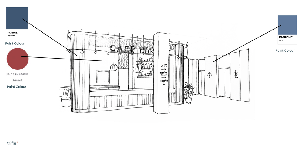
Our collaborative journey began with Trifle's artwork for the interior design, as seen below. We immediately noticed the zigzagging black metal lattice frames on the glass partitions. Depending how you looked at them, they resembled an M or W - the two letters that make up the logo for Mirror Works. A subtle nod that we knew we wanted to weave into our work.

Early sketch of the interior design for Mirror Works by Trifle, featuring zigzagging black metal lattice frames on the glass partitions. This design element inspired Glyphics' signage concepts, incorporating M and W motifs reflective of the Mirror Works logo.


This geometric motif formed the cornerstone of our signage design, appearing across the scope of the project, from filigree edges on all board signs to relief detailing on every cut vinyl floor number in the stairwell. Here's an early sketch illustrating how we experimented with incorporating the glazing detail, and how it eventually manifested throughout:

Workspace Mirror Works signage design concepts by Glyphics, showcasing the integration of the geometric motif with detailed sketches of directory signs, floor numbers, and the colour palette used throughout the project.
Installed floor number signage in the stairwell at Mirror Works, designed by Glyphics. The signage features relief detailing on cut vinyl, echoing the interior design's geometric motif for cohesive visual integration.
Close-up of the geometric motif incorporated into the signage design at Mirror Works. The design element is seamlessly integrated into various sign types, enhancing the overall aesthetic and navigational experience.
The M+W of Mirror Works manifesting in the main directory signage, with laser cut detailing on the outer right edge.
Echoes of the geometric shapes that exist throughout, present here within the custom light fixture commissioned by Trifle for Workspace Mirror Works.
Fret cut details in the plaques that complement the main directory - a visual element that features throughout to tie the signage together with the interior aesthetics,


One of our initial concepts saw us take this further with a reflective lenticular wall that would create interest by the directory in the reception lounge. We envisioned a narrow vertical box extending from floor to ceiling, made by manipulating acrylic into parallel ridges and grooves - once again resembling an M and W.

Initial concept design for a reflective lenticular wall at Mirror Works, envisioned by Glyphics. The design includes a narrow vertical box with parallel ridges and grooves, creating an M and W effect. This feature aims to create interest by the directory in the reception lounge.The corrugated surface would be overlaid with two overlapping words and give the optical illusion of movement as you walk past, flicking playfully between a greeting and a goodbye when viewed from different angles. This brief was an extraordinary opportunity to showcase our bespoke signage capabilities, and this dynamic feature was at the heart of it.


Core Design Components

Containing our brainstorming within the boundaries of Trifle's vision and Workspace's established branding, we also deliberated the UI and UX fundamentals of the signage, given how vast the application of these micro elements would be.

Colour

Potential colour palettes for signage at Mirror Works, designed by Glyphics. The palettes include matt black with white vinyl, matt burnt orange with sprayed bronze, and matt blue-grey with mirror bronze. Each palette is shown with corresponding wayfinding signs, enhancing the interior aesthetic.
Interior view of the lounge and seating area at Mirror Works, showcasing the use of vibrant colours and modern design elements. The space features a mix of seating options, industrial lighting, and an open layout that encourages social interaction and collaboration.
Close-up of the installed floor number signage at Mirror Works, featuring a sleek design with a matt blue-grey background and mirror bronze accents. The signage integrates the geometric motif from the interior design, enhancing visibility and style.
Detailed view of the 'G' sign at Mirror Works, highlighting the high-quality craftsmanship with sprayed bronze detailing and precision design. The sign exemplifies Glyphics' commitment to creating visually striking and functional signage.

Colour is a powerful element in signage systems, especially for wayfinding. It serves a triple function: imparting a cool or warm ambiance to a space, enhancing visibility due to its inherent attractiveness, which can in turn be used to introduce a coding system, distinguishing between different areas or sign types e.g. directional, informational, identification or regulatory.

In the case of Mirror Works, each area in the lobby and subsequently every floor in the building was represented by a specific shade on the walls or partitions. We ensured signs correspond with their location via an exact-match powder paint coating and/or the hue of the vinyl lettering. With consistent application throughout, users could rapidly link colour schemes with their respective environments, strengthening orientation and accelerating decision-making as they navigate the space.

Pictograms

Close-up of a minimalist remote control pictogram sign at Mirror Works, designed by Glyphics. The sign features a simple outline and 'REMOTE' text on a sleek background, hopefully ensuring easy identification when you need it the most.Stylised hot cuppa pictogram mounted on a projecting sign at Mirror Works, created by Glyphics. The sign, located near a cosy lounge area, uses clear and elegant iconography to direct visitors to the tea point, integrating seamlessly with the interior design.

Symbols are a subtle yet critical visual component of wayfinding experiences, doing away with the heaviness of text to convey essential information quickly instead. Many icons, such as those representing fire exits or WCs, are universally recognised and therefore vital cues to enable easy navigation in unfamiliar settings.

For this brief, we made geometric abstractions from minimalist lines for tea point pictograms, and found the fun in functional with a box symbol for the meeting room side tables. It aspires to answer man's most ubiquitous question - where's the remote?

Typography

The selection of typeface plays a key role in the effectiveness of wayfinding signage.

Lettering should look sharp to attract the eye and improve readability from afar, so it's imperative to factor in the clarity of your font style and how it will manifest in the selected materials at the point of reproduction.

As a rule this tends to be a sans-serif font - an environment with artful flair being one of the few exceptions - but in every case, stick to the selected typeface consistently to aid comprehension.

Along with simplicity and legibility, the hierarchy within the messaging is also crucial; there must be unmistakable differentiation between headings, subheadings, and the main text. This can be achieved by tactfully utilising spacing between letters, line height, and the arrangement of text.

As experienced sign makers, we are meticulous about building signs to suit the viewing distance - ensuring uniform typography throughout to guarantee ease and efficacy.

In summary:

  • We utilise legible sans-serif fonts.

  • Spacing and size are optimised for distance readability.

  • Clear hierarchy in text: headings, subheadings, body text.

  • Consistency in typography is non-negotiable.

Our initial concepts visualised Workspace's corporate typeface in place and suggested three further typefaces, selected with the above criteria and three creative considerations in mind -

  • Workable in diverse use cases and dimensions.

  • Complementing the feel of a co-working space, providing the perfect balance of between casual and professional.

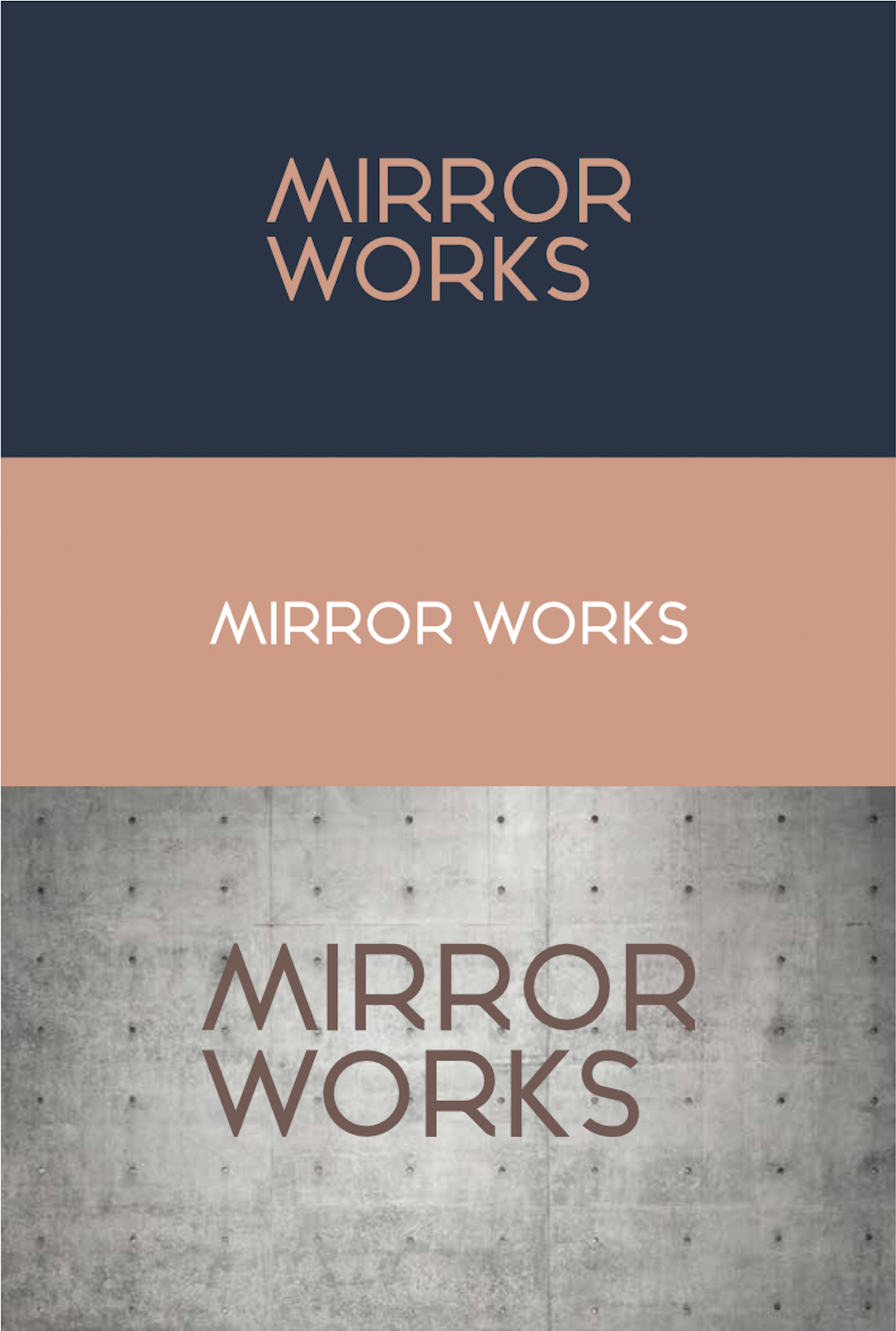
  • The M and W mirror each other perfectly.

Fabrication

Reflective 'hello' sign above the main directory board at Mirror Works, created by Glyphics. The sleek design features 3D brass lettering and clear wayfinding information, enhancing the user experience and aligning with the building's modern interior aesthetics.

Detailed concept for the directory signage at Mirror Works by Glyphics, showcasing the thought process and creativity behind the project.
Installed floor number on a wraparound plaque sign at Mirror Works, designed by Glyphics. The sign features laser-cut details with brass underlays, creating a visually appealing and functional wayfinding system that guides and informs users.
Close up of laser cut signage, underlaid with brass for textural interest.

The strategic use of relevant graphics or architectural builds can enhance understanding among audiences, while adding richness to the signage design. Using photographs as wallpapers, raised arrows to point towards departments, or illustrations to stylise corridor approaches reduces monotony and increases visual appeal.

The form a sign takes can make or break its effectiveness. A classic example is a directory and the challenge of transforming what's essentially an office map into a focal point that stops people in their tracks. In this case, we made it into an alluring feature using tactile elements achieved from laser cut details underlaid with brass. A 'hello' in reflective 3D lettering above and wraparound plaques on each floor continue and complete it, serving to intrigue, guide and inform in tandem.

SIGNAGE PRODUCTION

The successful completion of the Mirror Works project is a testament to the harmonious collaboration between Workspace, Trifle and Glyphics. By implementing a bespoke solution, our signage not only met but went beyond the brief, enhancing the real time user experience throughout the building, while aligning perfectly with a sophisticated interior design philosophy.

Outside The Box: Exterior Signage

Fascia Signage

The exterior signage, prominently displaying the Mirror Works logo, is crafted to be both eye-catching and elegant. The choice of materials and the precision in design reflect the building's modern architecture, providing a welcoming first impression.

Exterior signage displaying the Mirror Works logo. An eye-catching vinyl sign crafted from weather-resistant materials, it reflects the building's modern architecture and provides a welcoming first impression.
Close-up view of the Mirror Works exterior signage by Glyphics. Elegant design, quality materials and laser cut precision highlight the building's sleek and contemporary aesthetic, ensuring high visibility and brand recognition.


Inside Information: Internal Signage
High-visibility signage for Glaze Café at Mirror Works, featuring bold, three-dimensional letters crafted from ultra-reflective materials. The dynamic design stands out against the vibrant backdrop, highlighting the café as a key social hub within the building.
Close-up, face-on view of the Glaze Café signage at Mirror Works, showcasing the reflective 3D letters and the elegant design. The sign is a prominent feature within the workspace, drawing attention and reinforcing the café's identity.
Side angle of 3D signage built from high-end materials for a sleek finish that suits the vibe at Glaze Café, designed by Glyphics.
Café Lettering

Defined by high-end, high-visibility signage, Glaze Café has been established as a stand out space within Mirror Works. Utilising bold, three-dimensional letters crafted from ultra-reflective materials, the sign creates a dynamic contrast against the vibrant backdrop, immediately drawing attention - highlighting the café as a focal point and centring it as a key social hub within the building.

This sign is one of only two such prominent signs within the fabric of the workspace, with the other being a 'hello' sign situated above the directory at the entrance. Together, these two signs bookend the visitor experience within Mirror Works, offering both a warm welcome and a communal gathering spot, injecting the environment with sociable undertones.

Modern floor number signage at Mirror Works, crafted by Glyphics. The sleek metal plaques are seamlessly mounted and wrap around the tubular panelling, adding a chic and textured aesthetic to the landing walls on the upper floors.
Worm's eye view of the floor number signage at Mirror Works, highlighting the sleek design and integration with the tubular panelling. The brass-backed fret cut number enhances both visibility and style, creating a sophisticated look.
Close-up view of a floor number plaque at Mirror Works, featuring a precise fret cut number with a brass backing. The signage integrates with the architectural elements of the space, providing clear visibility and an elegant touch.
Wraparound floor number plaque at Mirror Works, designed by Glyphics. The plaque, featuring a bold number 3, is mounted on the upper floor's tubular panelling, adding a visually appealing and functional element to the modern interior design.
Floor Number Signage

The floor number signage takes the form of sleek metal plaques that are seamlessly mounted and made to wrap around the tubular panelling that pads the landing walls on the upper floors. The plaques feature a fret cut number backed by glistening brass, adding a textured quality to match the felt grooves beneath while enhancing visibility. As one of the most prominent and utilised sign types from our collection for this project, the plaques appear on various corners on every floor, creating a visual language of luxury throughout. They function as an effortlessly chic user guide and are a sophisticated design choice that sits cohesively within the modern aesthetic of the interior.

Wayfinding Identifiers

Minimalist projecting room identifier sign at Mirror Works, featuring a sleek design with a tea cup icon. This sign by Glyphics is designed to complement the contemporary aesthetics of the workspace while providing clear and stylish wayfinding.
Close-up of room ID signage for a glass door at Mirror Works, showcasing a clean design for enhanced visibility and modern aesthetics.
Changeable door sign for tenants of the flexible offices at Mirror Works, created by Glyphics to allow customisation.
Large geometric stairwell number signage at Mirror Works, designed to complement the ruggedness of concrete walls and steel steps, and integrate seamlessly with the industrial aesthetic of the space.

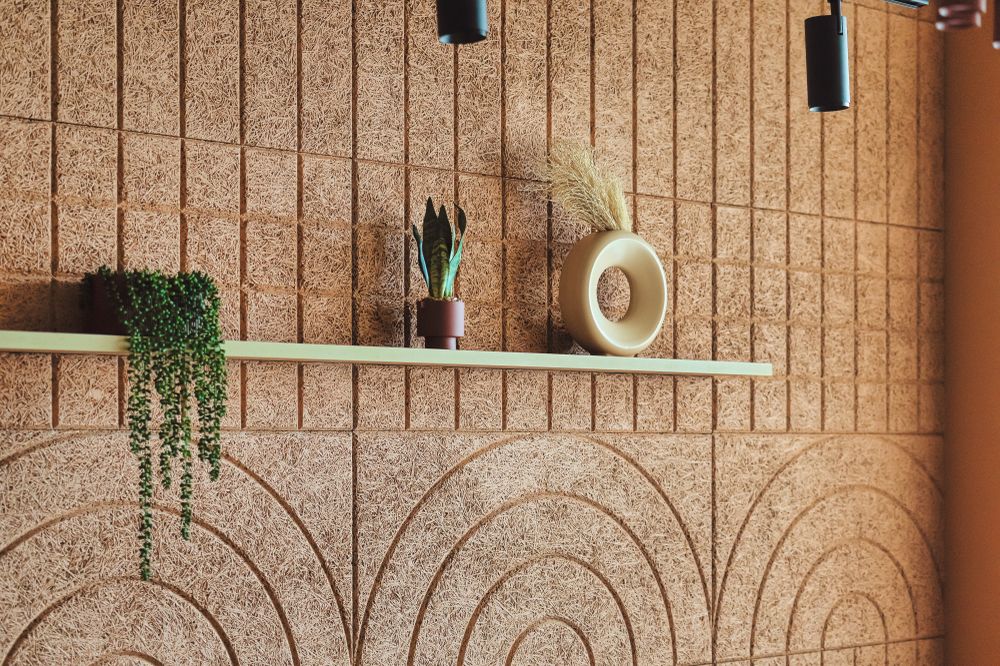
Commonplace signs are given meticulous attention to detail - from minimalist icons for the projecting room identifiers, sensitively designed to suit the contemporary aesthetics of the space they label, to the large geometric stairwell numbers, produced to complement the ruggedness of the concrete walls and steel steps. Crafted from quality materials and installed to a high spec finish, even the most functional signage is carefully considered and executed with the Mirror Works aesthetic in mind.

Upon entering the coworking space, visitors are greeted with an explosion of colour; from cool blues to rich wine tones and accents of yellow and green—the result feels vivid yet balanced.
On Office Magazine
Design / Architecture magazine and digital platform
It's a bold, sophisticated and contemporary space.
Trifle
Interior Designers

Lobby Directory

Conceived, fabricated and installed with public perception in mind, the directory is strategically placed opposite the door to lend an immediate sense of confidence to users looking to orient themselves while navigating the space. The largest build of our project, it hosts subtle touches of elegance in the details of the design.

It includes the building name to alleviate any confusion, the essentials of what's where to allow straightforward navigation, clean typography, an intuitive floor-by-floor layout, minimalist fret cut lines to efficiently demarcate these, underlaid with slivers of brass to enhance engagement.

Above is a solid and resplendent 'hello' sign - built in brass 3D lettering, it serves a significant purpose by providing a welcoming touchpoint for visitors as they enter, setting a friendly and approachable tone for the entire space.

Lobby directory signage at Mirror Works. This large directory features fret-cut elements underlaid with brass, with matching brass 3D 'hello' lettering above, creating a welcoming touchpoint for visitors and enhancing the navigational experience.
Looking up of the depths of our brass 'hello' sign at Mirror Works. This elegant 3D lettering provides a friendly and approachable tone for the entire space, welcoming visitors upon entry.
Close up view of the lobby directory signage at Mirror Works, showcasing the clear typography and floor-by-floor layout, outlined by minimalist fret cut detailing underlaid with brass, enhancing visibility and engagement.
Lobby directory at Mirror Works, positioned strategically opposite the entrance to provide immediate orientation for visitors. The design integrates clean typography and elegant details, contributing to a sophisticated and user-friendly environment.
Conclusion
First floor area by the lifts at Mirror Works featuring modern grey armchairs and a decorative plant. The area is marked with a stylish floor number sign, enhancing both functionality and aesthetic appeal.
A close-up view of a modern, sleek directory signage featuring brass and black details. The directory lists various companies and room numbers, with a minimalist design that enhances readability and elegance, reflecting the refined aesthetic of the space.
Two plush chairs with black metal frames, situated on a patterned carpet on the ground floor of Mirror Works, East London. This seating provides a comfortable lounging spot drenched in sunlight, contributing to the overall warm and inviting atmosphere of the lobby.
A vibrant area set against a red accent wall - given a cosy feel with armchairs and sofas in sunny hues and made to pop with abstract artwork at its heart, illuminated by modern ceiling lights. A dynamic space that's perfect for both relaxation and social interactions
A modern kitchen area with integrated waste disposal units, marked for general and food waste with small bits of simple signage to enhance the usability and cleanliness of the space.
A stylish kitchen setup with a minimalist design, featuring a long countertop, integrated waste disposal units, and beige tiles. The wall is adorned with industrial lighting and framed abstract art pieces, adding a touch of creativity to a very functional space.
A designer meeting room for Mirror Works featuring a warm toned textured wall with geometric patterns and contemporary lighting fixtures. Decorative elements such as sculptural plant pots add character to the space, creating a visually inviting environment.
A close-up of a brown table with a vinyl "Remote" label to provide a default space for the TV controller. The image highlights the attention to detail in the signage design, with a focus on incorporating helpful elements into the decor.
A wraparound directional sign mounted on a wall, guiding visitors to various rooms and facilities within the building. The sign's sleek design and clear typography ensure ease of navigation and enhance the overall aesthetic of the space.
A close-up of a glass partition with a repeat pattern window manifestation - these simple frosted dots ensure safety by increasing visibility and contribute to the sophisticated ambiance.
The 3D "Glaze Café" sign prominently displayed on a red wall within the café area. The sign features bold, reflective letters that stand out against the vibrant background, effectively drawing attention to the café as a focal point and social hub within the building.

Project Highlights

  • Design Integration: The signage throughout Mirror Works is designed to complement the interior spaces, using materials, colours and typography that align with Trifle’s vision. This integration ensures a seamless flow from one area to another - represented visually by the wraparound plaques that underpin the system.

  • User-Friendly Navigation: By strategically placing signs at key decision points and using clear, legible fonts, layouts and icons, the wayfinding system enhances the user experience, making navigation intuitive and stress-free.

  • Brand Reinforcement: The signage not only guides but also reinforces the building’s identity look and the wider Workspace trademark. Elements like the café signage are designed to be visually striking, contributing to the overall branding strategy of Mirror Works as a memorable place to be.

  • High-Quality Craftsmanship: The use of premium materials and precise manufacturing techniques ensures that the signage is impressive and durable, reflecting the high standards of Workspace.

The Result

For Glyphics, the Mirror Works project allowed us to revel in our collaborative element. Partnering with Workspace was, as always, a pleasure, and we relished the opportunity to play with Trifle's visions for the interiors, translating them into our own creative signage ideas.

Despite budget constraints and the pressure of a tight deadline to coincide with the inaugural opening event, we successfully transformed the approved designs into tangible products that maintained the fidelity of the original concepts. Our final output aligned flawlessly with Trifle's real-time implementations, ensuring a harmonious visual experience and effortless navigation for Mirror Works occupants.

The Mirror Works launch party was not just a celebration of the opening but also a brick-and-mortar realisation of the synergy between Workspace, Trifle and Glyphics.

This project is a prime example of how innovative design and pragmatic solutions can converge to create an environment that is brand-centric, aesthetically pleasing and user-friendly. Our signage played a crucial role in this transformation, providing clear direction and reinforcing the building's sophisticated identity.

The design of this new-age workspace ultimately encourages much-needed community and aims to actively entice teams and businesses together post-pandemic. A functional landscape for differing working needs has been created, from quiet to collaborative, plus comfortable areas for reading, relaxing and moments to switch off.
Mix Interiors
Commercial Interior Design Magazine
Super-modern style in the iconic Olympic Village. Mirror Works is truly a celebration of the amazing regenerative growth that the area has seen.
Workspace
Client

FAQS - MIRROR WORKS BY WORKSPACE

What was the scope of the Mirror Works project?

The Mirror Works project involved developing a comprehensive wayfinding signage system for Workspace’s new building in East London. The scope included system design, prototyping concepts, and signage production, integrating the interior design vision provided by Trifle.

WHY ARE WAYFINDING SIGNS IMPORTANT AND WHERE DO THEY WORK BEST?

A wayfinding system is a network of signposted journeys within a space that allow people to find the best way around it, no matter how simple or complex the layout is. Wayfinding signs are the tools that manifest that wayfinding systems into reality - they impart essential navigational information and a sense of security along with it, allowing users to confidently orient themselves.

Speaking broadly, you'll typically want to present all possible destinations at entry, with place names and locations providing the key to begin navigation. For ease, you'll then need to reinforce information at every point that the customer needs to make a decision such as arriving on a new floor or coming to a crossroads in a corridor, identifying the spaces nearby with small directories. Last but not least, you'll want to signpost destinations in the main walkways available with direction signs, as well as identify or mark them where they are with room numbers and name or logo signs. Overall, these signs will serve your visitors, employees or residents best when the most direct journey between the starting point and destination is clearly shown.

Alongside placement there are many other layers to wayfinding that need to be considered, for example, leaning on landmarks as orientation anchors and implementing a minimalist colour coding system to create identities for different spaces. For help planning your wayfinding system, contact us.

How did Glyphics approach the system design for Mirror Works?

Glyphics started by understanding the movement patterns of different users within the space, such as staff, tenants, and visitors. We conducted floor plan analyses and on-site observations to determine custom navigation needs. This information guided our development of an intuitive and uniform signage system.

HOW DO YOU GO ABOUT DEVISING WAYFINDING SYSTEMS?

We began crafting intuitive and user-friendly wayfinding schemes as a passion a few decades ago. Today, it's become a specialism that's integral to our service portfolio, and a challenge we thoroughly enjoy with the help of our clients. The best way to start the process is to get in contact with us with any prior information you might have i.e. up-to-date floor plans, branding ideas and any thoughts you may have on the type of signage you'd like. This allows us to visualise themes, annotate directions and position signage on paper. If the site is complex or large, a more in-depth assessment of the space is often required so we're happy to arrange a site visit - a walkabout then allows for a comprehensive evaluation of the area and a detailed discussion about your specific requirements.

What materials and design elements were used in the signage?

The design incorporated materials that aligned with the building's aesthetic, such as polished finishes and high-gloss elements. We used brass accents, matte tone finishes, and fret cut numbers to complement the interior design.

How did Glyphics ensure the signage aligned with the interior design by Trifle?

We worked closely with Trifle's design to ensure our signage complemented their interior concepts. This involved using the same colour schemes and textures as well as incorporating thematic elements from Trifle’s vision, such as geometric motifs that resembled the Mirror Works logo and became a staple feature throughout our ideation phase.

What challenges did Glyphics face during the project?

The main challenges were modifying designs concepts to suit the budget when it came to real-time implementations, and working to tight deadlines to coincide with the building’s opening event. Despite these constraints, we maintained the fidelity of our original ideas and still ensured that our final products aligned seamlessly with Trifle’s interiors.

Can you describe some of the stand out signage created for Mirror Works?

The striking features of this project are the fret-cut office directory with brass accents and metal wraparound plaques, which work as a set to enhance both functionality and visual appeal, as well as the high-visibility signage for Glaze Café, which uses bold, three-dimensional letters crafted from ultra-reflective materials.

Though we didn't see it through to the build phase, another worthy mention was the lenticular wall; a narrow floor-to-ceiling installation designed to create an optical illusion, alternating between the 'M' and 'W' shapes of the logo as viewers move past it.

Whether you are in the initial concept phase or ready to move forward with production, we are here to assist you with bespoke solutions. Contact us for custom signage.

How does the signage enhance the user experience at Mirror Works?

This signage system was devised to provide clear and intuitive navigation by picking the important information and presenting it with minimalist styling, thereby reducing confusion and making it easy for users to find their way. The added integration of branding elements and consistent design across the signage then served to enhance the overall aesthetic, creating a cohesive and welcoming environment.

What makes Glyphics’ approach to wayfinding special?

Glyphics combines artistic design with practical solutions to make bespoke signage systems, ensuring they are both visually appealing and highly functional. We focus on user-friendly wayfinding that integrates unique creative features, such as heritage technqiues like hand painting, and custom branding elements to develop spaces that are truly enjoyable to experience.

What feedback has Glyphics received about the completed signage at Mirror Works?

Reactions have been overwhelmingly positive, highlighting the effectiveness of the signage in enhancing navigation and reinforcing the building’s particular brand identity. The launch party and subsequent user experiences have underscored the success of the collaborative efforts, showcasing the practical and aesthetic benefits of the signage system we conceptualised, built and implemented to complement Trifle's interior design. We've since continued our long lasting partnership with Workspace and worked on further up and coming projects.

HOW DO I START THE PROCESS WITH GLYPHICS?

Complete the form on our get in touch page with your project particulars, or contact us via email at hello@glyphics.co.uk, call us on 020 3667 9281 or pop into our studio at 75 Leonard Street in Shoreditch to discuss your requirements. Read Our Process for what to expect when you reach out.

Latest articles
More articles
Some of our awesome clients
Workspace Group logoCo Space logoOzone Coffee Roasters logoStrong Roots logoThe Hackett Group logoGrabthai logoEtsy logoPlaystation logoThe Croc logoCenttrip logoSadler's Wells logoBP logoHerbert Smith Freehills logoNational Crime Agency logoZSL London Zoo logoNonsense logoInterchange Coworking logo30 St Mary Axe logo
THREE DECADES AS LONDON’S TRUSTED SIGN MAKER
QUALITY BESPOKE SIGNAGE

From independent businesses and private offices to public buildings and cultural centres, we serve organisations across the UK with signs made using both traditional skills and contemporary technologies.

As a company built on testimonials and repeat custom, we nurture strong relationships with our clients from the very start.

Our ordering process is simple and hassle-free:

  1. Contact us through the form to discuss your design needs and receive a quote.

  2. Our team of experts will determine the best materials and construction methods.

  3. Feedback or approve the design and quote.

  4. Relax while we craft your custom sign.

  5. We'll handle installation and ensure everything is to your satisfaction.

Get a quote
Name
Company
Work email
Work phone number
Company size
Number of signs required
When do you need the sign(s)?
Upload relevant design files
Installation address
Job description