Workspace: The Light Box Wayfinding signs for coworking spaces
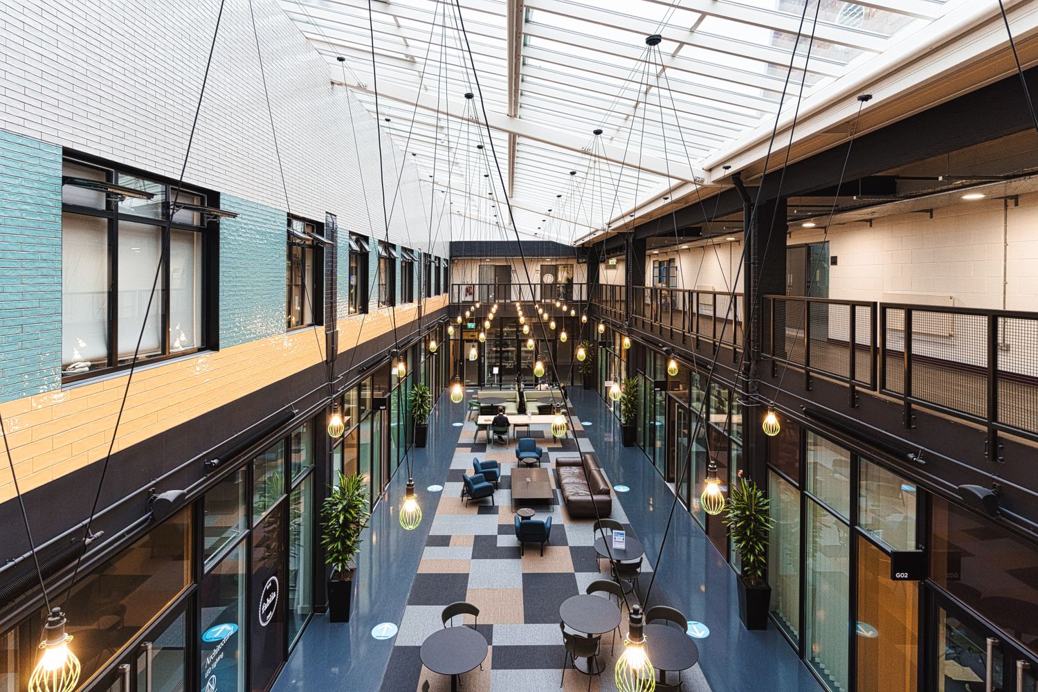
Providing flexible commercial premises for businesses across London, this branch of Workspace resides within an impressive building by Gunnersbury station. It capitalises on modern architecture; wrapping offices, studios, meeting rooms, shops and a café around a stunning atrium styled on a New York jazz bar.
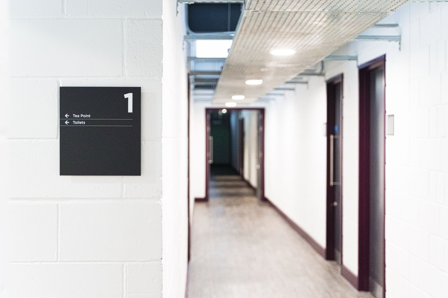
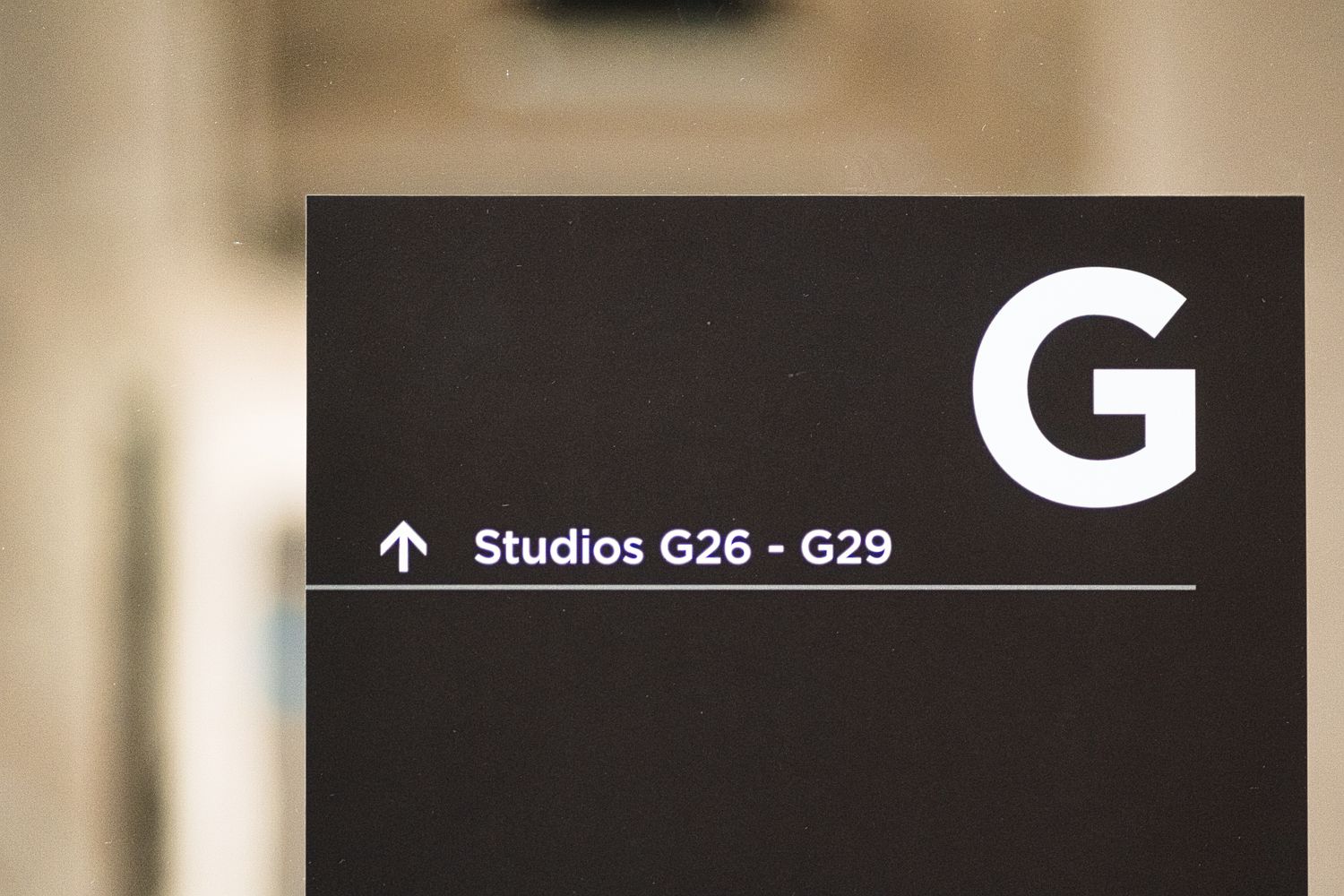
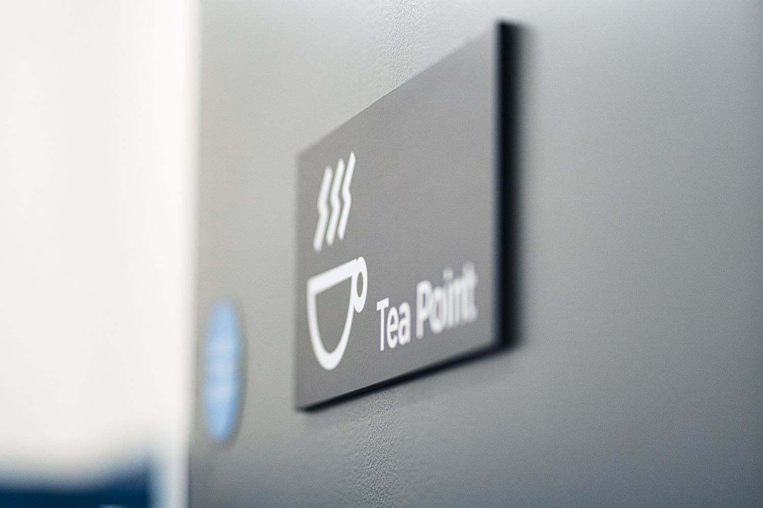
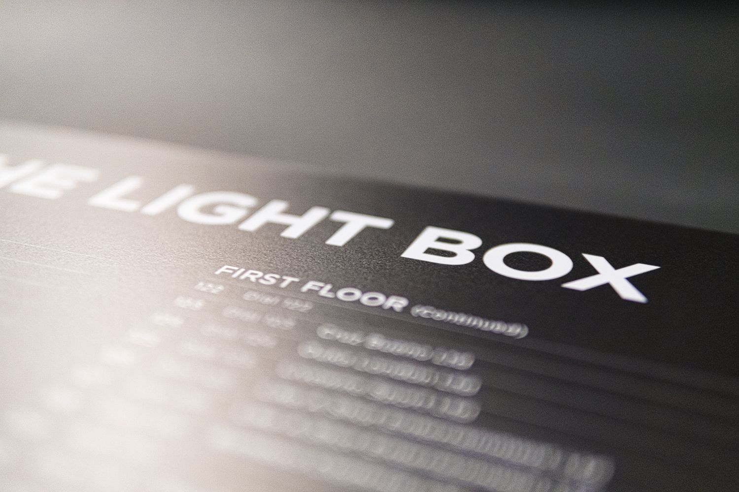
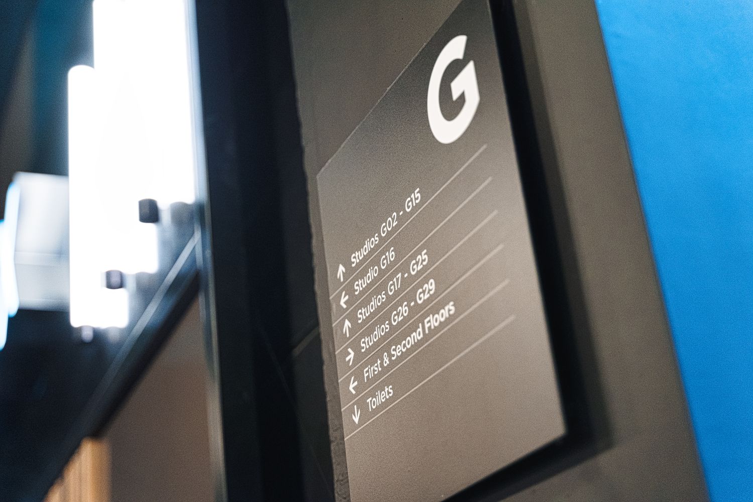
While its glass rooftop, low hanging lights and glittering high gloss tiles have taken coworking back to the roaring 1920s, we’ve been working on bringing the signage right up to date. Having recently given The Light Box its retro refurb, as well as a rearrangement in layout, the team at Workspace contacted us to continue their spruce up with some custom wayfinding signage.
THE SPECS
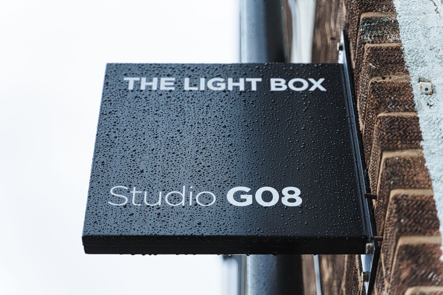
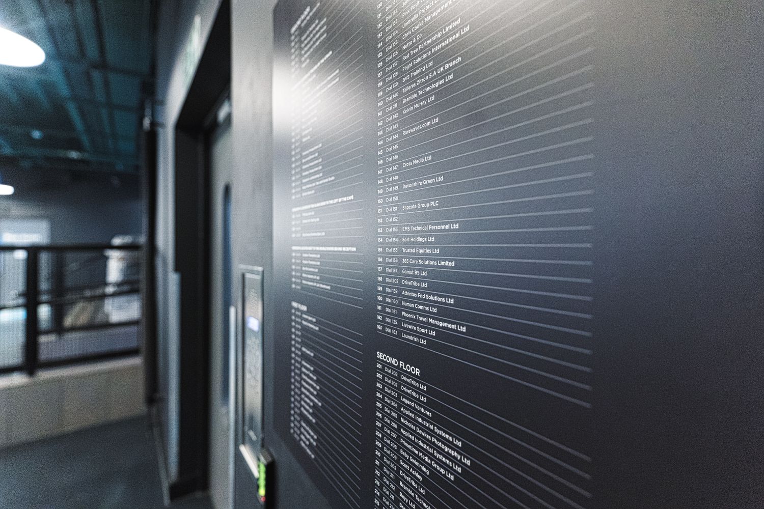
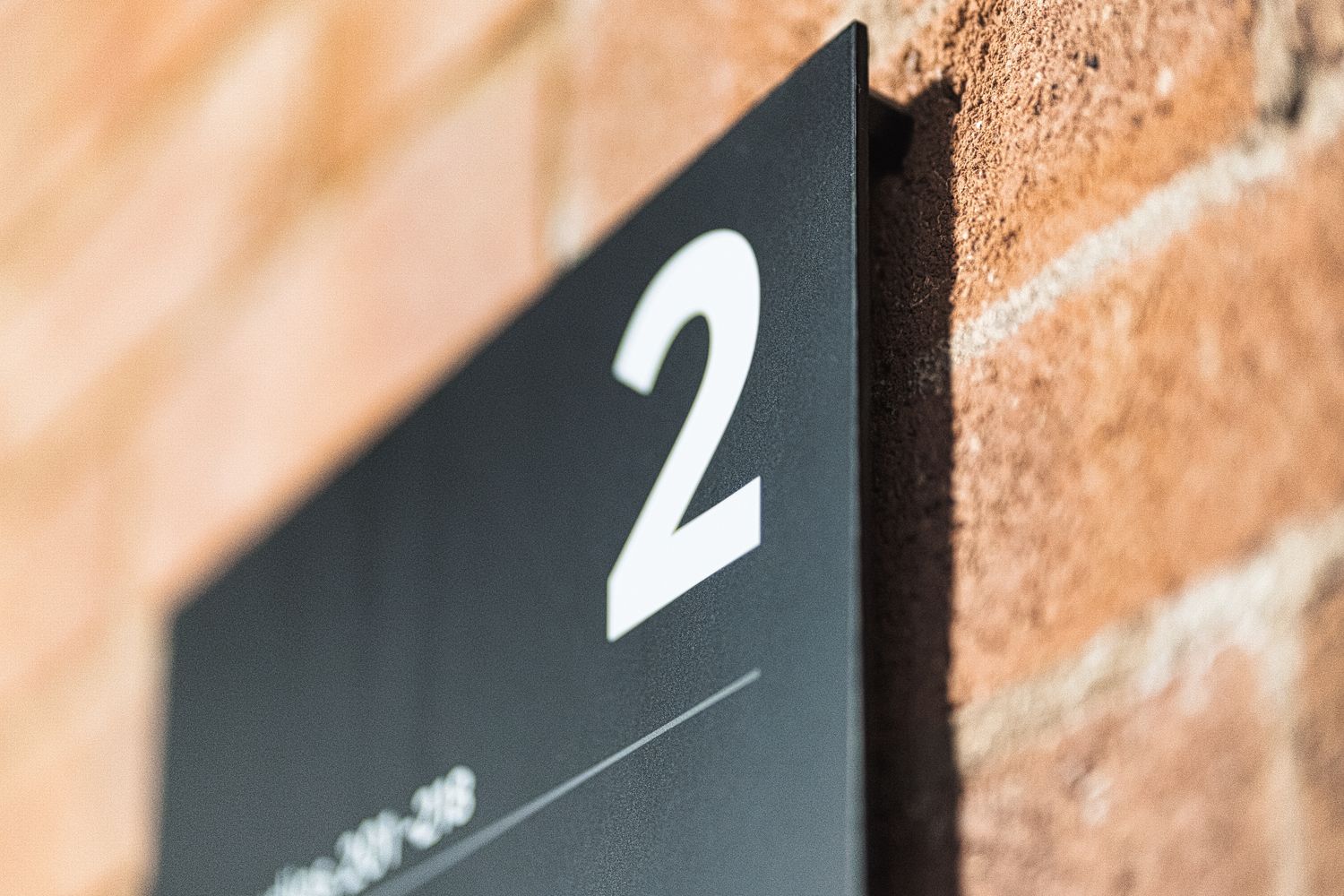
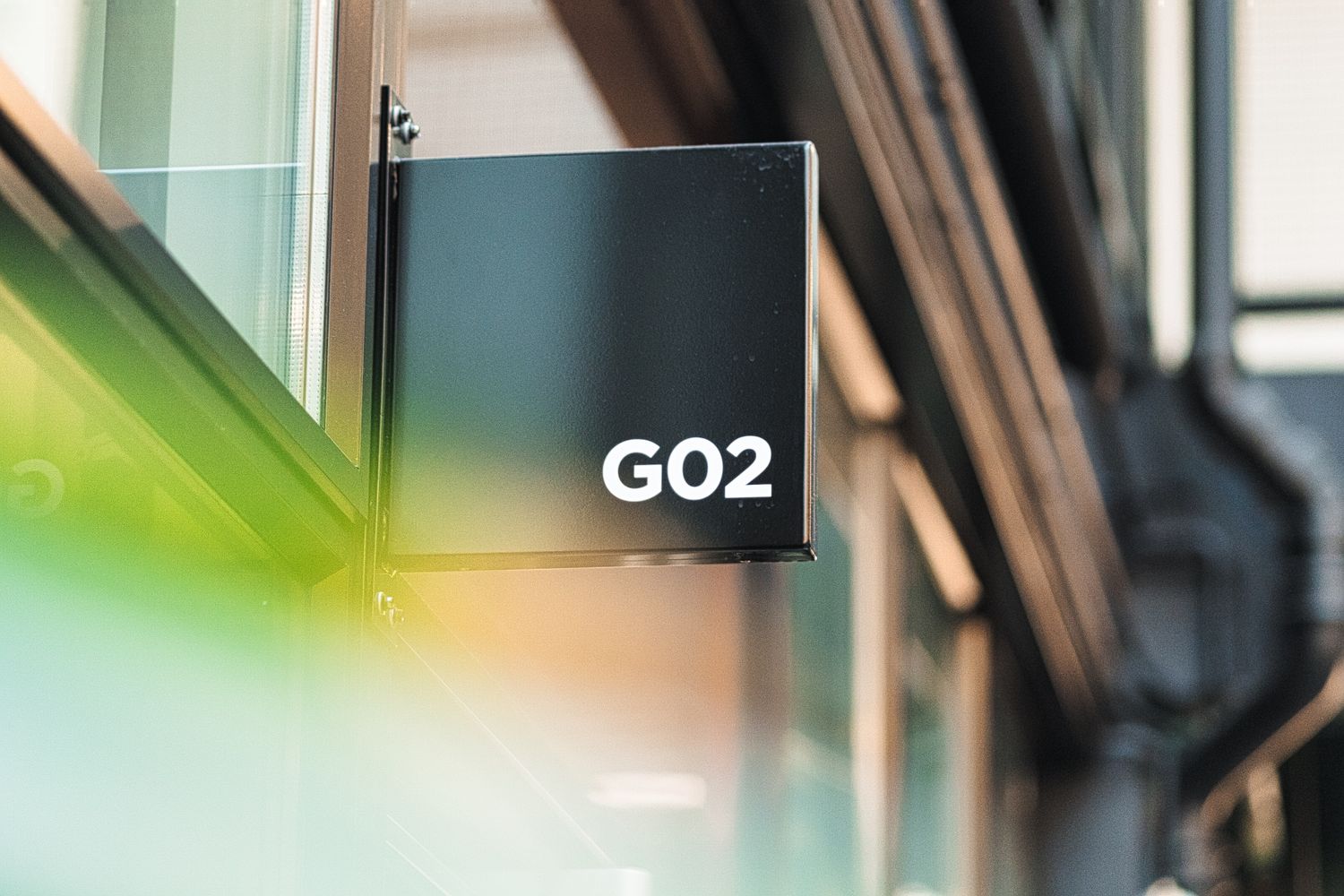
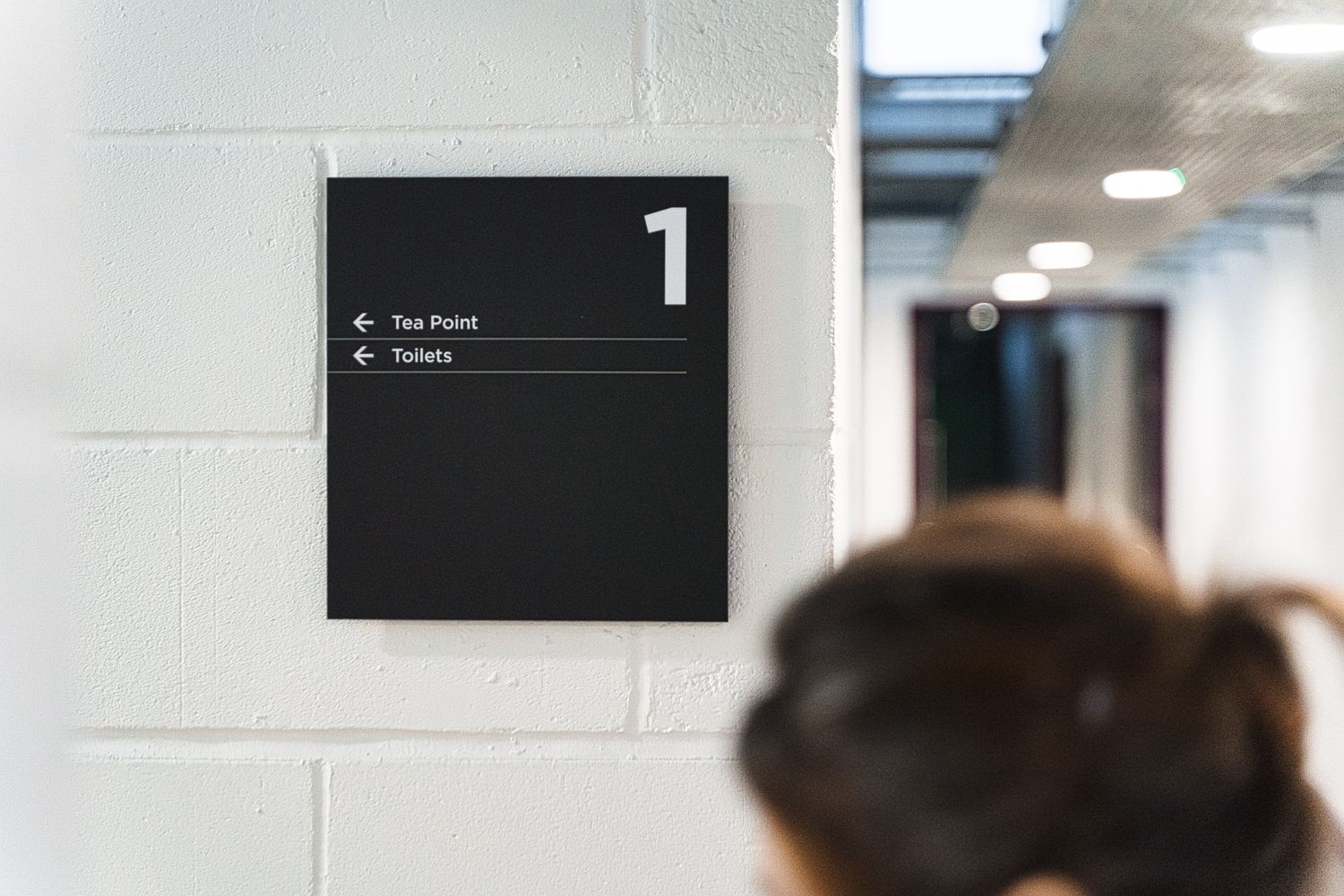
A long term client of ours, Workspace approached us with a pretty open ended brief – provide directories, intercom signage, information signs, direction signs and room signs to point people the right way – leaving it to us to figure out the mechanics of the wayfinding system and undertake the signage design process from start to finish.
With the entire building laid out around a breathtaking internal courtyard, this particular Workspace presented us with a unique wayfinding challenge. There are rooms on the peripheries of the ground floor, on a second mezzanine level and even some peering in from a third level above the behemoth slanted skylight. Given its potential to become a maze, our primary question was how do we make sense of this split up without overcomplicating the wayfinding system, and help life flow around the heart of the space easily intuitively?
Guiding people through a physical environment smoothly – especially one where they work, where stress levels can be elevated and where they spend a large chunk of their day – contributes to a sense of wellbeing, safety and security. Conscious of the subliminal impact of effective signposting, we decided to carry out a survey to work out where things would go. A simple walkabout of the site allowed us to have a feel of the space firsthand; experiencing the lighting, getting a sense of the dimensions, and trying out the different routes available all helped to configure navigation of the workspace.
Not ones to rest on our laurels, we went back and forth multiple times – choosing the areas that needed signage, how they would be arranged, the quantities required, and the types of signs – tweaking and tweaking till it felt easy to walk the workspace. We had committed to an install date, so being this deliberated at the start and spending the largest portion of the project on perfecting the pathways was risky in terms of feeling like we were making progress, but it paid off at the time of execution.
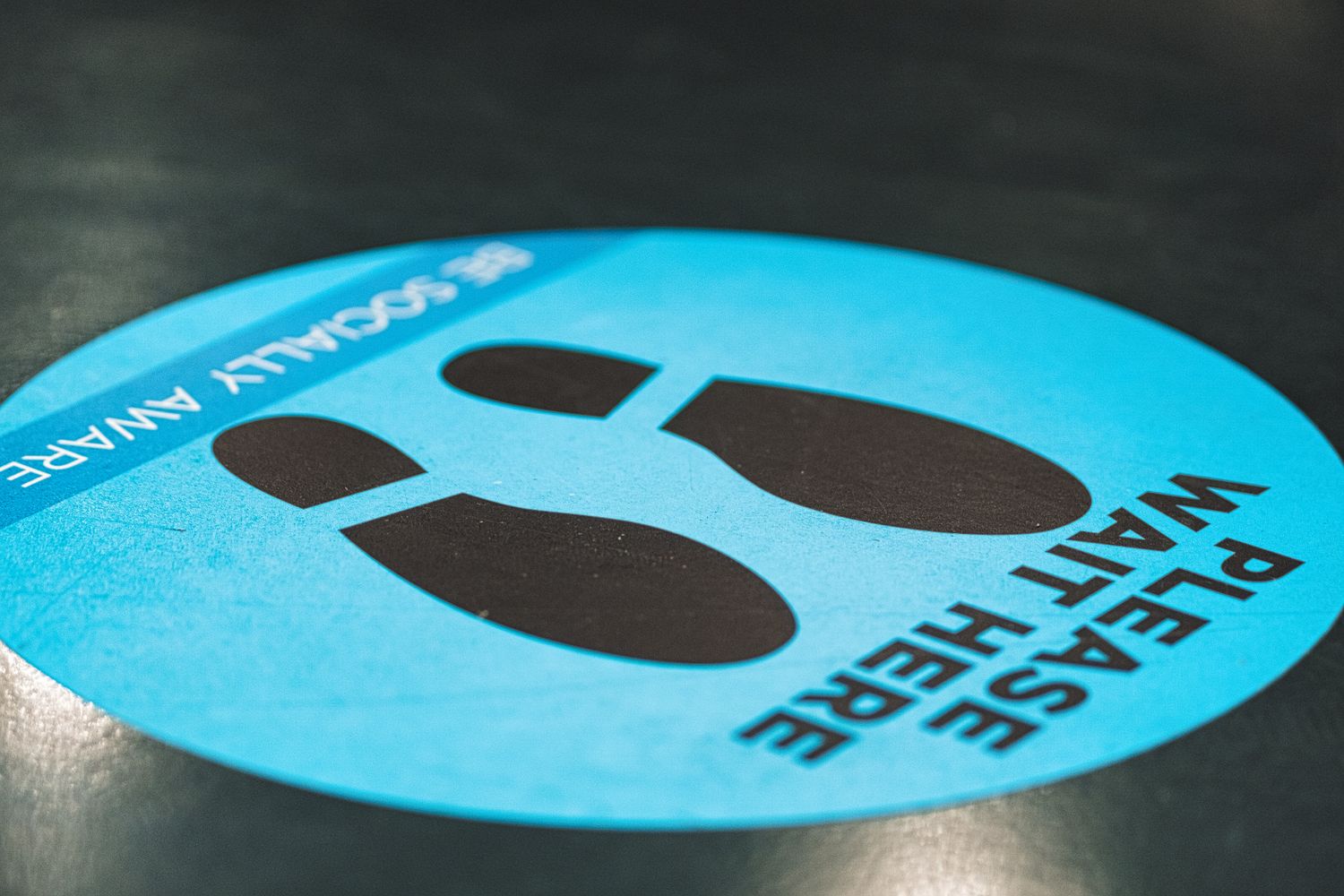
Managing the look and feel, the appropriate materials, and the sizing of each and every sign ourselves – we designed the signs in house and produced everything in less than two weeks. We kitted out all three floors in under three days and with the pandemic at large, that was appreciated by all parties. It was a pleasure to develop and deliver function to this beautifully architectured form, and as one of the only indoor communal environments open for business at the time, we were happy to see the space be appreciated too.
