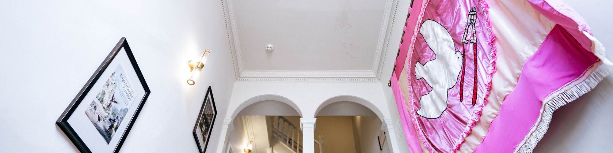


The Paul Mellon Centre, Yale UniversitySUSTAINABLE HERITAGE SIGNAGE FOR A GRADE I LISTED SITE IN BLOOMSBURY, HOME OF YALE'S LONDON EDUCATIONAL HUB.
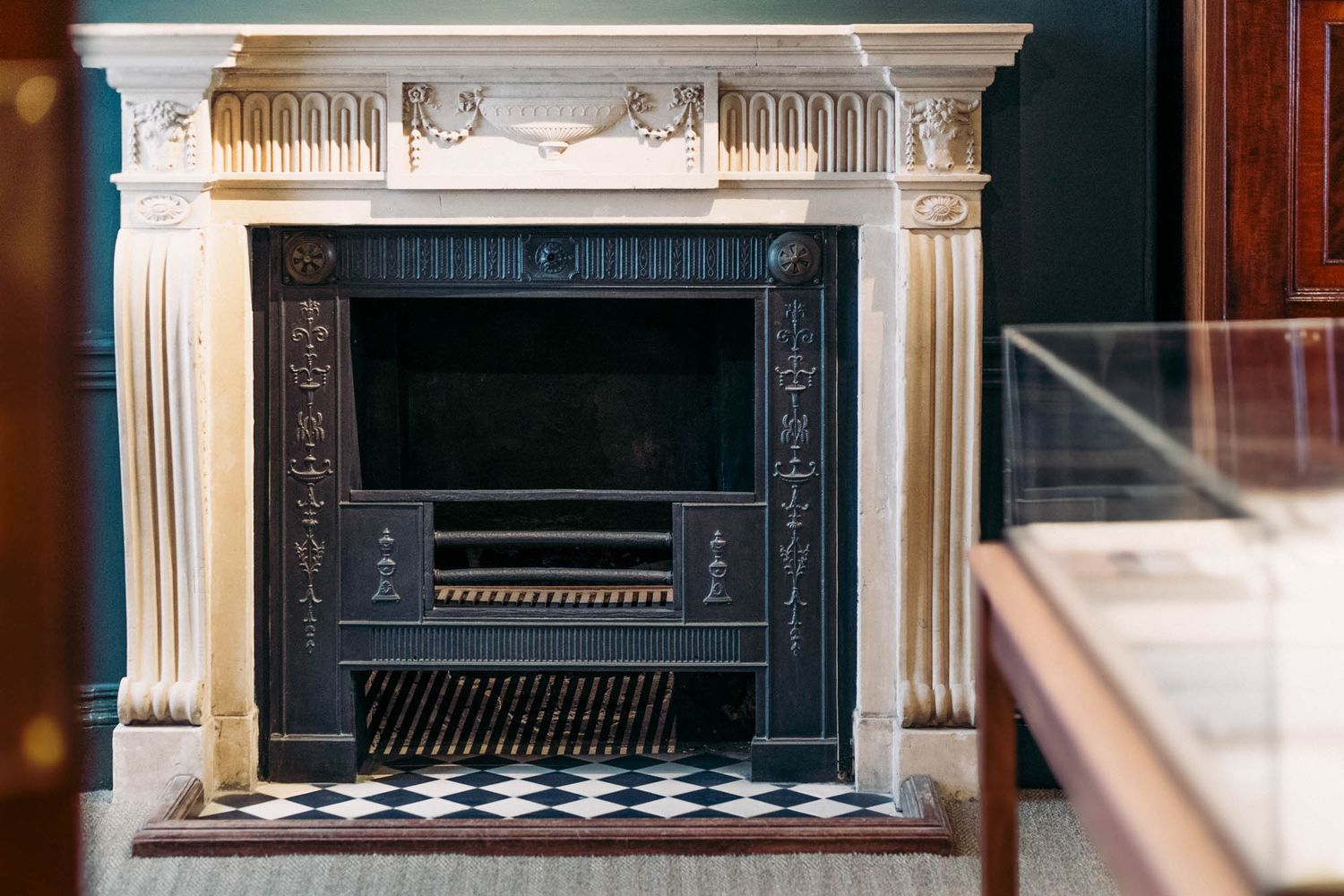
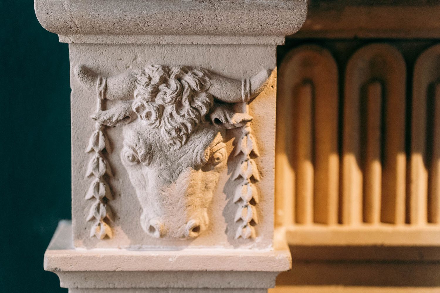
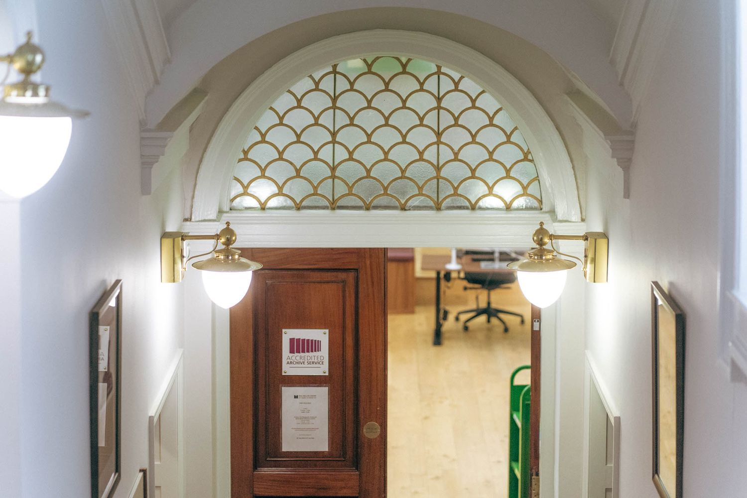
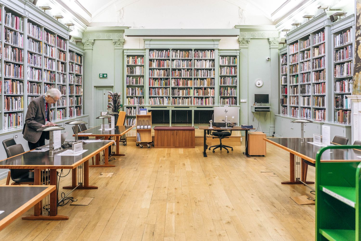
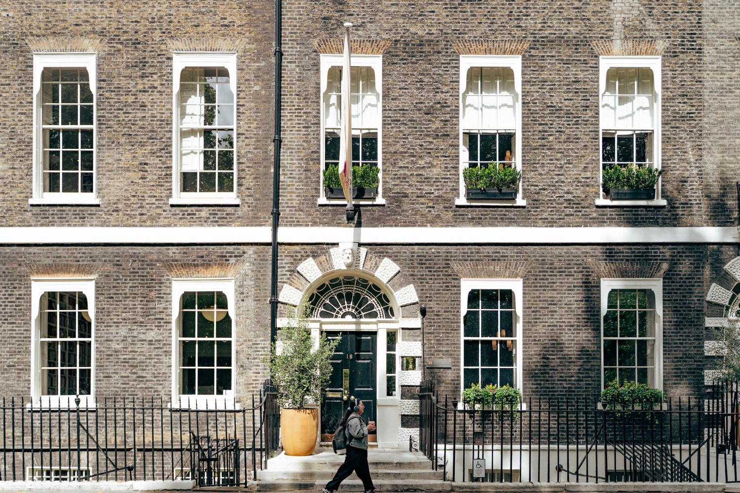
The Paul Mellon Centre is a London-based research centre and educational charity dedicated to the study of British art and forms part of Yale University. Its Bedford Square home brings two Grade I listed townhouses together, creating an environment full of original features, changing levels and the quirks that come with adapting historic buildings for modern use.
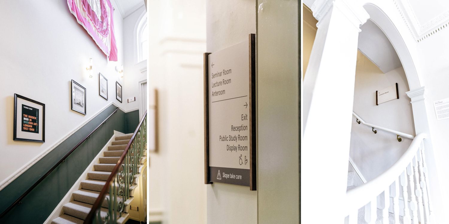
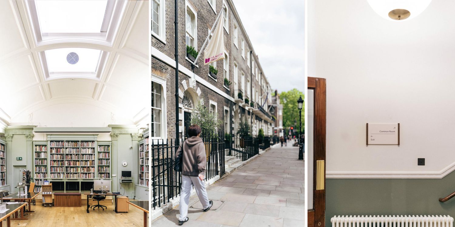
Following a major interior refresh, we were introduced by the interior design team to develop a new wayfinding and room signage scheme. An initial visual direction had already been explored, but there was plenty still to resolve, from how the signs should look and where they should sit to how they could accommodate future changes.
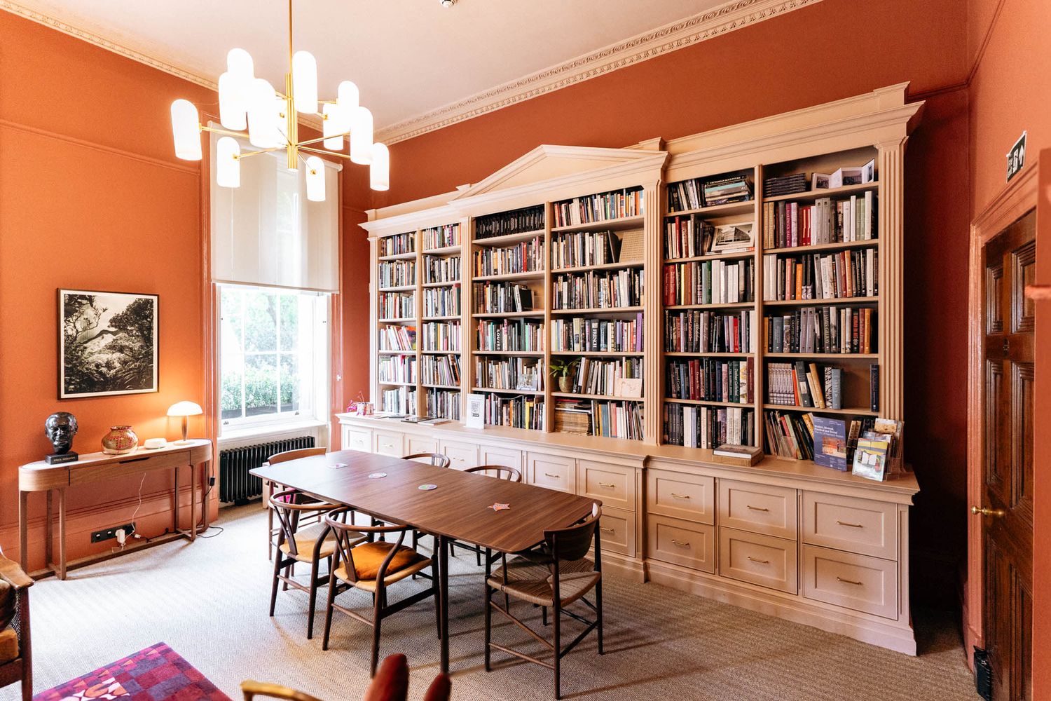
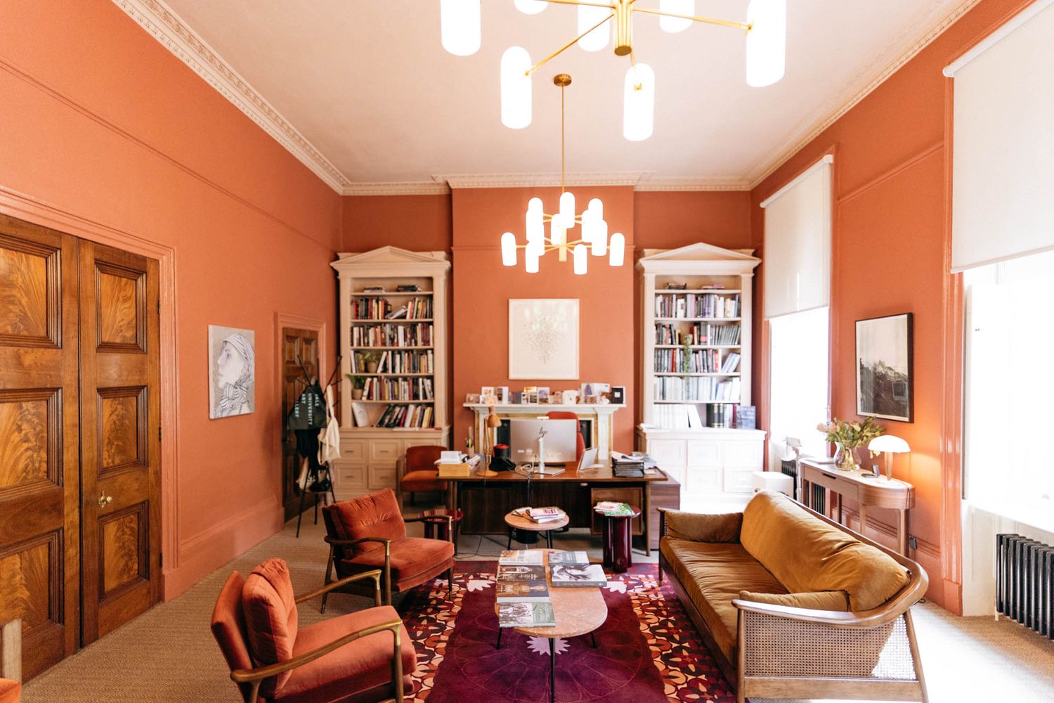
The Centre wanted something contemporary enough to complement the refreshed interiors, but warm and understated enough to sit comfortably alongside the existing architecture. Natural materials were an important part of that conversation, with sustainably sourced walnut proposed to relate directly to the new joinery throughout the building. Flexibility mattered too - room names and functions could change, so the signage needed to be updateable rather than disposable.
The finished family included:
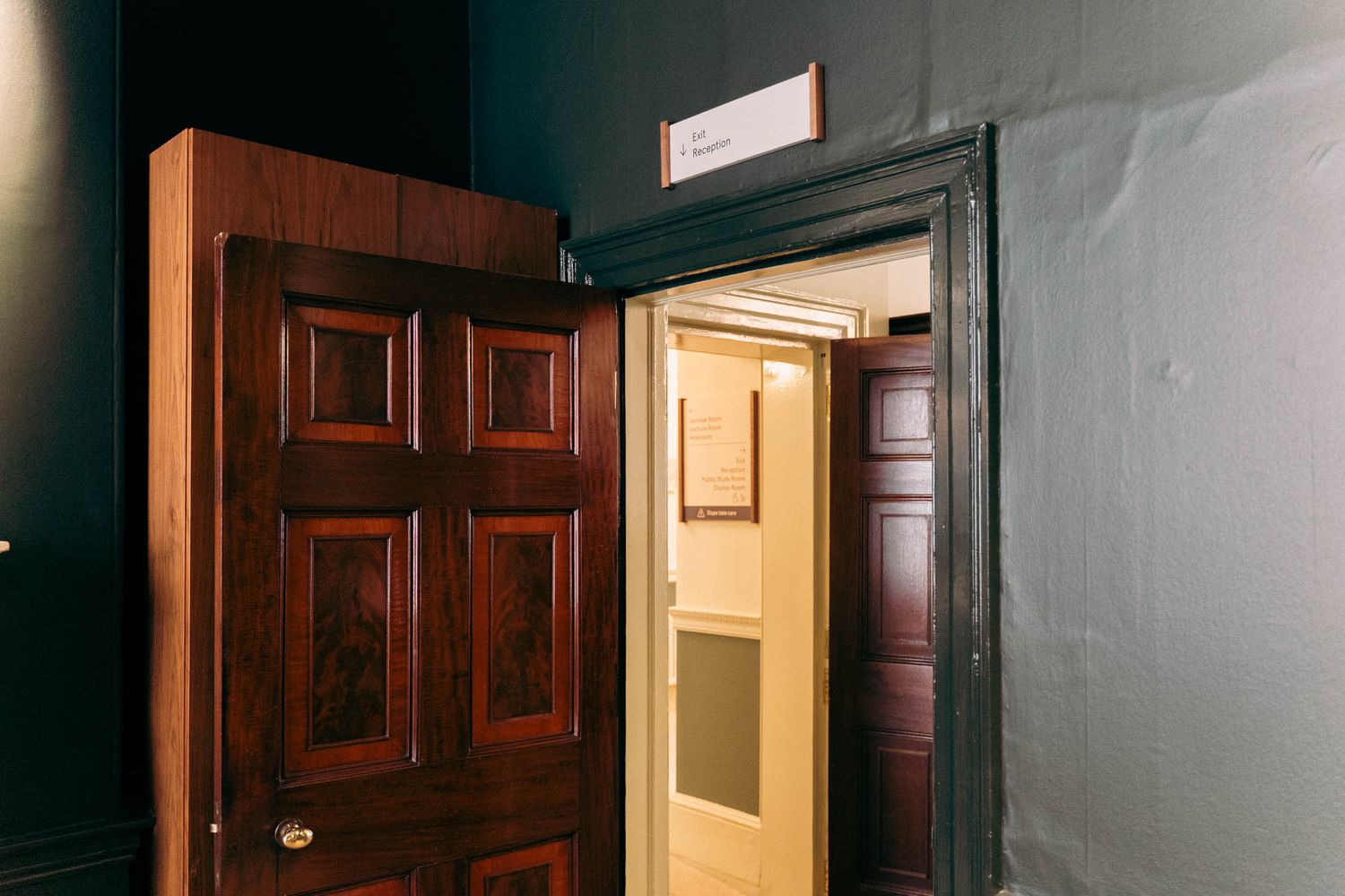
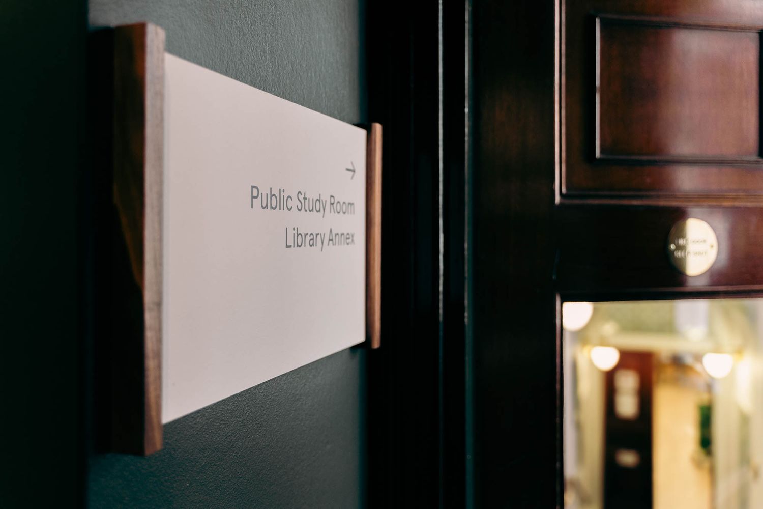
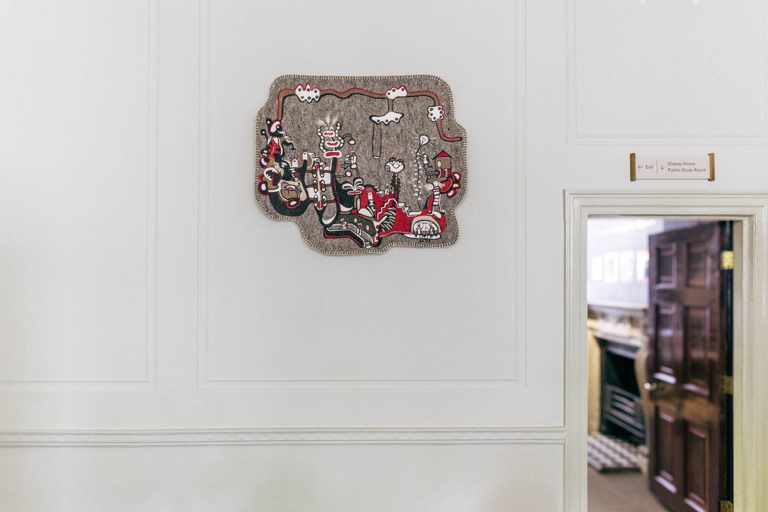
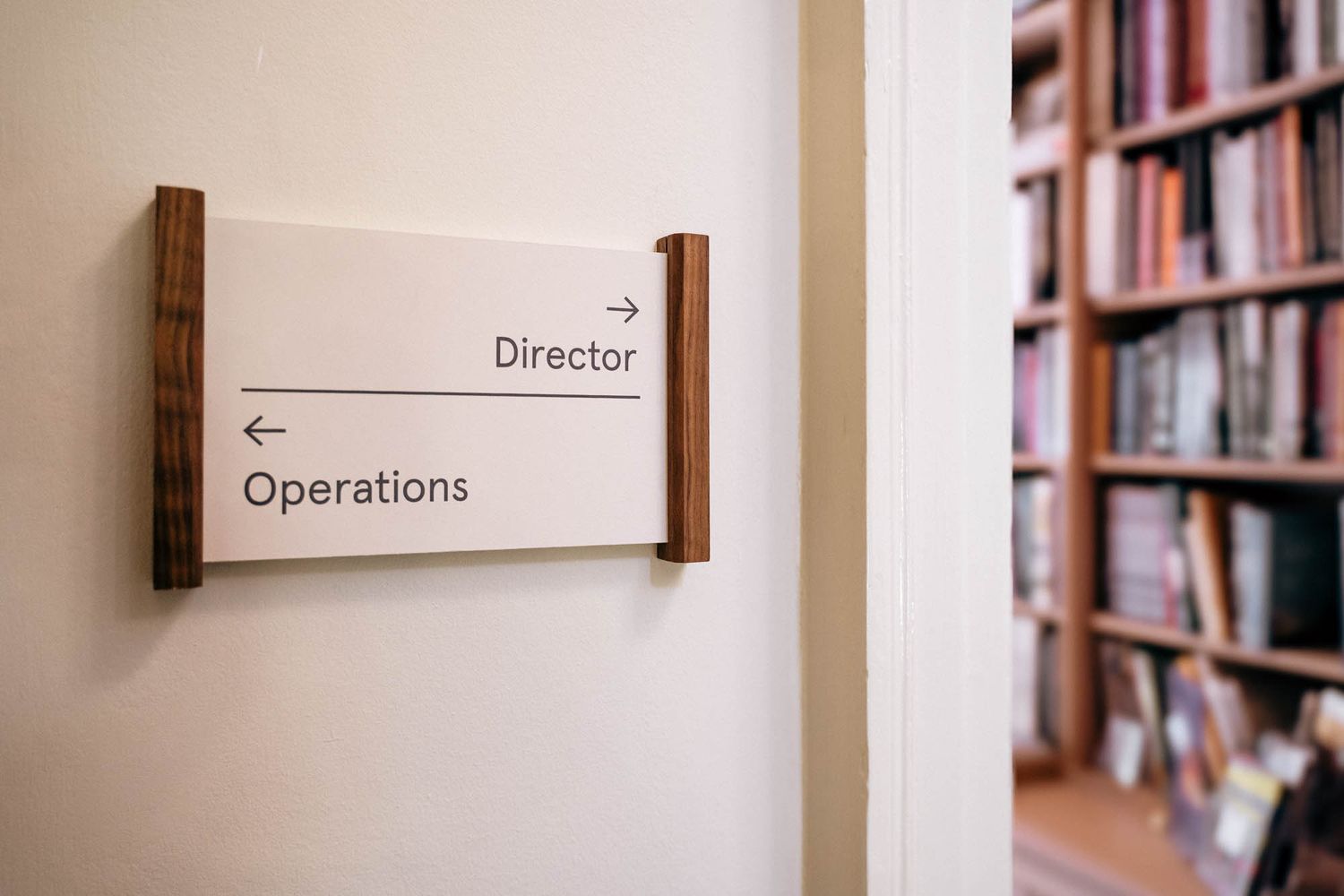
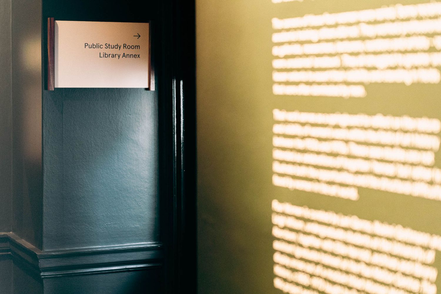
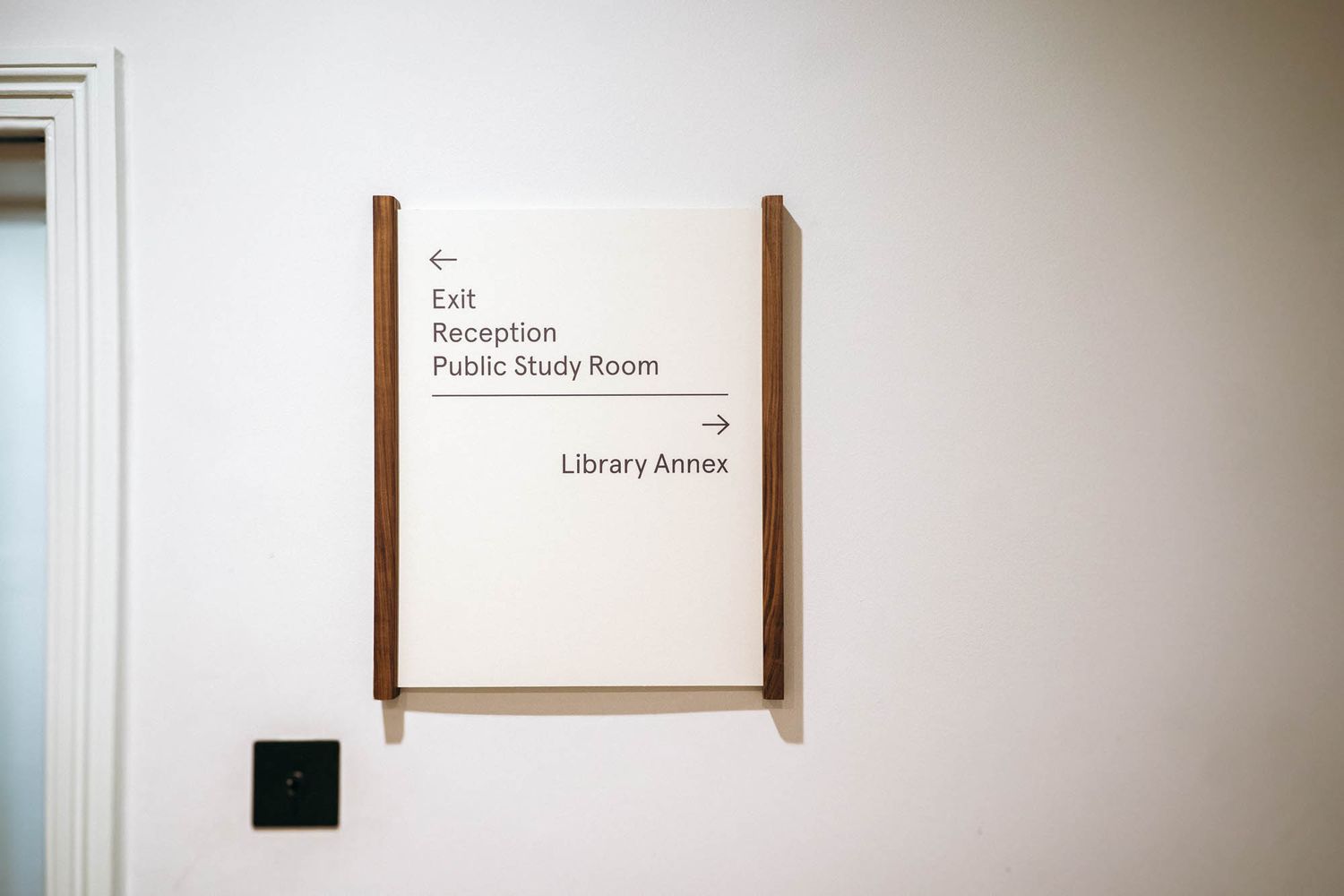
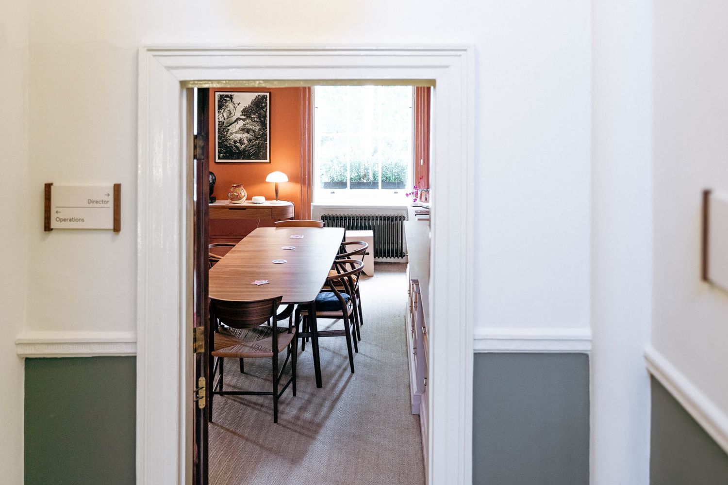
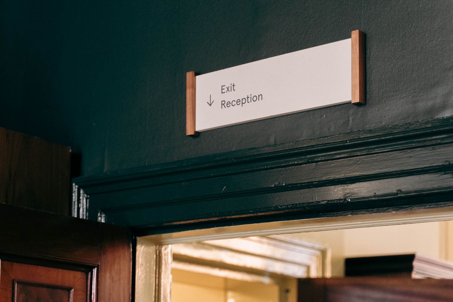
Wayfinding signs directing visitors between reception, study areas, offices, event spaces and shared facilities.
Room signs used throughout the Centre for offices, meeting rooms, library and archive spaces.
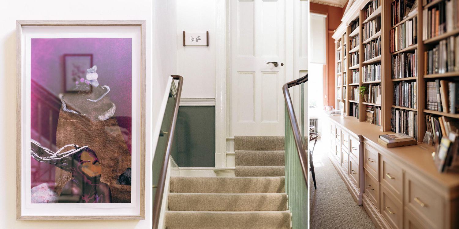
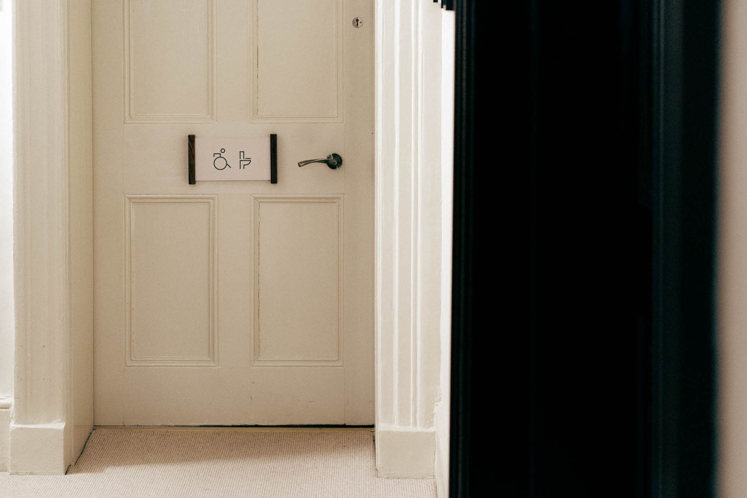
Amenity and access signs covering WCs, showers, staff-only areas, and other details that support the space.
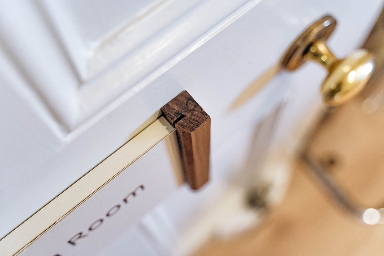
Modifiable signs with removable printed cards in recycled acrylic sleeves for rooms where tenants might change.
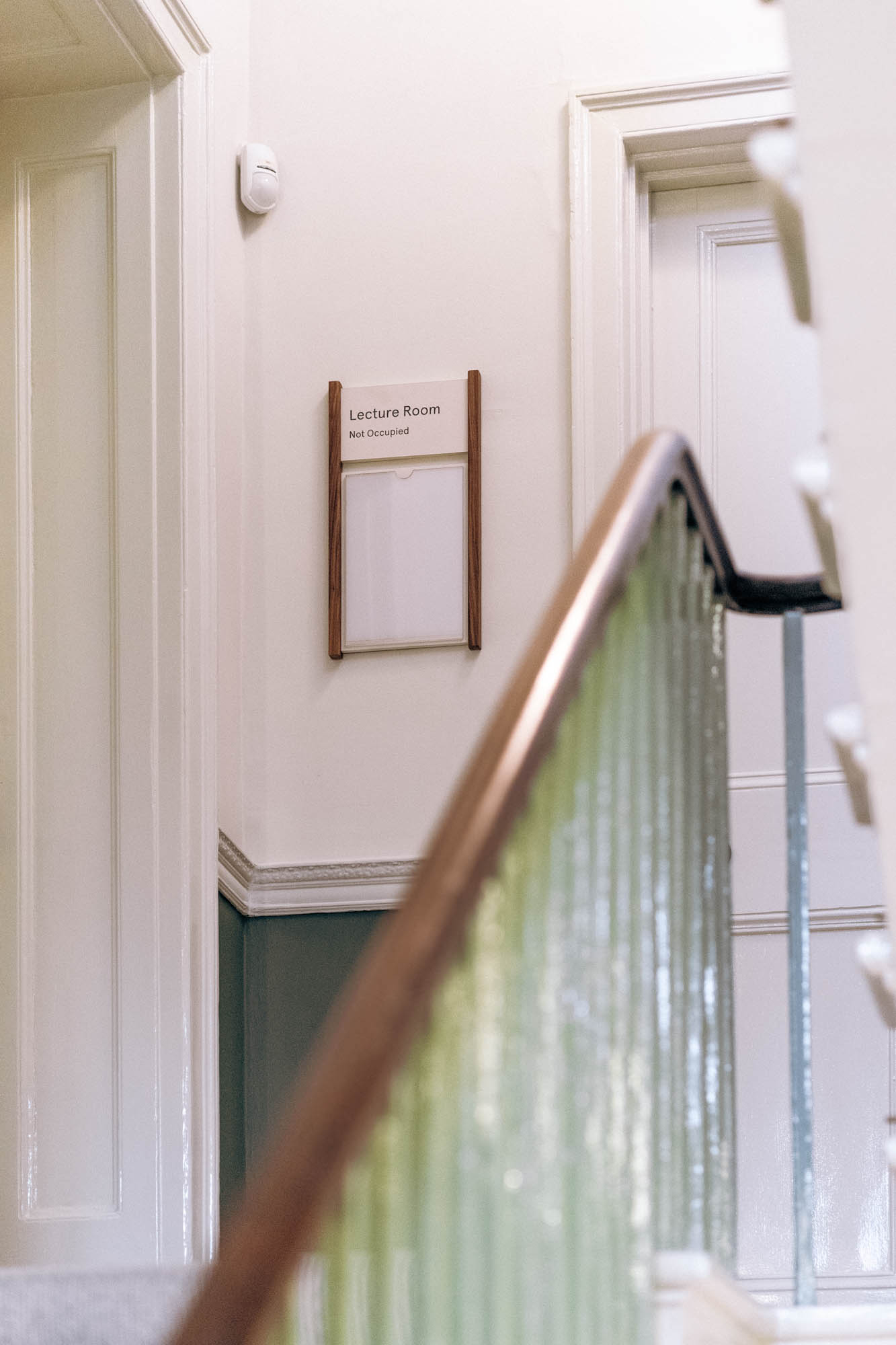
Rather than giving every designated purpose its own distinct design, the signage was built around one restrained visual language. Varying mainly in scale, each piece features a solid panel in a pale painted finish, flanked by two neatly shaped pieces of sustainably sourced walnut in a natural stain. The finished forms have a scroll-like quality that suits the setting, with the timber bringing warm character to the system while keeping the information itself crisp and easy to read. The simplicity means the signs feel kindred to the space without competing with the furniture, artwork or historic features around them.
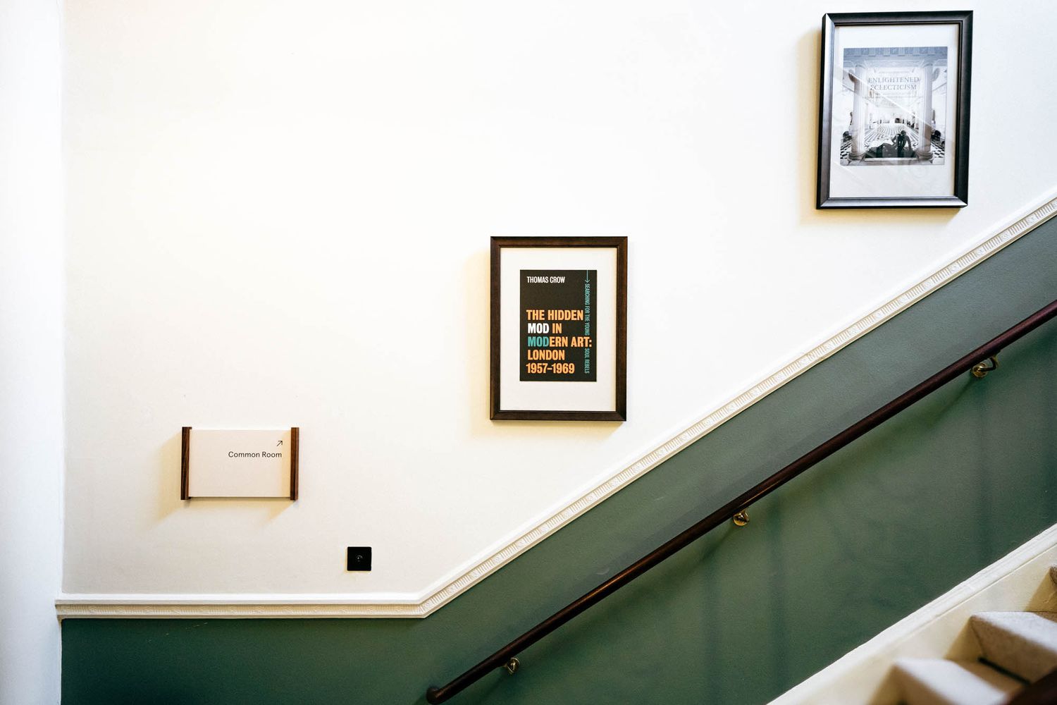
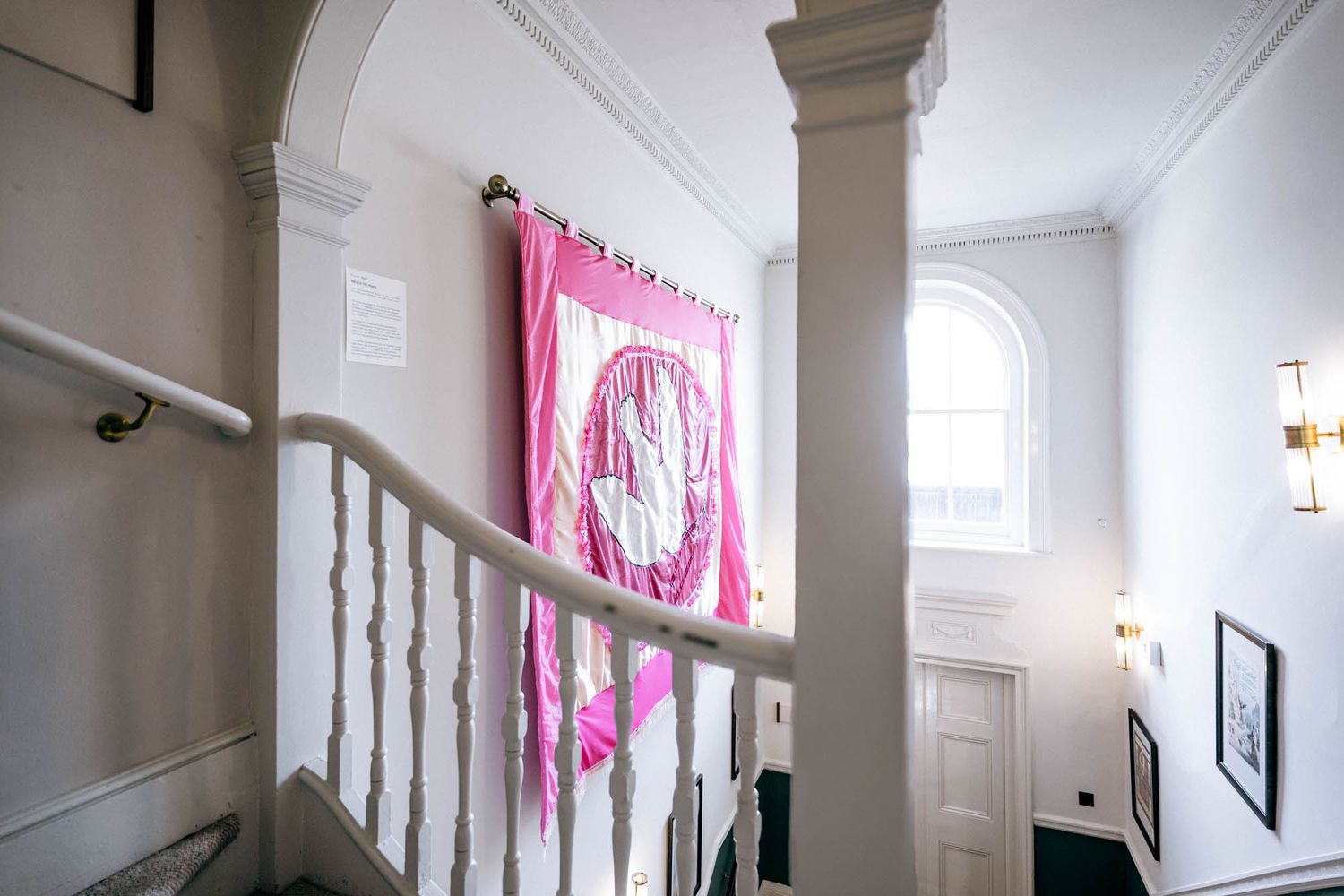
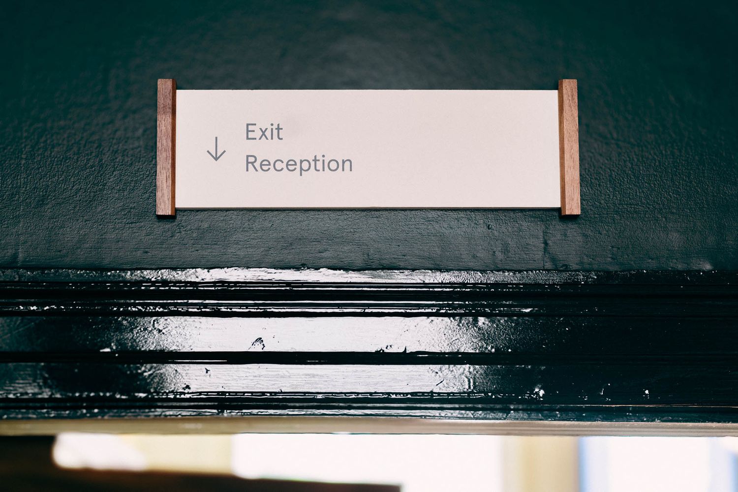
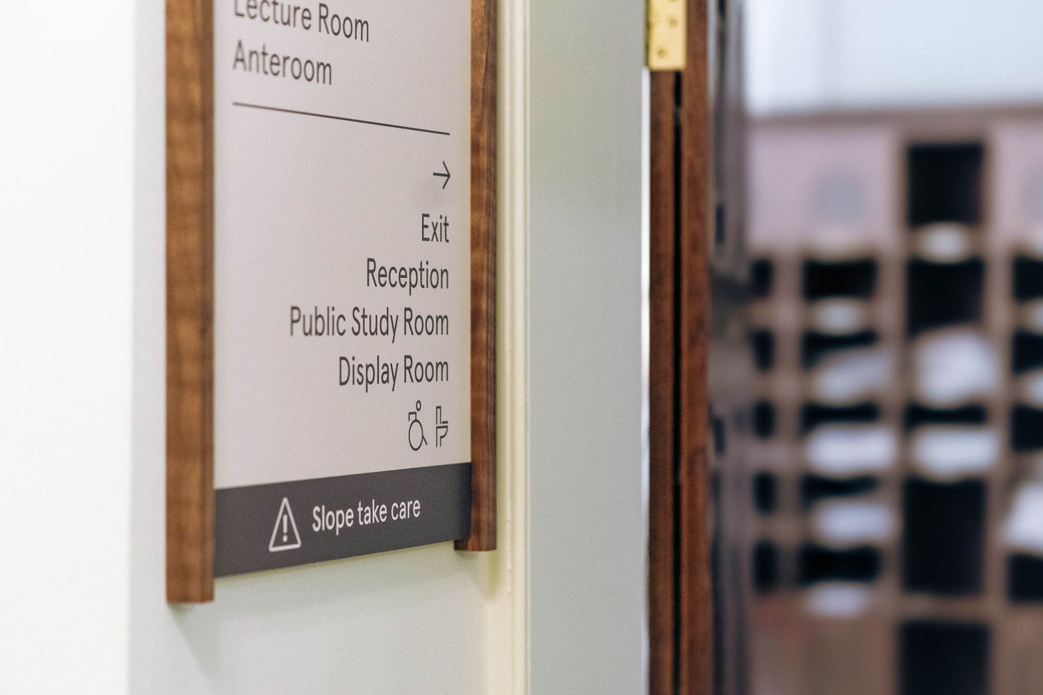
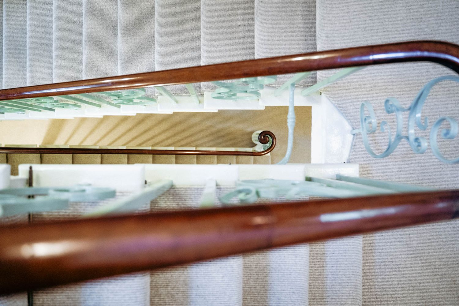
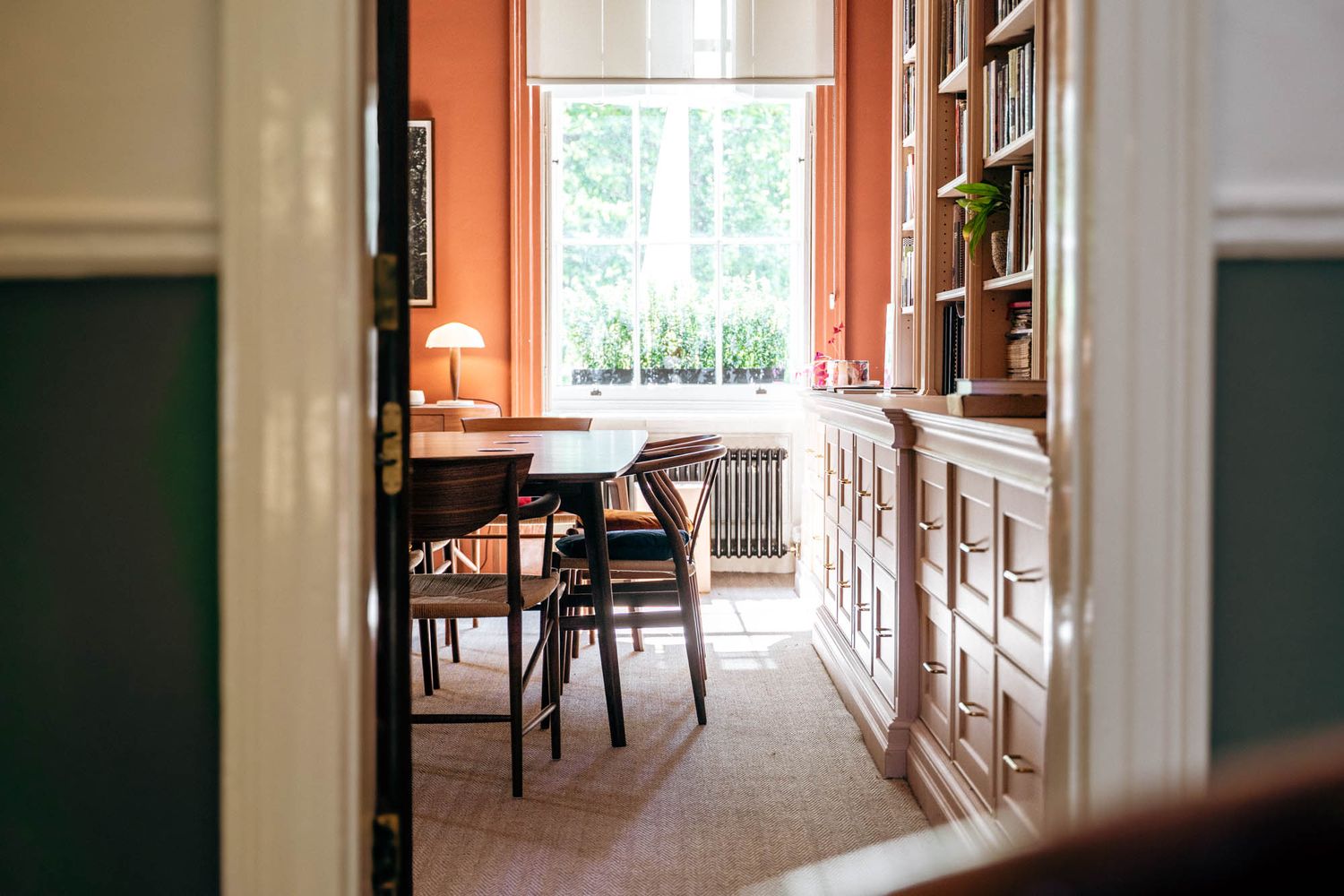

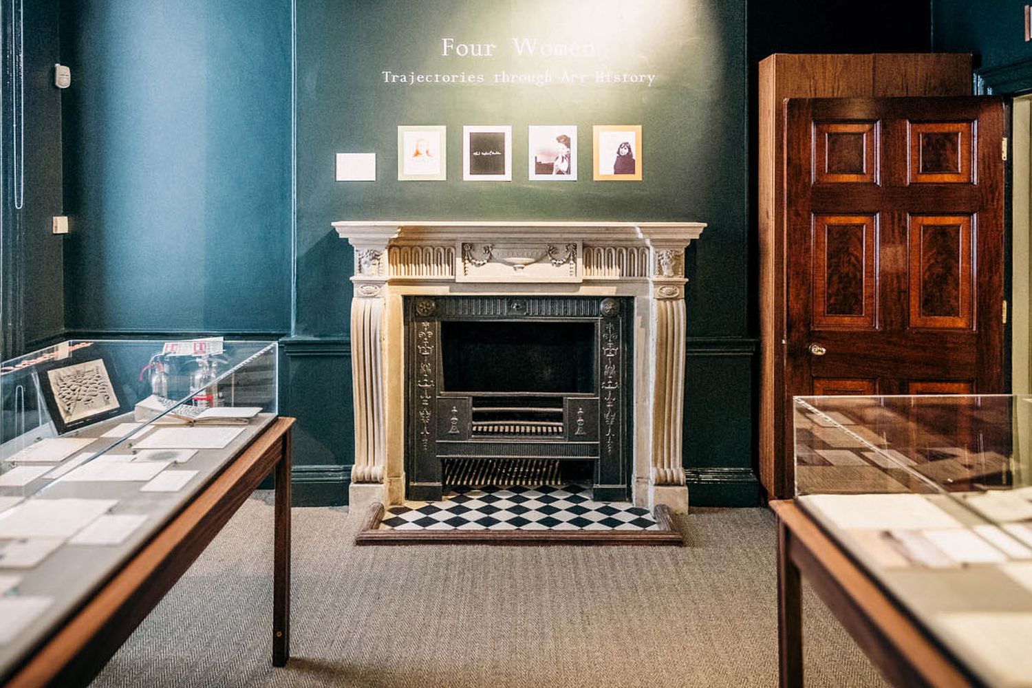
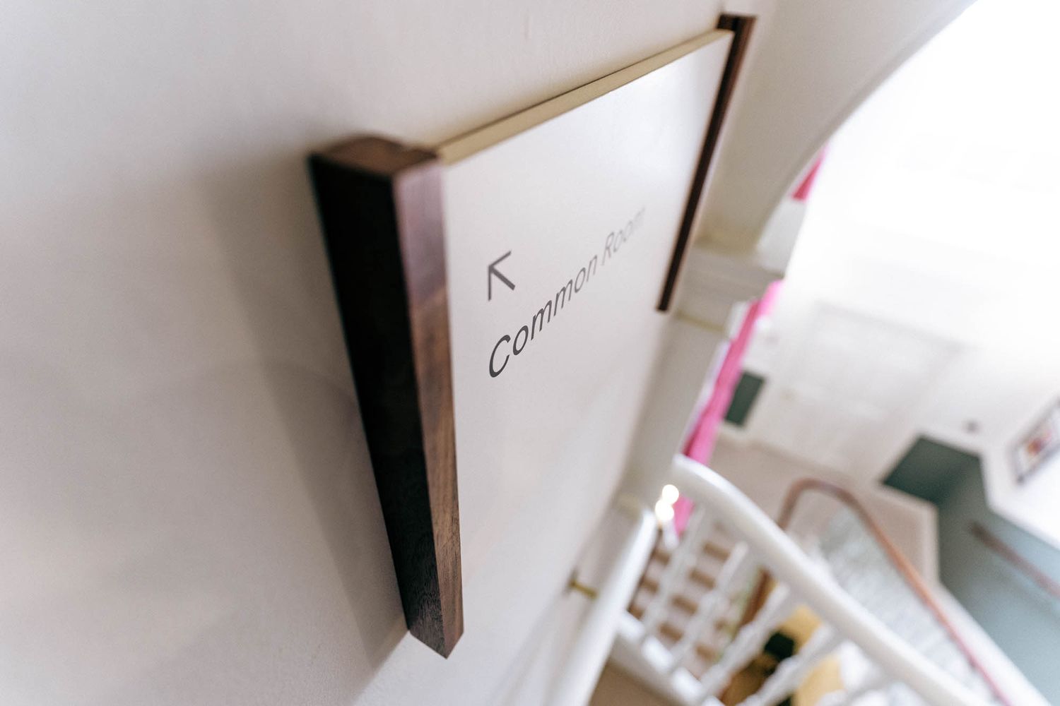
The signs themselves were intentionally straightforward. Installing them neatly into two joined Georgian townhouses was the more interesting part, requiring a proper wander around - stepping into the shoes of visitors, taking the routes ourselves and seeing the building as they would.
The Centre’s accessibility map makes the layout challenge quite clear: the ground floor stretches across both No.15 and No.16, while the Public Study Room sits below and the Lecture Room and Anteroom sit above, with several routes involving stairs or changes in level. In a Grade I listed building, practical wayfinding also has to sit comfortably alongside the architectural fabric that makes the place what it is.
On site, that translated into dado rails, architraves, door frames, switches and decorative details landing exactly where a sign might otherwise naturally sit. Walls were not always perfectly true, fixing heights couldn’t simply be repeated mechanically and every floor presented slightly different constraints.
So rather than forcing the signage onto the building, we worked around it. A detailed survey helped establish how people actually moved through the Centre, where visitors were likely to hesitate and where information needed to be visible from more than one direction. Flow, bottlenecks, orientation and quantity were all considered before positions were finalised.
The simplicity of the sign family helped here too. With the same basic format carrying through the building, individual pieces could be developed and positioned to suit each location without losing their connection to the wider scheme.
Flexibility was built into the signs themselves. Printed room cards can be changed if a space is renamed or repurposed, while larger versions incorporate recycled acrylic sleeves for A4 inserts, allowing information to be updated without replacing the whole piece. Where more information was needed for wayfinding, the same format was scaled up into a larger build.
That left us with a system that could accommodate the quirks of the building without trying to disguise them - consistent where it needed to be, adaptable where the configuration demanded it. In a place with this much history and character, that was really the point: clear enough to guide you, considered enough to belong.
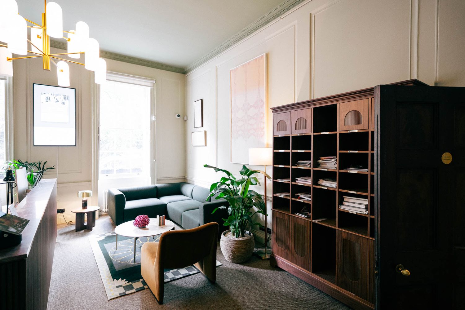
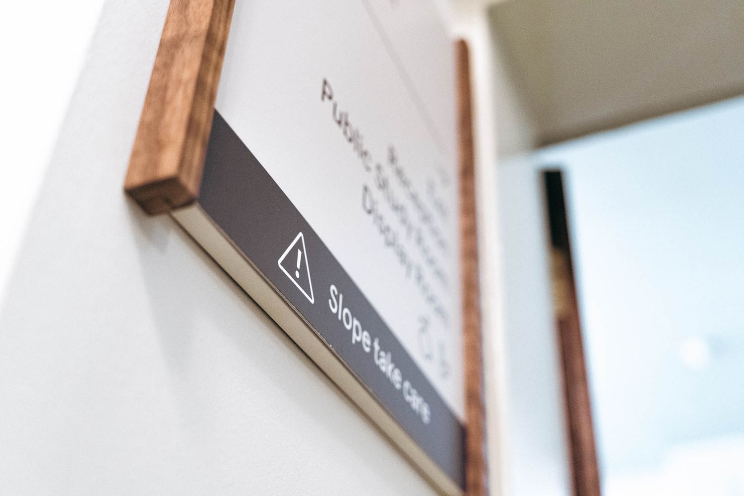
FAQs - The Paul Mellon Centre, Yale University
Start with the building rather than the sign. Original mouldings, architraves, dado rails, doors and other protected features can all affect where signage can be positioned and how it should be fixed. A detailed survey makes it possible to design around those constraints while still creating a consistent system.
If you're planning signage for a listed or character property, talk to Glyphics about surveying the space before the system is developed.
Not necessarily. Contemporary signage can work beautifully in a historic interior if the materials, proportions and finishes respond to their surroundings. At the Paul Mellon Centre, walnut helped connect the new signage with the refurbished joinery without trying to imitate Georgian detailing.
If you’re looking for material inspiration, explore our wooden signs and other bespoke build options.
Floor plans show where rooms are. They do not always show where people hesitate, what can actually be seen from a corridor or how architectural details affect a sign position. The survey for the Paul Mellon Centre considered movement, bottlenecks and orientation before the final signage locations were resolved. Get in touch and we can look at the wayfinding as part of the wider space.
Yes, and it is often worth doing. The Centre specifically wanted flexibility as rooms changed use, so the main room signs were designed to take removable printed inserts. Names and functions can therefore be updated without manufacturing an entirely new sign.
For workplaces, education spaces and venues where occupants or room uses change regularly, we can develop the update mechanism into the design from the outset.
Absolutely. Wood is often associated with traditional signage, but the species, stain, shape and way it is combined with other materials can completely change the result. At the Paul Mellon Centre, slim walnut side pieces were paired with pale painted panels to create something warm and tactile without feeling heavy or too old-fashioned.
Glyphics makes wooden signage in solid and veneered timbers, with options including staining, painting, engraving and applied graphics. You can see more examples on our wooden signs page.
There is no single answer, but materials that relate to the interior generally feel more integrated. Timber, metals and painted finishes can all work well depending on the architecture. Here, sustainably sourced walnut echoed the new joinery, while pale painted panels kept the information clear and understated.
Have an interior palette you want the signage to work with? Send it over to Glyphics and we can advise on suitable materials, finishes and construction.
Consistency does not always mean fixing every sign at exactly the same measurement. In an older building, the better approach can be to maintain consistent visual relationships while adjusting individual positions around architectural features. That is why final site positioning is often just as important as the original drawings.
If you're working on signage for a listed, heritage or character building, reach out and we can help develop a wayfinding system with signage that works with the architecture rather than against it.