Low-angle view of a green multi-panel directory board with black rails, listing businesses and floor levels, mounted on a white wall at Workspace Pall Mall Deposit.
The Pride of Pathfinding

At Glyphics, we're often astounded by how directory signs are routinely underestimated in their importance - an oversight that, in our experience, can become a critical stumbling block. Over our years of guiding clients through complex environments, we've seen how these signs quietly shape the way people operate and orient within a space.

This article explores the delicate interplay of design and utility that directory signs embody. It’s an acknowledgment of their indispensable role - not just as navigational guides, but as the first foundations of safety and assurance, integral to how confidently and comfortably we move through our daily working lives.

Glyphics’ Approach to Directory Signage

Glyphics sign installer using a blue cloth to tidy a large black directory sign on a white wall with blue lettering and shadows, at the Biscuit Factory co-working space..

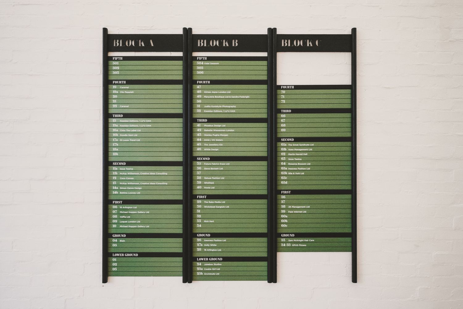
Years of work in London’s busiest commercial spaces have shaped our view of directory signage. We’ve built custom systems - from corporate offices to retail - that don’t just point the way; they set the tone for how a place feels and functions. This piece isn’t exhaustive; it’s our playbook - the practices we return to: clear hierarchies, consistent typography, smart placement, and modular systems that evolve.

And crucially, a directory never works in isolation. It sits within a wider ecosystem of directional signs, floor identifiers, room numbers and confirmation points. If these elements don’t speak the same language - visually or verbally - even the most elegant directory will falter. Consistency across the entire system is what converts isolated signs into coherent wayfinding.

Round mirror reflecting a wall sign listing reception, offices, meeting rooms and rooftop terrace - part of a wayfinding signage system at Co-Space in Reading.
Round orange velvet sofa centered in a modern office corridor with glass-walled rooms and a wooden floor, at Co-Space, a co-working space in Reading..
Angled view of a wall covered in the raised black letters and symbols of a directory sign, with recessed ceiling lights and a hanging glass chandelier above.
KISS: Keep it simple

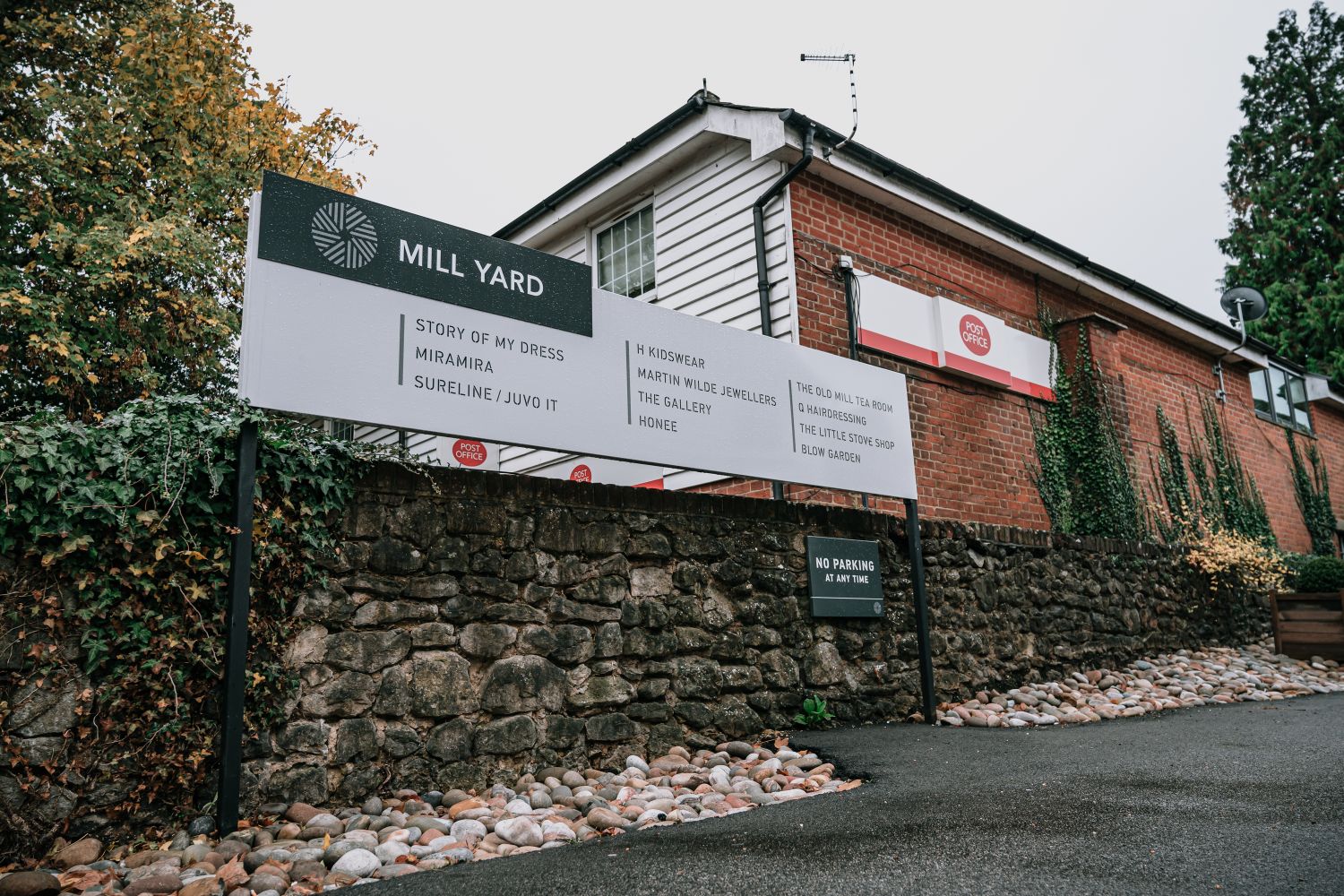
Simplifying Navigation

A good navigation scheme gives an instant sense of place that often starts with a directory. A directory’s job is to make movement effortless, clearly laying out the floor plan and signposting people with certainty to their desired destination, whether through a labyrinth-like office or a sprawling department store.

To do this successfully, understanding how real people react in unfamiliar spaces is just as important as design fundamentals. Most users seek quick confirmation, not long instructions; many read signs on the move rather than standing still; and stress or time pressure can reduce comprehension dramatically. Good directories are designed around these behaviours, offering reassurance without cognitive overload.

A well-designed system cuts wandering - a benefit which increases exponentially in complex sites. Directories therefore are in a sense critical infrastructure. As the first touchpoint on arrival, they should underpin the entire wayfinding experience, making the space legible, accessible and user-friendly.

Bright modern lobby with a door-length wall directory panel to help people navigate Leroy House co-working space in London.

Spacious modern office lounge at Leroy House co-working space in London, complete with colourful furnishings, potted plants and communal tables.
Wall-mounted double-panelled directory sign, with cut-out "DIRECTORY" header in red metal fold-over detail.
Cafe dining area with red upholstered chairs and small tables under four abstract framed artworks, part of Leroy House co-working space in London..
Close-up of metal office directory sign showing numbered tenant listings, with blank lines for more to come in newly kitted out co-working space, Leroy House.
  • Directories are the cornerstone of a building’s navigation.

  • Essential in larger sites and more complex spaces.

  • Clarity first: reduce confusion and aimless detours.

  • Must serve both first-time visitors and regulars.

  • Sensitive design improves accessibility and ease of use.

Modern office lobby with gold hello sign on a blue wall above a high-end directory board at Mirror Works, where exposed ceiling lights and sunlit windows give this co-working space a wonderfully warm feeling.
Illuminated metallic number 1 on a modern glossy wall directory, with soft glow and blurred corridor lights in the background.
Close-up of a glossy office directory panel listing floors, with the blurred lobby of Mirror Works co-working and warm round bokeh lights in the background.
Like what you see

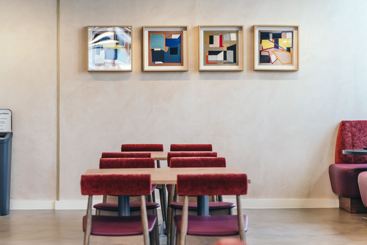
The Aesthetic Aspect

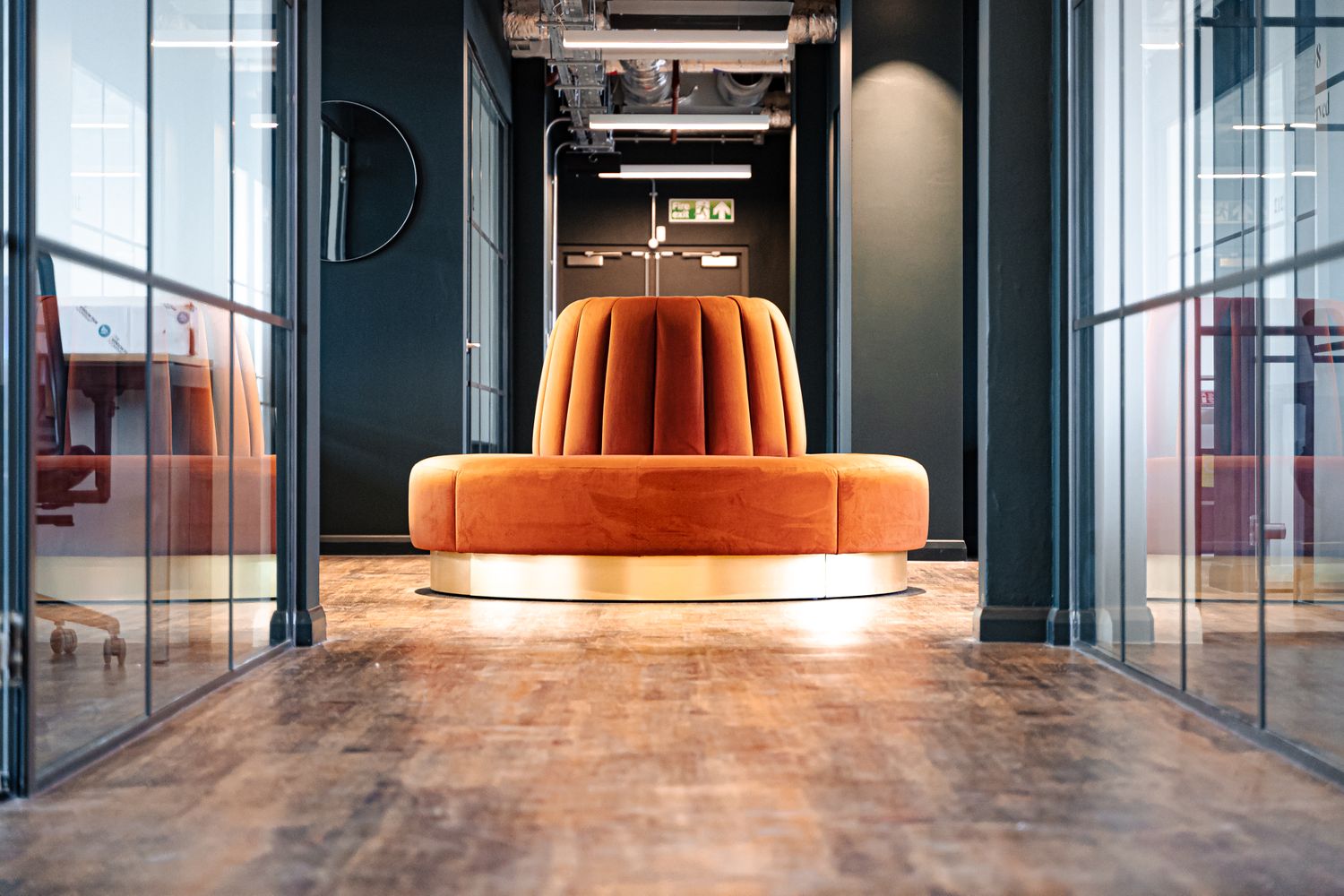
At Glyphics, function and form carry equal weight. Directories should guide with clarity - and if they look good doing it, then they can serve to lift a space instead of clutter it.

So while legibility and hierarchy of information come first in ensuring usability, design is important in setting the tone. Our job is to balance practical needs with visual allure through disciplined choices in colour, typography, contrast, scale and layout.

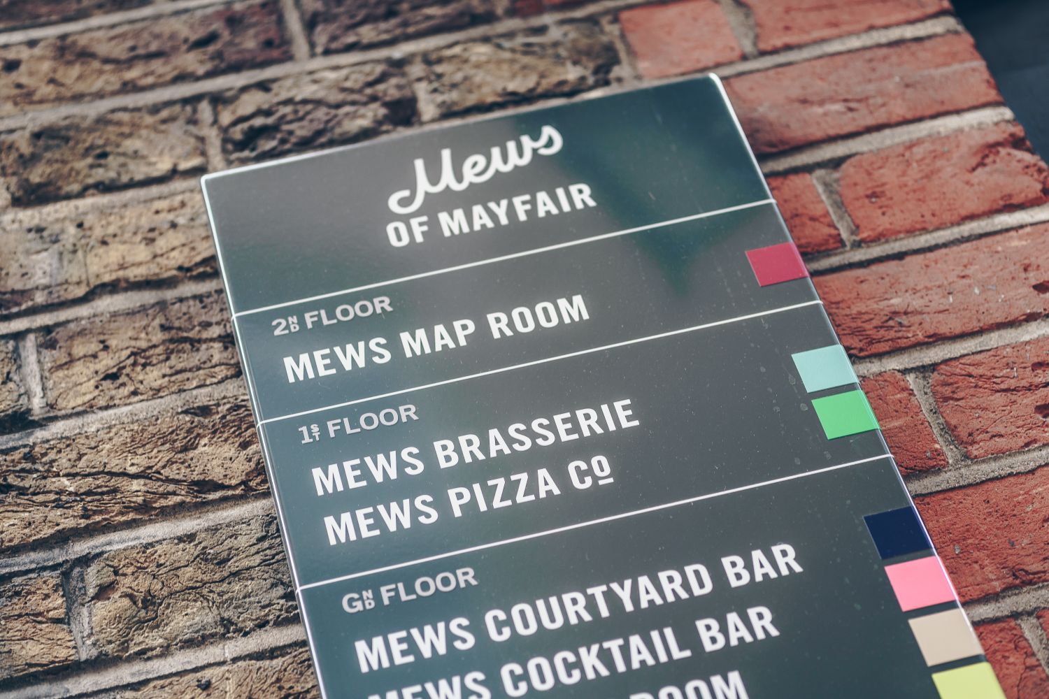
Your choice of material curates the first impression. Before an interaction even begins, the tactile and visual quality of the build sets the tone. Making the right selection is about marrying durability with design intent; creating a finish that survives the real world while telling a specific story.

Etched glass whispers of modern sophistication; wood veneer grounds a space with natural warmth; and metal delivers a sharp, resilient aesthetic perfect for contemporary, high-impact environments.

  • We prioritise both function and form.

  • The right design can positively transform a space.

  • Aesthetic appeal must not compromise functionality.

  • We balance visual and practical demands with intention.

  • High-quality materials enhance durability and finish.

A large black exterior wayfinding panel with yellow and white writing, made to give people an immediate sense of place upon arrival, and withstand the elements.
Where am I?
0

70% of people say they get lost in buildings without clear signage (Gensler, 2020 US Workplace Survey)

Retail wayfinding
0

85% of customers consider good wayfinding to be important to their overall experience (ZenPilot, 2023 Retail Wayfinding Survey)

Contrast
0

Using high-contrast fonts on directory signs can improve readability by 30% (American Institute of Graphic Arts, 2021 Accessibility Guidelines).
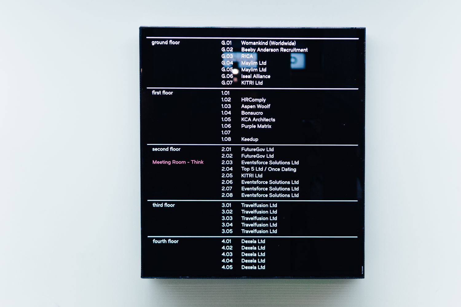
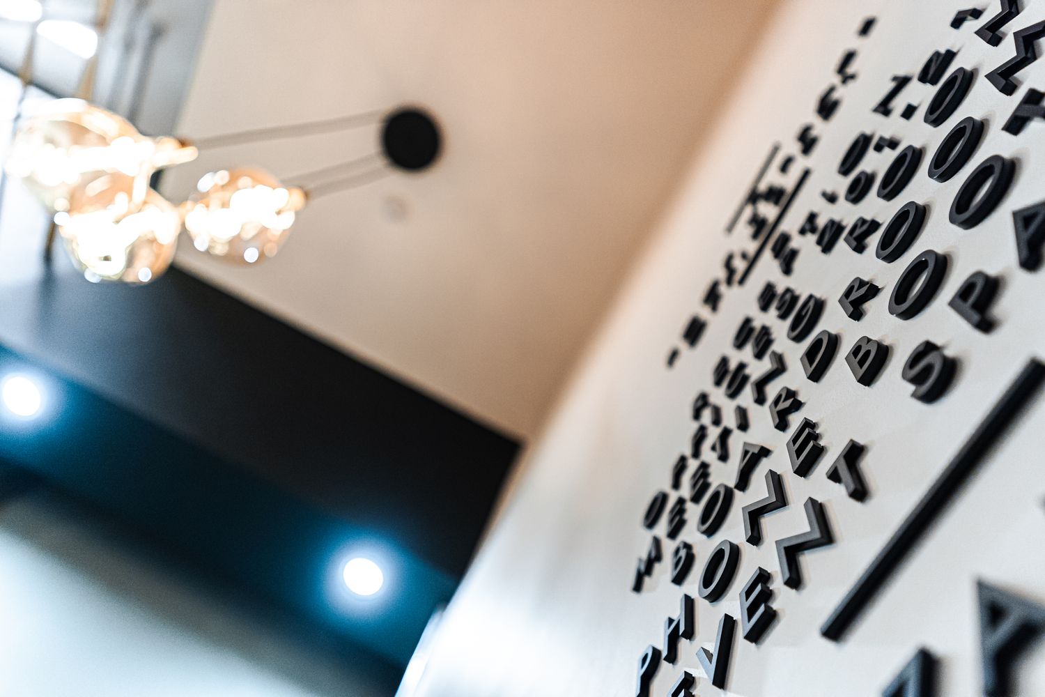
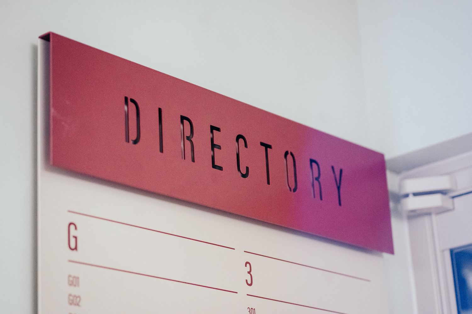
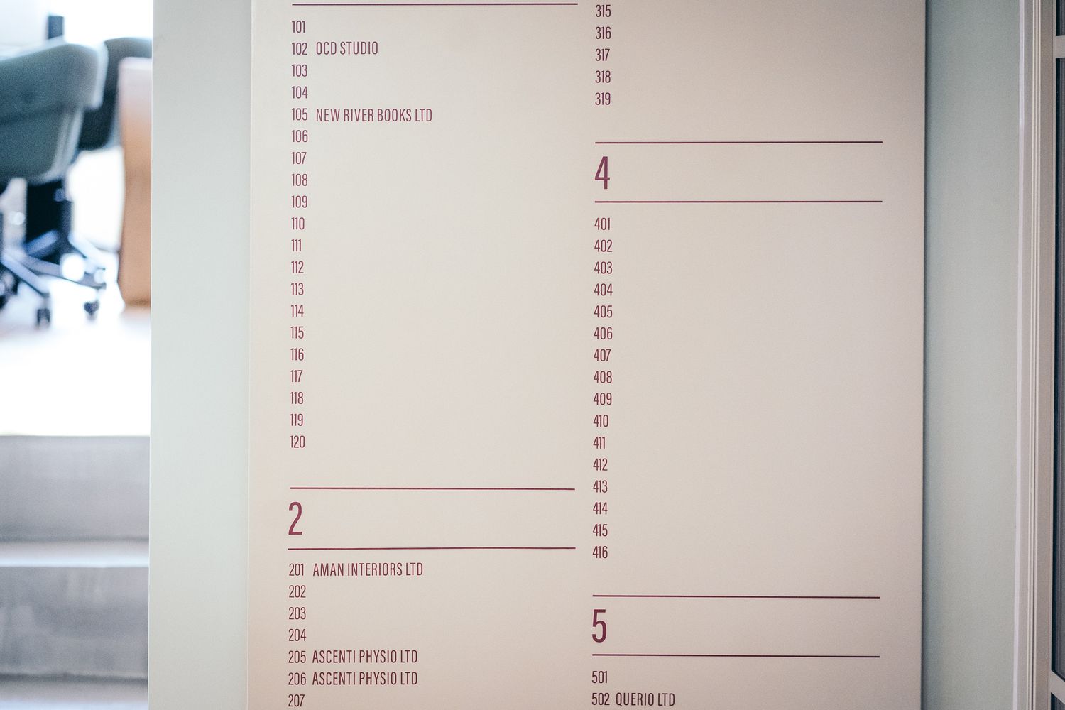
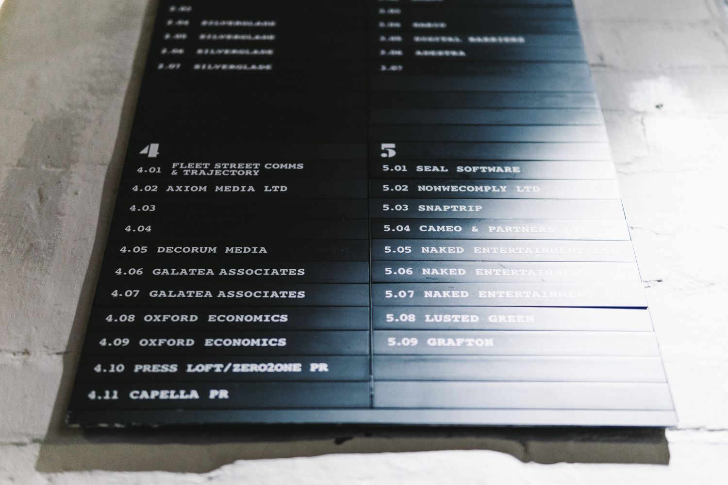
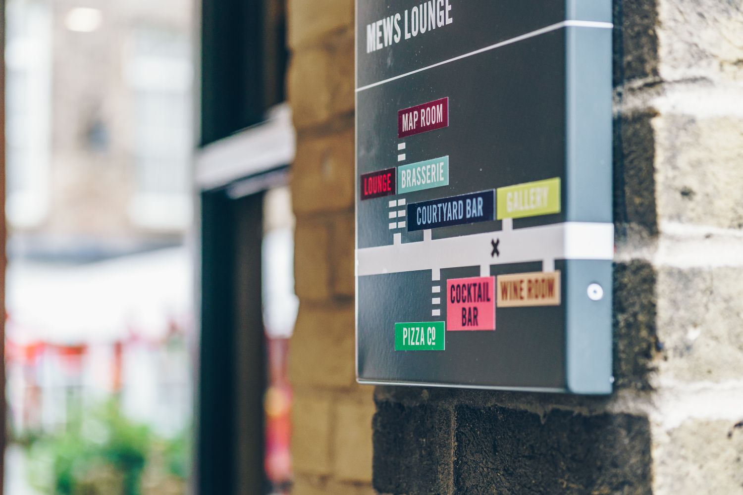
A way with words

Typography

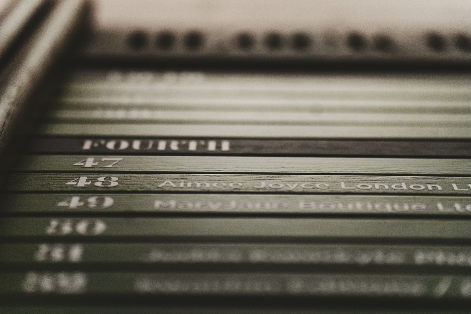
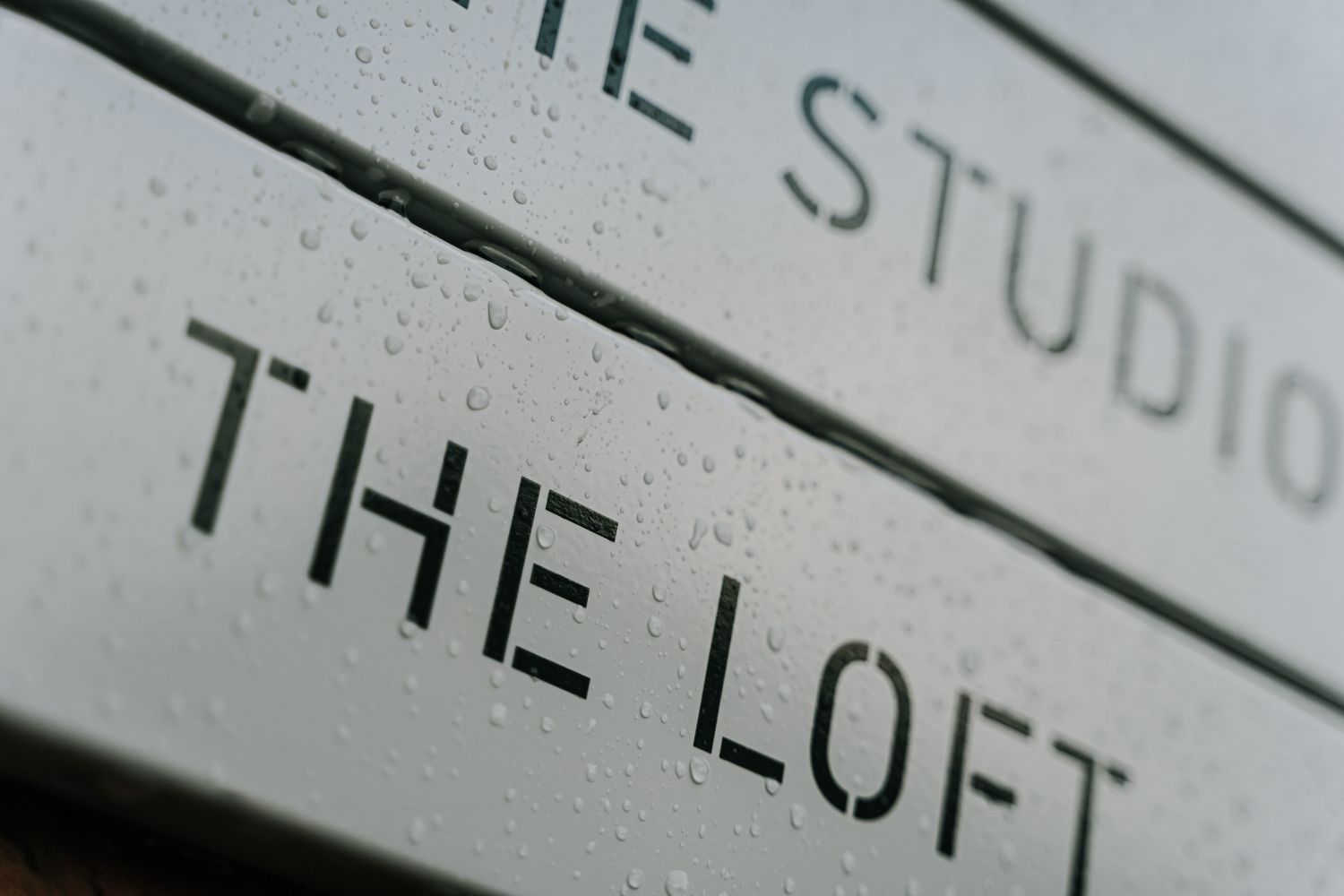
Getting to the nitty gritty, typography is the backbone of effective directory design. The choice of font, spacing between letters, balance of white space, and line height all determine not just readability, but the overall sense of order a sign conveys.

Clarity comes first. Text must be legible from a distance, which is why we favour clean, sans-serif fonts and adjust size, spacing and weight to suit each viewing context. Hierarchy is equally vital: clear visual cues between headings, subheadings, and body text guide the eye effortlessly.

Crucially, accessibility should affect your choices in this context. Around 1 in 12 men and 1 in 200 women experience some form of colour-blindness, making strong contrast and careful colour pairing essential for inclusive directory design. Slimline fonts can disappear under certain lighting, and overly tight spacing collapses at distance. Thoughtfully chosen typography ensures directories function for users with differing needs, without compromising aesthetic integrity.

Consistency ties it all together. Uniform typography across every panel ensures coherence and builds trust in the system, which means users can navigate intuitively without second-guessing. It’s this quiet precision that separates a lacklustre sign from an exemplary one.

  • Typography is fundamental to directory design.

  • Legible sans-serif fonts enhance clarity and readability.

  • Spacing and sizing optimised to viewing distance are essential.

  • Strong hierarchy helps users process information quickly.

  • Consistent typography builds familiarity and ease.

  • Meticulous typographic detail defines professional quality.

Three black-framed vertical green directory boards with white text labeled Block A, Block B, Block C, made from wooden slats and mounted on a white brick wall at Pall Mall Deposit co-working space in London.
Shallow-focus close-up of a green directory panel showing the vinyl lettering and blurred numbered listings for current and future tenants of at Pall Mall Deposit co-working space in London.
Close-up of a glowing vintage filament light bulb with warm amber glow against a dark background.
Industrial-style lounge with tan leather sofas and chairs clustered around low coffee tables, arched windows and exposed ceiling beams - the heart of at Pall Mall Deposit co-working space in London where we installed a bespoke wayfinding system.
User of Pall Mall Deposit studying green directory board signage on a lobby wall to find her way around the co-working space.
The Little Details

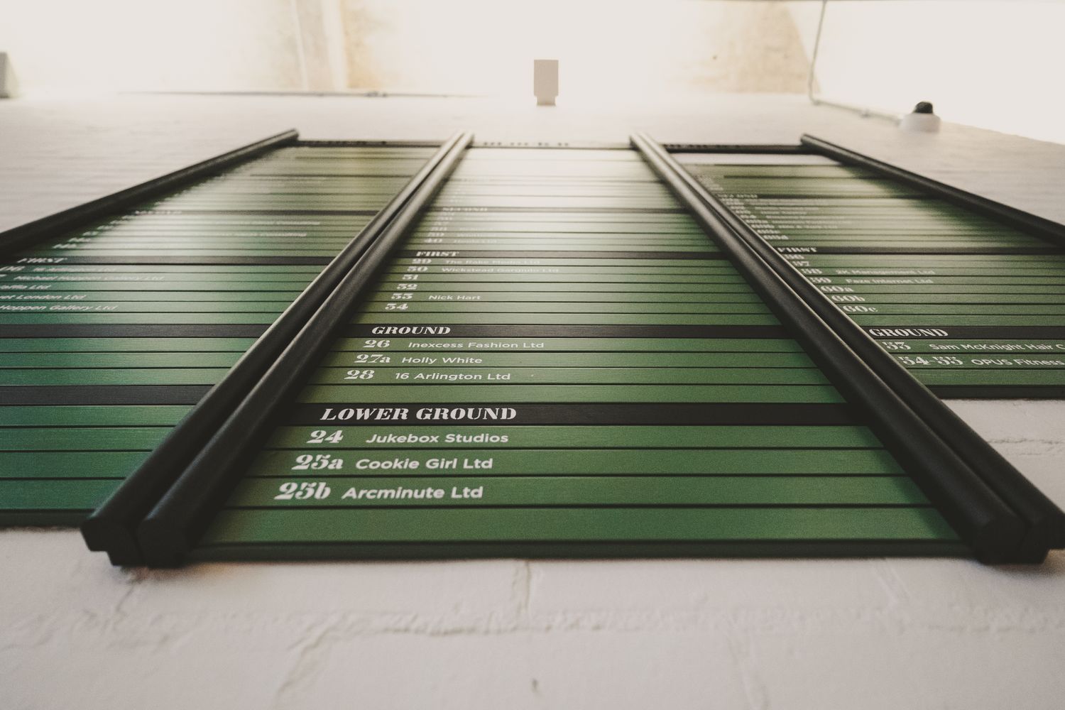
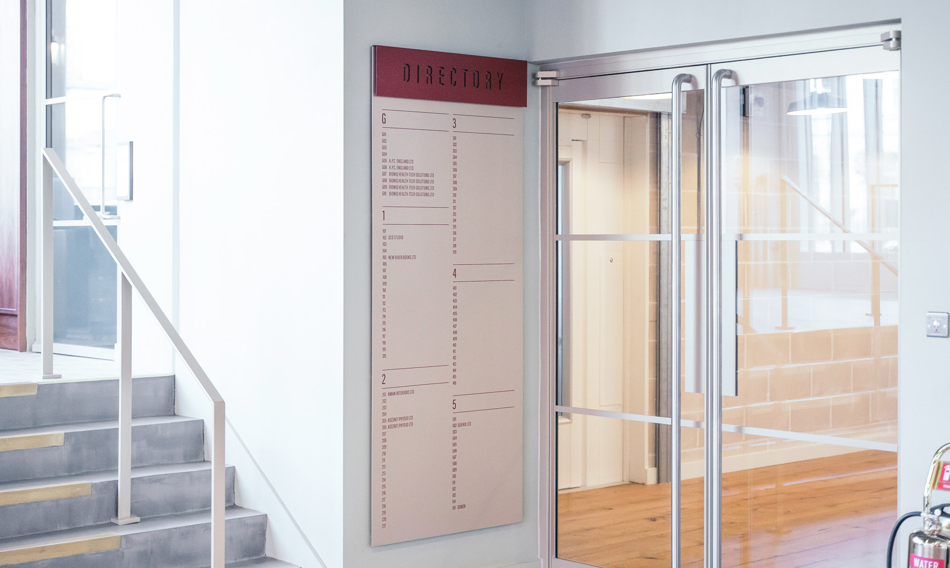
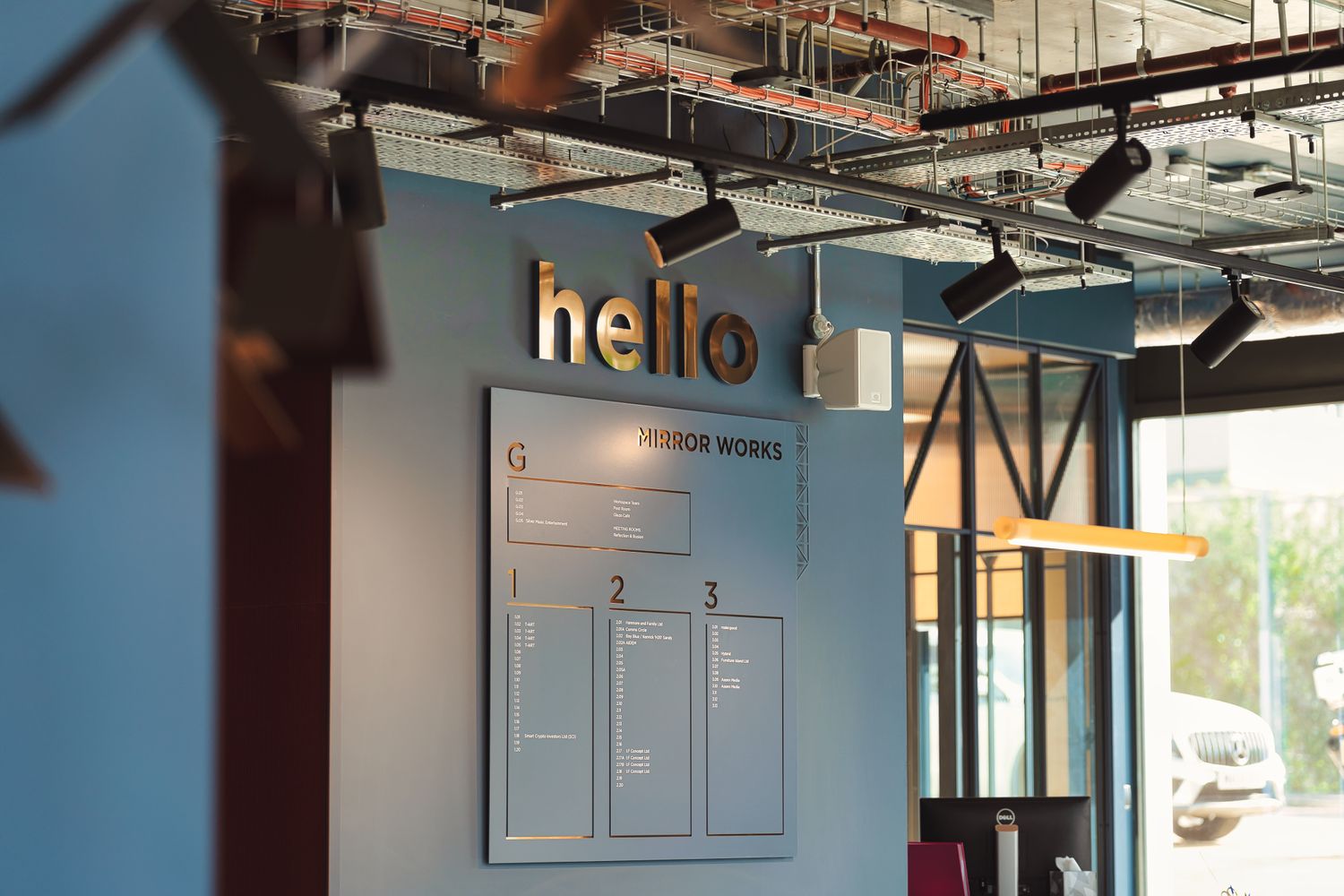
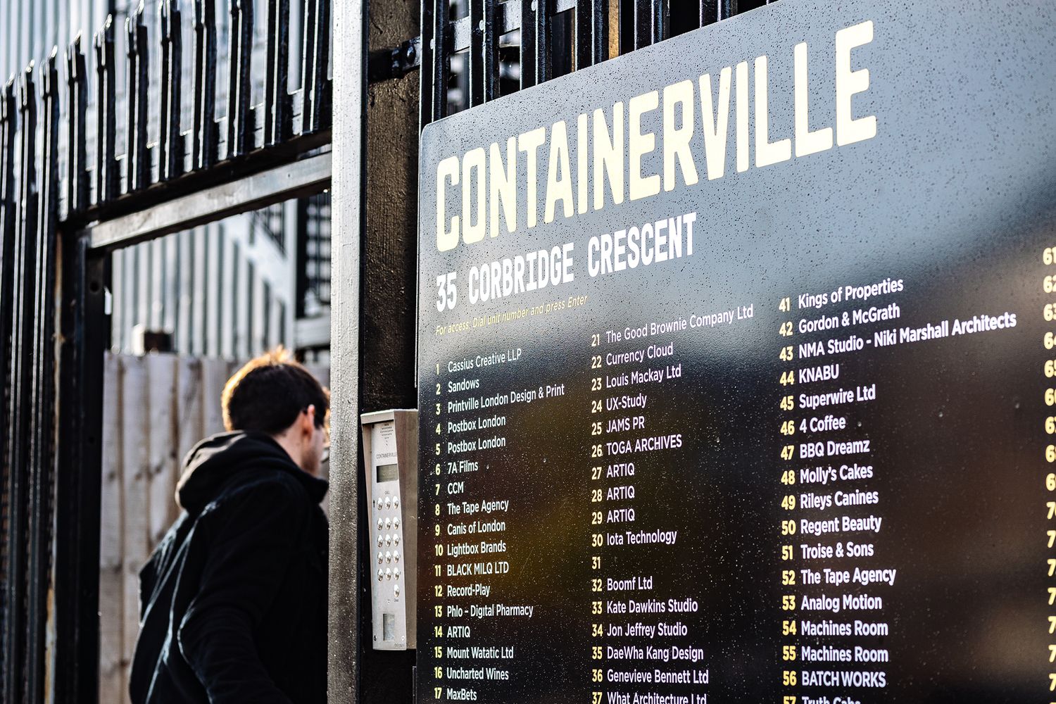
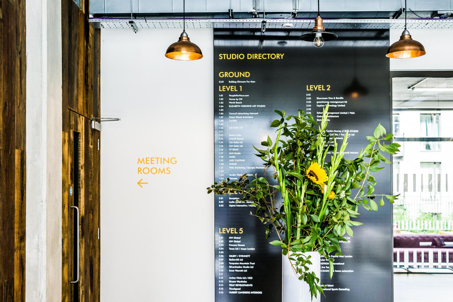
Supplementary Information

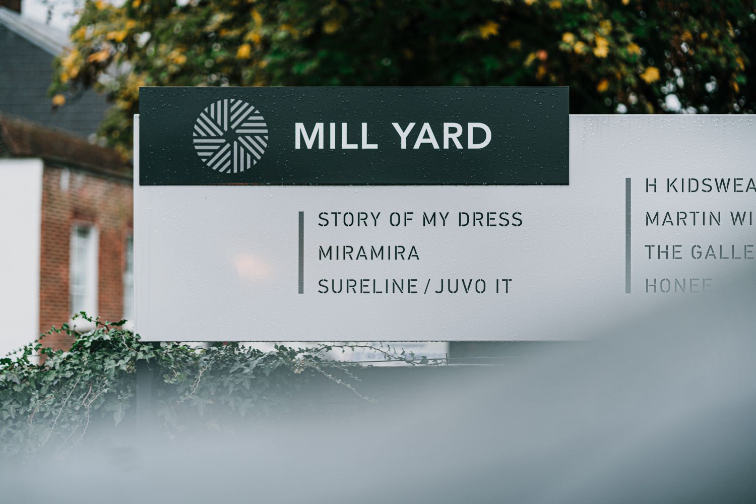
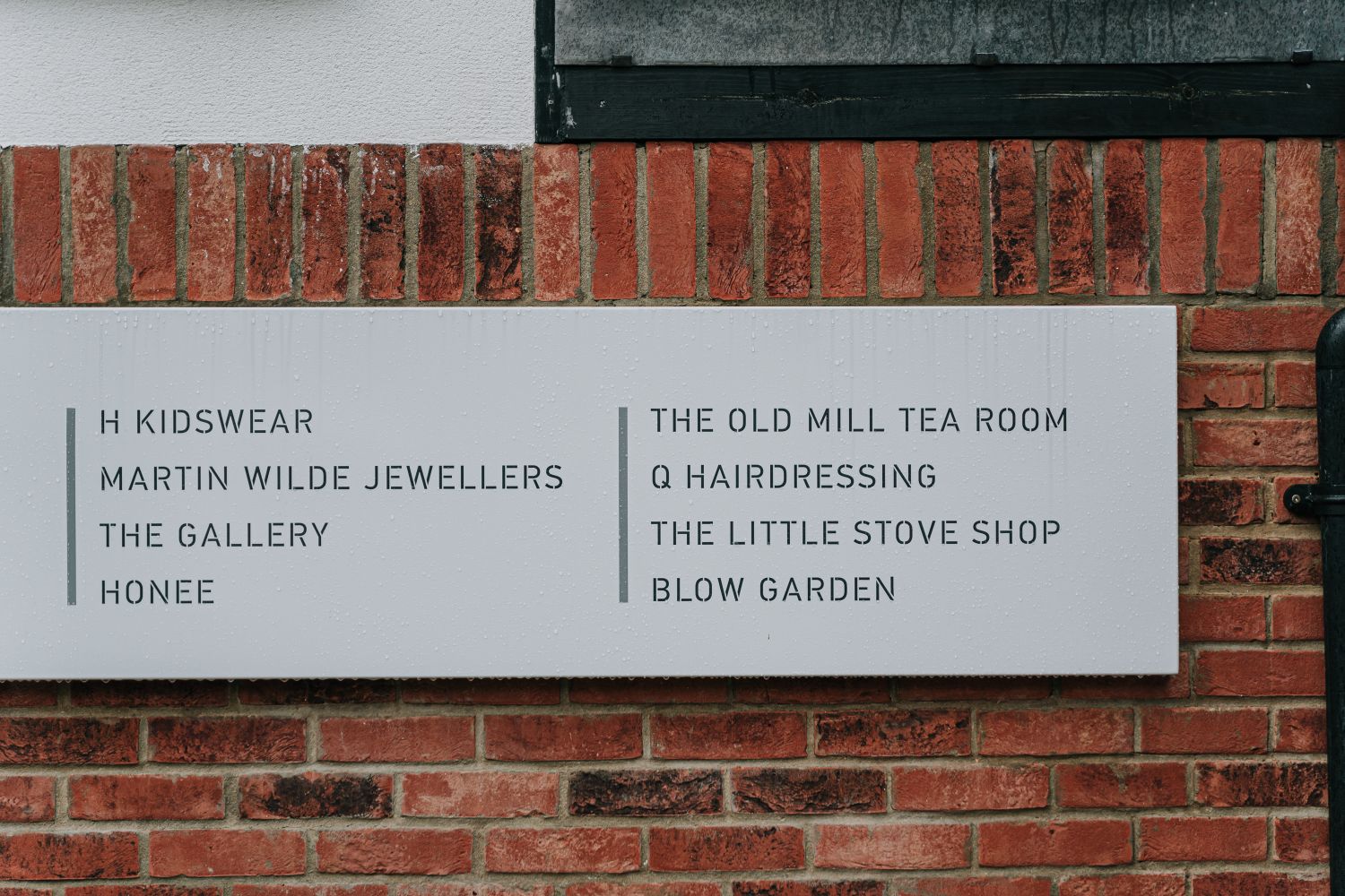
A directory should offer more than names and numbers. The best systems layer in the right supplementary details to make the experience smoother and more intuitive.

Maps provide vital spatial context, helping visitors grasp where they are and how to get where they’re going, whilst icons and pictograms support quick, universal understanding. Including operating hours and key information is basic good manners, preventing needless frustration at closed doors or unexpected restrictions.

In multilingual or international settings, supplementary information becomes even more important. A second language or well-chosen icons can bridge communication gaps without cluttering the layout. When done well, multilingual content enhances clarity rather than complicating the design. Branding also has its place within wayfinding, best done with a light touch—the aim is to reinforce identity without shouting over the key information.

The real trick is balance. Overloading a directory in any way is a sure way to undermine its purpose. With that in mind, we focus on selecting, editing and presenting only what genuinely adds value.

  • Include essential extras: maps, opening hours, policy information, and branding.

  • Use clear icons and pictograms for universal communication.

  • Provide spatial context with maps that genuinely aid orientation.

  • Reduce frustration by stating key details clearly.

  • Keep branding subtle so it supports, not competes with, navigation.

  • Avoid overload: too much information dilutes clarity and can confuse users.


Industrial interior with exposed ducts, black tiled elevator area and a green neon script sign above a directory board sign at Mare Street Studios offices.
The Emergence of Illuminated and Digital Directories
Industrial interior with exposed ducts, black tiled elevator area and a green neon script sign above a directory board sign at Mare Street Studios offices.

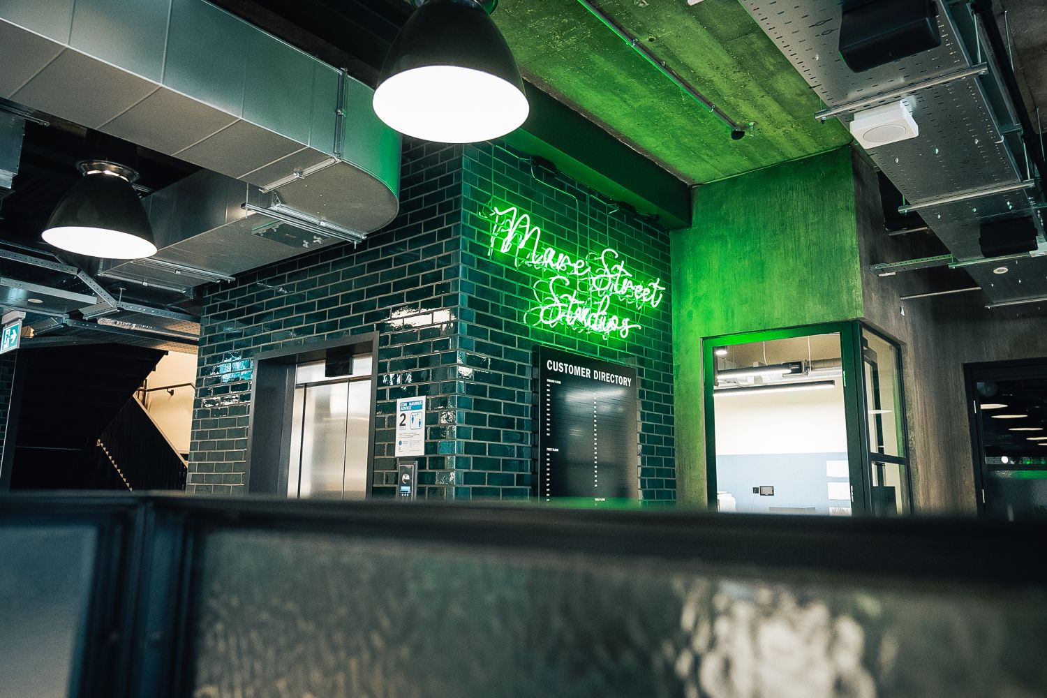
In recent years, illuminated and digital directories have surged in popularity. Illuminated directories, with their understated backlighting, offer a visually striking yet functional solution in poorly lit areas or at night. They bring a touch of elegance and significantly boost visibility - making them particularly effective in premium environments or spaces where clarity after dark is essential.

Digital directories, meanwhile, provide unparalleled versatility. Their ability to dynamically update information makes them ideal for buildings where tenants, departments or room allocations change frequently. Touchscreens and interactive maps can further refine the user experience, offering intuitive, engaging navigation that static signs simply can’t match.

However, both options come with practical considerations that must be assessed early. Digital systems introduce ongoing maintenance, software updates and higher energy use, while illuminated directories require careful installation and long-term upkeep. These operational demands - along with initial costs - mean the most technologically advanced option isn’t automatically the best one for every environment.

Whether static, illuminated or digital, directories must also be designed with their lifecycle in mind. Tenant turnover, cleaning routines and day-to-day handling all influence how well a system performs over time. A directory that falls out of date or into disrepair becomes more misleading than helpful, regardless of how sophisticated it looked on day one. Reliability must sit alongside design as a core consideration.

In many settings, traditional static signs remain the most appropriate, efficient and economical choice. The key is matching the solution to the space: understanding the building’s needs, its budget, its pace of change and the expectations of those who use it.

  • Illuminated directories: Striking and practical in low light, adding sophistication.

  • Digital directories: Highly flexible, ideal for frequently changing information.

  • Considerations: Cost, maintenance, installation demands and energy use.

  • Traditional signs: Often still the most effective and reliable long-term.

  • Our advice: Choose based on needs, resources and lifecycle demands.


Bespoke black office directory board on white brick wall listing floor and suite numbers and various company names in white text.
Angled close-up of a black signboard showing white "Fleet Street" text - part of an office directory.
Close-up of a black directory sign mounted onto a wall and embedded seamlessly amongst wooden panelling.
Modern lobby with vertical striped wood panelled wall, finished with a smart directory board illuminated by pendant lights.
Easy Read

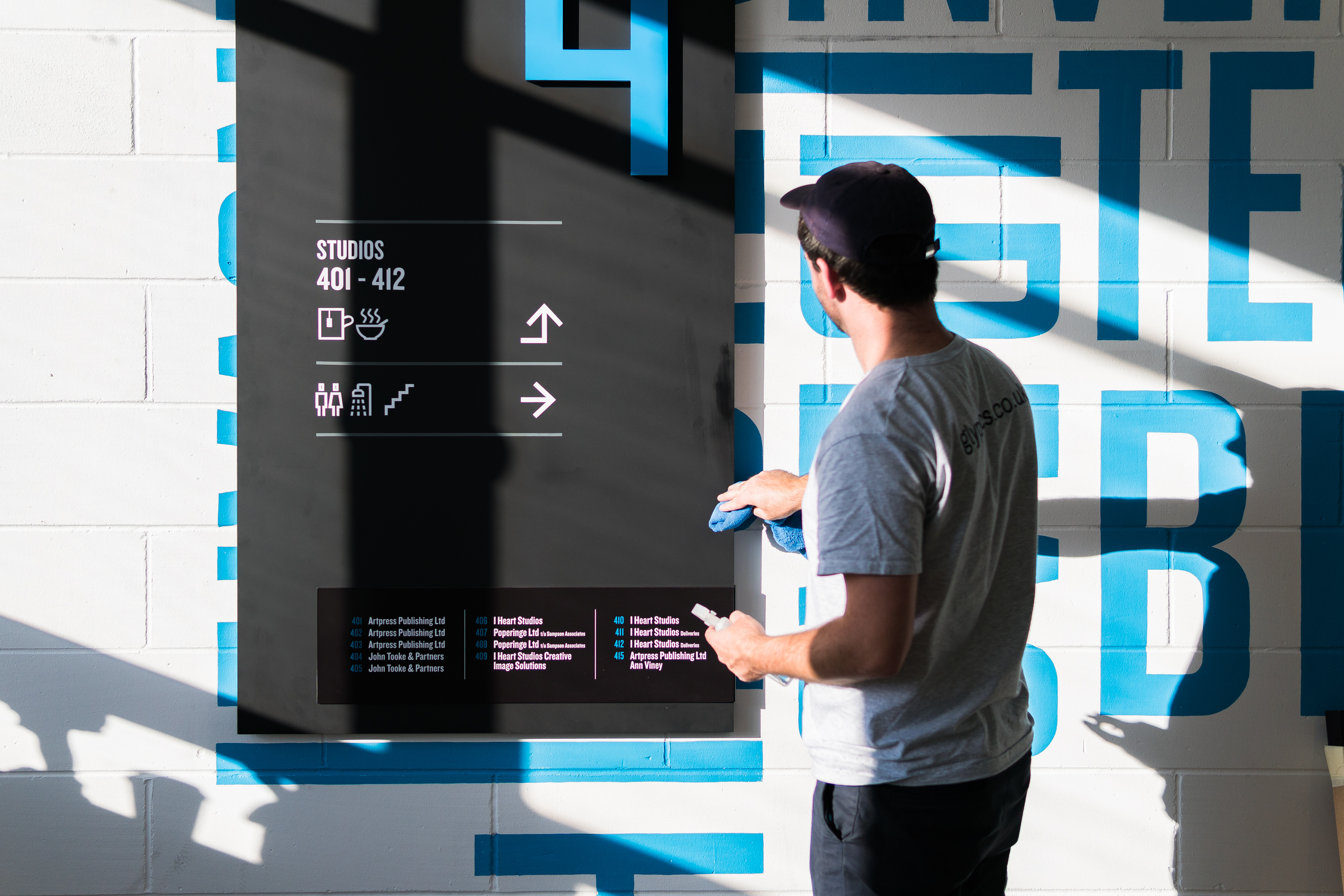
Real-world legibility

Legibility begins long before fonts or layouts are chosen. A directory has to succeed in the real world – in the lighting, movement and viewing conditions people actually encounter, including those we can’t control. That’s why legibility isn’t just a typographic concern; it’s a behavioural and environmental one.

Indoors, people typically read directories from 20–30 feet away, often while moving rather than pausing. Our work reflects this reality: in larger atriums or long corridors, we scale builds accordingly or turn to illuminated or digital displays to keep information crisp at distance. And the opposite issue is just as common – when a directory sits too close, people are forced to step back just to take in the full message, disrupting the natural rhythm of movement, so we downsize to maintain comfortable readability.

Surroundings matter just as much as proportionality. Glare, dim lighting, reflective surfaces and poor colour contrast can all undermine what should be a straightforward read. More often than not, we can’t influence these environmental factors, but we can test our designs in situ against sightlines, under real lighting conditions and having taken the actual approach angles ourselves – ensuring directories perform not only on a designer’s monitor, but in the environments they’re to serve.

Reception area with a floor to ceiling black studio directory, telling people the way from behind a tall vase of greenery and sunflowers.

And because legibility depends so heavily on what happens in the physical space, the way a directory is mounted naturally becomes part of the equation. Installation is an extension of design: the moment a directory meets the wall matters as much as what it says. No matter how well it’s crafted, a directory only truly works when it’s fixed securely, aligned accurately and built to withstand real-world use – the everyday knocks, cleaning routines and repeated handling that quickly expose anything less than robust. A sign that wobbles when touched, sits off-level, throws shadows that distract or reflects overhead lighting harshly becomes harder – or even impossible – to read.

And it’s important to recognise that the impact of this isn’t uniform. Directories and wayfinding schemes with installation flaws can disproportionately hinder anyone who doesn’t match the assumed ‘average’ viewer, while considerate finishes, fixtures and fit-outs create strong, reliable legibility – ensuring key information is accessible to everyone.

  • Legibility begins with real-world conditions, not just font and layout choices.

  • Design must account for movement, with directories readable from 20–30 feet while people are on the move.

  • Scale responds to context — larger atriums need larger builds or digital/illuminated solutions; tight spaces benefit from down-sizing.

  • Environmental factors matter: glare, lighting, reflections and colour contrast all affect readability.

  • Testing in situ is essential, using real sightlines, real lighting and real approach angles.

  • Installation affects legibility, making secure fixing, accurate alignment and robust construction integral to clarity.

  • Small installation flaws disproportionately affect non-‘average’ users, so thoughtful finishes and fixtures support accessibility and equity.

  • Consistent, reliable legibility ensures equity, helping all users navigate with the same confidence.

External "Mews of Mayfair" directory sign mounted on a brick wall, listing floors and their respective hospitality spaces: Mews Map Room, Mews Brasserie, Mews Pizza Co., courtyard and cocktail bars.
Round marble table holding a pink menu reading 'Mews Cocktail Bar', with the bar blurry in the background.
Colourful external directory sign for "Mews of Mayfair", mounted on a brick wall, mapping out the layout of its spaces, labelled Map Room, Brasserie, Courtyard Bar, Cocktail Bar, Wine Room and Pizza Co.
On Point

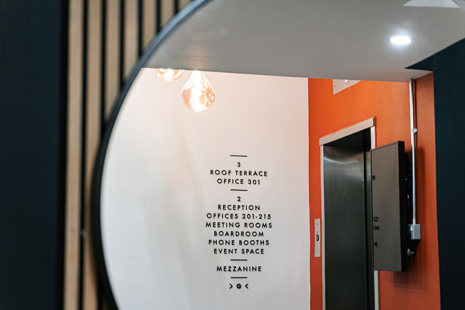
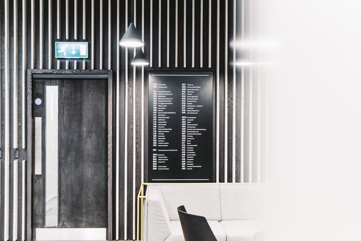
Position and Orientation

At Glyphics, we know that a directory’s effectiveness succeeds or fails by where it’s placed and where it's facing. As one of the very first points of contact with a wayfinding system, the directory should be unmissable - set near entrances, junctions or key decision points - so it naturally catches the eye at the exact moment someone begins needing guidance.

It's imperative that these signs are mounted at average eye level, serving the widest range of users without making them strain to see or second-guess themselves. This approach caters to a diverse range of people, ensuring ease and accessibility.

Just as crucial is the sign's alignment in relation to the user's approach and the building's layout - even the most beautifully designed directory can become a source of confusion, instead of an anchor, if angled awkwardly or tucked out of sight.

All in all, a poorly positioned or oriented sign can disrupt flow and impede navigation, so at Glyphics we aren't afraid to admit we obsess over sightlines, approach paths and the natural rhythms of movement when we design and install directories, in the effort to ensure a seamless experience.

  • Placement and alignment are critical.

  • Position near entrances or key decision points.

  • Mount at average eye level for universal accessibility.

  • Angle towards user approach and work to building's layout.

  • Poor placement creates unnecessary frustration.

Outdoor sign "MILL YARD" with tenant names listed below, framed by greenery and a blurred brick building background.
Close-up angled view of a wet external sign panel at Mill Yard, reading "THE LOFT" and "THE STUDIO" with water droplets visible on its surface.
White directory sign mounted on a red brick wall listing local shops at Mill Yard in neat columns.
Large directory sign on posts above a stone wall and gravel landscaping at Mill Yard shopping in West Malling.
Finding The Best Way Forward

Great directories don’t compete for attention - they clear the way for it. When every element is considered, from typography to lighting and from materials to maintenance, a directory simply becomes part of the building’s rhythm. It supports the flow of people, reduces friction and brings a sense of calm to environments that might otherwise feel overwhelming, all without necessarily making much of a feature of itself.

As makers and installers, for us wayfinding is about meeting people where they are. Directories live in real conditions, shaped by movement, architecture, accessibility needs and continual change. Designed with that reality in mind, they become more than lists of locations - they become the safety net of navigation, offering the quiet certainty people look for when orienting themselves in unfamiliar spaces.

This is why we see wayfinding not as decoration, but as infrastructure. Every decision - placement, hierarchy, materials, legibility and lifecycle - influences how someone experiences a building and how confident they feel existing within it.

And in the end, the success of a directory isn’t measured by how striking it looks, but by how effortlessly it disappears. When a wayfinding system works seamlessly, most people will never stop to think about why - so in this instance, not giving a sign a second thought is one of the biggest compliments we can receive at Glyphics. Come and explore our approach further.

High-gloss black wall-mounted office directory displaying company names and floor numbers against a neutral wall.
Person in a dark coat walking away down a modern office corridor lined with yellow-framed doors and overhead lights, navigating the space confidently.
High-gloss black wall-mounted office directory displaying company names and floor numbers against a neutral wall.
Person in a dark coat walking away down a modern office corridor lined with yellow-framed doors and overhead lights, navigating the space confidently.
High-gloss black wall-mounted office directory displaying company names and floor numbers against a neutral wall.
Person in a dark coat walking away down a modern office corridor lined with yellow-framed doors and overhead lights, navigating the space confidently.
High-gloss black wall-mounted office directory displaying company names and floor numbers against a neutral wall.
Person in a dark coat walking away down a modern office corridor lined with yellow-framed doors and overhead lights, navigating the space confidently.
Latest articles
More articles
Some of our awesome clients
Workspace Group logoCo Space logoOzone Coffee Roasters logoStrong Roots logoThe Hackett Group logoGrabthai logoEtsy logoPlaystation logoThe Croc logoCenttrip logoSadler's Wells logoBP logoHerbert Smith Freehills logoZSL London Zoo logoNonsense logoInterchange Coworking logo30 St Mary Axe logo
THREE DECADES AS LONDON’S TRUSTED SIGN MAKER
QUALITY BESPOKE SIGNAGE

From independent businesses and private offices to public buildings and cultural centres, we serve organisations across the UK with signs made using both traditional skills and contemporary technologies.

As a company built on testimonials and repeat custom, we nurture strong relationships with our clients from the very start.

Our ordering process is simple and hassle-free:

  1. Contact us through the form to discuss your design needs and receive a quote.

  2. Our team of experts will determine the best materials and construction methods.

  3. Feedback or approve the design and quote.

  4. Relax while we craft your custom sign.

  5. We'll handle installation and ensure everything is to your satisfaction.

Get a quote
Name
Company
Work email
Work phone number
Company size
Number of signs required
When do you need the sign(s)?
Upload relevant design files
Installation address
Job description