REHEGOO Wall graphics, glass manifestations & illuminated signs
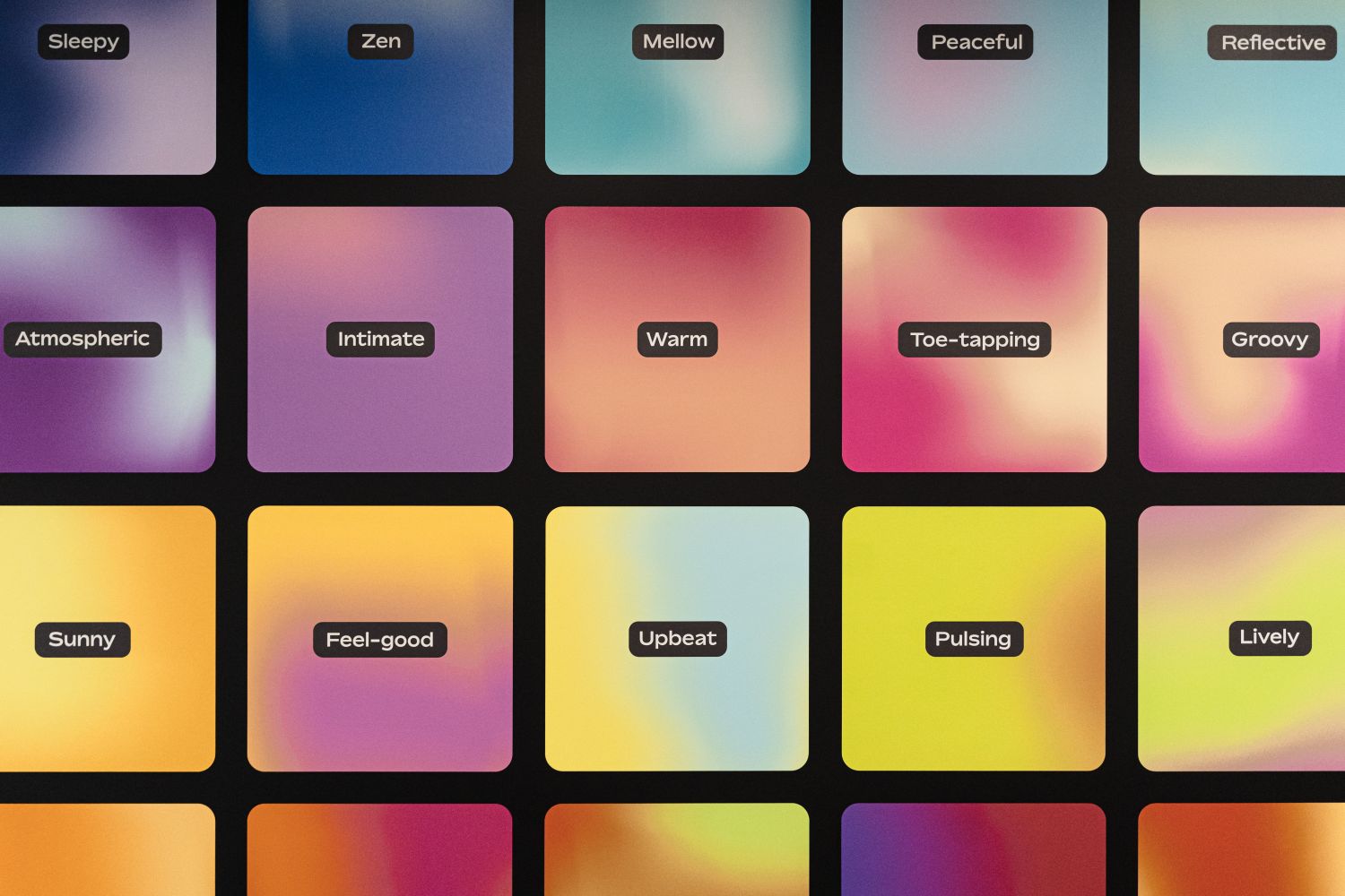
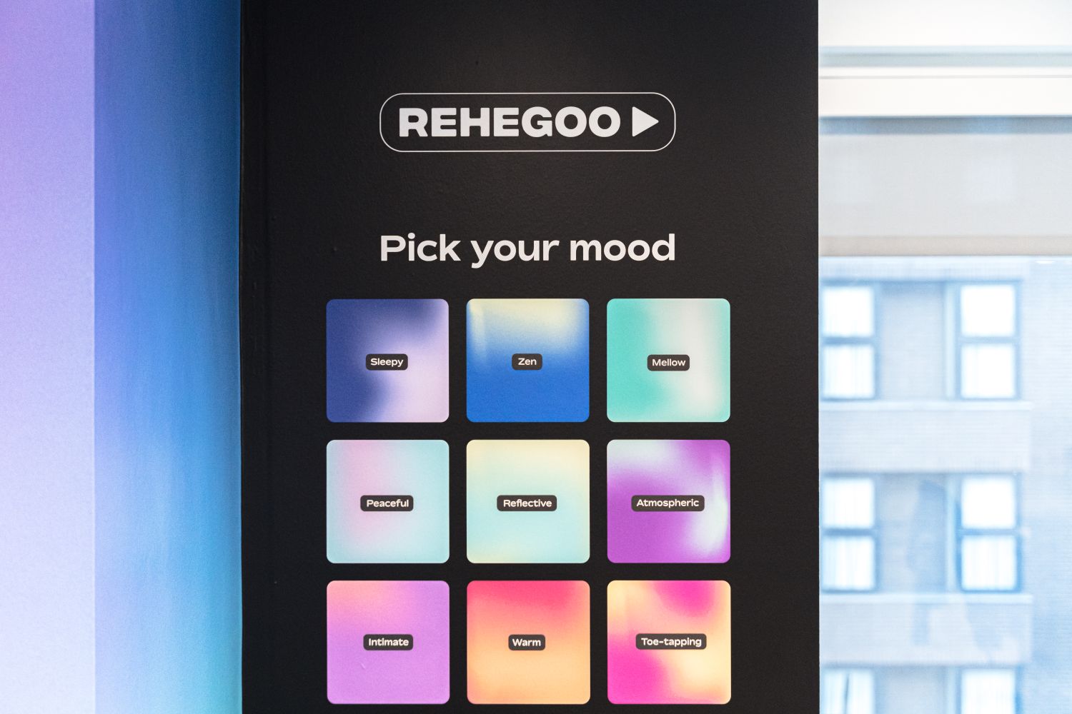
Music licensing company, Rehegoo, discovered us through our website, and we were thrilled to collaborate with them on their first London HQ. They had already set up an office in Europe and wanted to find their groove in the UK, seeking out bespoke wall graphics that would brighten up their open plan space using their established online branding. Rehegoo's vast music library is organised by moods, each distinguished by a colour palette - making for a visual identity that translates into vibrant signage, from wall graphics to illuminated logos.
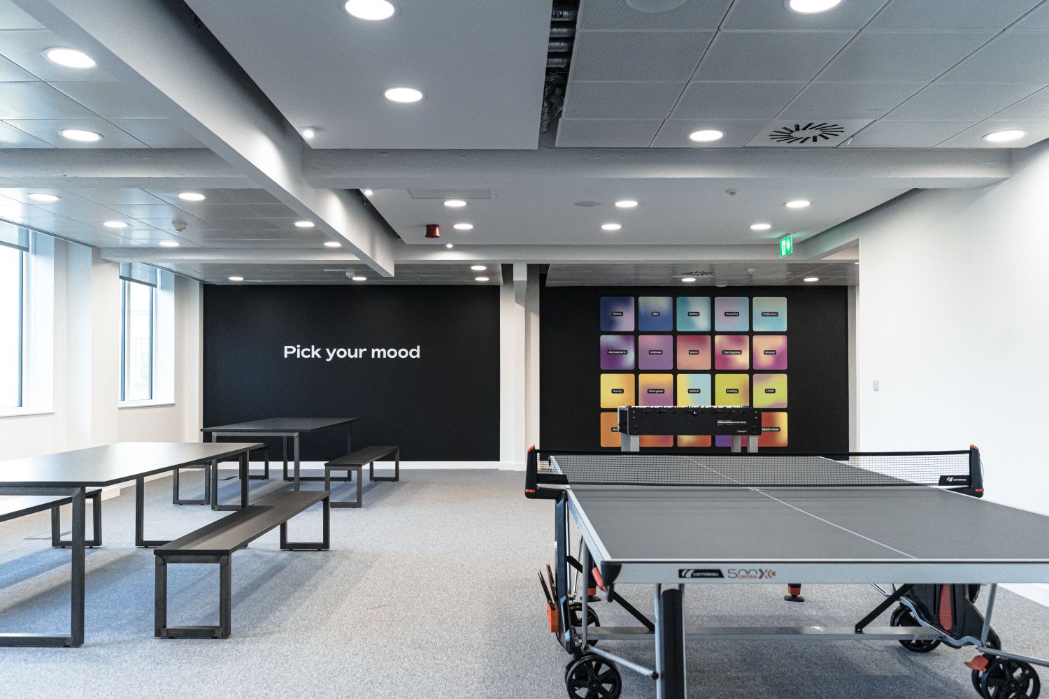
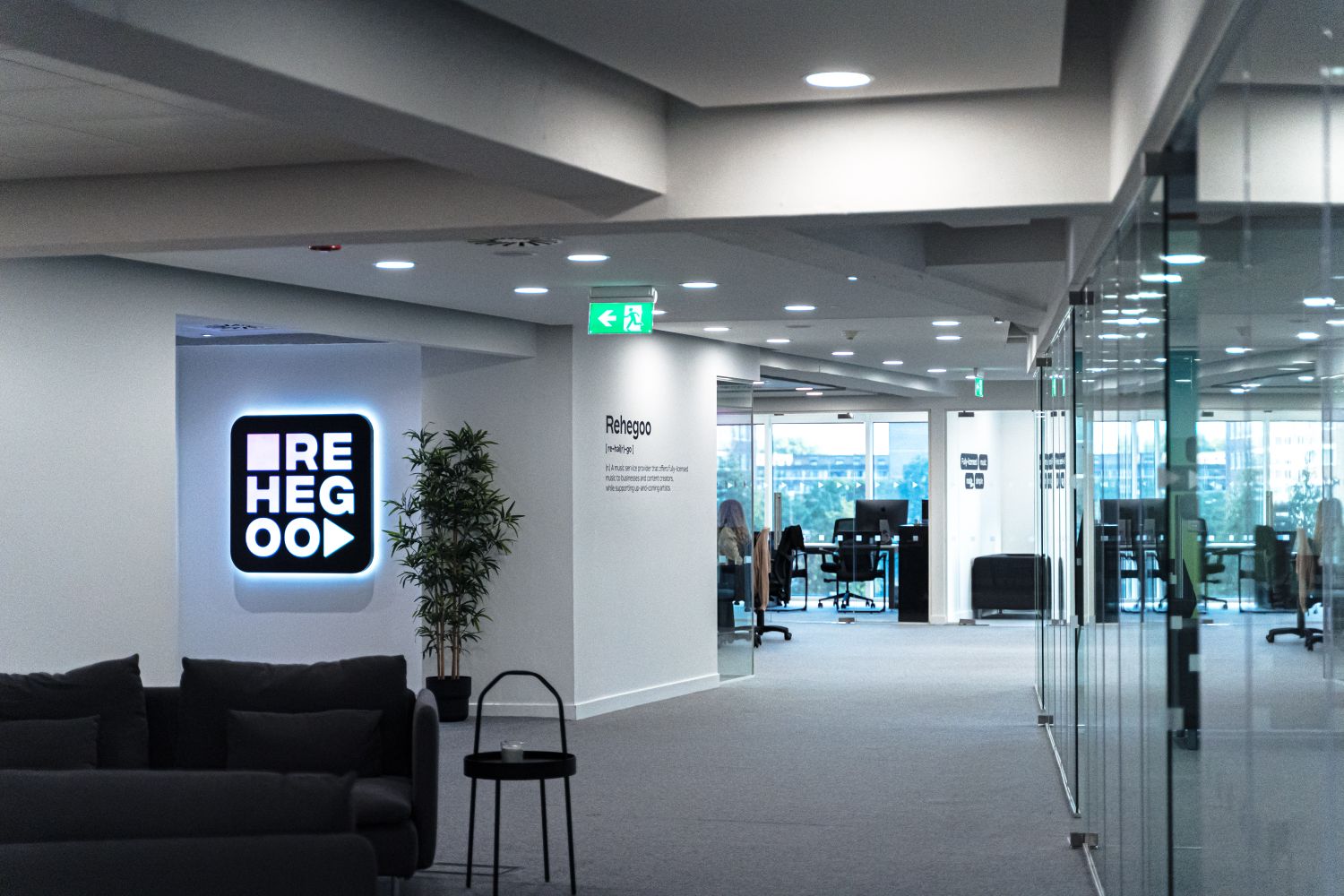
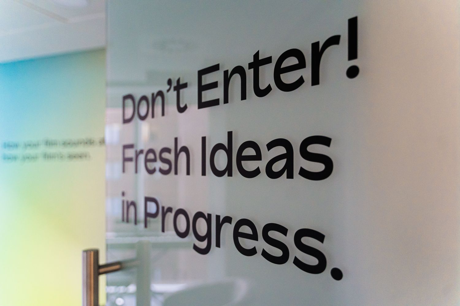
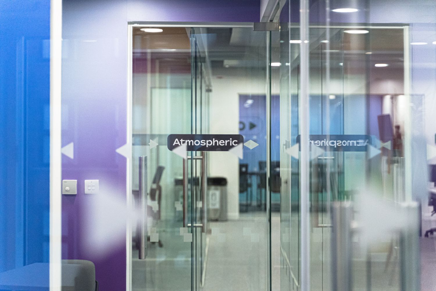
From the get-go, we collaborated closely with Rehegoo to bring their brand's digital language to life in their new London HQ. Following our initial discussion, we surveyed the Kensington High Street location to evaluate the project's scale and examine the surfaces we would be working with. This proved to be invaluable, as it revealed that the client needed glass manifestations to comply with safety regulations. We proposed an understated yet on-brand solution to accentuate any internal glazing – a minimalist pattern comprising the 'play' and 'stop' symbols, which we are glad resonated with Rehegoo.
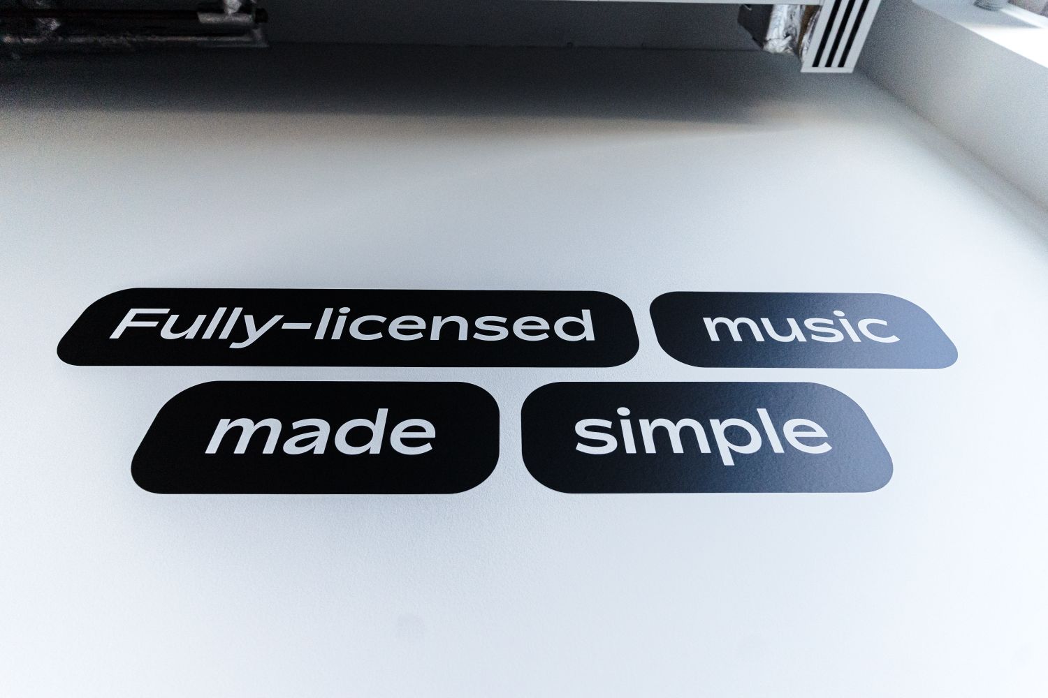
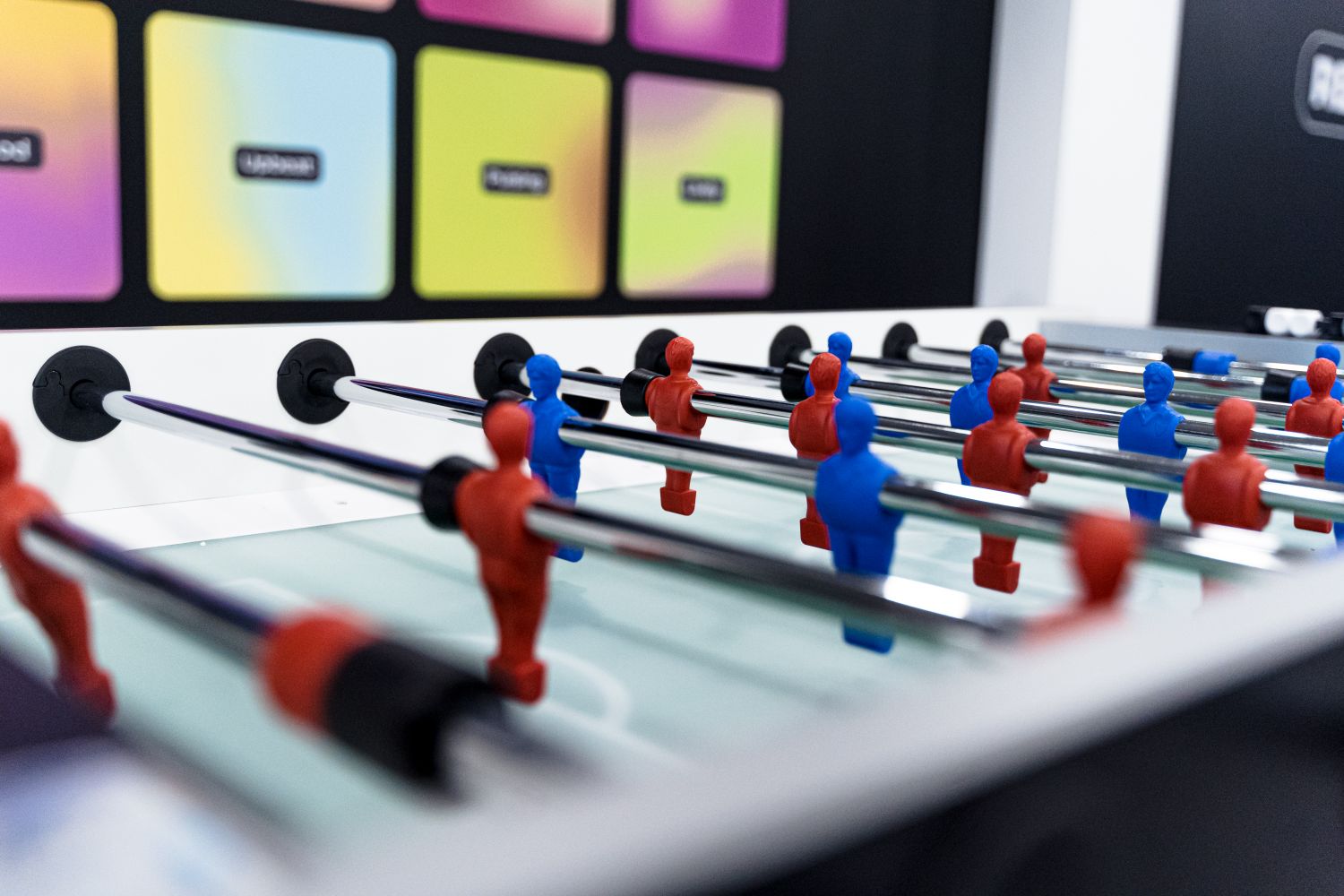
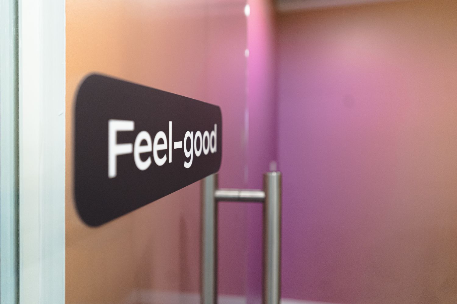
Our team made sure that every custom sign we crafted incorporated Rehegoo's digital product, allowing the music platform to define the design of their interiors. We repurposed the rounded tab buttons from their website architecture into stylised meeting room identifiers and installed graded wallscapes in the offices, evoking the appearance of sonic wavelength visualisers.
The challenge before us was to maintain the clean and contemporary air of these commercial offices while manifesting retro aesthetics, given that Rehegoo's branding is a modern take on a nostalgic look. Walking into a completely blank slate of white-washed walls and glass doors, it became apparent that we’d need a thoughtful solution, with signage applied in a way that preserves the calm and coolness of this light-filled space.
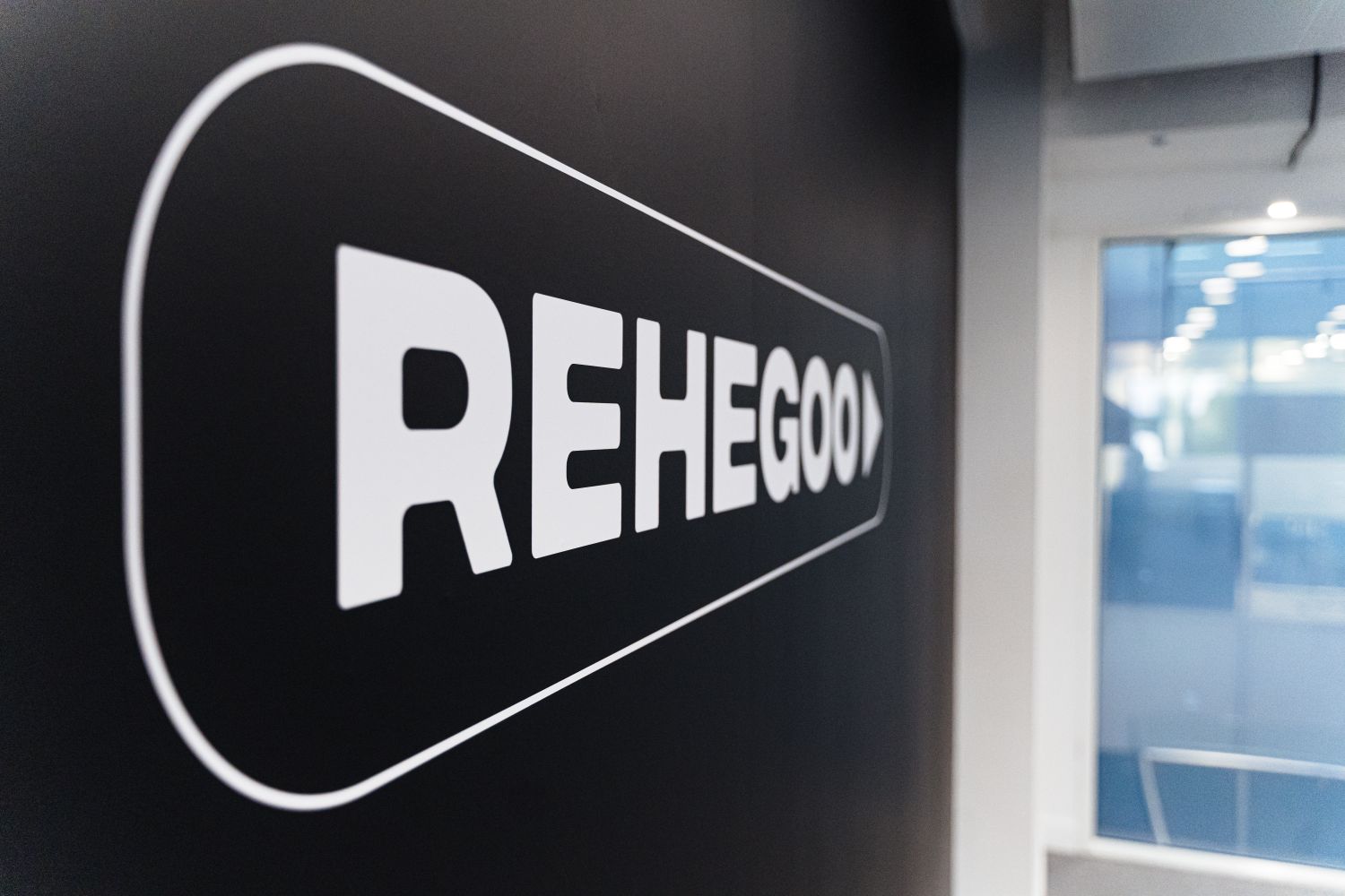
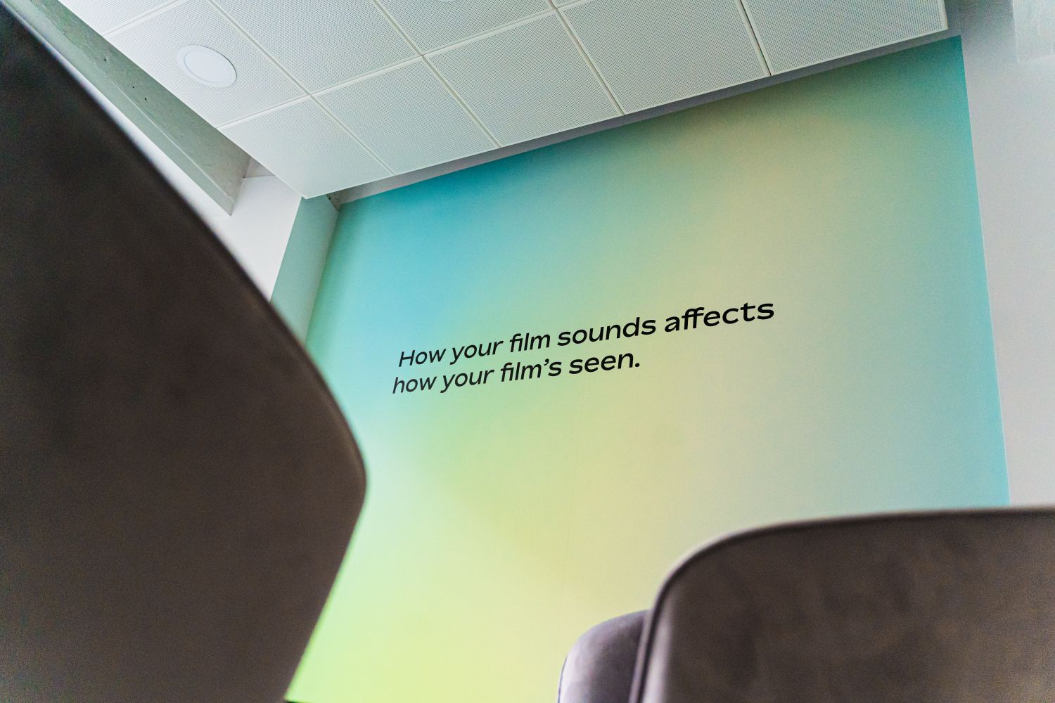
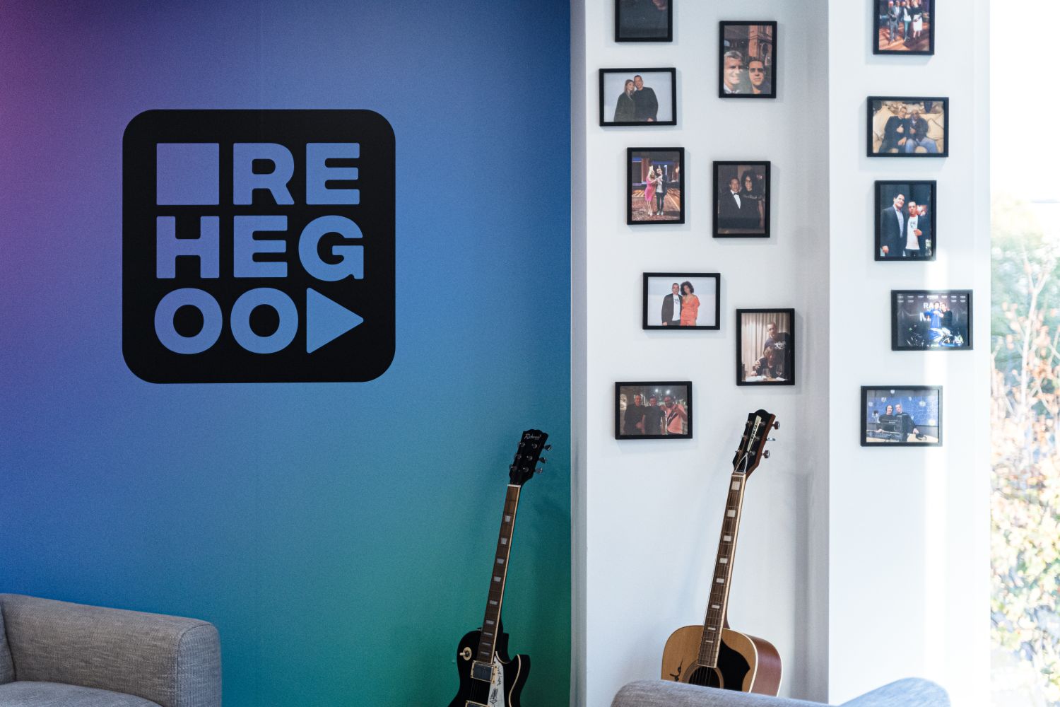
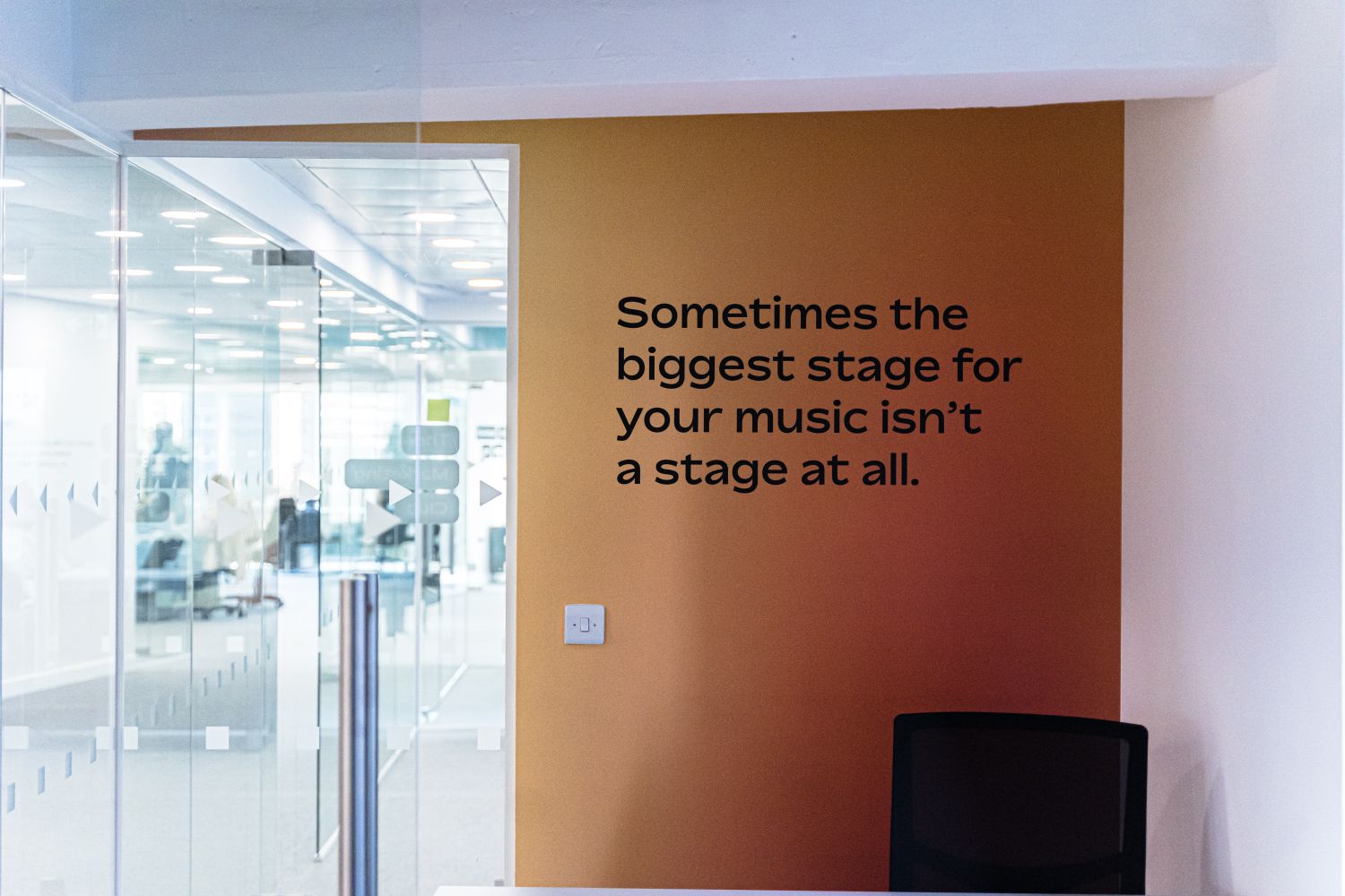
As a result, we printed large-scale matt vinyl wallpapers that set the tone without swamping the sense of sophistication, applied to a single wall in each room. Every feature wall displayed a distinct colour spectrum, allowing the ambience to evolve across the space. We replicated Rehegoo's zesty sans serif font and employed it subtly, from the cut lettering quotes that grace the office’s walls and doors to the small vinyl graphics for the themed meeting room names. Spanning from 'zen' to 'beast-mode’, these echoed the categorisation system from Rehegoo’s website to encourage different creative energies within the company's employees and customers. Lastly, we created two softly illuminated signs to leave a glowing impression on visitors in the entryways.
Each of our signs was considerately made and carefully placed, conveying the designated mood or functionality of an area. We successfully built elements that sang for Rehegoo's brand without stifling the natural airiness of its offices and while optimising flow.
The end result showcases a clever evolution of design that integrates digital identity into the built environment, and is a testament to the power of collaboration between client and sign maker. We love that we get to wear the shoes of another for a while - exploring aspirations and feeling passions makes for a rewarding job that translates into our work. Echoing our relationship with Rehegoo, we were delighted to deliver a lively, dynamic space that encourages creativity, and look forward to conspiring to create in the future.
FAQs - Rehegoo
Our collaboration with music licensing company, Rehegoo, involved creating bespoke signage for their inaugural London headquarters. The task entailed embodying their already established digital presence in physical form, including wall graphics and illuminated logos.
Our design concept was inspired by their innovative music library, which sorts euphonic moods by colour gradients - a retro graphic style that dictates the brand’s look and feel. As a result, the challenge for us lay in achieving balance, preserving the office's light-filled, contemporary air while introducing nostalgic aesthetics.
To ensure alignment, we thoroughly absorbed Rehegoo's visual identity and manifested their online domain in the tangible environment. This involved consistently utilising their colour palette, typographic style, and branding elements across all signage.
Examples include gradient-rich vinyl wallscapes inspired by the vibrant imagery of sonic wavelength visualisers; the graphic design of the meeting room identifiers, based on the rounded tab buttons and typeface found throughout Rehegoo’s website; and glass manifestations which feature a repeat pattern of the 'play' and 'stop' symbols.
Carrying the creative spirit of Rehegoo's brand, the signage provided not only direction and functionality but also significantly enhanced the aesthetic and experiential qualities of the workplace.
We've had the opportunity to work on several projects that were blank slates as such, where our signage played a pivotal role in not just defining brand identity and implementing office functionality, but setting the tone of the interior design with aesthetic elements.
For instance, The Croc saw us transform a bare office, segmented by plain glass walls, into a warm workplace, and we were entrusted by Moo to outfit 'The 404' – a concept café within their open floor plan, evolving it from white-washed walls into a slick and stylish corner for a coffee break. There's also our collaboration with co-working space The Biscuit Factory, where the core decorative feature came from our artistic wayfinding concept.
See more of our work for offices here.
To initiate a project with Glyphics, companies can reach out to us for a consultation. We will discuss your vision, brand identity and specific needs to ensure the signage we develop not only meets but enhances your office space.


